Grimsby Town To Return To Old Crest After Fans Backlash
 Jan 8, 2022, by Khoi

It's like walking on thin ice whenever it comes to changing a club's logo. Grimsby Town certainly learned the hard way.

Grimsby Town Forced To Use Old Logo Again Due To Angered Fans
Unlike what we've usually seen when a new logo is presented, Grimsby Town's redesigned crest was not altered too much compared to the old one.
The crest designer, Rich Lyons.
The designer, Rich Lyons, who is also a lifelong Grimsby fan, added a flag with the founding year to the trawler, used a bolder font and slightly thicker black outline around the crest. That was it, the new logo stays pretty much true to the original design.
However, it was met with backlash from the fans, not because of the design, though. It was more about the lack of communication from the club regarding the changes and that the fans were not involved.

Grimsby Town's Chairman Jason Stockwood (left)
In a series of Tweets, club Chairman Jason Stockwood said: "Dear GTFC, we messed up on the consultation & comms over the new crest & club brand guidelines.

"It has been months of work and subtlety updates the club for a more digital age but we hold our hands up that we got this wrong."
Dear #GTFC we messed up on the consultation & comms over the new crest & club brand guidelines. It has been months of work and subtlety updates the club for a more digital age but hold our hands up that we got this wrong. 1/2
— Jason Stockwood (@jstockwood) January 1, 2022
He added: "The whole board stand behind the brilliant work Rich Lyons has done and the reasons it needed doing.

"Apologies, we will start again tomorrow to explain fully and then will put the option to fans for a vote over the coming days."
The whole board stand behind the brilliant work @richlyons_ has done and the reasons it needed doing. Apologies, we will start again tomorrow to explain fully (please read the article on the website) & then will put the option to fans for a vote over the coming days #GTFC 2/2
— Jason Stockwood (@jstockwood) January 1, 2022
The process will now restart and the fans can decide whether or not the crest will be changed.
What do you think of Grimsby Town reverting their logo change? Comment below.


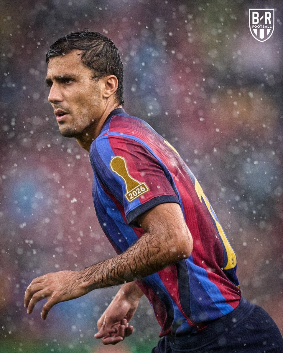
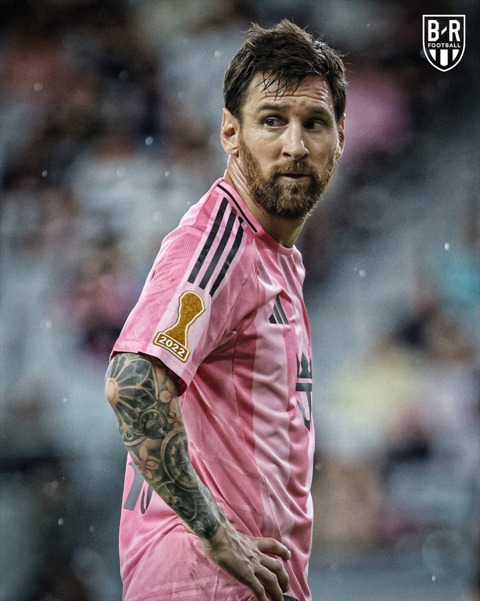
Concept: What If World Cup Winners Wore Special Badges on Club Kits?
A creative concept visualized by Bleacher Report has sparked discussion among kit enthusiasts, posing an intriguing question: what if players who have won the FIFA World Cup were allowed to wear a special champion badge on their club kits? Under current FIFA equipment regulations, only reigning national team champions and Club World Cup winners are permitted to sport the official FIFA Champions Badge, but bringing an individual achievement patch to the club stage introduces a bold twist to modern shirt details.
The mockups feature World Cup winners wearing a sleek, gold trophy silhouette on their kit sleeves stamped with the year of their international triumph. The concept envisions players like Lionel Messi donning a 2022 patch on his Inter Miami shirt, Kylian Mbappé carrying a 2018 badge in Real Madrid white, and Rodri sporting a 2026 mark. It serves as an immediate visual marker of football's ultimate honor, staying with the player regardless of their club transfers.
In reality, domestic leagues and confederations enforce strict uniform guidelines that limit sleeve real estate almost entirely to league badges, sleeve sponsors, and charitable campaign logos. While regulatory hurdles make such a badge virtually impossible in professional football, the visualization offers a clean and compelling look at how personal legacy could be integrated into club kits.

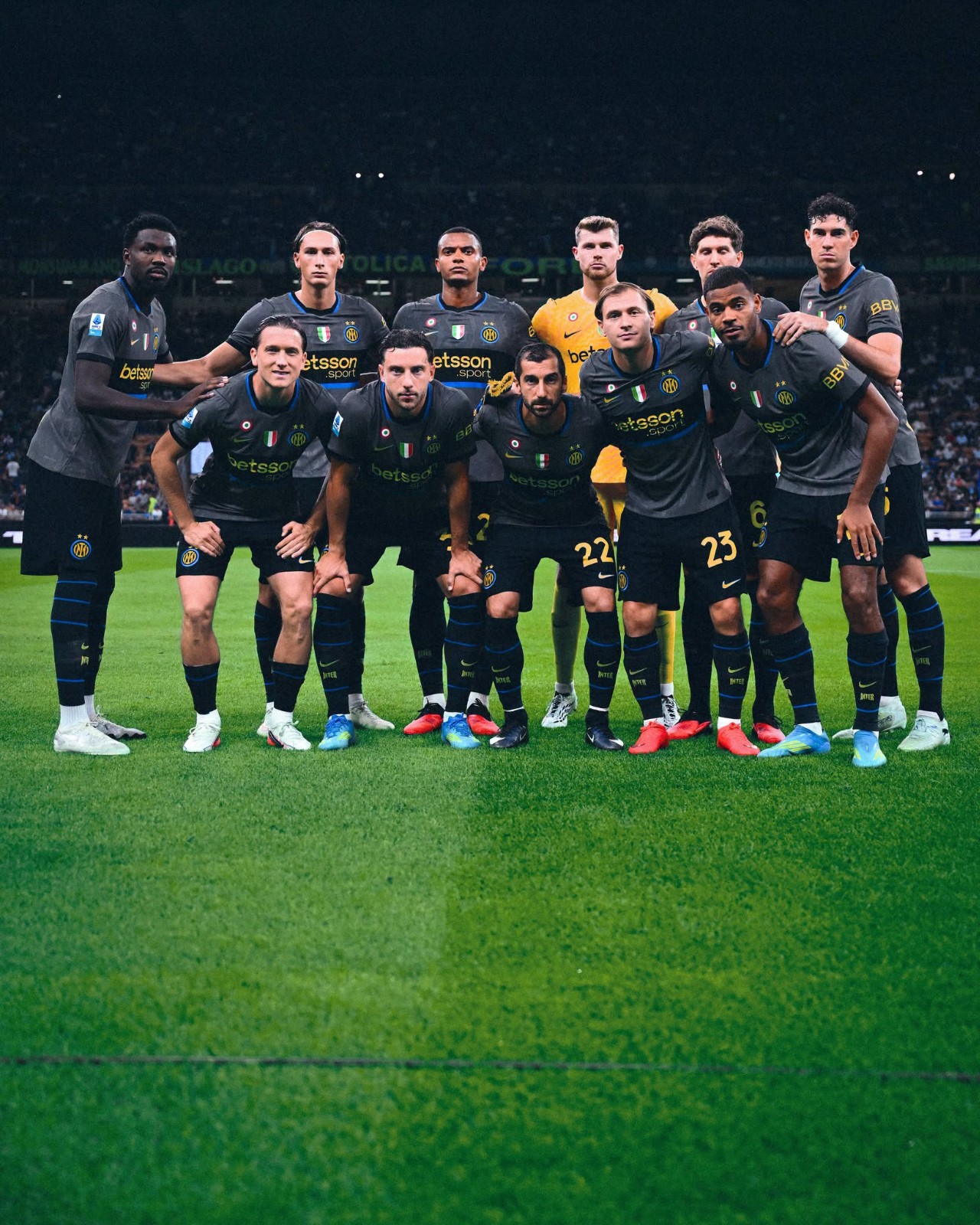
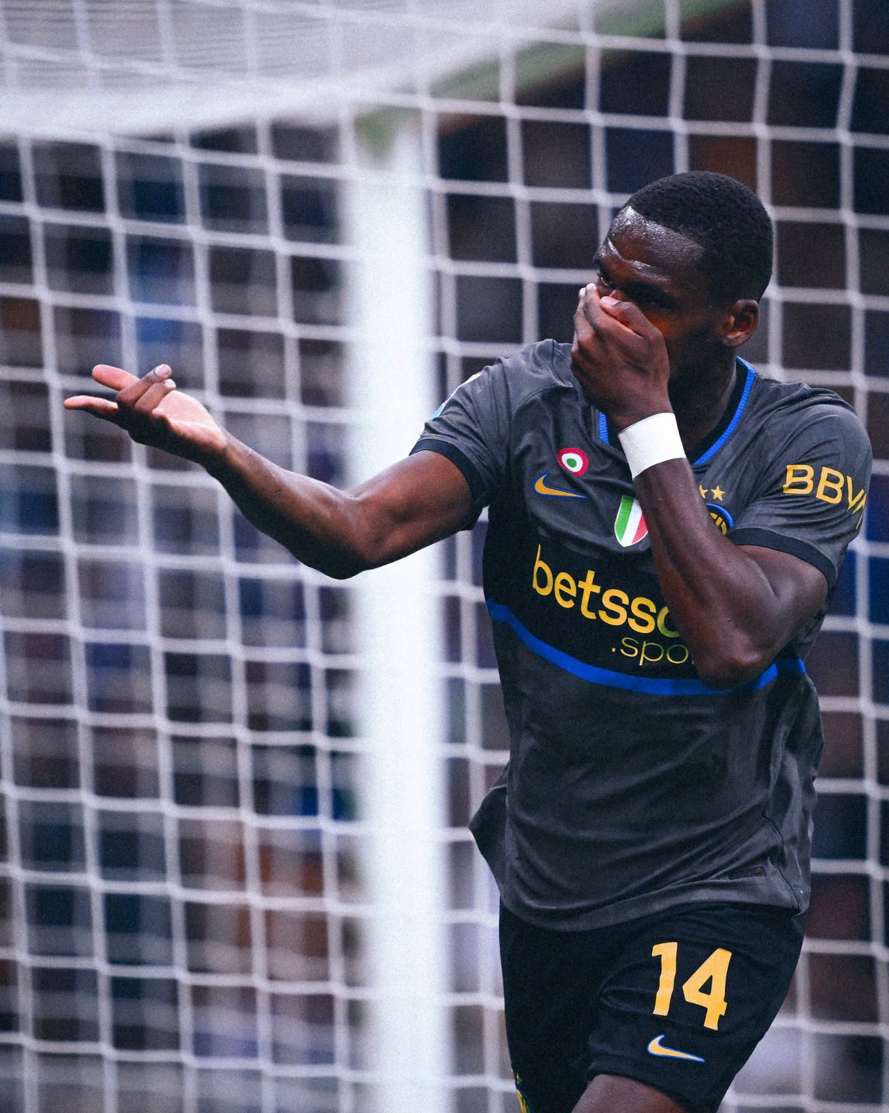
Inter Milan 26-27 Third Kit Debuted
Inter Milan officially debuted their new Nike 26-27 third kit on the pitch during a dramatic 5-3 Serie A comeback victory against Udinese at the San Siro, just hours after its official unveiling.
Taking inspiration from the Nerazzurri's iconic look from the late 1990s, notably referencing the 1997-98 and 1998-99 shirts. the new third kit is built on a stone-grey 'Iron Ore' base featuring a subtle tonal jacquard pattern. The centerpiece of the design is a prominent black horizontal chest band accented by a thin 'Blue Spark' lower stripe. Bright 'Speed Yellow' details are applied to the Swoosh, the two-starred club crest, the Betsson.sport sponsor, and retro-styled 1990s font names and numbers.


Adidas Croatia 2026-27 Home & Away Kits Leaked - 4 Real Images
Vietnamese kit expert jerseyreview has leaked 4 new real images of the new Adidas Croatia 2026-27 home & away kits, which will be released soon.
The new Adidas Croatia 2026-27 home kit retains the traditional red and white checkerboard pattern but incorporates ancient Glagolitic script graphics into the red squares, symbolizing Croatian cultural identity.
The new Adidas Croatia 2026-27 away kit features lace-inspired graphics, drawing from Croatia's rich tradition of intricate lace-making.