Manchester City Send Letter to Chilean Team for Copying Logo
New Chilean football team Santiago City FC have more or less obviously copied Manchester City's logo, and the English Premier League club are not happy with it.

Santiago City FC were founded in 2020 and are yet to play a professional match after joining Chile's third division.


Manchester City Issue Cease and Desist Order to Chilean Club Santiago City Over Badge Similarities

Manchester City have issued a cease and desist order to Santiago City over similarities between their crests. With it, they would also give the impression they are part of the City Football group (CFG). Of the badge, City's lawyers allege "unauthorised use of trademark and characteristic design".


In addition, lawyers acting for the Manchester club, Sargent & Krahn, also flagged a press release by the new club that appeared to admit that their name had been adopted in a "direct attempt to imitate Man City and other teams" in the City Football Club (CFG), the umbrella organisation which contains a number of satellite clubs around the world.
City confirmed that they do not currently have a Chilean side in their stable.
Manchester City order Santiago to "not reuse the requested or registered trademarks, including similar devices."
Santiago City FC - A Very Suspicious New Football Club
There are more suspicious things about Santiago City FC.

Are Adidas really sponsoring them?
First, they give the impression of having a big sponsorship deal with Adidas.
In an interview with the Chilean website Central Deportes, Jorge Sotomayor, president of Santiago City, talked about the identity and aims of the club...
Their president says that he has has good a good relationship with Rodrigo Anguita, a Senior Manager Sports Marketing at adidas Chile. We do not believe that Adidas are officially involved.
Santiago City have a world brand like Adidas as a sponsor..."We have an agreement. I have a good relationship with Rodrigo Anguita, head of the football recruitment area of Adidas Chile. I told him about the project and he told me: “Dale, we support you as much as we can”. He has helped us in every way. We have to take care of the brand, it is super important. It is not minor, nobody helps you in such a category."
And why the colors chosen for the shirt and shield?
"We did a market study. In Chile there is no team that has black with pink, nor has it been seen in the history of Chilean soccer. There is none like us. In the badge we show the modern Santiago. We belong to Santiago, from Pincoya to Puente Alto, from Las Condes to Vitacura, Maipú, Cerrillos, etc. And the colors are an emblem for women, because most of them suffer from breast cancer. And black because there is no team that plays in complete black, except Colo Colo. Some say we look like Inter Miami (laughs)."

Second, Santiago City misused an image of Palestinian refugees to hang on their website.

Third, their website has been "suspended" a few days ago.

Do you think Santiago City FC can keep their logo? Comment below.


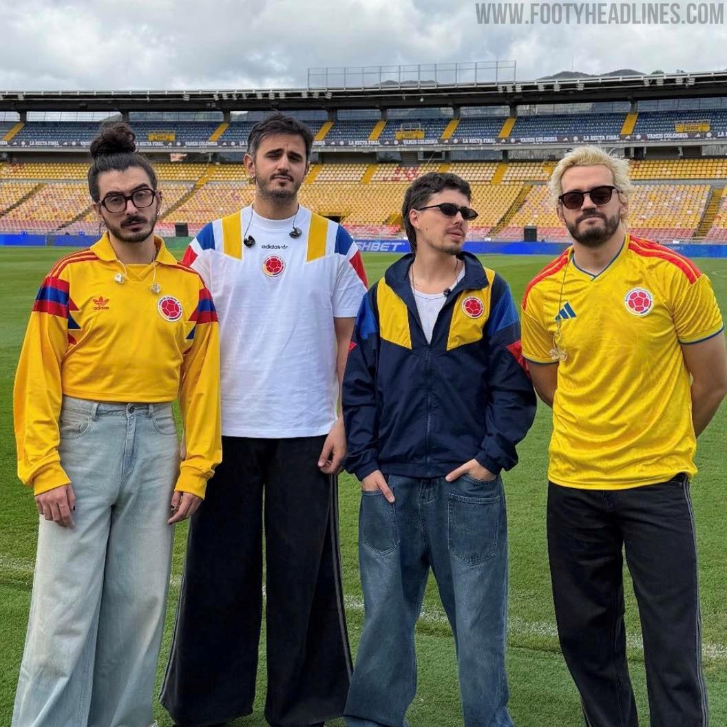
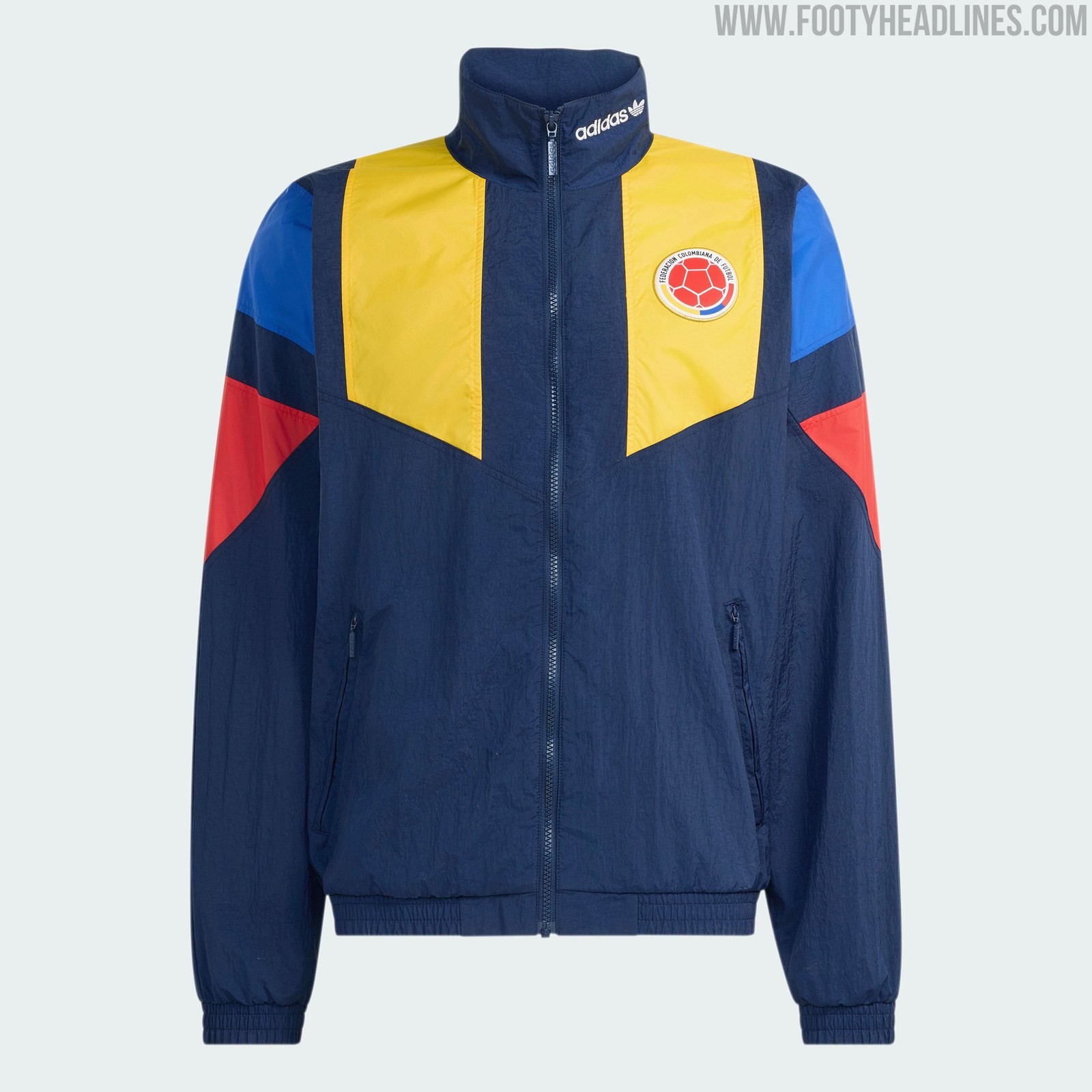
Colombia 2026 World Cup 1992 EQT Retro Collection "Leaked"
As for other nations, Adidas will release a Colombia 2026 World Cup retro apparel collection. It was already worn by the popular Colombian band Morat.
Based on the Adidas EQT 1992 block design, the Colombia 2026 World Cup retro collection boasts giant 3 stripes in yellow, blue, and red, on a navy / white base.


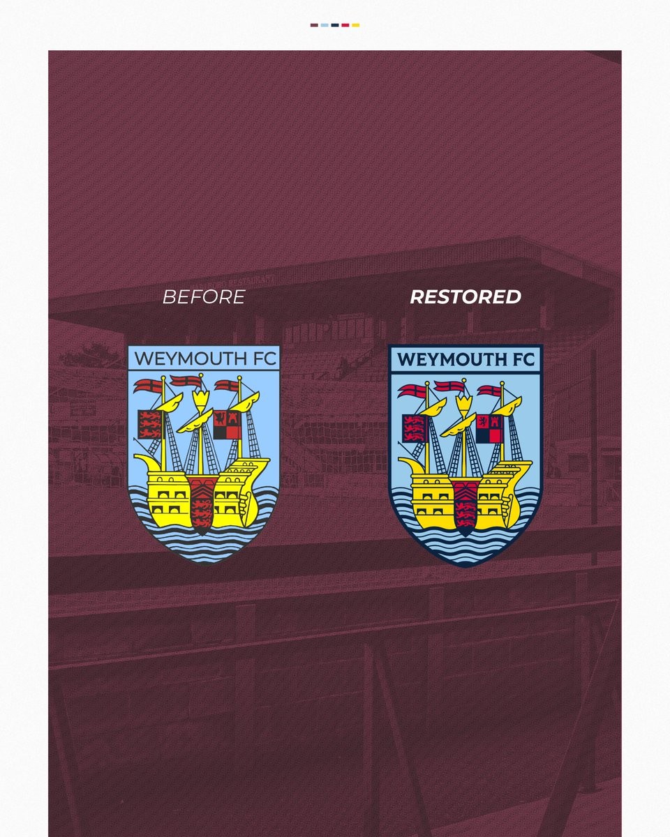
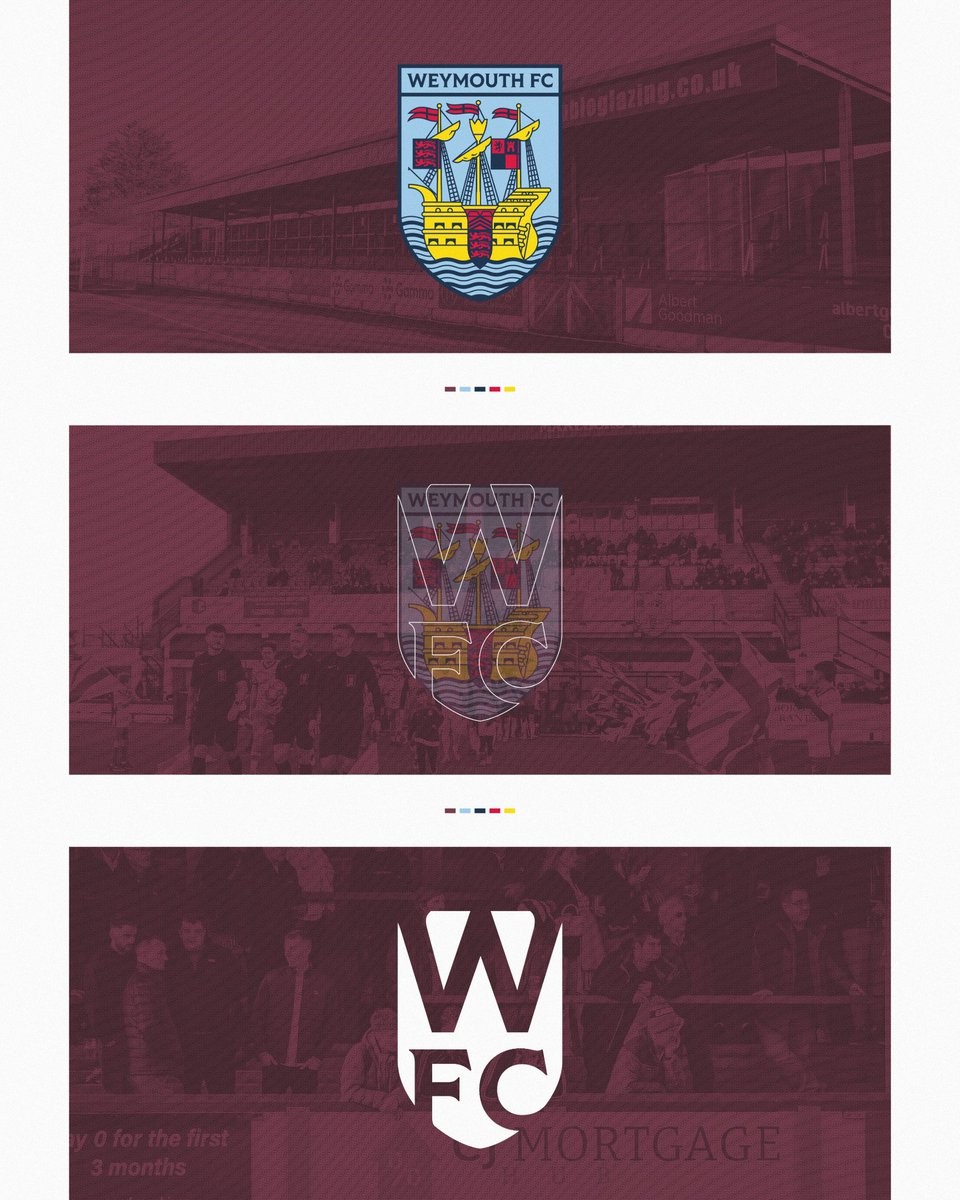
Weymouth FC Restores Historic Crest as Part of New Visual Identity
Weymouth Football Club has unveiled a restored version of its historic crest, presented with the caption "Restored, not replaced." The update keeps the badge instantly recognizable while refining it for greater clarity, sharpness, and versatility in modern applications. This approach avoids a full redesign in favor of preserving the traditional elements that fans associate with the club.
The restored crest sits at the core of a broader visual identity refresh announced by the club. Additional elements include new wordmarks for flexible communication, a secondary WFC shield logo, and a Jubilee Anchor mark that connects the club to local Weymouth symbols such as the Jubilee Clock and pavilion anchor. The primary crest will feature on upcoming team kits and official materials.
Club statements highlight the work as a way to standardize assets and safeguard the identity long-term. The changes maintain continuity with the badge's long-standing design while improving its overall presentation across digital and physical uses.

Ezeta and Daniel Norris Reveal New Tivoli Calcio Logo
Italian creative sports brand Ezeta has officially presented a brand-new logo for Tivoli Calcio 1919. Designed in collaboration with graphic designer Daniel Norris, the updated crest aligns perfectly with Ezeta's established reputation for blending modern design aesthetics with deep local history, providing the Italian side with a highly bespoke and culturally resonant identity.
The newly unveiled emblem intricately weaves several of the city's most recognizable historical landmarks and symbols into a single, cohesive design. The crest prominently features a traditional eagle, the historic Rocca Pia fortress, a classic three-arched bridge, and the flowing waters of the Aniene River. These carefully chosen elements have long safeguarded the historical identity of Tivoli, and their inclusion ensures the club's badge remains deeply connected to its geographical roots.
According to Ezeta, the updated logo was specifically created to celebrate the city's rich heritage and highlight the pride of the local "Tiburtini" people.
What are your thoughts on this new crest for Tivoli Calcio 1919 designed by Ezeta and Daniel Norris? Let us know in the comments below.

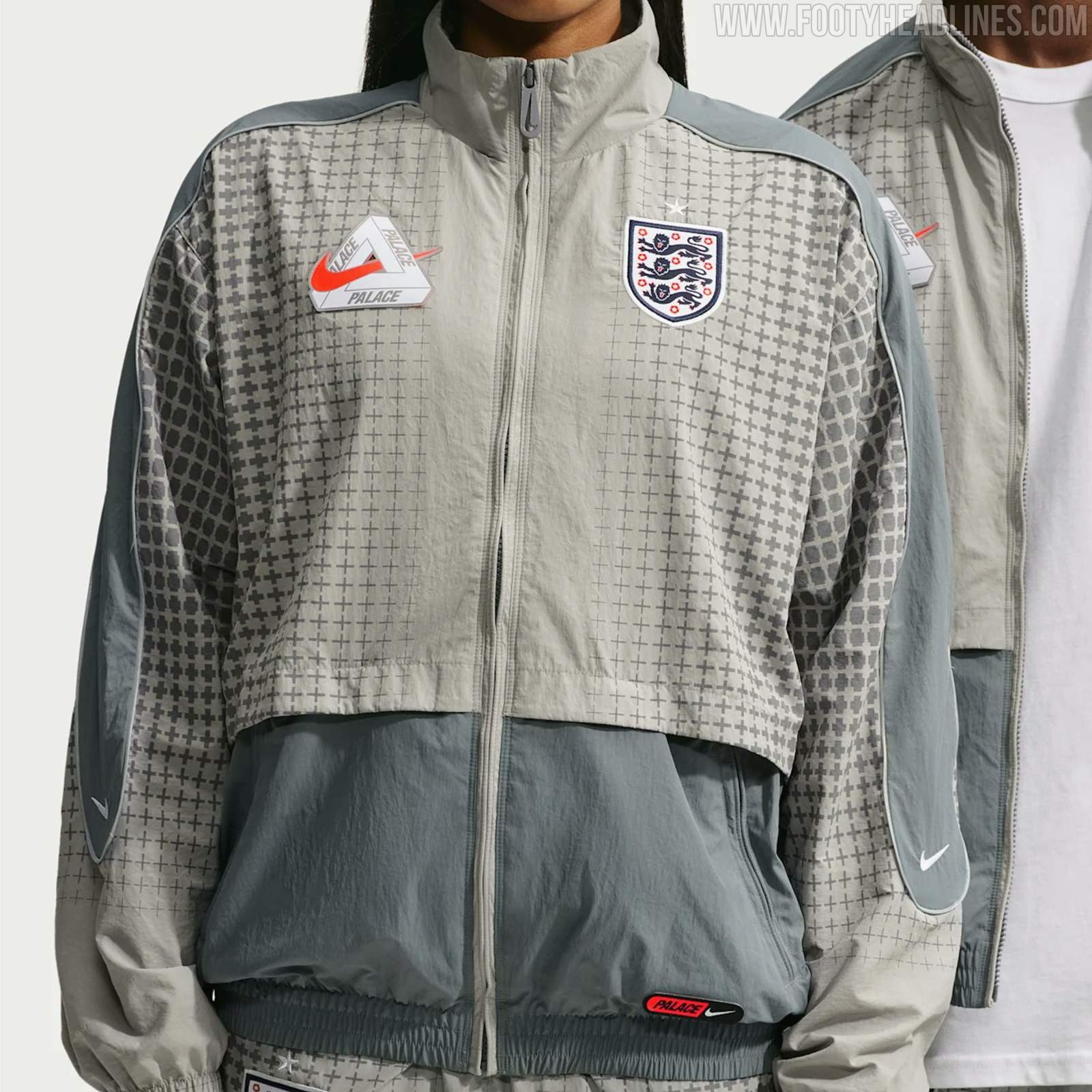

Leaked: Official Look at Nike x Palace England Jacket and Boots
Following the announcement of the highly anticipated England x Nike x Palace World Cup collection, we have the first detailed images, courtesy of sneaker insider @vladieboi.
The image shows a striking full-zip Enfland Palace track jacket paired with matching pants. The tracksuit features a two-tone grey and silver colorway, dominated by a geometric, repeating cross pattern that serves as a subtle, stylized nod to the St. George's Cross. The defining detail, however, sits on the right chest: a bespoke co-branded logo that sees the iconic red Nike Swoosh slicing directly through the famous Palace Tri-Ferg emblem, sitting opposite the traditional England national team crest.
Also visible is a pair of retro-inspired Nike x Palace footwear. Bearing a strong resemblance to classic heritage silhouettes like the Nike Premier, the black shoes feature a nostalgic fold-over tongue adorned with bold red "PALACE" text and a small white Swoosh. The boots come with a cage, making it easy to wear them on the streets.
What are your thoughts on the co-branded logo and the retro-styled boots in this Nike x Palace England collection? Let us know in the comments below.

