
Mizuno Logo Evolution - Which One Will Appear on Lazio's Kits?

Following the official announcement of the deal between Lazio and Mizuno, we take a look at the evolution of the Mizuno logo over the years and the different possible logos that Mizuno could use on the Italian club’s shirts.
The History of Mizuno's Logo in Football - J. League beginnings
The image below shows every logo used by Mizuno since their inception in 1906.
When the Japanese brand first started making football kits for the J. League teams in the early 90s, they used the capital M logo on all their shirts, like these Tokyo Verdy and Yokahama F. Marinos jerseys show. The logo would of course have been very recognisable in their home country.


Tokyo Verdy away 1993, Cerezo Osaka home 94-95, Yokohama F. Marinos home 1993
When producing kits for Steinhousemuir FC of Scotland in the 94-95 season, they opted to incorporate the Mizuno name into the logo, placing the lettering under the capital M, probably to gain more visibility and recognition in a new international market. Other UK club kits around this time featured the same logo.


Steinhousemuir away 94-95, Reading home 97-98
International Recognition
This trend continued for much of the 90s, seemingly using different logos for the domestic and international markets, but towards the end of the decade, they started to use both logos on international club kits.

Watford home 97-98
In their sole season as technical sponsor of Marseille in 95-96, they dropped the M logo and just used the Mizuno name logo, this time with a central placing on the shirt.

Marseille home 95-96
The Runbird Era
Although they adopted the Runbird logo in 1993, it wasn’t until the 98-99 season that we saw it used for the first time on football kits, appearing on Scunthorpe’s kits with Mizuno lettering underneath. This became the norm for the years that followed, appearing on the shirts of Fiorentina in the 01-02 season and many other clubs across the world.


Fiorentina away and home 01-02, Scunthorpe home 98-99
Although occasionally in the early 2000s the old M logo was seen, the Runbird with Mizuno lettering underneath took hold and was used on the vast majority of the brand’s jerseys until 2019, when they dropped their name from the logo.

Ho Chi Minh City home 2018, the last year to use this version of the logo
We have seen many brands and even clubs changing their visual brand image to something more minimal in recent years, with Adidas being the latest to follow in Mizuno’s footsteps in this sense, just as Macron did before them in 2018, also dropping their name and using a simple logo free of lettering.


Citadella third 21-22, Nagoya Grampus home 2021, Hokkaido Consadole Sapporo home 2022
Return to the Big Stage in Europe
Based on their designs over the last few years, including for some clubs in Italy, it is most likely that Lazio’s kits will feature the Runbird without any lettering underneath, but given brands’ love for nostalgia and drawing inspiration from their archives, don’t rule out seeing another variation on some of their kits in the coming years.
Which logo would you like to see used on Lazio’s kits next season? Let us know in the comments.
Melbourne City 26-27 Home, Away & Third Kits Released
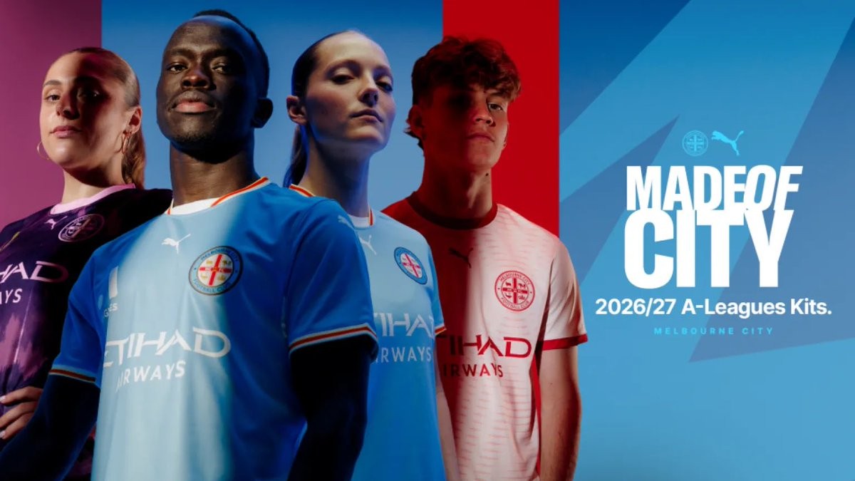
Puma and A-League club Melbourne City FC have officially unveiled their complete kit collection for the 26-27 campaign. Launched under the campaign tagline 'Made of City', the three-kit drop blends the club's signature identity with Melbourne street culture and club heritage.
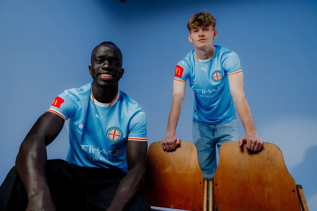
The Melbourne City 26-27 home shirt stays true to tradition, centered around the iconic City Blue base. Drawing inspiration directly from the club badge, red and yellow trim accents decorate the collar and sleeve cuffs. Meanwhile, the away kit leans into nocturnal Melbourne fashion, pairing a deep plum jersey with an abstract zig-zag graphic and vibrant shimmer pink branding across all sponsor prints and the club crest.
Rounding out the lineup is the 26-27 third kit, which pays homage to the club's origins as Melbourne Heart. The shirt combines a crisp off-white base with red accents and incorporates a subtle heartbeat graphic emerging across the chest from behind the crest. A heart motif inside the collar completes the tribute. The new collection is available through Melbourne City's online store and Puma Australia.

AC Mestre 26-27 Third Kit Released
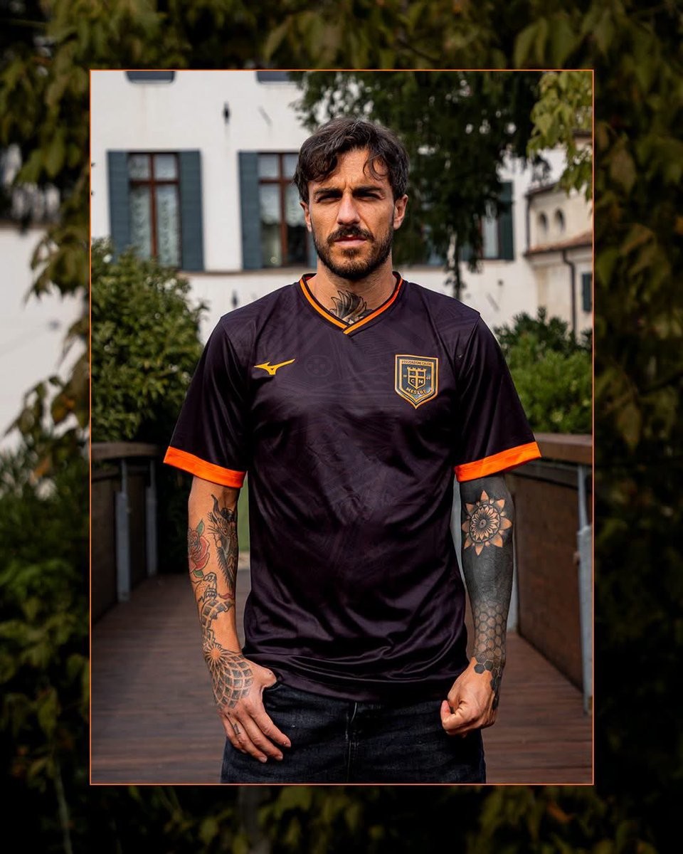
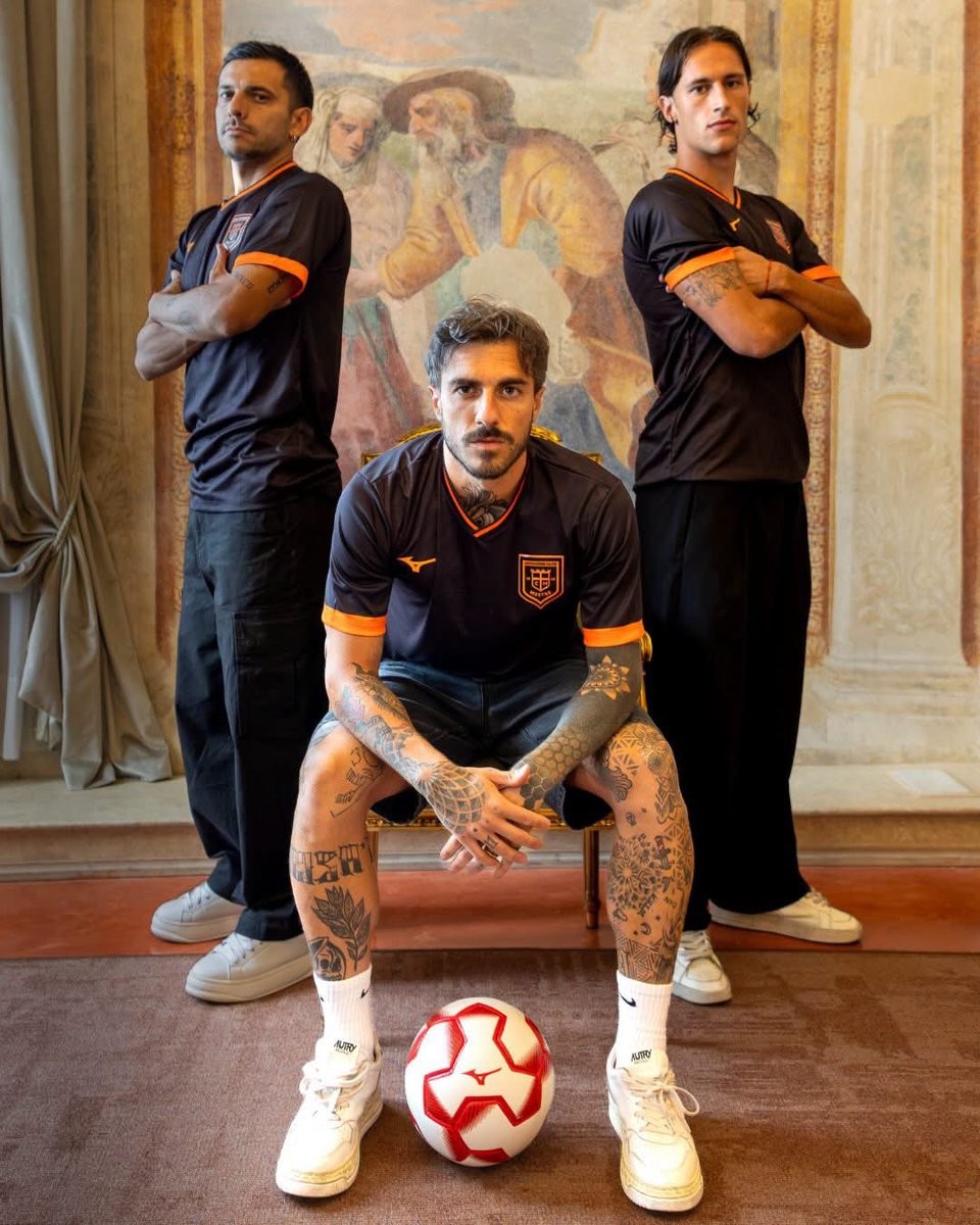
Italian Serie D club AC Mestre has officially unveiled its new third kit for the 26-27 campaign, manufactured once again by Japanese sportswear brand Mizuno. The new drop follows the earlier presentations of the club's home and away shirts, completing their kit lineup for the new season.
The Mizuno AC Mestre 26-27 third shirt introduces a sleek and stealthy design, dominated by a black base accented by vibrant orange details. Bright orange trim lines the V-neck collar and broad sleeve cuffs, while both the Mizuno Runbird logo and the AC Mestre crest are rendered in matching monochrome orange. A subtle jacquard pattern is also incorporated across the front fabric, adding depth to the understated look.
Black shorts and socks with orange detailing complete the full AC Mestre 26-27 third uniform.

Video: FC Barcelona 27-28 Home Kit
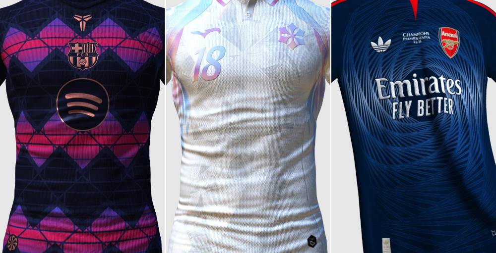
Based on leaked images, Footy Headlines can bring you a 360º video of Barcelona’s 2027-28 home kit, created using Kit Creator.

Adidas to Launch Arsenal 26-27 Spezial Collection
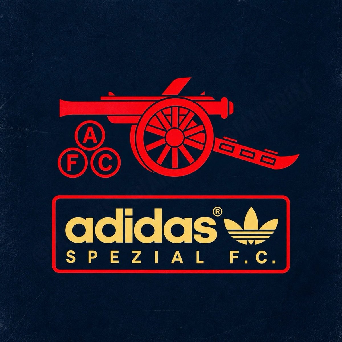
Adidas is expanding its terrace-rooted Spezial F.C. label to the Emirates, with a newly surfaced teaser confirming an upcoming Arsenal SPZL F.C. collection. Thanks to @IamCrisJ.
The teaser reveals the collaborative Arsenal SPZL F.C. insignia, presenting the club's heritage cannon emblem and "AFC" cannonballs in red set above a red-bordered box housing the Trefoil and "adidas SPEZIAL F.C." branding in gold. Following the blueprint established by previous SPZL F.C. club projects, the range will lean heavily into retro football culture, archival tailoring, and casual terrace style.
The upcoming Arsenal SPZL F.C. range will include bespoke footwear and lifestyle apparel, slated for release through ArsenalDirect, adidas, and select Spezial retailers.
Adidas Colo-Colo EQT Collection Leaked
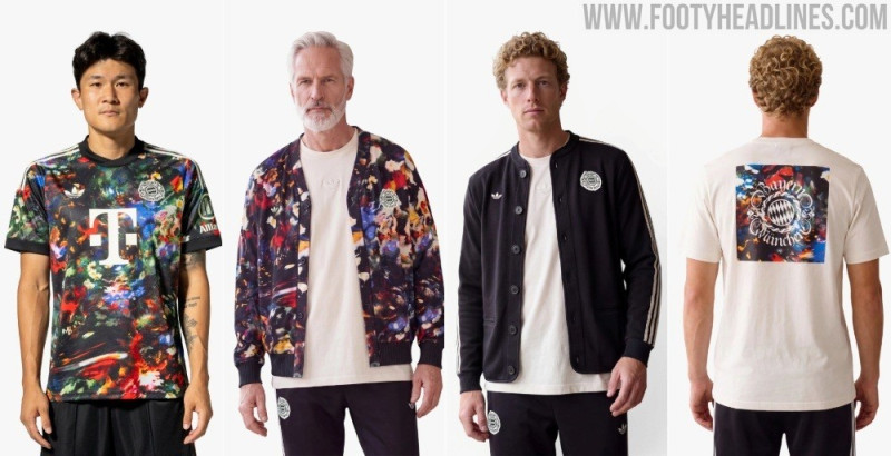
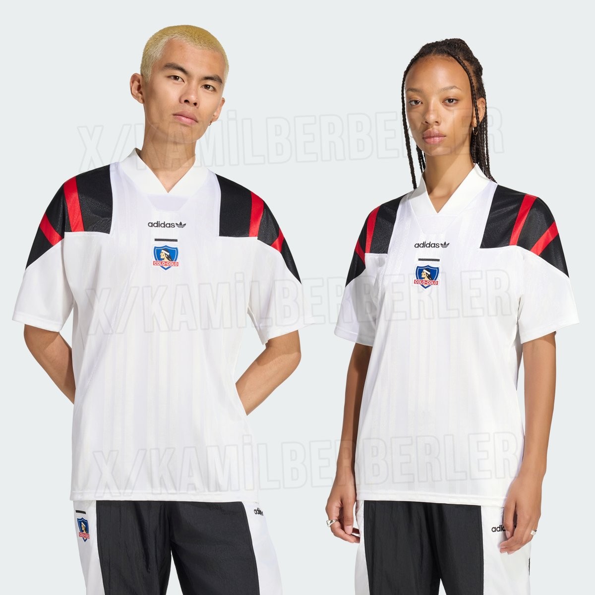
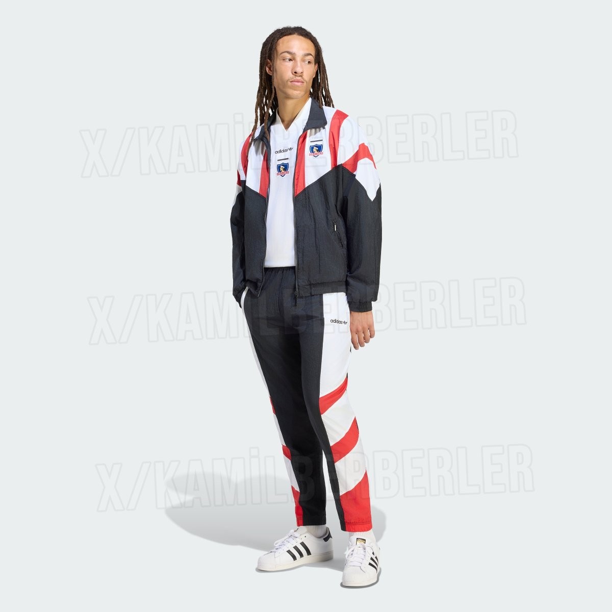
Adidas is expanding its 1990s-inspired EQT lifestyle range to South America, with official images of the upcoming Colo-Colo EQT collection leaking online. Following recent retro drops for European giants such as Bayern Munich and Juventus, the Chilean club is set to receive its own heritage capsule steeped in unmistakable nineties football culture. Big thanks to @KamilBerberler.
The centerpiece of the range is a retro shirt dominated by Colo-Colo's traditional white, accented by subtle tonal shadow stripes running vertically down the body. It features oversized three stripes sweeping over the shoulders in bold black and red, paired with a chunky ribbed V-neck collar. Staying true to the era, the classic Adidas wordmark and Trefoil are placed centrally on the chest just above the iconic club crest.
Complementing the jersey, the wider lifestyle capsule includes a color-blocked track jacket, matching track pants, a graphic t-shirt, and a relaxed crewneck sweatshirt. The entire collection maintains the club's sharp black, white, and red palette, combining vintage paneling with modern streetwear silhouettes. The Adidas Colo-Colo EQT collection is slated for release in the coming weeks.
Kit Blunder: Matheus Cunha Wears Inverted Sleeve Badges in Manchester Derby
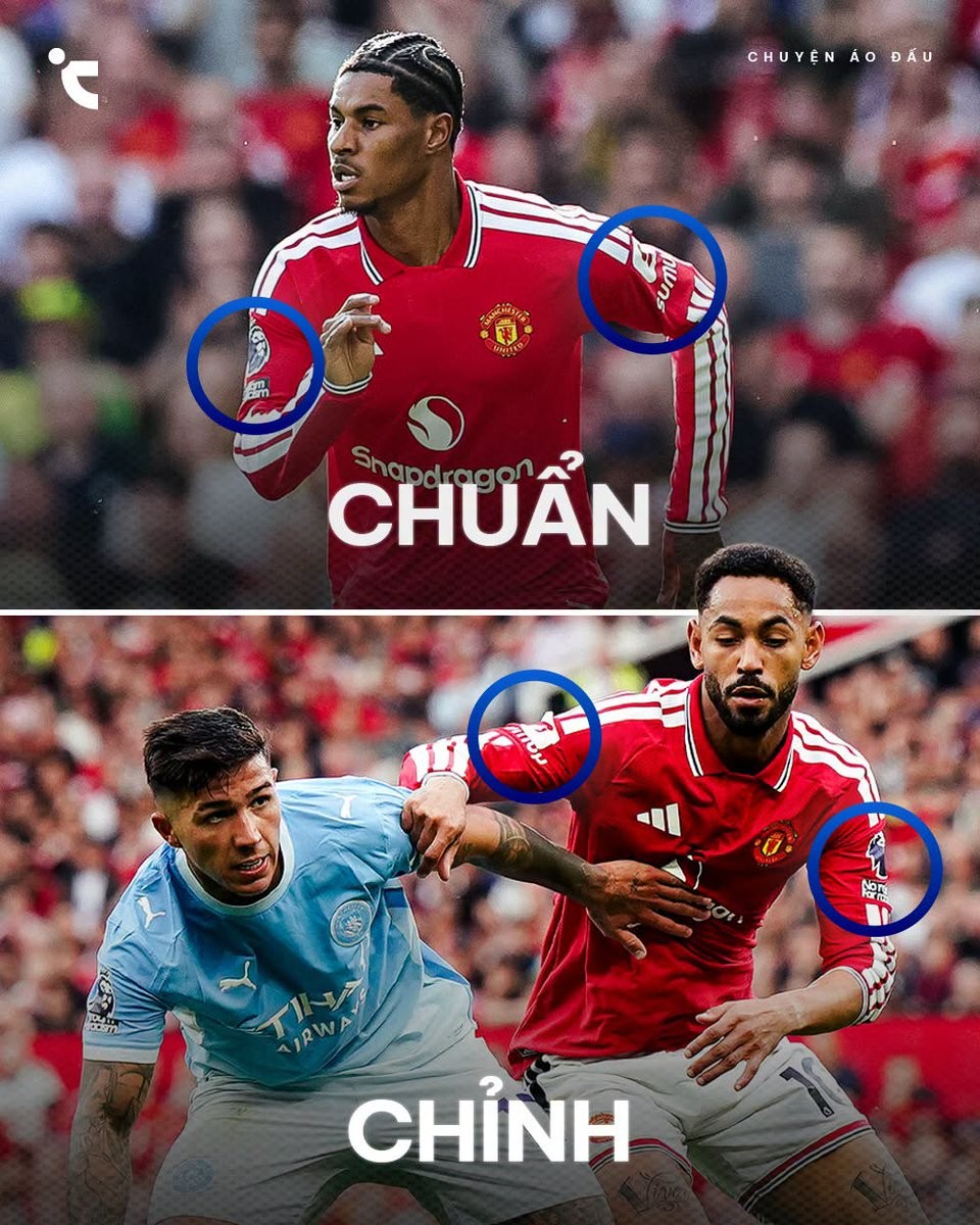
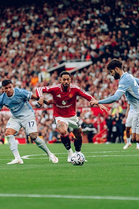
Manchester United striker Matheus Cunha was spotted sporting an unusual kit detail during Sunday's Manchester derby against Manchester City. Eagle-eyed kit enthusiasts quickly pointed out that the Brazilian forward took to the pitch with his sleeve badges completely reversed on his 26-27 home shirt.
Under standard Premier League kit regulations, the official competition badge and "No Room For Racism" patch must be applied to the player's right sleeve, while the left sleeve is reserved for the club's commercial sleeve partner. On Cunha's long-sleeve jersey, however, the configuration was flipped: the sponsor logo was applied to his right arm, leaving the Premier League badge positioned on his left sleeve.
Side-by-side images comparing Cunha's jersey to teammate Marcus Rashford clearly showed the contrast between the standard layout and Cunha's swapped sleeves. Whether caused by a mix-up in the kit room or an accidental printing error during match preparations, the subtle mistake provided a unique talking point for shirt collectors.

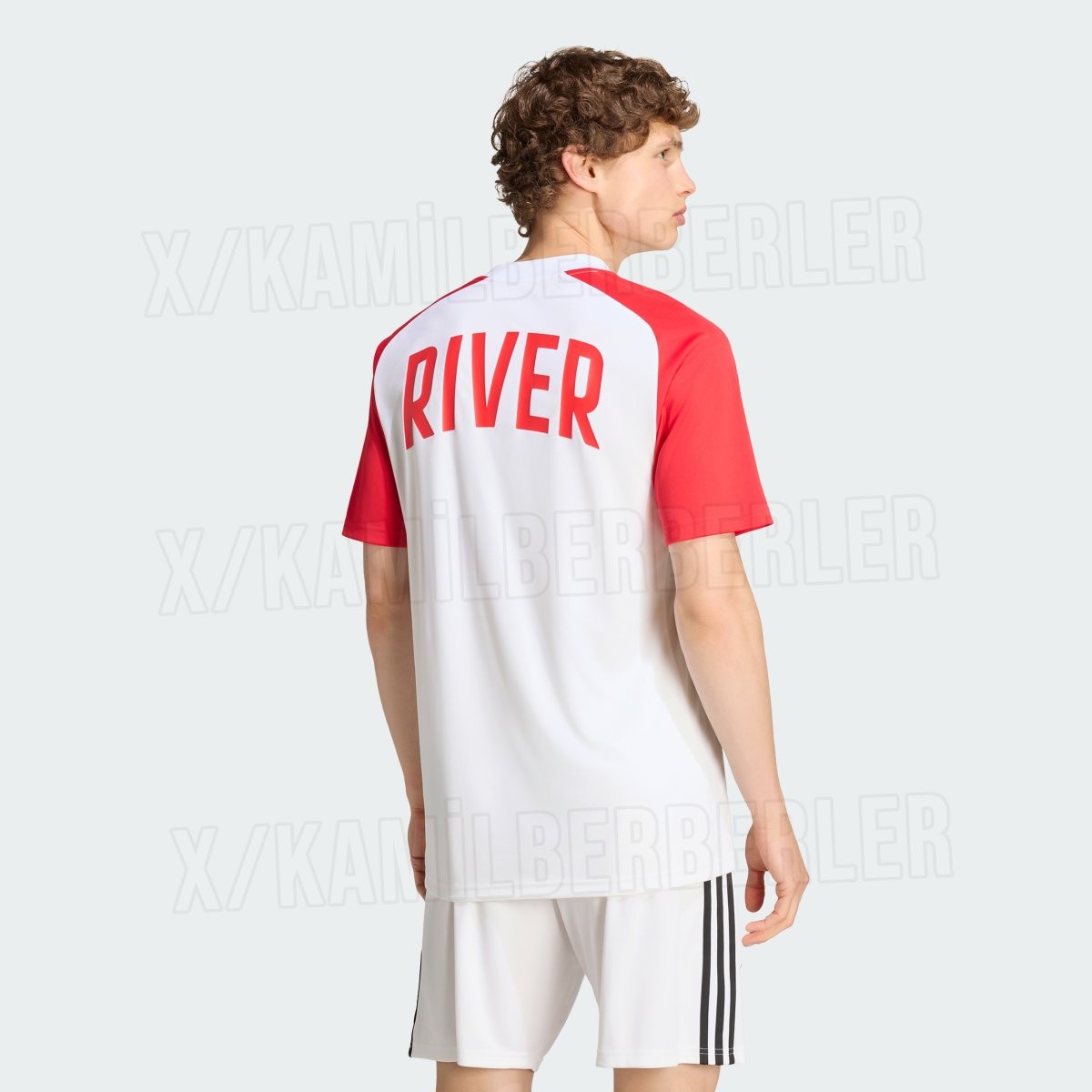
River Plate 26-27 Away Pre-Match Kit Leaked
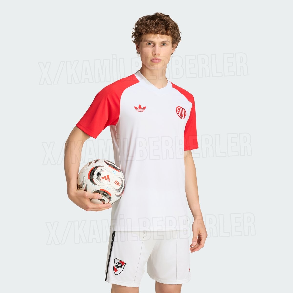
Official images of the River Plate 26-27 away pre-match kit have surfaced, revealing a clean retro-inspired look produced by Adidas. Following the release of the club's tricolor away strip in August, this warm-up top expands River Plate's heritage-driven collection for the 26-27 season. Big thanks to @KamilBerberler.
The Adidas River Plate 26-27 away pre-match jersey features a crisp white body paired with bold red raglan sleeves and a matching white collar. Emphasizing the classic aesthetic, the shirt showcases the iconic Adidas Trefoil logo in red on the right chest, opposite a vintage circular CARP crest in red on the left. Across the upper back, large red block lettering spells out "RIVER" to complete the minimalist, old-school design. The shirt is paired with white shorts sporting black Three Stripes on the sides.
The new River Plate 26-27 away pre-match jersey is scheduled to be worn by the squad during warm-ups for away fixtures and will be available to purchase in the coming weeks.