Evolution of Argentinian Club Logos

With major Argentinian club River Plate having recently updated their logo, we thought it would be interesting to take a look at some other clubs' logos from the South American nation. Twitter user @FrancooC07 created a neat summary of the logo evolution of some of Argentina's biggest football clubs.


Logo Evolution in Argentina
Boca Juniors
Boca has a tradition of adding titles as stars inside of their shield instead of placing stars above the crest. Obviously, this means that the club's logo will constantly be changed.
The club have had their signature blue and yellow shield look for many decades now.

River Plate

River Plate are the most recent club in this list to alter their crest. This change was nothing noteworthy, however.
Boca's main rivals have also had their own iconic shield shape for some time, as well as the CARP acronym, the oldest remaining aspect of their crest.
San Lorenzo

Using yet another shield for a crest, San Lorenzo have only added minor updates to their logo. The vertical blue and red stripes and the acronym in the center have not changed much over the years.
Racing Club

Pictured above is only a glimpse at Racing Club's quite extensive logo evolution. Most noteably, the club first started featuring the sky blue and white stripes on their crest in 1928, almost 100 years ago.
Indepentiente

Back in 1905, Indepentiente's crest honored Saint Andrew with the Scottish flag. In fact, the old 1905 badge is still used on Independiente's away kits to this day.
The club's current logo has its roots in 1935, when the shield was adopted alongside the letters CAI.
What do you think of the evolution of club logos in Argentina? Comment below.
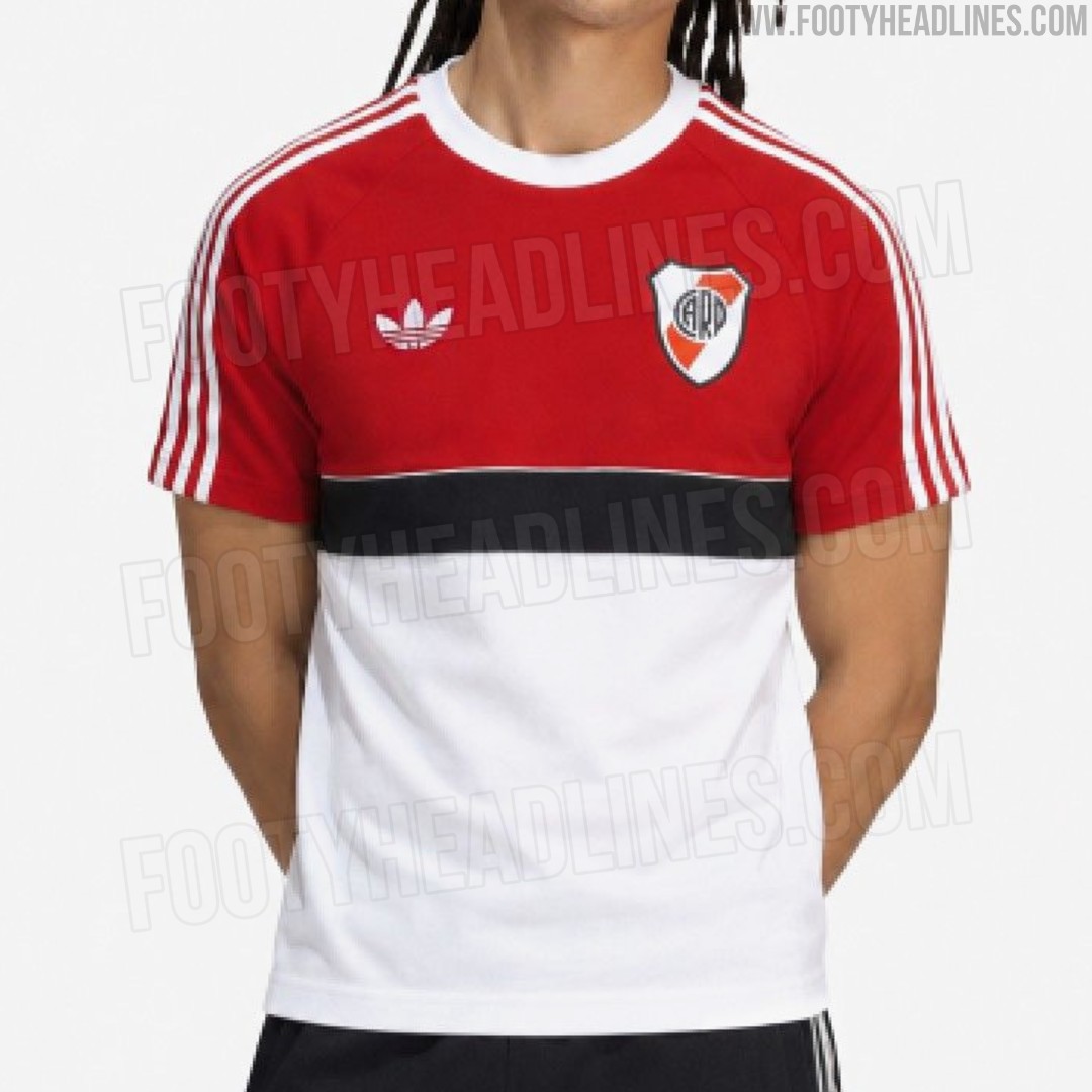
Leaked: Adidas Originals River Plate Retro Shirt Hints at 26-27 Away Kit
We have the first image of a brand-new Adidas Originals River Plate retro shirt. It is part of the team's 26-27 away collection.
The River Plate retro shirt features a color-blocked design reminiscent of classic 1980s sportswear. The upper half of the torso and the raglan sleeves are solid red, while the lower half is crisp white. Separating the two sections is a prominent, thick black horizontal chest band. A classic white Adidas Trefoil logo and the traditional River Plate shield sit high on the chest, keeping the design completely free of modern sponsors for a pure, vintage aesthetic.
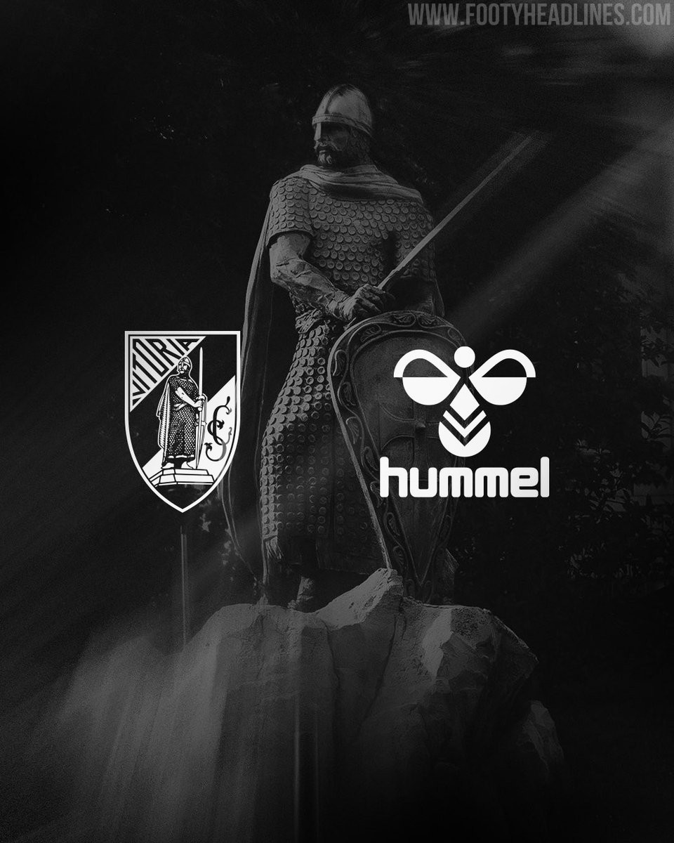
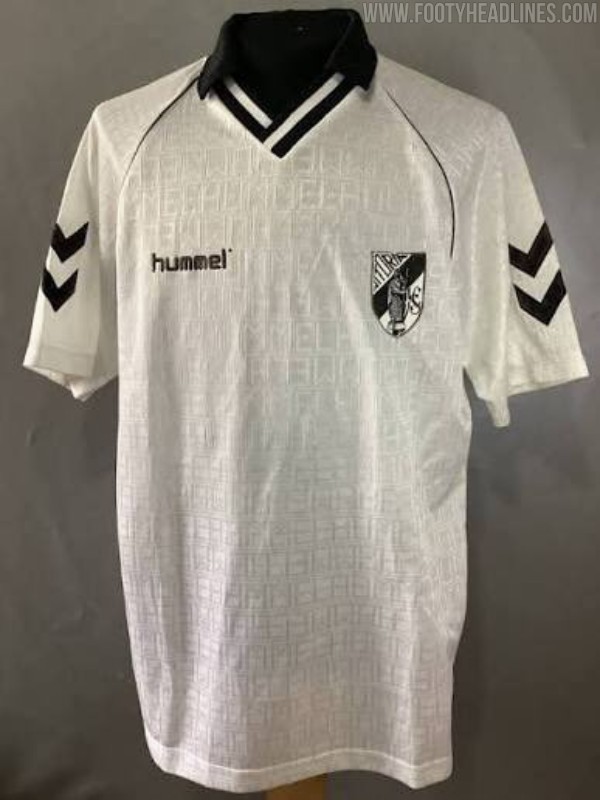
Vitória SC Announces Hummel Kit Deal
Vitória Sport Clube has officially announced a new five-year technical sponsorship deal with Hummel, beginning with the 2026-27 season. The Danish sportswear brand will supply the Portuguese club's match kits, training gear, and lifestyle apparel until the end of the 2030-31 campaign. This agreement brings an end to Vitória SC's decade-long partnership with Macron, who had been the club's kit maker since the 2016-17 season.
The club described the new agreement as a "return to the past to project into the future," referencing Hummel's previous stint as Vitória SC's kit supplier during 1992-92.
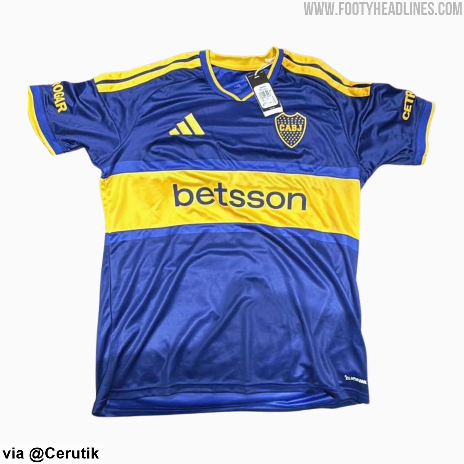
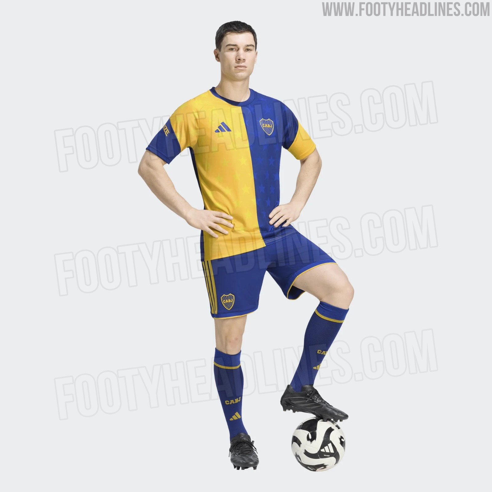
Boca Juniors 26-27 Shirt + Shorts, Socks & Pre-Match Jersey Leaked
We can leak the full look at the Boca Juniors 2026-27 home kit - it is completed by shorts and socks that match the stripe design of the kit.
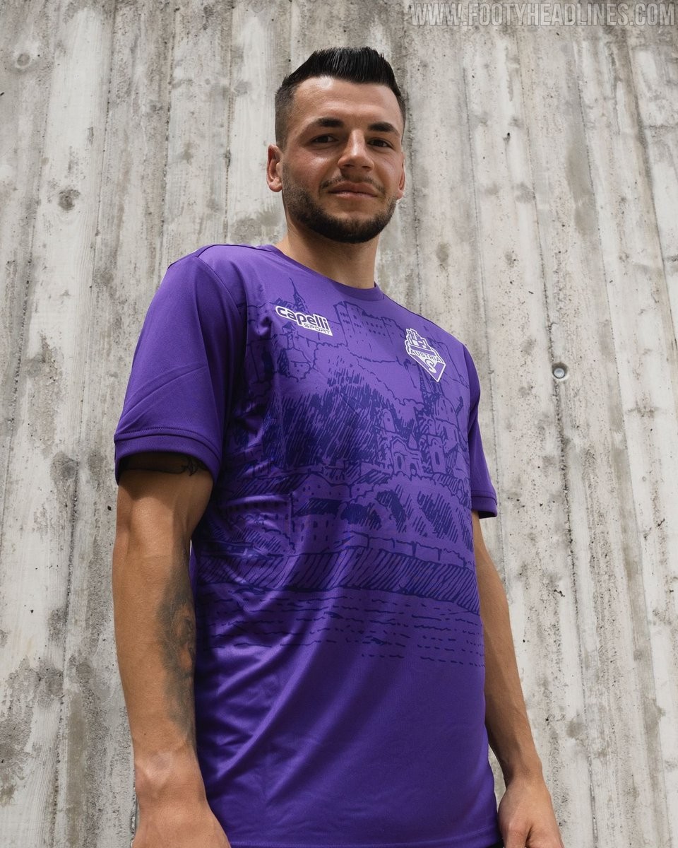
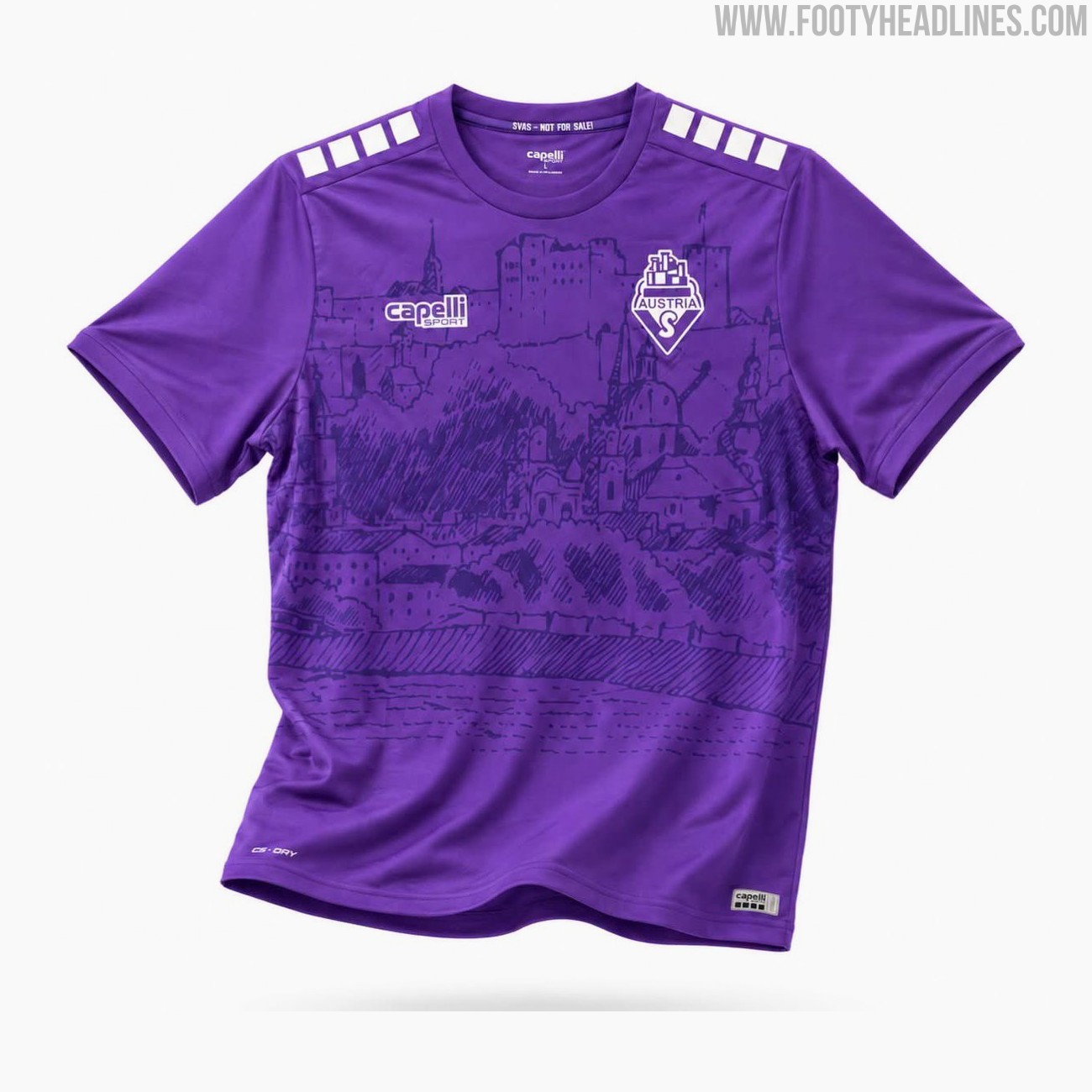
SV Austria Salzburg 26-27 Home Kit Released
The new SV Austria Salzburg home kit for the 26-27 season has been officially released today. Made by Capelli, the new shirt will be worn by the club in the Austrian 2. Liga.
The Capelli SV Austria Salzburg 2026-27 home jersey features a bespoke design in the club's traditional colors. It incorporates two different tones of violet and is highlighted by a custom graphic showcasing the Hohensalzburg fortress and the towers of the old town, representing the team's local identity and heritage.
The Capelli SV Austria Salzburg 2026-27 home football shirt is available to purchase immediately through the club's official fanshop, retailing at a price of 69 Euro.
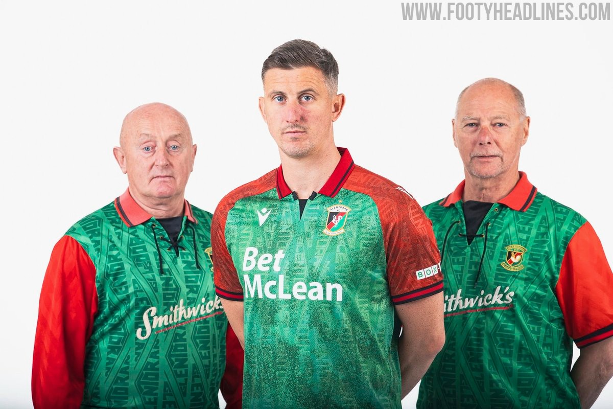
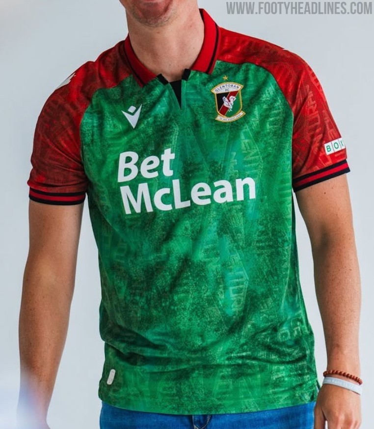
Glentoran 26-27 Home Kit Released
Glentoran and Macron have launched the club's new 2026-27 home kit for the upcoming NIFL Premiership campaign. The design pays homage to the classic 1992-93 shirt worn during their memorable European Cup tie against Marseille, featuring a green body with red sleeves and shoulder panels separated by black trim.
Giving the shirt a distinct early 1990s retro feel, a red fold-over collar is included with black striping and a black V-shaped insert at the front. A tonal graphic pattern runs across both the green and red sections, adding texture to the Macron Eco Fabric. The Macron Hero logo appears in white on the chest and sleeves, sitting opposite the stitched Glentoran crest and its accompanying gold star.
Additional details include the club motto Le Jeu Avant Tout embroidered in white on the back of the collar, and Glentoran FC Est 1882 printed inside the lower hem. Featuring Bet McLean as the main sponsor, the new Glentoran 2026-27 home shirt is completed with matching white shorts and green socks.

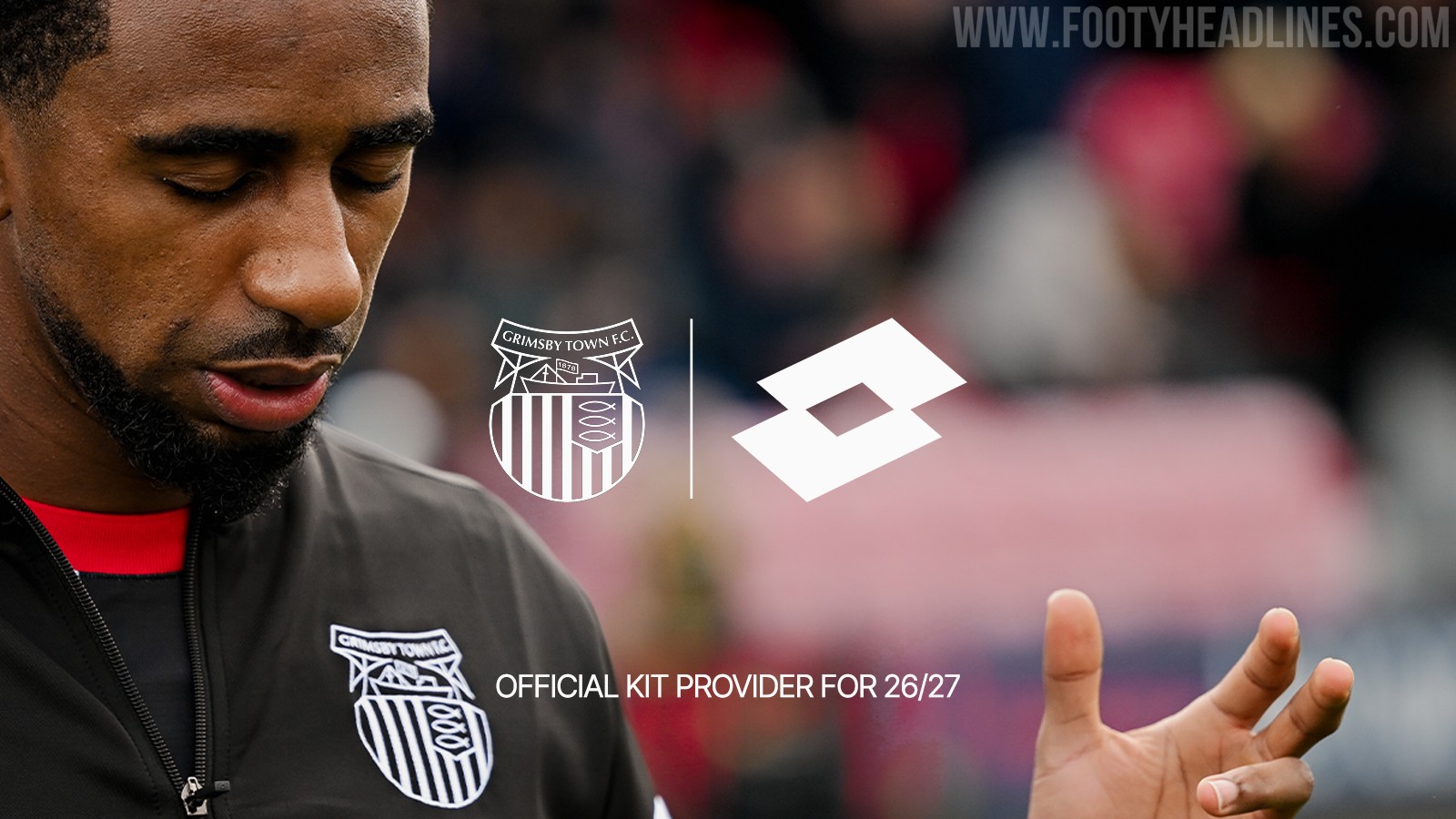

Grimsby Town Announces Lotto Kit Deal
Grimsby Town Football Club has officially announced a multi-year partnership with Italian sportswear brand Lotto Sport, who will become the club's official kit supplier starting from the 2026-27 season. Lotto replaces Umbro, whose kits were supplied to the club in collaboration with Kitlocker.
The announcement has been met with a positive reaction from fans, many of whom fondly remember the club's previous stint with Lotto kits in the late 1990s.
While no official images of the new 2026-27 kits have been released yet, supporters are eagerly anticipating the unveiling of the new designs.
