
Which Is the Best Badge for AS Roma?
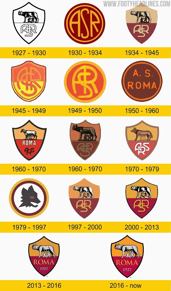
AS Roma will wear a special kit with the club's old ASR crest in the Derby della Capitale against Lazio. Many fans now want the club to fully return to that old logo. Let's take a look at the different incarnations they’ve used over the years.

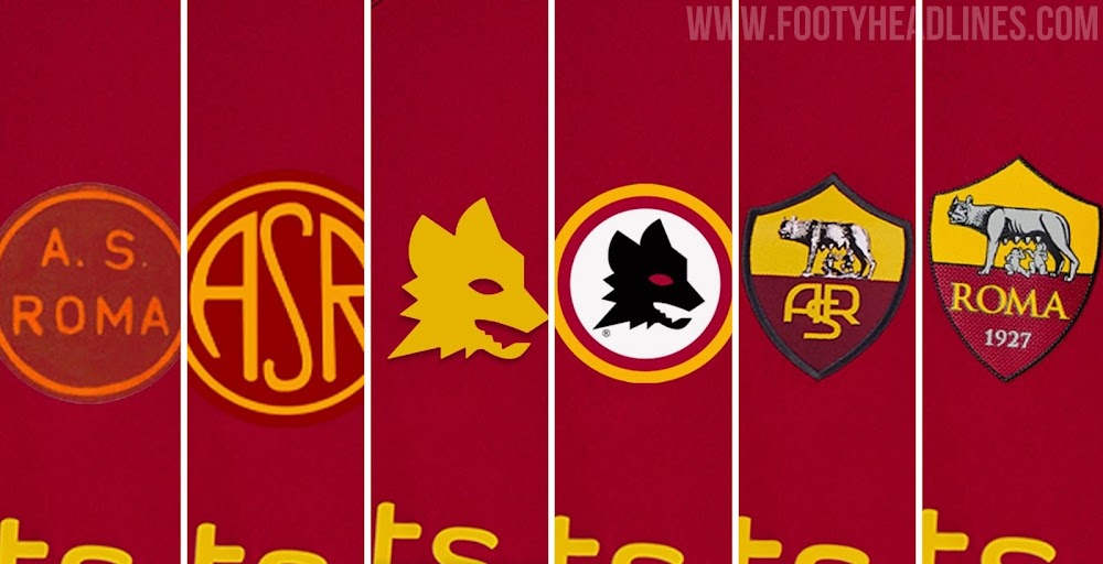
Throughout their history, the crest of AS Roma has changed and evolved, with the club occasionally reverting to older versions of the badge.
AS Roma Badge History
The graphic above shows each badge used by the club since they were founded in 1927, with the original version having a traditional shield shape and depicting the Lupa Capitolina, a bronze statue which portrays Romulus and Remus, the brothers who founded Rome according to legend, feeding on the she-wolf who raised them. The bottom half of the crest features the stylised ASR (Associazione Sportiva Roma) lettering. This version went on to be slightly updated several times, always keeping it’s two core elements, with the biggest change being the addition of the golden yellow and dark red background, the club’s famous colors.

Some updates to the badge dropped the mythical imagery and kept just the ASR lettering, while shades of yellow and red changed from time to time, with some form of this design being the most frequently used in the club's history.
Lupetto


1979 saw the introduction of the famous Lupetto logo, the work of much-respected designer Piero Gratton. Although it was officially replaced in 1997 by a colourised take on the original, it has been on the Giallorossi shirts from time to time in recent years.
An Unpopular Change

2013 saw a change that did not go down well with fans, the replacement of the almost ever-present ASR lettering with the name of the city in capitals, ROMA, accompanied by the founding year, 1927. This change came under the ownership of American billionaire James Pallotta, who like all billionaire owners, prioritised the creation of a global recognizable brand over the club’s history. He of course did not consult the fans before doing this. He claimed that few people outside of Italy knew what ASR stood for, and preferred to lean on the club’s association with the city itself to increase its reach.
This is a trend we’ve seen a lot of recently, with PSG making the “Paris” lettering much more prominent on their badge when it underwent its most recent change, as did Bordeaux, before reverting back.
The Right Choice?
The mock-ups by @magliofili show various badges on the current New Balance Roma kit.


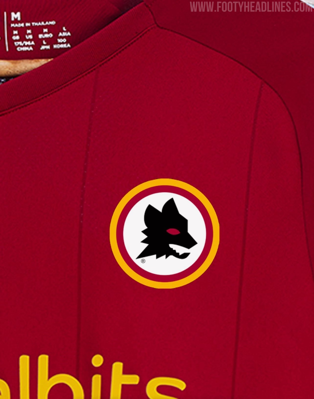


The club have released a special kit for the upcoming Derby della Capitale featuring the pre-2013 badge, which will no doubt be popular with the tifosi, although there are no plans to get rid of the current logo completely.
Which incarnation of the AS Roma badge do you think looks best? Have your say in the comments.
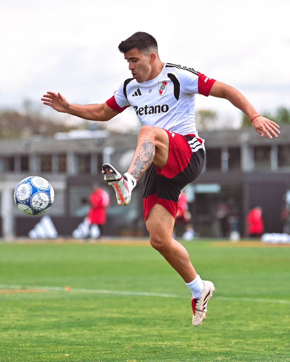
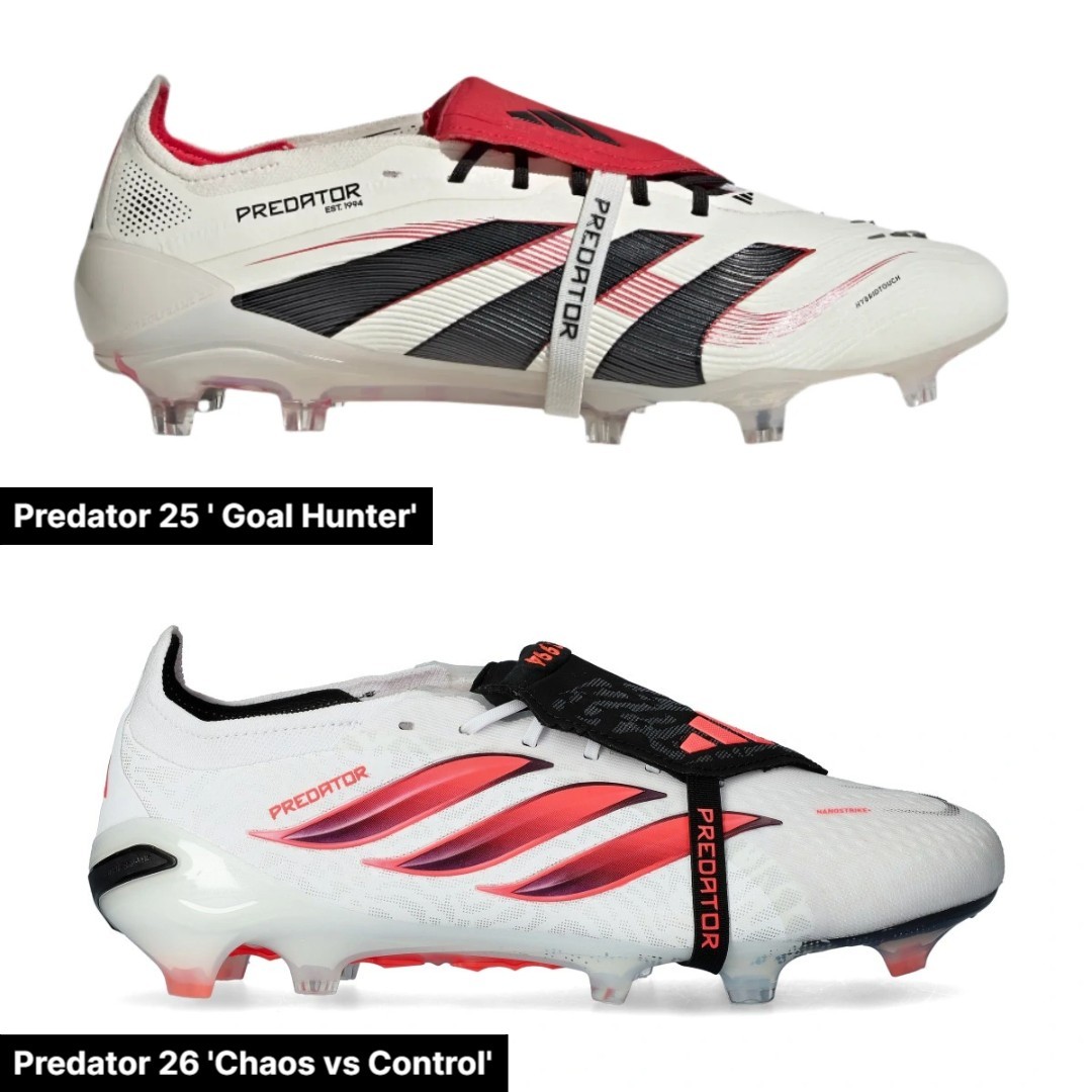
Generational Clash: Marcos Acuña Wears Mismatched Predator 25 and 26 Boots
River Plate defender Marcos Acuña caught the eye in recent training by stepping onto the pitch in an unusual boot setup. The Argentine international was spotted wearing two different generations of the Adidas Predator line simultaneously, lacing up the newer Predator 26 on his left foot and sticking with the previous-generation Predator 25 on his right foot.
While both cleats share a similar white, black, and red aesthetic, the technology beneath them differs significantly. The Predator 26 features a revised, lightweight textile mesh construction with updated grip elements and a restructured soleplate, contrasting with the HybridTouch 2.0 synthetic upper and tooling found on the Predator 25. Opting for different generations across each foot is often a sign of a player testing new tech, managing minor fit and comfort preferences, or dealing with foot sensitivity on his dominant striking foot.
Mismatched boots are relatively uncommon at the top level, and combining consecutive generations of the same silo is an especially rare boot spot. It remains to be seen whether Acuña will stick to this split setup in official matches or complete the full switch to the Predator 26 in the near future.
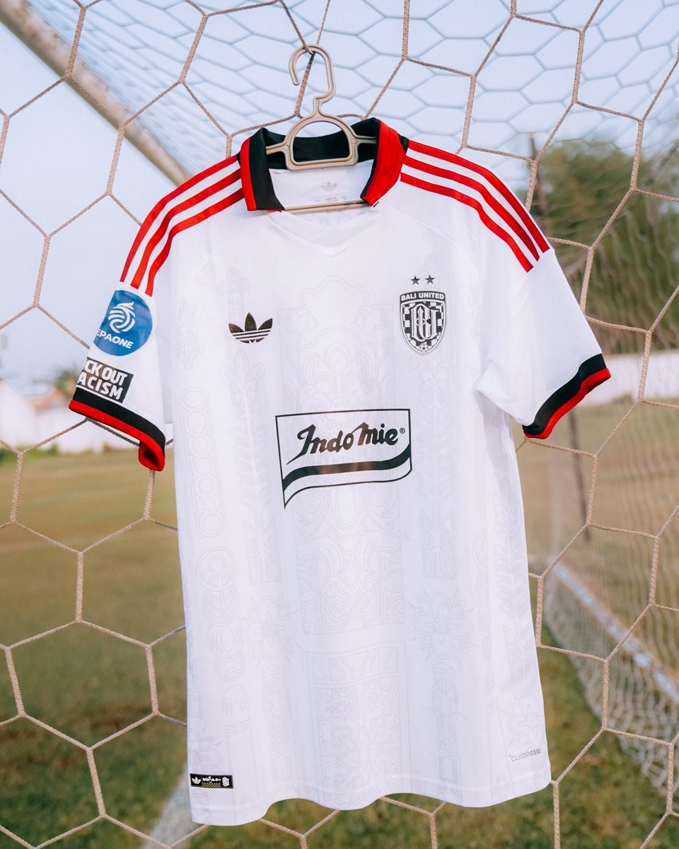
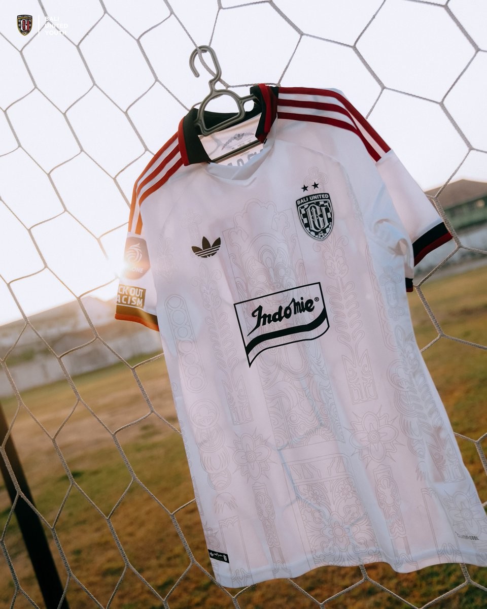
Clean Single-Sponsor Adidas Bali United 26-27 Away Kit Revealed
A much cleaner, single-sponsor edition of the Bali United 26-27 Adidas Trefoil away kit has been revealed, providing fans and kit enthusiasts with the simplified look they have been asking for. While Bali United's senior team away kit carries an array of commercial partner logos across the front in typical Indonesian league fashion, this streamlined version has been produced specifically for the club's youth squads in the Elite Pro Academy 26-27 campaign.
The shirt retains the exact artistic foundation crafted by Adidas Indonesia in collaboration with local Balinese artist Dewa Gede Raka Jana Nuraga (Rakajana). Subtly sublimated across the white fabric are intricate cultural graphics inspired by Hanoman and traditional Balinese Lamak motifs. The look is framed by a black folded collar with vibrant red piping, matching red three stripes running down the shoulders, and the classic Adidas Trefoil logo on the chest opposite the monochrome Bali United crest.
The defining difference lies in the chest sponsor execution. Instead of several crowded sponsor patches, the front features only the retro-styled Indomie banner logo in black and white. Finished with the official EPA One competition sleeve badge and an anti-racism campaign patch, this academy variant delivers a vastly superior, retro-focused visual balance that highlights the Trefoil design.

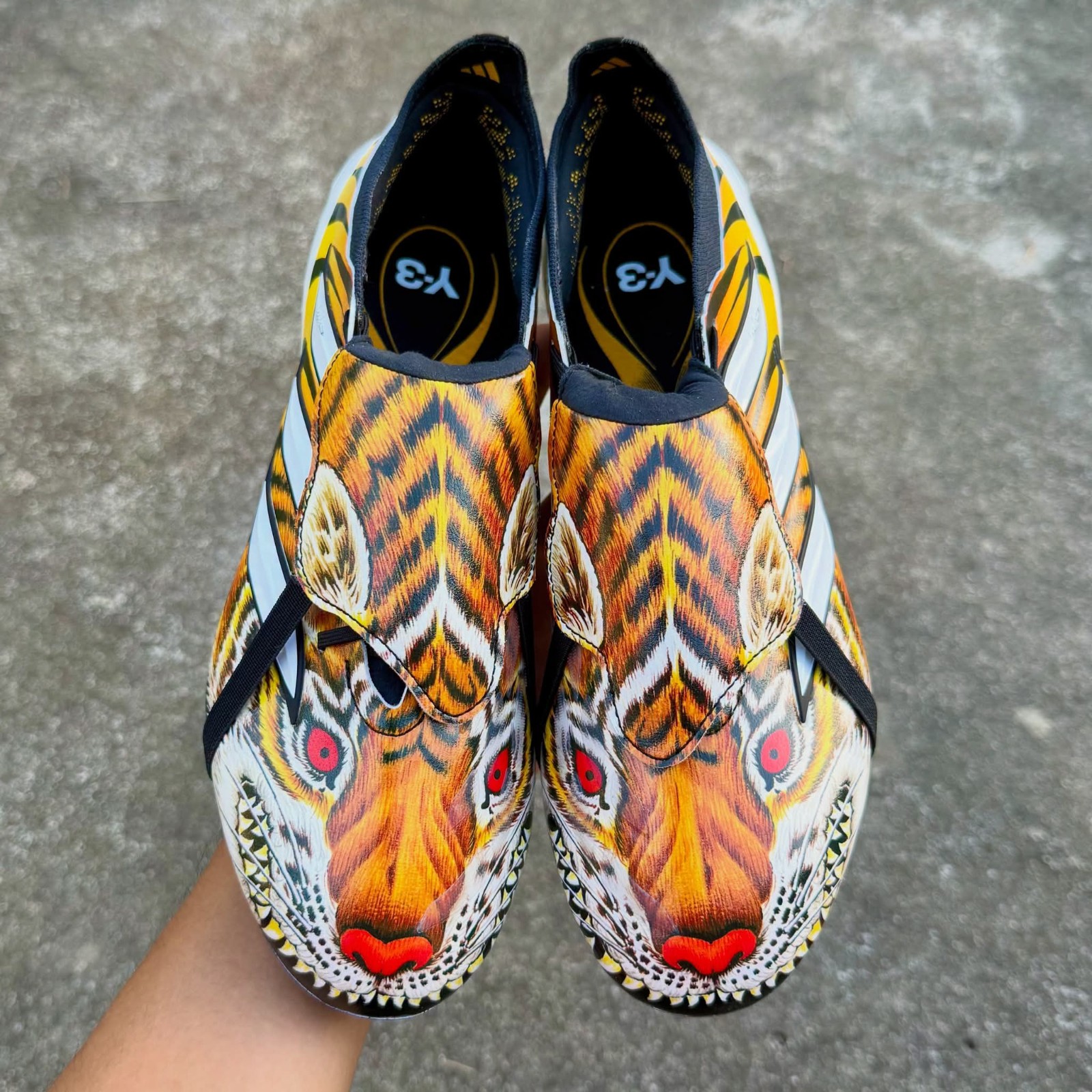
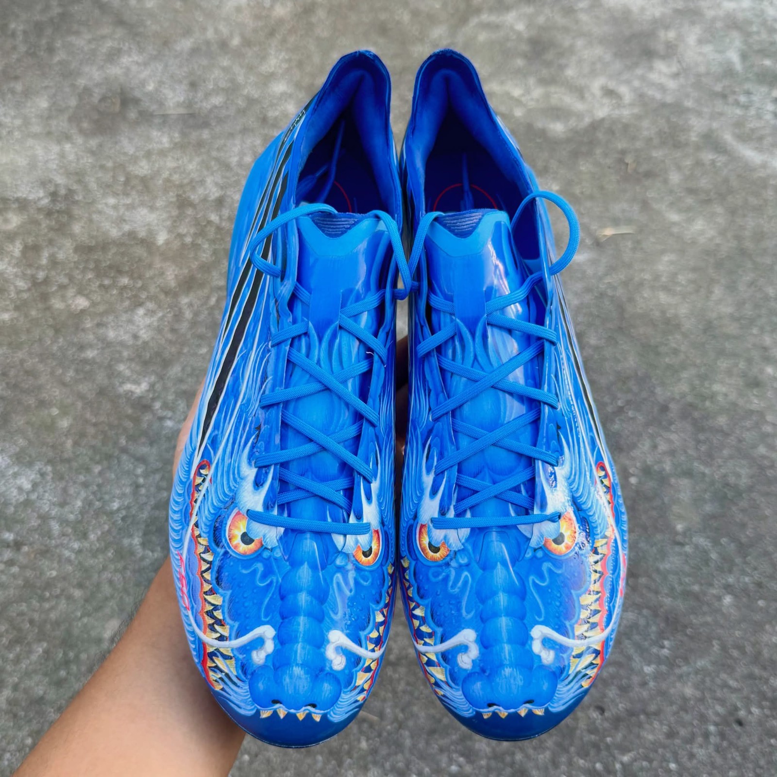
Adidas Y-3 2026 Boots Pack Leaked - Predator 'Tiger' & F50 'Dragon'
Adidas is set to release a special-edition Y-3 football boot collection in late 2026, bringing back the iconic creature motifs first introduced during the 2006 World Cup in the +F50 Tunit Beast Pack designed by Yohji Yamamoto. Huge thanks to RKID for the images.
The upcoming pack features an Adidas Predator wrapped in a fierce all-over tiger graphic across the upper alongside an Adidas F50 finished in a striking blue dragon design complete with scaly artwork.
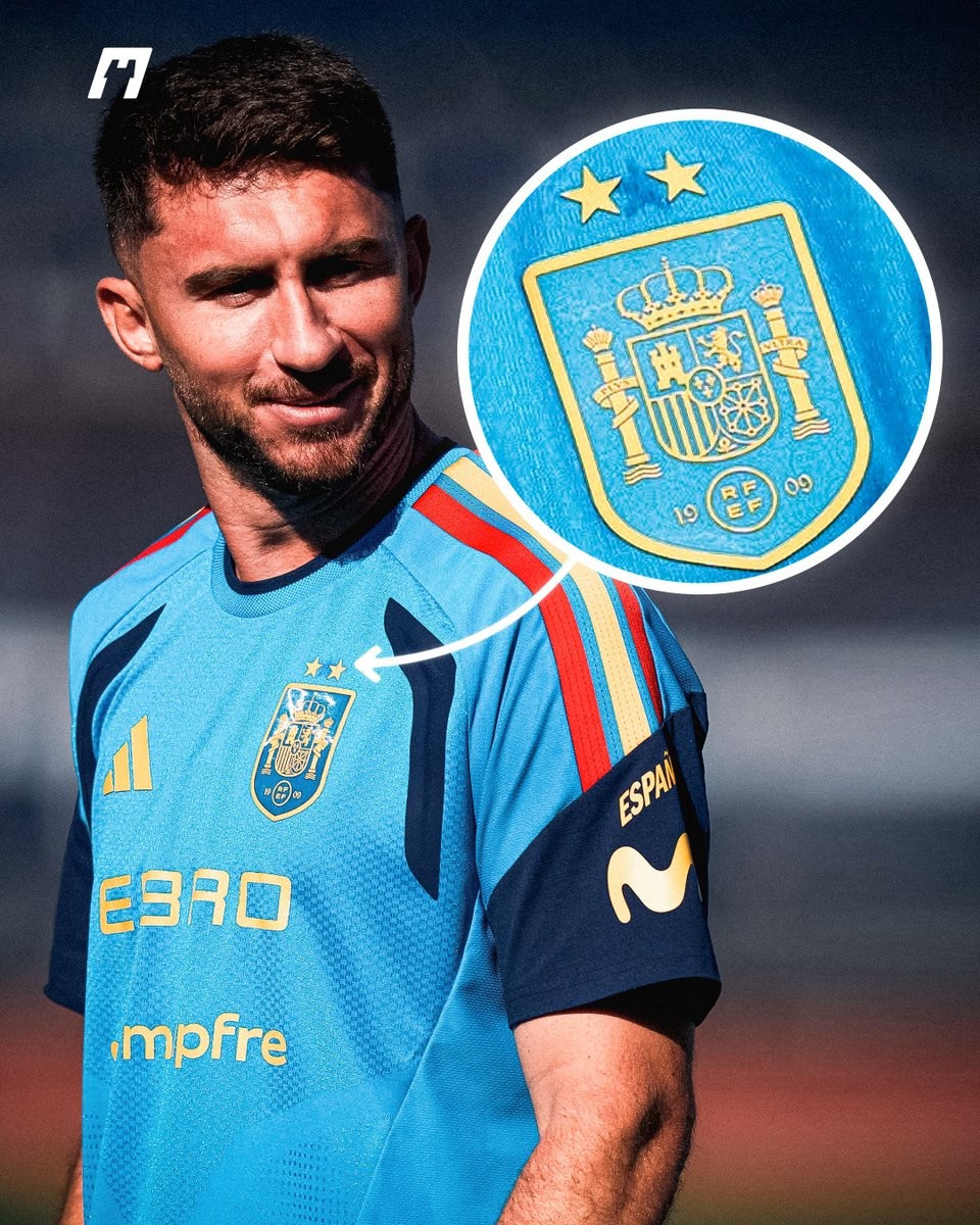
Adidas Modifies Spain Training Kits with Makeshift Two Stars
Following Spain's triumph at the 2026 World Cup, which secured their second global title, Adidas officially updated the national team's match kits with two gold stars and the central FIFA World Champions badge. However, a closer look at the squad's recent training camp reveals that a makeshift approach was taken for their daily training gear. Huge thanks to What the Kit for the great spot.
Instead of producing new batches of training shirts, Adidas and the Spanish federation chose to repurpose existing stock. Detailed photographs of defender Aymeric Laporte in the blue training top clearly show that the original single star above the crest was peeled away, with two smaller stars heat-pressed onto the fabric above the shield. The faint adhesive imprint and outline of the removed single star remain visibly stamped into the fabric.
While fans can purchase proper factory-made two-star home and away match shirts, the national team's training apparel provides an intriguing look at equipment room logistics at the highest level. Modifying already produced gear reduces waste, so it is actually a good act.
Close-Up Look: Adidas Predator Touch 1996 Remake Boots Leaked
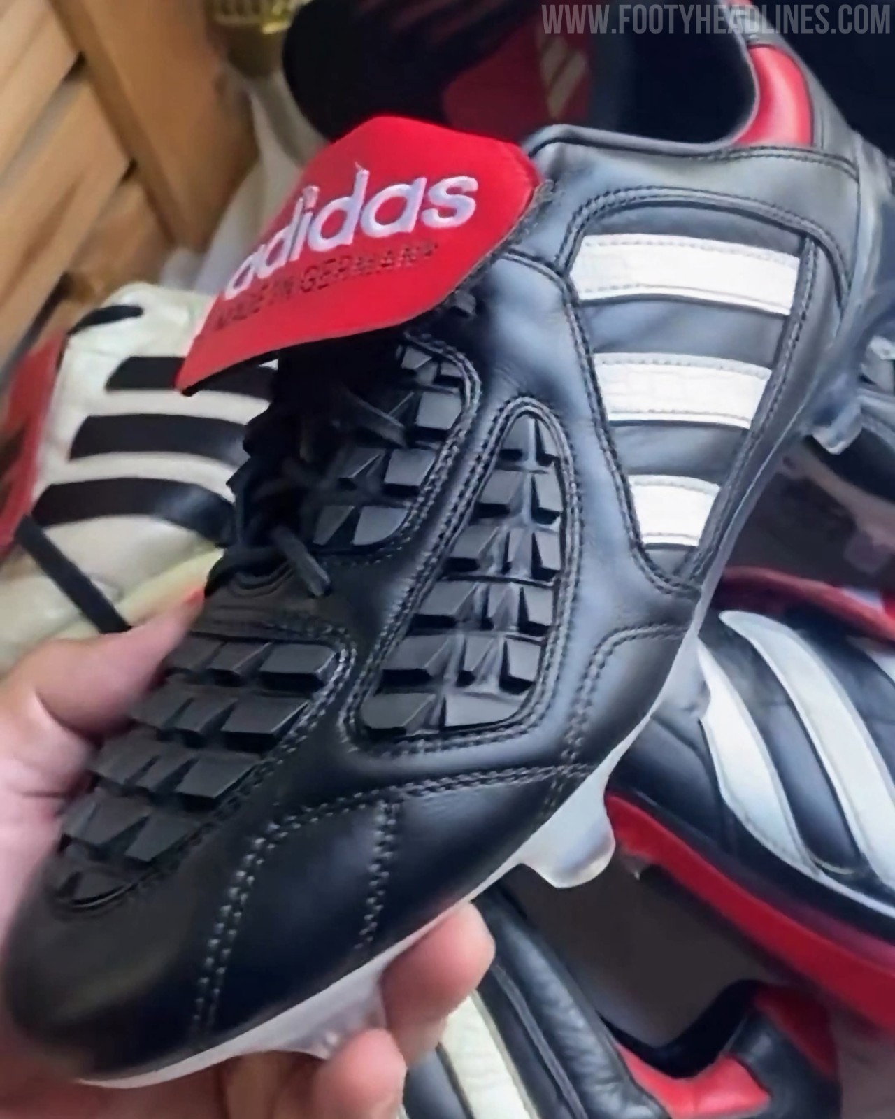
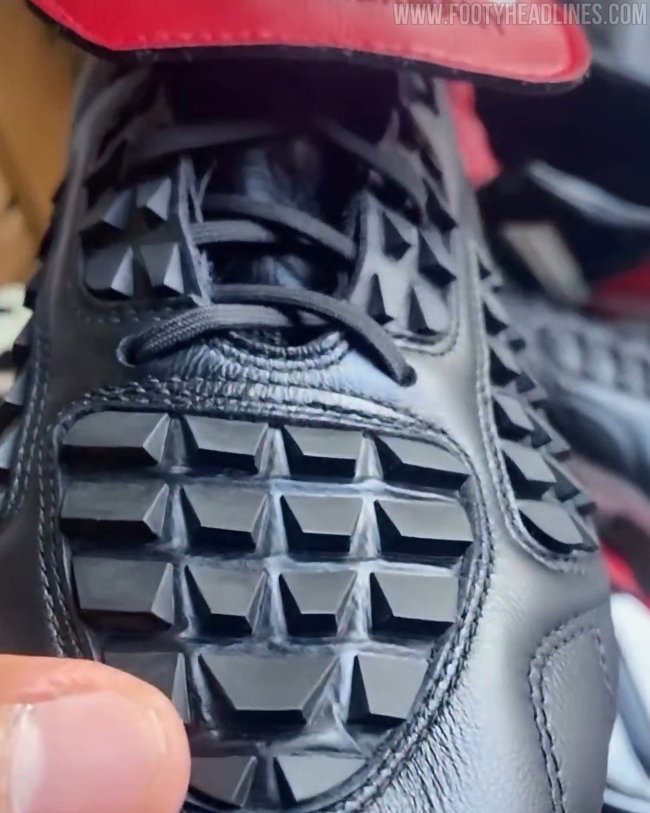
Following its recent on-pitch appearance during training with Germany head coach Jürgen Klopp, new close-up images have surfaced providing the most detailed look yet at the upcoming Adidas Predator Touch 2026 remake boots. Celebrating 30 years since the iconic model made its debut at Euro 1996, the reissue faithfully revives the original's classic black, white, and red design, highlighted by a premium leather upper, directional rubber grip fins across the vamp, and the silhouette's signature oversized red fold-over tongue. The heritage upper is combined with a modernised Predator soleplate for elite performance, with a limited-edition launch scheduled for November 2026.
Adidas Originals Fenerbahçe 26-27 Goalkeeper Kit Released
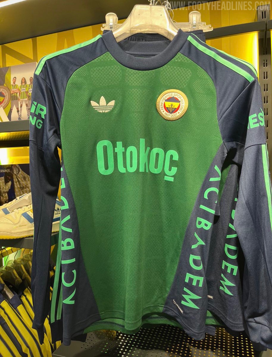
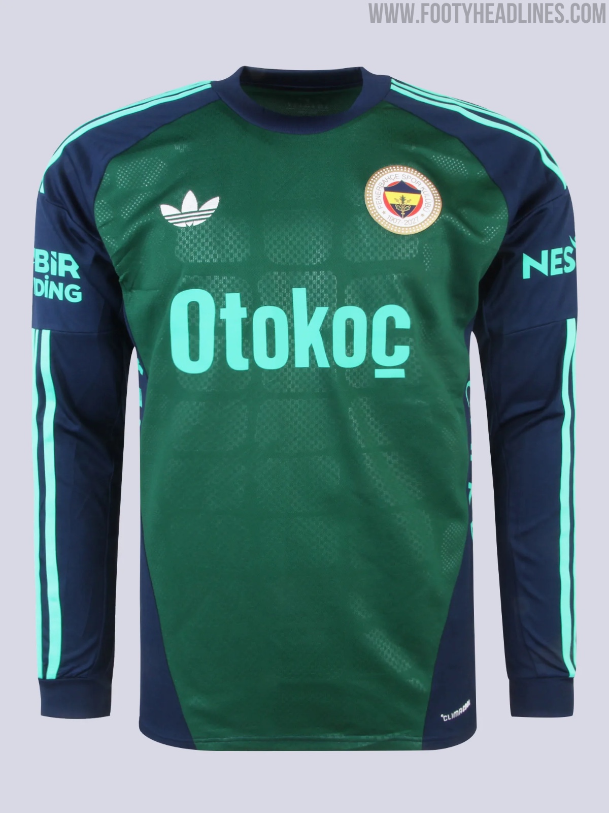
Fenerbahçe and Adidas have officially released the green 26-27 goalkeeper kit featuring the iconic Trefoil logo. Designed as part of the Turkish club's away gear, the long-sleeved green and navy template worn by goalkeeper Ederson Moraes has now gone on sale in both the club's flagship Fenerium Maraton store and online via Fenerium for 6,999 TL.

David Beckham Teases New Adidas Predator 26 Signature Boots
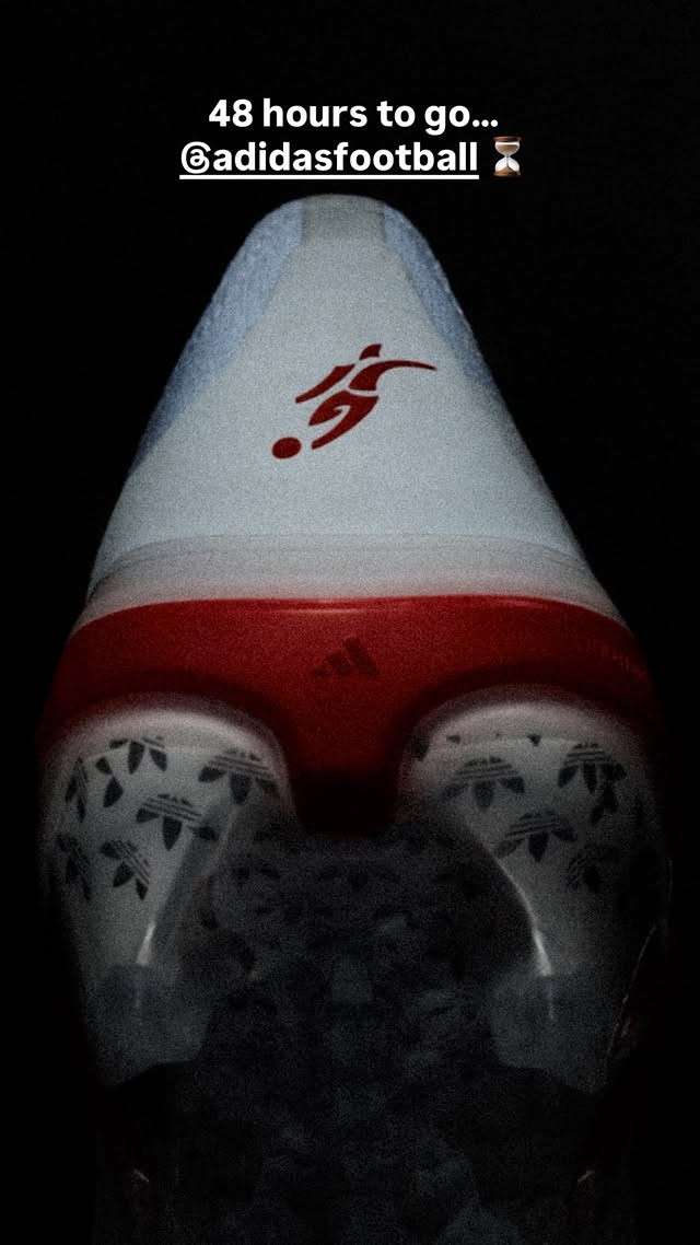
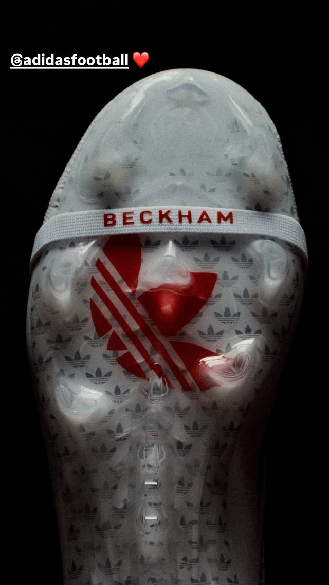
David Beckham has taken to Instagram to tease his upcoming Adidas Predator 26 signature football boots. Sharing close-up preview shots to his story alongside a "48 hours to go..." countdown tagging Adidas Football, the England legend provided the first official glimpse of the boots ahead of their imminent release on Tuesday, October 6.
Following previous signature editions in 2024 and 2025, this 26-27 release marks the third consecutive year that Adidas has honored Beckham with a bespoke Predator model. The cleat features a clean white and vibrant red palette inspired by England. Prominently displayed in the teaser images are Beckham's iconic free-kick silhouette on the heel, custom "BECKHAM" lettering across the elastic tongue strap, and a bold red Adidas Originals Trefoil visible through the translucent soleplate beneath an all-over Trefoil pattern.
Built on the standard Predator 26 silhouette with a classic fold-over tongue, the boot balances modern performance technology with nostalgic heritage styling. The timing of the launch also aligns with the 25th anniversary of Beckham's famous stoppage-time free-kick against Greece on October 6, 2001, capping off a major commemorative week for the brand and its long-time ambassador.

Amiens SC Add Pink Details to 26-27 Home Kit for Pink October
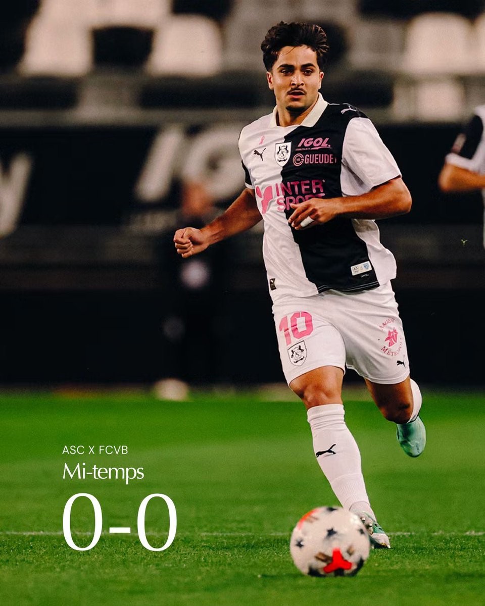
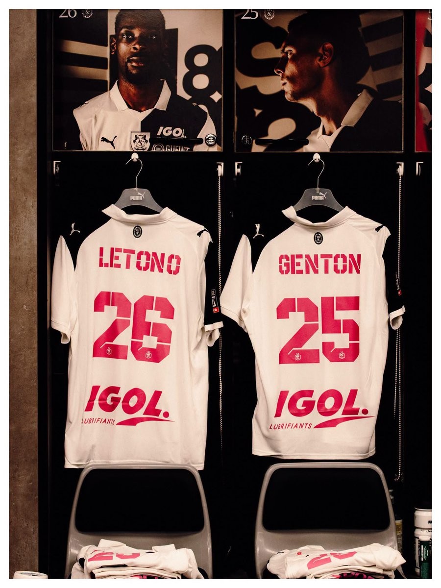
French side Amiens SC have introduced a special update to their 26-27 Puma home kit in support of the annual Octobre Rose (Pink October) breast cancer awareness and screening campaign. Debuted during their 3-0 victory against FC Villefranche at the Stade Crédit Agricole de la Licorne, the club's traditional black-and-white halved home strip was revamped with vibrant pink details.
The customized kit features eye-catching pink names and squad numbers on the back, along with pink-tinted sponsor graphics, including Intersport and Igol. Completing the tribute is a small pink ribbon placed prominently on the right chest just above the Puma cat branding.
Amiens SC confirmed that the special pink printing is not a one-match appearance; the team will also wear the modified kit during their upcoming away match against Valenciennes FC later this month.
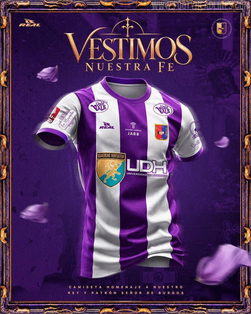
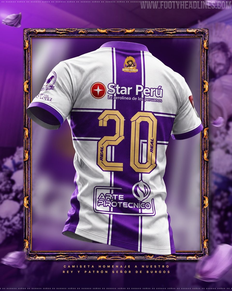
Alianza Universidad 2026 Special Kit Released
Peruvian club Alianza Universidad de Huánuco and local manufacturer Real Sport have officially unveiled a special commemorative kit for the 2026 season. Launched under the slogan "Vestimos nuestra fe" (We wear our faith), the release embraces Peru's deep-rooted October tradition of donning purple to pay homage to religious heritage, specifically honoring the Señor de Burgos, the patron saint of Huánuco.
The Real Sport Alianza Universidad 2026 special shirt swaps the team's customary red and blue palette for a striking purple and white striped look. It features bold purple vertical stripes across the front, complemented by a purple crew neck and matching sleeve trim on white sleeves. On the upper back sits an intricate graphic badge depicting the Señor de Burgos, accompanied by the inscription "Rey y Patrón de Huánuco", while squad numbers are rendered in gold with purple outlines.
The special edition kit is set to make its on-pitch debut during October Liga 2 action and is currently available via pre-order through the club's official channels.