Do Charlton's Shirt and Shorts Feature Different Versions of Crest?
 Jul 2, 2022, by John

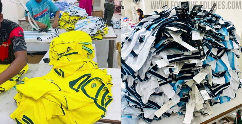
Update: Charlton already yesterday debuted their new 2022-2023 Castore home kit in the friendly against Kilmarnock FC. And surprisingly, the shorts worn by the players were a little different from those in the online store.

The shorts worn by Charlton did NOT feature the 3D logo but the classic flat variant. This stands in contrast to the shorts pictured in the official store, which feature a 3D effect.

It seems likely that the shorts in the online store show a prototype. At this point we think that it's unlikely that the version with the 3D crest is actually getting shipped out.

Original Article: We have some rather unusual kit news, as there is an odd inconsistency between Charlton Athletic's jersey and shorts.

Castore Apply Different Club Crest
Here is the possible mistake that can be found on Charlton's home shorts by Castore.
It seems that Castore and Charlton have accidentally applied the 3D Charlton Athletic logo to the new home shorts. When compared to the goalkeeper shorts, where the correct, kit-version of the crest is used, the difference becomes apparent.


Charlton Athletic have a separate version of their club crest better suite the digital era and improve the look on their kits.

The other logo has various impractical 3D effects, such as the shadow behind the hand and sword or the shadow on the blade itself. The red background is also not one solid color tone, the same going for the black outer ring, which clearly has a reflection at the top.

Charlton Athletic's 3D crest also does not have the thick white outline that the new one features.


All these elements can be spotted on the logo that has been applied to Charlton's home shorts. All other shorts and jerseys in the collection so far are unaffected by this potential mistake.


It is hard to say what the reason for this small inconsistency is, it could have been a simple mistake by either the club or outfitter Castore.

What do you think of this one-off 3D logo being applied instead of the usual flat version? Have you ever noticed something similar with other brands or teams? Comment below.
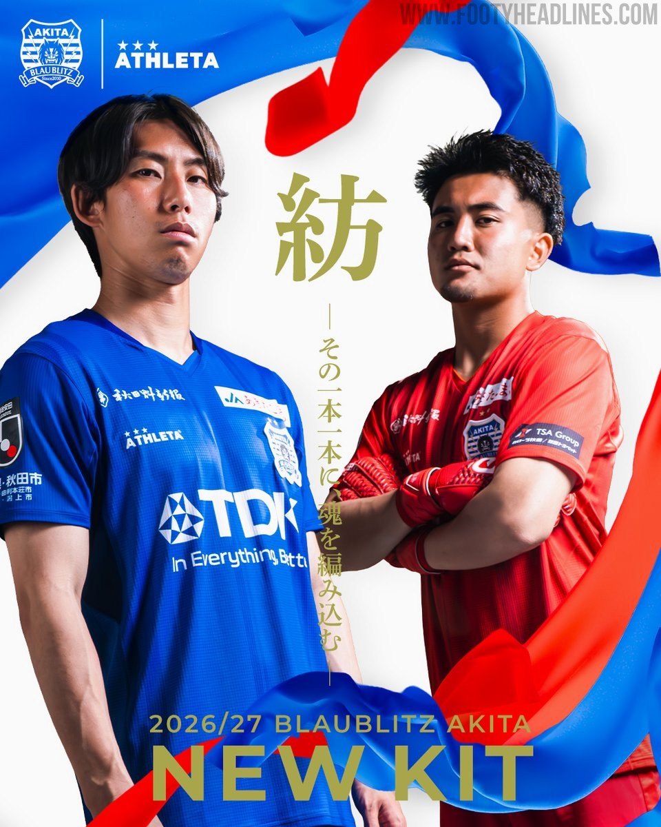
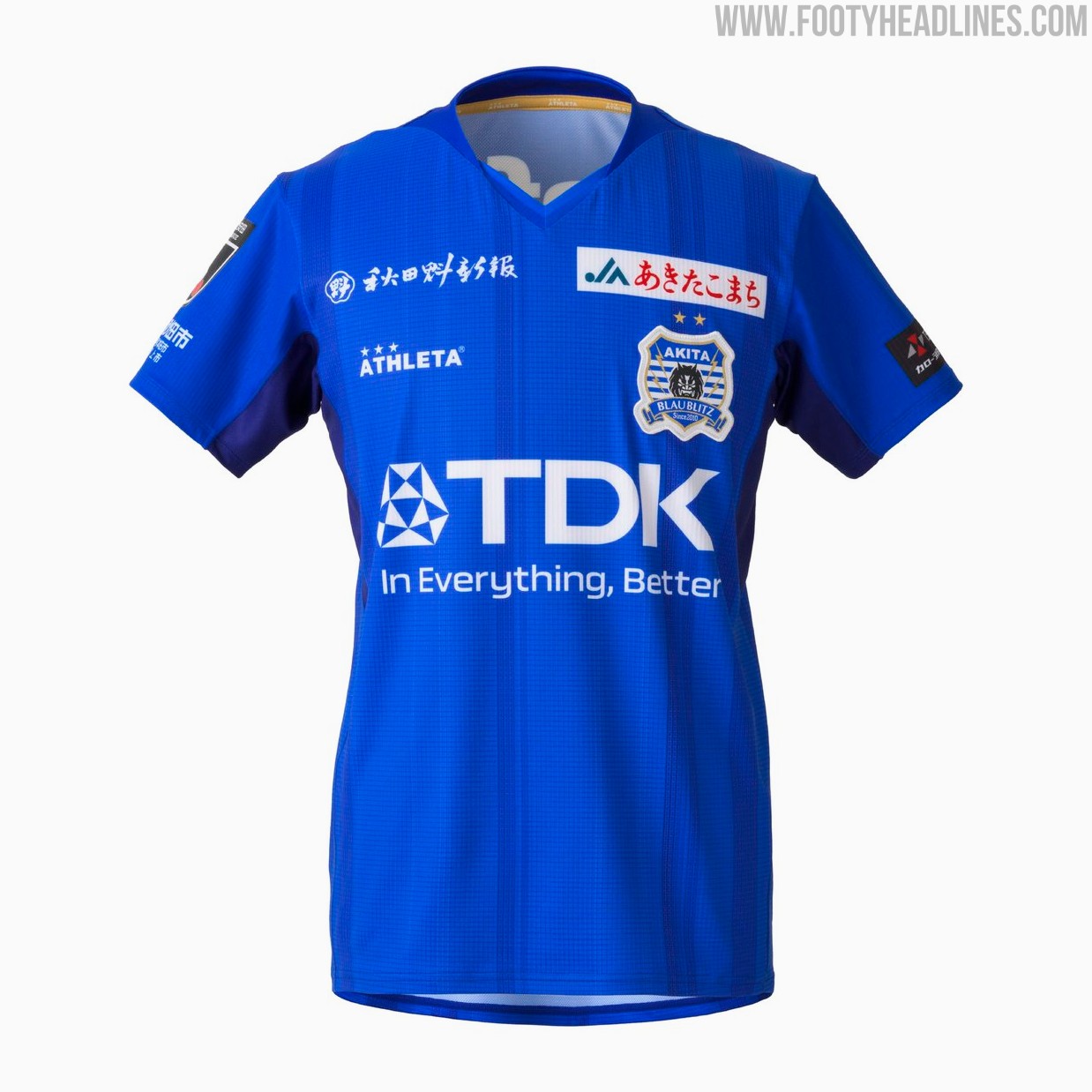
Blaublitz Akita 26-27 Kits Released
Japanese J2 League club Blaublitz Akita have unveiled their new 2026-27 kits. Made by Athleta, the new kits feature a distinct design inspired by the concept of weaving.
The Athleta Blaublitz Akita 2026-27 kits are designed around the theme of weaving, reflected in a woven pattern on the shirts, symbolizing the unity of the stakeholders spinning their efforts onto the pitch.
The new Athleta Blaublitz Akita 2026-27 kits will be available to pre-order starting July 6, 2026, with deliveries planned ahead of the start of the new league season.


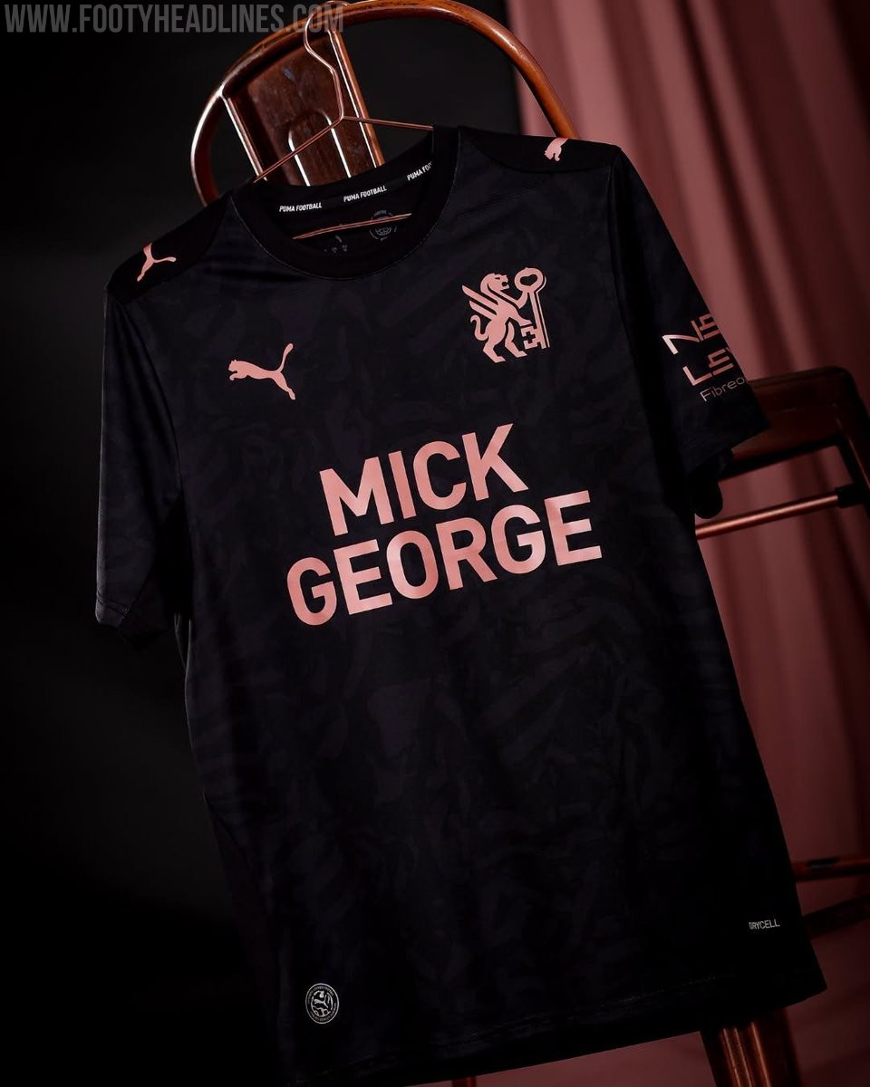
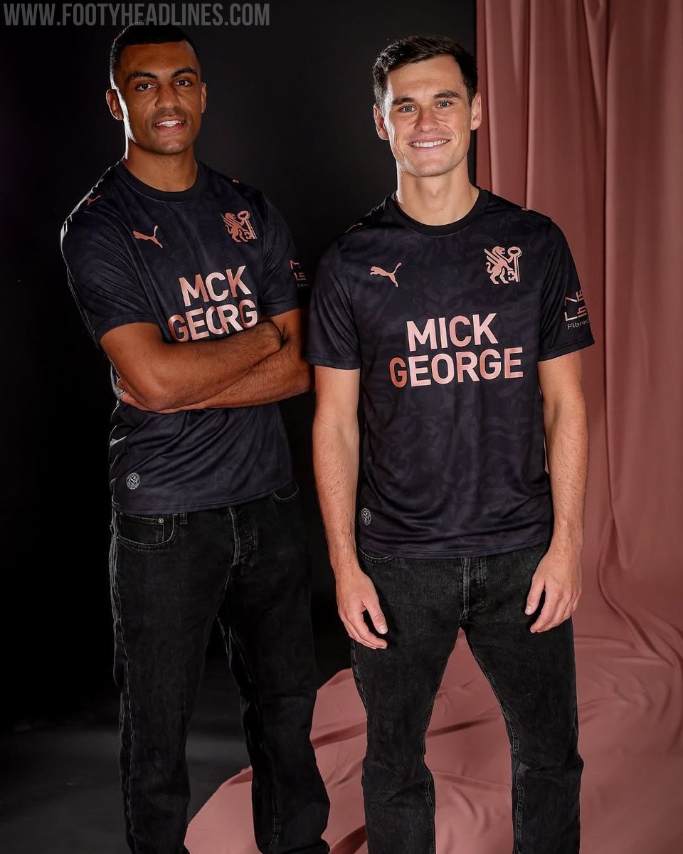
Peterborough United 26-27 Away Kit Released
League One side Peterborough United have officially launched their new Puma away kit for the 2026-27 season. The strip was unveiled during the club's Fan Zone Fun Day event on July 4, following the release of their home kit earlier in the summer.
The Peterborough United 2026-27 away shirt showcases a contemporary design that aligns with the club's new direction. It features a black base with rose gold accents. It also prominently features the club's newly introduced crest, marking a fresh chapter for the team.
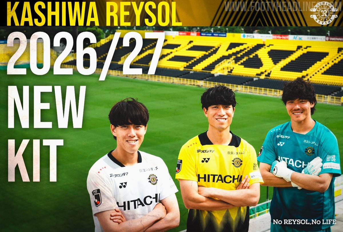
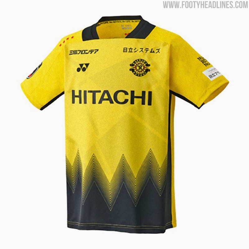
Kashiwa Reysol 26-27 Kits Released
Japanese J1 League club Kashiwa Reysol has officially unveiled its new 2026-27 kits, which are once again designed and manufactured by Yonex. The official launch on July 4 follows a short teaser video released earlier in the week and coincided with the announcement of the club's squad and player numbers for the upcoming season.
The Kashiwa Reysol 2026-27 kits feature a striking design centered around the concept of "Break the Light." The home shirt incorporates the club's traditional yellow and black colors, separated by dynamic geometric patterns that symbolize moving through the light. The away and keeper kits mirror the design in different colors.
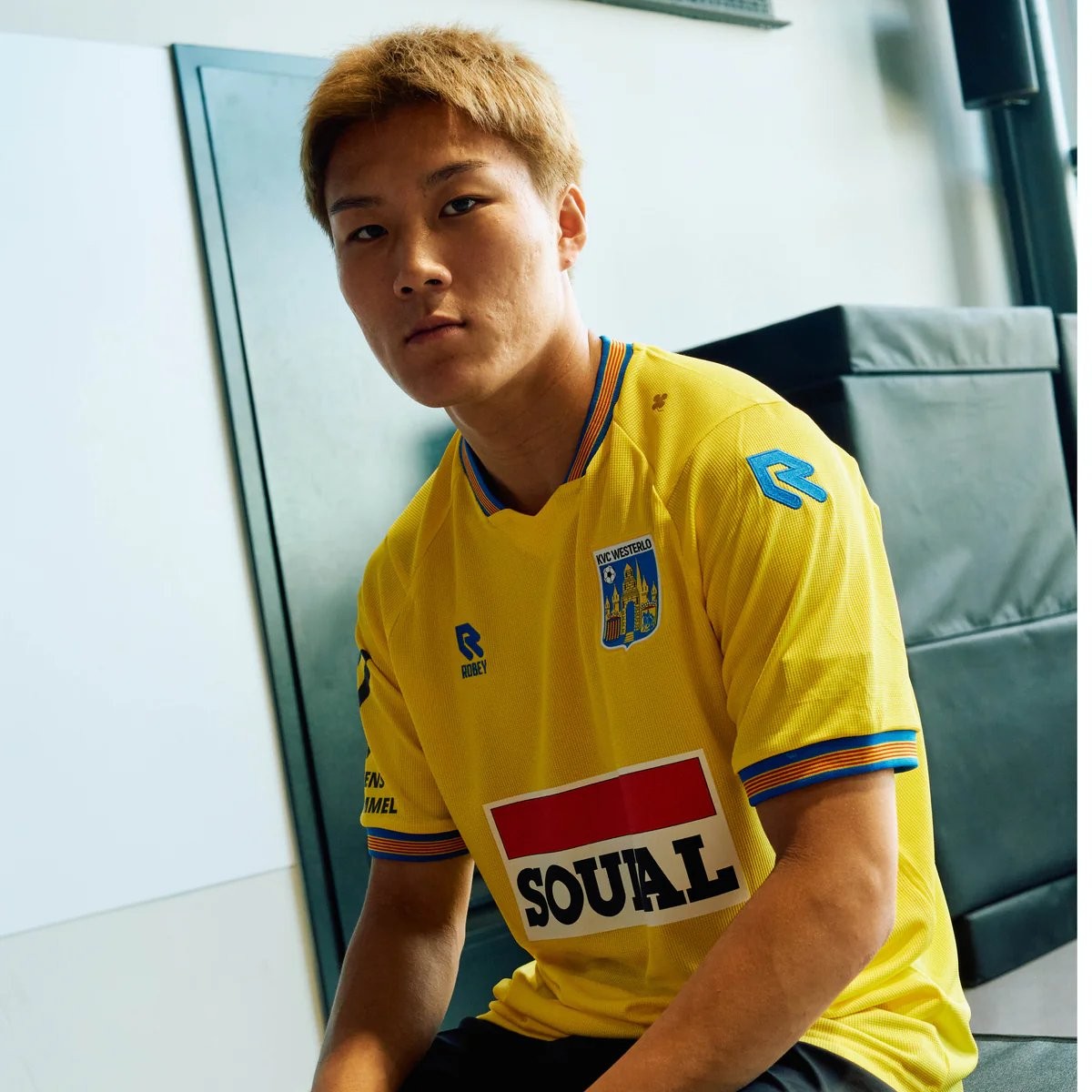
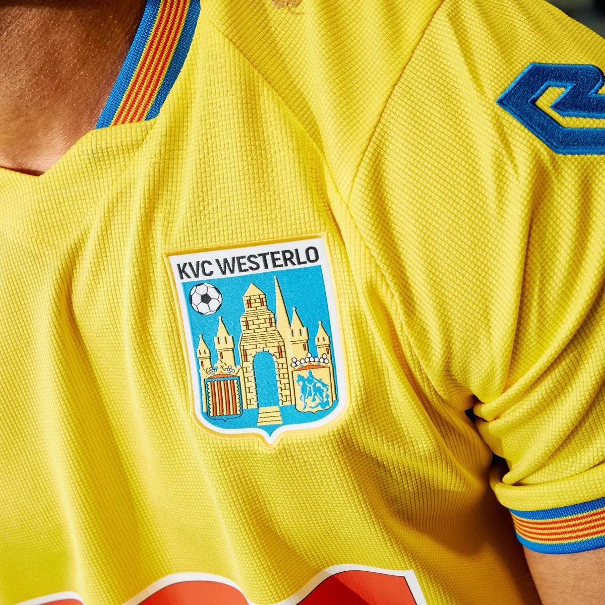
Robey KVC Westerlo 26-27 Home Kit Released - No More Nike
Belgian club KVC Westerlo has unveiled their new 2026-27 home kit, marking the beginning of a new partnership with Robey Sportswear. The Dutch brand takes over from Nike, which had supplied the club's kits since 2022.
The Robey KVC Westerlo 2026-27 home shirt features the club's traditional yellow and blue colors. Launched with the slogan 'Designed for you. Worn by you. Because you are Westel,' the design aims to celebrate the strong bond between the team, its supporters, and the local Kempen region.