
Girondins Bordeaux 22-23 Home & Away Kits Released
 Aug 1, 2022, by John

FC Girondins de Bordeaux's new 2022-23 home and away kits were released following previous leaks. They are made by Adidas and will be worn in this season's Ligue 2 campaign, as the club were able to avoid a forced relegation to the third division.
Le Club remercie ses sponsors pour leur soutien 🔵⚪
— FC Girondins de Bordeaux (@girondins) July 30, 2022
➡ https://t.co/H2iGa9neMR
➡ https://t.co/ZyiPg9SQQA pic.twitter.com/3475l04YtQ
Girondins Bordeaux 22-23 Home Kit
This is the new Adidas Bordeaux home jersey for 2022-2023.

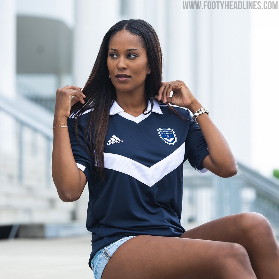
The Adidas Girondins 22-23 jersey is mainly navy, featuring the traditional white chevron on the front. A classy white collar is applied as well, having the same style as those seen on many other Adidas kits this season.


Extremely subtle pinstripes cover the front of the shirt. White is used for the logos, Adidas' branding and the sleeve cuffs.
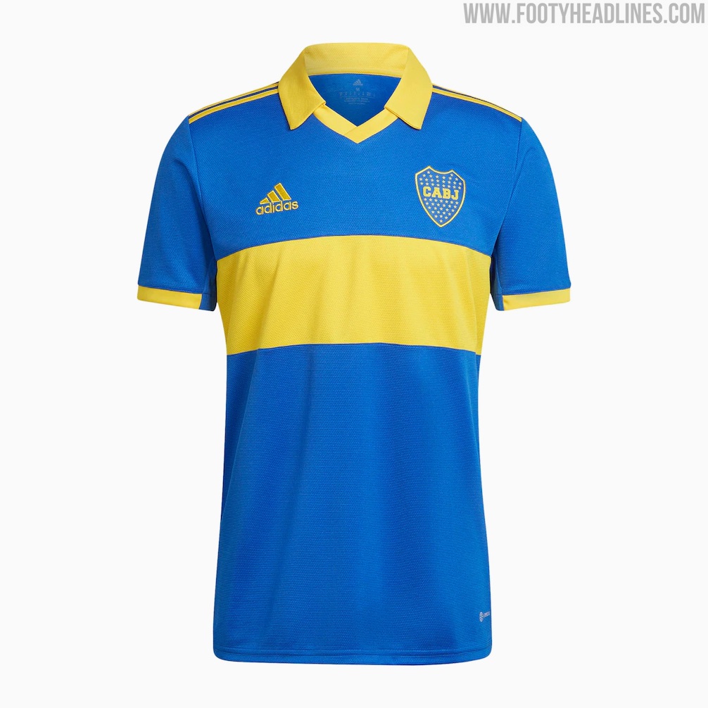
Bordeaux's kit is based on the standard template that many 'B-teams' have been receiving. Boca Juniors' 2022 shirt is a good comparison where the colors are different and a hoop is used instead of the chevron.
Navy shorts and socks will complete the new Adidas FC Girondins de Bordeaux 2022-2023 home strip.
Bordeaux 22-23 Away Kit
This is the new Adidas Bordeaux away jersey.

The new Bordeaux 2022-2023 away kit has a classy design. It combines a white base with a maroon chevron and golden logos, with the chevron placed higher than on the home kit. Both the detailing on the collar and the Three Stripes are maroon as well.

Bordeaux's 2022-2023 away kit is based on the Adidas mi License 22 template.

Bordeaux's new 22-23 home and away kits by Adidas are not available to buy yet.
Do you like Girondins' 22-23 shirts? Comment below.
QPR Kit Clash Against West Brom
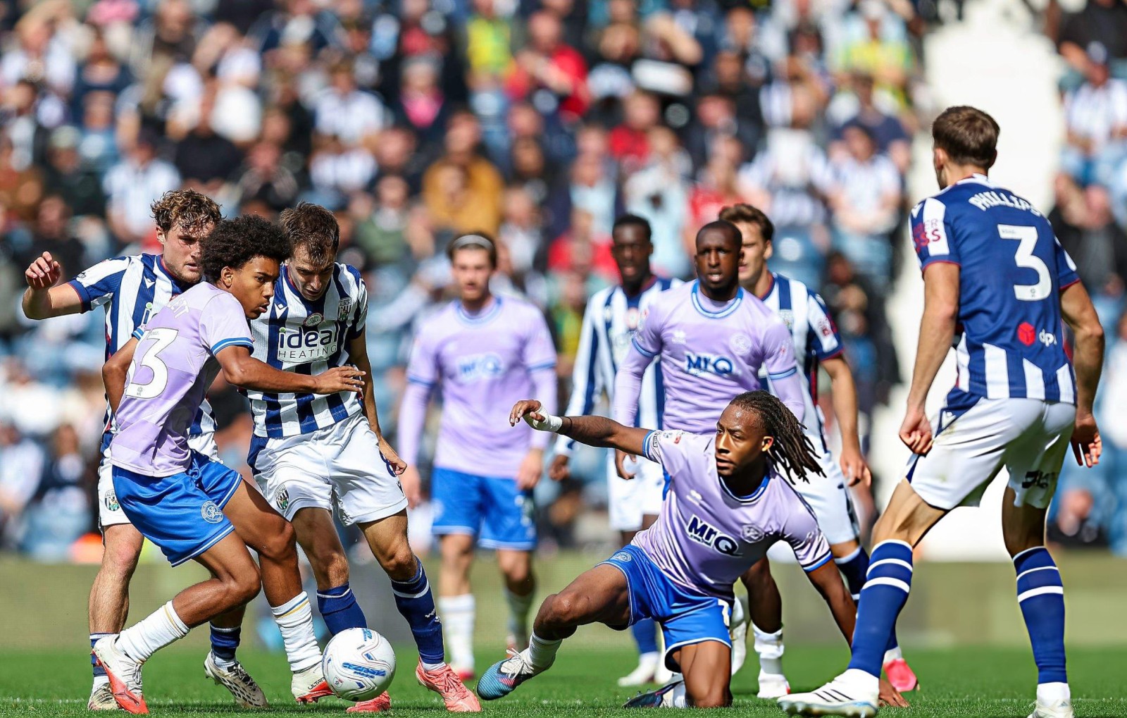
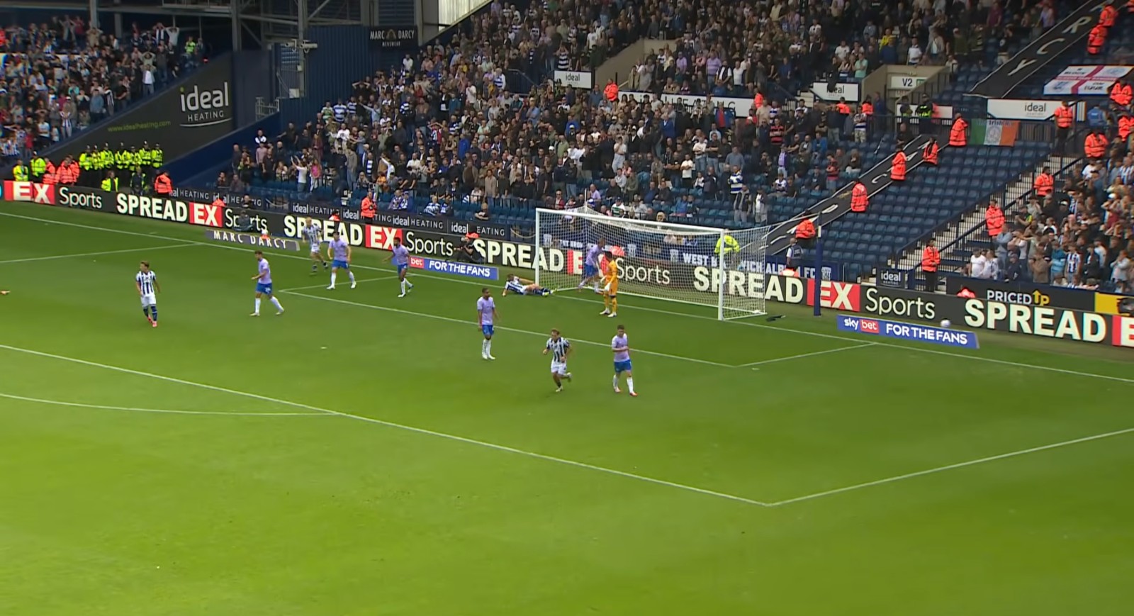
QPR faced a major kit clash in their EFL Championship away game at West Brom, wearing their pink away shirt with blue shorts against West Brom's traditional blue-and-white home shirt.
The bright pink of QPR looked surprisingly similar to the white stripes of West Brom on TV, while the blue shorts and dark details made the overall contrast even less clear.
From the wide camera angle, the two teams became difficult to distinguish, creating a frustrating viewing experience for fans.


Nike Kobe 8 Protro 'Mambacurial' Releasing Next Week
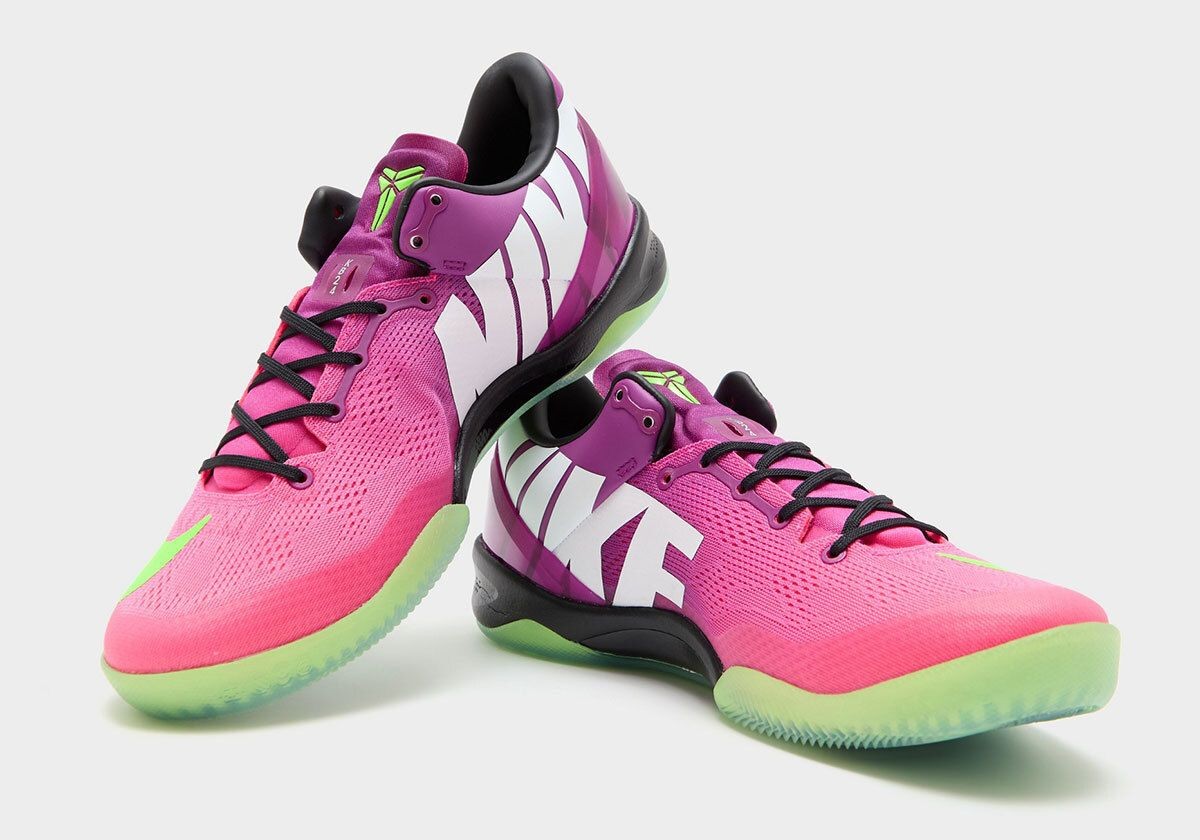
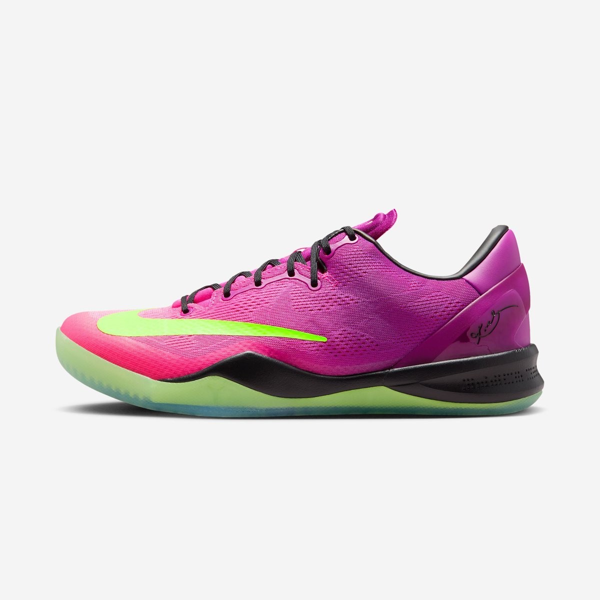
Nike is set to officially bring back one of its most famous crossover designs, the Kobe 8 Protro "Mambacurial", releasing on September 19, 2026. First introduced in 2013 as a tribute to Kobe Bryant's lifelong passion for football, the sneaker drew direct inspiration from the vibrant 2013 Nike Mercurial Vapor IX football boot. Thirteen years after its original debut, the model returns under the modernized Protro banner, uniting basketball performance with iconic football heritage. Big thanks to House of Heat.
The shoe faithfully recreates the beloved colorway, featuring a bold gradient across the engineered mesh upper in Red Plum, Pink Flash, and Electric Green. Signature football details define the look, including the oversized forefoot Swoosh that mimics Mercurial boot branding, massive block-letter "NIKE" lettering across the medial flank, and a translucent neon green outsole. Modern Protro upgrades have been implemented beneath the surface to provide improved cushioning and traction.


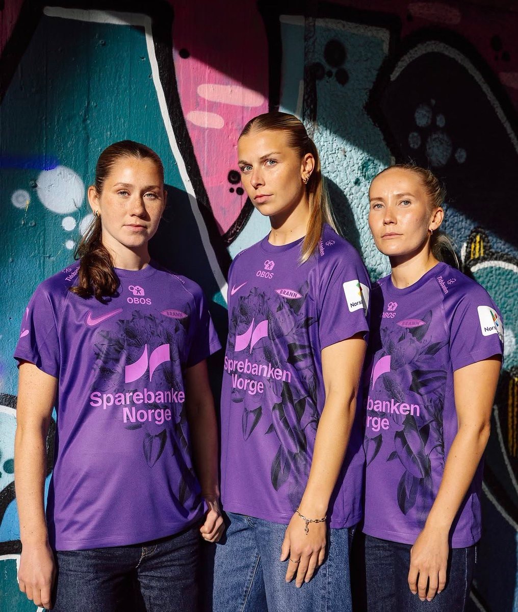
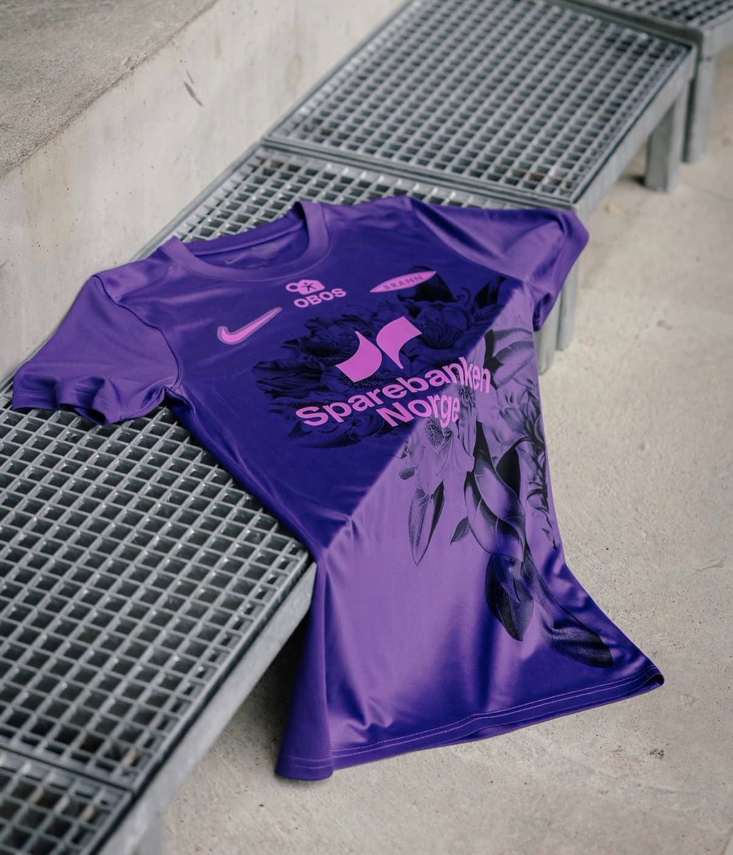
SK Brann Kvinner 26-27 Third Kit Released
Norwegian Toppserien side SK Brann Kvinner have officially unveiled their new 26-27 third kit, produced by Nike in collaboration with Unisport. The team debuted the vibrant new design during their away fixture against Lyn in Oslo.
The Nike SK Brann Kvinner 26-27 third shirt features a purple base paired with a large, dark rhododendron flower graphic printed across the front. The design honors Bergen's reputation as Norway's "Rhododendron City," known for the vibrant bushes that flourish in gardens and parks across the city. All branding, including the Nike Swoosh, monochrome Brann crest, and sponsor logos, is applied in a contrasting bright pink.
On the back, the jersey includes the inscription "For Bergen" in gothic lettering just below the collar, symbolizing the pride of representing the city on away trips. The new third uniform completes Brann Kvinner's 26-27 wardrobe alongside their traditional red home and dark away kits.
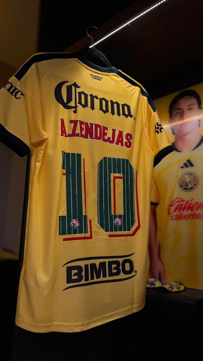
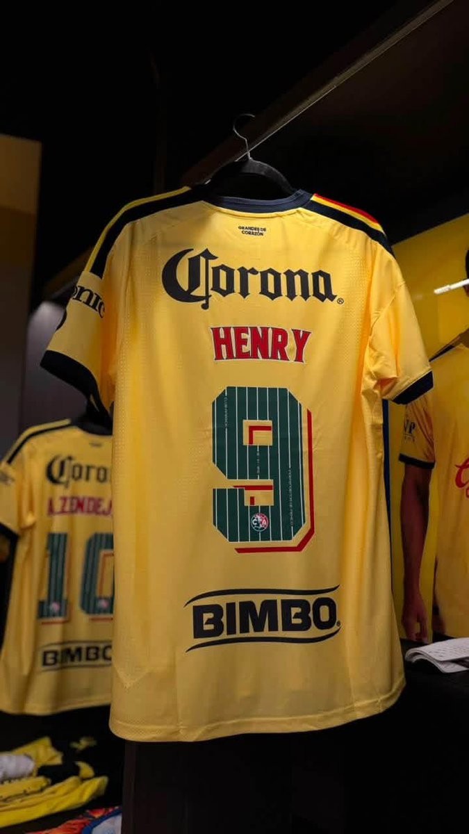
Special Club América 26-27 Kit Font Released
Club América has unveiled a special commemorative kit font for the 26-27 season, celebrating Mexican Independence Day and the club's marquee Clásico matches throughout September. The bespoke nameset replaces the regular squad typography on the back of Las Águilas' primary yellow home shirt, adopting the iconic green, white, and red of the Mexican flag.
The custom numbers feature a deep green base detailed with thin white vertical pinstripes. Embedded along the vertical lines are historic commemorative inscriptions, including the club name, the date "16 - 09 - 1810" marking the start of the Mexican War of Independence, and "INDEPENDENCIA DE MÉXICO". The player names above are rendered in vibrant red with a clean white outline.
To complete the patriotic design, each numeral incorporates a geometric red and cream 3D shadow effect, alongside Club América's crest placed at the base of every digit. The special typography delivers a unique cultural tribute, adding extra identity to the squad's jerseys during one of the most important periods of the Mexican football calendar.
