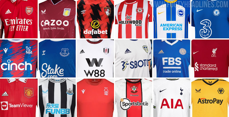
Premier League Kit Font Is Bad For Many 22-23 Kits

The 2022-2023 Premier League will bring us many stylish new jerseys. However, some will look worse than they could because of Premier League's streamlined kit font.


Premier League Typeface Still Just Offered In 5 Colors In 22-23 Season

The official Premier League typeface has to be used by all teams in the Premier League. The look of the typeface is no problem but there is a major problem with it - it is just offered in five colors - white/black, black/white, red/white, hi-vis yellow/white & navy-blue/white.


For many kits, there is no fitting color number. For example, Arsenal can't have a gold number for their away kit, and Nottingham Forest use a mismatching navy font instead of royal blue.


Another kit that can't be combined with a fitting font is the Manchester City 2022-2023 away kit. There is no classic yellow typeface but just a volt one. Manchester City will certainly opt for the white variant.

Each of the five standard EPL fonts also comes with a border. This is also unfitting for many kits like it was for Spurs' 21-22 away kit.


La Liga, MLS, Serie A, and Ligue 1 offer totally custom colors for the font
The problem with mismatching kit fonts is only a problem of the Premier League. La Liga, MLS, Serie A, and Ligue 1 offer teams to have custom-colored versions of the streamlined font.

Do you hope that Premier League will fix this? Comment below.
Vintage Football Shirts
from Cult Kits
2006/07 Barcelona Ronaldinho #10 Home Shirt (L) Nike

1996/98 Bayern Munich Munch #3 Away Shirt (XL) Adidas

1992/94 Brescia Track Jacket (M) Uhlsport

1998/00 Real Madrid 'Champions Of Europe' Home Shirt (L) Adidas

2016/17 Barcelona Messi #10 Away Shirt (L) Nike

2002 FC Tokyo Away Shirt (S) Adidas

2012/13 Queretaro Home Shirt (L) Atletica

1995/96 PSG Polo Shirt (L) Nike

2016/17 Celta Vigo Away Shirt (L) Adidas