Kit Clash? - Hertha and Schalke Both Wear Light Kits

Today's Bundesliga match between Hertha and Schalke was met with several complaints from fans, who had trouble properly visually distinguishing the two sides.


Hertha and Schalke Wear Similarly Light Outfits
Hertha of course wore their usual blue and white stripes, combined with blue shorts and white socks. The kit itself is mainly white, including an almost solid white back.


Schalke's first two kit choices are both not suitable for this match, as one is blue and the other white. This leaves only their third kit, which has a light mint colour.

Depending on the lighting, it can appear similar to white, which makes up the majority of Hertha's home look. The result is a mainly white team playing against an off-white looking side.


The TV images show that these opposing colours are quite similar. This begs the question why Schalke did not release a dark kit for their 22-23 line-up. Since their home and away shirts are blue and white, it seems like a no-brainer that a colour contrasting both of these is necessary for the third option. Mint does not fulfill this requirement, however.


Our best solution for this small kit dilemma would have been Hertha wearing their navy away outfits, something they did several times at home last season. Alternatively, Schalke could have opted for a new black fourth jersey, perhaps even a simple teamwear solution.
What do you think of the kits worn in today's match? What would your ideal solution be? Comment below.
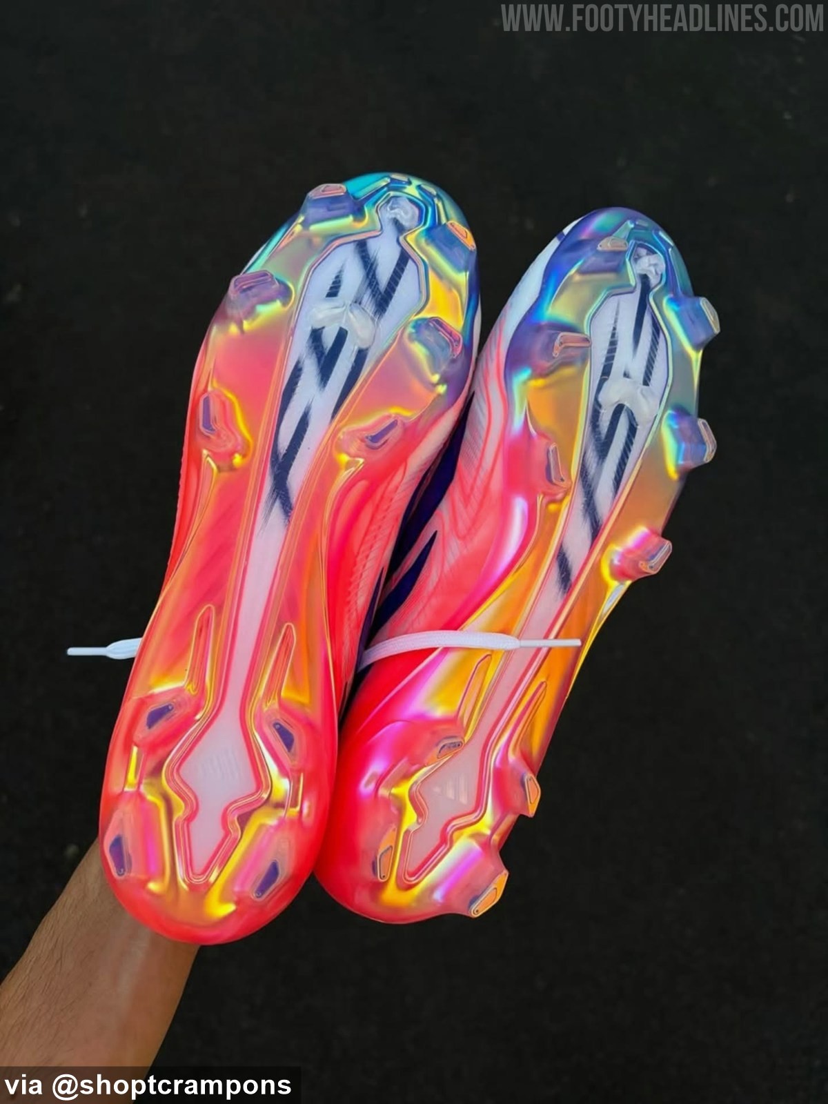
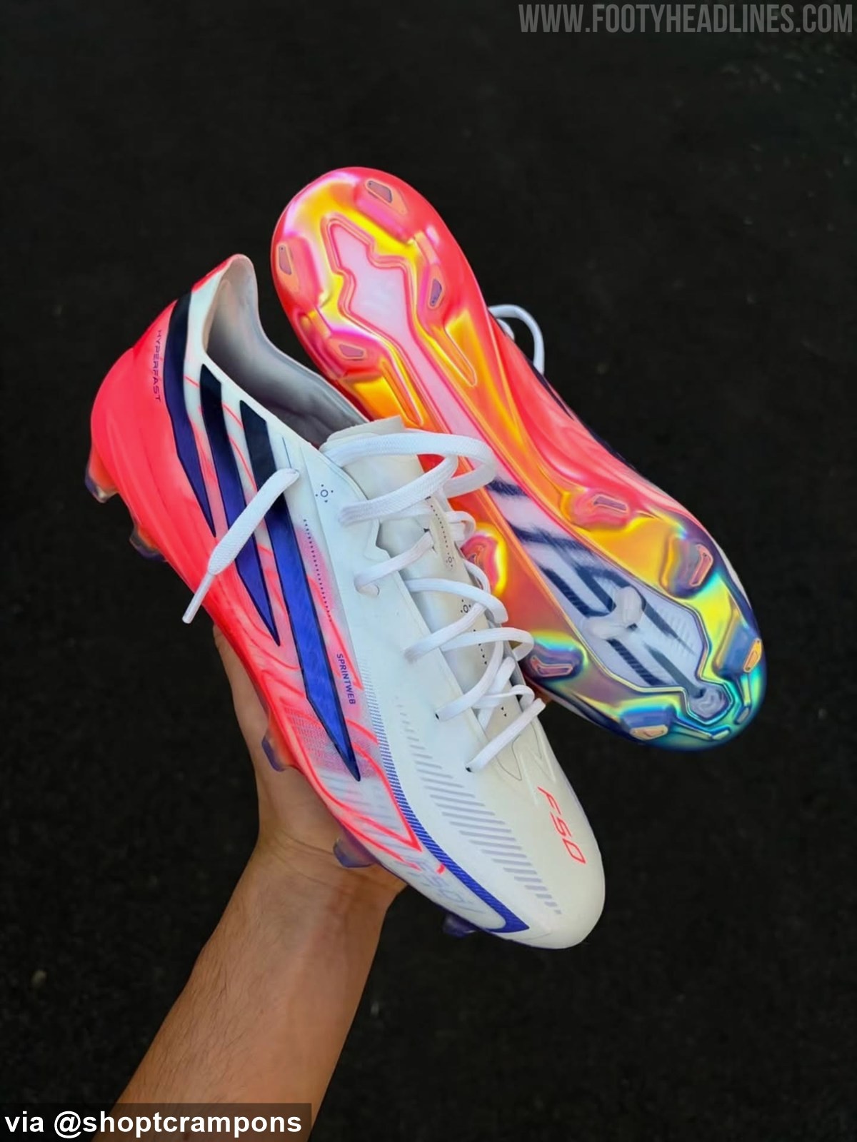
Adidas F50 Hyperfast 26-27 New Season Boots Leaked - 4 New Pictures
Footy Headlines can now leak 4 new pictures of the new Adidas F50 Hyperfast '26-27 New Season' boots. Big thanks to shoptcrampons.

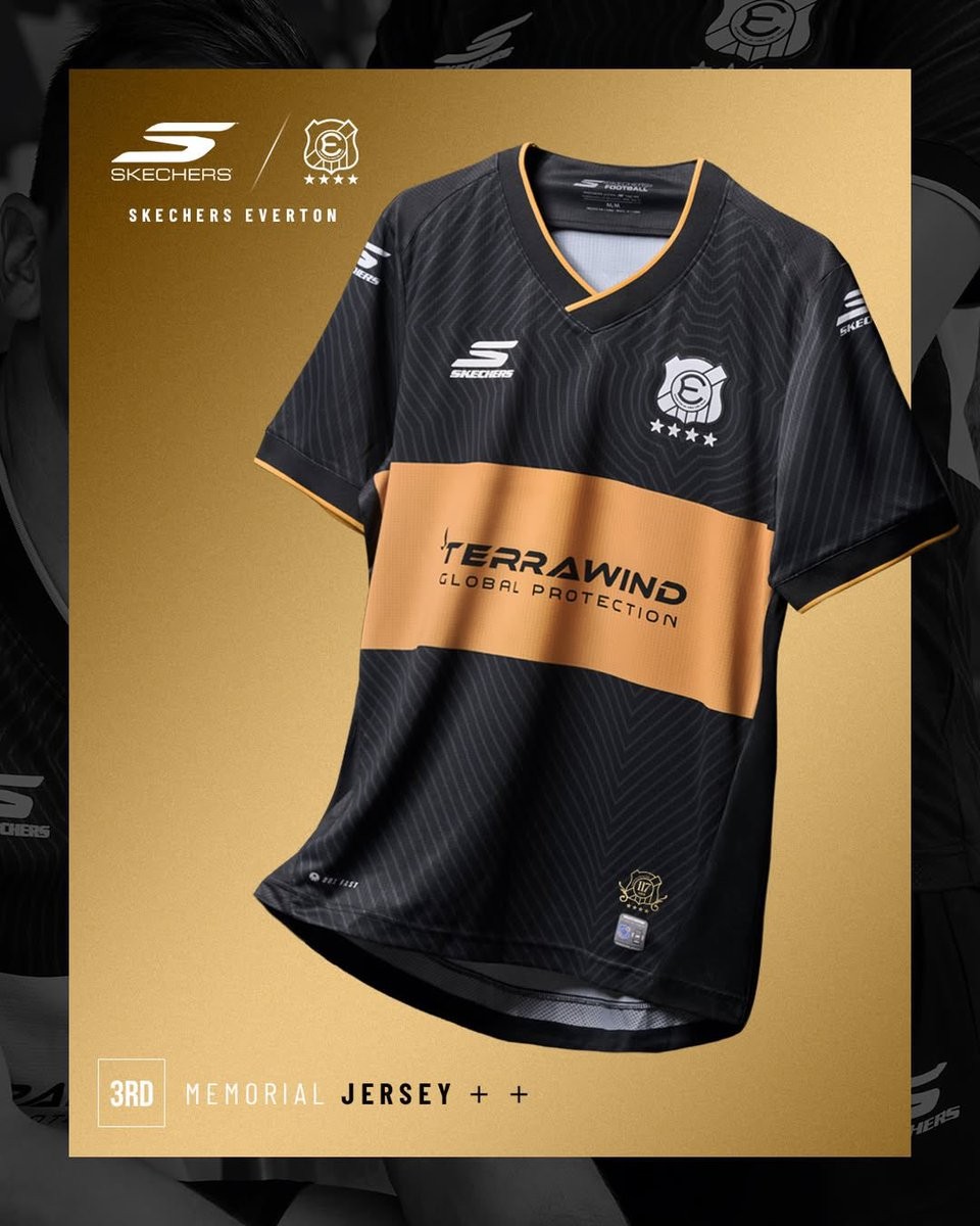
Everton de Viña del Mar 2026 Third Kit Released
The new Everton de Viña del Mar third kit for the 2026 season has been revealed. Made by Skechers, the alternative strip completes the club's lineup for the current Chilean Primera División campaign.
The launch of the third kit follows the introduction of the club's 2026 home kit, which was announced in December 2025 alongside the official confirmation of the Skechers partnership. The new third shirt offers a fresh design for the team, contrasting with the traditional look of the primary uniform. The club has been highly active recently, celebrating its 117th anniversary in June 2026.
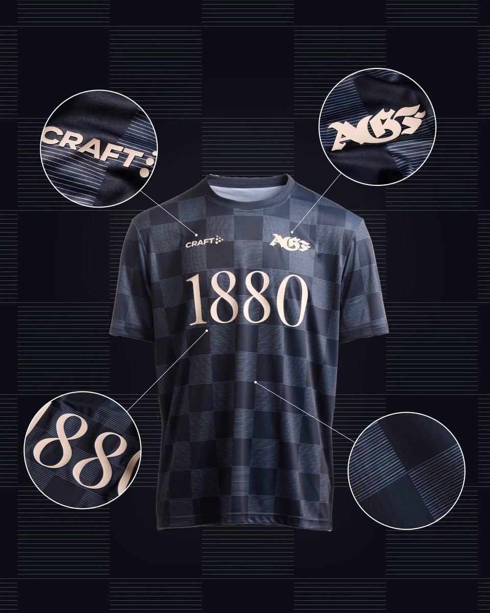
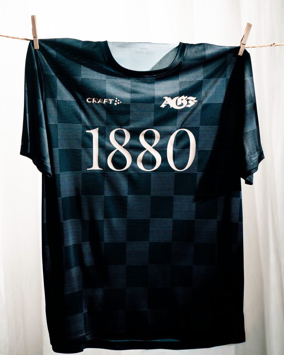
AGF Aarhus 2026-27 Pre-Match Kit Released
Following the launch of their new home shirt earlier this month, Danish Superliga side AGF Aarhus has revealed their 2026-27 pre-match kit. The new pre-match top is produced by the club's technical sponsor, Craft, and will be worn during the upcoming season.
The Craft AGF Aarhus 2026-27 pre-match shirt features a unique look designed specifically for the players' pre-game preparations.


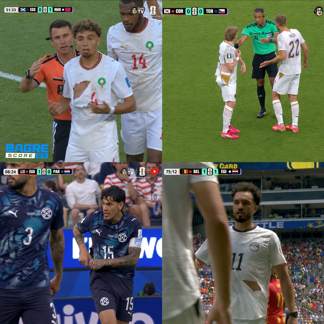
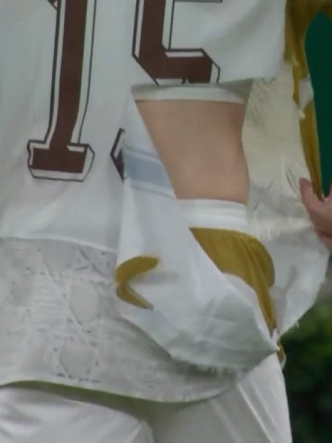
Puma Kits Keep Ripping at the 2026 World Cup
Puma is facing significant criticism at the 2026 World Cup as multiple national team jerseys have easily ripped during matches.
Incidents involving players from Czechia, Morocco, Egypt, and Paraguay have highlighted an ongoing durability issue with the brand's latest kits - every torn shirt in the tournament so far belongs to a Puma-sponsored team.
The Puma 2026 World Cup kits incorporate the latest version of PUMA's ULTRAWEAVE “Thermoadapt” technology, which obviously is not tear-resistant enough.
The recurring wardrobe malfunctions have resulted in terrible PR for the German sportswear manufacturer and even prompted the viral resurgence of Xherdan Shaqiri's infamous quote from Euro 2016, where he joked that he hopes Puma does not produce condoms.
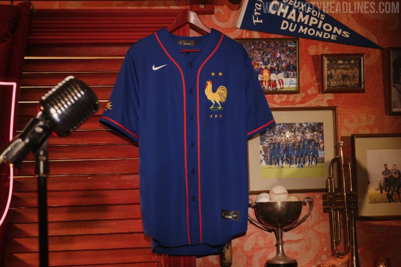
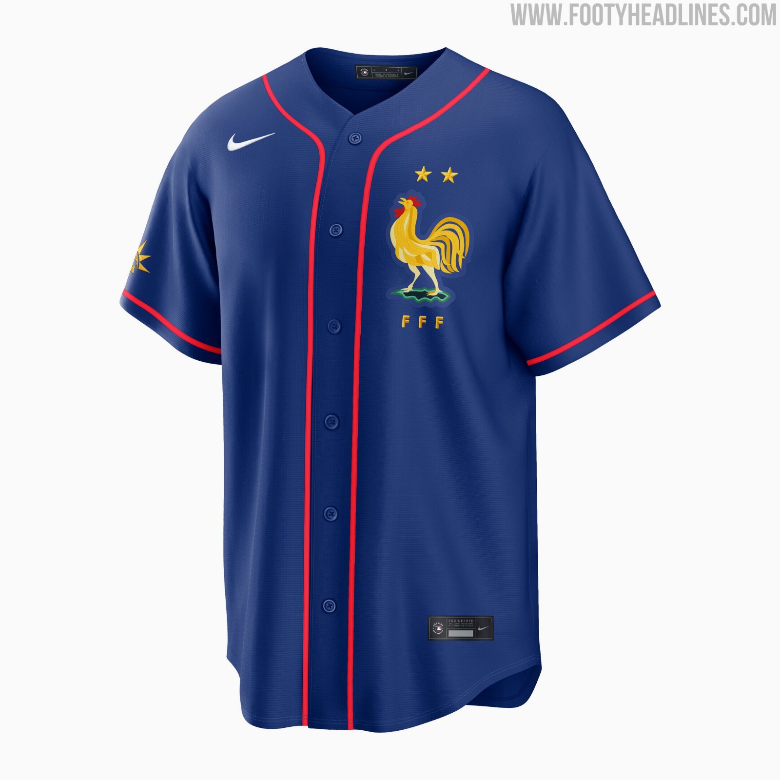
France x MLB Baseball Jersey Released
The French Football Federation has officially launched a new crossover collaboration jersey with Major League Baseball.
The France MLB jersey features a classic baseball button-down design in the team's signature blue color, complete with the FFF crest and MLB branding.
Available now through the official FFF boutique and MLB Shop Europe, the new collaboration jersey retails for 140 Euro. The release has drawn some criticism from fans regarding its high price point of 140 euros.
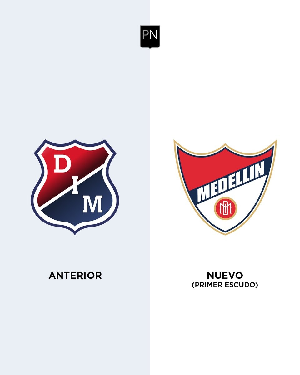
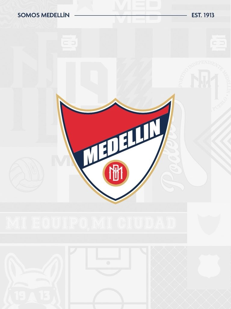
Deportivo Independiente Medellín Returns to Original Crest
Colombian club Deportivo Independiente Medellín has officially announced a return to their original crest, reconnecting with their 1913 roots.
Unveiled on June 19, 2026, the updated identity features the club's historic first shield, which prominently displays the city's name and honors their successes during the amateur era. The decision to revert to this traditional emblem is described by the club as a return to their origins, aiming to celebrate the beginning of their history and strengthen their brand identity.
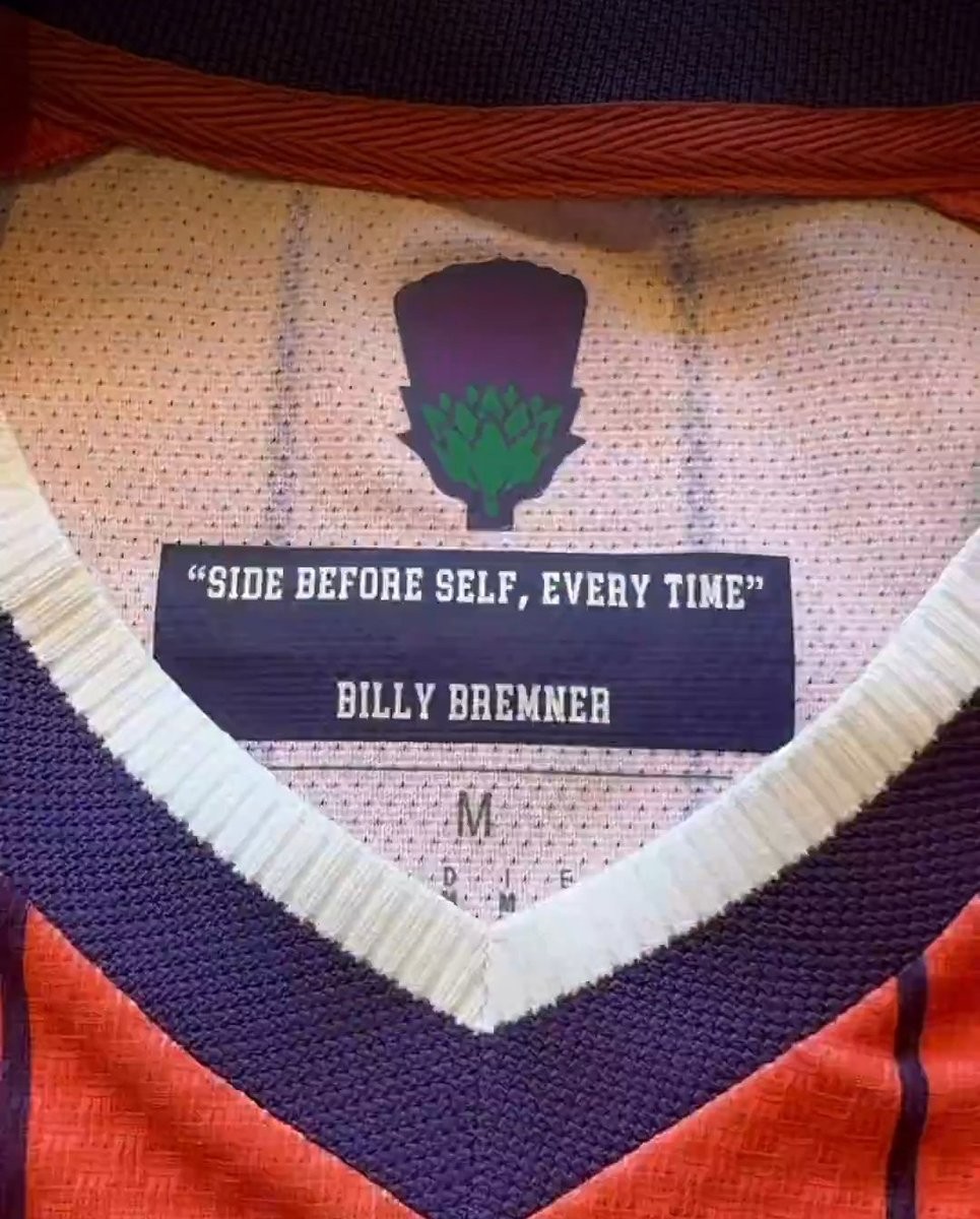
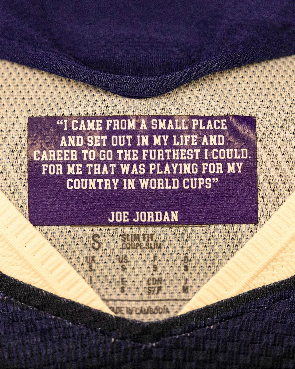
Scotland Add Motivational Phrases to 2026 World Cup Kits
The Scottish national team's equipment staff have taken an extra step to inspire their players during the 2026 World Cup by adding motivational phrases to the inner collar of their match shirts.
This initiative is part of the broader "Choose Scotland" campaign, which features messaging such as "You can’t choose where you’re born but you can choose who you stand with."
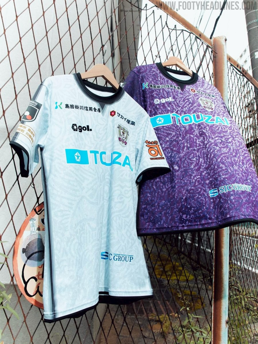
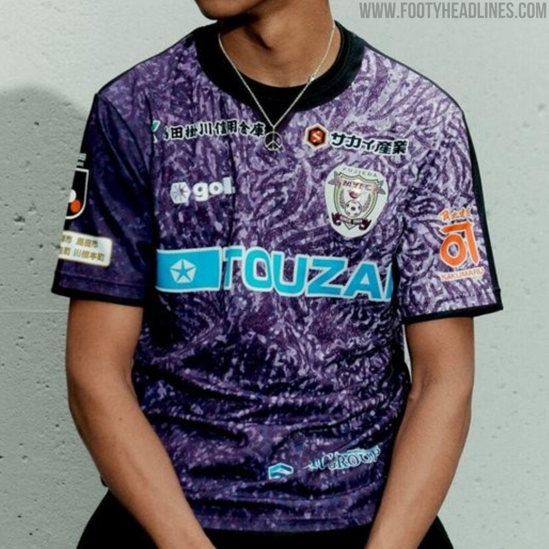
Fujieda MYFC 26-27 Kits Released
Japanese J2 League club Fujieda MYFC have officially unveiled their new 2026-27 kits, produced by sportswear brand Gol. Designed under the theme "Merge," the new shirts symbolize the fusion of the ball, boots, players' spirit, fans, and partners uniting for the upcoming season. The collection features bespoke graphic patterns across the home, away, and goalkeeper jerseys, with sponsor logos cleanly integrated throughout the designs. The new Fujieda MYFC 2026-27 kits will be available to purchase starting in late June 2026 via the official J.League online store.
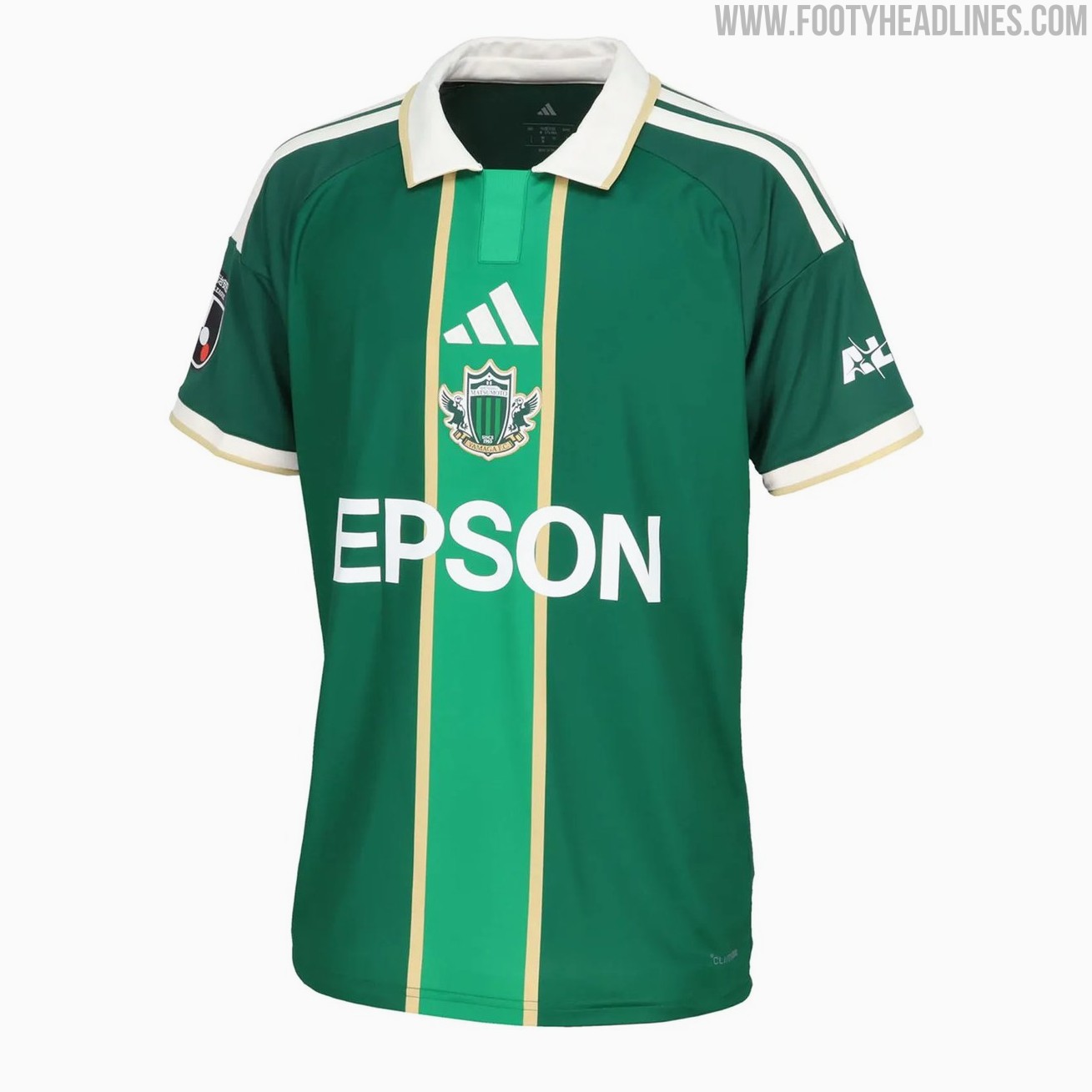
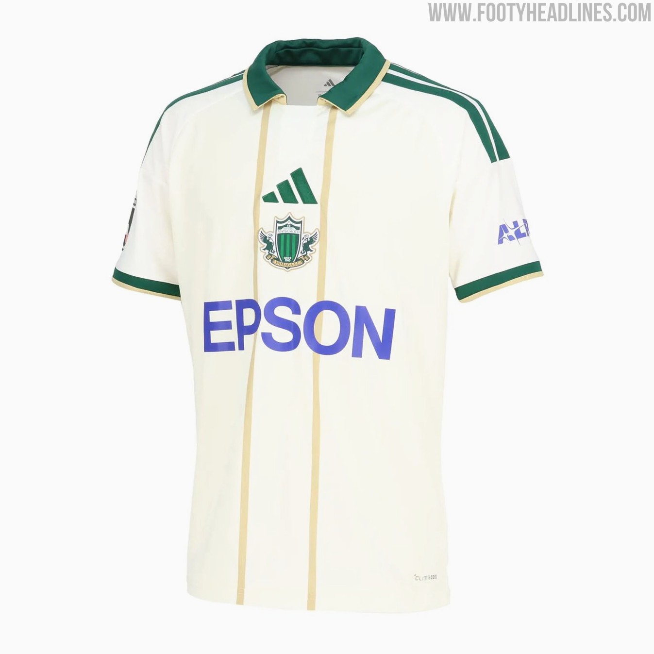
Matsumoto Yamaga 26-27 Home & Away Kits Released
Japanese J3 League club Matsumoto Yamaga FC have revealed their new 2026-27 home and away kits. The new Adidas Matsumoto Yamaga 2026-27 shirts introduce bespoke designs for the club.