LASK Present New Logo - Too Simple?
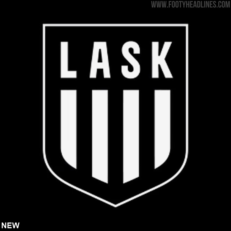
Along with their new 23-24 kits, LASK recently unveiled their new brand identity, including a reworked logo. Here is a closer look.

New LASK Logo
Here is a side-by-side comparison of the new logo with its predecessor.
Firstly, the shield shape was retained, with the top going from rounded to flat. The four vertical black stripes at the bottom half are also retained, but slightly elongated.
A new font was developed for the club's brand, which is used for the team's intitials 'LASK'. Rather than having a red 'L', the entire lettering is black this time around.
Lastly, the small flag crest at the top was removed entirely from the new logo. The exclusively black and white color scheme allows for a great reversible design.
What do you think of LASK's updated logo? Is it better than the old version? Comment below.
Vintage Football Shirts
from Cult Kits
2015/16 Hamburg Training Jacket (M) Adidas

2005/06 Piacenza #1 GK Shirt (XL*) Macron

2019/20 Inter Milan Lautaro #10 Third Shirt (S) Nike

1996/98 Adidas (Germany) Kopke #1 Template GK Shirt (S)

2004/05 Real Madrid Raul #7 *Player Issue* Home Shirt (L) Adidas

2008/09 Juventus Del Piero #10 *BNWT* Away Shirt (M) Nike

2007/08 Sheffield United Hendrie #11 *Match Worn + Squad Signed* Home Shirt (M) Le Coq Sportif

2015/16 Internacional 1/4 Zip Fleece Top (XL.Kids) Adidas

2004/06 France Zidane #10 Home Shirt (M) Adidas

2007/08 Chelsea Lampard #8 Away Shirt (M) Adidas
River Plate 1996 Remake Jacket Leaked
Adidas will release a River 1996 remake kit + collection in 2026. Now, we can exclusively another piece of the collection, a track jacket.
See the full River Plate 1996 remake collection: https://www.footyheadlines.com/2026/02/adidas-river-plate-1996-remake-home-kit.html
AS Saint-Étienne 1976 European Cup Final Remake Kit Revealed
Exactly 50 years to the day after the famous European Cup final in Glasgow, Le Coq Sportif has released a special limited-edition reissue of the iconic AS Saint-Étienne 1976 kit. Paying tribute to the legendary Dominique Rocheteau, the brand has meticulously reproduced his number 7 jersey directly from their Romilly-sur-Seine workshops. The retro green shirt faithfully maintains the original cut, material, and classic blue-white-red tricolor collar of the era.
The limited collection is available soon via the official Le Coq Sportif web store. It features a long-sleeved version retailing for €110, a short-sleeved option for €89, and a matching track jacket priced at €190.
AS Saint-Étienne 1976 European Cup Final Remake Kit Reveled
Exactly 50 years to the day after the famous European Cup final in Glasgow, Le Coq Sportif has released a special limited-edition reissue of the iconic AS Saint-Étienne 1976 kit. Paying tribute to the legendary Dominique Rocheteau, the brand has meticulously reproduced his number 7 jersey directly from their Romilly-sur-Seine workshops. The retro green shirt faithfully maintains the original cut, material, and classic blue-white-red tricolor collar of the era.
The limited collection is available soon via the official Le Coq Sportif web store. It features a long-sleeved version retailing for €110, a short-sleeved option for €89, and a matching track jacket priced at €190.
All-New Ligue 3 Revealed
The French Football Federation (FFF) has officially announced the launch of the fully professional "Ligue 3" for the upcoming 2026-2027 season, permanently replacing the current third-tier Championnat National. This historic move marks the first time the FFF will directly organize a professional men's league.
As part of this major restructuring of the French football pyramid, the lower divisions will also be renamed for better clarity: the current National 2 will become National 1, and National 3 will shift to National 2. The newly formed 18-team Ligue 3 aims to bring greater financial stability, technological innovation such as a coaches' video challenge system, and increased exposure to the division, with all 309 matches set to be broadcast exclusively on the Ligue 1+ platform.
To mark this monumental transition, the FFF has also introduced a completely new visual identity for the competition. The rebranding is centered around a modern logo that combines the rectangular shape of a football pitch with the tiered structure of a stadium grandstand. This design visually embodies the league's new official slogan, "Terrain de rencontres" (Meeting Ground), aiming to highlight the intersection of professional ambition and popular, locally rooted football.
Kappa San Martín de Tucumán 26-27 Home & Away Kits Released
The Kappa San Martín de Tucumán 2026-2027 home and away kits were launched today, showing off the Argentine club's visual direction for the upcoming campaign.
The home jersey embraces a highly traditional aesthetic, featuring the team's iconic thick red and white vertical stripes, a solid red v-neck collar, and contrasting black text for the Kappa logo and "Caja Popular de Ahorros" main sponsor.
In stark contrast, the away kit introduces a sleek and modern look, utilizing a dark charcoal grey base with subtle tonal vertical bands. To maintain a strong connection to the club's heritage, the alternate shirt is sharply accented with vibrant red detailing on the collar and sleeve cuffs, alongside crisp white branding.
Uniqlo J.League All-Stars 2026 Kits Released
The J.League has officially unveiled the uniforms for the
upcoming 2026 All-Star DAZN Cup, produced in a unique collaboration with
Japanese retail giant Uniqlo and exclusively designed by Francesco Risso.
The bold aesthetic of the All-Star collection is deeply rooted in heritage,
utilizing a traditional Japanese ink-marbling technique known as "suminagashi"
to create a fluid, organic pattern across the fabric. The shirts carry a deeper
meaning as a "garment of gratitude," featuring a special bow-style motif on the
back that symbolizes the strong connection tying together the league's players,
staff, and passionate supporters. To ensure all fans are represented, the
collection drops in six distinct colorways mapped to the tournament's division
brackets. The top-flight J1 teams will wear red (East) and blue (West), while
the combined J2 and J3 divisions are split into four regional subgroups: light
blue (East-A), green (East-B), yellow (West-A), and purple (West-B).
Players will also use a special custom match ball produced by Sfida,
which boasts a nostalgic design heavily inspired by the iconic football anime
Captain Tsubasa.
Which of the six suminagashi colorways from this
Francesco Risso-designed collection is your favorite? Let us know in the
comments.
Al-Nassr Gives Away Free Adidas Shirts to Every Fan in Stadium
For the crucial Saudi Pro League clash against Al Hilal SFC, Al Nassr made something special. To boost morale and strengthen the sense of unity, the club gave free team shirts to every fan attending the match (no match kits but training shirts).
Liverpool 26-27 1994 Jersey Leaked
Adidas will release a Liverpool 2026-2027 Lifestyler jersey based on the Adidas 1994 template. The same model will be given to all Adidas elite teams. This is not a remake but an alternate history.
See the others here:
https://www.footyheadlines.com/2026/04/arsenal-26-27-lifestyle-shirt.html
https://www.footyheadlines.com/2026/04/real-madrid-26-27-lifestyle-shirt.html
https://www.footyheadlines.com/2026/04/blog-post_25.html


