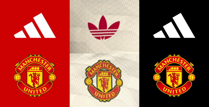
West Ham Have an Aston Villa Kit, Aston Villa Have a Burnley Kit and Burnley Have a West Ham Kit
 Jul 16, 2023, by Chris

The 2023-2024 Premier League season will see three teams wearing very similar colored kits.

West Ham Vs Aston Villa Vs Burnley 23-24 Home Kits
As spotted by many fans, the new Aston Villa, Burnley, and Aston Villa kits all have a claret body and blue sleeves. Each of the clubs had been wearing these colors since their early days.
Three claret and blue teams play in the Premier League next season

What is unusual is that all three claret and blue teams are playing in the Premier League in the same season.
All have betting sponsors
It is a coincidence that all teams have betting sponsors, making them more alike.
West Ham United FC - Claret and Blue Possibly Because of Company
West Ham United started using claret and blue as their official colors in the early 20th century. The exact reason for choosing these colors is unclear, but there are a few theories. One theory suggests that West Ham adopted the colors due to the influence of Thames Ironworks, the company where many of the club's early players worked. Thames Ironworks also had claret and blue as their colors. Another theory suggests that the colors were chosen simply because they were fashionable at the time.
Aston Villa - Colors From Cricket Club Aston Villa Wesleyan Chapel
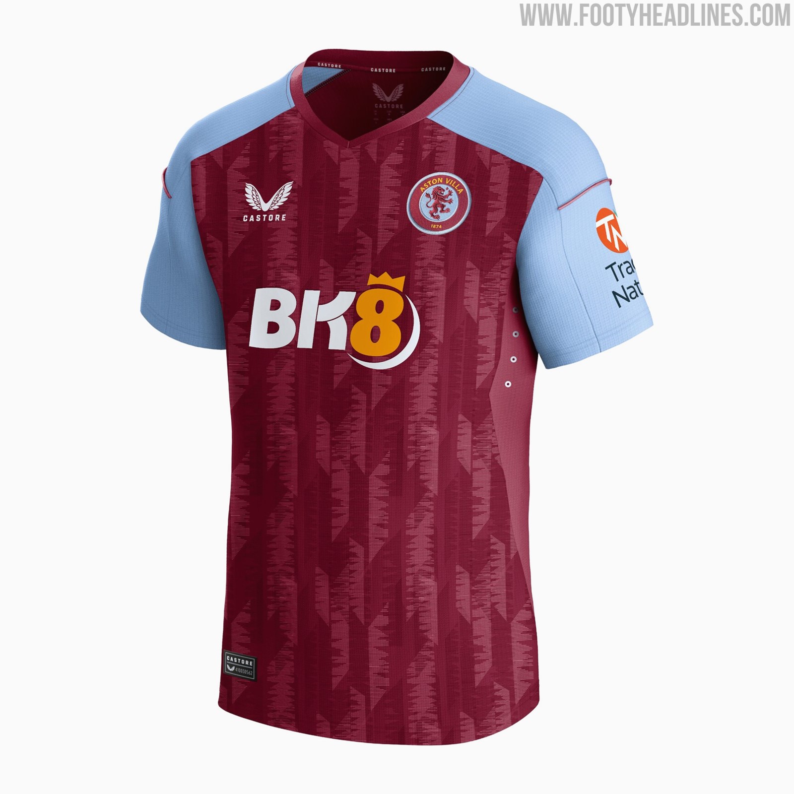
Aston Villa are one of the oldest football clubs in England and has been wearing claret and blue since 1886. The team's founder, William McGregor, was a director of a cricket club called Aston Villa Wesleyan Chapel, which also used claret and blue as their colors. When the football club were formed, they adopted the same colors as a continuation of their heritage.
Burnley FC - Claret & Blue Colors as a Tribute to Aston Villa
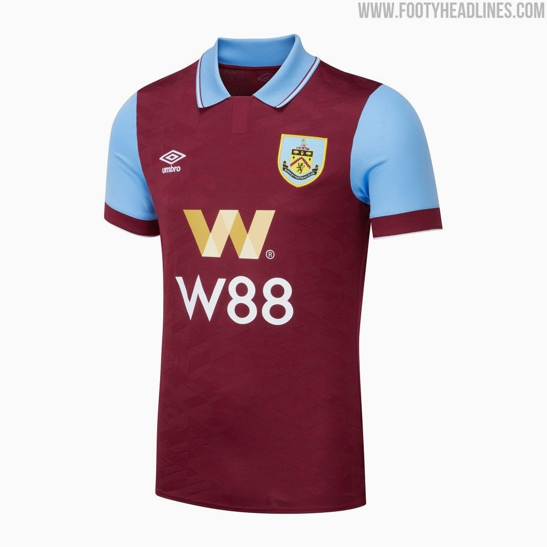
Burnley's team colors of claret and blue date back to the late 19th century. The club adopted these colors as a tribute to their first professional player, Arthur Bellamy, who hailed from the Aston Villa region and had previously played for the Birmingham-based club. Bellamy provided Burnley with the claret and blue kit as a gesture of goodwill.
Scunthorpe United - Reason for Claret & Blue Unknown

The reason behind Scunthorpe United's choice of claret and blue as their team colors is not well-documented. However, it's believed that the colors were adopted in the early years of the club's formation, which can be traced back to 1899. Scunthorpe are playing in the sixth division in the 23-24 season.


Which of the three claret and blue 2023-2024 Premier League kits is your favorite? Let us know in the comments below.
FC Tokyo 26-27 Third Kit Released
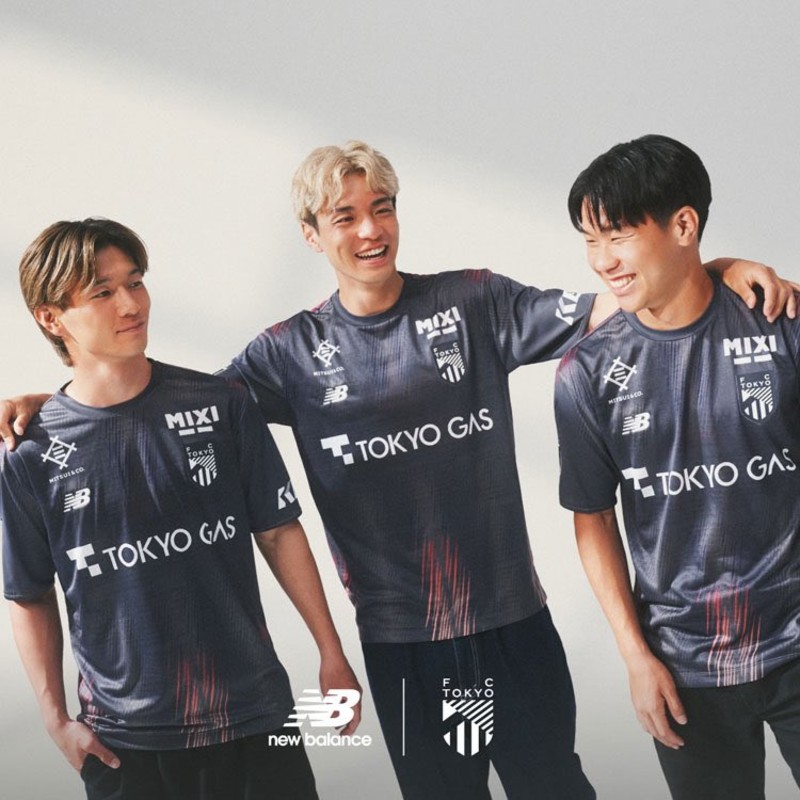
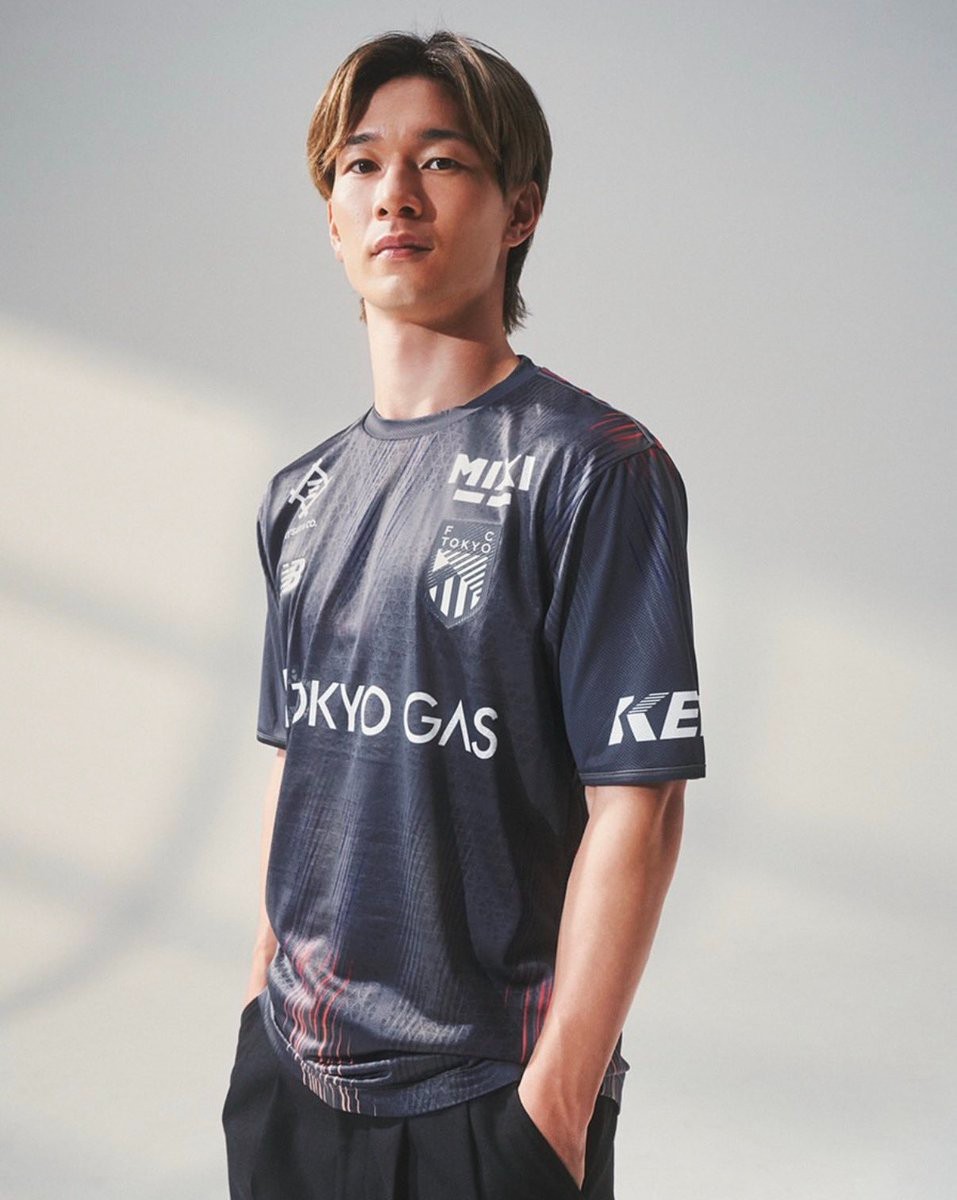
J1 League club FC Tokyo has officially revealed its new 26-27 third kit produced by New Balance. Following the club's full collection unveiled earlier in the summer, the new third uniform builds on the overarching dawn theme with a distinct design concept titled "THE BORDERLESS BALANCE".
The New Balance FC Tokyo 26-27 third shirt combines New Balance's signature gray tone with deep navy to capture the transition from night to dawn over the capital. Subtle red gradient streaks emerge along the shoulders and bottom hem, adding a dynamic accent to the dark base. All sponsor logos and the FC Tokyo crest are applied in clean monochrome white, creating a sleek lifestyle-friendly look.
FC Tokyo will debut the 26-27 third kit in J1 League action in February 2027 against V-Varen Nagasaki and JEF United Chiba.
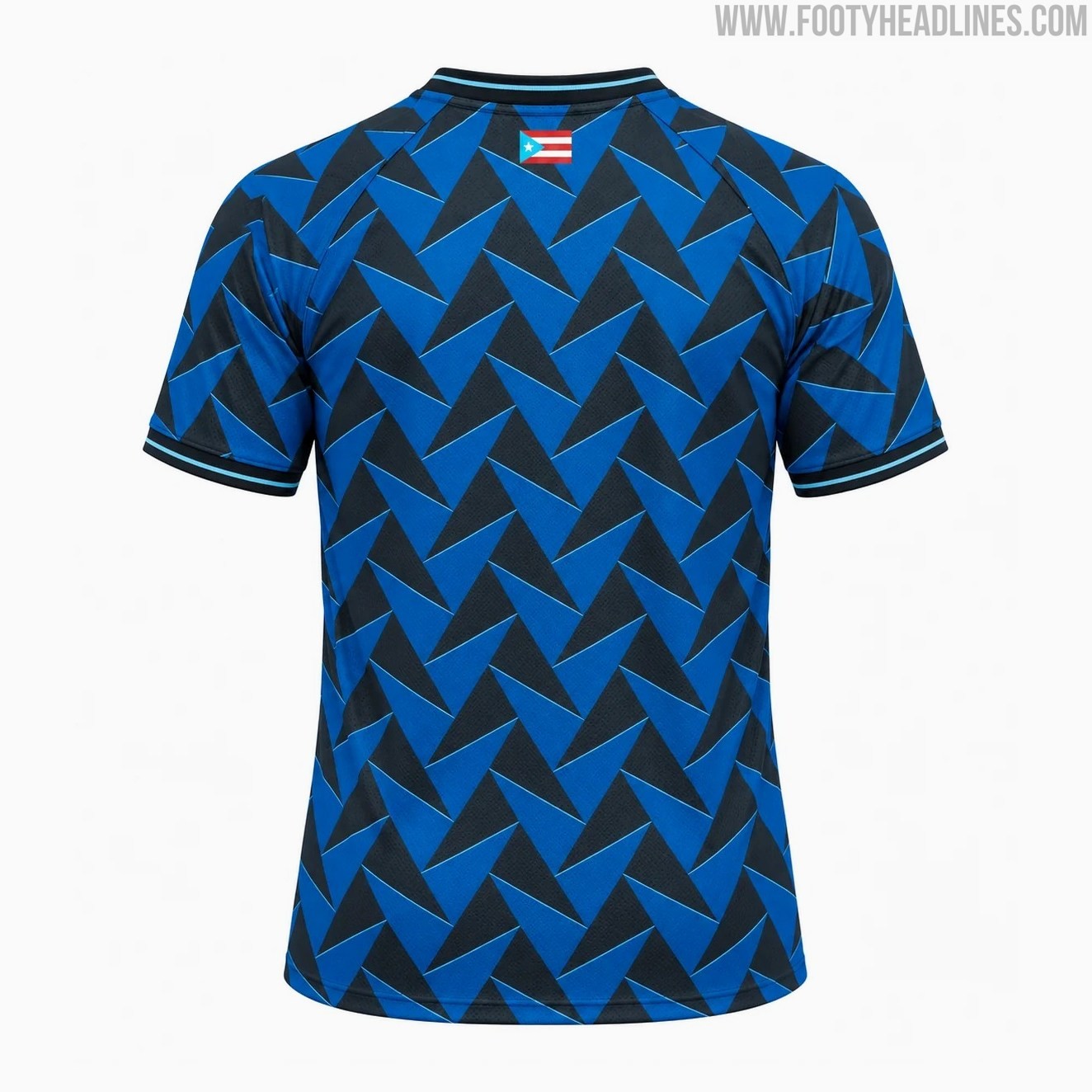
No More Hummel: Stimulus Puerto Rico 2026 Home & Away Kits Released
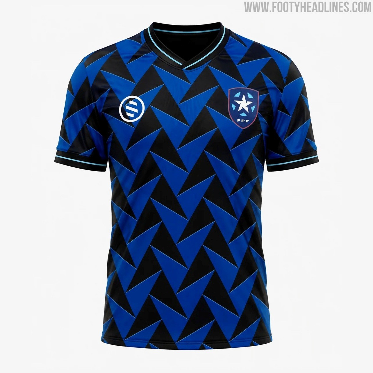
The Puerto Rican Football Federation (FPF) has officially launched its new home and away kits for the 26-27 cycle, marking the beginning of a technical partnership with American sportswear brand Stimulus Athletic. The Minneapolis-based custom kit maker takes over the apparel duties for El Huracán Azul, officially replacing previous supplier Hummel.
The new home shirt boasts a bold geometric pattern in deep blue and black shades, inspired by the historic cobblestones of Old San Juan alongside the luminous glow of Puerto Rico's world-famous bioluminescent bays. The striking mosaic extends across the entire front and sleeves, complemented by subtle teal accents along the collar and cuff trims. Black shorts and blue socks complete the primary uniform.
In contrast, the away jersey provides a crisp white design adorned with details drawn directly from the national flag. It features dynamic red striping down the flanks that fades into a digital gradient towards the hem, flanked by cyan and red accents on the collar and sleeve cuffs. Both shirts are available for $80 through the official FPF online store, alongside dedicated goalkeeper versions.
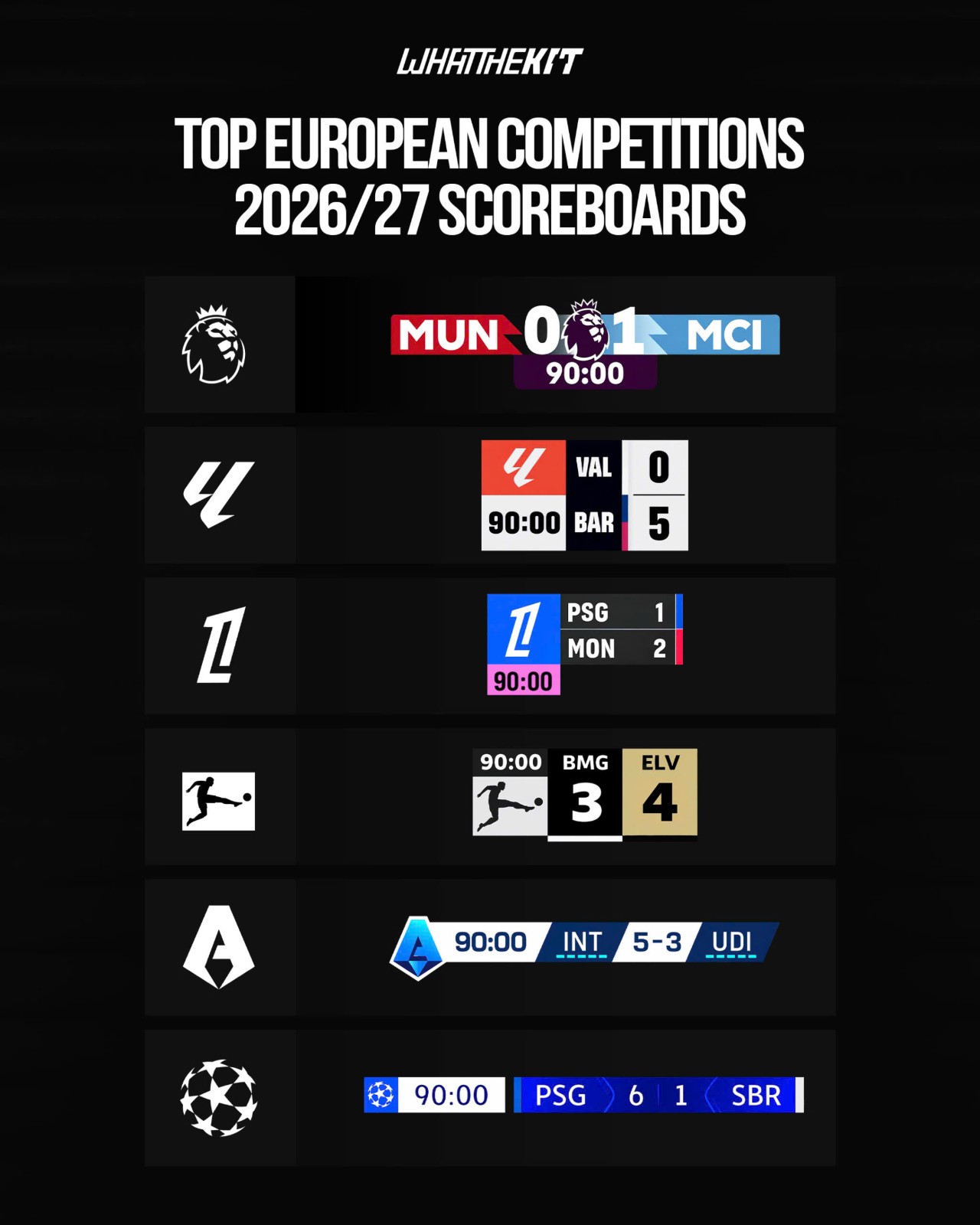
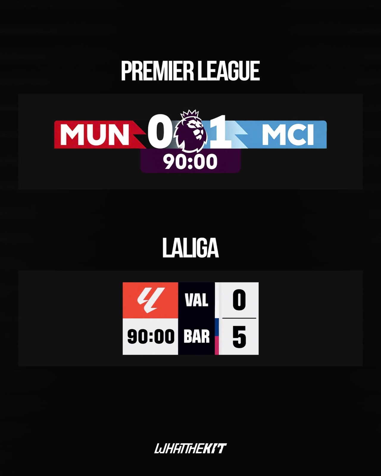
Official 26-27 TV Scoreboard Of Top European Competitions
Following the start of the 26-27 season, we have had a complete view over every official TV scoreboard of the biggest European competitions. Though there are mostly no changes, we can see how many of the top leagues are adapting the current trend of minimalistic designs.
Join us to take a look at current scoreboard graphics from Premier League, LaLiga, Serie A, Bundesliga and UEFA Champions League. Huge thanks to our partner @whatthekit_x for amazing compilation.


Chattanooga Red Wolves Reveal Vibrant Hispanic Heritage Pre-Match Shirt
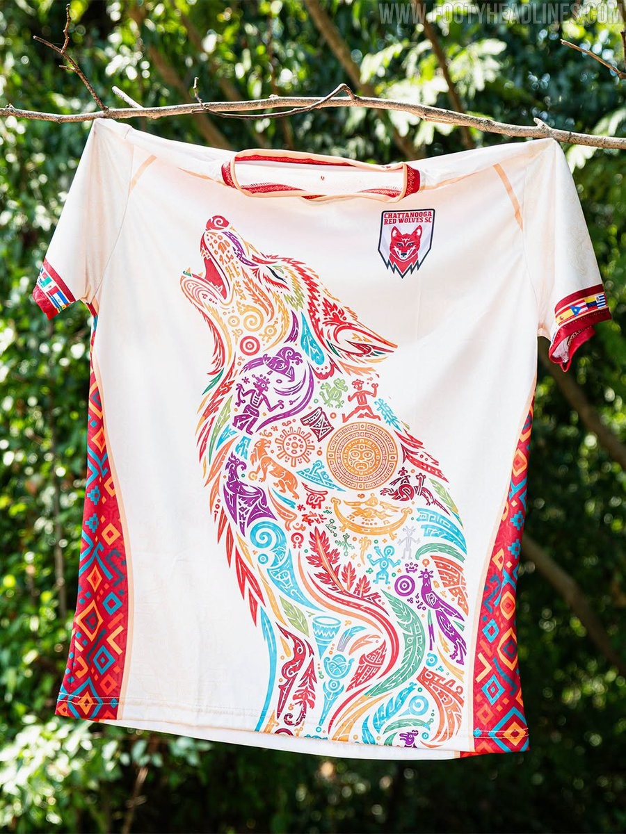
USL League One club Chattanooga Red Wolves SC have unveiled a striking special-edition warm-up top in celebration of Hispanic Heritage Month. Worn ahead of the club's annual Hispanic Heritage Night celebrations, the design pays homage to the rich cultural contributions and traditions of the Hispanic and Latino communities within the local area and across the sport.
Set against an off-white base, the standout feature of the shirt is a massive howling wolf graphic across the front. The silhouette of the club's emblem is brought to life through intricate Mesoamerican and folk art motifs, filled with vibrant shades of teal, red, yellow, orange, and violet. Matching cultural diamond patterns run down the red side panels, while the sleeve cuffs are detailed with horizontal sequences representing various Latin American flags.
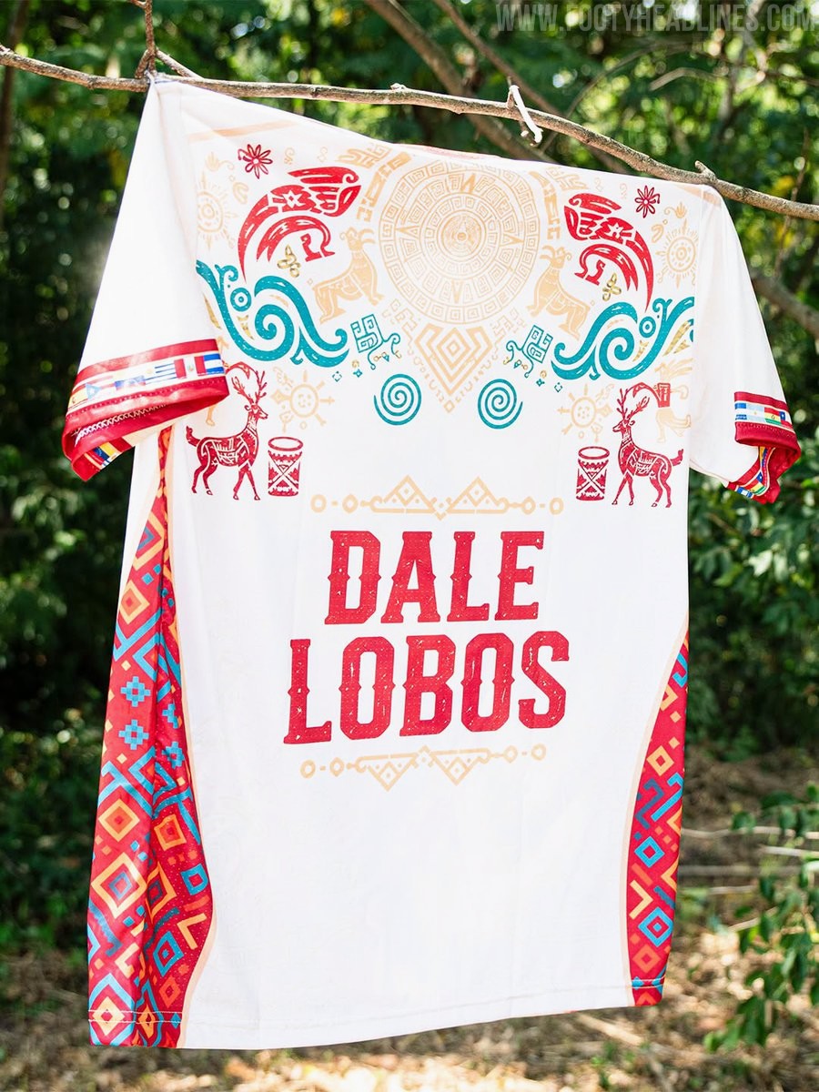
The reverse side continues the celebratory theme with a sun wheel and mythological fauna gracing the upper back. Centered below is the club's rallying cry, "DALE LOBOS," printed in a bold red textured font and framed by geometric borders.
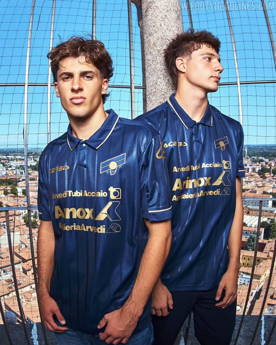
US Cremonese 26-27 Third Kit Released
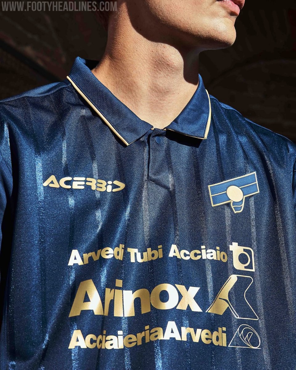
Italian club US Cremonese and technical sponsor Acerbis have officially unveiled their new third kit for the 2026-27 campaign. Designed by Cremona native Carlo Enrico Bonvicini, the jersey is built around a deep navy base enhanced by an alternating pattern of glossy and matte tonal pinstripes for subtle depth.
Elegant golden trim outlines the classic polo collar and sleeve cuffs, complemented by monochrome gold sponsor branding and a reimagined two-tone club crest that references 1980s and 1990s iconography alongside the historical Giovanni Baldesio legend.