Will Minimalist Rebrands Ever Stop?
 Mar 28, 2024, by Phan Tich Giay

- Minimalist Rebranding Trend: Several major sports leagues, including La Liga, Ligue 1, and the Premier League, have adopted minimalist logo designs, removing many of the distinctive elements from their previous logos.
- La Liga & Ligue 1 Changes: Both La Liga and Ligue 1 have recently rebranded with minimalist logos, La Liga abandoning its iconic color wheel for a coral red logo, while Ligue 1 uses an "L1" design which stands for Ligue 1.
- Widespread Adoption: The trend of minimalist logos in sports is not new with the Premier League, changing its logo 8 years ago to a simpler design in which the name Barclays is not included.
Last year, La Liga unveiled a new logo with a minimalist design style. A year later, Ligue 1 announced a new brand identity with a similarly designed logo. However, these new logos have lost the inherent identity of these two major tournaments. Will minimalist rebranding ever stop?

Will Minimalist Rebrands Ever Stop?
Both the new La Liga and Ligue logos have a minimalist design style and have removed the previously highly recognizable details (La Liga has removed the color wheel, Ligue 1 the silver trophy).
The new logo is not easy to recognize as La Liga & Ligue 1
Ligue 1 2024-25 Logo

The new Ligue 1 24-25 logo is a combination of the letter L and the number 1 (the abbreviation for Ligue 1) with the full word Ligue 1 underneath.

LaLiga 2023-2024 Logo

The new LaLiga logo ditches the iconic color wheel that has been there for 30 years. Instead, the new logo will feature a coral-red color. The coral color (officially Pantone Red 032C) is symbolizing the passion, energy, and excitement of football.

Not only Ligue 1 and La Liga, but also the Premier League changed its logo to a minimalist design style 8 years ago.
2016-2017 Premier League Logo

The new Premier League logo for the 2016-17 season onwards features an all-new design that comes without Barclays name after Premier League announced to remain sponsorless from the 2016-17 season.

All-New Premier League Logo Unveiled - Sleeve Patch Revealed
Do you like the minimalist design? Will minimalist rebrands ever stop? Comment below.


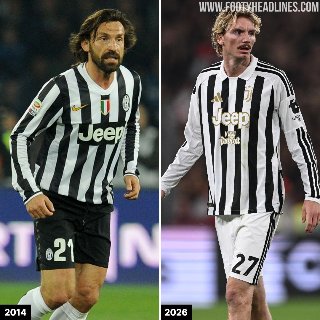
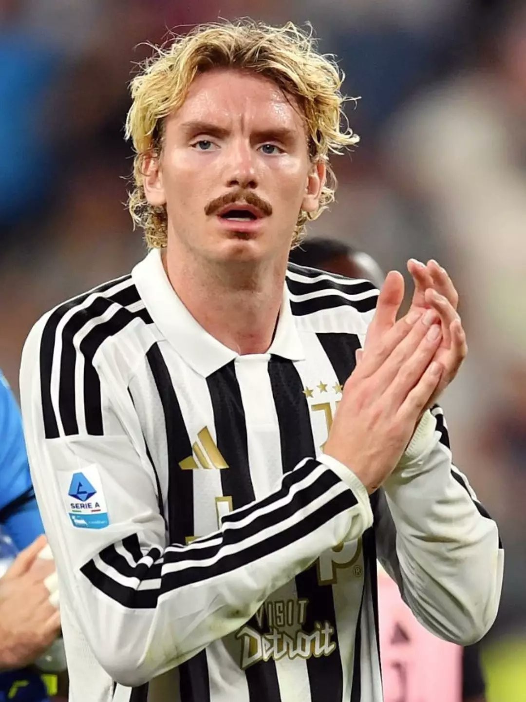
First Time in 12 Years: Juventus Bring Back Long-Sleeved Kits on Pitch
Making his Juventus debut in the match against AC Milan, Nick Woltemade was the only Juventus player on the pitch wearing long sleeves. Excluding special-edition kits, the German strike became the first Bianconeri player made this choice since Andrea Pirlo and Claudio Marchisio back in the 13-14 season.
Remarkably, even Cristiano Ronaldo, a long-sleeve icon, never wore one during his time in Turin.
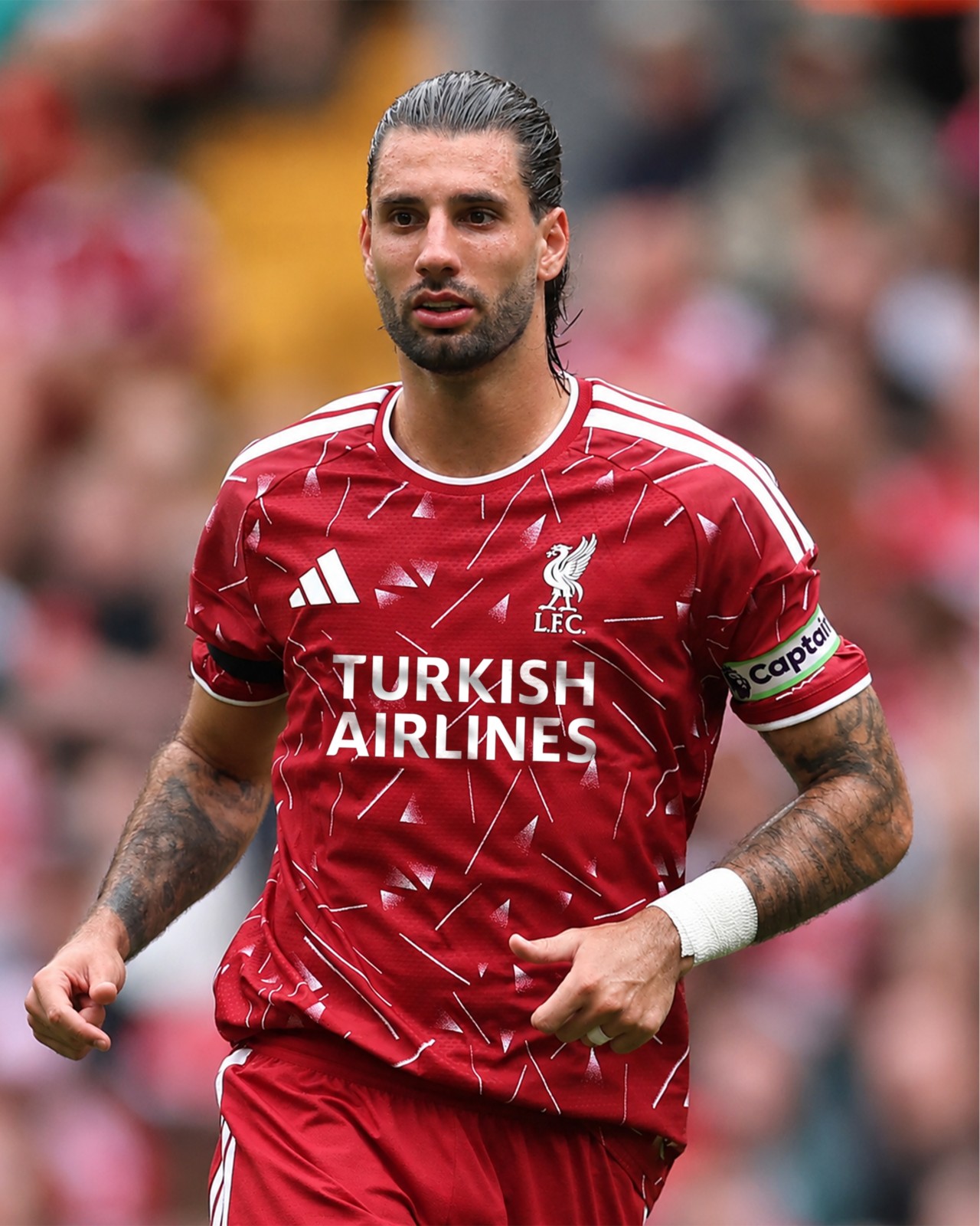
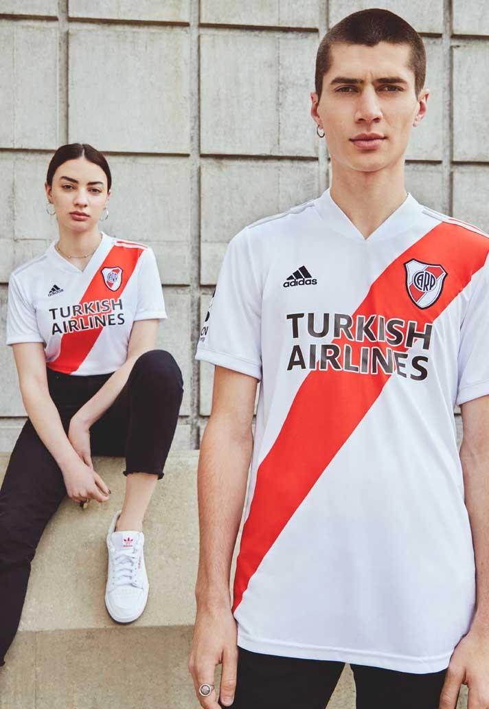
Liverpool Could Use a Text-Only Turkish Airlines Sponsor?
Liverpool have announced that Turkish Airlines will become the club's new shirt sponsor from the 2027-28 season, ending the Reds' 17-year partnership with Standard Chartered.
While early fan concepts have used Turkish Airlines' familiar circular bird logo above the wordmark, a text-only sponsor could also be a realistic option.
The airline previously used a simplified two-line “TURKISH AIRLINES” wordmark on River Plate's shirts between 2019 and 2022, while Turkish clubs such as Galatasaray and Samsunspor have also used streamlined typographic versions of the branding.
A text-only layout could give Liverpool's future Adidas shirts a cleaner, less crowded look. The final sponsor application has yet to be confirmed, with the partnership set to begin in June 2027.