Manchester United 25-26 Pre-Match Shirt Leaked - Official Pictures
 May 26, 2025, by Chris

- Shirt Details: The Manchester United 25-26 pre-match shirt, manufactured by Adidas, features a bold geometric pattern with jagged black shapes on a vibrant red base.
- Design Inspiration: The pre-match shirt's pattern is largely derived from the 25-26 away shirt, similar to the approach taken last season.
- Additional Features: The shirt includes a simple red crew neck collar, the standard Manchester United crest, and a white Adidas logo in its usual position.
Update: Footy Headlines now can leak the official pictures of the Manchester United 25-26 pre-match shirt.

Manchester United 25-26 Pre-Match Shirt
This is the Manchester United Football Club 2025-26 pre-match jersey, made by Adidas.

The Adidas Manchester United 2025-2026 pre-match jersey features a bold geometric pattern with jagged black shapes across a vibrant red base. This angular, lightning-like graphic creates a dynamic look that stays true to United's traditional color scheme while adding visual interest.

the pattern is largely derived from the 25-26 away shirt
Indeed, the pattern is largely derived from the 25-26 away shirt, similar to last season.


The design includes a simple red crew neck collar, the standard Manchester United crest, and a white adidas logo in its usual position.


Manchester United 24-25 Away Kit & Matching Pre-Match


Manchester United 24-25 vs 25-26 Pre-Match Shirt

Adidas 25-26 Pre-Match Shirts


Check out classic Manchester United kits on Football Kit Archive

Made by Adidas. Are you a fan of Manchester United's pre-match football shirt? Comment below.
Clean Single-Sponsor Adidas Bali United 26-27 Away Kit Revealed
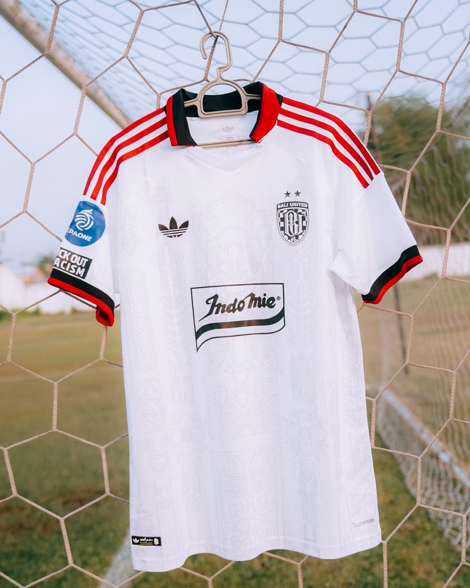
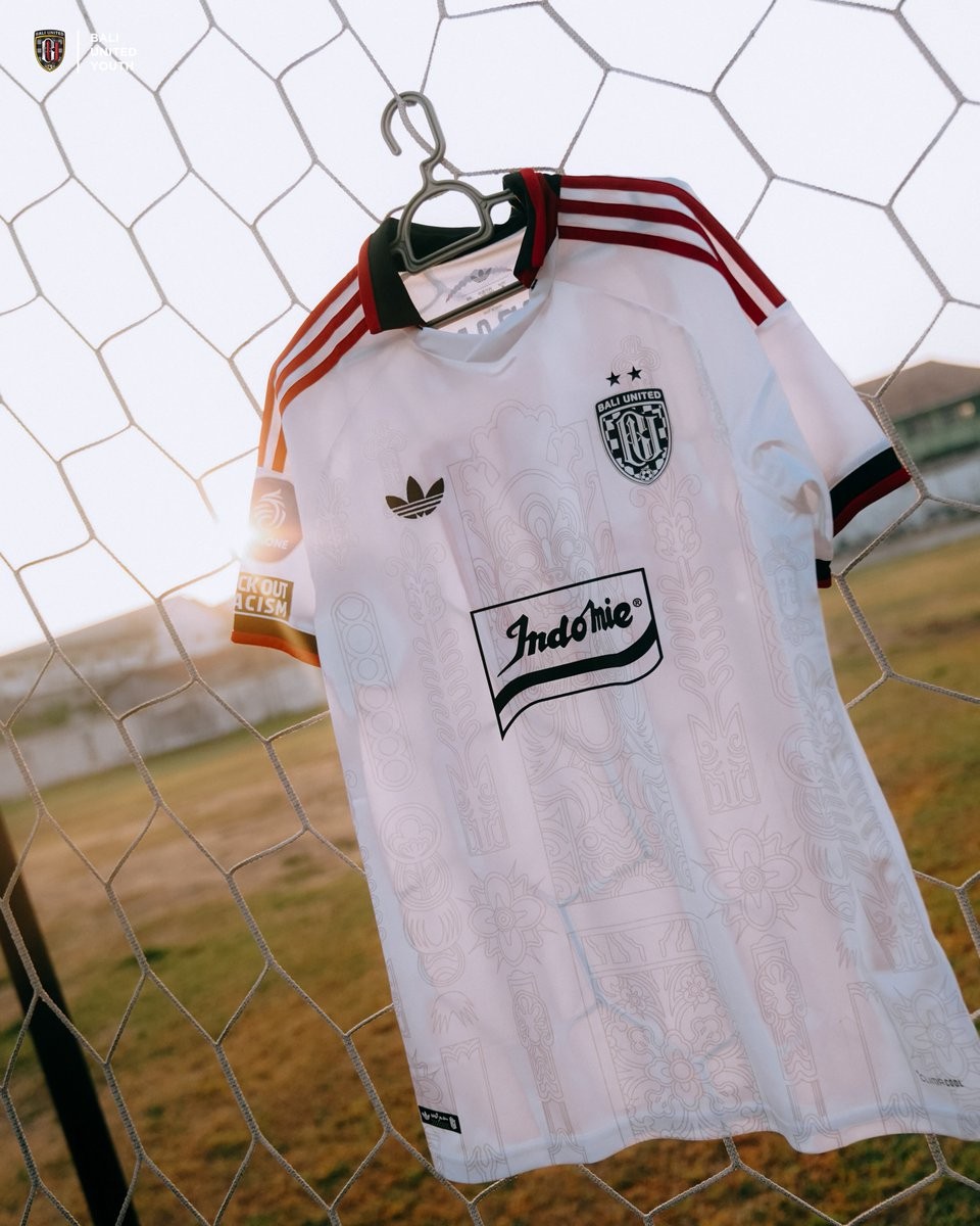
A much cleaner, single-sponsor edition of the Bali United 26-27 Adidas Trefoil away kit has been revealed, providing fans and kit enthusiasts with the simplified look they have been asking for. While Bali United's senior team away kit carries an array of commercial partner logos across the front in typical Indonesian league fashion, this streamlined version has been produced specifically for the club's youth squads in the Elite Pro Academy 26-27 campaign.
The shirt retains the exact artistic foundation crafted by Adidas Indonesia in collaboration with local Balinese artist Dewa Gede Raka Jana Nuraga (Rakajana). Subtly sublimated across the white fabric are intricate cultural graphics inspired by Hanoman and traditional Balinese Lamak motifs. The look is framed by a black folded collar with vibrant red piping, matching red three stripes running down the shoulders, and the classic Adidas Trefoil logo on the chest opposite the monochrome Bali United crest.
The defining difference lies in the chest sponsor execution. Instead of several crowded sponsor patches, the front features only the retro-styled Indomie banner logo in black and white. Finished with the official EPA One competition sleeve badge and an anti-racism campaign patch, this academy variant delivers a vastly superior, retro-focused visual balance that highlights the Trefoil design.

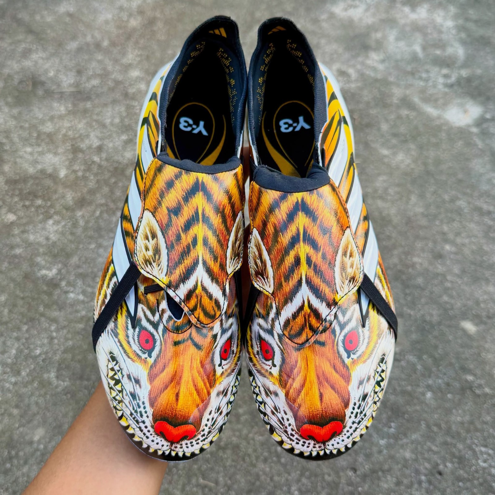
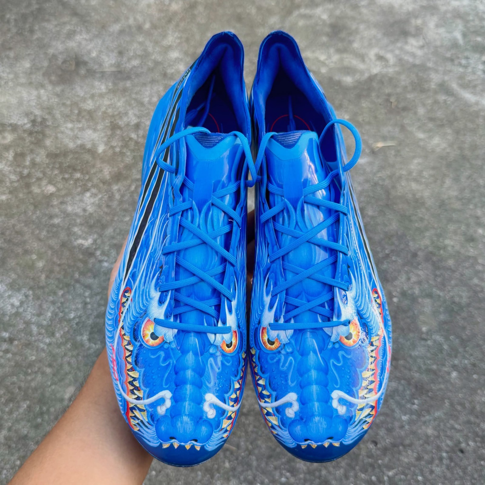
Adidas Y-3 2026 Boots Pack Leaked - Predator 'Tiger' & F50 'Dragon'
Adidas is set to release a special-edition Y-3 football boot collection in late 2026, bringing back the iconic creature motifs first introduced during the 2006 World Cup in the +F50 Tunit Beast Pack designed by Yohji Yamamoto. Huge thanks to RKID for the images.
The upcoming pack features an Adidas Predator wrapped in a fierce all-over tiger graphic across the upper alongside an Adidas F50 finished in a striking blue dragon design complete with scaly artwork.
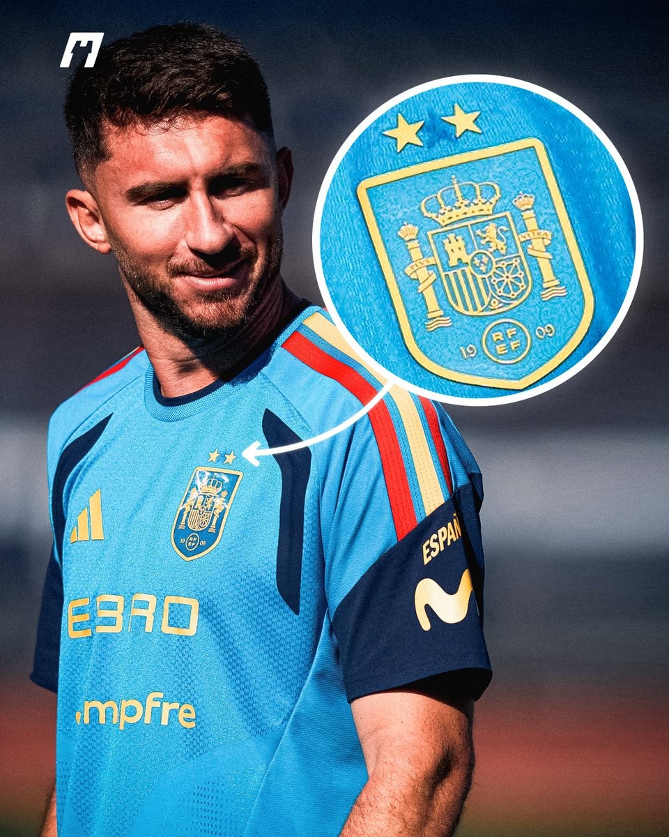
Adidas Modifies Spain Training Kits with Makeshift Two Stars
Following Spain's triumph at the 2026 World Cup, which secured their second global title, Adidas officially updated the national team's match kits with two gold stars and the central FIFA World Champions badge. However, a closer look at the squad's recent training camp reveals that a makeshift approach was taken for their daily training gear. Huge thanks to What the Kit for the great spot.
Instead of producing new batches of training shirts, Adidas and the Spanish federation chose to repurpose existing stock. Detailed photographs of defender Aymeric Laporte in the blue training top clearly show that the original single star above the crest was peeled away, with two smaller stars heat-pressed onto the fabric above the shield. The faint adhesive imprint and outline of the removed single star remain visibly stamped into the fabric.
While fans can purchase proper factory-made two-star home and away match shirts, the national team's training apparel provides an intriguing look at equipment room logistics at the highest level. Modifying already produced gear reduces waste, so it is actually a good act.
Close-Up Look: Adidas Predator Touch 1996 Remake Boots Leaked
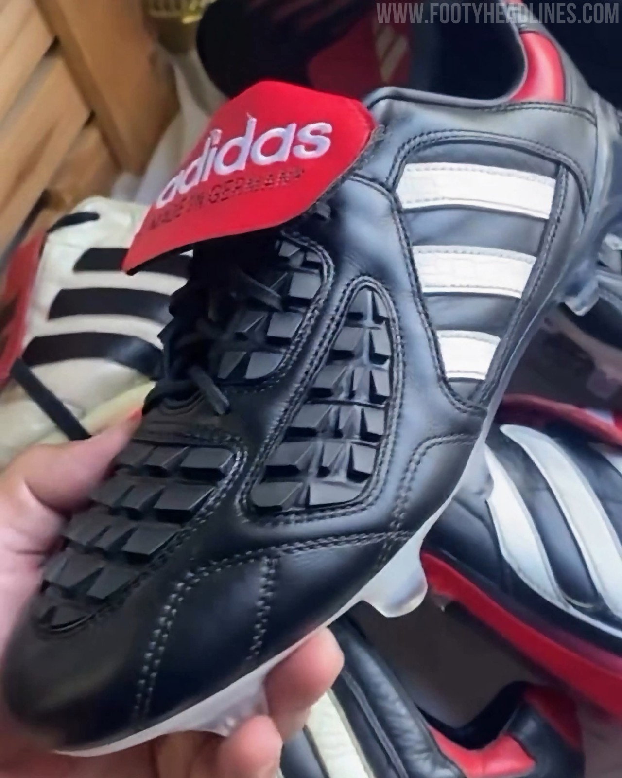
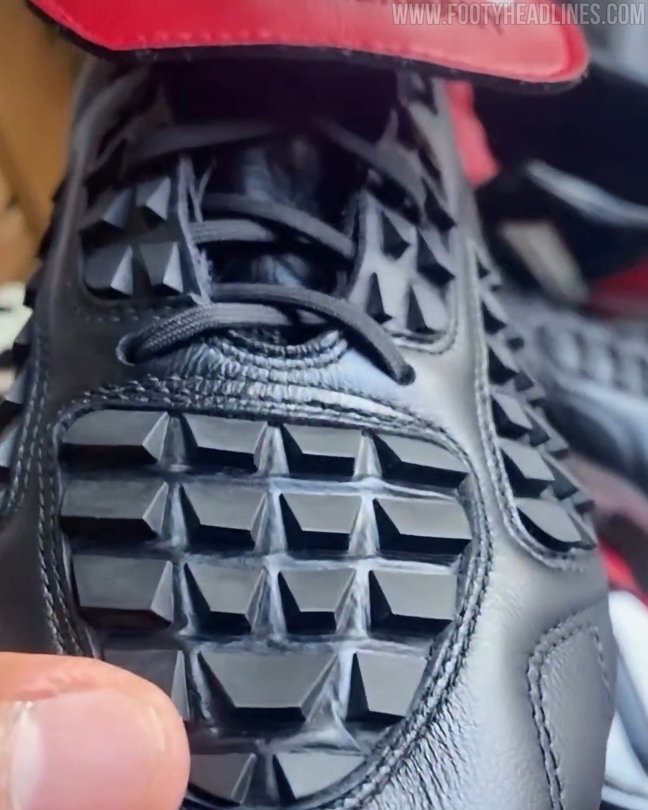
Following its recent on-pitch appearance during training with Germany head coach Jürgen Klopp, new close-up images have surfaced providing the most detailed look yet at the upcoming Adidas Predator Touch 2026 remake boots. Celebrating 30 years since the iconic model made its debut at Euro 1996, the reissue faithfully revives the original's classic black, white, and red design, highlighted by a premium leather upper, directional rubber grip fins across the vamp, and the silhouette's signature oversized red fold-over tongue. The heritage upper is combined with a modernised Predator soleplate for elite performance, with a limited-edition launch scheduled for November 2026.
Adidas Originals Fenerbahçe 26-27 Goalkeeper Kit Released
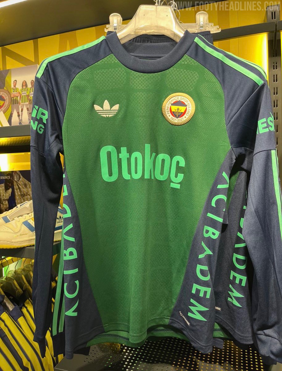
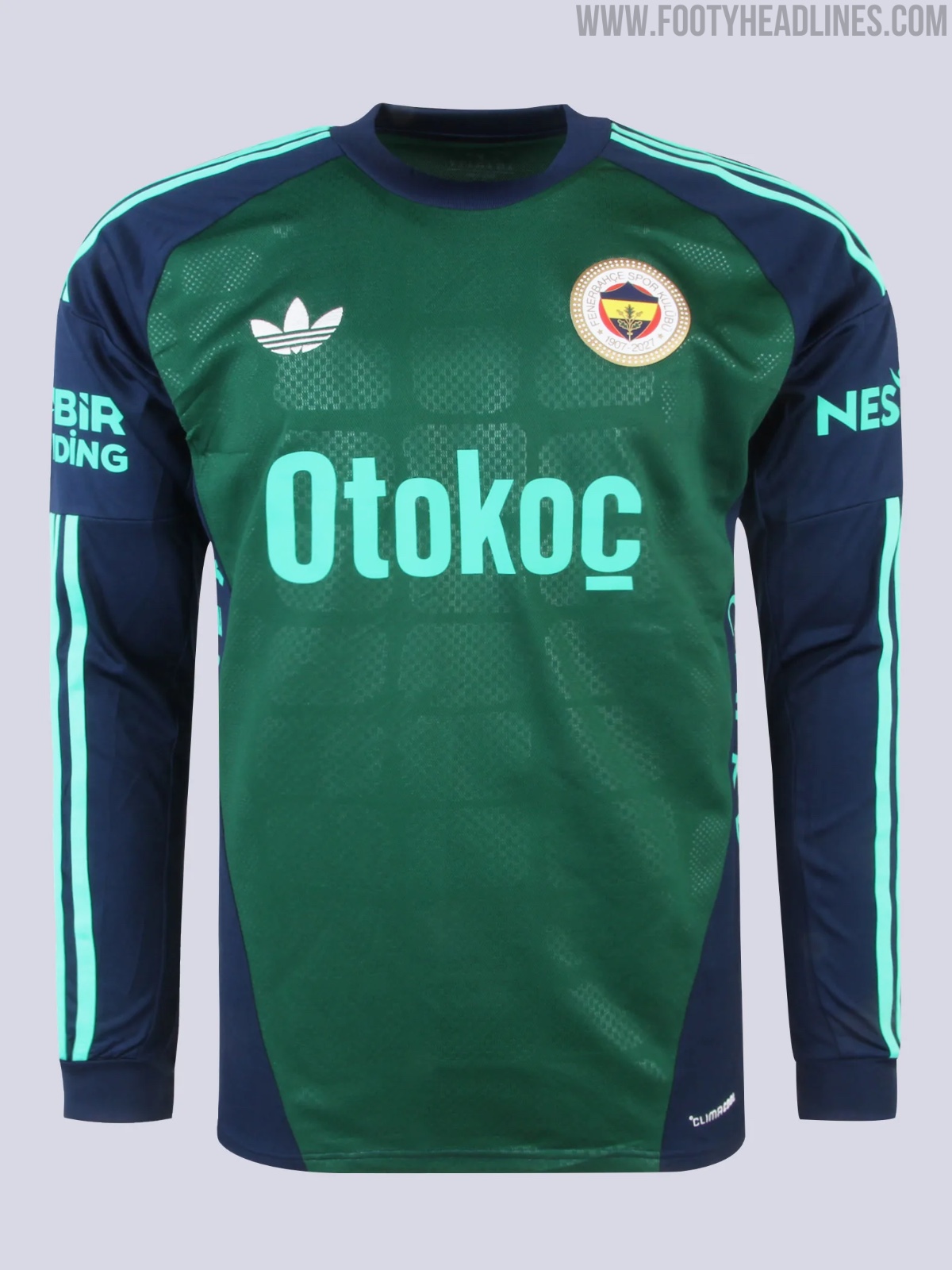
Fenerbahçe and Adidas have officially released the green 26-27 goalkeeper kit featuring the iconic Trefoil logo. Designed as part of the Turkish club's away gear, the long-sleeved green and navy template worn by goalkeeper Ederson Moraes has now gone on sale in both the club's flagship Fenerium Maraton store and online via Fenerium for 6,999 TL.

David Beckham Teases New Adidas Predator 26 Signature Boots
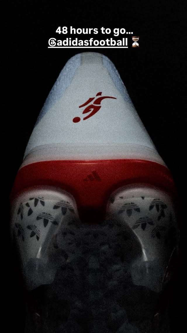
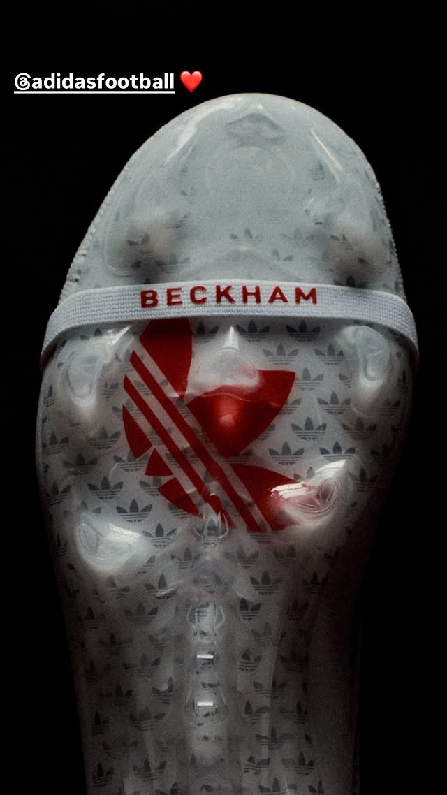
David Beckham has taken to Instagram to tease his upcoming Adidas Predator 26 signature football boots. Sharing close-up preview shots to his story alongside a "48 hours to go..." countdown tagging Adidas Football, the England legend provided the first official glimpse of the boots ahead of their imminent release on Tuesday, October 6.
Following previous signature editions in 2024 and 2025, this 26-27 release marks the third consecutive year that Adidas has honored Beckham with a bespoke Predator model. The cleat features a clean white and vibrant red palette inspired by England. Prominently displayed in the teaser images are Beckham's iconic free-kick silhouette on the heel, custom "BECKHAM" lettering across the elastic tongue strap, and a bold red Adidas Originals Trefoil visible through the translucent soleplate beneath an all-over Trefoil pattern.
Built on the standard Predator 26 silhouette with a classic fold-over tongue, the boot balances modern performance technology with nostalgic heritage styling. The timing of the launch also aligns with the 25th anniversary of Beckham's famous stoppage-time free-kick against Greece on October 6, 2001, capping off a major commemorative week for the brand and its long-time ambassador.

Amiens SC Add Pink Details to 26-27 Home Kit for Pink October
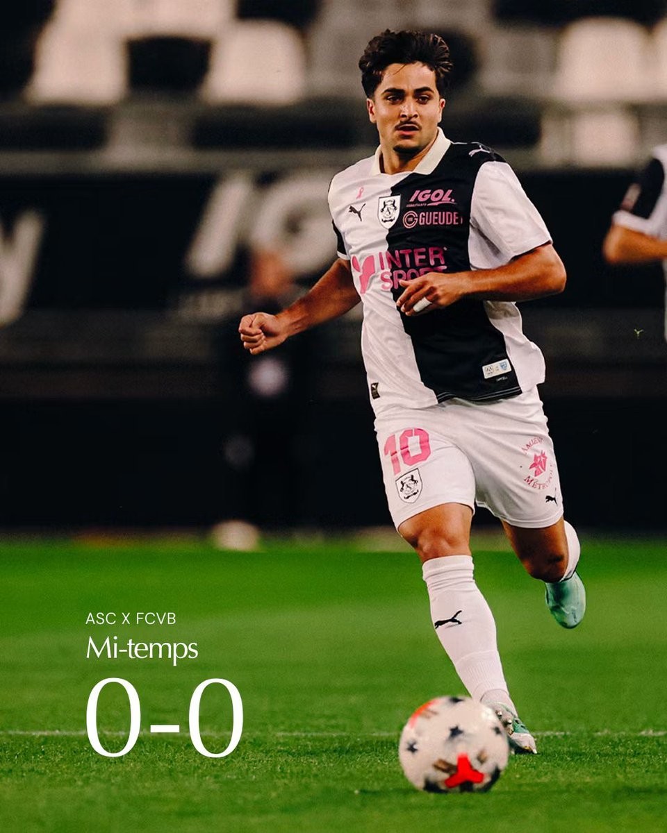
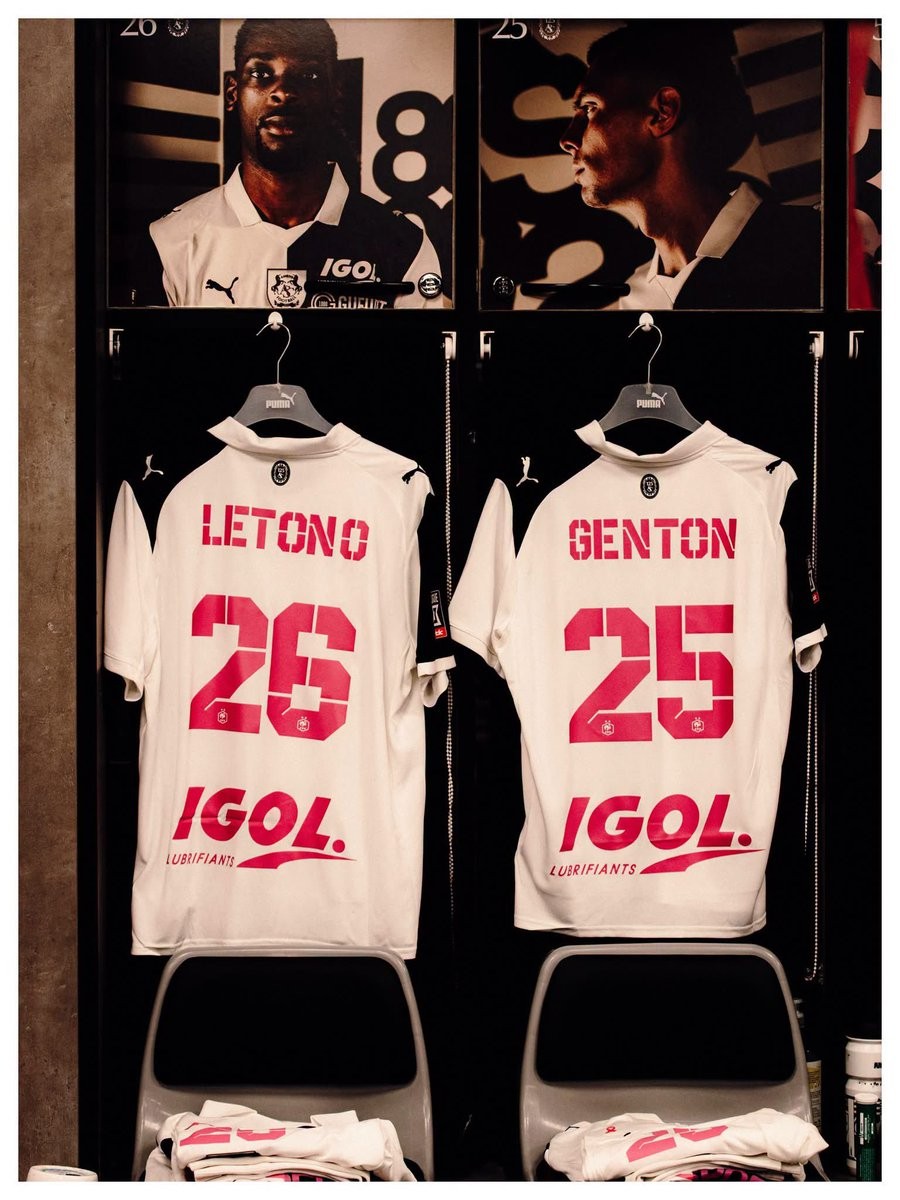
French side Amiens SC have introduced a special update to their 26-27 Puma home kit in support of the annual Octobre Rose (Pink October) breast cancer awareness and screening campaign. Debuted during their 3-0 victory against FC Villefranche at the Stade Crédit Agricole de la Licorne, the club's traditional black-and-white halved home strip was revamped with vibrant pink details.
The customized kit features eye-catching pink names and squad numbers on the back, along with pink-tinted sponsor graphics, including Intersport and Igol. Completing the tribute is a small pink ribbon placed prominently on the right chest just above the Puma cat branding.
Amiens SC confirmed that the special pink printing is not a one-match appearance; the team will also wear the modified kit during their upcoming away match against Valenciennes FC later this month.
Alianza Universidad 2026 Special Kit Released
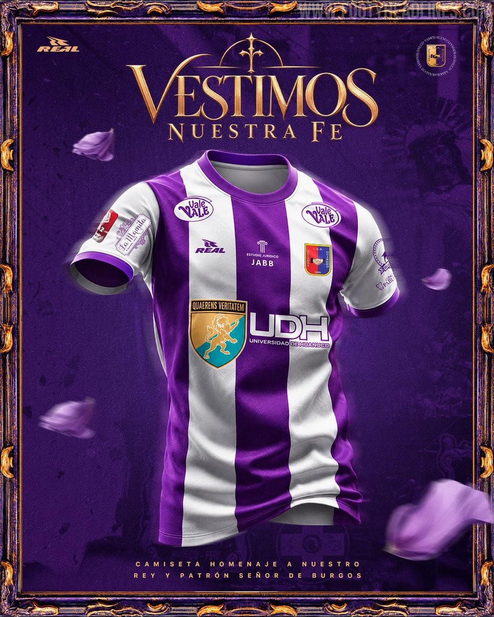
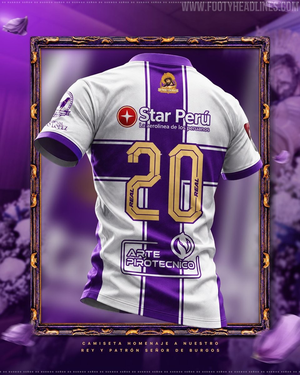
Peruvian club Alianza Universidad de Huánuco and local manufacturer Real Sport have officially unveiled a special commemorative kit for the 2026 season. Launched under the slogan "Vestimos nuestra fe" (We wear our faith), the release embraces Peru's deep-rooted October tradition of donning purple to pay homage to religious heritage, specifically honoring the Señor de Burgos, the patron saint of Huánuco.
The Real Sport Alianza Universidad 2026 special shirt swaps the team's customary red and blue palette for a striking purple and white striped look. It features bold purple vertical stripes across the front, complemented by a purple crew neck and matching sleeve trim on white sleeves. On the upper back sits an intricate graphic badge depicting the Señor de Burgos, accompanied by the inscription "Rey y Patrón de Huánuco", while squad numbers are rendered in gold with purple outlines.
The special edition kit is set to make its on-pitch debut during October Liga 2 action and is currently available via pre-order through the club's official channels.