The 4 Football Kit Trends You Need to Know in 2025 - By Phil Delves
- Embossed patterns: Embossed patterns have become a popular trend in football kits for 2025, offering a more premium feel and allowing teams to express themselves subtly, with examples including Roma's third shirt and Lazio's home kit.
- Piping: The use of piping, a kit construction element common in the 90s and 00s, is a noticeable trend within the broader retro movement, exemplified by Celta Vigo's 2025/26 home shirt and Wimbledon's home shirt.
- Off-white: Off-white is emerging as a prominent color in football kits for 2025, offering a stylish alternative to blackout and black & gold kits, with examples like Lille's away shirt and West Ham's away kit.
At this point in the year we have a good idea of what the football shirt landscape will look like for the 2025/26 season.

Though there are still some dominoes left to fall, such as the official start date of Liverpool x adidas part III, the majority of teams have begun to release their new shirts for our enjoyment/critique. The sheer volume of launches can make July feel like something of a gauntlet to survive as a kit enjoyer, with teams at every level of the pyramid vying for our attention. Now is the time though to pause, take a deep breath, and properly assess what is unfolding before our eyes.
Every year brings the good, the bad and the ugly, but as we zoom out patterns begin to emerge. Certain colours and shades proliferate across teams. Similar manufacturing techniques start to appear in all sorts of places, in a way which perhaps wasn’t as prevalent the year prior.
Here are 4 trends I’ve observed from the class of 2025 so far.
Embossed patterns

Arguably, the most enjoyable trend in 2025 has been the extensive use of embossed patterns up and down the leagues.
After several years of what I’ve previously described as a “pattern arms race”, where teams have been seeking to create increasingly bold patterns in the wake of the success of Nigeria 2018, the football shirt pendulum has swung back towards more subtle designs which put a greater focus on subliminal ornamentation.

Embossing or debossing (for the sake of brevity I’m going to use “embossing” but there is a technical difference for what it’s worth) has risen to become one of the go-to approaches for manufacturers. Even the plainest of kits can be elevated with a well-executed embossed pattern, allowing teams to express themselves and tell stories in a less “in-your-face” but equally effective way compared to other styles.
The more premium feel of an embossed pattern is another big tick in favour of the technique. Sublimated shirts may offer almost complete freedom in terms of aesthetic, but the flat nature of most sublimated kits pales in comparison to an embossed kit where the details can be felt as well as seen.
For a good example of an embossed kit, look no further than Roma’s new third shirt. Hot off the press and an early frontrunner for kit of the season, Roma’s white, green and gold alternate look has a lot of visual appeal even at a distance. Get up close and personal with the shirt and the design comes alive though, as an embossed pattern inspired by Roman villas reveals itself across the entirety of the white base (yes, it continues on the back too).
the flat nature of most sublimated kits pales in comparison to an embossed kit
Across the Italian capital Roma’s eternal rivals Lazio are enjoying an embossing masterclass of their own. Japanese brand Mizuno, who have steadily worked their way back into the kit conversation over recent years, have created one of the better home kits of the season. Look at pictures of the 25/26 Lazio home and you might scoff at the idea that it’s any more than a plain light blue shirt, but as with Roma you have to zoom in to see what’s really going on. And, in an amusing example of cross-rival synergy, Lazio are also looking to architecture for inspiration with a pattern inspired by the Piazza del Campidoglio.
Any conversation about embossed patterns has to make mention of Macron. Long a favourite amongst the collecting community, the Italian brand have been making use of embossed patterns with more frequency and for longer than any other manufacturer I can think of. Of the many superb embossed kits I could choose to highlight, have a look at Motherwell’s away shirt. The old logo of British Steel is repeated across the kit as an embossed pattern; a tribute to the Motherwell community who suffered after the local steelworks was demolished in 1996.
Piping

In 2025, we are stuck in the middle of a giant echo chamber.
On one side we have adidas churning out their modern interpretation of the Teamgeist template at a rapid pace. Nike, meanwhile, are shoving Total 90 down our throats whether we like it or not. Brands are unashamedly trying to activate the nostalgic side of our brains even if creativity and original thought are being sacrificed.
We could talk a lot more about the seemingly unstoppable retro train, but one specific trend I’ve noticed within the broader retro movement has been the use of piping.
In 2025, we are stuck in the middle of a giant echo chamber
Few kit construction elements exemplify the 90s and 00s more than piping. It was essential in framing both the aforementioned templates from the big two, and its presence can help a kit feel retro even if it’s not trying to be a direct nod.
Celta Vigo’s 2025/26 home shirt is a perfect example. The design from hummel is evocative of the 00s not least because of its contrasting red piping, and indeed the shirt is officially a tribute to the era. Look at the Umbro shirts Celta wore during those years and you’ll see that the original shirts are not a like-for-like resemblance to the 2025 kit.
We have a different collar style, shadow stripes instead of a printed pattern and matching light blue panels on the underside of the sleeves and sides of the shirt as opposed to the dark panels of the new kit. What the kits do share though is the piping (albeit in a different colour), and it’s this element which is key in bringing back the nostalgic feel.


Staying in Spain, we also have Cádiz, whose fantastic home shirt makes excellent use of piping to help shape the design. There’s nothing revolutionary about the approach, and indeed its the embossed pattern which is doing most of the heavy lighting in terms of the kits quality, but it’s a welcome addition which helps the shirt feel like a sort of upgraded 00s look (both the 04/05 Cádiz home from Kelme and the 09/10 home from Diadora sport similar piping).
Piping is fully back this season
For a third offering, how about the new Wimbledon home shirt from Lotto? You’d be hard pressed to find a team with a better trio of shirts than The Dons, and the home in particular possesses a wonderful instance of piping (and of course, a great embossed pattern). The inspiration for the kit is found back at the turn of the 90s; showcasing the enduring appeal of the aesthetic.
3. Off-white

Two colourways have helped to define the football shirt industry of the past seven or so years. Firstly we had blackout kits, which exploded onto the scene following the release of AIK’s all black ensemble in 2018 (the Swedish club would of course go on to release several special edition kits to varying levels of success). So pervasive was the trend that we are still seeing clubs release blackout kits, even though the horse has been well and truly flogged.
At the same time black and gold kits grew in popularity, with an example I like to use being the Corinthians Senna tribute shirt which was also released in 2018. Like any trend, we saw a trickle of clubs dipping their toe into the luxurious pool before clubs began to find any excuse to release a kit in the colours.
there is space for other colours to take the place of blackout and black & gold kits
Though both blackout and black and gold kits will be found in 2025 there is space for other colours to take their place, and one shade I’m keeping my eye on is off-white.
Off-white shirts are hardly new, and hugely successful releases like Roma’s away shirt in 2020/21 (the base colour was officially called “ivory”) or Liverpool’s away shirt the following season showcased the merits of the aesthetic.
Momentum has gathered pace since then, with Lille’s off-white fourth kit in 2022/23 being a favourite example, and now in 2025 the colour is everywhere. Lille themselves have returned to the off-white table with a smart away shirt in 2025, and the likes of Partick Thistle, Cambridge Unite and Atalanta are also sporting stylish off-white creations.


Though we’re seeing more and off-white kits being released, we’re still in that relatively early stage of the trend where I’m not completely bored by the look. So, when I see West Ham’s away kit, I’m a fan, especially with the contrast of the black details on the ecru base. Dundee United’s away kit is sneakily one of my favourite recent releases, which again pairs off-white with black to create a pleasing look.
If off-white shirts go the way of blackout and black and gold kits before them we’ll reach saturation point and there’ll be diminishing returns for every team that releases a kit in the colourway. Until then, we can enjoy the trend.
4. Alternate crests


Teams have never been as daring with their crests as they are now.
In many ways, the signs have been there for a few years in regards to the usage of alternate crests. Teams like Arsenal and Manchester United have adopted different crests over the past few years, and some sides like Atalanta have been utilising alternate crests for several years. Many of these badges, like the solo cannon for Arsenal or the isolated devil for Man Utd are fairly subtle changes, but the willingness for teams to run with these looks has paved the way for others to follow.
An alternate crest is a great direction to go down for away and third kits
Often teams will dig through their back archives to revive historical looks, as is the case with AC Milan and their away shirt this season which sees the return of the Diavoletto last seen in the early 80s. As a general rule we can expect to see classic crests on anniversary shirts too, so a natural consequence of more teams creating anniversary kits (and more teams being old enough to hit 100th, 125th anniversary marks) has been an increase in the number of crest variations. Releases such as the MLS Archive collection also bring with them a boatload of throwback logo designs for us to chew on, with many of the retro (or faux retro) looks being superior to, or at least more interesting than, the modern designs.


If you want to stand out from the crowd or create a point of difference for your away or third shirt an alternate crest is a great direction to go down. Just take a look at Brentford’s lovely new away kit. It’s hard to argue that the fractal bee doesn’t stand out more compared to the generic ‘Man City’ style crest the club have been using since 2017.
With more and more kits now being released mid-season, we can expect to see more than a few embossed off-white kits with alternate crests and a bit of piping before the season is over. And take note of what the bigger teams and brands are doing, because chances are the design decisions will echo down to 26/27, 27/28, and beyond.

This article has been written by Phil Delves, football shirt authority and Head of Content of Cult Kits, a trusted seller of authentic classic shirts. Phil Delves' engagement is a crucial part in enhancing our football kit coverage and content.
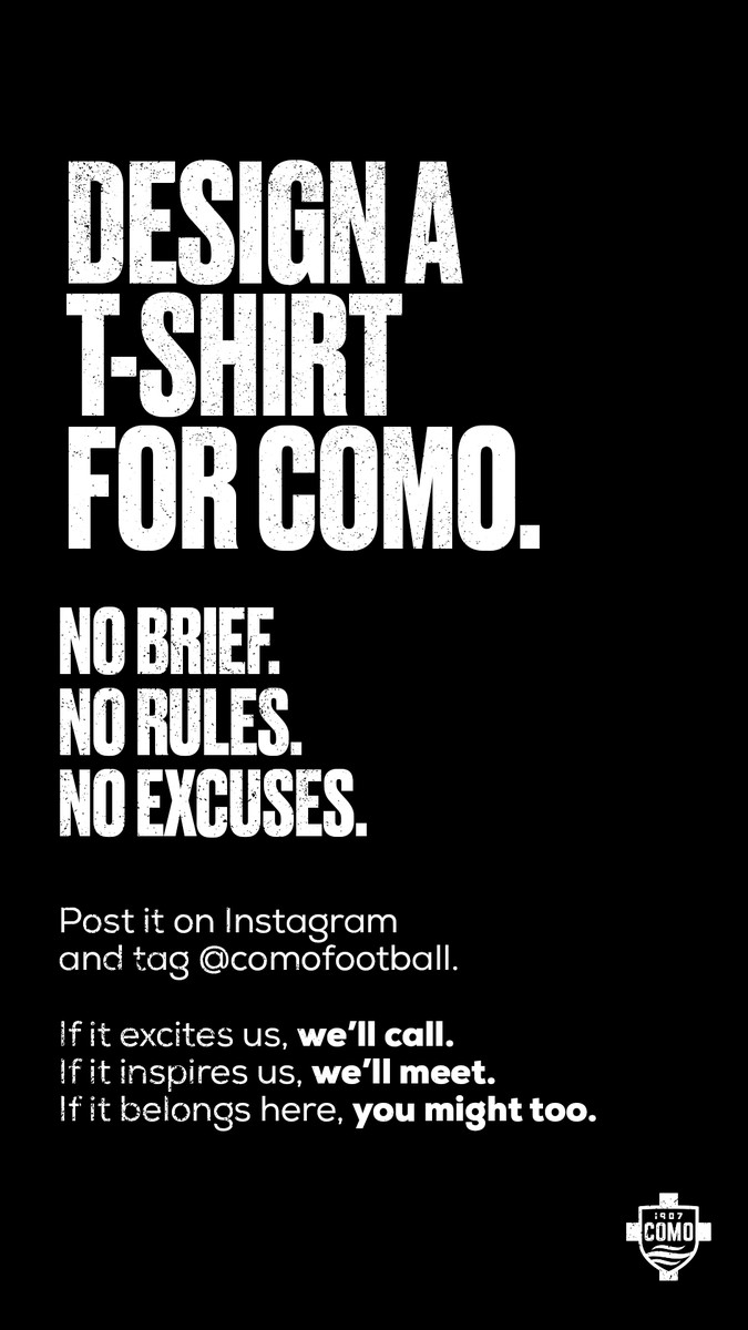
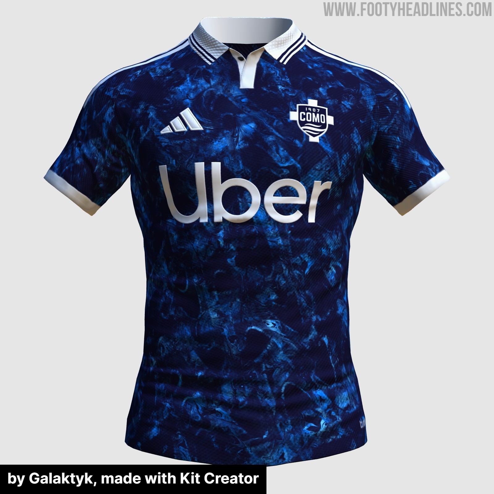
Como 1907 Announce Kit Design Contest
Italian club Como 1907 has launched a new design contest, inviting fans and designers to create a new look for the team. While the official announcement asked supporters to design a t-shirt for Como, it is likely that the club is referring to a football kit, given the context of the post and the reactions from the fanbase.
The club has kept the instructions incredibly open, stating there is no brief, no rules, and no excuses. To enter the competition, fans simply need to create their design, post it on Instagram, and tag the official Como 1907 account.
The announcement has already sparked significant interest online, with numerous supporters sharing their concepts and ideas. Whether the winning design will be produced as an official match kit, a pre-match shirt, or a special edition lifestyle item remains to be seen, but it offers a unique opportunity for fans to leave their mark on the club's visual identity.
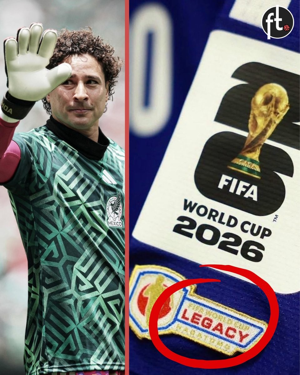
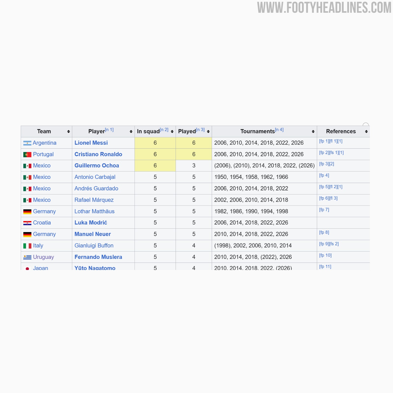
FIFA Denies Guillermo Ochoa 2026 World Cup Legacy Patch Over Appearance Rules
Guillermo Ochoa has been denied the chance to wear FIFA's new legacy patch at the 2026 World Cup. Despite being selected for six World Cup tournaments spanning from 2006 to 2026, the Mexican goalkeeper does not meet the strict criteria set by FIFA. The governing body requires players to have made on-pitch appearances in at least five different World Cups to qualify for the special badge.
Ochoa did not play any minutes during the 2006 and 2010 tournaments, meaning he has only registered on-pitch appearances in three World Cups prior to the 2026 edition. Because of this, FIFA officially refused to award him the patch. Other veterans playing in the tournament, such as Lionel Messi, Cristiano Ronaldo, Luka Modric, Manuel Neuer, and Yuto Nagatomo, have received the legacy patch for meeting the five-tournament appearance threshold.
The Mexican Football Federation is reportedly planning to push for a reconsideration of the ruling. If Ochoa features in a match during the 2026 tournament, the federation intends to appeal FIFA's decision in hopes of securing the legacy patch for the veteran goalkeeper.

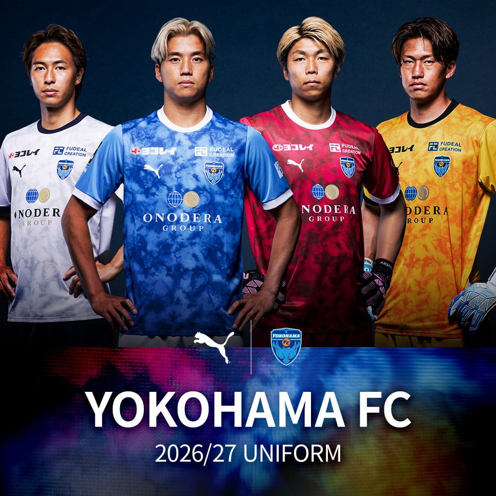
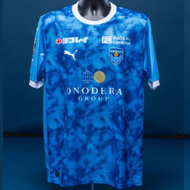
Yokohama FC 26-27 Home & Away Kits Released
Japanese J2 League club Yokohama FC have officially released their new Puma 2026-27 home, away, and goalkeeper kits. The new Yokohama FC 26-27 shirts feature an abstract graphic design that represents flow and movement across all the jerseys. The home jersey is predominantly blue, while the away kit is white. The goalkeeper kits complete the collection in red and yellow colorways. The Puma Yokohama FC 2026-27 kits are available to purchase via the club's online store.


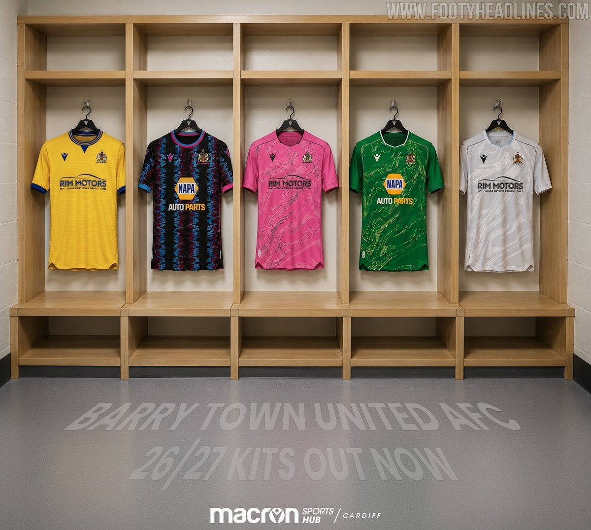
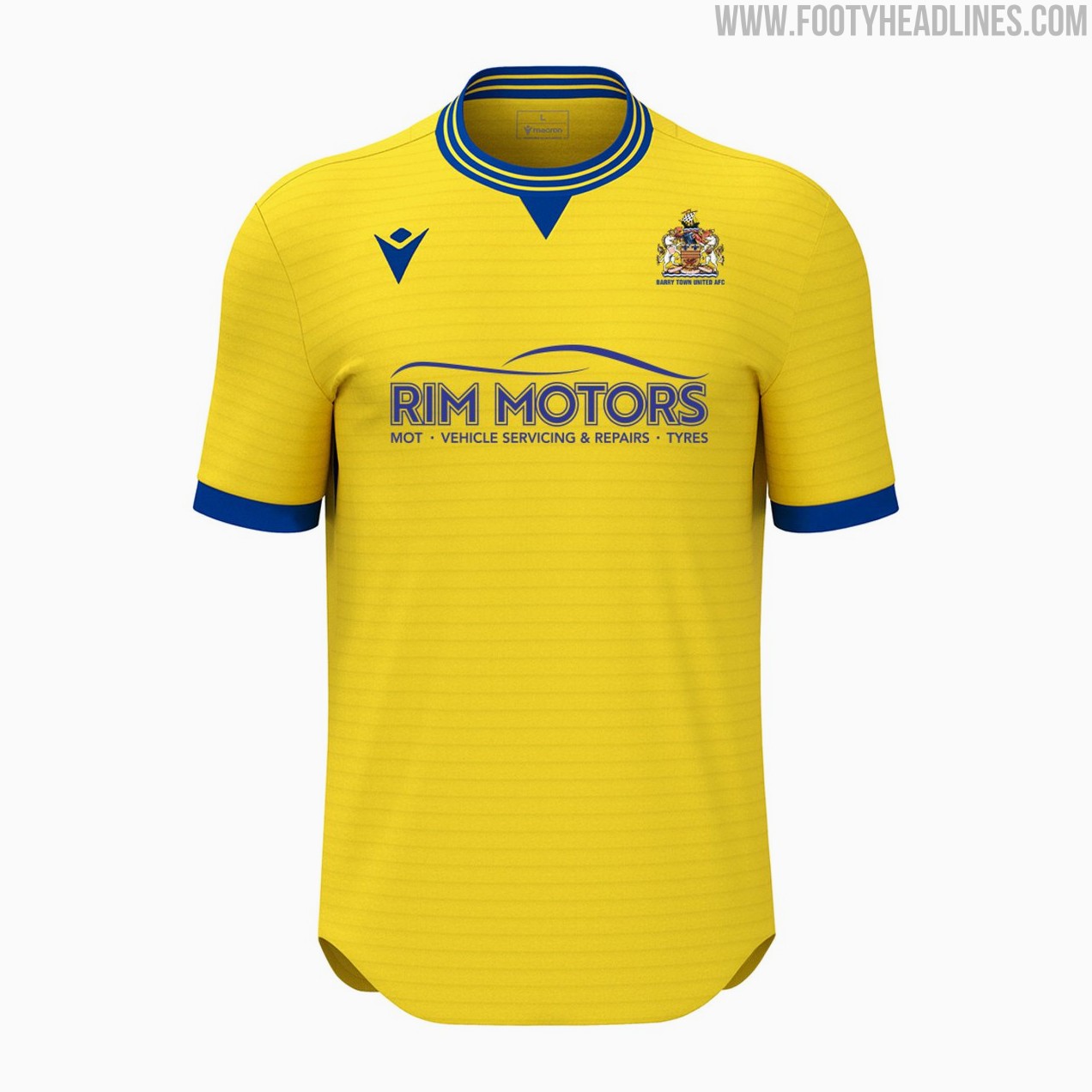
Barry Town United 26-27 Kits Released
Welsh Cymru Premier side Barry Town United AFC have officially unveiled their new Macron kits for the 2026-27 season. Produced by the Italian sportswear brand, the newly released collection features bespoke designs tailored for the club's upcoming campaign. Fans looking to purchase the new shirts can currently find them available exclusively at the Macron Sports Hub Cardiff store.