Should Manchester United Remove the Gradient From Their Logo?
- Gradient Effect: The Manchester United logo currently uses a gradient effect to give a 3D look, which some fans want removed for a cleaner design.
- Modern Design Preferences: Modern design trends favor simplicity and flat colors, prompting a discussion on whether Manchester United should adopt a flat logo.
- Practicality in Kit Manufacturing: Manchester United already uses a solid-color crest on their match shirts due to the practicality of flat colors in sportswear manufacturing.
A recent post on our Footy Headlines X (formerly Twitter) account has sparked a massive debate among kit enthusiasts and supporters of the Red Devils alike. The question at the center of the discussion: is it time for Manchester United to finally drop the gradient effect from their official club crest?
Should Manchester United Remove the Gradient From Their Logo?
Currently, the official Manchester United digital crest utilizes a distinct gradient color effect. This dark-to-light shading is applied heavily across the yellow borders and almost all the internal block details of the badge.
Historically, this was done to add a sense of 3D depth and a traditional, premium aesthetic to the logo.
However, the modern design landscape heavily favors simplification, minimalism, and solid, plain colors. To see how the iconic crest would look under modern design rules, we created a concept version that completely strips away all the gradient shading.
As you can see in our side-by-side comparison, removing the gradients results in a remarkably clean, punchy, and highly striking flat design.
The Reality
For those closely following Man United's kits over the past few years, there is actually a fascinating irony to this entire debate.
Despite the club's official digital and broadcast logo featuring these heavy 3D gradients, the actual crest applied to the team's physical match shirts has been a solid-color version for several recent seasons.
The reasoning behind this is purely practical. In the world of sportswear manufacturing, solid, flat colors are simply much more optimal for physical application. Whether it is traditional embroidery or the modern, high-density heat-applied TPU badges seen on authentic kits today, flat colors ensure a sharper, cleaner, and more consistent finish on the fabric.
Given that the club already uses the flat version on their most important merchandise—the actual kits—many fans are arguing that it is time for the club to officially update its digital branding to match.
Remove the gradients https://t.co/vgf0JEHeaH pic.twitter.com/wG2LI7qjHH
— Footy Headlines (@Footy_Headlines) March 2, 2026
What do you think? Should Manchester United officially ditch the gradients and adopt the flat logo across all their branding, or do you prefer the traditional 3D depth? Let us know in the comments below.


England 2026 World Cup Kit Font Prepared with Laser
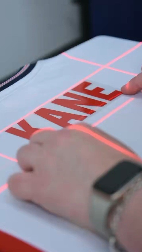
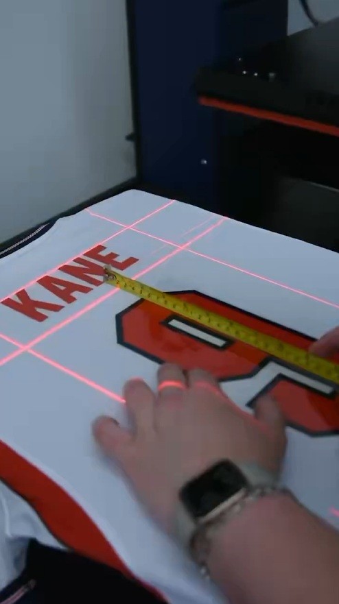
Football kit retailer @subsidesports has offered a behind-the-scenes look into their printing operations ahead of the 2026 World Cup. In a recent social media update, the company shared a video of their heat press machinery in action, highlighting the process behind their Fan Style customization service. This service utilizes official typefaces and plotter sheets to apply names and numbers to replica shirts, ensuring an authentic look for supporters.
The short video features what eagle-eyed followers suspect to be a Transmatic REV 5SA heat press, a heavy-duty machine used for professional garment decoration.
One standout detail is that they used lasers to ensure the names and numbers were placed with absolute precision on the back of the jerseys. It’s a testament to Subside Sports’ commitment to craftsmanship and attention to detail.

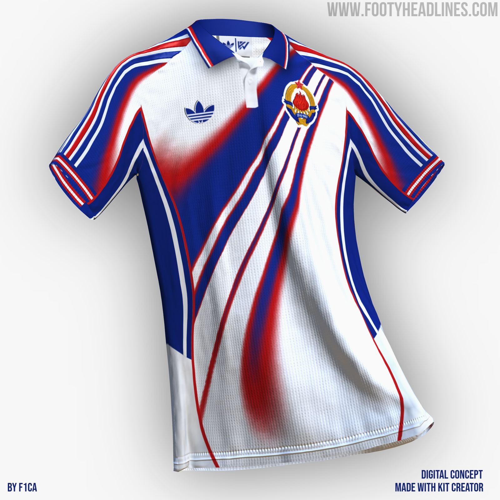
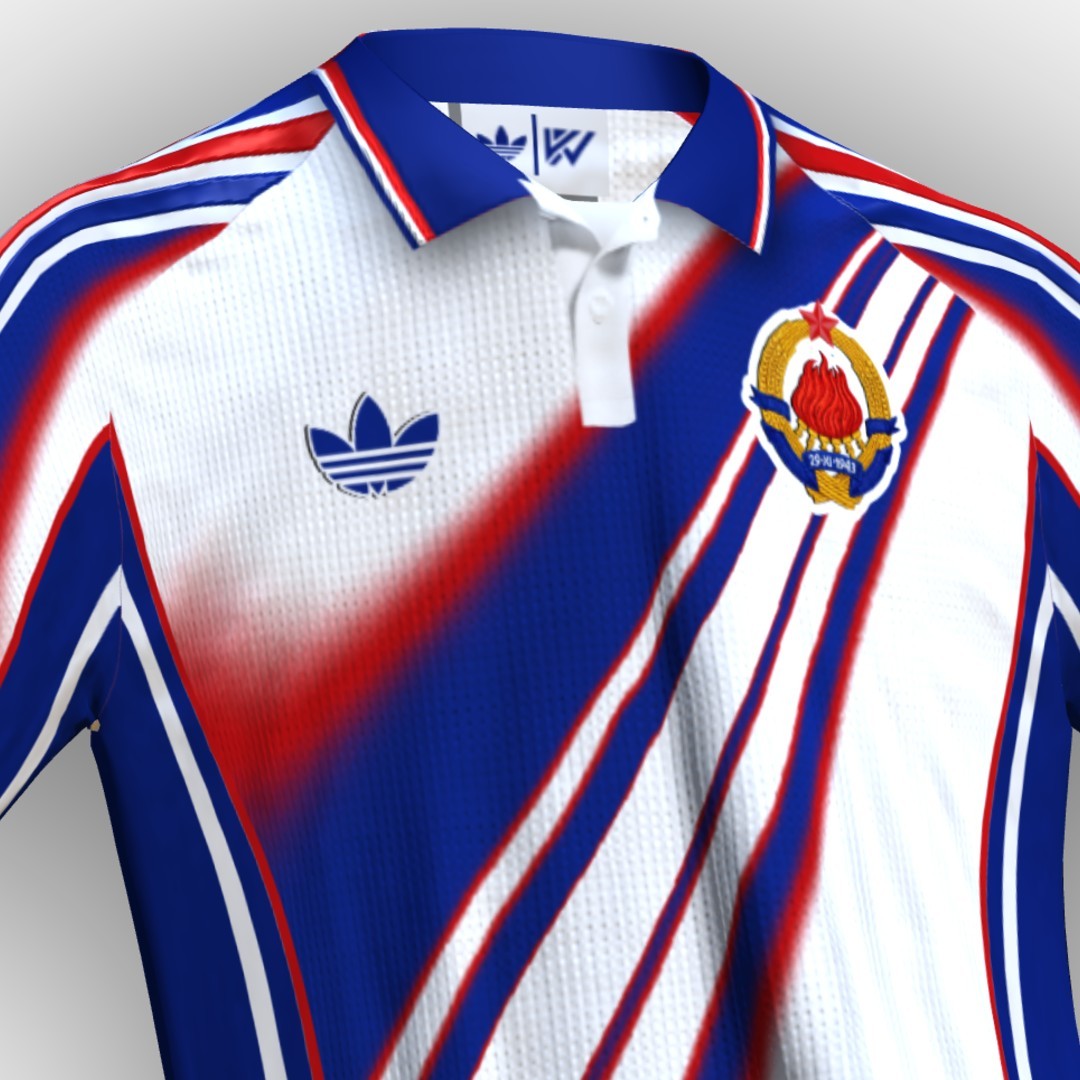
What if? Adidas x Yugoslavia
Designer F1CA has imagined how Adidas x Yugoslavia could look like in 2026, if Yugoslavia still existed. He used Kit Creator to create and share his design.

Adidas Teams Twinned by Product Code & Design
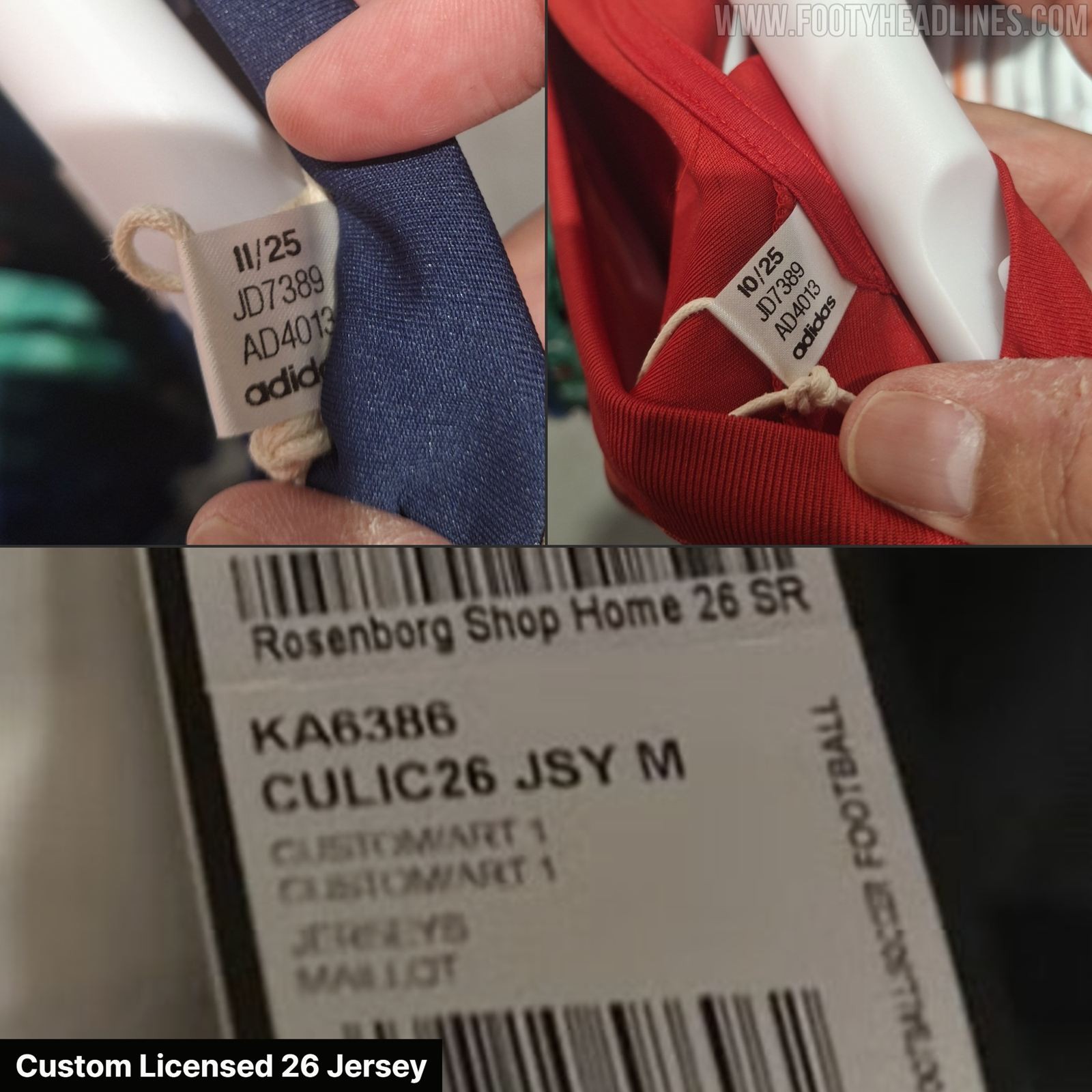
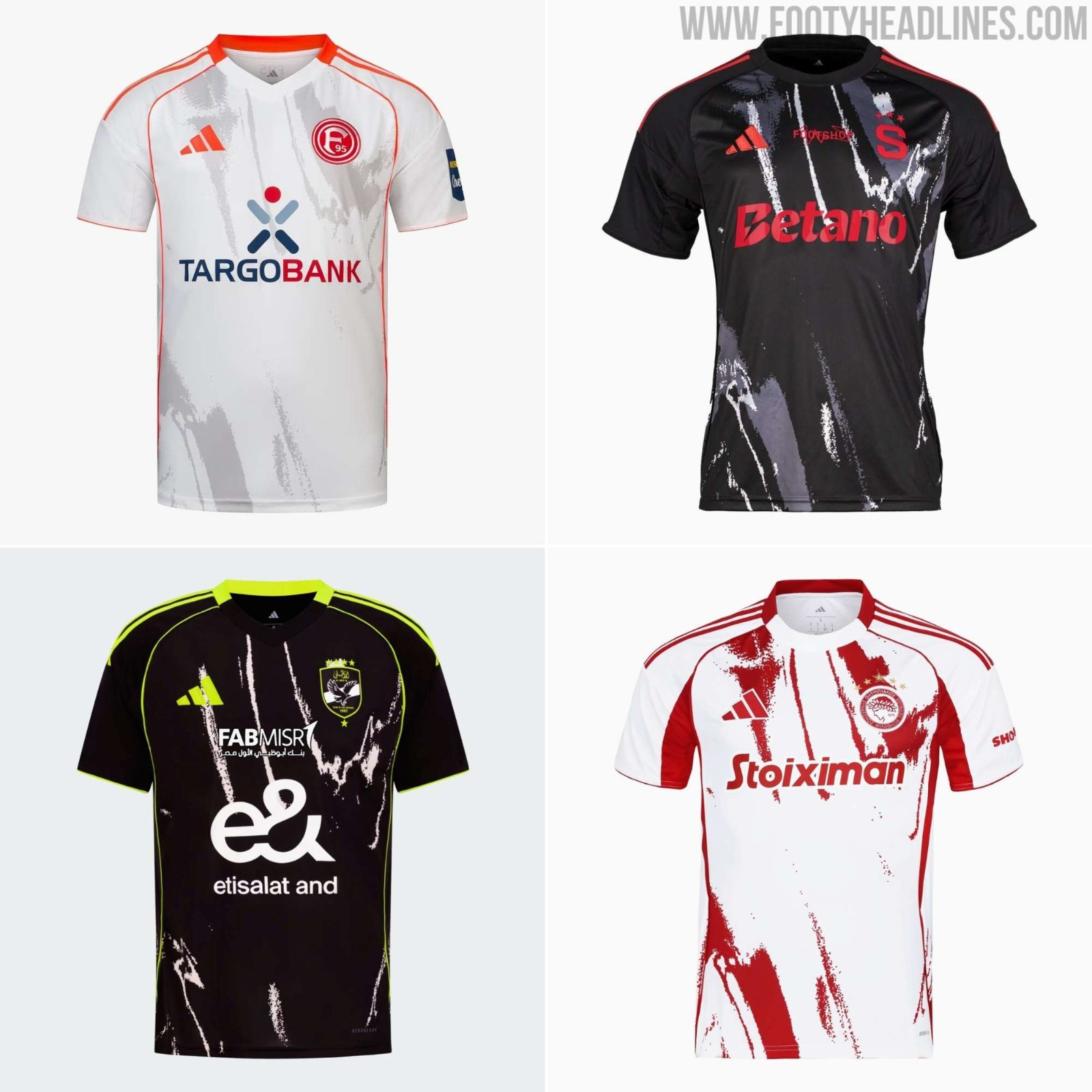
Update - Sunday, June 7, 2026: As spotted Indonesian jersey experts @Jerseyforum, Adidas teams with the same design also share the product. In particular, they do not have the usual Team + Shirt Type Name (e.g. FCB A 26 JSY), but are called Custom Licensed Jersey (CULIC26 JSY).
Templates are not as common as they were in the past, but smaller Adidas teams still do not have custom designs always. In the outgoing 25-26 season, teams such as Düsseldorf, Al Ahly, and Sparta Praha all used the same Locker Room design with custom colors.
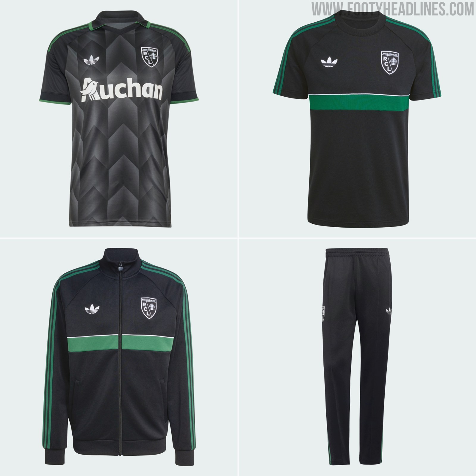
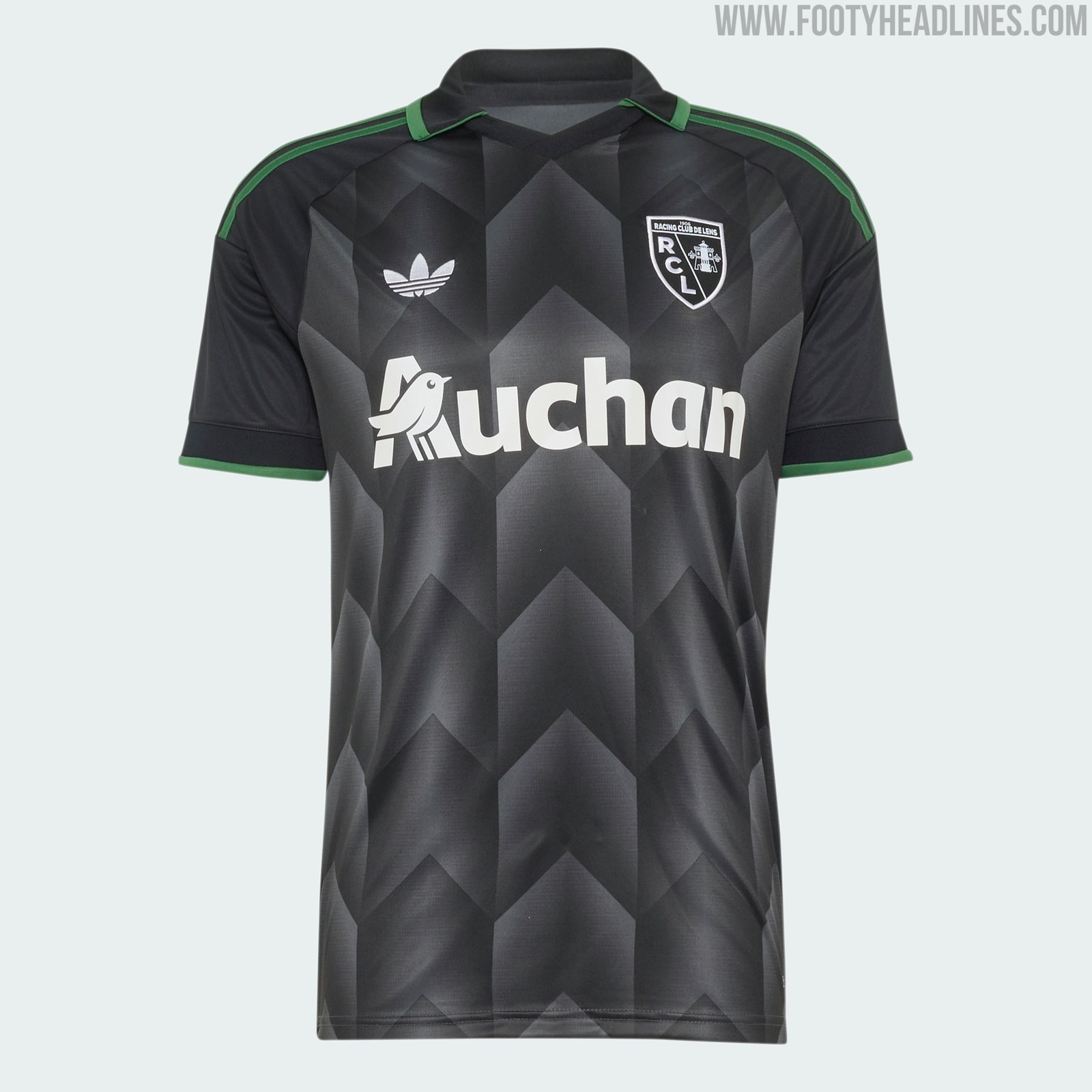
RC Lens 26-27 Originals Collection Released - Away Kit + 3 Items
As other Adidas teams, RC Lens is getting a nice collection with their 2026-27 away kit.
\[Explore every Racing Club de Lens jersey on Football Kit Archive\]([https://www.footballkitarchive.com/rc-lens-kits-t418/](https://www.footballkitarchive.com/rc-lens-kits-t418/))
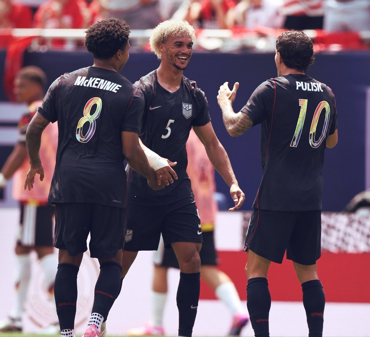
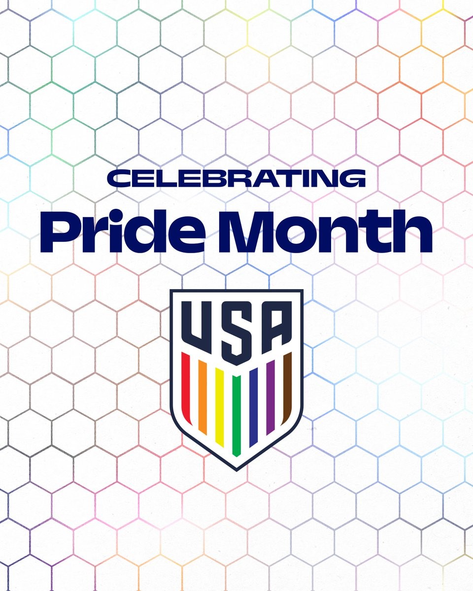
USA Wear Special Rainbow Numbers Against Germany
The United States men's national soccer team wore special rainbow-colored namesets during their friendly match against Germany on June 6, 2026, in support of Pride Month. The unique multicolored design was applied exclusively to the names and numbers on the back of the players' jerseys, while the front of the kits retained their standard gray appearance.
The USA Women's Team also used the Pride numbers in the friendly match against 2027 Women's World Cup hosts Brazil in São Paulo where they were defeated 2-1.
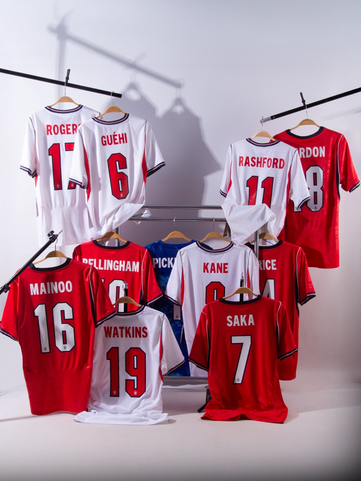
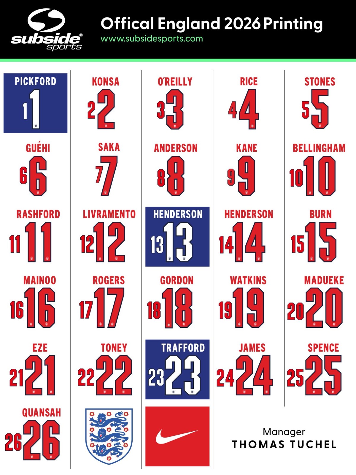
England Release Squad Numbers for 2026 World Cup
Update - Sunday, June 7, 2026: Subside Sports have created two nice images showing the Nike England 2026 World Cup font applied on the kits and the full squad.
England have released their squad numbers for the 2026 World Cup.
1: Jordan Pickford
2: Ezri Konsa
3: Nico O'Reilly
4: Declan Rice
5: John Stones
6: Marc Guehi
7: Bukayo Saka
8: Elliot Anderson
9: Harry Kane
10: Jude Bellingham
11: Marcus Rashford
12: Tino Livramento
13: Dean Henderson
14: Jordan Henderson
15: Dan Burn
16: Kobbie Mainoo
17: Morgan Rogers
18: Anthony Gordon
19: Ollie Watkins
20: Noni Madueke
21: Eberechi Eze
22: Ivan Toney
23: James Trafford
24: Reece James
25: Djed Spence
26: Jarell Quansah
