

Arsenal Unveils Bespoke 'Rocastle' Blackletter Typeface
- Arsenal Unveils Rocastle Typeface: Arsenal has introduced "Rocastle," a new bespoke three-weight blackletter typeface family, developed over four years by David Rudnick and Léa Bruneau, which completes their typographic trio.
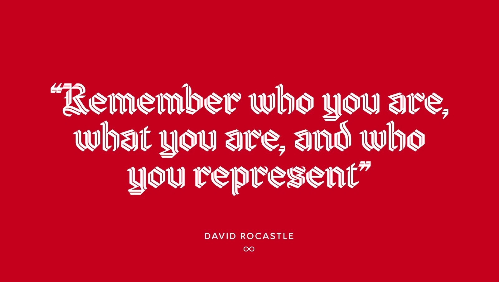
- Honoring Club Icon David Rocastle: The typeface is named in memory of David "Rocky" Rocastle, a beloved club legend who made 277 appearances for Arsenal and tragically passed away at 33.
- Purpose and Cultural Application: Rocastle is purpose-built for cultural applications such as lifestyle apparel, art, music, fashion, and commemorative moments, distinct from the club's existing Northbank and Chapman typefaces.
Arsenal has officially unveiled a striking new addition to its visual identity with the introduction of Rocastle, a bespoke three-weight blackletter typeface family. Created over a meticulous four-year development period by renowned designer David Rudnick alongside Léa Bruneau at Terrain studio, the font completes the Gunners' bespoke typographic trio alongside their existing Northbank and Chapman type families.
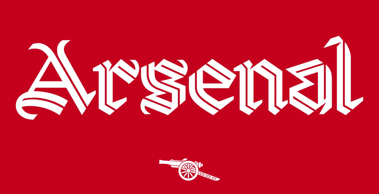
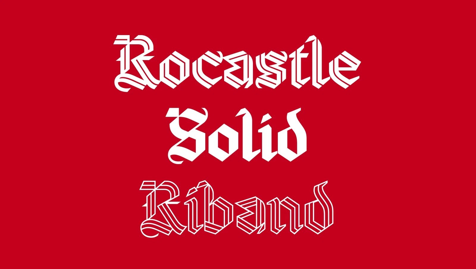
Bespoke Arsenal Rocastle Typeface
This is the all-new Arsenal Rocastle typeface family designed by David Rudnick and Léa Bruneau.
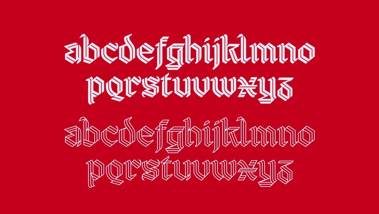
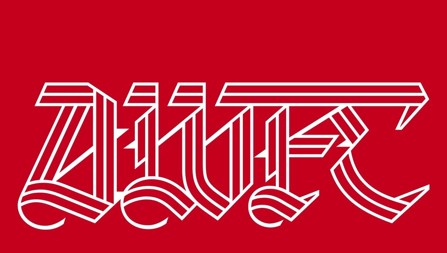
The typeface is named in honor of club icon David "Rocky" Rocastle, who joined Arsenal at age 15 and went on to make 277 appearances for the club, winning two league titles. Rocastle, who tragically passed away in 2001 at the age of 33, remains one of the most beloved figures in Arsenal folklore, celebrated for his talent, humility, and indelible connection to the fans.
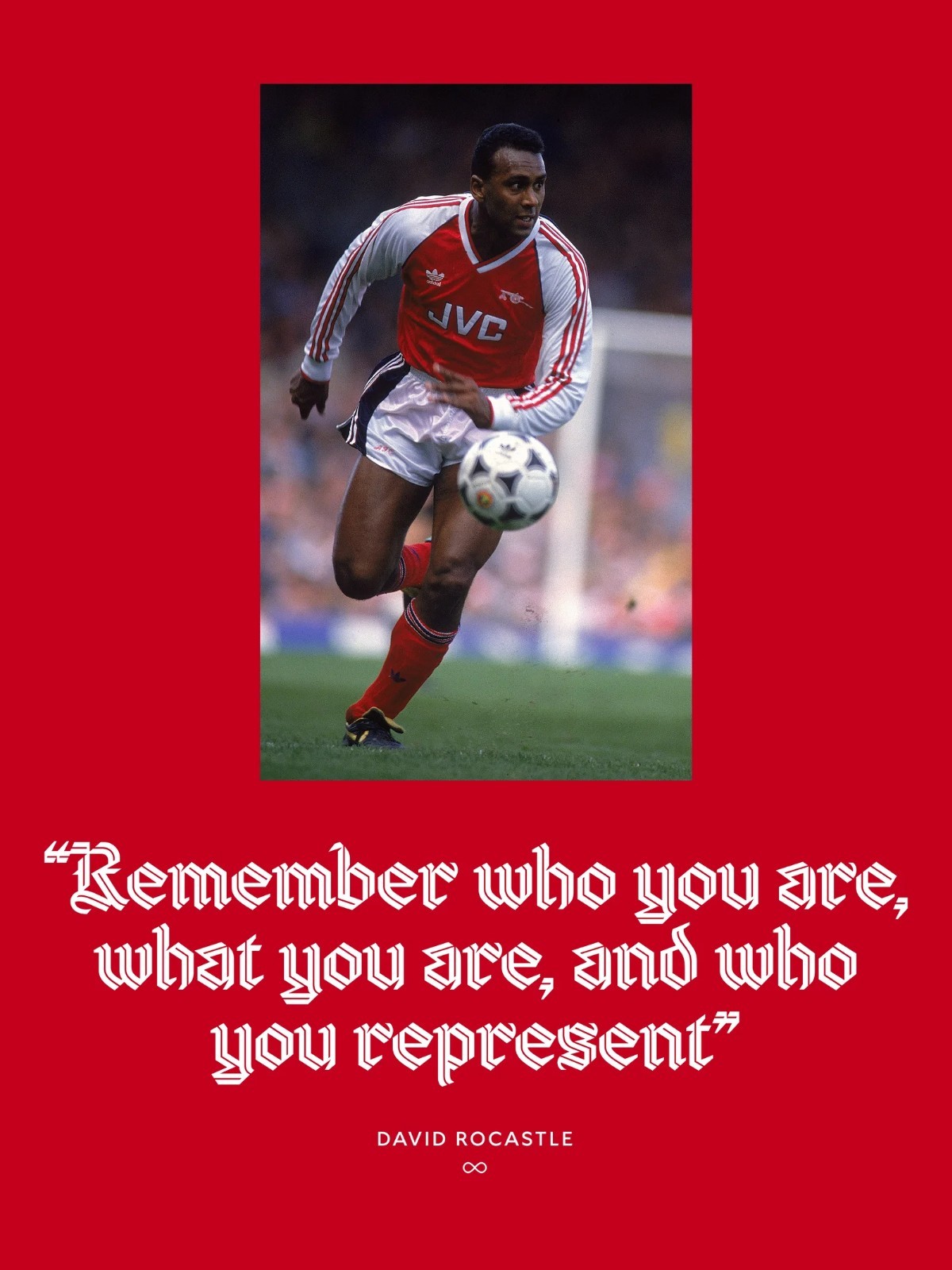
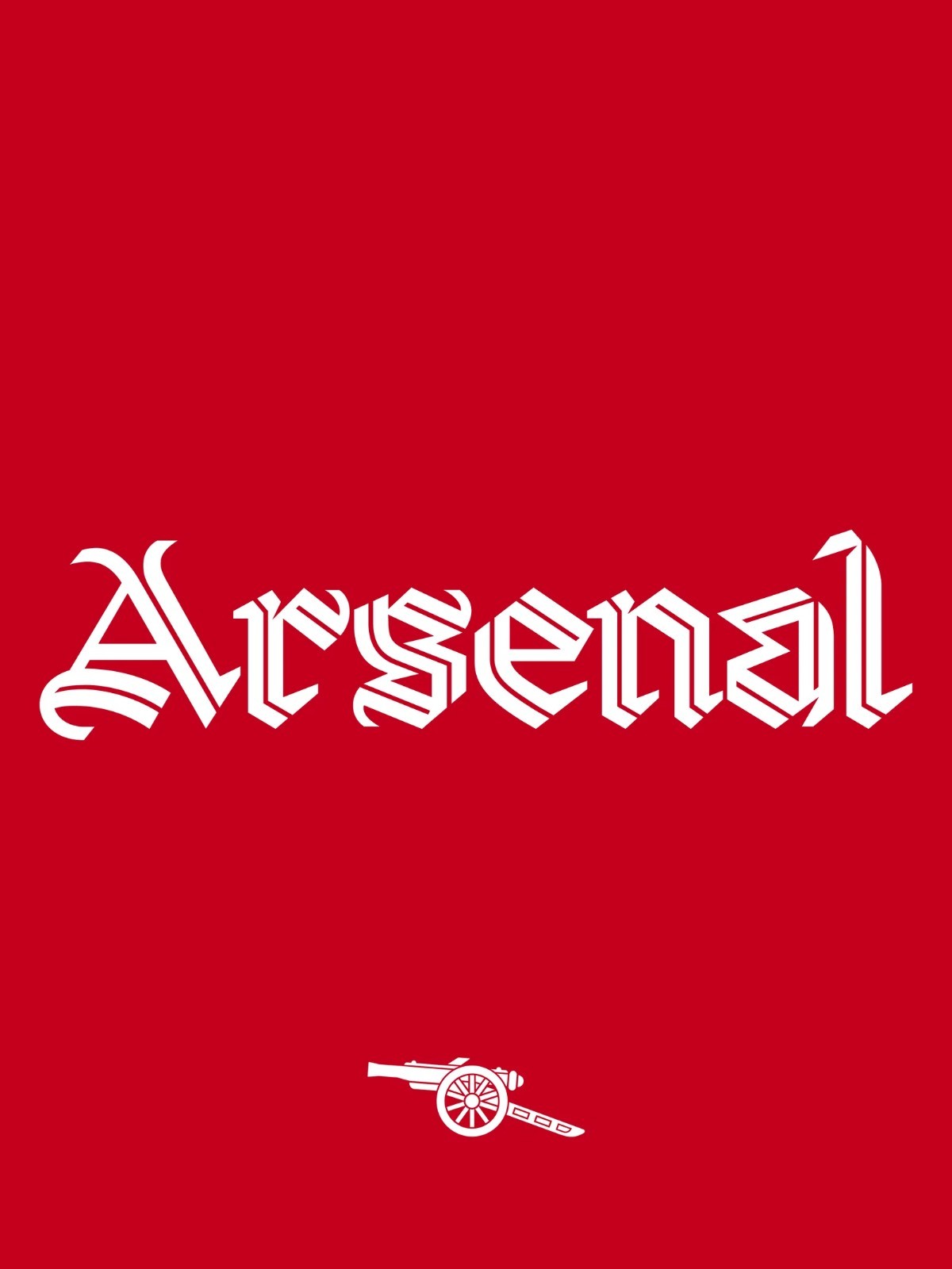
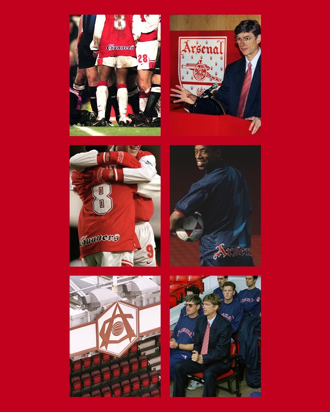
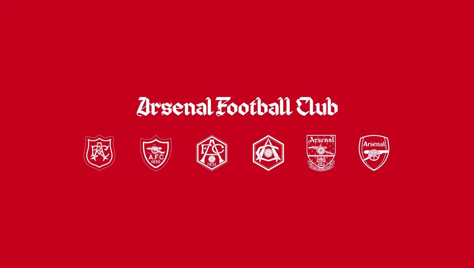
Visually, Rocastle revives and refines historic Gothic lettering discovered across decades of Arsenal heritage. The design team dove deep into the club's archives, examining old crests, paper season tickets, vintage matchday programmes, and fan memorabilia where only fragmented blackletter forms previously existed.
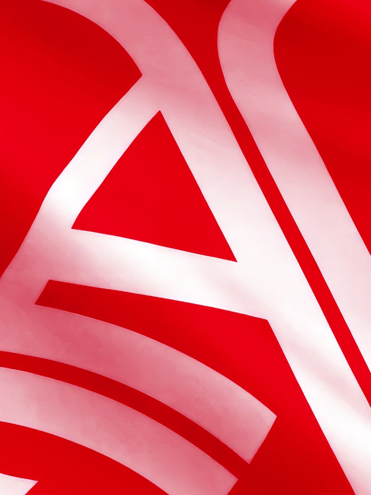
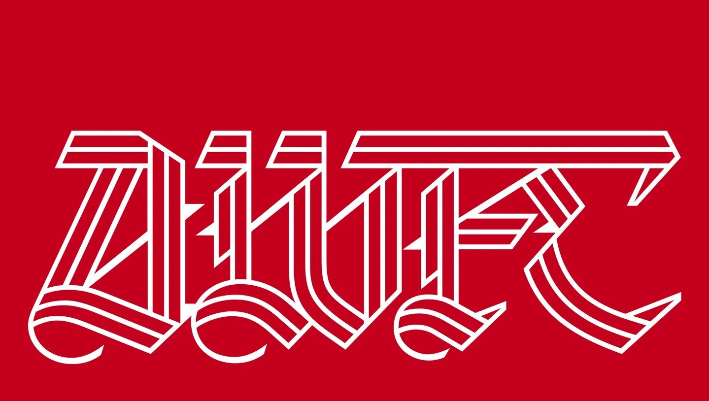
The resulting typeface reimagines that legacy through a sharp, contemporary lens, featuring three distinct weights with dimensional, multi-layered inline and outline styling.
Unlike Northbank, which serves matchday and pitch-side applications, and Chapman, which anchors the club's community and narrative voice, Rocastle is purpose-built for culture.
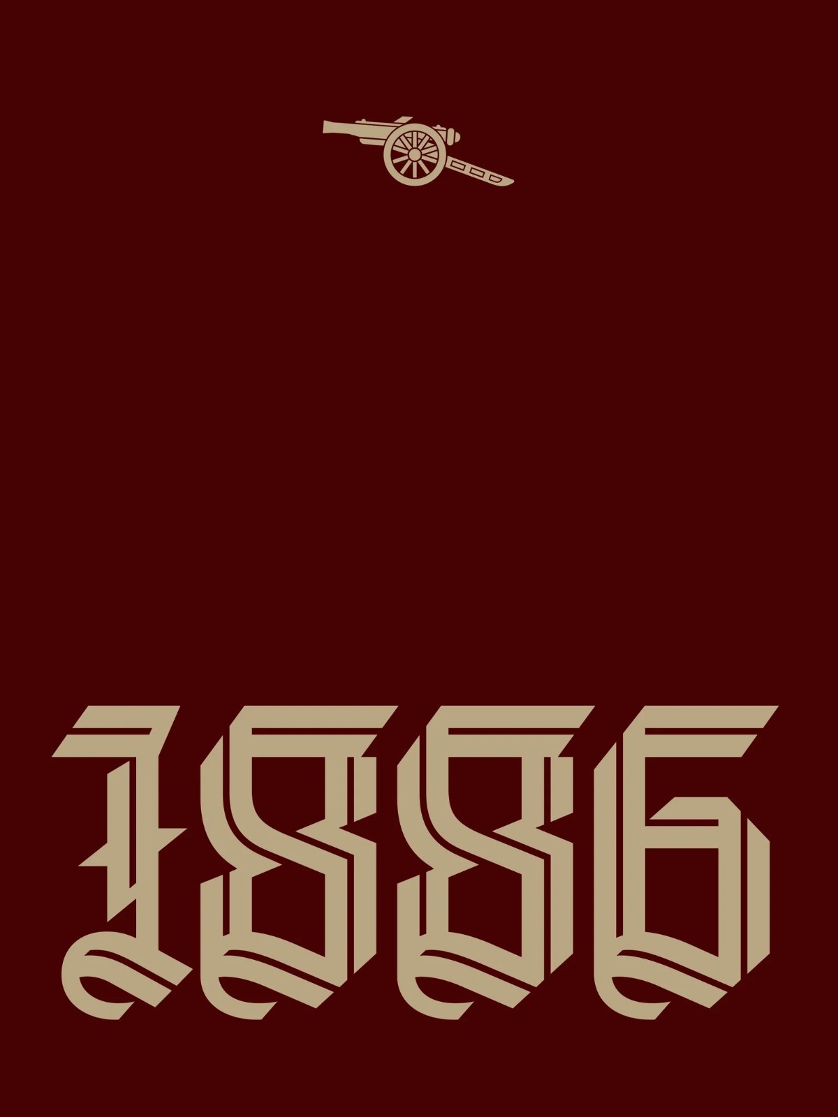
The club plans to deploy the blackletter family across lifestyle apparel, art, music, fashion capsules, and special commemorative moments where the Arsenal brand transcends the pitch.
Fans got their first in-person look at the new typography during the free Arsenal by Design exhibition at the Design Museum in London, which highlighted the evolution of the club's design aesthetic.
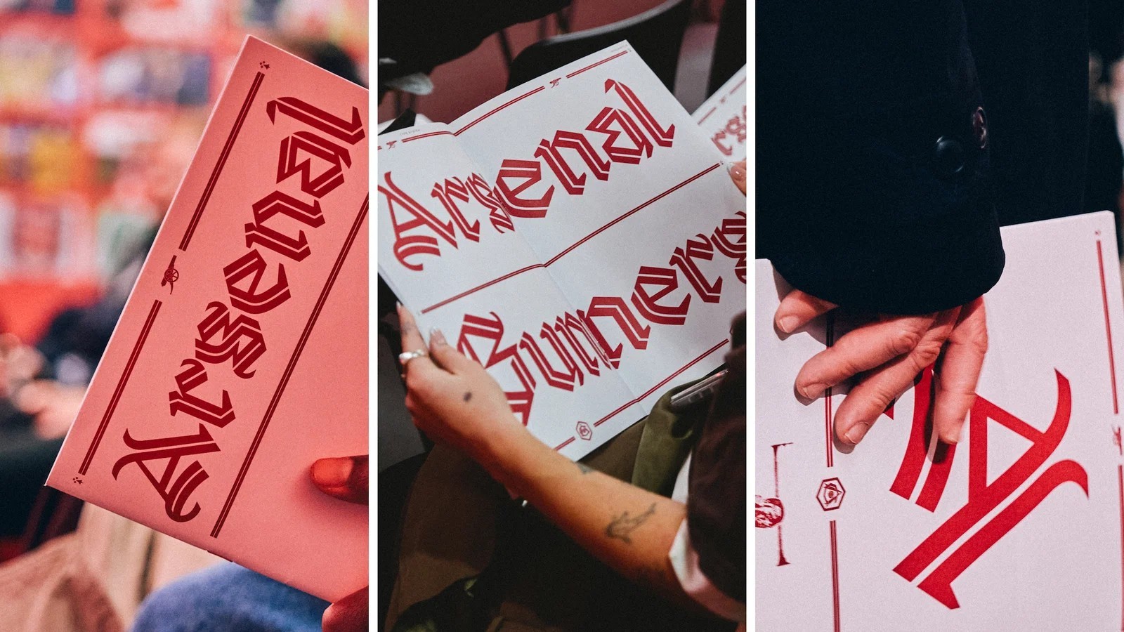
Rudnick subsequently shared the first official digital specimens directly with supporters, underlining Arsenal's ongoing commitment to supporter-first storytelling.
What do you think of Arsenal's new Rocastle typeface? Would you like to see it used on special-edition kits?