Germany 2017 Confed Cup Kit Released
 Nov 6, 2016, by Pat

The new Germany 2017 home kit introduces a clean design that marries past with present, taking inspiration both by contemporary templates and fabrics as well as from the iconic 1990 Germany away jersey.


The Germany Euro 2016 home kit has been replaced by yet another new jersey just a year after it was launched. Designed to be worn at Germany's first Confederations Cup appearance since 2006, the Germany 2017 shirt was released on November 6, 2016, and is expected to be debuted against Italy on the 15th.
Germany 2017 Confed Cup Kit
This is the Germany 2017 Confederations Cup jersey, made by Adidas.

As always, the Germany 2017 Confed Cup kit is white and black. Drawing inspiration from the iconic 1990 away jersey, the Germany 2017 home kit features a unique graphic print on the front. The collar of the Germany 2017 Confed Cup jersey is white with a subtle flag detail, while 'Die Mannschaft' is written on the upper back below it.

After they were placed on the sides on the Euro 2016 kits, the Adidas stripes re-appear on the shoulders for the Germany 2017 home kit. As always since the 2014 World Cup win, the winners badge appears on the center front of the Germany 2017 shirt.


While Adidas has released a new Germany home shirt, the black shorts and socks of the Germany Euro 2016 kit are set to be used for another year.
Germany 2017 Confed Cup Away Kit
The unusual 2016 Germany away jersey gets carried over and accompanies the new home kit.

Germany will participate in next year's Confederations Cup, taking place in Russia, as current World Cup title holders. They will be joined by Russia, Australia, Chile, Mexico and New Zealand and Portugal. The 2017 Africa Cup champion will also join the field.
Let us know what you think of the new Germany 2017 kit in the comments below.

A Look at Football Broadcast Scorebugs Across Major Competitions
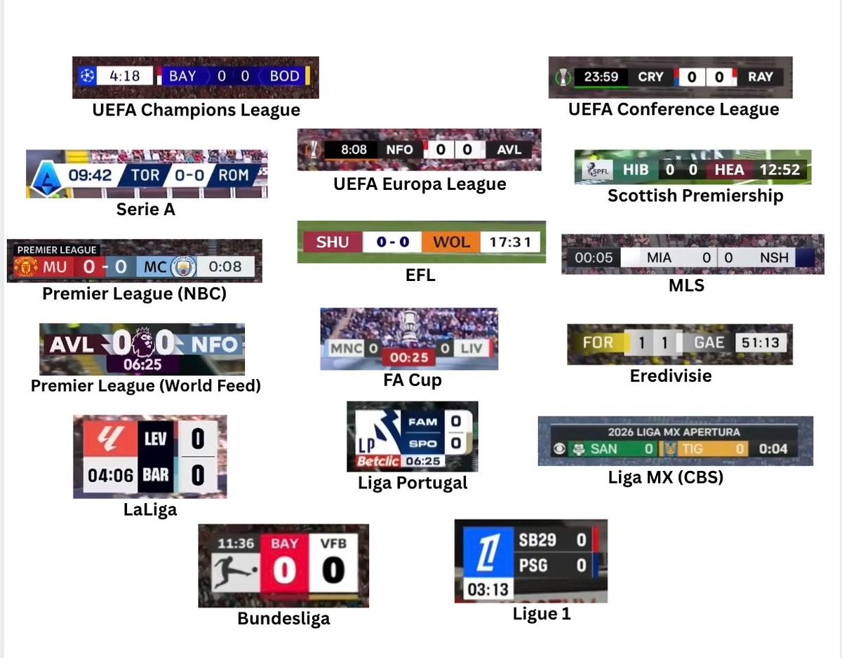
On-screen graphics have become an integral part of modern football broadcasting, directly shaping how supporters digest match details and information. A comparison shared by sports media creator @Braylon_Breeze brought together 16 distinct scorebugs featured across contemporary broadcasts, highlighting the diverse visual identities adopted by major leagues and networks. From the clean, vertical arrangements of Ligue 1 and La Liga to the horizontal bars used across UEFA club competitions, the overview captures the differing design philosophies currently on display.
While all scorebugs serve the fundamental purpose of presenting the scoreline, match clock, and team colors, their execution varies considerably. Tournaments like the UEFA Champions League, UEFA Europa League, and the Premier League opt for streamlined horizontal strips with strong contrast and subtle tournament branding. In contrast, competitions such as the Bundesliga and Ligue 1 utilize distinctive square or stacked formats, while Apple TV's presentation for MLS embraces extreme minimalism by stripping away ornate design elements in favor of a low-profile look.
The side-by-side comparison sparked lively discussion among fans regarding legibility versus graphic flair. Supporters often single out the high readability of the Bundesliga and Champions League graphics for praise, while bulkier or more generic designs frequently draw criticism. As broadcast networks and leagues continue to overhaul their visual packages season after season, scorebugs remain one of the most prominent and scrutinized design pieces in televised football.
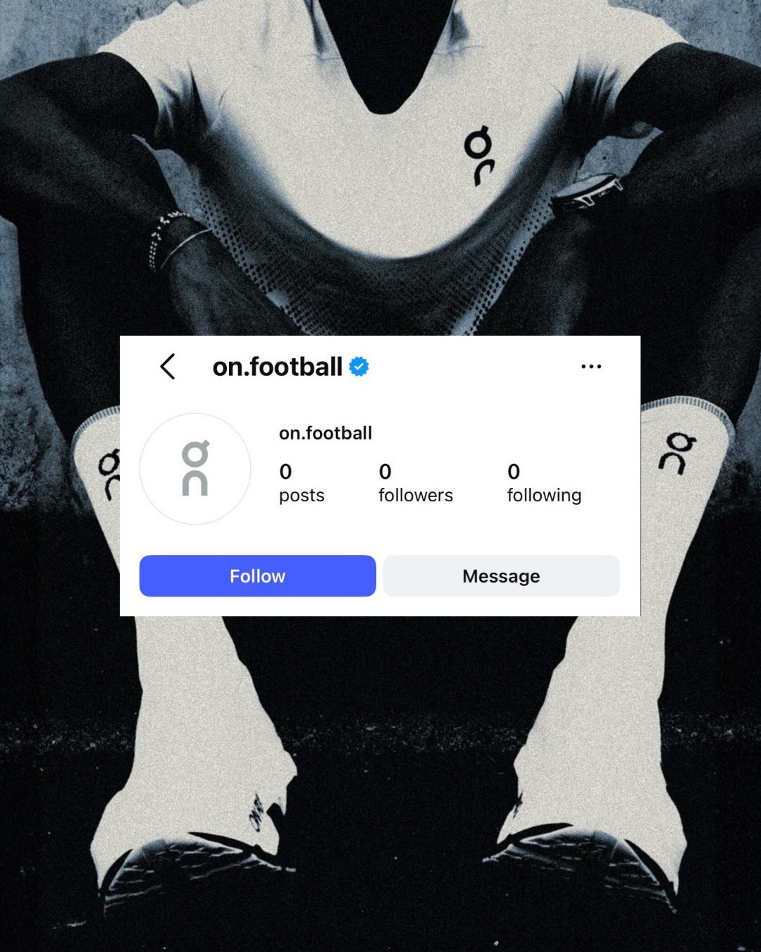
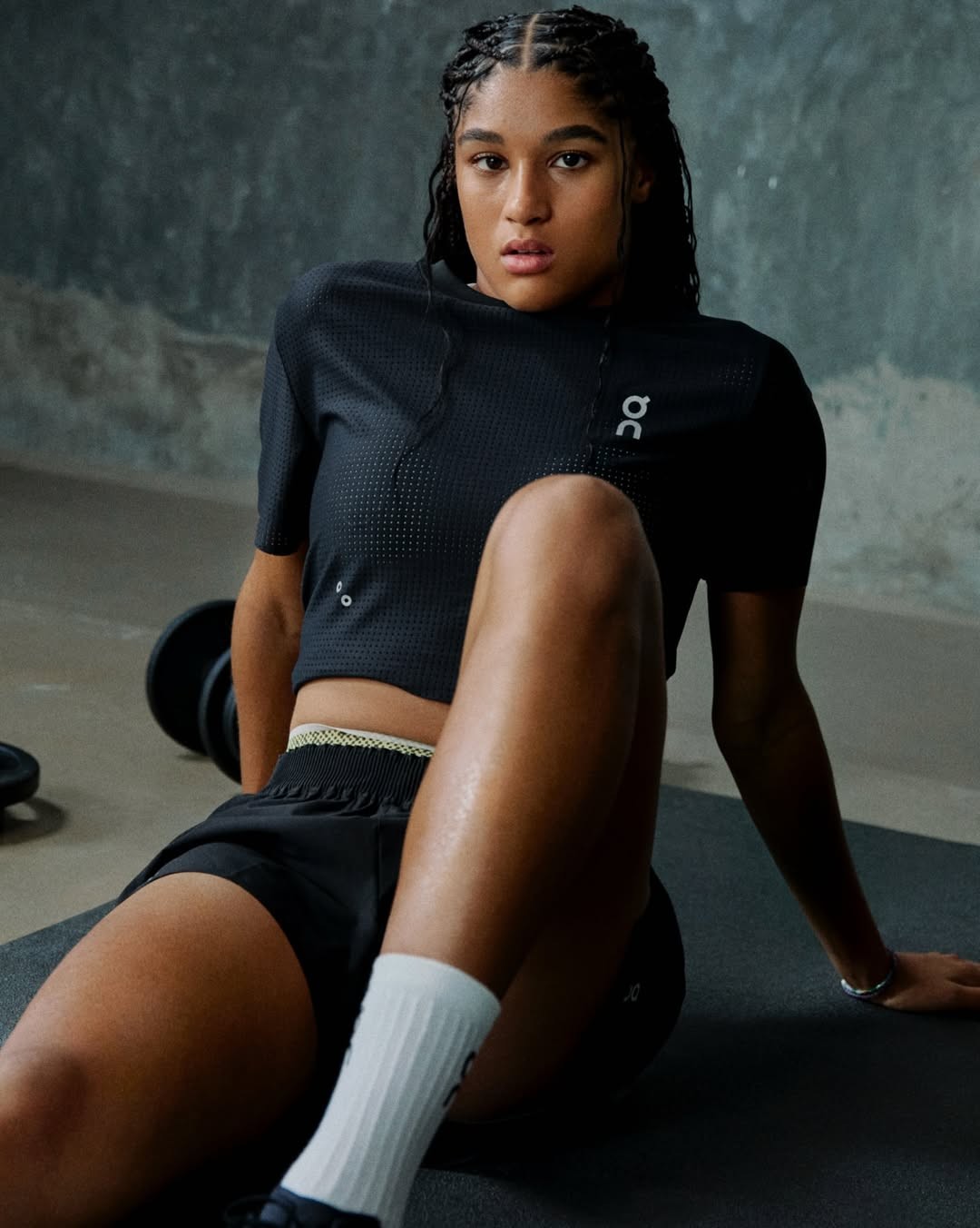
Swiss Brand "On" Prepares Official Entry Into Football Boot Market
Swiss sportswear company On is taking its first official steps into football. Renowned globally for its high-performance running footwear and rapid expansion across tennis and athletics, the brand has begun teasing its venture into the world's most popular sport with dedicated football channels. This move follows reports earlier in 2026 indicating that On is preparing to challenge established giants like Nike, Adidas, and Puma by bringing its innovative production methods, including its robotic LightSpray upper technology, to football cleats.
The groundwork for On's football expansion has been developing behind the scenes for several months. The brand initially signaled its interest by partnering with young Swiss international Sydney Schertenleib to co-develop training and lifestyle products. As the Swiss company readies its debut boot models, speculation regarding marquee athlete endorsements has also accelerated, fueled by persistent industry rumors linking top-tier players to potential landmark deals with emerging market disruptors.
Early concepts and design previews indicate that On will translate its clean, technical aesthetic and seamless upper constructions directly onto the pitch. While technical specifications, launch timelines, and the official player roster for the upcoming 26-27 period remain tightly guarded, On's arrival represents one of the most fascinating shifts in the modern football footwear landscape.
Adidas Originals Liverpool EQT Collection Released
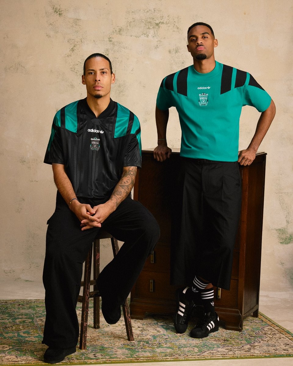
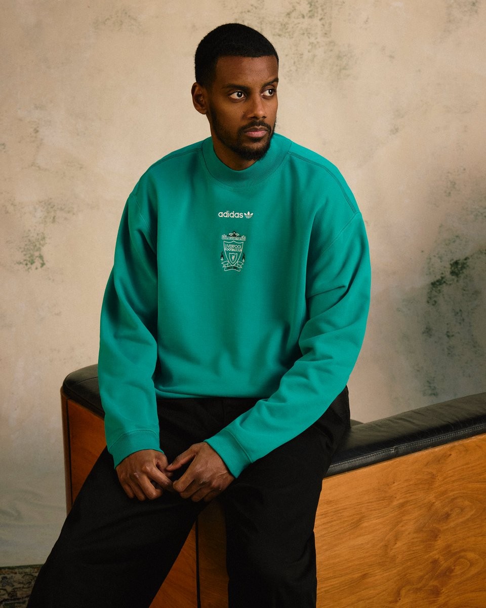
Liverpool FC and adidas Originals have officially released a brand-new retro collection heavily inspired by the iconic adidas Equipment (EQT) era of the 1990s. Following earlier heritage drops, this new lifestyle capsule leans fully into the bold aesthetics of vintage nineties teamwear, combining a sharp black and EQT green colorway with oversized retro design elements.
The centerpiece of the range is a retro-inspired shirt crafted with subtle tonal vertical stripes, bold diagonal block stripes extending across the shoulders, and centered vintage logos featuring the classic 1990s Liverpool crest and adidas Trefoil wordmark. Alongside the jersey, the apparel collection includes a woven track jacket, half-zip top, crewneck sweatshirt, graphic t-shirts, and track pants, spanning unisex, women's, and kids' sizes.
The new adidas Originals Liverpool EQT collection is available immediately through the official Liverpool FC online store, club retail locations, and the official LFC Store app.

Central Coast Mariners 26-27 Home, Away & Third Kits Released
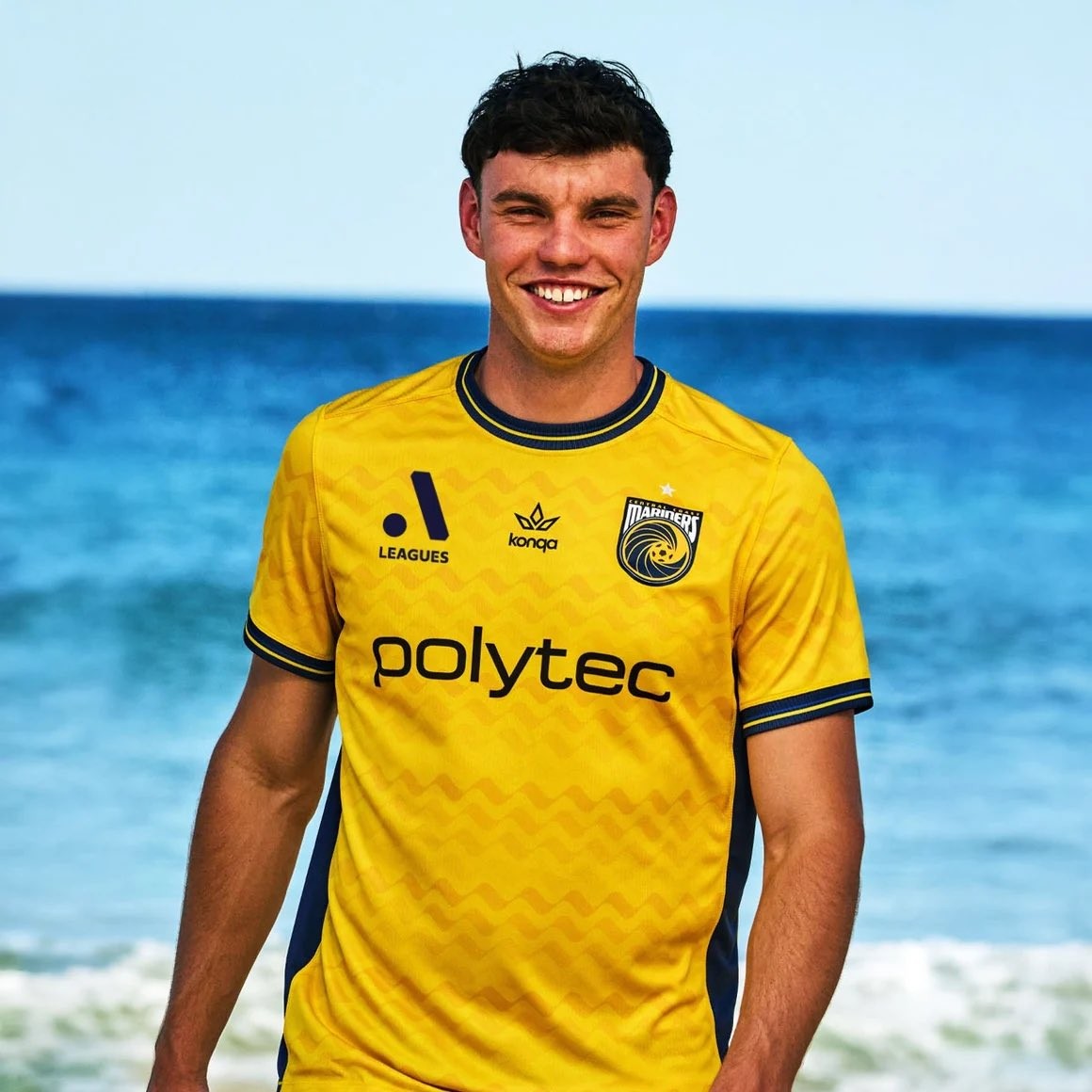
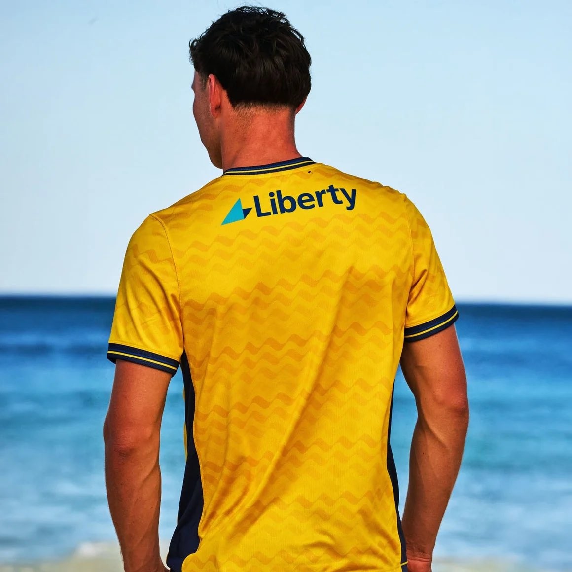
A-League side Central Coast Mariners have officially unveiled their new home, away, and third kits for the 26-27 season. Made by Australian brand Konqa in their debut A-Leagues collection following their Australia Cup release earlier this winter, the entire set is designed around the identity of the region, carrying the theme "inspired by the sand, the tide and the character of the Coast."
The 26-27 home kit represents the sand, sticking to the club's traditional bright yellow base complemented by navy accents. Across the front and back runs a subtle horizontal wave graphic reminiscent of ripples on the beach, completed by a ribbed navy-and-yellow crew collar and matching sleeve cuffs. In contrast, the away kit symbolizes the ocean's tide, featuring a navy foundation highlighted by electric blue vortex rings radiating outward from around the club crest.
Completing the trio, the sky blue third kit embodies the coast with a sublimated repeating palm tree graphic. The pattern draws directly from the iconic palm trees lining the bayside stadium in Gosford, paired with subtle Art Deco design elements. All three kits feature Polytec as the primary front-of-shirt sponsor and will be worn by both the men's and women's teams throughout the 26-27 campaign.

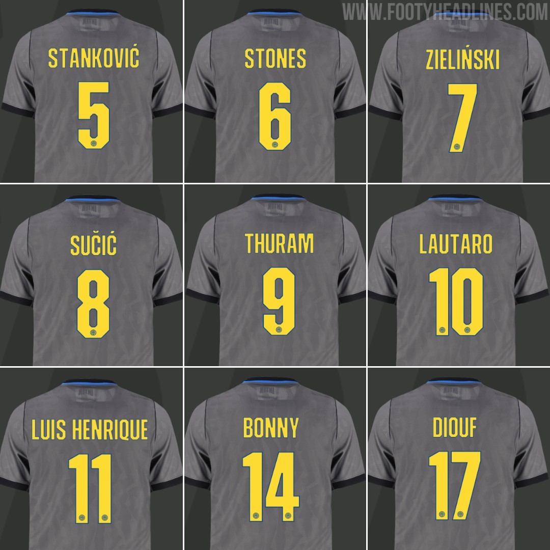
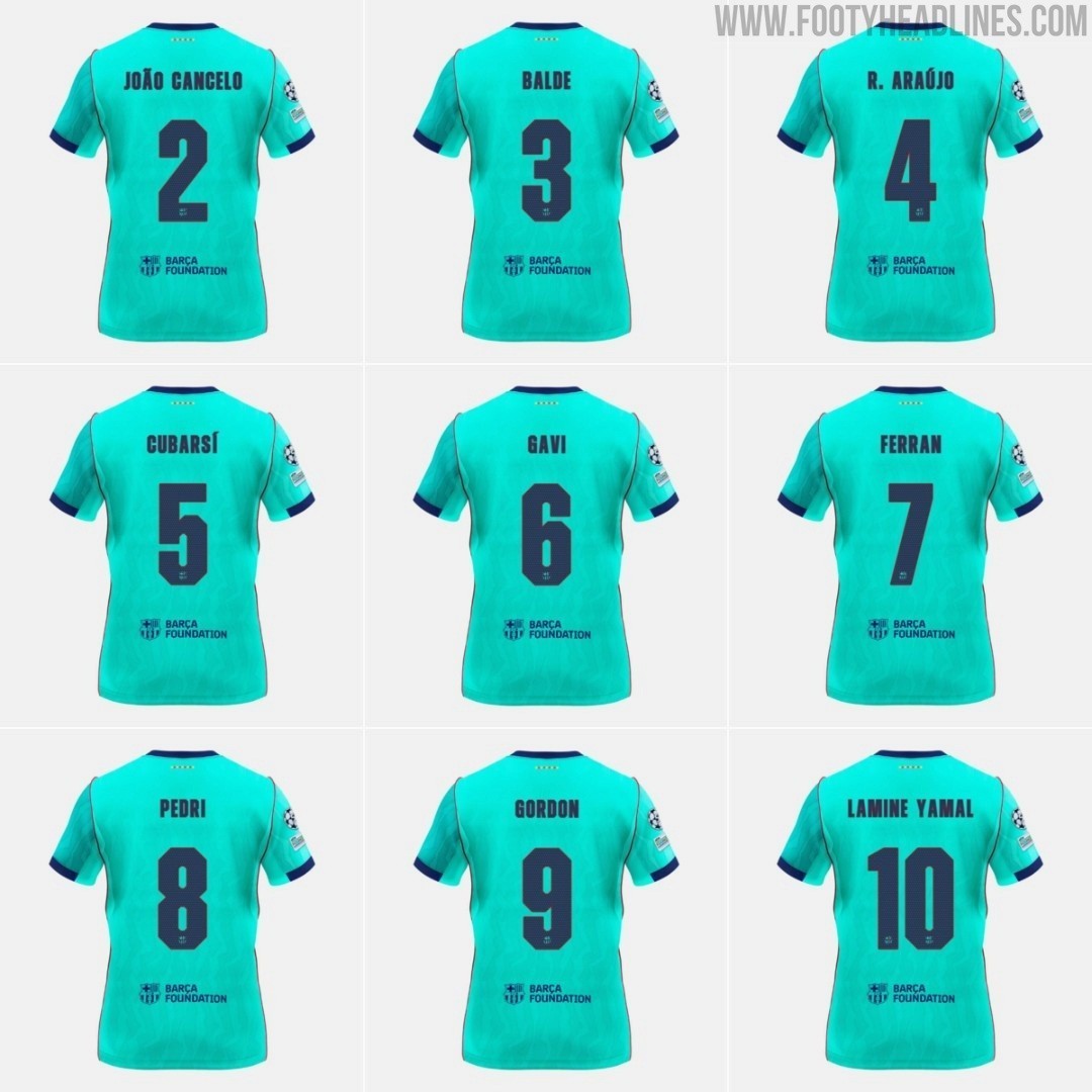
Not Unique: Inter Milan 26-27 Champions League Kit Font Is Identical to Barcelona's
While the Nerazzurri introduced a dedicated cup font for their European campaign in the UEFA Champions League, the typeface is actually not exclusive to the Italian club. It is completely identical to the custom font introduced by FC Barcelona on their own 26-27 third kit.
Barcelona officially presented the typography in August alongside their third kit, sporting an angular, blocky, and squared-off aesthetic that contrasts with the curved, art-inspired font used on their home and away shirts. For Inter's 1990s-inspired Iron Ore grey third jersey, Nike used the exact same font set. The only differences are the color scheme - Speed Yellow with a subtle blue outline for Inter compared to deep navy for Barcelona - and the club crest stamped at the bottom of the numbers.
Inter Milan have traditionally stuck with the standard Serie A league font even in European fixtures, so the appearance of a bespoke Champions League typeface on their third kit caught plenty of attention. However, it seems Nike chose to streamline the design across their elite roster rather than creating a truly unique typography for each club.