Redesigned Manchester United Logo by Ozando
Ozan Dolgundag, a Turkish graphic designer, imagined how a redesigned and overhauled Manchester United crest could look like. Check out his design down below and make sure to give him a follow on Behance to catch a glimpse at all of his work.
Overhauled Manchester United concept crest by Ozando
The new Manchester United fantasy crest comes with the same base design as the nowadays used crest, which consists of a devil with trident as well as a ship in full sail in the middle of the design. However, the exterior now forms a streamlined circle in which the words 'Manchester United' are written, while one football on each side rounds off the design.
Interestingly, Ozando seems to have taken inspiration from Manchester City's logo redesign at the end of December 2015 for the overhauled Manchester United logo, as the general design and lettering are very similar.
Do you like this Manchester United logo? Let us know in the comments down below.
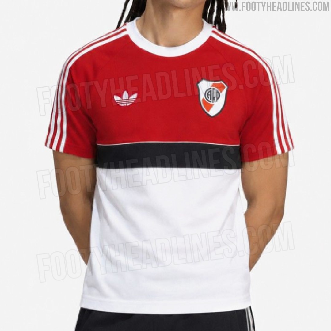
Leaked: Adidas Originals River Plate Retro Shirt Hints at 26-27 Away Kit
We have the first image of a brand-new Adidas Originals River Plate retro shirt. It is part of the team's 26-27 away collection.
The River Plate retro shirt features a color-blocked design reminiscent of classic 1980s sportswear. The upper half of the torso and the raglan sleeves are solid red, while the lower half is crisp white. Separating the two sections is a prominent, thick black horizontal chest band. A classic white Adidas Trefoil logo and the traditional River Plate shield sit high on the chest, keeping the design completely free of modern sponsors for a pure, vintage aesthetic.
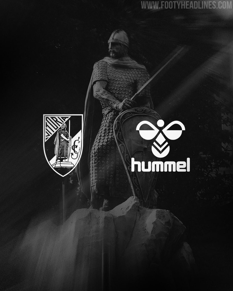
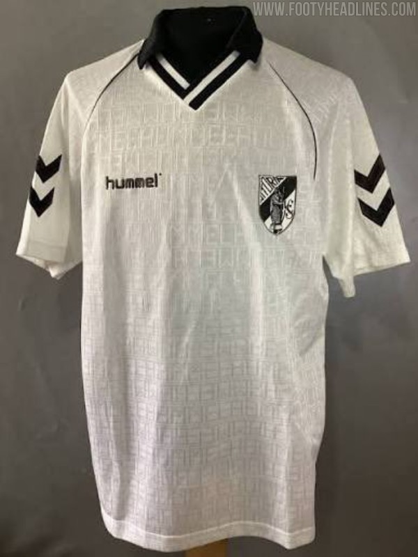
Vitória SC Announces Hummel Kit Deal
Vitória Sport Clube has officially announced a new five-year technical sponsorship deal with Hummel, beginning with the 2026-27 season. The Danish sportswear brand will supply the Portuguese club's match kits, training gear, and lifestyle apparel until the end of the 2030-31 campaign. This agreement brings an end to Vitória SC's decade-long partnership with Macron, who had been the club's kit maker since the 2016-17 season.
The club described the new agreement as a "return to the past to project into the future," referencing Hummel's previous stint as Vitória SC's kit supplier during 1992-92.
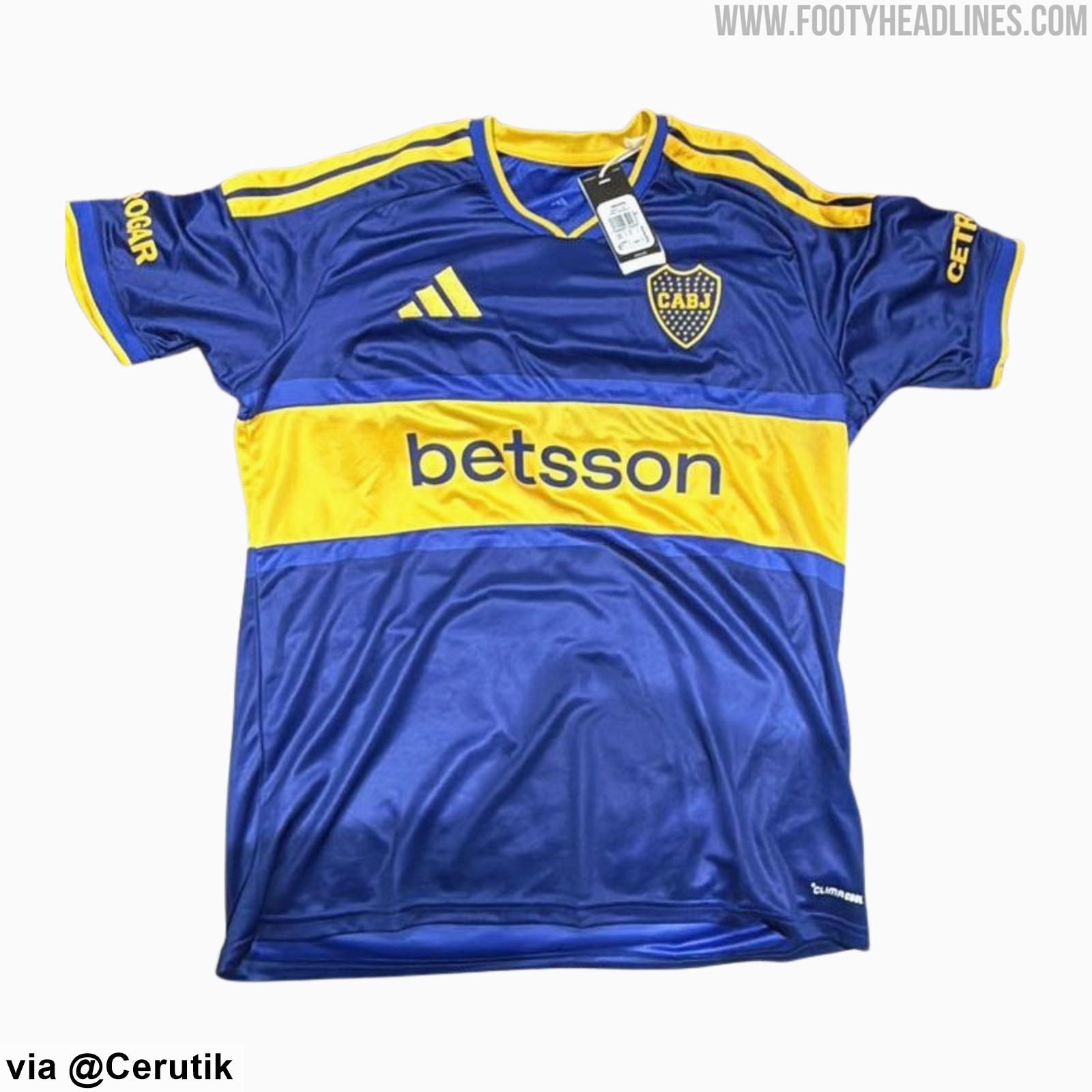
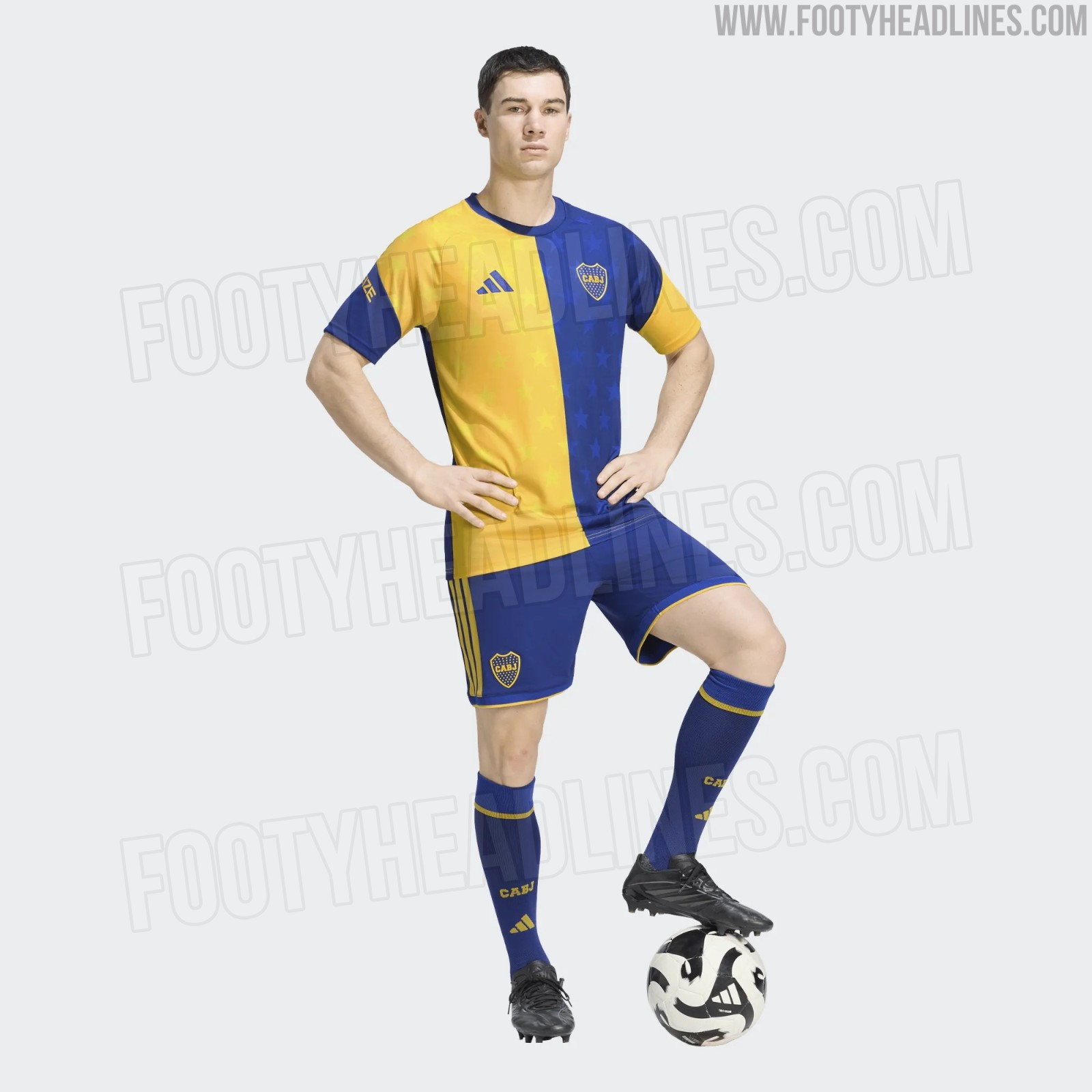
Boca Juniors 26-27 Shirt + Shorts, Socks & Pre-Match Jersey Leaked
We can leak the full look at the Boca Juniors 2026-27 home kit - it is completed by shorts and socks that match the stripe design of the kit.
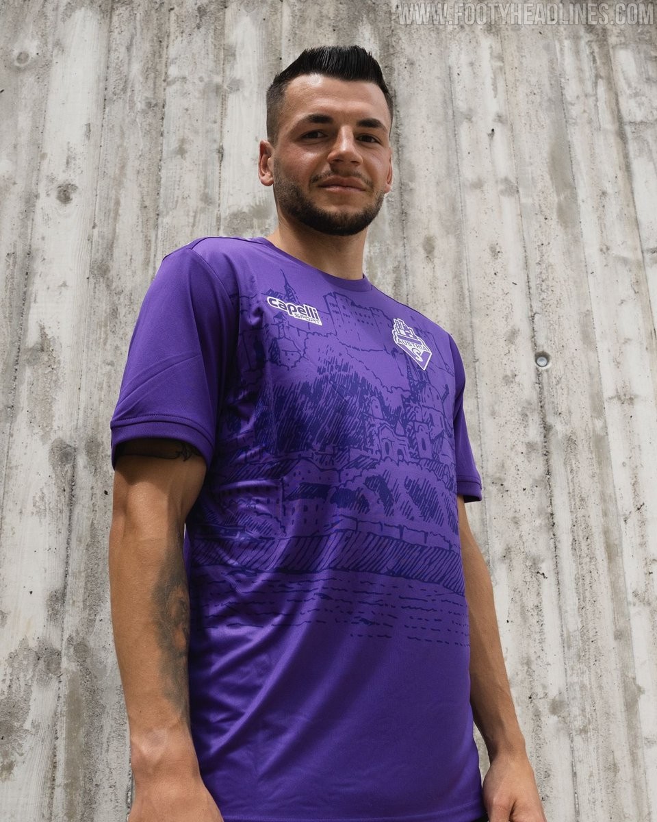
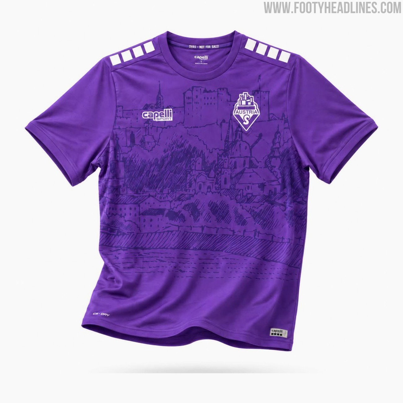
SV Austria Salzburg 26-27 Home Kit Released
The new SV Austria Salzburg home kit for the 26-27 season has been officially released today. Made by Capelli, the new shirt will be worn by the club in the Austrian 2. Liga.
The Capelli SV Austria Salzburg 2026-27 home jersey features a bespoke design in the club's traditional colors. It incorporates two different tones of violet and is highlighted by a custom graphic showcasing the Hohensalzburg fortress and the towers of the old town, representing the team's local identity and heritage.
The Capelli SV Austria Salzburg 2026-27 home football shirt is available to purchase immediately through the club's official fanshop, retailing at a price of 69 Euro.
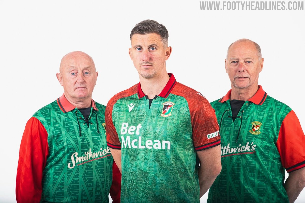
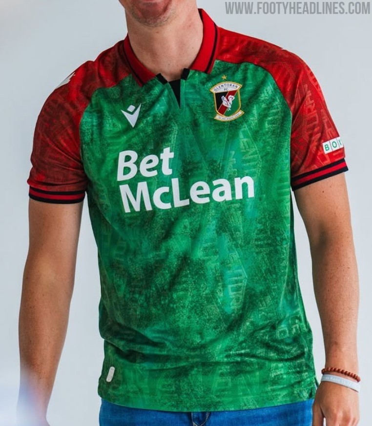
Glentoran 26-27 Home Kit Released
Glentoran and Macron have launched the club's new 2026-27 home kit for the upcoming NIFL Premiership campaign. The design pays homage to the classic 1992-93 shirt worn during their memorable European Cup tie against Marseille, featuring a green body with red sleeves and shoulder panels separated by black trim.
Giving the shirt a distinct early 1990s retro feel, a red fold-over collar is included with black striping and a black V-shaped insert at the front. A tonal graphic pattern runs across both the green and red sections, adding texture to the Macron Eco Fabric. The Macron Hero logo appears in white on the chest and sleeves, sitting opposite the stitched Glentoran crest and its accompanying gold star.
Additional details include the club motto Le Jeu Avant Tout embroidered in white on the back of the collar, and Glentoran FC Est 1882 printed inside the lower hem. Featuring Bet McLean as the main sponsor, the new Glentoran 2026-27 home shirt is completed with matching white shorts and green socks.

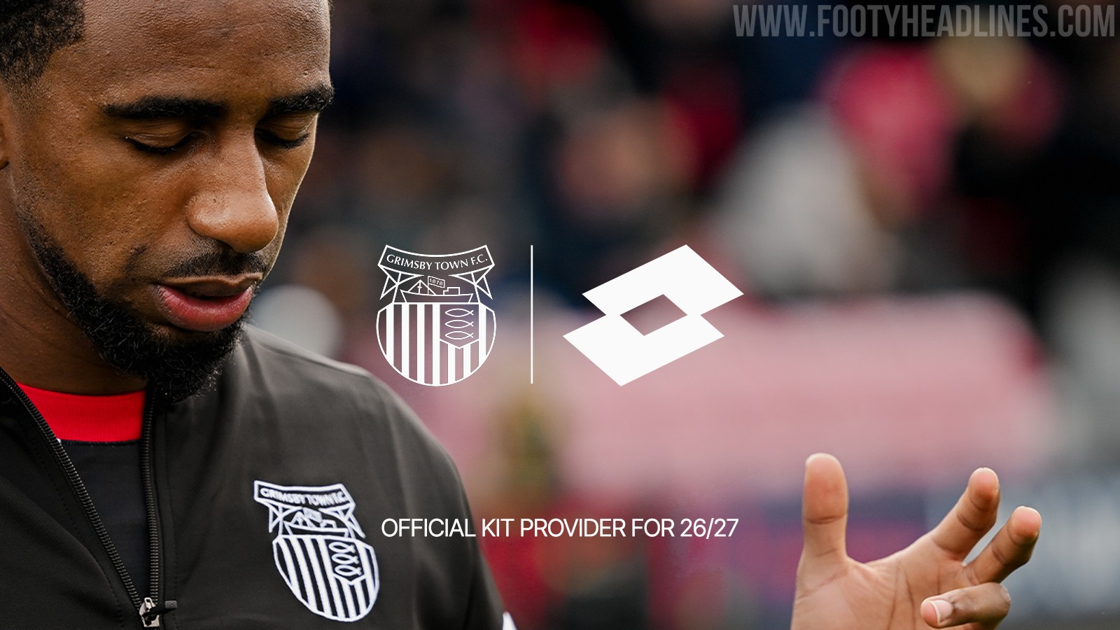

Grimsby Town Announces Lotto Kit Deal
Grimsby Town Football Club has officially announced a multi-year partnership with Italian sportswear brand Lotto Sport, who will become the club's official kit supplier starting from the 2026-27 season. Lotto replaces Umbro, whose kits were supplied to the club in collaboration with Kitlocker.
The announcement has been met with a positive reaction from fans, many of whom fondly remember the club's previous stint with Lotto kits in the late 1990s.
While no official images of the new 2026-27 kits have been released yet, supporters are eagerly anticipating the unveiling of the new designs.
