MLS Team From 2019 - New FC Cincinnati Logo & Identity Revealed

FC Cincinnati, who will play in the MLS from 2019, yesterday revealed their new MLS identity, including a new logo, marks and updated colors. The new FC Cincinnati MLS identity was unveiled before a capacity crowd at the Woodward Theater.
Ignite the passion.
— FC Cincinnati (@fccincinnati) November 12, 2018
Unite the city.
We are FC Cincinnati. #IgniteUnite | #FCCincy pic.twitter.com/33eLpc5qjZ
FC Cincinnati MLS Logo
According to the club's statement, the new FC Cincinnati MLS look takes the club’s vision and identity into the future. FC Cincinnati remains, while the words from which “FC” is shortened have changed. “Football Club Cincinnati” – the team’s full written name – will take the field in MLS. The name is to be shortened to FC Cincinnati on first reference.

The much-speculated name Fussball Club Cincinnati – or Fußball Club Cincinnati using the German character – is the formal, legal name of the club - It is not to be used in any sporting references to the team, or in any public discussion.

The branding system was created in tandem with Interbrand after an intensive three-month process that culminated in early August when it was presented to Major League Soccer officials at the 2018 All-Star Game.
We have some amazing brand firms in Cincinnati," FC Cincinnati President and General Manager Jeff Berding said. "We interviewed several firms before we decided on Interbrand. Their work with Juventus was very motivating... It was fun in that we got to involve a lot of our supporters. It was a very fun project because a lot of people got to be involved who have real passion for the club."

"That (old) crest was enormously popular," Berding said. "The first sort of fundamental question was, 'are we going to (have) a revolutionary change or an evolutionary change?' We felt very strongly that there was such enormous support for our original marks that we wanted to pay some homage to that and improve what we built. As we worked through that process there were different iterations, yeah.
FC Cincinnati's new crest, as explained by the club:
The Colors
FC Cincinnati’s familiar “Orange and Blue” color scheme remains as the club moves to MLS, but now they’re brighter and bolder.
The club’s new Orange (PMS 021) and Blue (PMS 287) pop more, with the secondary colors of Dark Blue (PMS 282), White and Grey (PMS Cool Grey 4c) added to help amplify what is a unique color palette in soccer.
The Logos
The new FC Cincinnati crest was developed as a representative of the city. Inspired by Cincinnati – itself a city on the rise – the crest highlights the region’s German heritage in a modern manner.
The winged lion has been carried over and has taken a more prominent place on the shield. It is bolder, stronger and ready for battle. It represents the club’s winning spirit, while its crown pays homage to the Queen City.
The seven points on the lion’s mane represent the seven hills of Cincinnati, while the wings’ three feathers highlight the club’s three-year journey to MLS. Curved into a “C”, the lion’s tail is another nod to Cincinnati.
Featuring the club’s two new primary colors, the crest also introduces the accent dark blue and it helps provide emphasis against the white background to further emphasize the word “Cincinnati.”
The team’s new wordmark is a familiar update on the team’s original mark. Still an orange and blue combination on FC Cincinnati, the crown remains firmly affixed atop the “C” in Cincinnati – again, a nod to the Queen City. Written straight out with no breaks or punctuation between letters, the FC moves straight into Cincinnati to show the club’s direct connection to the city.
The club’s new secondary mark is the stylized FCC from the full wordmark, while stand-alone tertiary elements will eventually include the full lion from the crest, the lion’s head and mane, and the crown. Those elements will be introduced more prominently in future years as the brand gains traction in the marketplace.
The Taglines & Hashtags
FC Cincinnati has introduced two new taglines to represent the club’s ambitions and goals, and has cemented a long-standing term as an official team reference:
Ignite and Unite
Now and Forever
The Orange and Blue
“Ignite and Unite” reflects the passion and energy of our club to inspire people to connect and join together. As witnessed in the club’s first three years, FC Cincinnati’s fan base is magically diverse and has connected different communities – demographic, socioeconomic, geographic, ethnic, etc. The club has become a rallying call for people to forget their differences and come together to support a singular subject as one.
“Now and Forever” not only captures how FC Cincinnati has arrived here at MLS, but it also conveys how the club will continue to strive for more and aims to continue its momentum in galvanizing the region behind a common source.
“The Orange and Blue” has been used by the club for much of its early history, but now the nickname is solidified in the brand as FC Cincinnati moves to MLS. It is an acceptable second reference to the club and the team, as well.
In terms of official club hashtags, #IgniteUnite will now be integrated as an official club hashtag, in addition to #FCCincy, which the club has used since its inception.
When using emojis to represent “The Orange and Blue,” the orange and blue diamonds – either the small or large versions – are acceptable with the orange emoji first, followed by an ampersand and then the blue emoji. (Examples: 🔶&🔷, 🔸&🔹).
Club Values
The new MLS identity was built on the foundation the club laid in its first three years in the country’s second division, and honed to reflect the club’s vision for the future.
The MLS brand will help FC Cincinnati write a new chapter in its story and is focused on four core values.


Share your thoughts on the new FC Cincinnati logo and the club's new MLS identity in the comments below.

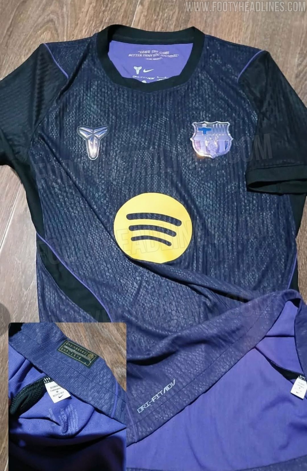
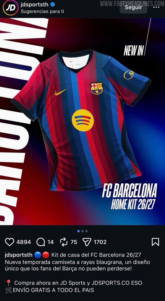
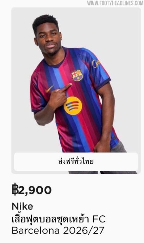
FC Barcelona 26-27 Home Kit Spotted on Sale Ahead of Official Launch
The FC Barcelona 26-27 home kit has been spotted on sale well before its official presentation. The new Nike jersey is currently available for purchase at JD Sports in Thailand, both in physical retail stores and online.
The early availability appears to be happening in multiple regions, with reports from fans mentioning sightings in stores across the United States.

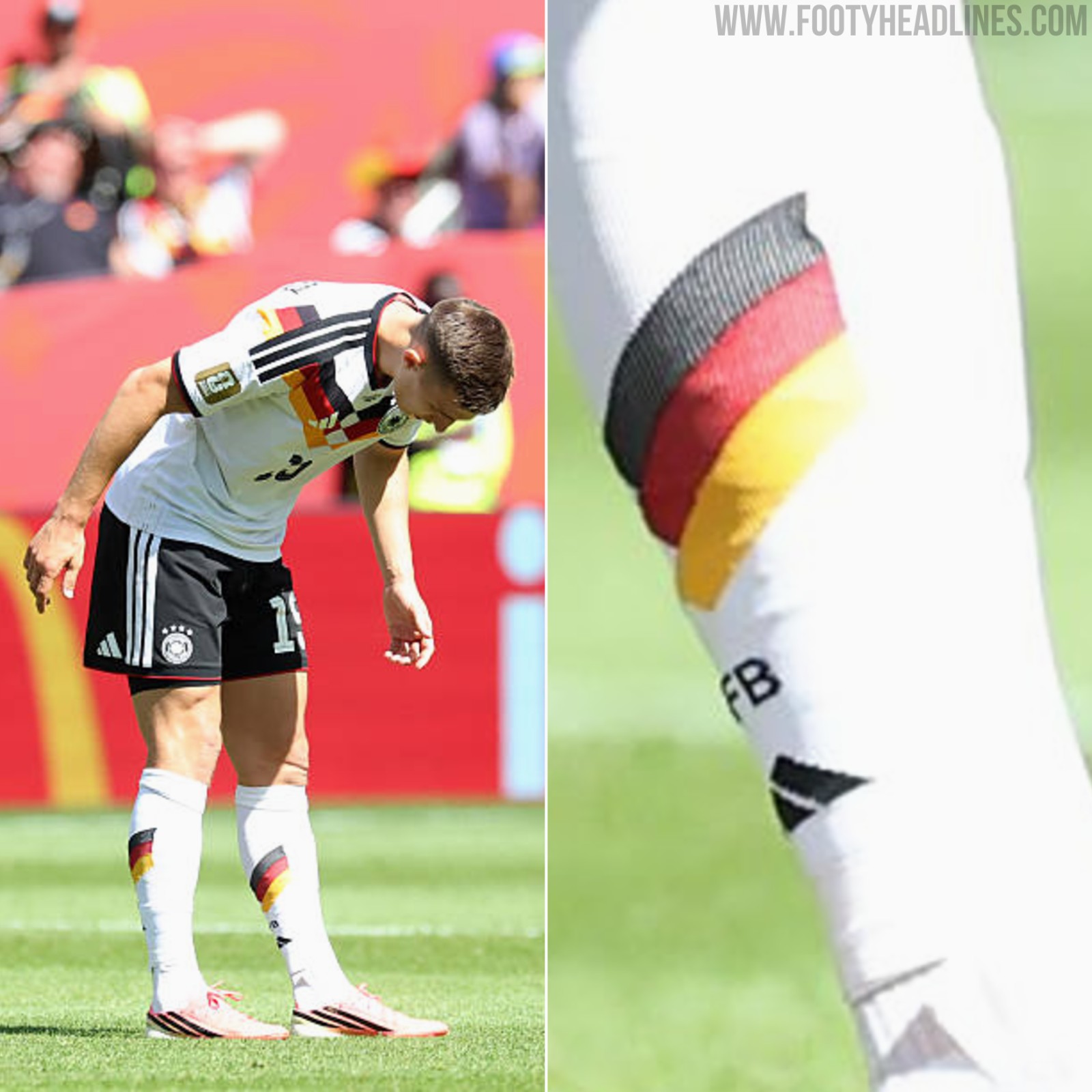
Schlotterbeck Deliberately Wears His Football Socks the Wrong Way Round
Borussia Dortmund and Germany defender Nico Schlotterbeck has a very specific habit regarding his matchday attire. The centre-back deliberately wears his football socks the wrong way round - the back is on the front, and the front is on the back.
In 2025, the Borussia Dortmund & Germany center back once told SPORT1 that this was one of his unique habits.

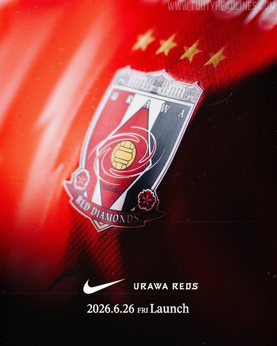
Urawa Red Diamonds 26-27 Home Kit Teased - Launch Next Week
Japanese J1 League club Urawa Red Diamonds have officially teased their new 26-27 kit. The club announced through their official social media channels that the full details and design of the new uniform will be revealed on June 26, 2026.
The teaser image released by the club gives very little away regarding the actual design of the shirt, but it confirms the continuation of their long-standing partnership with American sportswear brand Nike.

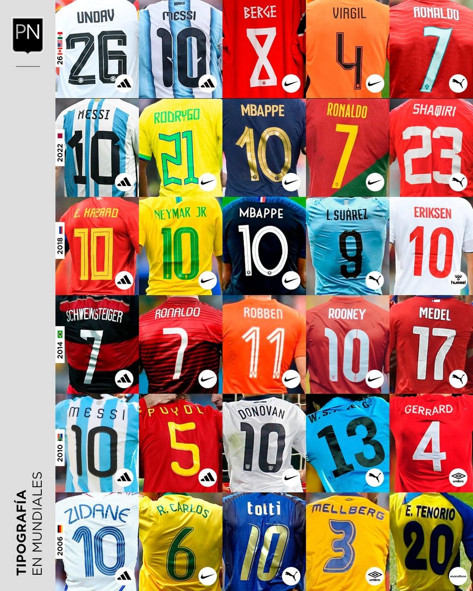
A Look Back at World Cup Shirt Number Typography
Football kit design account @PaladarNegroWeb has shared an interesting retrospective on the typography used for shirt numbers in recent World Cups. The visual language of football kits is often defined by these details, with fonts becoming instantly recognizable symbols of specific tournaments and eras.
The collage highlights various iconic typefaces worn by national teams on the biggest stage. spanning from the 2006 World Cup to the FIFA World Cup.
This overview is part of an ongoing series by the account exploring the visual elements of football. It serves as a great reminder of how deeply typography impacts the overall aesthetic and legacy of a football shirt.