Minimalist New Goiás 2019 Logo Revealed

Brazilian team Goiás Esporte Clube yesterday revealed a brand-new logo. The new Goiás Esporte Clube logo features a minimalist design.
GEC / Manifesto from BR/BAUEN on Vimeo.
Goiás Esporte Clube 2019 Logo
The new Goiás EC 2019 crest features a minimalist design, inspired by the club's classic crest of the past. It ditches all letters and information included in the previous logo in favor of just a G included within a circle.

Interestingly, the new Goiás EC 2019 crest initially reminded us of th logo of Dutch club Groningen, which shares a similar design and colors.


The Goiás Esporte Clube 2019 crest was created by Brazilian agency BR/BAUEN Design Group. The new visual identity is intended to "raise awareness among the parties involved about the importance of organization and noise elimination through a cohesive identity system".
 <
<

The agency also showcased a new kit font and typography that will be used by the club as well as examples of how the crest looks on a kit (using the Nike Aeroswift template by Rupertalbe).


What did you think of the new Goiás EC crest for 2019 and beyond? Let us know in the comments below.
Vintage Football Shirts
from Cult Kits
2003/04 Vicenza De Martin #22 *Match Issue* Home Shirt (XL) Biemme

1999/00 Monaco Trezeguet #9 Away Shirt (L) Kappa

2015/16 Raith Rovers Polo Shirt (S) Puma

2006/07 Le Mans *Player Issue* Home Shirt (L) Kappa

1995/97 Nike *BNWT* Template Shirt (Multiple Sizes)

2010/11 England Training Shirt (S*) Umbro

2008 Urawa Red Diamonds Home Shirt (L.Kids) Nike

1979 ICONIC BOOT – TOTE BAG

1996/98 Adidas (Germany) Kopke #1 Template GK Shirt (S)

1995/97 Portsmouth Away Shirt (L) Asics


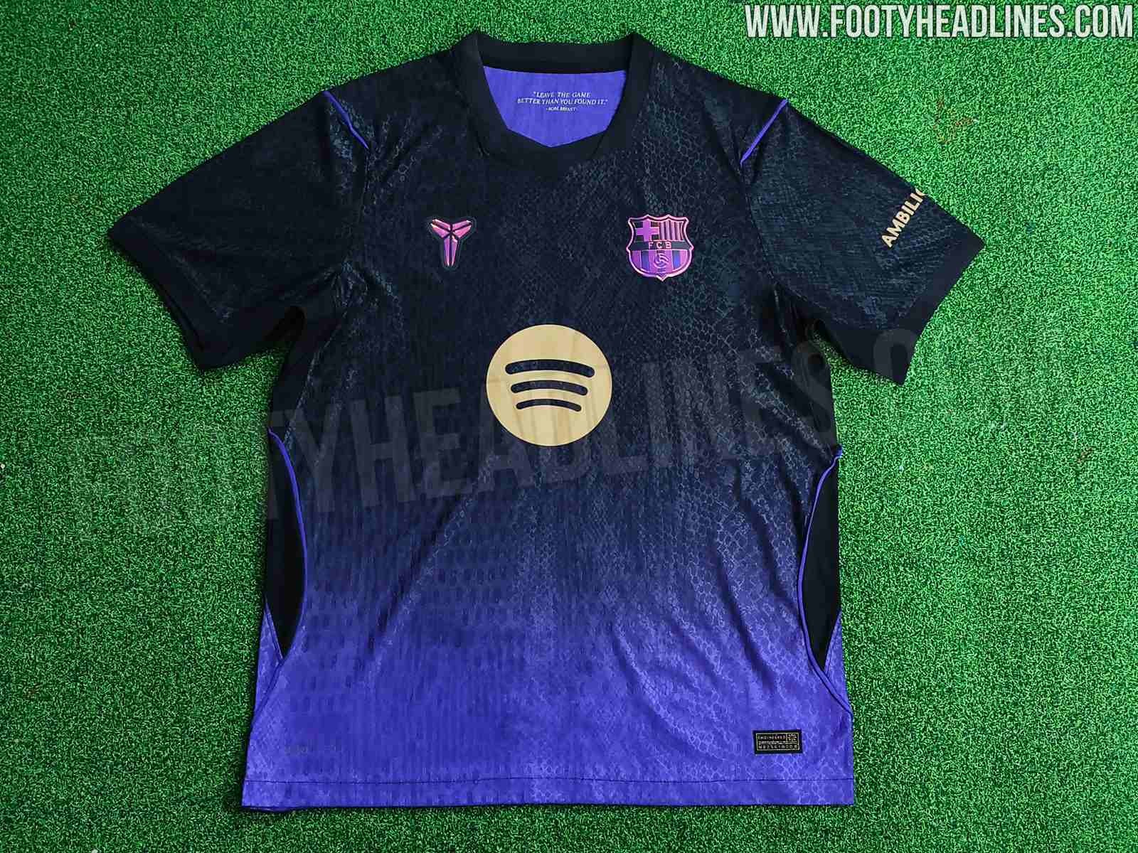
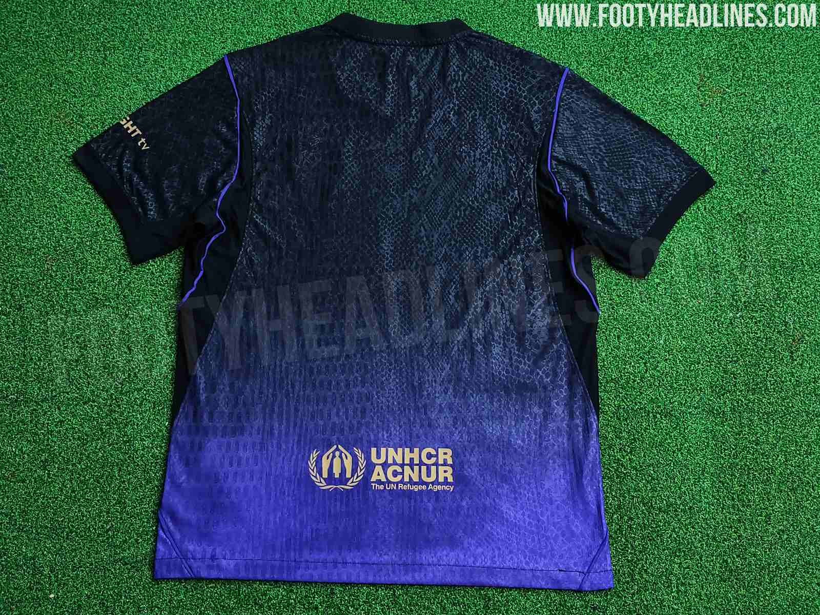
Nike Mamba Barcelona 26-27 Third Kit Leaked
We have ten new images of the Nike Barcelona 2027-2027 away kit, in the authentic version (counterfeit, based on real product).
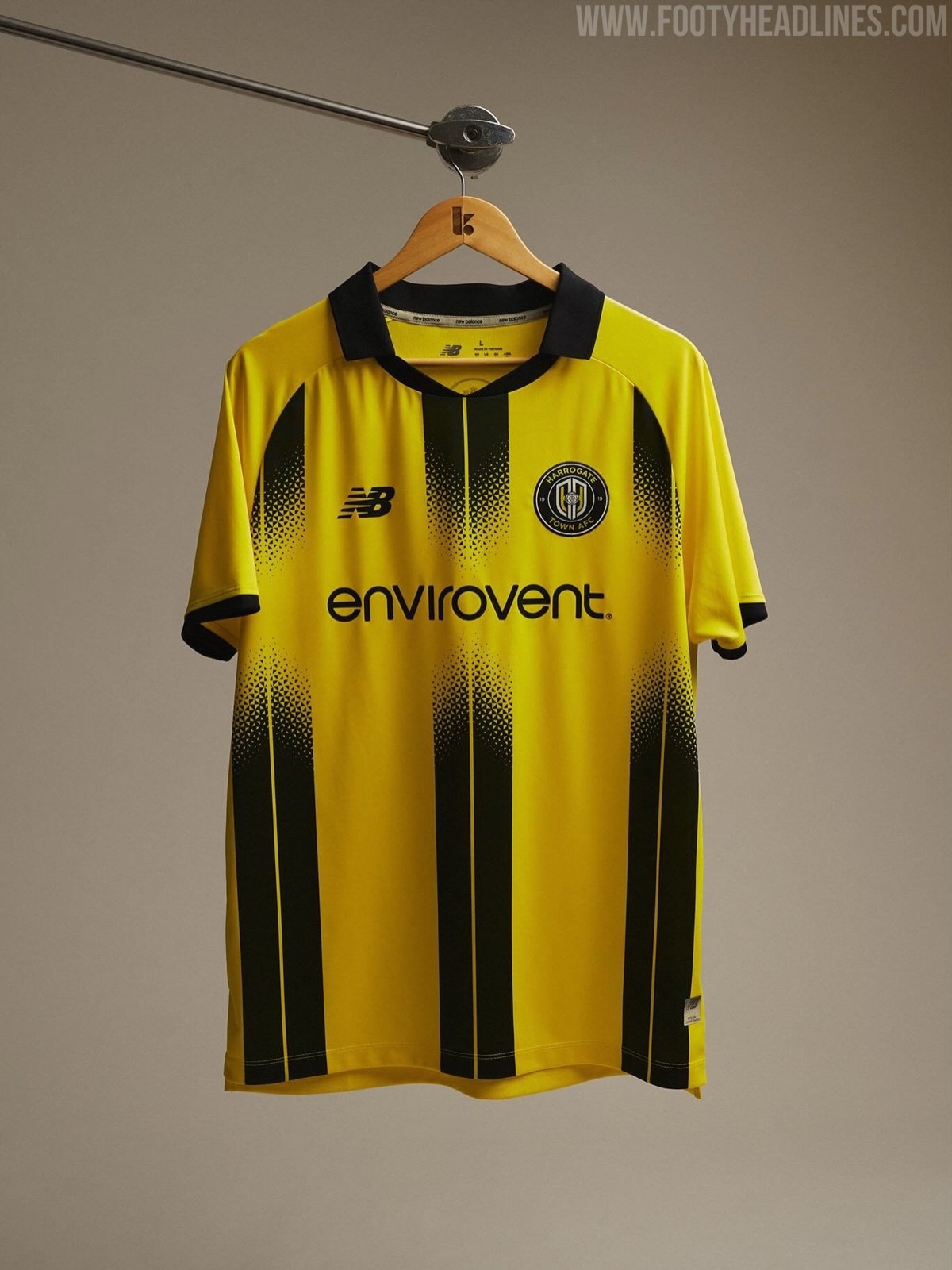
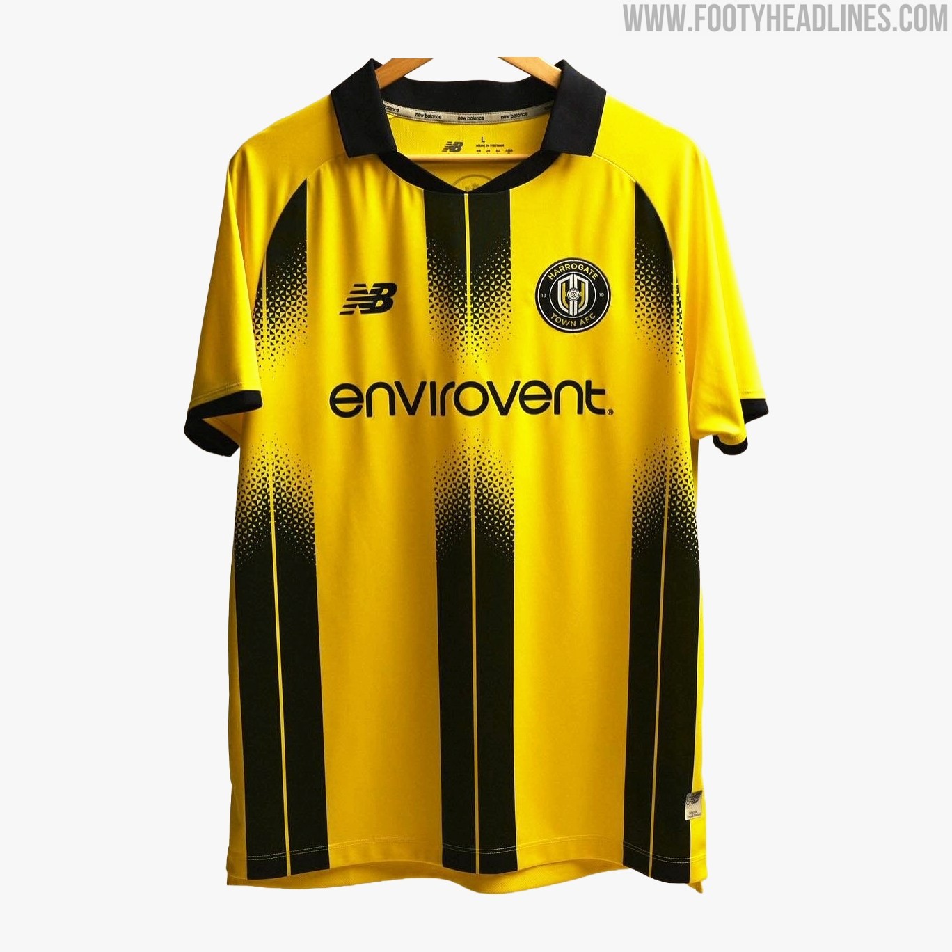
Harrogate Town 26-27 Home Kit Released
Harrogate Town has officially revealed its new home kit for the 2026-2027 season. Produced by technical sponsor New Balance, the latest primary strip offers a bold and modern twist on the club's traditional yellow and black colors. Following the recent reveal of their striking geometric away jersey, this home release confirms that New Balance is committed to delivering highly bespoke and eye-catching designs for the North Yorkshire side's upcoming campaign.
The New Balance Harrogate Town 26-27 home shirt features a vibrant yellow base, anchored by thick black vertical stripes across the front of the torso. However, instead of traditional solid bands, these stripes are executed with a modern, pixelated halftone gradient effect that fades heavily around the midsection to seamlessly accommodate the black "envirovent" sponsor logo. To ensure a cohesive and sharp aesthetic, the New Balance manufacturer logo and the official club crest are both applied in a sleek black and yellow monochrome finish.
The launch completes the team's set for 2026-2027.
What are your thoughts on this pixelated gradient stripe design for the new Harrogate Town home kit? Let us know in the comments below.


Mamba Barcelona 26-27 Away Kit - Iridescent Logo Effect
Barcelona kit collector account @memorabilia1899 has shared four images highlighting different aspects of the Mamba Barcelona 2026-27 away jersey under the theme of Mamba Mentality.
It highlights the stunning iridescent effect of the Mamba logo, with the colors shifting as the viewing angle changes.
