INSANE - Nike AS Roma 19-20 Away Kit Is Same As User Concept Design

The new Nike AS Roma 2019-2020 away kit got leaked this week. However, while the design of the jersey was an instant hit, it might be not have created by a Nike designer but by a hobby designer.

Nike AS Roma 19-20 Away Kit Design Not Created By Nike
The Nike AS Roma boasts an eye-catching lightning graphic on the front in shades of red and orange - just as a concept that was created by someone already some time ago.


In fact, when the first pics of the AS Roma 2019-2020 away kit surfaced, we thought that it would be not real but a fake based on a concept. But it is 100% certain that it is the actually kit as it was spotted at the official Nike store in Hong Kong - the photo of the new AS Roma 19-20 away shirt was taken by @AndyBell_10.

It is not known who originally created the concept...
Stay tuned for more info about the AS Roma away kit by Nike as we receive them.

Share your thoughts in the comments below.
Vintage Football Shirts
from Cult Kits
1998/00 Italy Polo Shirt (XXL) Kappa

1994 USA 94 *BNWT* World Cup Cap Twins

2000/01 Everton Gerrard #1 GK Shirt (M) Puma

1990/92 Ennerre #1 *BNWOT* GK Template Shirt (L)

2004/06 Chicago Fire Training Shirt (M) Adidas

2013/14 Netherlands Robben #11 *BNWT* Away Shirt (L) Nike

2017 Bayern Munich Track Jacket (XXL) Adidas

1998/99 Atletico Madrid Away Socks (Multiple Sizes) Reebok

1994/96 Liverpool Third Shirt (XL) Adidas

2013/14 Shrewsbury Away Shirt (M) Surridge
New Adidas Three Stripes Become Even Thicker Sometimes
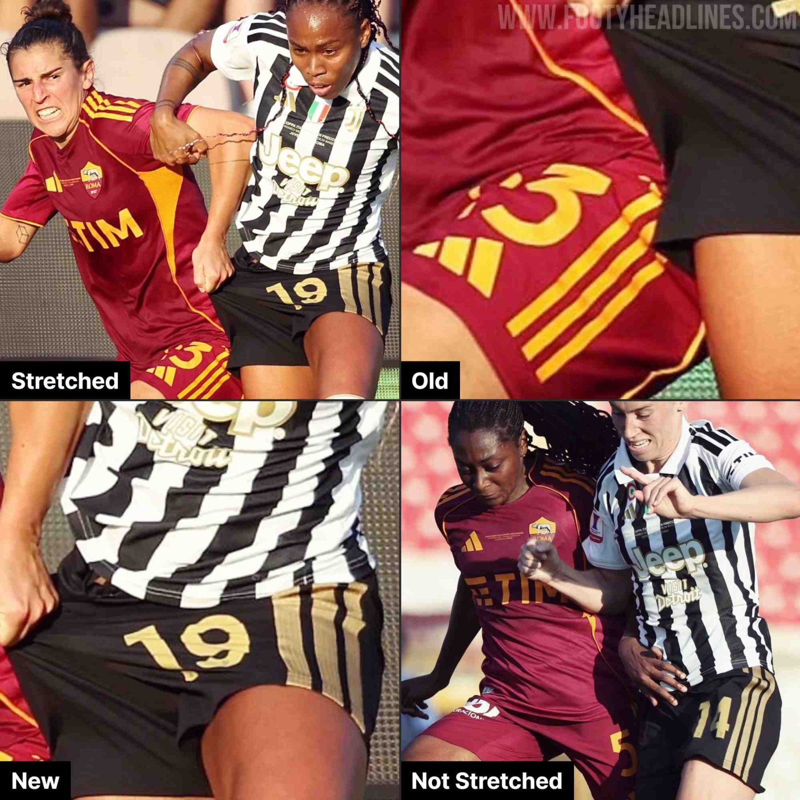
The new Adidas 2026-2027 kits have been worn around the whole of Europe this weekend. With more and more on-pitch debuts, another feature of the new kits becomes obvious.
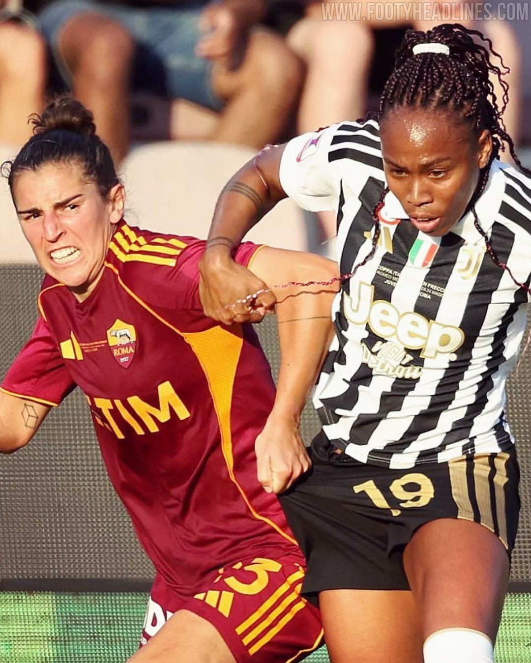
Instead of utilizing traditional stitched-on fabric strips or standard heat-pressed decals, the famous Three Stripes are now directly engineered into the woven fabric of the side panels. This has the effect that the bigger 3 stripes get even bigger when the shirt is stretched.


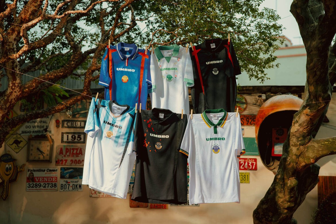
Umbro Launches Nations 2026 Collection
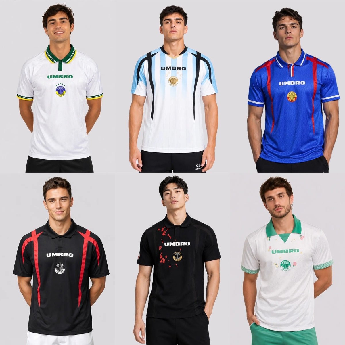
Umbro has released the Nations collection, inspired by the 2026 World Cup. The designs are available for **Brazil, Argentina, France, England, Japan and Morocco**. Rather than official team replicas, the pieces feature authorial reinterpretations with custom color palettes, exclusive graphics, crests and typography developed specifically for the project.
Each jersey includes symbolic details tied to the respective nation's identity, balancing minimalist and bolder approaches. Umbro Brazil director Eduardo Dal Pogetto noted that the aim was to go beyond traditional sportswear and create pieces representing the energy and identity of various nations with a modern outlook for daily use.
The jerseys are available now on the official Umbro Brazil website and select retailers, priced at R$349.99.

Arsenal Switches to Home Kit for Title Celebrations
After securing the Premier League title while playing in their Trefoil-adorned third kit, the Arsenal squad made a deliberate wardrobe change into their traditional 25-26 red and white home kit to actually lift the trophy.
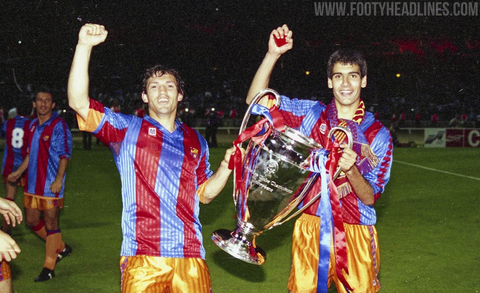
This evokes memories of FC Barcelona, who famously wore orange but switched to their home shirt for the title lifting. In contrast to Arsenal, Barcelona just switched the shirt and kept the orange shorts and socks.
Do you like teams switching into their primary colors after the final whistle to ensure historic celebrations are captured in their iconic home kits?
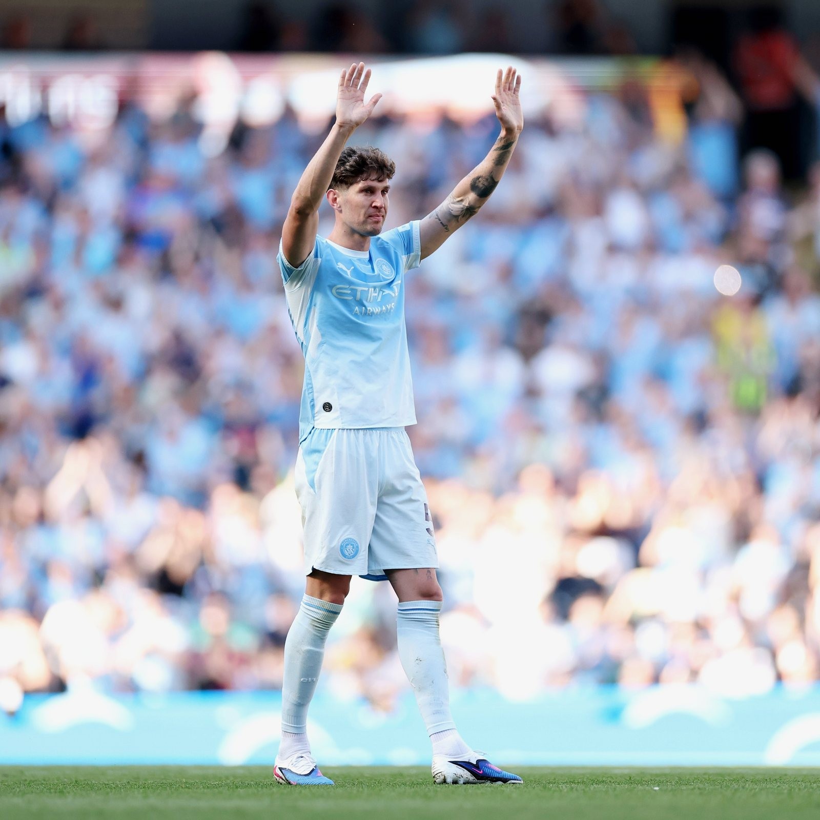
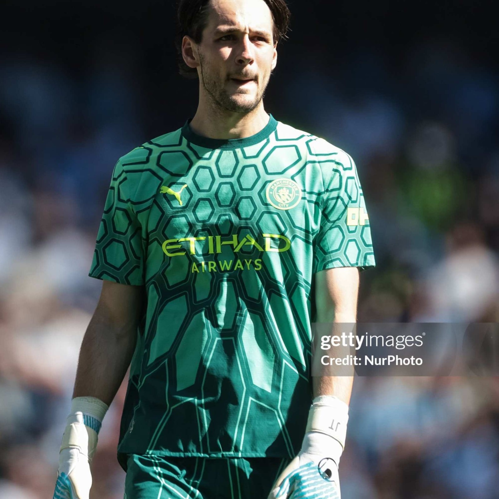
Manchester City Debuts 26-27 Home Kit
Man City did not wear the special golden inscription for Pep Guardiola. This edition was exclusively available at the stadium store, limited to 500 shirts.
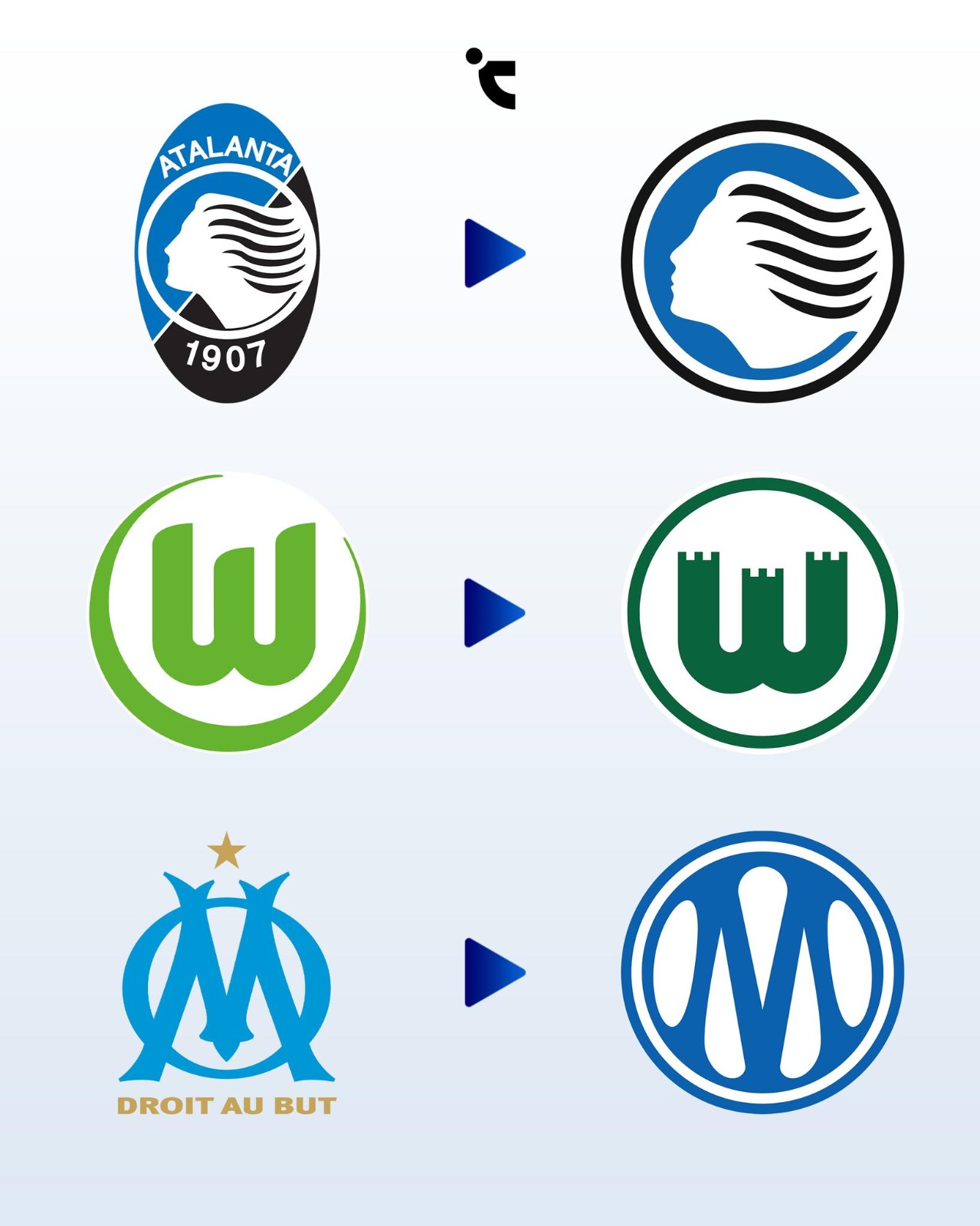
Atalanta, Marseille & Wolfsburg Change Logos for 26-27 Season
Vietnamese kit freaks Chuyện Áo Đấu have created a nice infographic of three European teams' logo changes for the 26-27 season. All of them have one thing in common - they are circular.
The underlying reasoning for this widespread circular design trend across modern football is primarily driven by digital functionality and commercial scalability. Circular, stripped-down logos provide a sense of visual balance and are significantly easier to apply across various media, ranging from tiny social media avatars to global lifestyle merchandise.
However, this rush toward extreme minimalism is increasingly alienating traditional football supporters and risking a severe homogenization of the sport's visual landscape.
For Wolfsburg, the change was praised by fans, as the Zinnen crest has been the fans' favorite design ever since. For Atalanta, it was also rooted in history, while OM was the biggest update.


