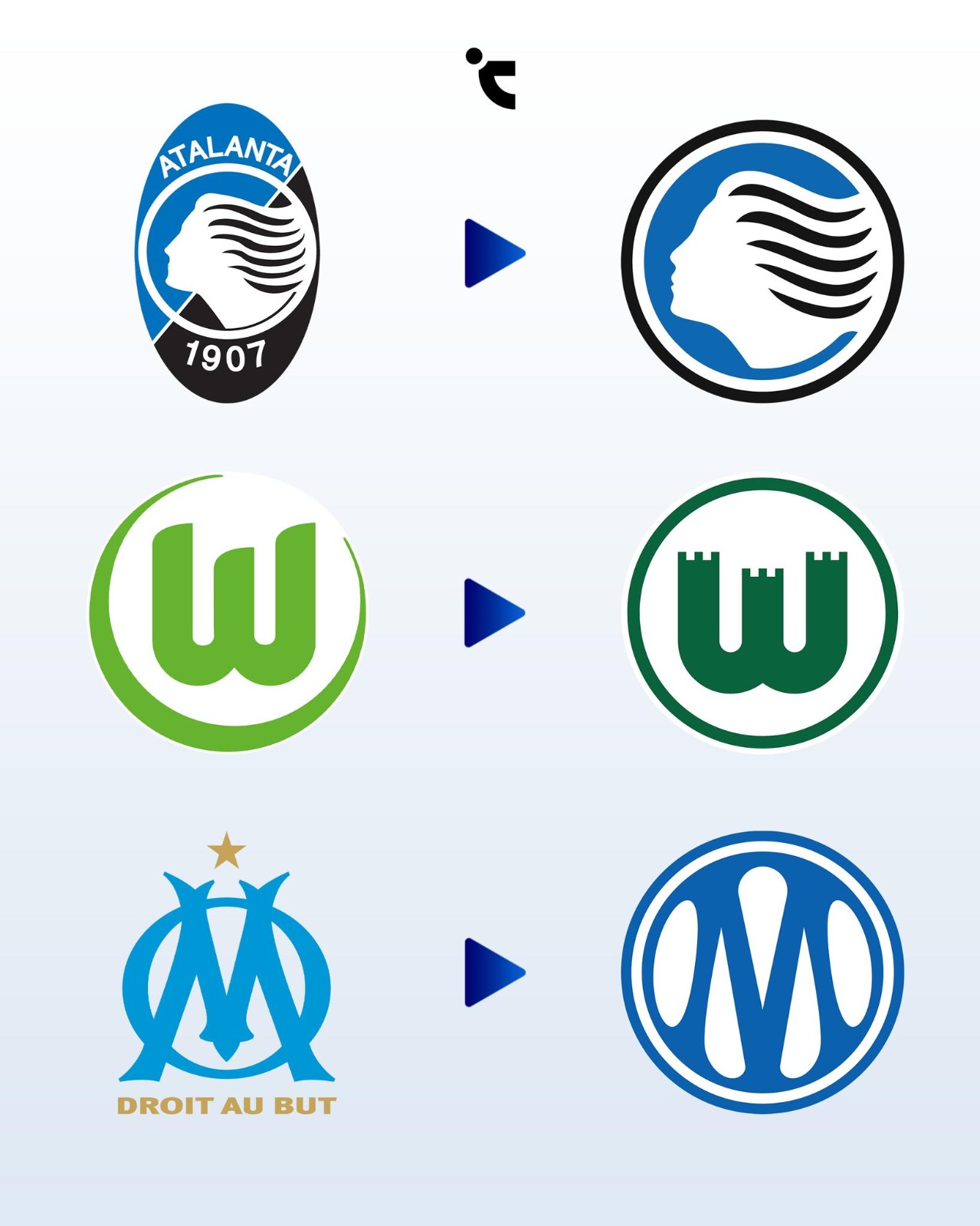
Atalanta, Marseille & Wolfsburg Change Logos for 26-27 Season
Vietnamese kit freaks Chuyện Áo Đấu have created a nice infographic of three European teams' logo changes for the 26-27 season. All of them have one thing in common - they are circular.
The underlying reasoning for this widespread circular design trend across modern football is primarily driven by digital functionality and commercial scalability. Circular, stripped-down logos provide a sense of visual balance and are significantly easier to apply across various media, ranging from tiny social media avatars to global lifestyle merchandise.
However, this rush toward extreme minimalism is increasingly alienating traditional football supporters and risking a severe homogenization of the sport's visual landscape.
For Wolfsburg, the change was praised by fans, as the Zinnen crest has been the fans' favorite design ever since. For Atalanta, it was also rooted in history, while OM was the biggest update.