Insane | FC Barcelona-Stolen WSG Swarowski Tirol Kit Font Boasts Glittery Names & Numbers
 Oct 10, 2019, by Chris

Today we came across something we have never seen before - glittery kit names and numbers on the kits if WSG Swarovski Tirol to promote the product of famous company Swarovski, producer of crystal (Swarovski Crystal).

WSG Swarovski Tirol is an Austrian football club located in Wattens, a town in the state of Tyrol in the west of Austria. They currently play in the Bundesliga, the top tier of Austrian football. They are owned by Swarovski, the world's famous an Austrian producer of crystal headquartered in Wattens, Austria.

In 2019, WSG Wattens was promoted to the Austrian Bundesliga. After promotion, the club announced that their name would be changed to WSG Swarowski Tirol.

WSG Swarowski Tirol Swarovski-Crystal Kit Font
A tricky way to promote Swarovski and the famous Swarovski-crystal the company produces, the kit font of WSG Swarowski Tirol boasts an extraordinary crystal effect. The kit numbers on the emerald green home kit are white, while the numbers of the white away kit are "emerald green".
While the crystal font style is somehting we have never seen before, the jersey font itself is not unique. In fact, the WSG Swarowski Tirol 2019-2020 kit font is stolen from the infamous Barcelona 2015-16 jersey typeface, just with more thick letters and numbers...


The kits of WSG Swarowski Tirol are not very special. Made by Erima, the WSG Swarowski Tirol 2019-2020 home kit is green / white with a horizontal stripes pattern, while the away kit is white / black.


The WSG Swarowski Tirol 2019-20 kits with "Swarovski-crystal" names and numbering are available for 85 Euro (75 Euro + 10 Euro for kit font).


What do you think of this? Do you know other clubs with such a special kit font? Share your thoughts in the comments below.
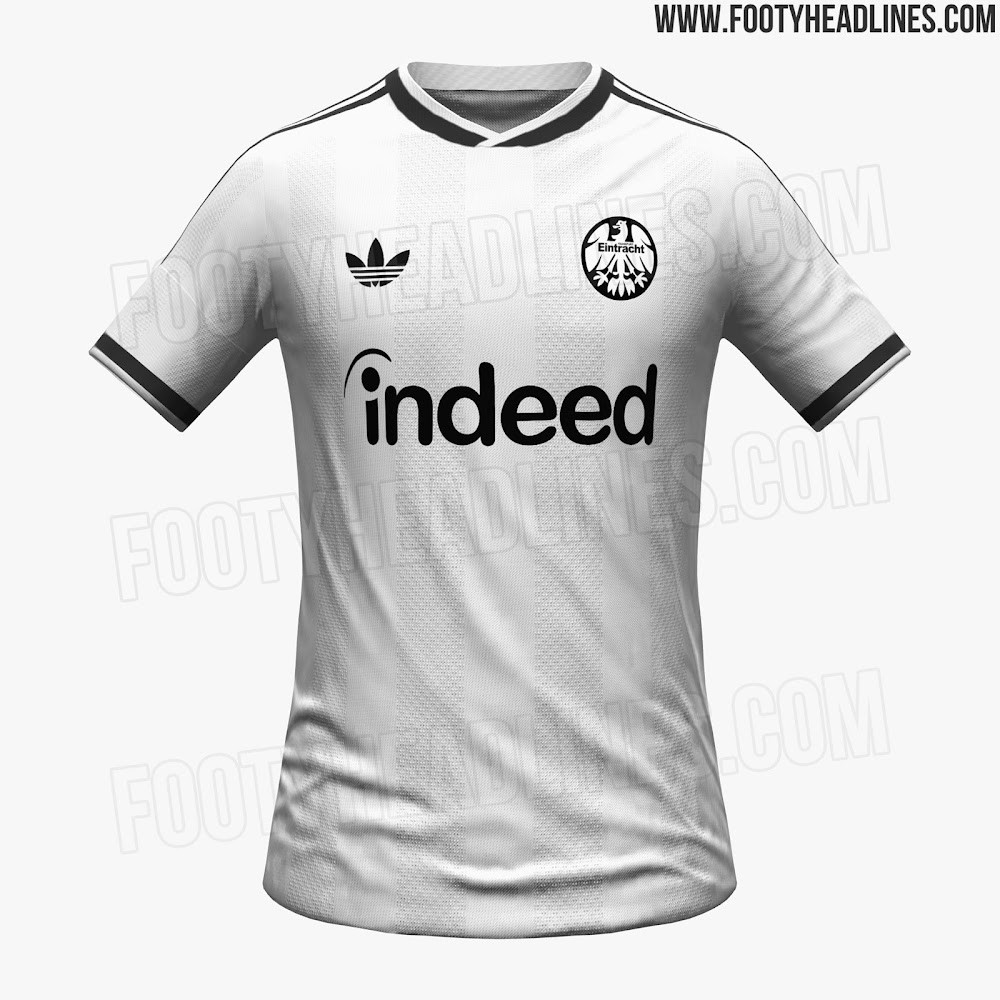
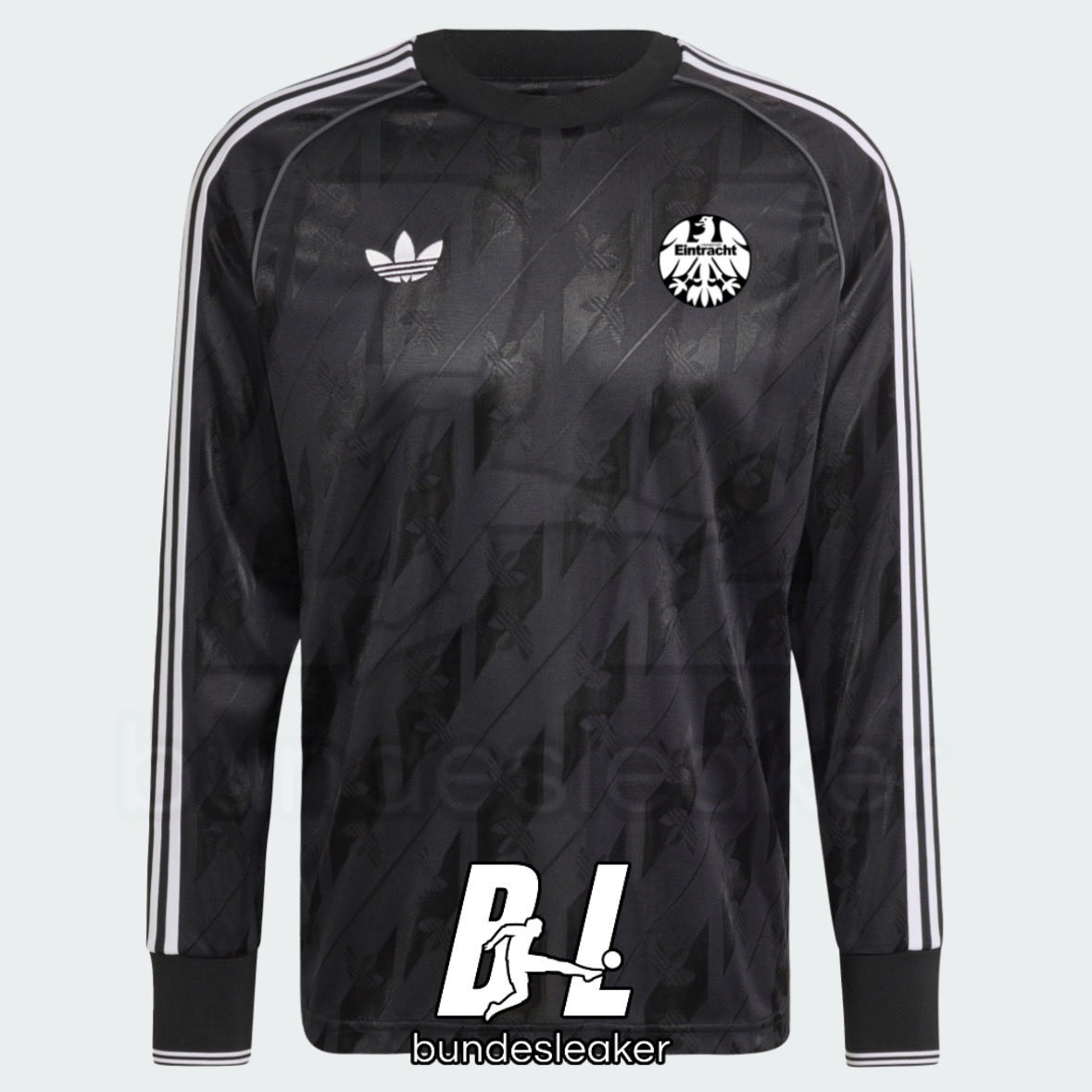
Eintracht Frankfurt 26-27 Away Kit + Adidas Originals Collection Leaked
The upcoming Eintracht Frankfurt Adidas Originals collection has been leaked online by Bundesliga kit specialist @Bundesleaker. The new images give us a comprehensive first look at the retro-inspired lifestyle range for the Bundesliga club, which prominently features the classic Adidas Trefoil logo.
The leaked collection includes a variety of apparel, highlighted by a long-sleeve retro jersey that is currently predicted to be 95 percent accurate to the final design. In addition to the clothing, the leak also showcases a first real picture of a special edition Eintracht Frankfurt Adidas Samba sneaker, confirming that footwear will be a key part of this release.
Embracing a clean aesthetic that heavily utilizes the club's traditional black and white colors, the range is designed for off-pitch wear. The Eintracht Frankfurt Adidas Originals collection is expected to be officially launched soon, joining the brand's growing lineup of retro club collections for the 2026-27 season.


Benfica 26-27 Away Kit Font Revealed
Following the official launch of the club's first-ever Adidas Originals game jersey, the bespoke lettering for the Benfica 2026-27 away kit has been revealed. The new font complements the predominantly white shirt and its distinctive central red heart graphic, which draws inspiration from the 'Papoilas Saltitantes' (jumping poppies) lyric in the club's anthem.

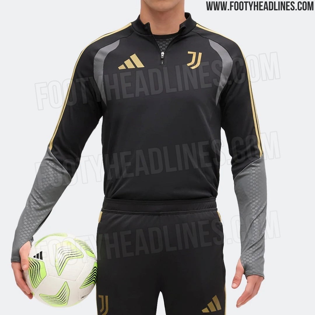
Juventus 26-27 Europa League Training Top Leaked - Official Look
The new Adidas Juventus 2026-27 European training top delivers a stealthy and premium aesthetic with a black base, dark grey side panels, and metallic gold accents used for the Juventus crest, Adidas logo, and shoulder stripes, sharing the same concept with the home kit.
The European training shirt will be worn in the 2026-27 UEFA Europa League.
What do you think of the new Juventus 2026-27 Europa League training top? Let us know your thoughts in the comments below.


Flamengo 26-27 Third Kit Leaked
The new Flamengo 2026-27 third kit has been leaked ahead of its official release. Brazilian rapper 2ZDinizz was spotted wearing the unreleased shirt during a performance in Macapá on July 4, giving fans their first look at the upcoming design.
Produced by Adidas, the Flamengo 2026-27 third shirt prominently features the classic Trefoil logo. The kit has a predominantly red base, complemented by black and white details alongside the old rowing crest.
The official launch of the Flamengo 2026-27 third kit is expected to take place later in July 2026.
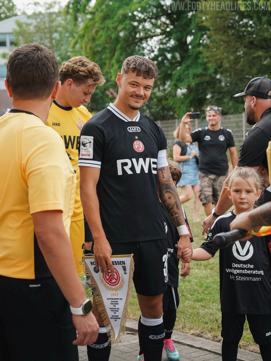
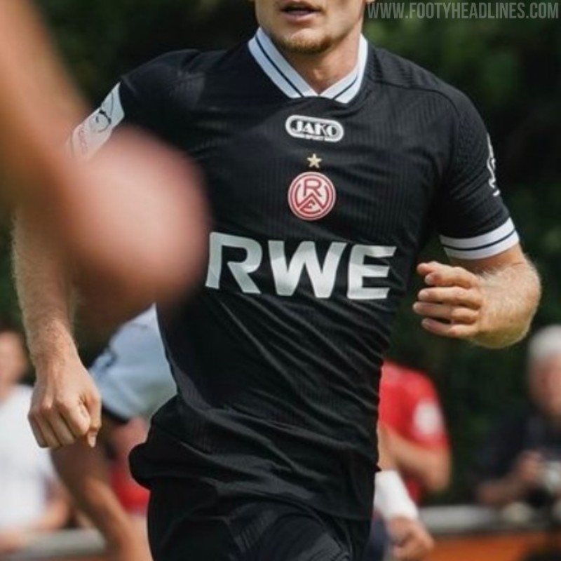
Rot-Weiss Essen 26-27 Away Kit Revealed
German 3. Liga club Rot-Weiss Essen has officially unveiled its new away kit for the 2026-27 season. Produced by Jako, the new away strip introduces a sleek black design and will be worn during the upcoming campaign.
The Jako Rot-Weiss Essen 2026-27 away shirt is predominantly black, providing a sharp contrast to the club's traditional red home colors. It is not a custom design but a 100% standard teamwear shirt.
Following a recent major sponsorship announcement, the iconic RWE AG logo is prominently featured on the front of the shirt. RWE AG signed a three-year deal to return as the club's main sponsor, while the previous primary partner, ifm-Unternehmensgruppe, has voluntarily moved to the left sleeve as a co-main sponsor.
Rot-Weiss Essen 26-27 Home Kit Revealed - RWE Returns as Main Sponsor
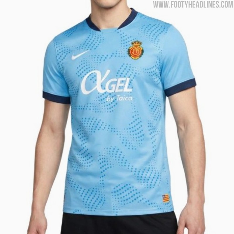
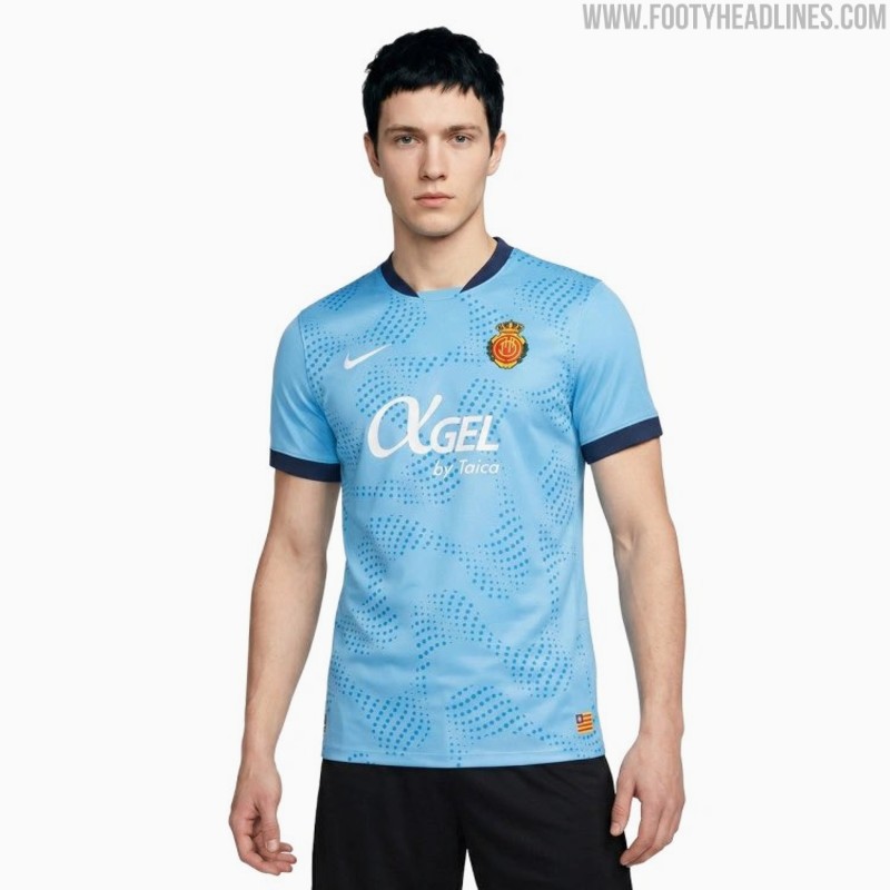
Mallorca 26-27 Third Kit Leaked


No More Kappa: Adidas Le Mans 26-27 Third Kit Released
Newly-promoted Ligue 1 side Le Mans has just revealed their third kit for 26-27 season, partner with Adidas after 10 years wearing Puma.
The new strip bring bold design featuring green and white checkers along with golden accents. Similar to most of their kits in recent years, the crest is kept in full color and placed at the center of the shirt.
The kit is now available on the club's new online store, along with its new collection box.
What do you think of Le Mans 26-27 third kit? Leave your thoughts in the comments below.
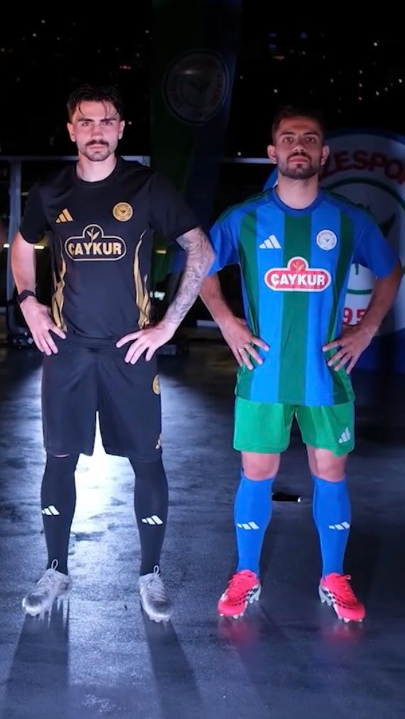
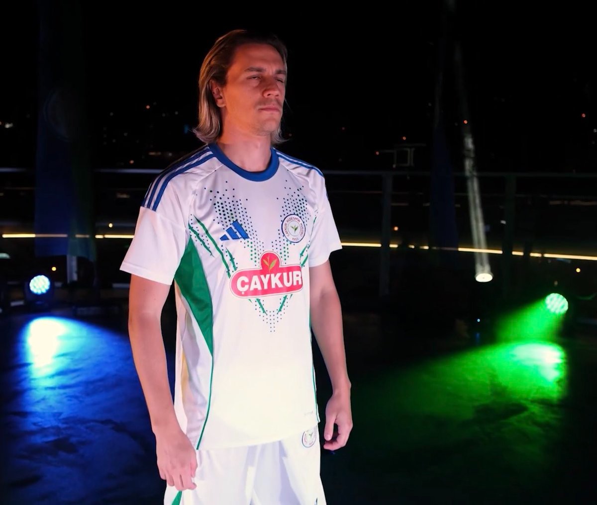
No More Nike: Çaykur Rizespor 26-27 Adidas Kits Released
Turkish Süper Lig club Çaykur Rizespor has unveiled new kits for the 2026-27 season, marking the return of Adidas as official kit supplier for the first time since 2008.
The launch features a total of five different shirts, utilizing standard Adidas templates adorned in the club's traditional blue and green colors. The new 2026-27 Adidas Çaykur Rizespor kits will be available for purchase at Atmaca SM stores starting next week.
What do you think of the new 2026-27 Çaykur Rizespor kits? Let us know your thoughts in the comments below.
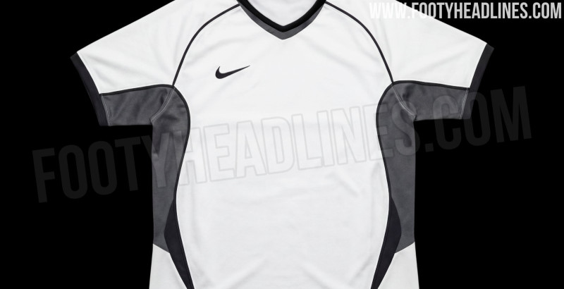
Nike 2026 Template Leak Coming
Nike has created something very good for Euro 2028 and the 2028-2029 season. Stay tuned for the full leak on Footy Headlines very soon.