Amazing New Logo For Kit - Tokyo Verdy 2020 Home, Away & Goalkeeper Kits Released
 Jan 20, 2020, by Chris

Athleta and Tokyo Verdy today released the club's new 2020 home, away and goalkeeper jerseys. They will be worn in the upcoming J2 League season.

Tokyo Verdy 2020 Home Jersey
This is the Tokyo Verdy 2020 home football shirt, made by Athleta.

Tokyo Verdy's 2020 home shirt comes with the usual colors of the club, green and gold. The most interesting new element of the new Verdy 2020 home football shirt is the badge, which has been specially designed for the shirts.


Verdy's new 2020 home shirt comes with an abstract pattern that uses the diversity of the city and people of Tokyo and the supporters of the stadium as elements of the design, and became one in Tokyo in 2020, expressing the united figure inspired by abstract paintings.


The shirt has a v-collar, golden logos and gold / green sleeve cuffs. The Tokyo Verdi brand font "TOKYO ONE" is continued to be used for uniform numbers and names to enhance the sense of unity.

Athleta combines the Tokyo Verdy 2020 home football shirt with green / gold shorts and socks.

Tokyo Verdy 2020 Away Kit
This is the new Athleta Verdy away shirt for 2020.

Tokyo Verdy's new 2020 away jersey is white and silver with green brandings and the gold logo.

The shorts of the new Verdy 2020 away strip are silver / green, while the socks are white.
Athleta Verdy 2020 Goalkeeper Shirt
Check out Athleta's Tokyo Verdy 2020 goalkeeper football shirt below.

Tokyo Verdy's first 2020 goalkeeper football shirt is black and white, while the Verdy's new away 2020 goalkeeper jersey is red, gold and green.

Both Tokyo Verdy's 2020 goalkeeper shirt feature the same graphic design as the corresponding player shirt.

Tokyo Verde also released all the other jerseys for their sport teams featuring the new branding and design.


What do you make of the new Tokyo Verdy 2020 home, away and goalkeeper shirts? Drop us a line below.



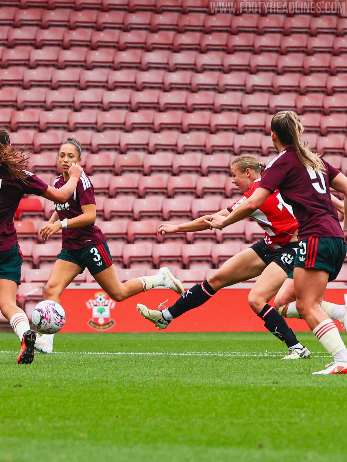

Nottingham Forest Women Wear Training Tops vs Southampton to Avoid Color Blindness Clash
In an unusual kit occurrence, Nottingham Forest Women took to the pitch wearing training tops instead of their official 26-27 away kit during their match against Southampton Women at St Mary's Stadium on Sunday. The late switch was implemented specifically to avoid color blindness visibility issues that would have arisen from a red-versus-green clash. Huge thanks to @david_g_cooper for the spot.
With Southampton wearing their traditional red-and-white home kit, Nottingham Forest's primary alternative option - their green 26-27 away shirt - posed a serious dilemma. Red and green kit pairings are strictly discouraged by governing bodies and accessibility guidelines because they become indistinguishable to individuals with red-green color vision deficiency, which affects roughly 8% of men and 0.5% of women.
Since Nottingham Forest's home shirt is also red, the club resorted to dark training gear with match numbers applied on the back to provide adequate contrast for players, referees, and spectators.
Forest could have worn their light blue kit, but apparently they did not bring it.

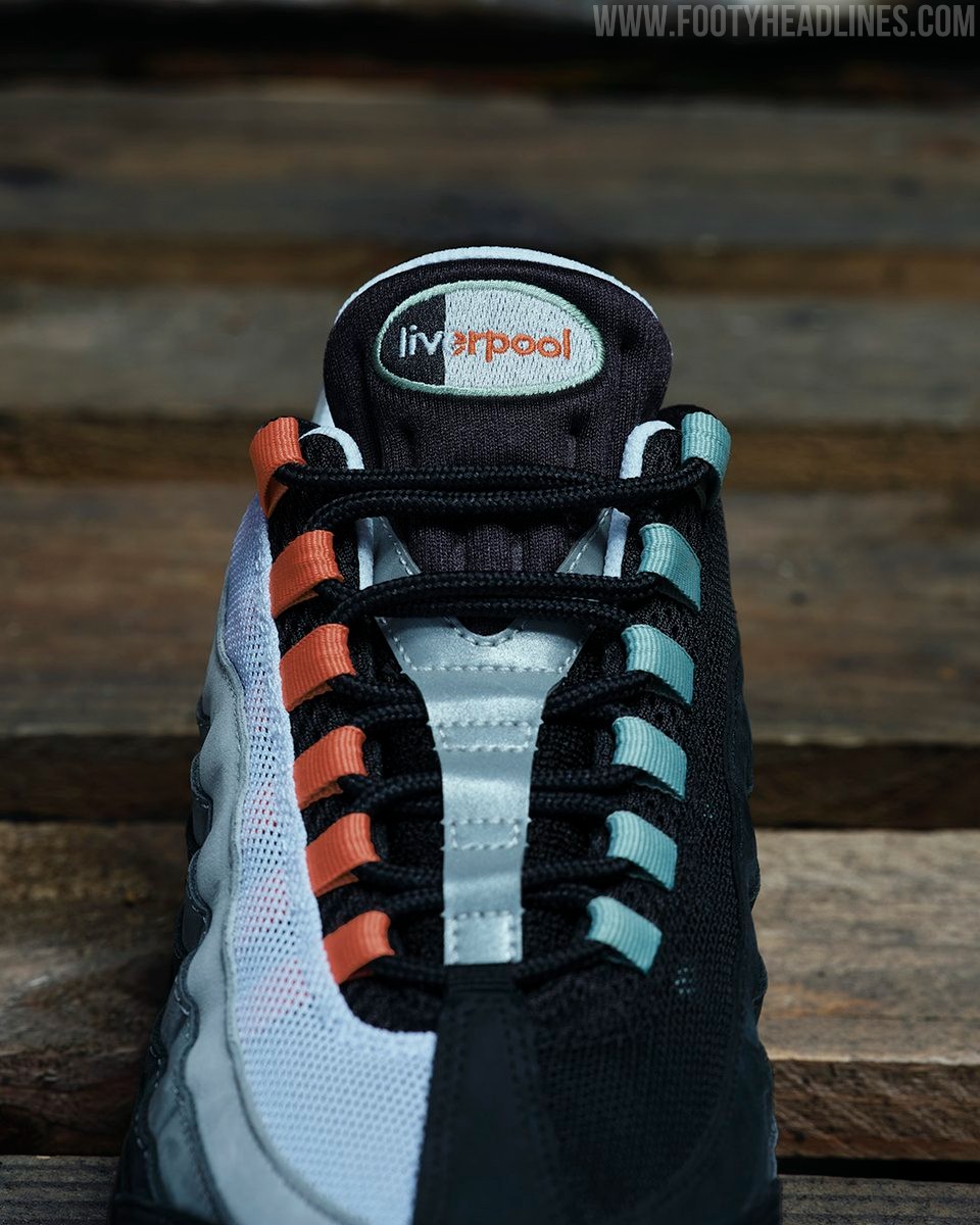
Dominik Szoboszlai Reveals Nike Air Max 95 'Liverpool'
Liverpool midfielder Dominik Szoboszlai has officially debuted the upcoming Nike Air Max 95 'Liverpool', a special-edition release designed in partnership with JD Sports ahead of their annual 1.10 Day celebration. Deeply rooted in local street culture, where the model has long been nicknamed the '110' after its original UK retail price, the sneaker is packed with bespoke details paying tribute to Merseyside. The shoe features mismatched accents of dockland-inspired 'Rust Factor' orange alongside 'Steam' green referencing the city's Liver Birds, complemented by a reflective brick pattern, a River Mersey map printed across the insole, a custom 'Liverpool' tongue badge, and 'SCOUSE' lettering visible beneath the outsole.