
48 Inter Milan Logo Options Revealed By Official Design Agency
 Apr 7, 2021, by Chris

On March 30 2021, FC Internationale Milano revealed their all-new visual identity. The club's new branding was not created in-house but by Munich-based agency Bureau Borsche. Now the founder of the design studio, Mirko Borsche, has shared some insights of the new Inter Milan logo.


It took one year of work, with a team of twelve people, to redesign the logo
It took the design studio Bureau Borsche one year of work to redesign the logo, with a team of twelve dedicated people - the logo of the International Football Club has now "a contemporary and digital friendly key".

Logo Created During Design Process Of New Inter Milan Badge

As visible on one picture, the designers experimented with many different variations of the 'IM', including some modern and vintage influenced looks. According to Mirko Borsche, the "research that has spanned a century of history and has produced about three hundred different logo options".
They produced about three hundred different logo options
In total, there are 48 different logo designs visible. We have taken close-up pictures of some remarkable ones.


"The main problem [with the previous logo] was the contrast between gold and white, which made it invisible on television and on portable screens", said Borsche, "we had to reduce the concept at all costs, and make it more essential ».
The work of invention was coordinated by Kolja Buscher, a 31- year-old graphic designer who had already created the restyling of the Balenciaga logo.


The designers have kept almost 90 percent of the original proportions
Albeit the new Inter logo looks totally new appears to have been completely revolutionized, the designers swear to have kept almost 90 percent of the original proportions.
For more about the new Inter Milan logo and the design process, we recommend this article on Vogue (Italian) and Highsnobiety, who managed to speak to Mirko Borsche directly.


Have you already grown up on the new Inter Milan logo? Which of the 49 logos created during the process do you like the most? Comment below.
Purple Real Madrid 26-27 Originals Collection Leaked
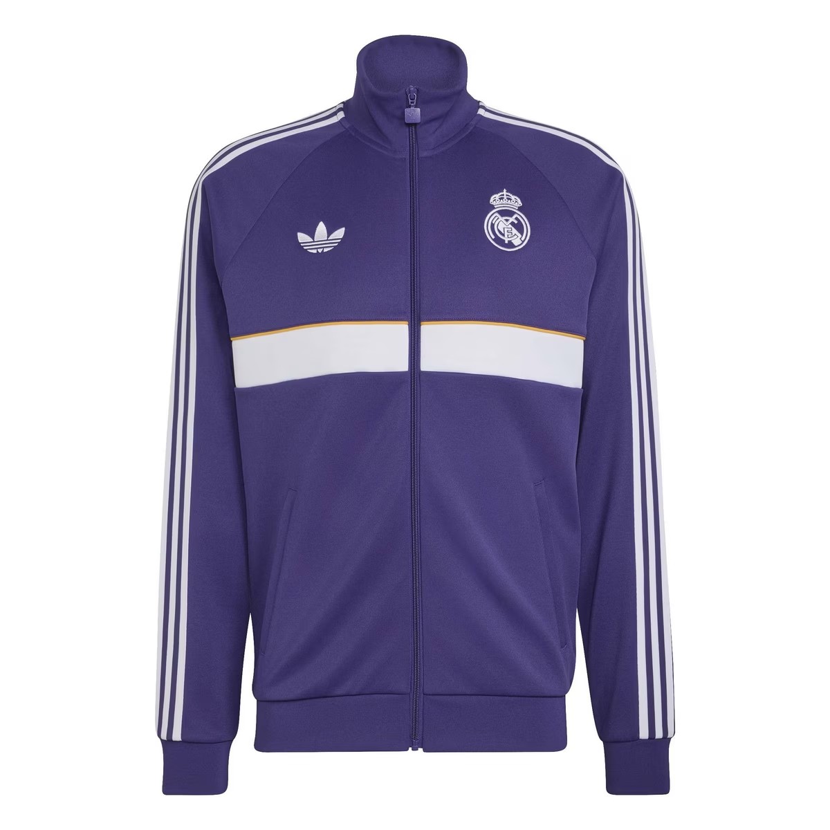
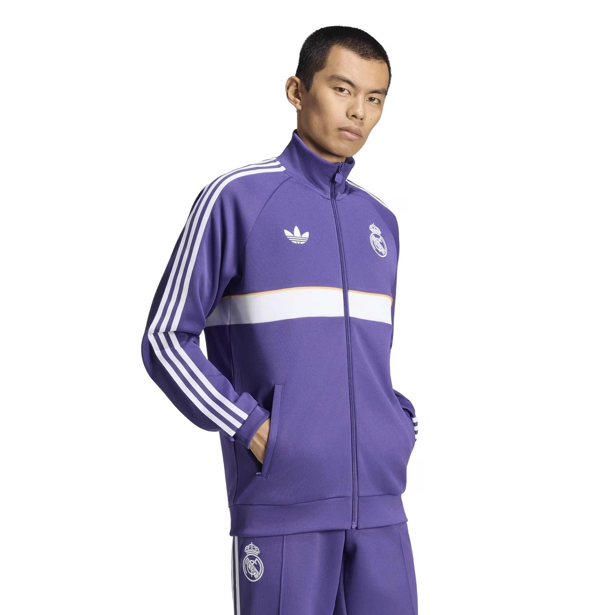
A brand new lifestyle collection from Real Madrid and Adidas have been leaked via online stores, giving a full look onto its purple Originals tracksuit.
The design of the jacket is identical to away anthem jacket range from the German brand this season, featuring a white horizontal band with a yellow/orange trim. Both logos are displayed in monochrome white, match with the shoulder three-stripes. The full tracksuit is expected to be used as pre-match outfit or anthem jacket, depending the club's own intention.
What do you think of the new Real Madrid 26-27 Originals collection? Let us know in the comments below.

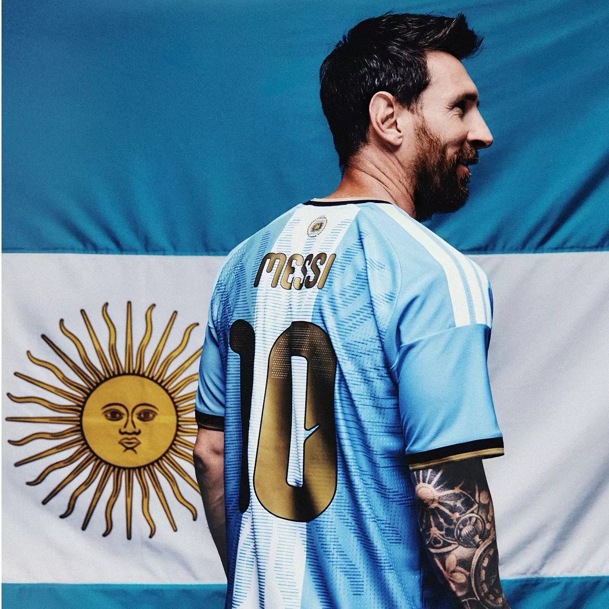
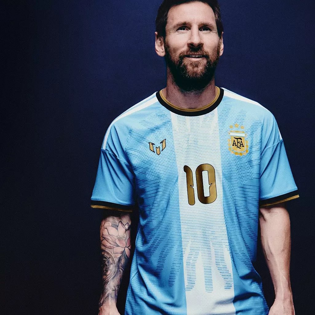
Adidas Argentina Messi 'Farewell' 2026 Kit Leaked - Coming Soon
@EldenMonitors has leaked the launch images of the special Adidas Argentina Messi “Farewell” 2026 jersey, which is set to be released soon.


Novara 26-27 Third Kit Released
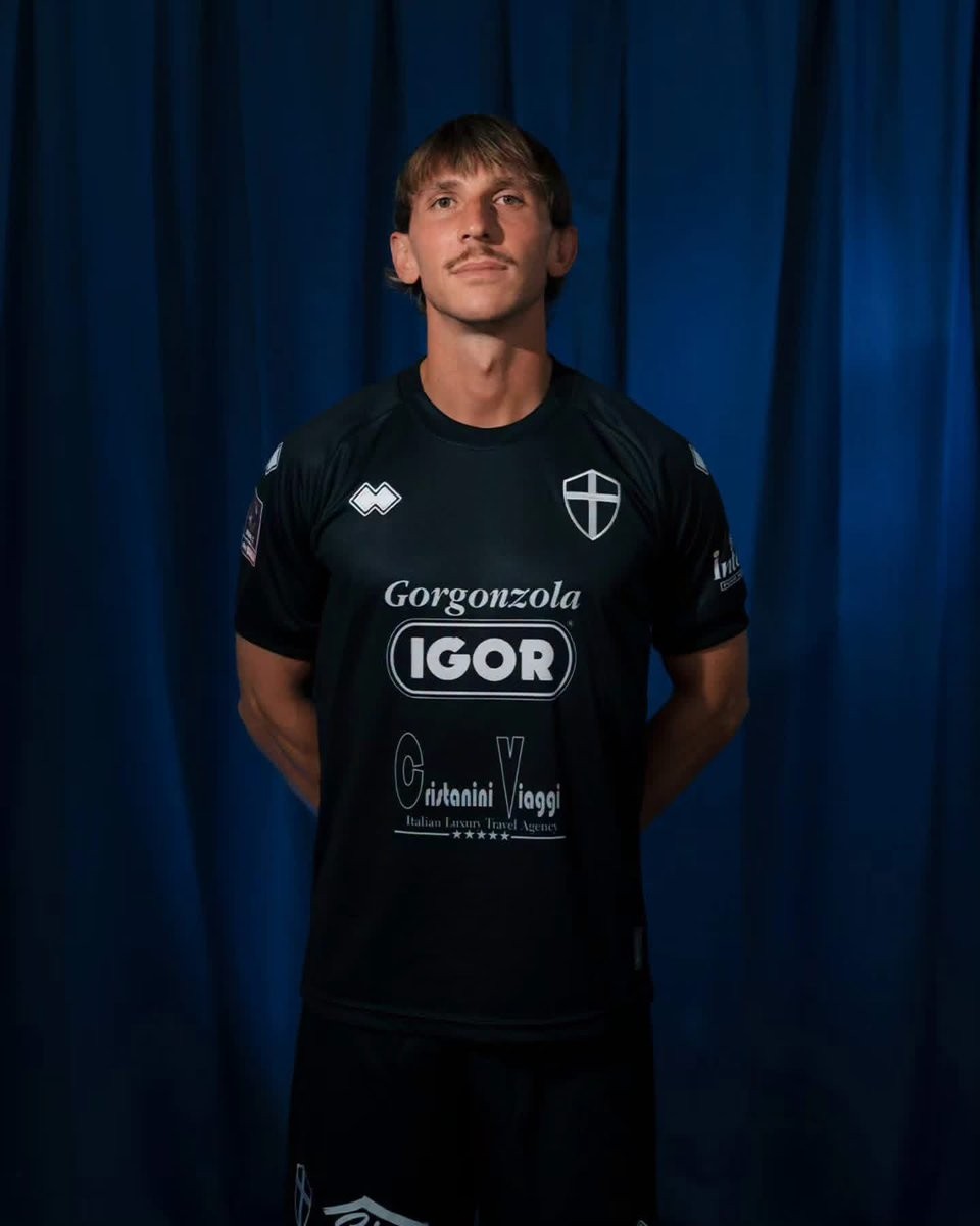
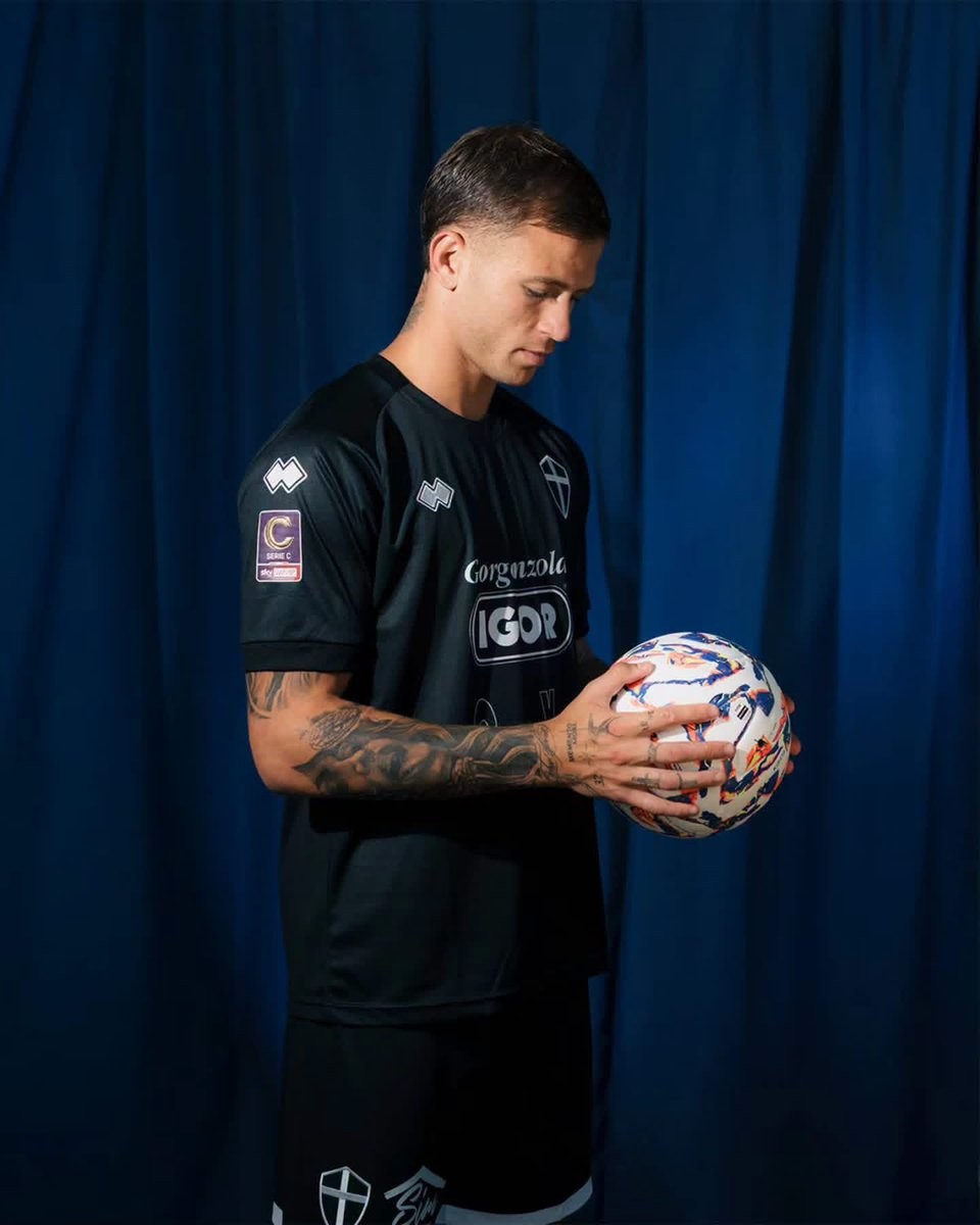
Italian Serie C side Novara FC and technical partner Erreà have officially released the club's new third kit for the 26-27 season. Following the release of their traditional azzurro home strip earlier in the summer, the new third shirt delivers a stealthy, understated alternative aesthetic for the current campaign.
The Erreà Novara 26-27 third jersey is built on a solid black base and adopts a full monochrome palette. Instead of the standard club crest, the chest features Novara's historic crossed shield rendered in clean white embroidery. Erreà's logos on the right chest and shoulders, alongside long-time front-of-shirt sponsor Igor Gorgonzola and secondary partners Cristanini Viaggi and Intesa Pour Homme, are similarly applied in monochrome white.
Completing the strip, matching black shorts and black socks with white accents and crest detailing round off the uniform for the 26-27 Serie C campaign.
RB Linense 26-27 Away Kit Released
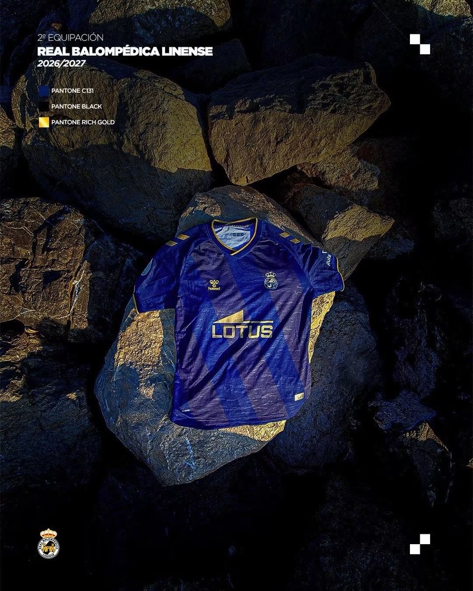
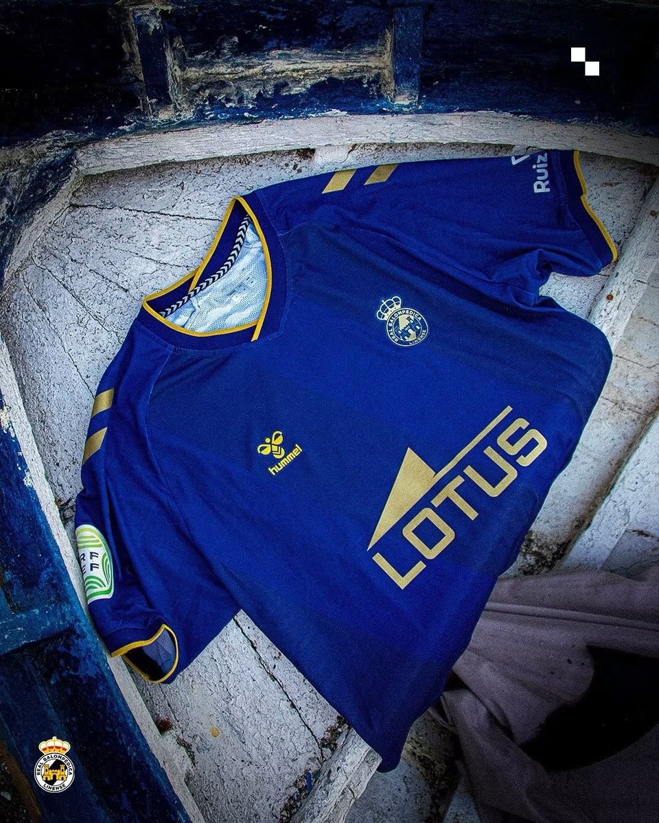
Spanish Tercera Federación side Real Balompédica Linense, popularly known as La Balona, has officially unveiled its new away kit for the 26-27 season. Produced by long-term technical partner Hummel, the new strip follows the release of the club's classic striped home kit earlier this summer.
Presented under the slogan "Segunda Piel" (Second Skin), the Hummel RB Linense 26-27 away jersey combines a deep navy base with rich gold detailing. Across the front, the shirt features tonal diagonal sashes that create a dynamic textured look. Gold accents appear on the V-neck collar, the sleeve cuffs, and Hummel's trademark shoulder chevrons, which are matched by a monochrome metallic gold club crest and Lotus chest sponsor.
The new away uniform is completed by matching navy and gold shorts and socks. The RB Linense 26-27 away shirt is already available for purchase through the club's official offices.
US Amal Tiznit 26-27 Home Kit Released
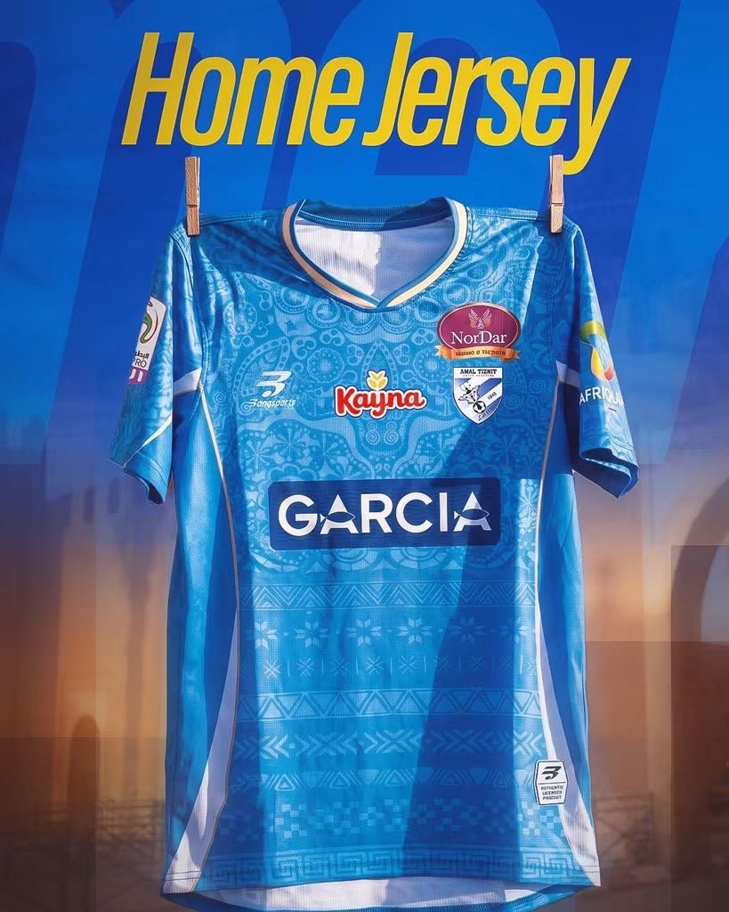
Moroccan club US Amal Tiznit have officially unveiled their new home kit for the 26-27 campaign, manufactured by domestic sportswear brand Bang Sports. The launch arrives during a historic chapter for the side, having achieved back-to-back promotions to compete in Morocco's top flight, the Botola Pro, for the first time in club history.
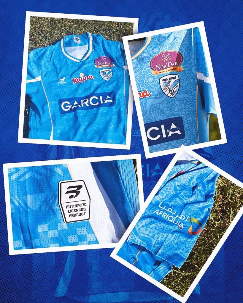
The Bang Sports Amal Tiznit 2026-27 home jersey is centered around the club's traditional sky blue colorway, decorated with intricate Moroccan geometric patterns across the entire front. Gold accents line the V-neck collar, while white side panels and sleeve trim bring contrast to the shirt. On the reverse, the kit adopts tonal vertical pinstripes alongside clean white player names and squad numbering.
Several sponsor marks are placed across the chest, sleeves, and lower back, complemented by Bang Sports branding and an authentic licensed patch near the hem. The new strip will be worn throughout US Amal Tiznit's debut season in the Moroccan top flight.