Crest Analysis | Chelsea & Manchester City Logos Explained
It is the biggest game in club football today - the 2021 UEFA Champions League final between Chelsea FC and Manchester City FC. Ahead of the match, South American football design experts Paladar Negro (@PaladarNegroWeb) have analyzed the crests of both teams.
Chelsea & Manchester City Crests Explained

Both Chelsea and Manchester City introduced their current logos in the 21st century. Chelsea's crest was officially adopted for the start of the 2005–06 season, while the Manchester City logo was unveiled in late December 2015.

Both current logos are inspired by old ones
A look at the logo history of both teams reveals that both marked a return to the older designs - Chelsea to the one used from 1953 to 1986, and Manchester City to the style used between 1960-1997.

Chelsea FC

A lion holds a staff – the same as that of Westminster Abbot. Three Scarlet roses of Lancaster symbolize England, and two goals – a commitment to football. The blue ring around the animal represents the coat of arms of the London Chelsea area.
Manchester City FC

The shield features a ship on its upper half representing the Manchester Ship Canal, and three diagonal stripes in the lower half symbolize the city's three rivers – the Irwell, the Irk, and the Medlock. 1894 is there for the club's founding year.


Do you like the Chelsea and Manchester City crests? Which logo do you prefer? Comment below.
Vintage Football Shirts
from Cult Kits
1996/98 Monchengladbach Windbreaker Jacket (XL) Reebok

2013/14 Everton #11 Home Shorts (XXXL) Nike

2020/21 Club America *BNWT* Home Shirt (Multiple Sizes) Nike

Cult Boots Adidas Copa Mundial Tee

1990 Ennerre #16 Template Shirt (L)

2015/16 Tigres Third Shirt (XL) Adidas

2003/04 Czech Republic Home Shirt (XL) Puma

1978/80 Houston Hurricane *BNWT* Home Shirt (S) Admiral Nasl

1998/99 Catalunya Jumper (XL) Puma

2010/11 Denmark *Player Issue* GK Shirt (XL) Adidas


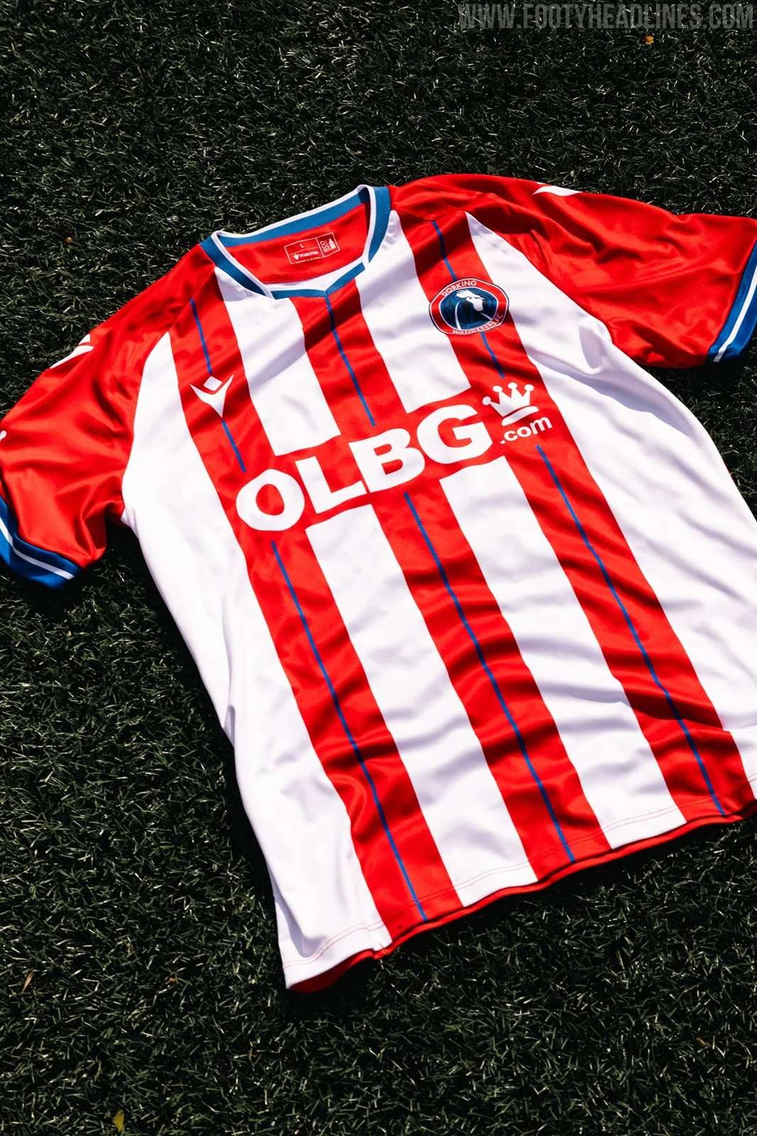
Dorking Wanderers 26-27 Home & Away Kits Released
English National League South side Dorking Wanderers have officially revealed their new home and away kits for the 2026-2027 season.
The new 26-27 home shirt introduces a classic and timeless design, stripping things back to a traditional aesthetic. It features bold red and white vertical stripes that draw inspiration from historic European football heritage. To complete the clean and authentic on-pitch look, the home jersey is perfectly paired with deep blue shorts and traditional white socks.
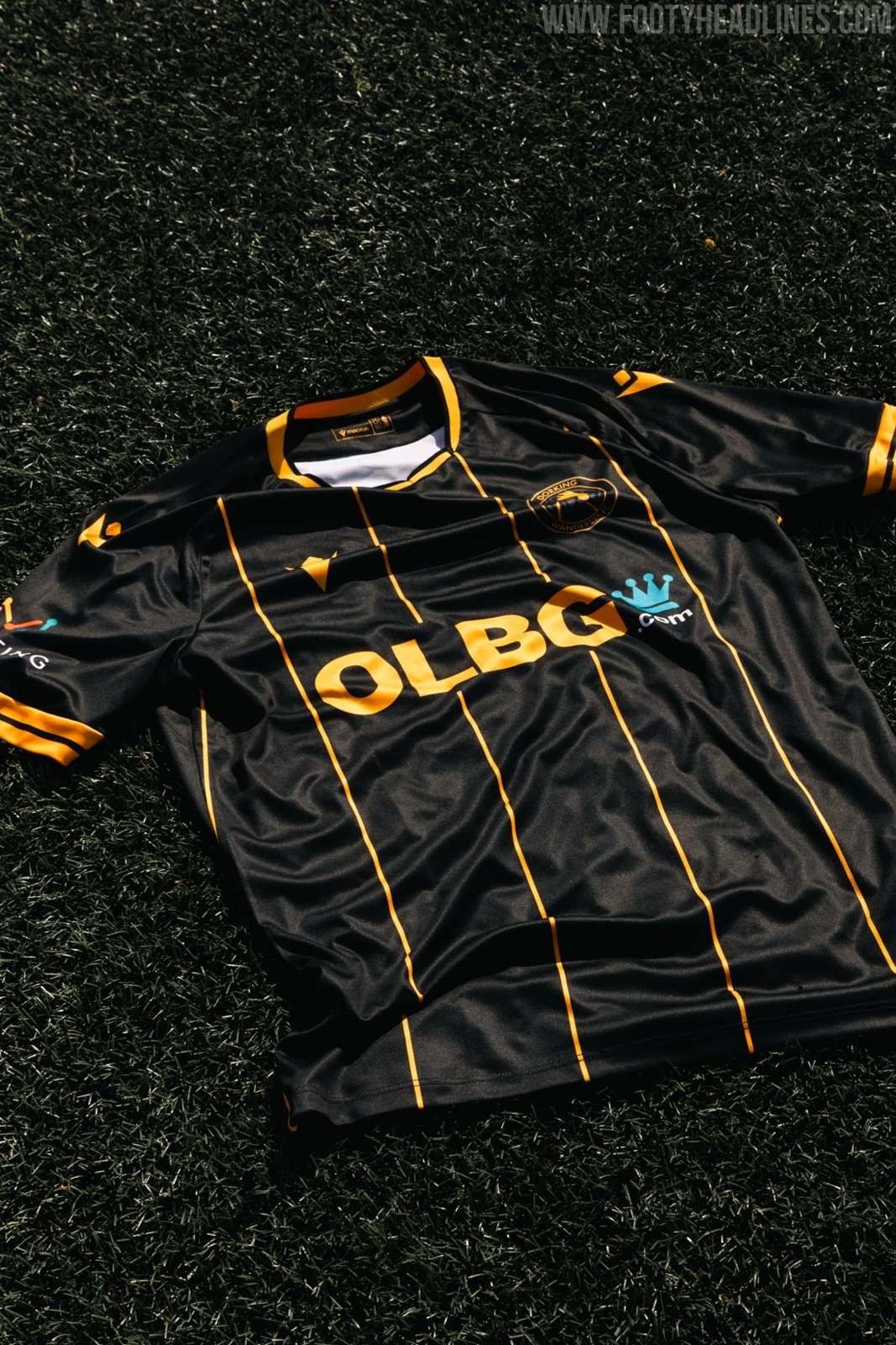
Following the launch of the primary strip, Dorking Wanderers also introduced their new 26-27 away kit, which delivers a much sharper and modern edge. This secondary jersey is defined by striking black and orange stripes, creating a strong contrast between dark and vibrant tones.
Notably, the club has thoughtfully replaced the betting sponsor with health and wellbeing partner Nuffield Health for all junior kits, while also actively reducing the price of youth shirts by £6 down to £39 to help younger fans afford their colors.
Which of these two striped Dorking Wanderers designs do you prefer? Let us know in the comments below.


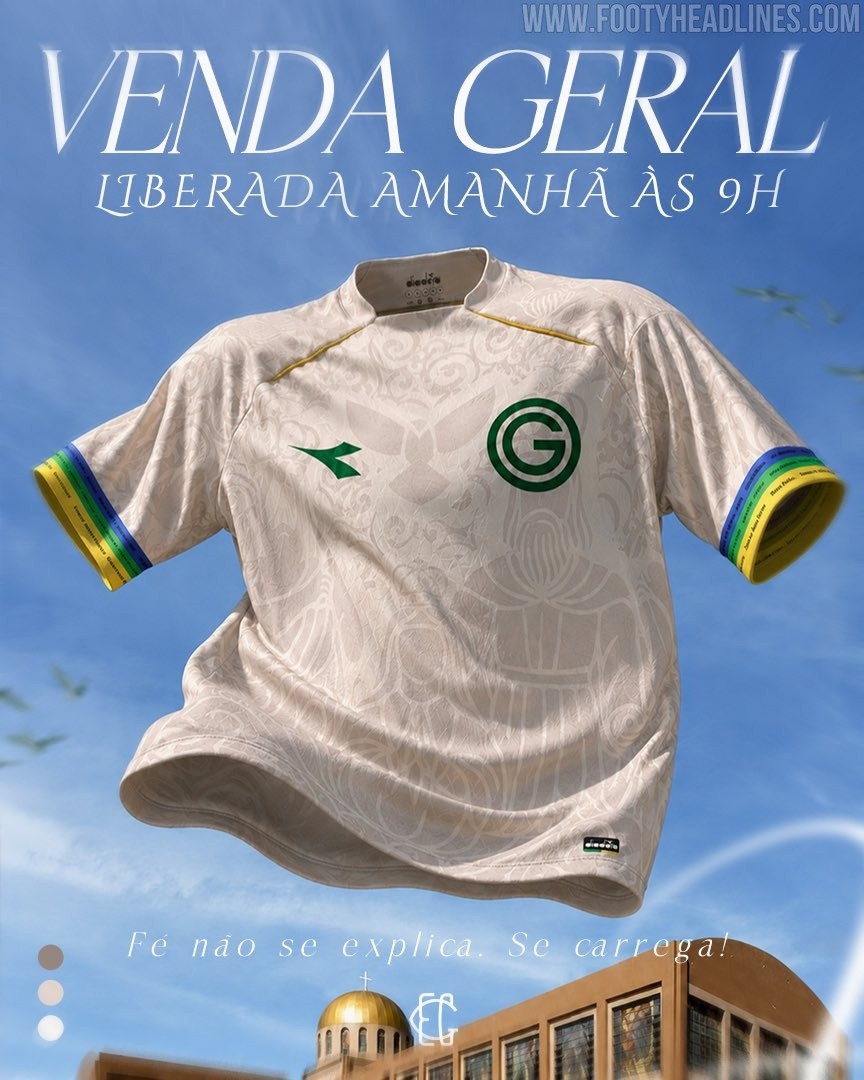
Special Goiás 2026 'Romaria' Kit Released
Brazilian side Goiás EC and technical sponsor Diadora have officially launched a special edition "Romaria" kit for the 2026 season. This unique jersey is designed to honor the deep-rooted faith and cultural traditions of the club's supporters, known as the Emerald Nation.
Tying heavily into the local religious pilgrimages that take place in the state of Goiás, the release operates under the fitting motto, "Faith is not explained. It is carried," successfully blending regional heritage with modern football apparel.
The design of the new Goiás 2026 Romaria shirt is anchored by an off-white base that is heavily detailed with an intricate, tonal graphic pattern. This all-over print features ornate filigree and religious iconography directly inspired by the Divino Pai Eterno (Divine Eternal Father), a central figure in the state's famous annual pilgrimage. To contrast the subtle background artwork, Diadora has applied its logo and the classic circular 'G' club crest in a sharp, dark green on the chest, while subtle gold piping accents the shoulder lines.
The most striking colorful details of the kit are reserved for the sleeve cuffs, which feature vibrant, tricolor bands of blue, green, and yellow. Upon closer inspection, these colored stripes are inscribed with repeating "Divino Pai Eterno" text, further cementing the jersey's homage to the region's spiritual traditions.
What are your thoughts on this intricately detailed Diadora and Goiás Romaria kit? Let us know in the comments below.

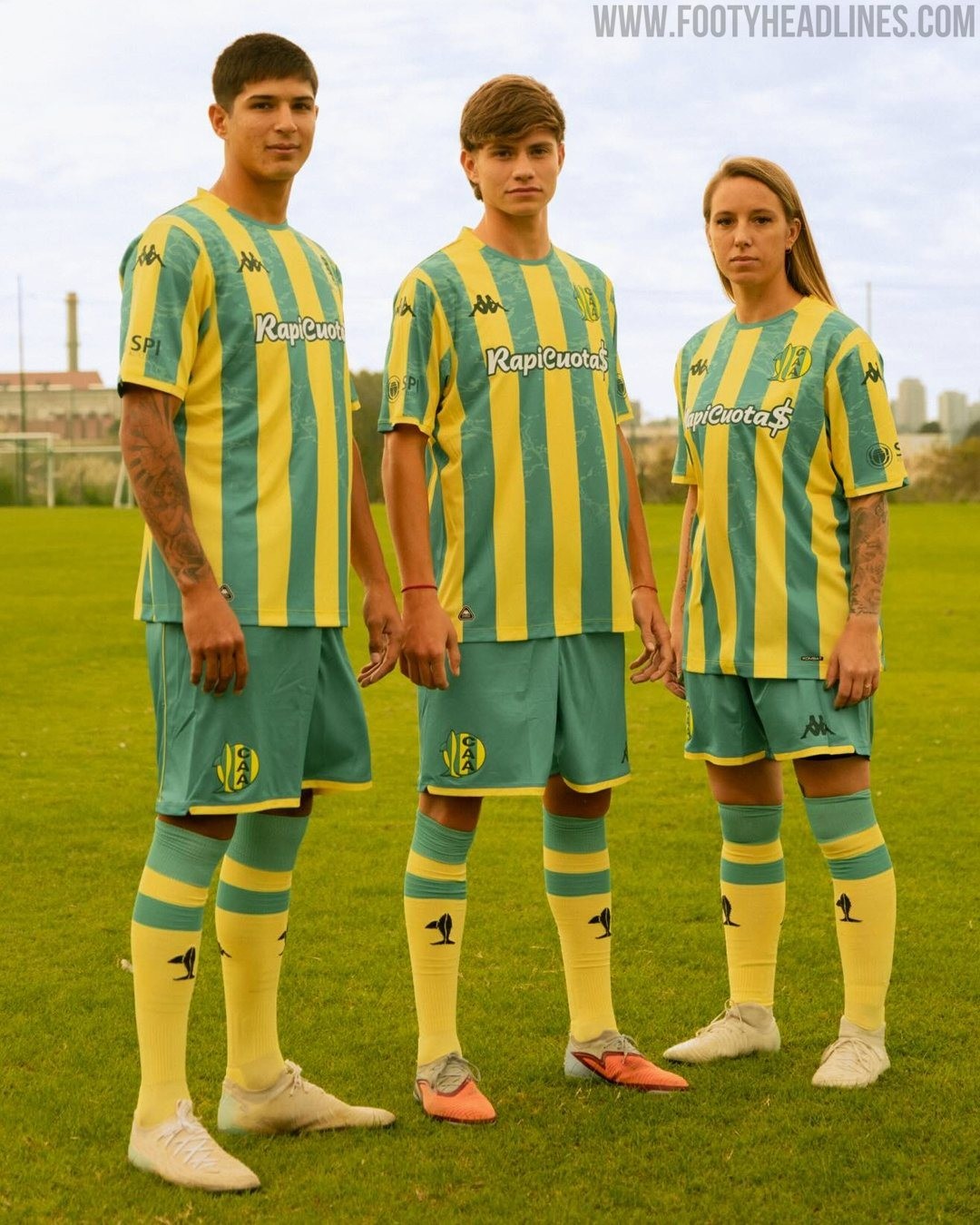

Aldosivi 2026 Home and Away Kits Released
Kappa has officially unveiled the new home and away kits for Argentine side Aldosivi ahead of the second half of the 2026 season. Launched under the campaign themes of "Familia" and "Barrio," the Italian sportswear brand has delivered a set of bespoke designs that celebrate the club's rich history and deep connection to its local community in Mar del Plata.
The Kappa Aldosivi 2026 home shirt is part of the "Familia" collection, which serves as a tribute to the inherited passion that unites different generations of the club's supporters. The design stays remarkably true to the team's historical visual identity, featuring the classic green and yellow vertical stripes. The green stripes have a subtle pattern.
Complementing the primary strip is the new Aldosivi 2026 away kit, introduced as part of the "Barrio" collection to honor the local neighborhood and the people who define the club's everyday identity. This alternative jersey opts for a modern look in black with gradient logos and elements.


