Top 10 Home Kits of the 22-23 Season

With pre-season done and the 22-23 season underway, we've had the chance to see plenty of new shirts in action. With so many great kits to choose from, it's impossible to pick just ten overall, we've decided go by category so that we can give out some more well-deserved credit. First up, it's our top ten home shirts of the season.
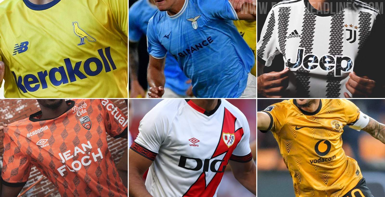
Top 10 Home Shirts of the 22-23 Season
Home jerseys can be the hardest to get right for kit manufacturers. If traditional colours, patterns and other features aren't respected, it can cause uproar among fans, or more concerningly for the brands, reduced sales. At the same time, they have to change things up somehow from year to year or else they'll be accused of laziness.
Getting the balance right is not an easy task, but the ten shirts below have done it better than the rest this season, in our opinion anyway. The ranking is of course subjective, let us know how you'd reorder them or change the list in the comments.
10 - Trabzonspor
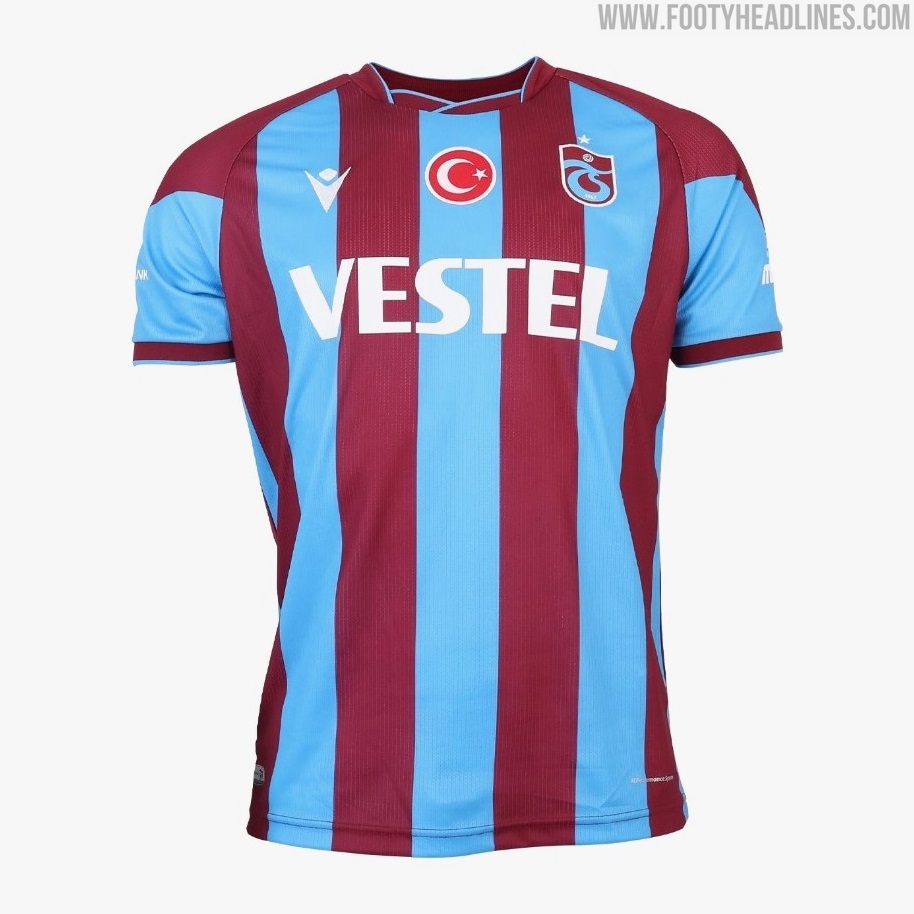

Claret and blue is a relatively common colour combo in football, but few shirts combine the two as well as Trabzonspor's 22-23 home shirt. Stripes of just the right thickness, an unintrusive sponsor, even the unusual collar somehow works here, tying in well with how the colours merge on the sleeves.

9 - FC Lorient
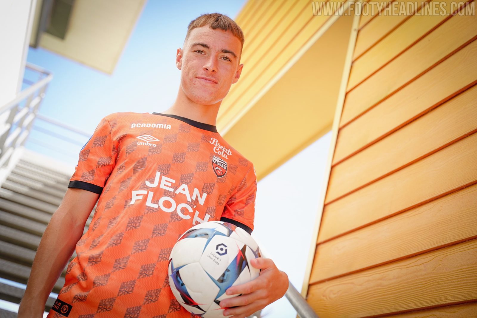


Umbro definitely delivered the goods with their first home kit for Lorient. The shaded diamond print earns them extra points for its all-over placement and not just covering the torso, while the black trim contrasts sharply with the orange base colour and encloses the pattern really well.

8 - Juventus


Stripes on football shirts have been reimagined in various brushstroke forms for a few seasons now, and it was never a great look to begin with. Credit to Adidas here for managing to come up with a genuinely creative alternative to the clean-cut lines, while still keeping things neat with the equally sized triangles, round neck collar and cuffs.

7 - Kaizer Chiefs
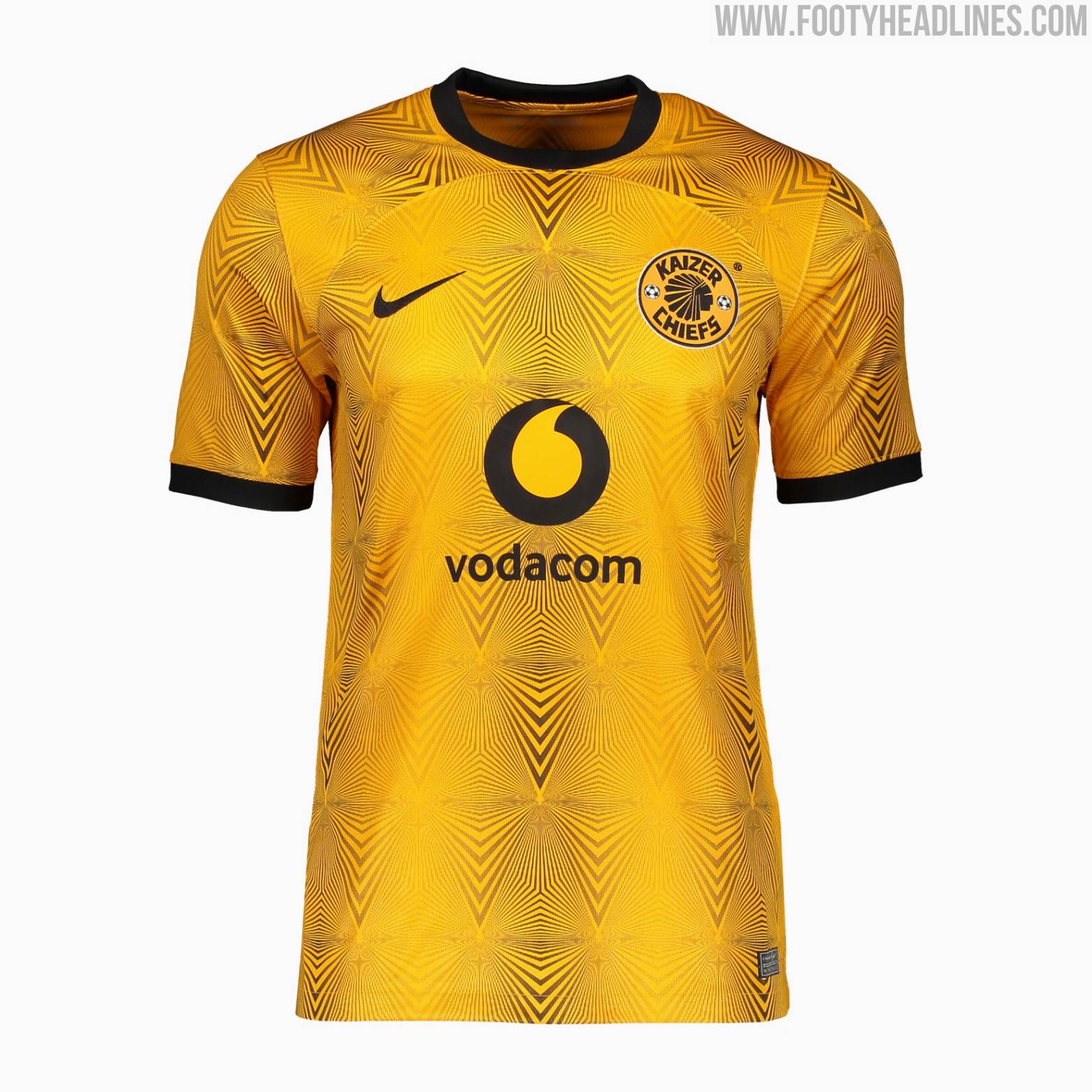

The pattern used on Kaizer Chiefs 22-23 home shirt was also given to other teams such as Eintracht Frankfurt, but the South African club's yellow and black colourway gives it an almost hypnotic quality. It makes the curved seam of Nike's template less noticeable, allowing it to stand out from the other shirts based on the same template.

6 - Modena
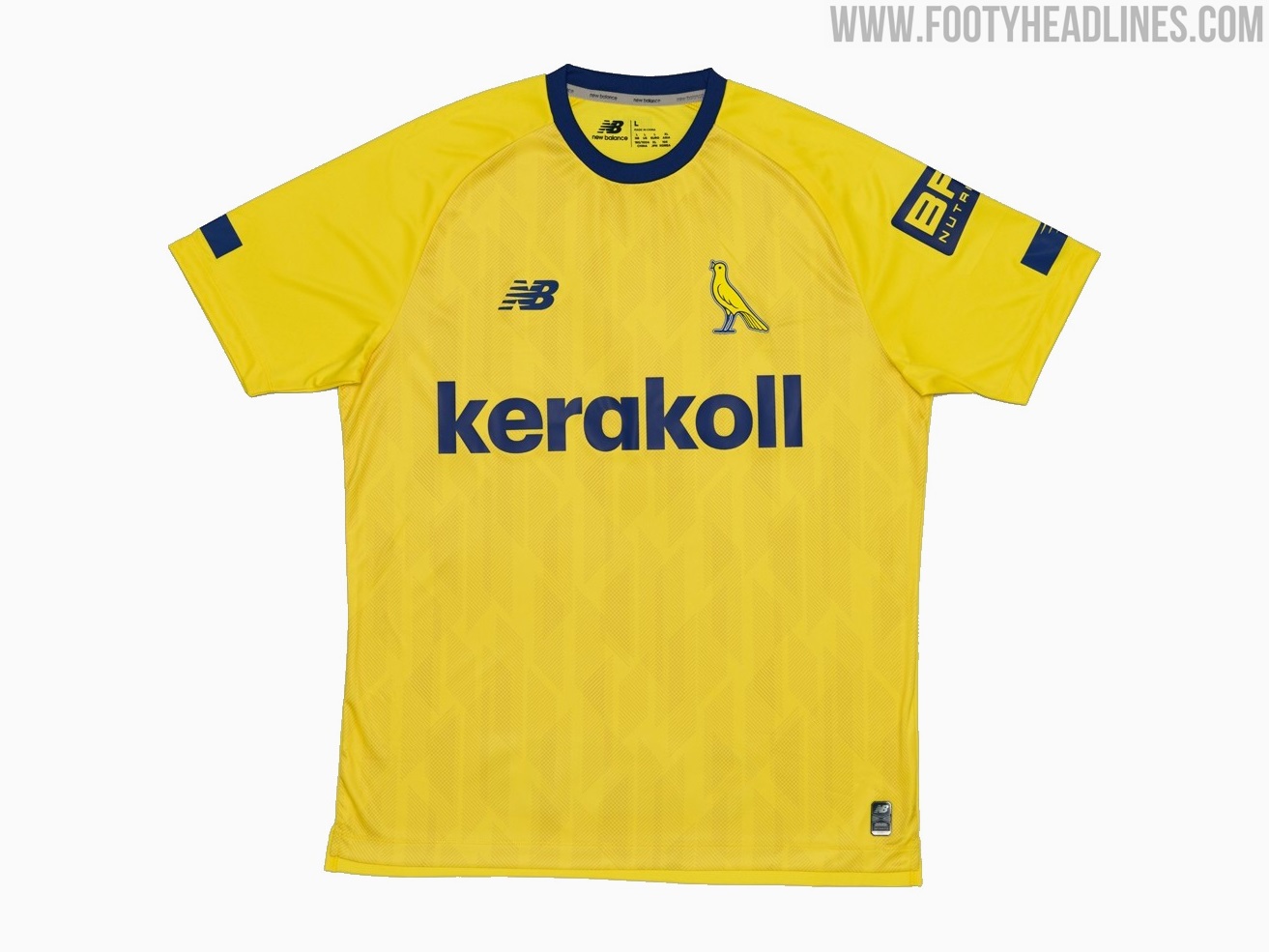
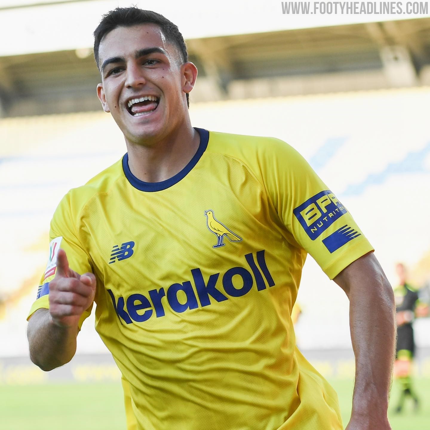
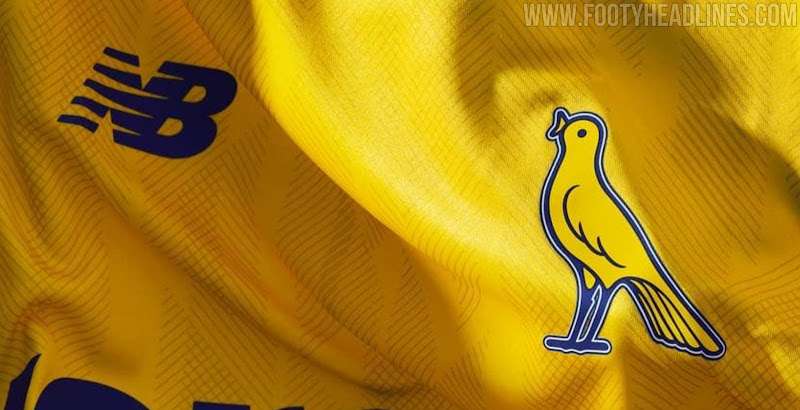
A new brand and a new badge for Modena this season, with both rightly receiving praise. The simplicity of the canary crest is mirrored in New Balance's understated design. The sublimated print provides just the right amount detail to prevent the Modena 22-23 home shirt from being too plain, instead rendering it one of the best in the club's recent history.
5 - VFL Bochum


Mizuno are back in the big leagues this season, and their first home shirt for Bochum was a great way to start. Using a shade of navy with more of a blue tint than their previous Nike shirts, lighter shades are blended perfectly on the upper chest, then cleanly divided on the lower half of the shirt for a very modern look, to which the Mizuno and sponsor logos also contribute.

4 - Real Madrid


Class, style and elegance are some of the traits historically associated with Real Madrid, and their 22-23 home shirt certainly reflects those qualities. The return of purple trim and the polo colour coincide very nicely, with the club crest embossed all-over providing a touch of luxury. One of the most solid Madrid shirts in recent years.

3 - Venezia
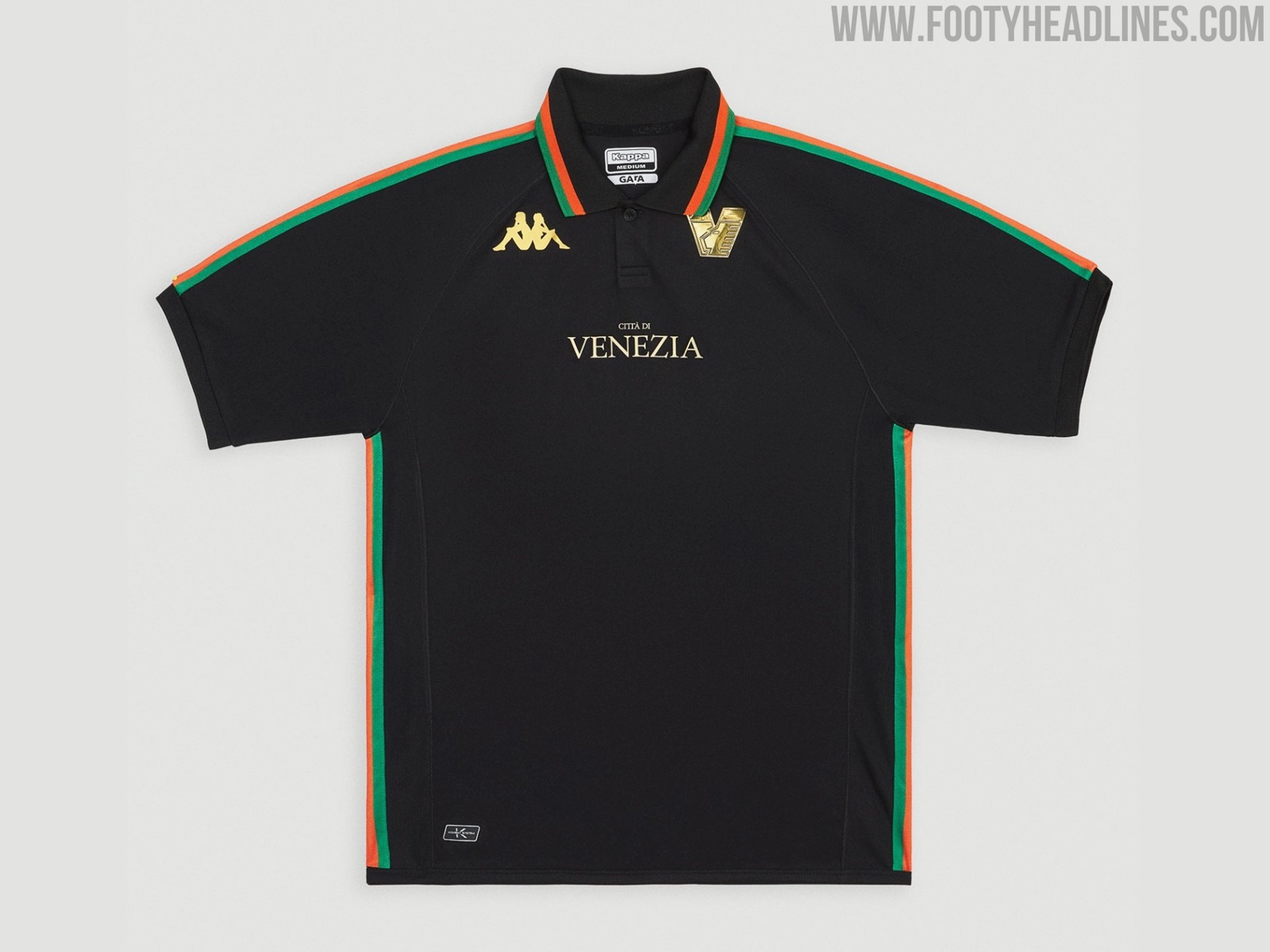


Even more bespoke than last season's hugely successful number, Venezia's 22-23 home shirt is not what you expect from a football jersey. A slightly shimmery black base, with green and orange trim expertly applied along the edge of the collar as well in the form of a very different kind of sleeve taping than we're used to seeing from Kappa. The badge and logo placement are higher than usual, while the Venezia text is smaller, both having the intended effect of setting the shirt apart from the rest.

2 - Lazio

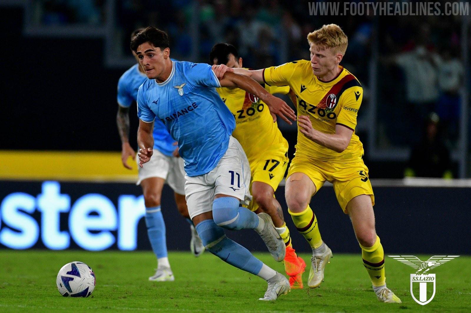
Mizuno really didn't need much time to get into their stride. Their first home shirt for Lazio has tradition, simplicity and modernity all rolled into one. The raglan sleeves are in no way disruptive as can sometimes be the case and the matching white-blue-white collar and cuffs make it tidy. The jewel in the crown, however, is the embossed eagle symbol that was used on the club crest from 1978-1988. The repeated diagonal placement was an ingenious way to incorporate it into the shirt and get into the good books of Lazio fans at the same time.

1 - Rayo Vallecano


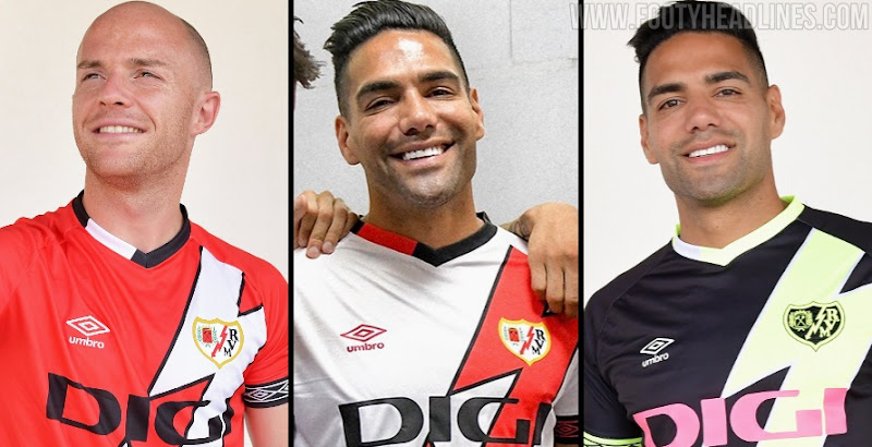
Umbro pulled a masterstroke last season by reshaping the red sash on Rayo Vallecano's shirts into a lightning bolt like the one on the club badge. They repeated the trick this season and improved on it by adding a black border, while the collar has an inventive use of colour and the Umbro branding on the cuffs continues the theme of perfectly proportioned colours. The lightning bolt sash is even included on the back too. It will be hard to top this next season.
What do you think of our ranking of the top ten home shirts of the 22-23 season? Are there any glaring omissions? Which jerseys make your list? Let us know in the comments.

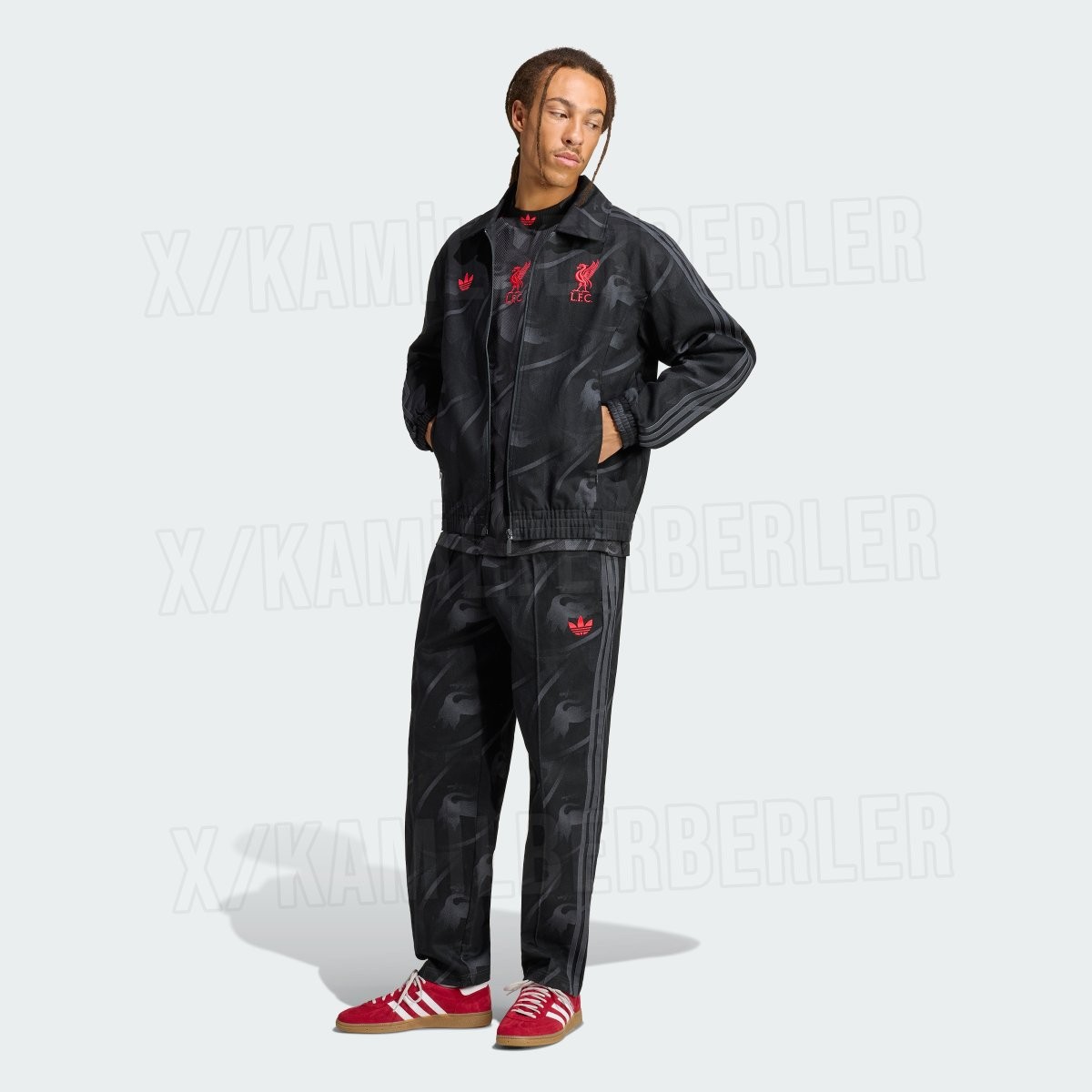
Adidas Liverpool 26-27 LFSTLR Collection Leaked
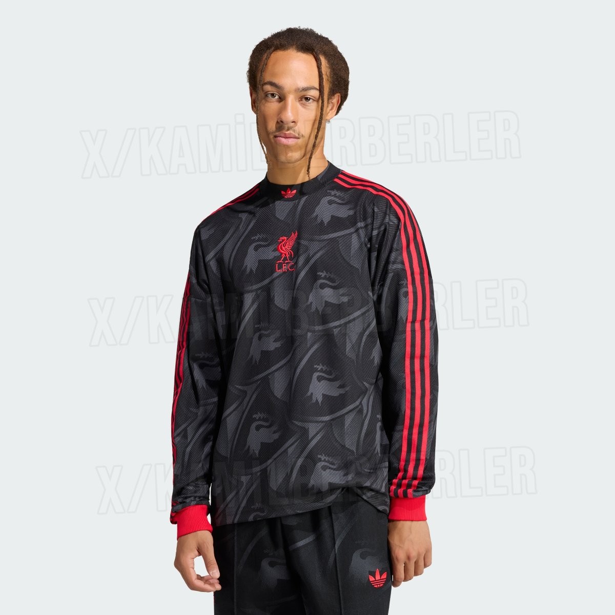
Official images of the upcoming Adidas Liverpool LFSTLR collection for the 26-27 season have surfaced online, courtesy of kit insider @KamilBerberler. Following the popular black and gold capsule from the previous campaign, the newest lifestyle range from Adidas Originals switches direction with a sleek black and vibrant red color palette, merging retro football heritage with contemporary streetwear design.
The standout piece of the collection is a long-sleeve lifestyle jersey finished in a deep black base with a subtle, tonal all-over graphic incorporating the iconic Liver bird. Contrasting vibrant red accents define the look, highlighting the classic Adidas Three Stripes running down the shoulders and sleeves, the ribbed cuffs, and centrally stacked Trefoil and Liver bird logos. A matching full-zip coach track jacket and tailored track pants carry the same stealthy tonal pattern and bright red detailing.
Alongside the tracksuit is a bold red pullover hoodie featuring dark, centered chest emblems and "YNWA" typography printed on the sleeve cuff. Rounding out the lineup is a relaxed-fitting black t-shirt that displays the stacked red logos on the chest, a jacquard "YNWA" pattern knitted into the ribbed crew collar, and an oversized red "YNWA" wordmark across the lower back hem. The new Adidas Liverpool 26-27 LFSTLR range is expected to launch in the coming months.
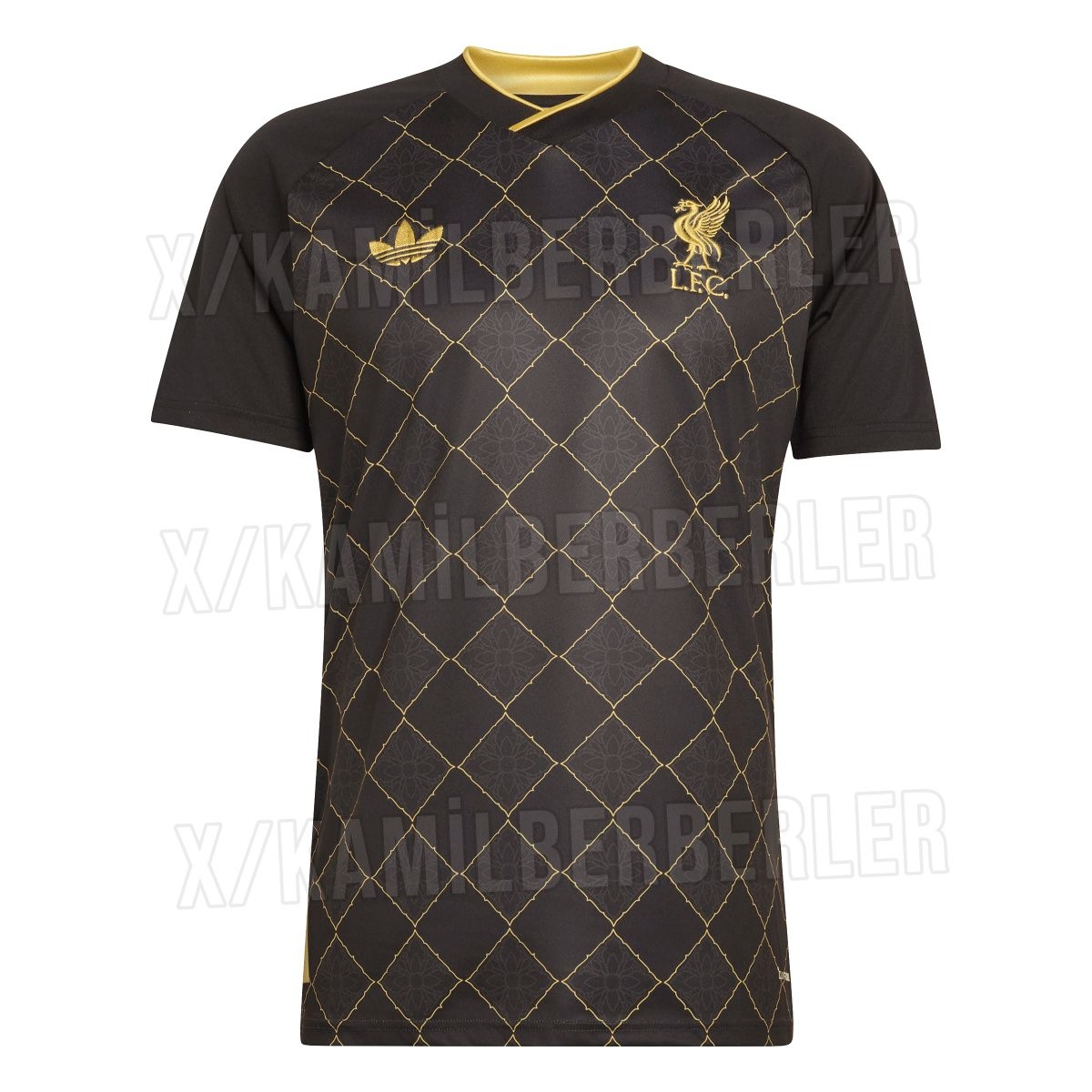
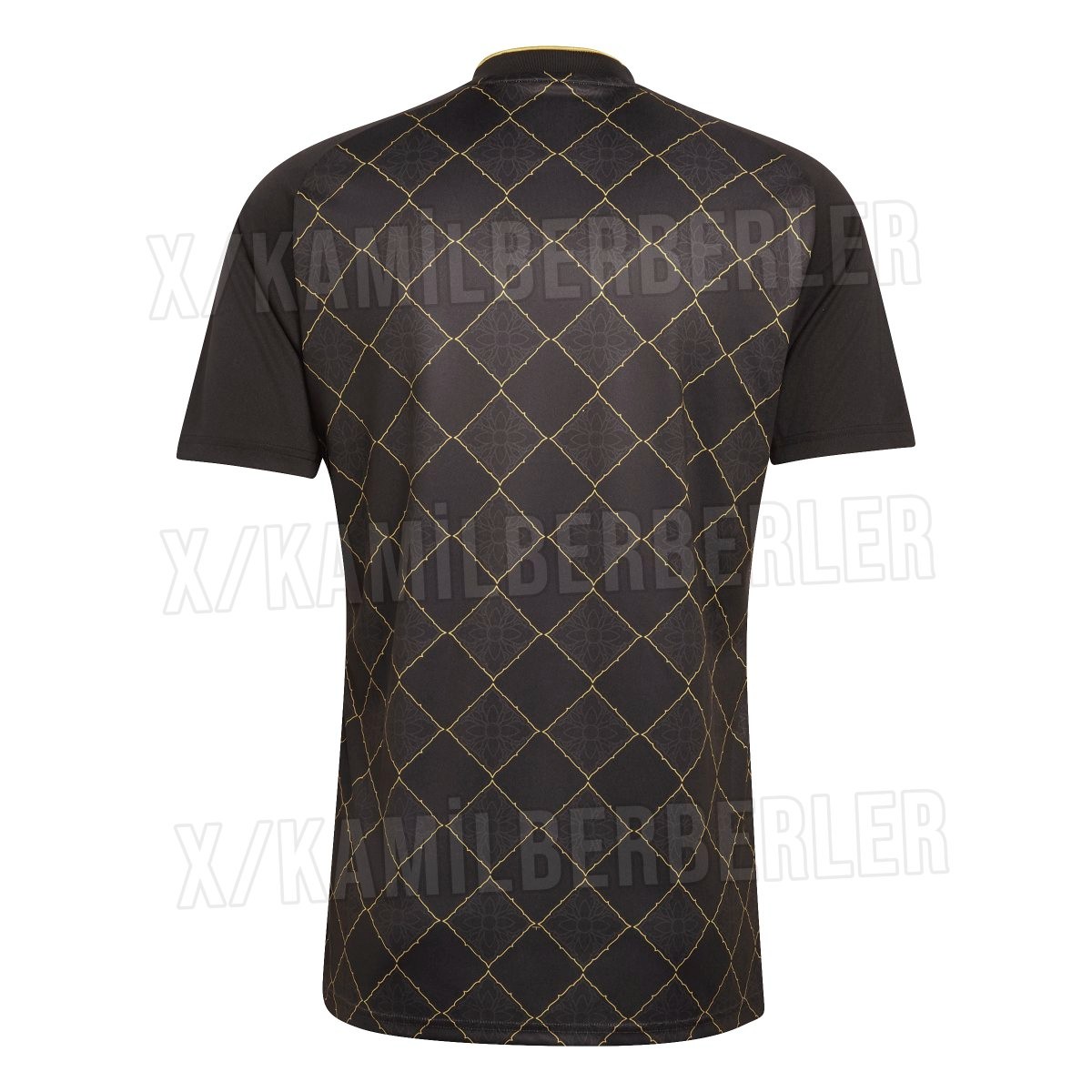
Black & Gold Liverpool 26-27 Lifestyle Shirt Leaked - Official Images
Official images of the upcoming Adidas Liverpool 26-27 special-edition lifestyle and pre-match shirt have surfaced online, providing the clearest look yet at the luxurious black and gold design. Known unofficially as the "Gold Leaf" jersey, the shirt is set to release during the 26-27 season as part of Adidas's off-pitch and culture range for the club. Big thanks to @KamilBerberler.
The shirt features a stealth black foundation covered by an intricate metallic gold diamond lattice pattern across the front and back of the torso. Each diamond enclosure contains an ornate floral damask motif inspired by traditional Southeast Asian art, honoring Liverpool's vast Thai fanbase. A classic Adidas Trefoil logo appears on the right chest alongside the Liver bird crest on the left, both applied in matching gold.
Completing the design are solid black sleeves and a crossover V-neck collar detailed with a gold inner trim. Tailored as a high-fashion crossover rather than a competitive match kit, this special-edition pre-match and lifestyle shirt will be available in the 26-27 season.