Top Ten Away Kits of the 22-23 Season

A few days ago we gave you our list of the Top 10 Away Shirts of the 22-23 season, so today it’s time four our pick of the best away kits. Like any judgement of physical appearance, these choices are subjective and plenty of you will have different opinions, so make sure you let us hear them in the comment section.
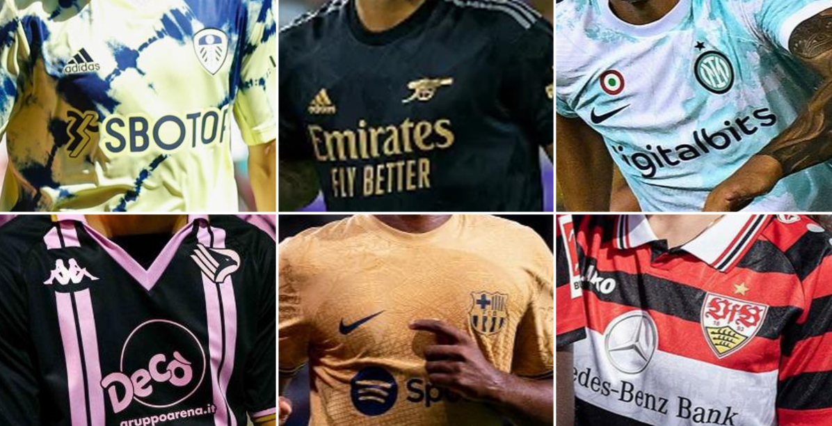

Top 10 22-23 Away Kits
Manufacturers have a little more freedom to experiment with away jerseys so often the designs can be a bit more adventurous than those of the home shirts. Plenty of clubs also have traditional away colours, although changes to these can generally be tolerated pretty well if the overall design is well executed.
Many of our top ten draw from their club’s history, while creating something that’s relevant to the more modern trends. Check them out below.
10 - Palermo

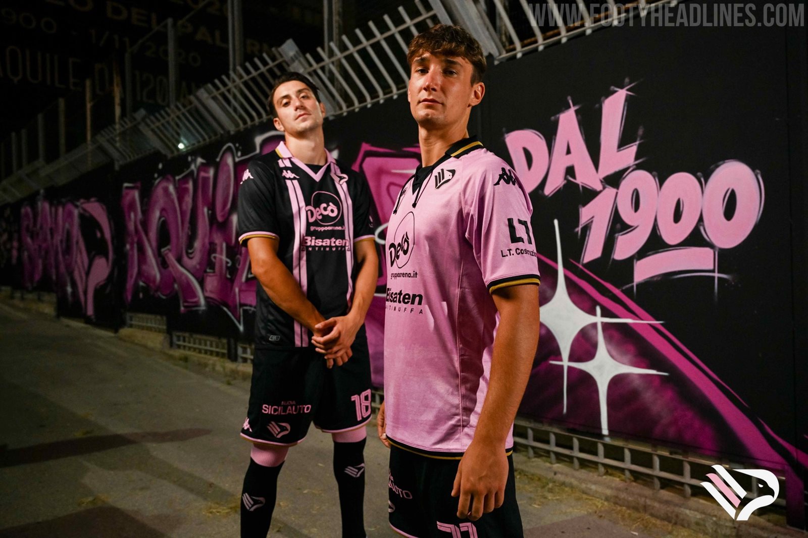
The latest acquisition of the City Football Group, Palermo launched a set of interesting shirts this summer, the black and pink away having lots of retro appeal with its symmetrical double stripes and wide collar with v insert. White trim on the collar and cuffs instead of gold may have worked better from an aesthetic standpoint, but gold has featured on the club badge throughout their history.

9 - Parma
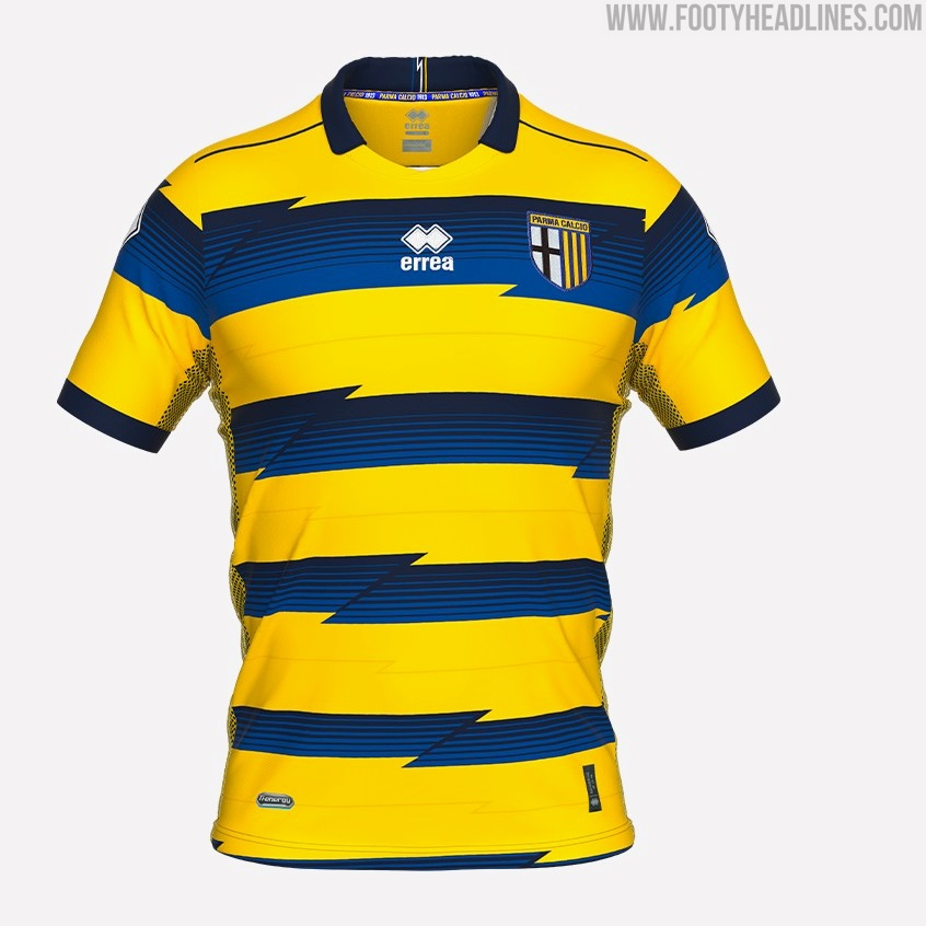


A new twist on the iconic blue and yellow striped shirts worn by Juan Sebastian Veron, Hernan Crespo, Lilan Thuram and Fabio Cannavaro during the club’s glorious late 90s to early 00s era. The jagged lines are a minor change and are executed better than some other attempts to introduce variety to striped shirts.

8 - Barcelona
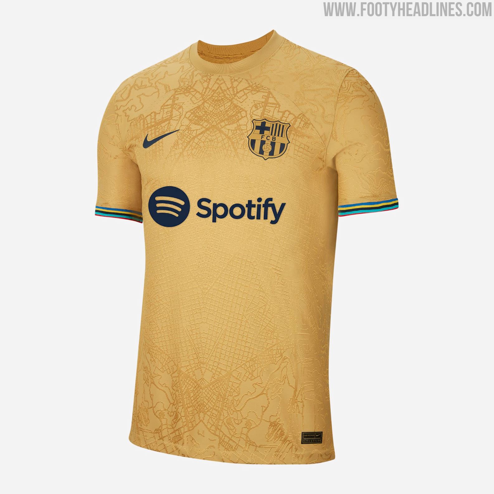


Map graphics are all the rage this season and this Nike effort for Barcelona is among the most impressive. The shirt is inspired by the 1992 Olympic Games that were held in the city, the gold base referencing the medals and the colours of the Olympic rings incorporated brilliantly in the cuffs. A map of Barcelona is woven into the fabric and applied in a mirrored fashion giving a symmetrical print on the torso.

7 - Leeds
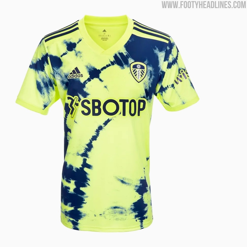

This kit would surely be flying off the shelves if the club could actually get their hands on the shipments. Tie-dye is nothing new, having been around since the 60s, going in and out of fashion before seeing a huge resurgence in recent years. Adidas have played around with it before but it's been done to great effect here by using the club’s traditional away colours while creating something unlike any of their previous yellow and blue kits.

6 - Brondby


Created in collaboration with a small group of fans and a local tattoo artist, sketches showing off the club’s origins and identity were sublimated onto the fabric, it’s safe to say this one went down well with the supporters. This shirt became the fastest selling in Brondby’s history. It's not the first time we’ve seen tattoos implemented into a design, but the all-over application, the blue on blue tones and its authenticity give it an edge. Solid colourway too.

5 - Lazio


Lazio featured on our list of best home kits and they’ve done it again with their away shirt. The black lines of the gradient chest band really accentuate the curvature around the Mizuno logo and create a sense of motion, which seems like the perfect accompaniment to the runbird. The blue and yellow are vibrant but are proportioned expertly to the black base. As if that wasn’t enough, it has the retro badge too. Really stellar work from Mizuno, let’s hope this partnership keeps churning out more beauties over the next few seasons.
4 - Valencia
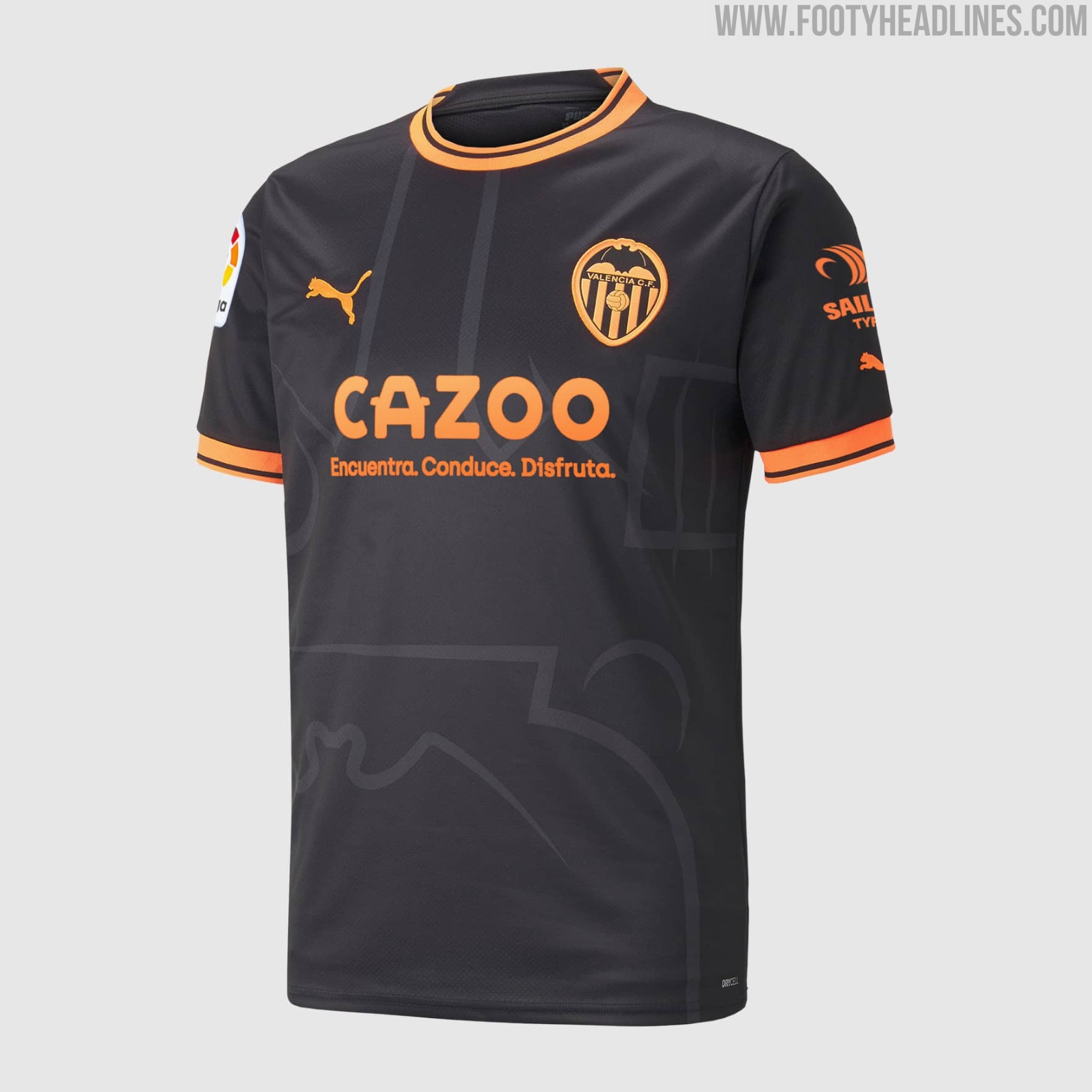
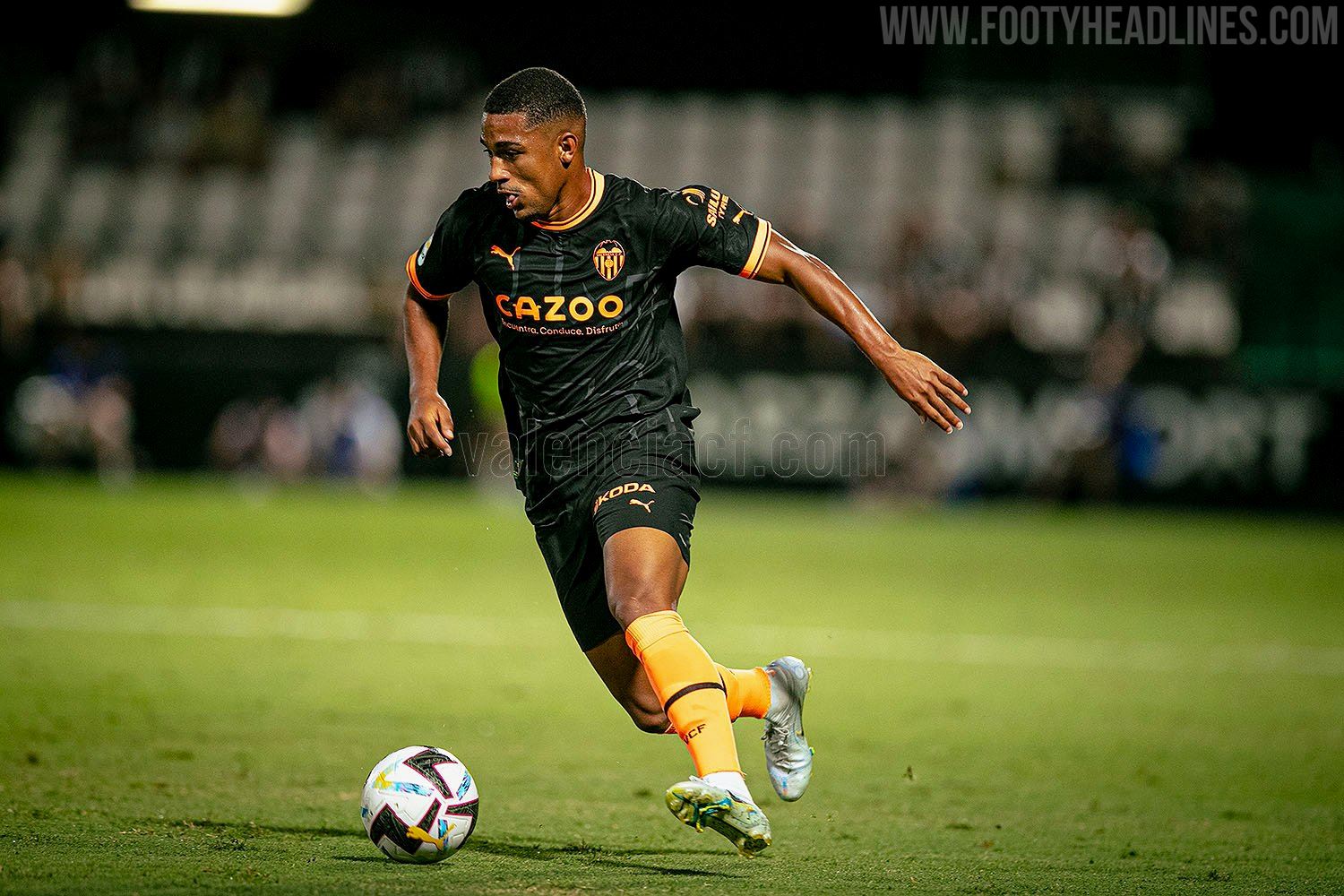
Another case of excellently proportioned main to accent colours. The same template as Man City’s home shirt, it's allowed to really shine here thanks to the two tone colour scheme and the stark contrast of orange on black. When sponsors are flexible enough to allow their logos’ colours to be changed, it can really do wonders for the shirt’s overall aesthetic. These two colours have been used frequently for Valencia away shirts, so its already got some identity to it, but the enlarged badge graphic elevates it further.
3 - Arsenal


Black and gold may have been done to death over the last couple of seasons, but this Arsenal shirt doesn't just rely on a tried and tested colourway (and technically it’s also black and bronze, according to Adidas). The simplified cannon badge instantly improves any Arsenal shirt and the AFC lettering print gives just enough of a retro tinge to what is a very modern shirt. Adidas haven’t put a foot wrong since they started making Arsenal’s kits and this shirt has set the bar even higher again.

2 - Stuttgart


Very likely the most faithful throwback kit produced by a brand different from the original manufacturer, Stuttgart’s 22-23 away kit is a tribute to the one they wore from 1997 to 1999. Jako even included Adidas’ the three stripes on the collar, but they obviously couldn’t go as far as putting them on the shoulders too. The jako logos and dots that replace them are probably the shirt’s weakest feature, but hats off for how the Mercedes logo is incorporated seamlessly into the striped design.

1 - Inter
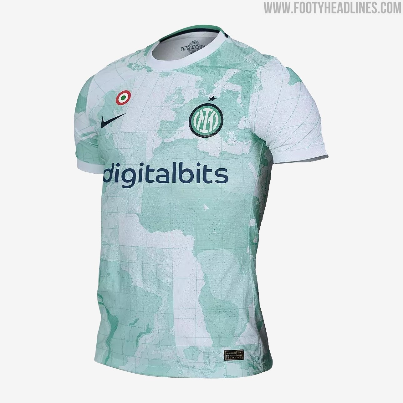

Contrary to the common popular theme of putting a map of the club’s home city on the shirt, Inter went bigger and better and splashed a mint green map of the whole world across their away jersey. This is in reference to the club’s origins as a splinter club open to players of any nationality (as opposed to AC Milan who limited the number non-Italians who could join), and the relatively neutral choice of colours prevent it from being over-imposing. This Nike template has its fair share of critics but this design manages to get the best out of it.

What do you think of our top ten away shirts? Some of them not worthy of their place? Any glaring omissions? Tell us what you’d change in the comments.
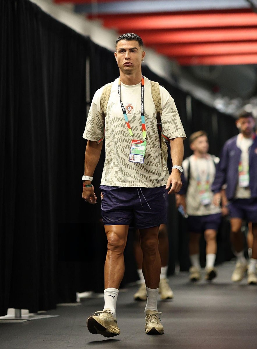
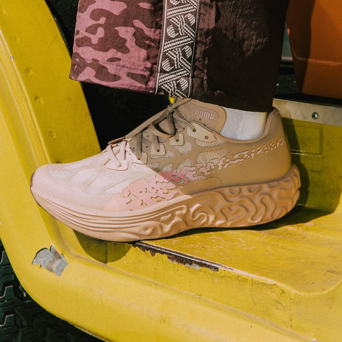
Cristiano Ronaldo Spotted Wearing Puma Sneakers Ahead of World Cup 2026 Match
Cristiano Ronaldo turned heads ahead of Portugal's 2026 World Cup match against DR Congo by arriving at the stadium wearing Puma sneakers. The Portuguese captain, making his record sixth World Cup appearance, paired his Portugal national team jersey with the Salehe Bembury Puma Velum Nitro collaboration sneakers.
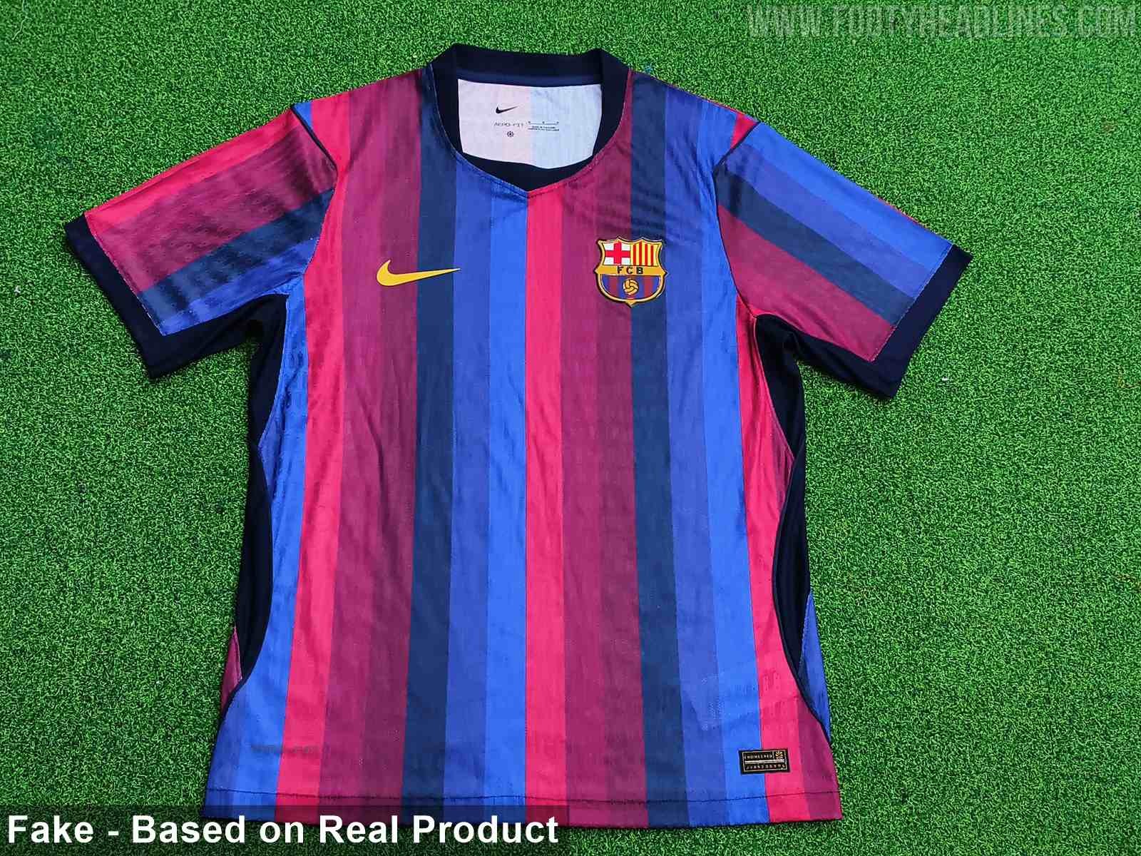
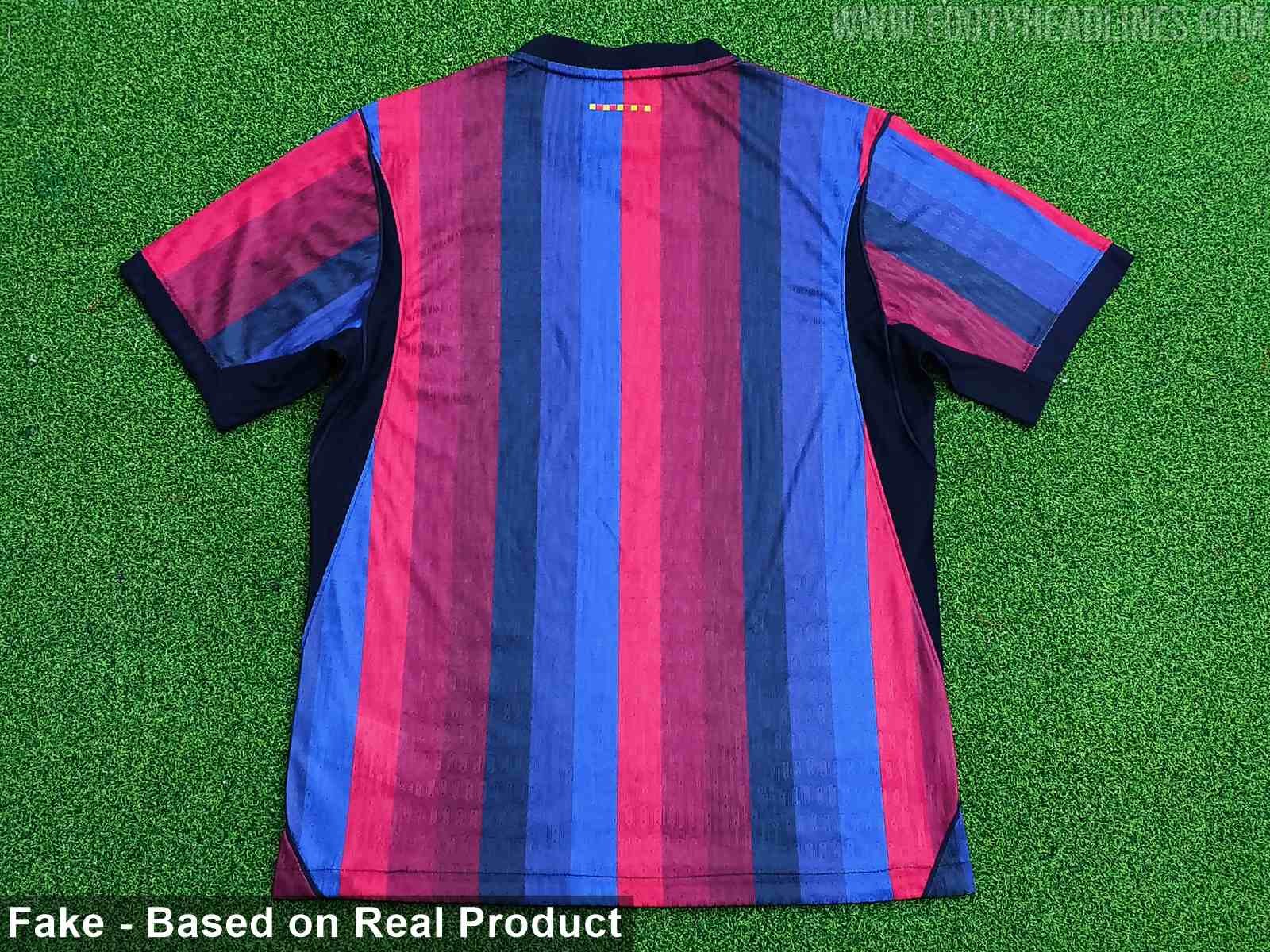
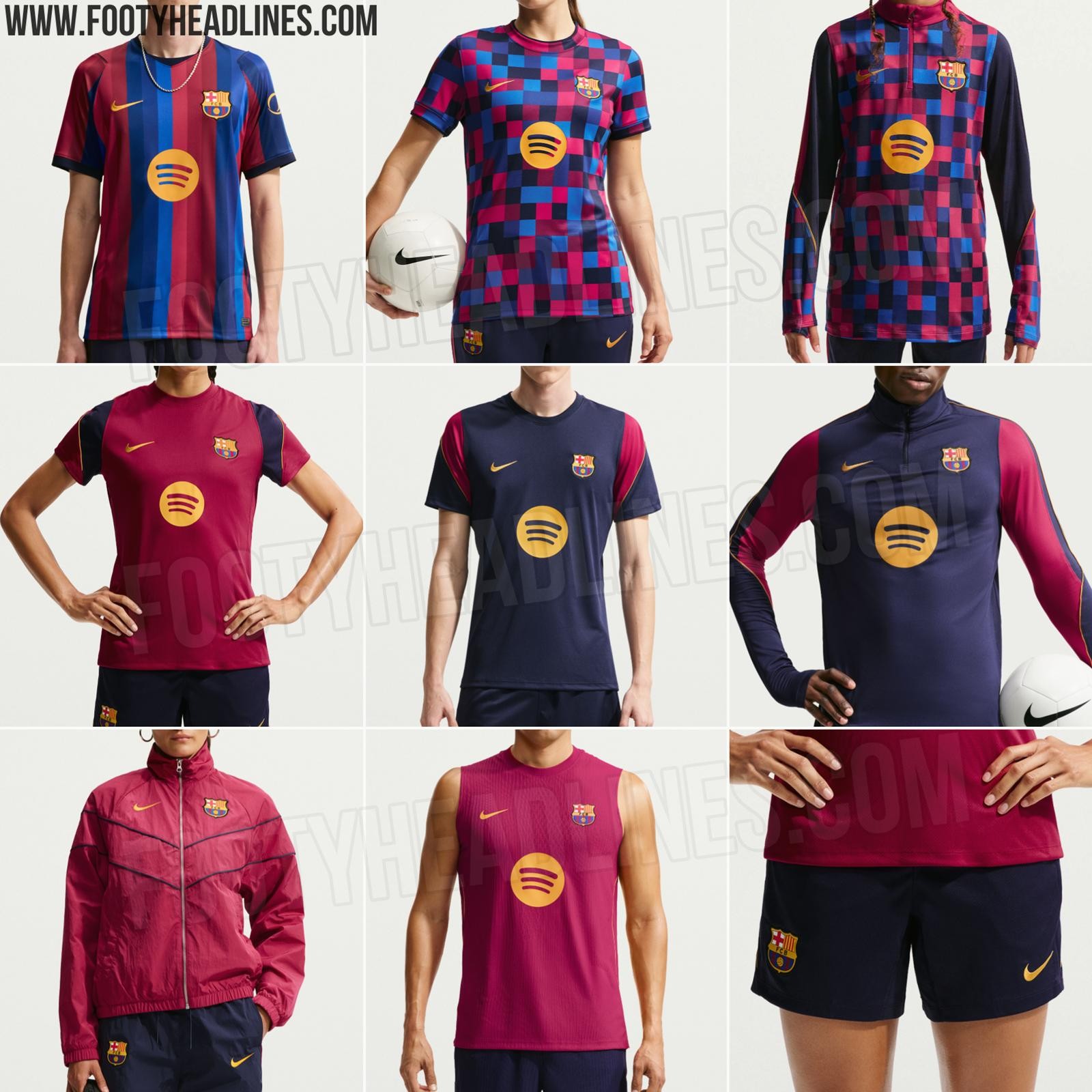
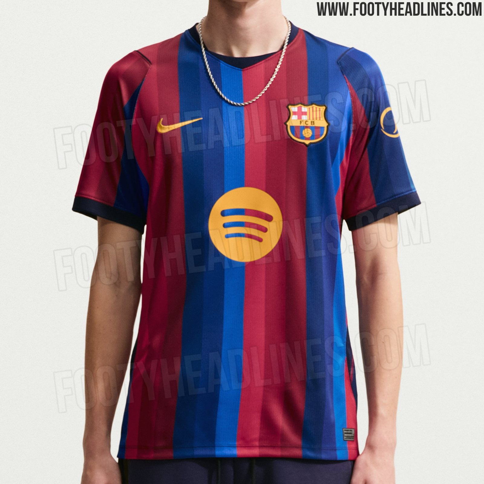
FC Barcelona 26-27 Home Kit Leaked - 11 New Pictures
Footy Headlines can now leak 11 new pictures of the Nike Barcelona 26-27 home kit, authentic version. Although it is a fake, the design is identical to the real one.
It will be released very soon.
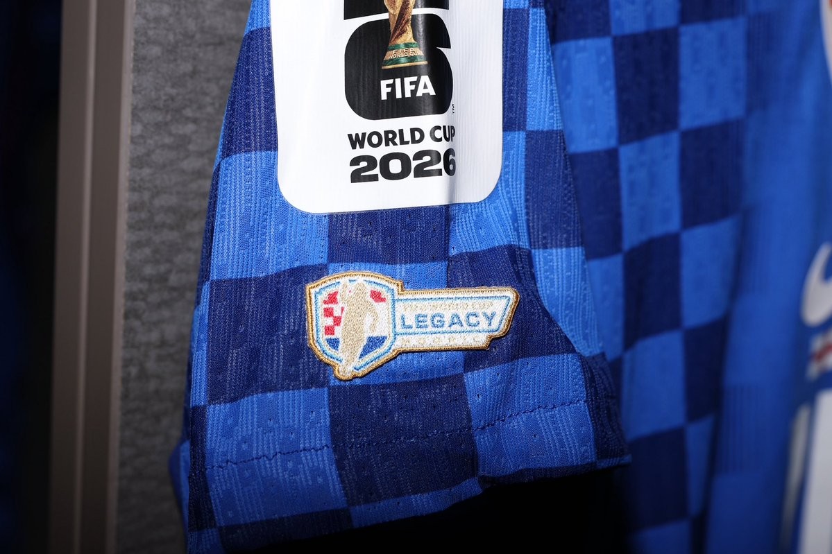
Luka Modrić Wears Special 'Legacy' and 'Golden Ball' Patches at 2026 World Cup
During Croatia's match at the 2026 World Cup, Luka Modrić took to the pitch wearing a jersey featuring two unique FIFA sleeve patches. The midfielder's shirt included a special FIFA Legacy patch, introduced for the 2026 tournament to honor players who have appeared in five or more World Cups. Modrić is participating in his fifth World Cup, joining an elite group of players such as Lionel Messi, Cristiano Ronaldo, Manuel Neuer, Yuto Nagatomo, and Guillermo Ochoa, who are also eligible to wear the Legacy insignia.
In addition to the Legacy patch, Modrić's kit featured a specific badge commemorating his achievement as the winner of the Golden Ball at the 2018 World Cup. This patch highlights his individual accolade from the tournament in Russia. The combination of these two special patches makes Modrić's 2026 World Cup jersey a standout piece, reflecting his long-standing presence and success on the international stage.
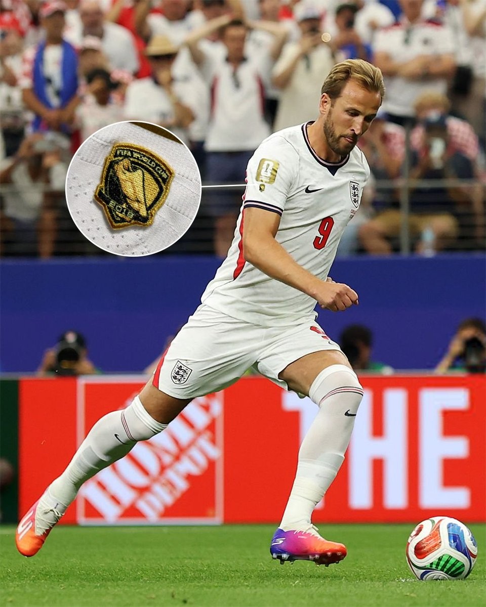
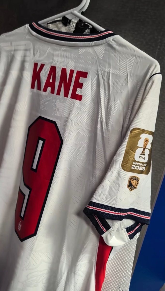
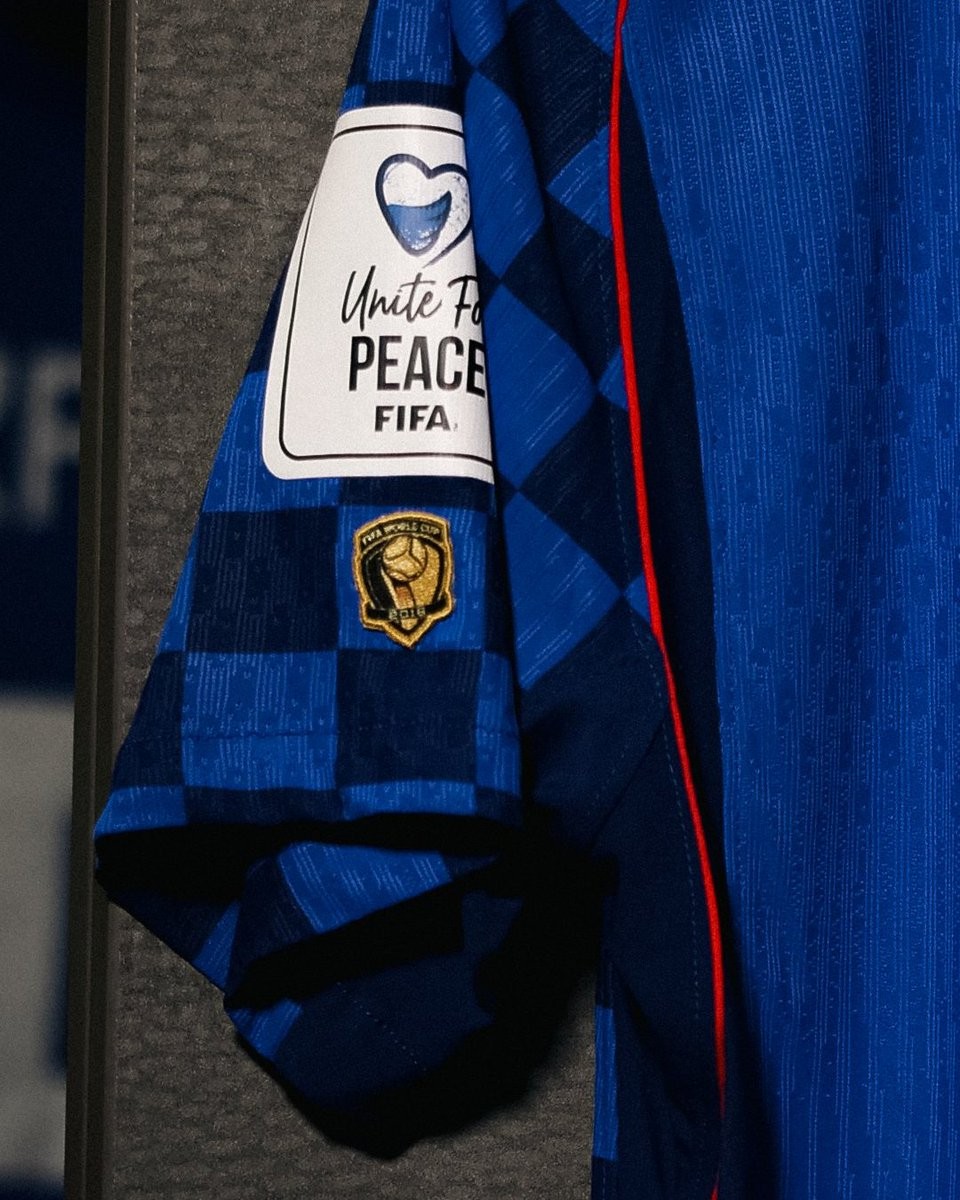
Harry Kane Wears World Cup 'Golden Boot' Winner Patch
During the 2026 World Cup, Harry Kane has been spotted wearing a special FIFA Golden Boot winner patch on the right sleeve of his England shirt. The patch commemorates his achievement as the top scorer of the 2018 World Cup, where he netted six goals. Kane is one of a select few players at the tournament to receive this individual honor, alongside other past Golden Boot winners such as Kylian Mbappe and James Rodriguez.
In addition to Kane's unique individual patch, the entire England squad is sporting a gold tournament sleeve patch. This team-wide detail marks their historic 1966 World Cup victory.
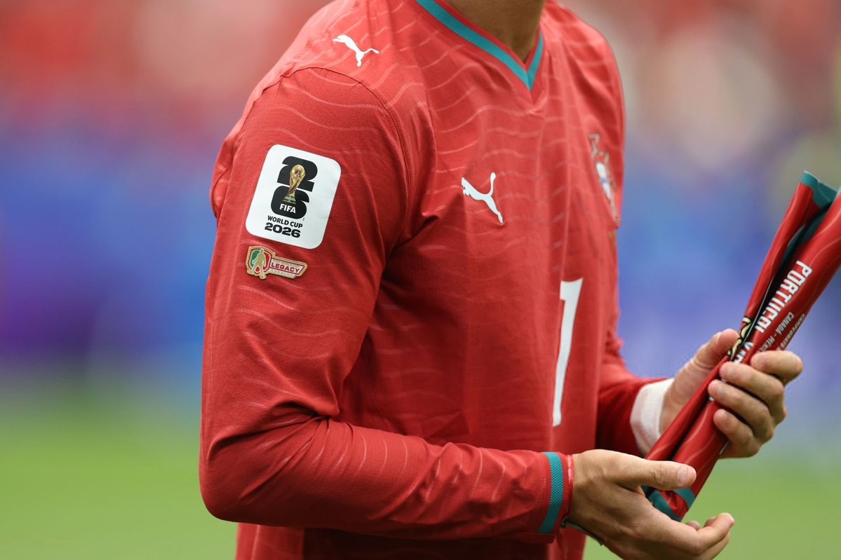
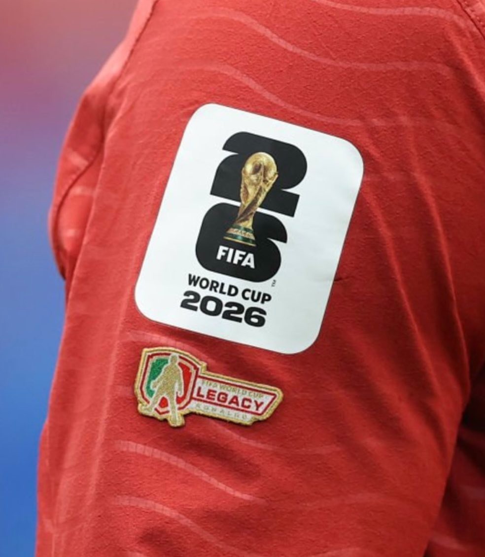
Cristiano Ronaldo Wears Special FIFA Legacy Patch at 2026 World Cup
Cristiano Ronaldo debuted a special FIFA Legacy sleeve patch on his Portugal kit during the 2026 World Cup, marking his historic sixth tournament appearance from 2006 to 2026.
Cristiano's Legacy badge features his signature SIUU pose.
The Legacy patch is an exclusive FIFA honor introduced to recognize players who have been selected for five or more World Cup squads. Ronaldo becomes the fourth player to wear the badge at the 2026 tournament, joining an elite group that includes Lionel Messi and Luka Modric, who are also sporting the Legacy patch alongside their respective individual award badges.


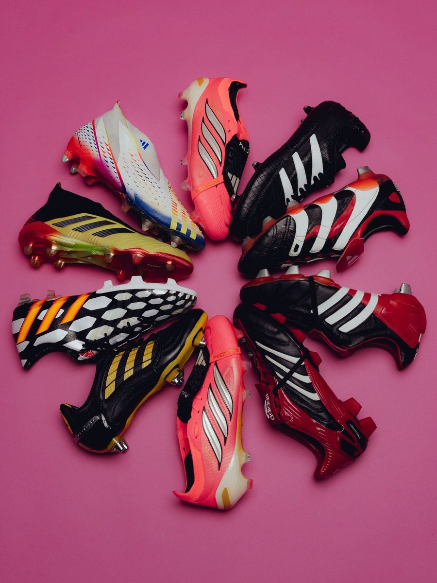
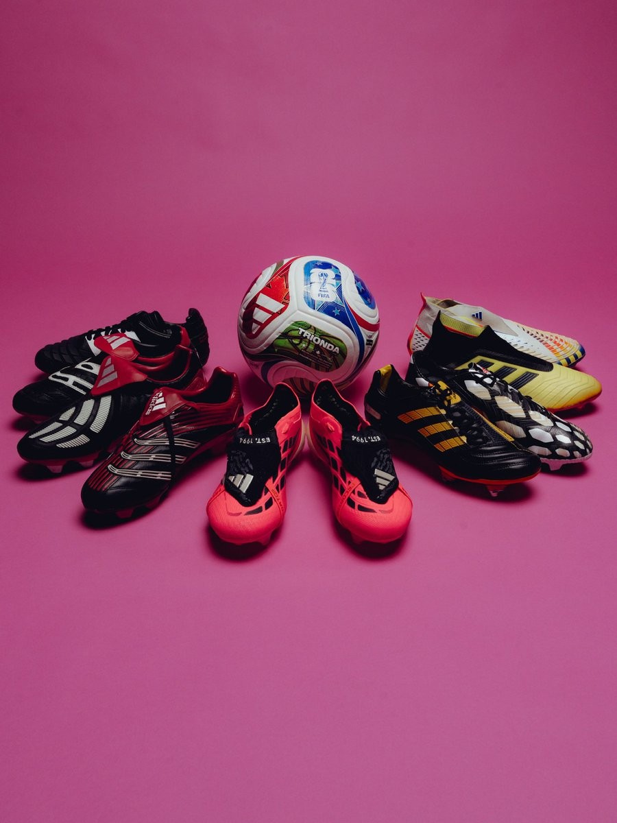
Adidas Teases Predator 1994 to 2026 World Cup Connection
Adidas has officially teased a connection between the original 1994 Predator boot and the upcoming 2026 World Cup. In a recent social media update, the brand highlighted the legacy of the iconic Predator silo, which was initially launched for the 1994 tournament hosted in the USA.
With the 2026 World Cup set to be co-hosted by the USA, Mexico, and Canada, Adidas is celebrating this 32-year journey as a full-circle moment for the boot. The brand noted that the Predator was made for the 1994 World Cup, and the tournament made the boot a legend. By stating that the road to glory continues, Adidas strongly suggests the upcoming release of special edition boots or a dedicated 2026 World Cup Predator model that pays homage to the 1994 original.
The teaser was accompanied by images showcasing the evolution of the Predator boot from its debut to its modern iteration. This announcement builds on recent Predator re-releases and limited editions, generating anticipation for what Adidas has planned for the 2026 tournament.