Top 5 Under-Appreciated Serie A Kits of the 90s
No football shirt fan's collection is complete without a couple of 90s Serie A jerseys, with a few big favourites regularly cropping up. Here are five great jerseys from that era that you may be less familiar with.

Top 5 Underrated Serie A Shirts of the 90s

Serie A in the 90s was the pinnacle of the game. Italian clubs dominated European competitions, attracted the best players, and the passionate atmosphere found inside their stadiums - complete with barriers to keep the fans off the pitch - was unrivalled. The kits were fantastic too. The variety of colours, the baggy fits and the photos of players posing for pre-match photos have all become intertwined with the nostalgic appeal of that era. Juventus, Inter, Milan, Parma, Roma, Lazio and Fiorentina became known as le Sette Sorelle (the seven sisters) and really marked what was the golden age of Serie A. The chances are that for any one of those clubs, one of their classic 90s shirts comes to mind as soon as you hear their name.

Between them, those teams won the majority of the titles on offer at the time, but they were not the only ones to be graced with gorgeous shirts by their technical sponsors. Outside of the elite, there were plenty of other clubs playing week in week out in kits from a wide array of brands, some of which are no longer around. With so many to choose from, it wasn't an easy task narrowing it down to five of the best, but here are our selections, in no particular order.
Torino 94-95 by Lotto


This may look like a fairly standard maroon shirt at first glance, but when you get up close the all over bull print becomes apparent. A fantastic touch by Lotto, incorporating the stylized rampant bull from the incredible angular crest designed by GBM Italia in 1983.


Intended to represent the determination and aggression that the club had always been known for, that version was simply one of the best football club crests of all time.
Hellas Verona 95-97 by Erreà


First worn for a season in Serie B, Verona kept this kit for another season, giving it a chance to shine on the big stage following their promotion. A navy shirt with a yellow chest band will forever by the trademark of Boca Juniors, but there was no mistaking this for anything other than a Verona jersey thanks to the enormous club crest in the centre.


If that wasn't clear enough, it was also woven into the jacquard print. This design was produced in an incredible five different colourways too.
U.S. Ancona 92-93 by Umbro


Ancona only ever played two seasons in Serie A, 92-93 and 03-04. They definitely looked the part for their maiden top flight season in the early 90s with another seemingly simple shirt that revealed some great details on closer inspection. "Ancona" text filled the Umbro's rhomboid-shaped jacquard print, and a large watermark of the club badge sat front and centre.


Throw in a food company sponsor and a contrasting polo collar and you've got a perfect 90s kit, or make that two when you count the inverted away kit. Ancona have sadly endured a lot of financial difficulties and the club has been re-founded four times in the last twenty years, most recently last summer. They now play in Serie C.
Udinese 99-00 by Diadora


Coming in right at the end of the decade, this Udinese home shirt by Diadora combined a number of elements that defined the aesthetic of the 90s. Italian clubs do striped kits better than anyone else, but this one didn't depend just on that particular tradition.


A huge watermarked crest was especially visible on the black stripes (which also had pinstripe borders), and the Diadora logo was well suited to the sleeve taping.
Vicenza 96-97 by Biemme


Biemme is a brand that specialises in cycling wear, but in the 90s and early 00s they also gave football shirts a go, and it turned out that they were pretty good at making them. Their 96-97 home kit for Vicenza had wider stripes than some of their previous offerings, a red polo collar with some nice detailing running around it and a shimmering jacquard print all over.


Vicenza's crest at the time was an imposing letter V within a shield, which was matched nicely by Biemme's tricolour logo and that of their main sponsor, Italian menswear brand Pal Zileri. The icing on the cake was the vertical "Vicenza" lettering that ran down the placket of the collar. A shirt more than worthy of the club's Coppa Italia triumph that season.
What's your opinion on these shirts? Are there any others that you rate highly but don't get much attention? Let us know in the comments.
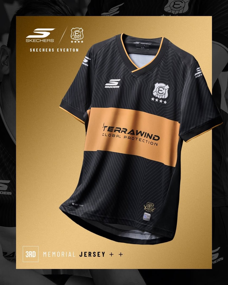
Everton de Viña del Mar 2026 Third Kit Released
The new Everton de Viña del Mar third kit for the 2026 season has been revealed. Made by Skechers, the alternative strip completes the club's lineup for the current Chilean Primera División campaign.
The launch of the third kit follows the introduction of the club's 2026 home kit, which was announced in December 2025 alongside the official confirmation of the Skechers partnership. The new third shirt offers a fresh design for the team, contrasting with the traditional look of the primary uniform. The club has been highly active recently, celebrating its 117th anniversary in June 2026.
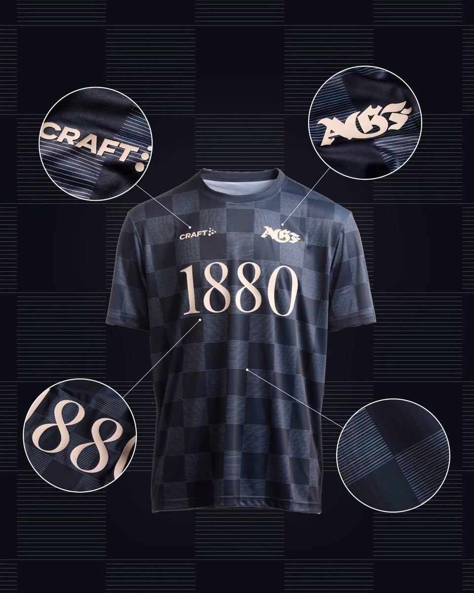
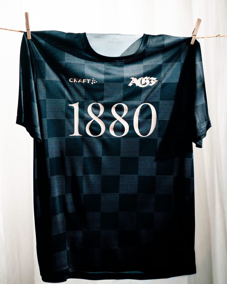
AGF Aarhus 2026-27 Pre-Match Kit Released
Following the launch of their new home shirt earlier this month, Danish Superliga side AGF Aarhus has revealed their 2026-27 pre-match kit. The new pre-match top is produced by the club's technical sponsor, Craft, and will be worn during the upcoming season.
The Craft AGF Aarhus 2026-27 pre-match shirt features a unique look designed specifically for the players' pre-game preparations.


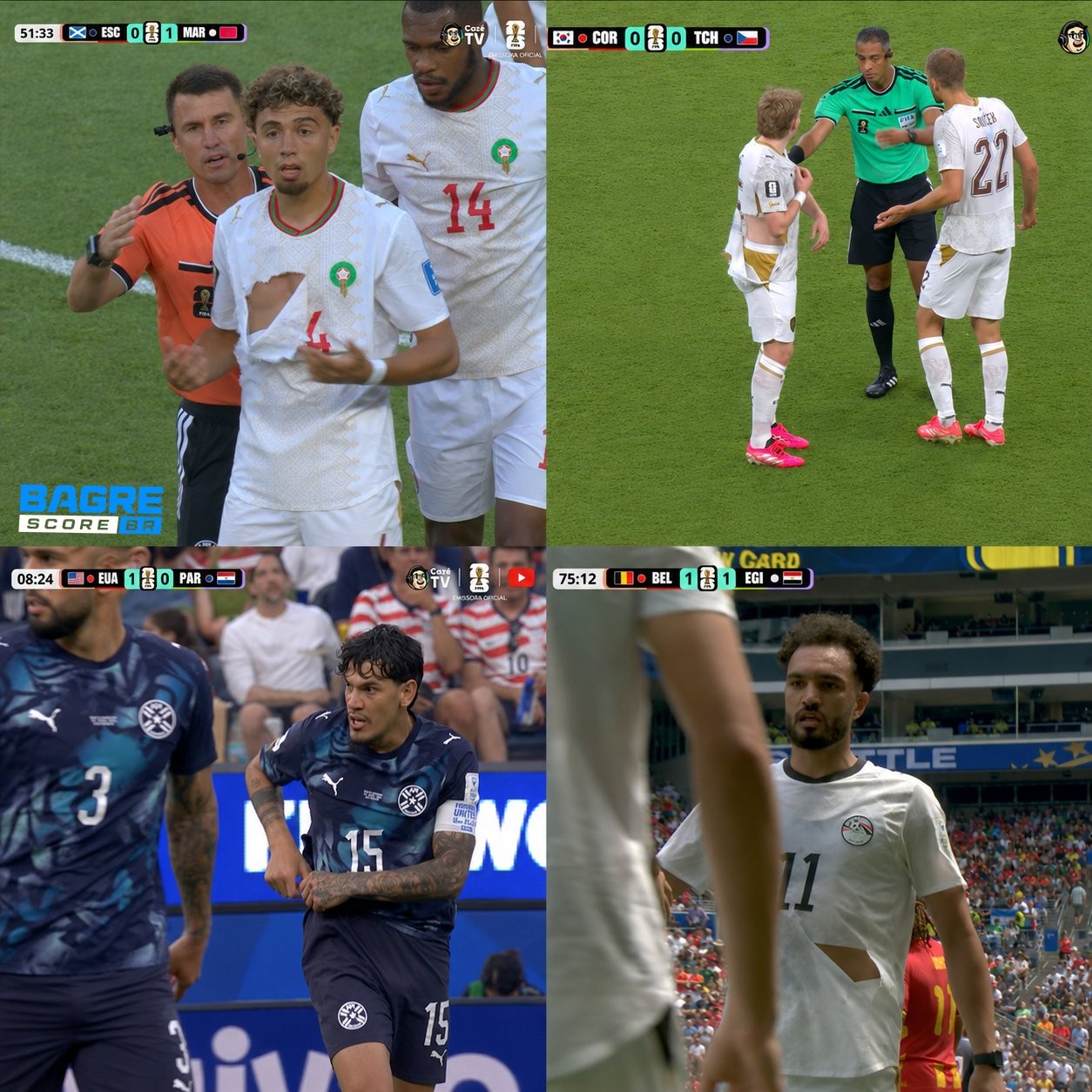
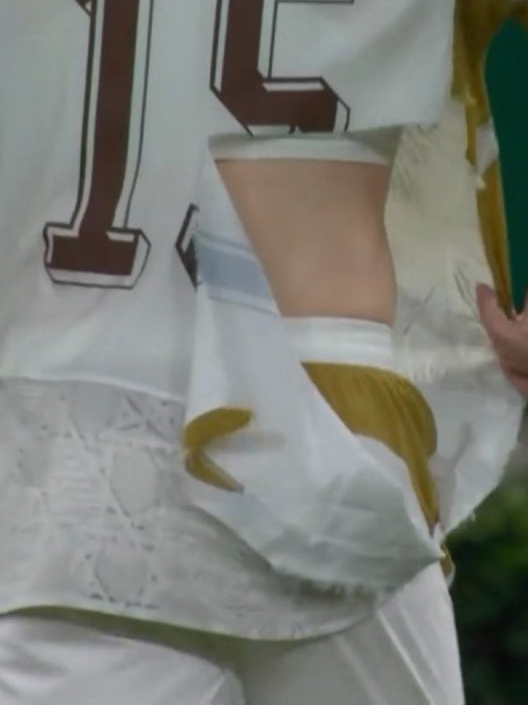
Puma Kits Keep Ripping at the 2026 World Cup
Puma is facing significant criticism at the 2026 World Cup as multiple national team jerseys have easily ripped during matches.
Incidents involving players from Czechia, Morocco, Egypt, and Paraguay have highlighted an ongoing durability issue with the brand's latest kits - every torn shirt in the tournament so far belongs to a Puma-sponsored team.
The Puma 2026 World Cup kits incorporate the latest version of PUMA's ULTRAWEAVE “Thermoadapt” technology, which obviously is not tear-resistant enough.
The recurring wardrobe malfunctions have resulted in terrible PR for the German sportswear manufacturer and even prompted the viral resurgence of Xherdan Shaqiri's infamous quote from Euro 2016, where he joked that he hopes Puma does not produce condoms.
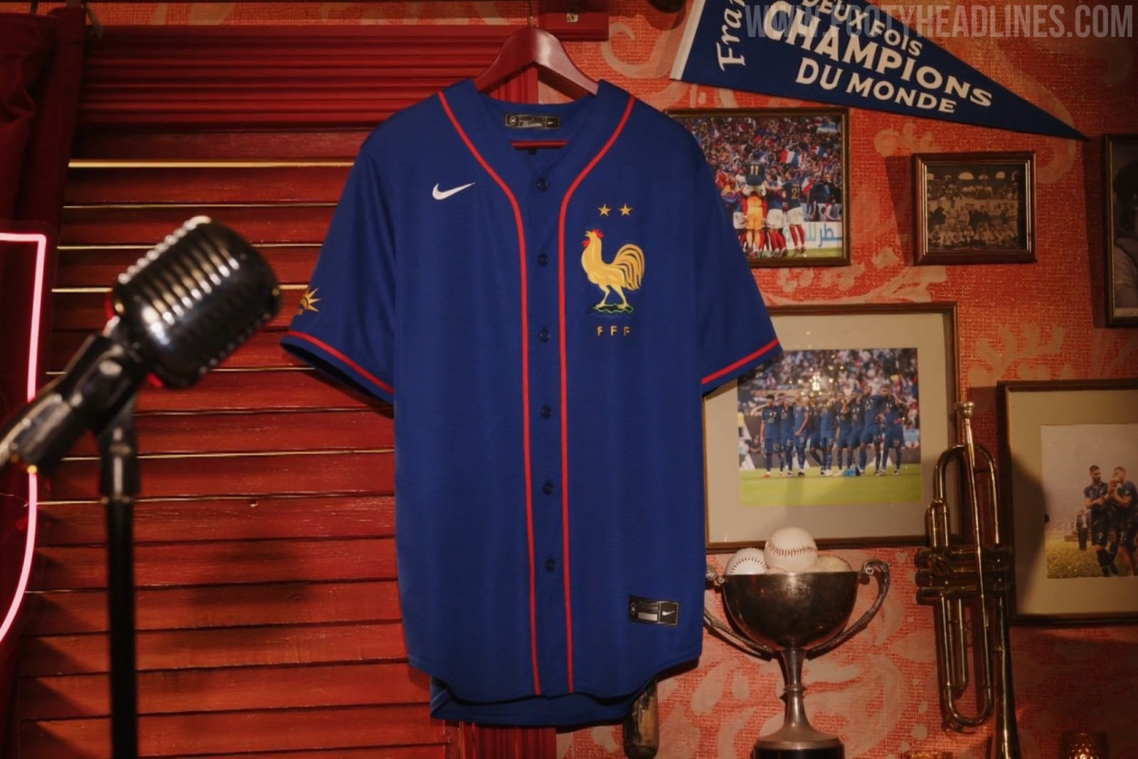
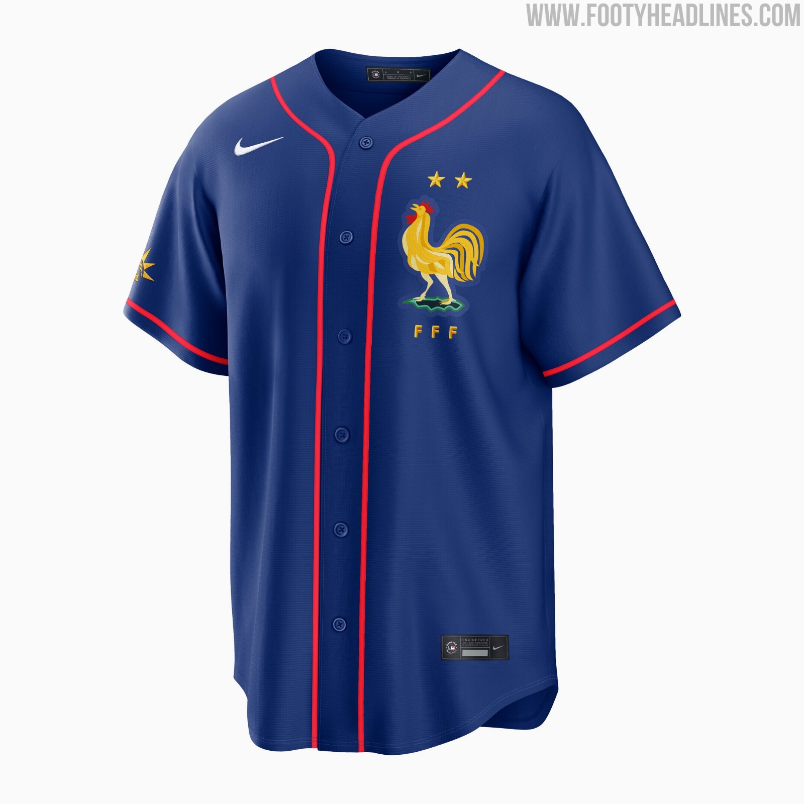
France x MLB Baseball Jersey Released
The French Football Federation has officially launched a new crossover collaboration jersey with Major League Baseball.
The France MLB jersey features a classic baseball button-down design in the team's signature blue color, complete with the FFF crest and MLB branding.
Available now through the official FFF boutique and MLB Shop Europe, the new collaboration jersey retails for 140 Euro. The release has drawn some criticism from fans regarding its high price point of 140 euros.
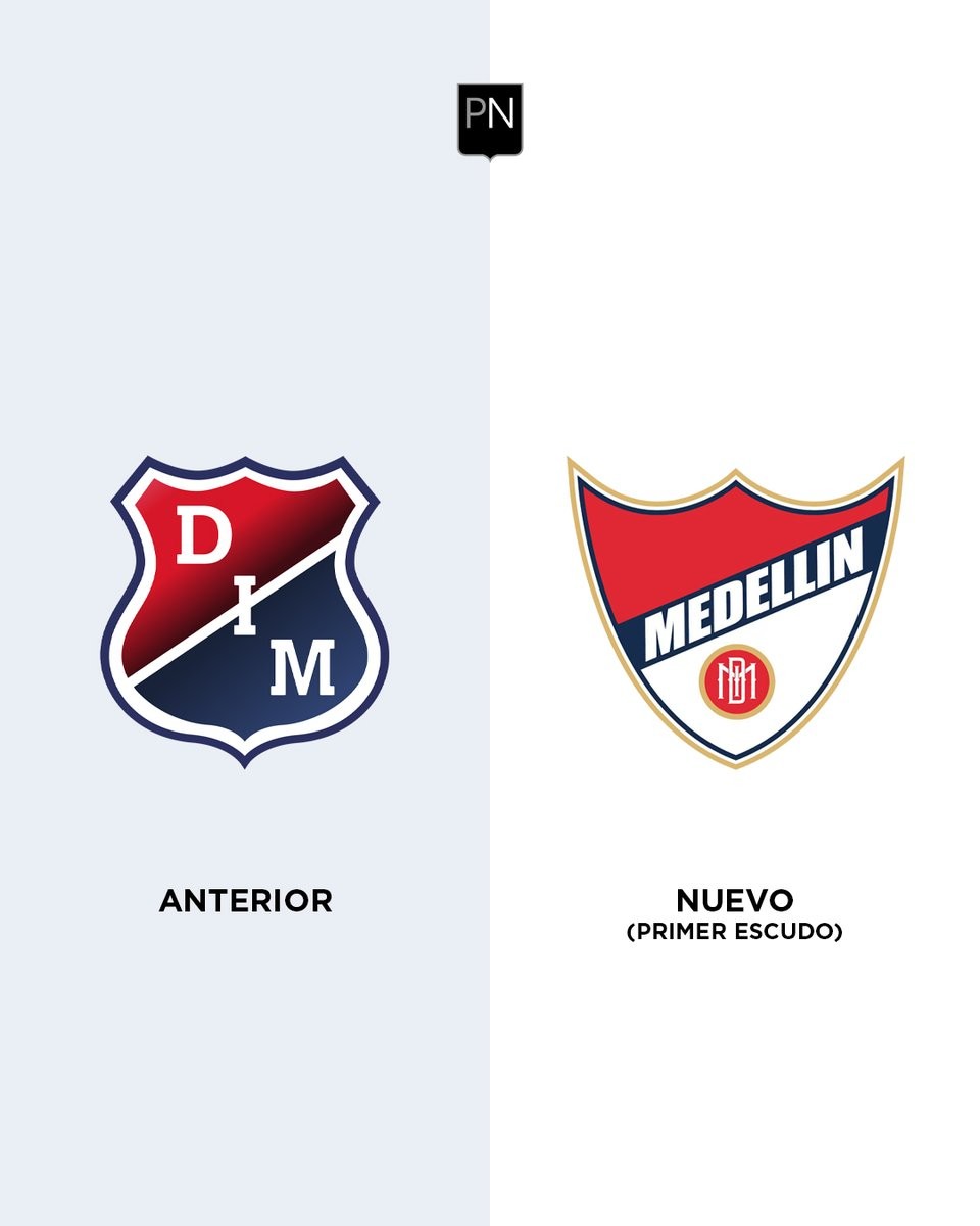
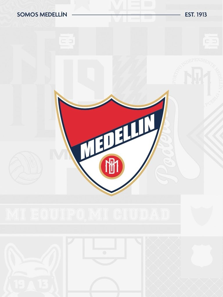
Deportivo Independiente Medellín Returns to Original Crest
Colombian club Deportivo Independiente Medellín has officially announced a return to their original crest, reconnecting with their 1913 roots.
Unveiled on June 19, 2026, the updated identity features the club's historic first shield, which prominently displays the city's name and honors their successes during the amateur era. The decision to revert to this traditional emblem is described by the club as a return to their origins, aiming to celebrate the beginning of their history and strengthen their brand identity.
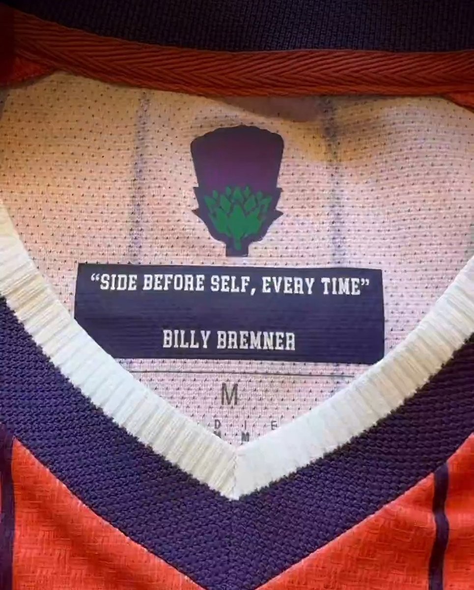
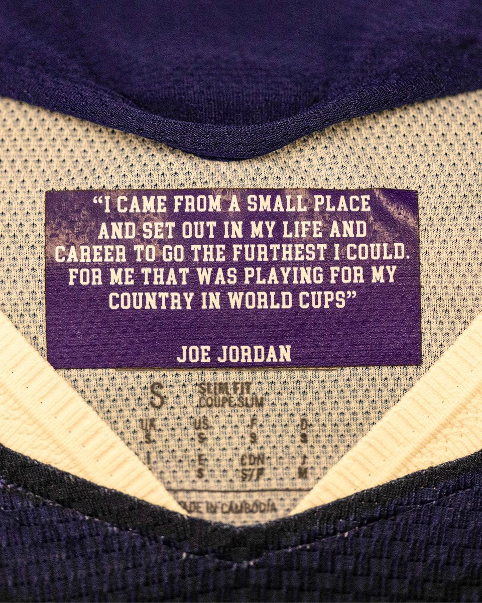
Scotland Add Motivational Phrases to 2026 World Cup Kits
The Scottish national team's equipment staff have taken an extra step to inspire their players during the 2026 World Cup by adding motivational phrases to the inner collar of their match shirts.
This initiative is part of the broader "Choose Scotland" campaign, which features messaging such as "You can’t choose where you’re born but you can choose who you stand with."
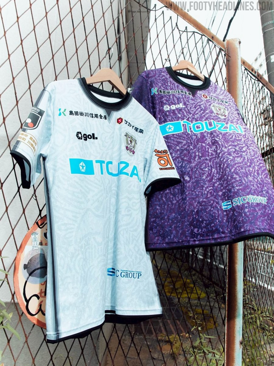
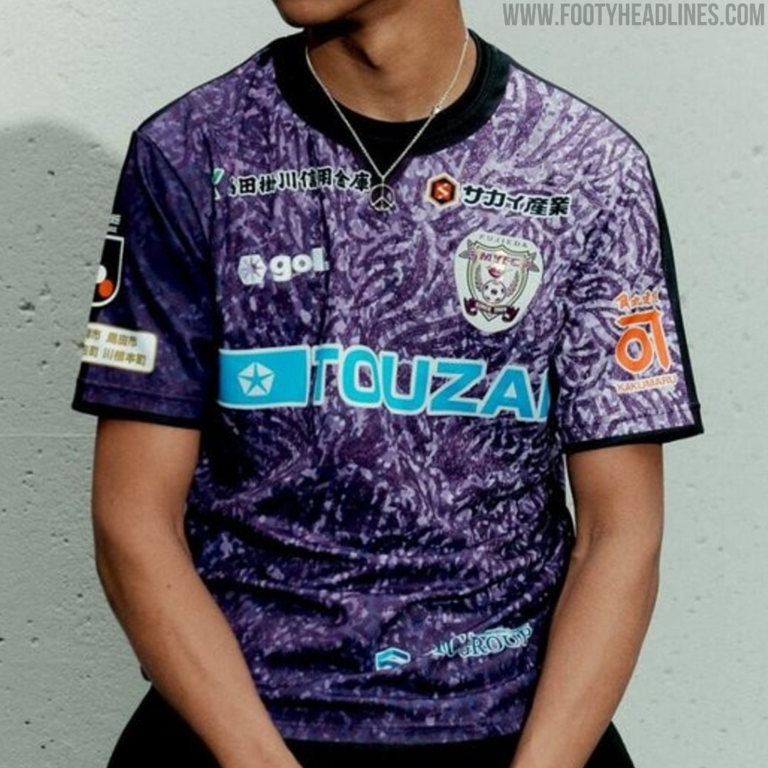
Fujieda MYFC 26-27 Kits Released
Japanese J2 League club Fujieda MYFC have officially unveiled their new 2026-27 kits, produced by sportswear brand Gol. Designed under the theme "Merge," the new shirts symbolize the fusion of the ball, boots, players' spirit, fans, and partners uniting for the upcoming season. The collection features bespoke graphic patterns across the home, away, and goalkeeper jerseys, with sponsor logos cleanly integrated throughout the designs. The new Fujieda MYFC 2026-27 kits will be available to purchase starting in late June 2026 via the official J.League online store.
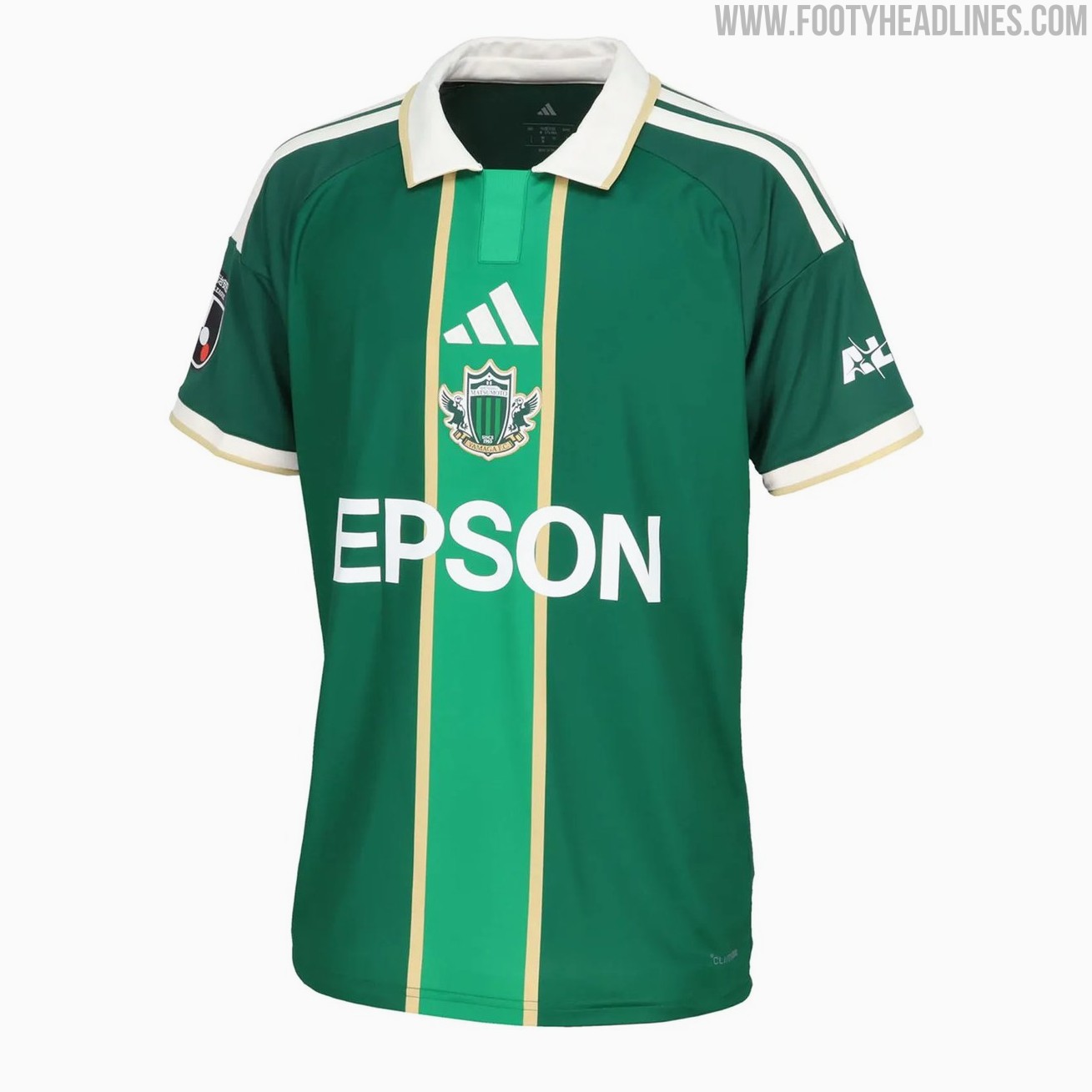
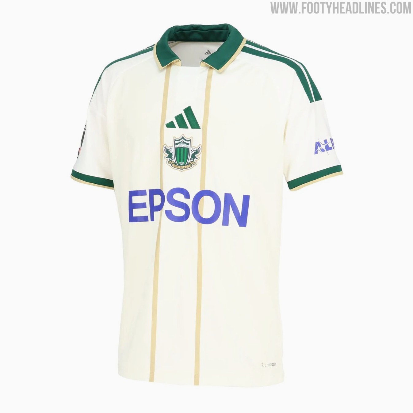
Matsumoto Yamaga 26-27 Home & Away Kits Released
Japanese J3 League club Matsumoto Yamaga FC have revealed their new 2026-27 home and away kits. The new Adidas Matsumoto Yamaga 2026-27 shirts introduce bespoke designs for the club.
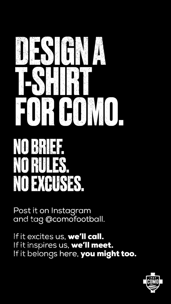
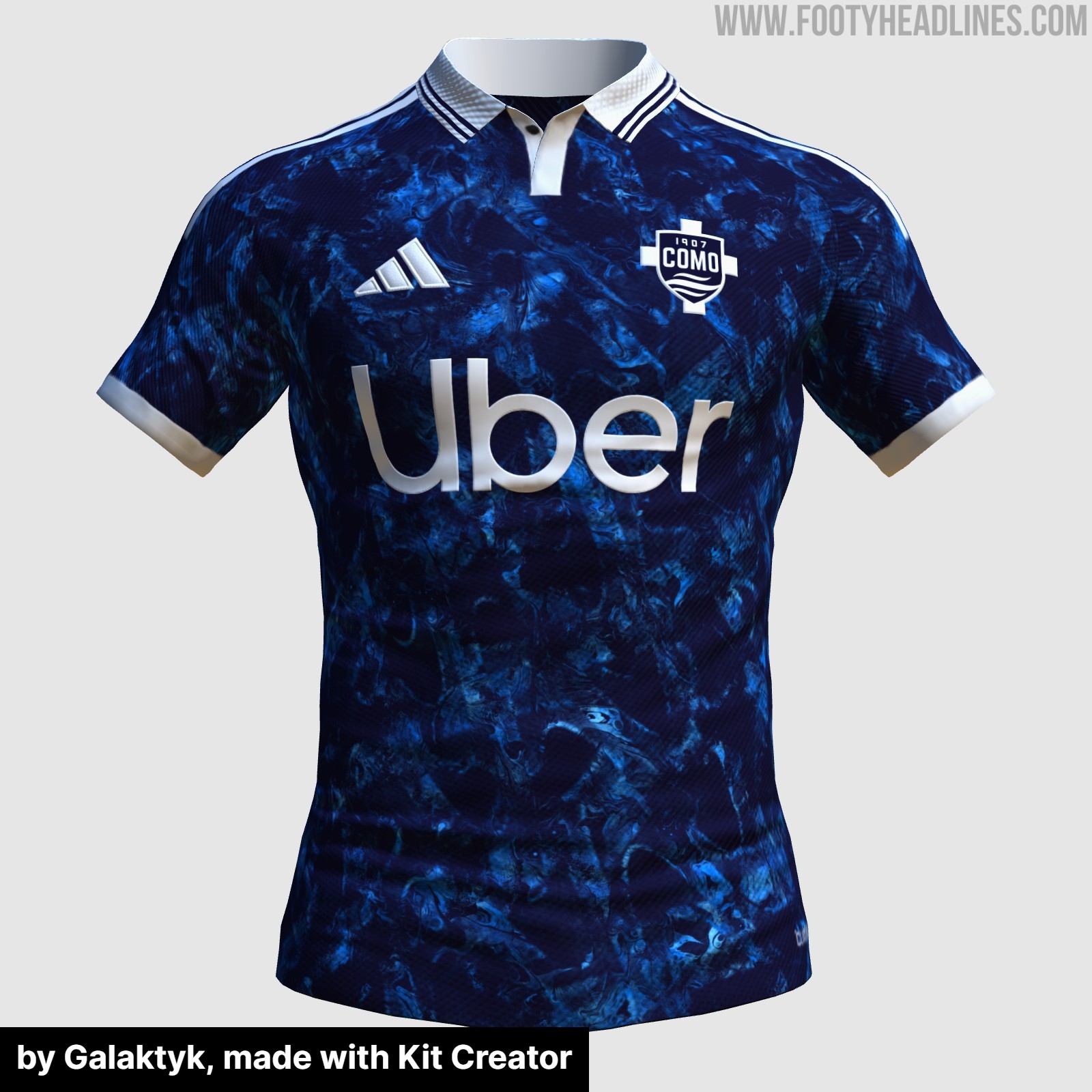
Como 1907 Announce Kit Design Contest
Italian club Como 1907 has launched a new design contest, inviting fans and designers to create a new look for the team. While the official announcement asked supporters to design a t-shirt for Como, it is likely that the club is referring to a football kit, given the context of the post and the reactions from the fanbase.
The club has kept the instructions incredibly open, stating there is no brief, no rules, and no excuses. To enter the competition, fans simply need to create their design, post it on Instagram, and tag the official Como 1907 account.
The announcement has already sparked significant interest online, with numerous supporters sharing their concepts and ideas. Whether the winning design will be produced as an official match kit, a pre-match shirt, or a special edition lifestyle item remains to be seen, but it offers a unique opportunity for fans to leave their mark on the club's visual identity.
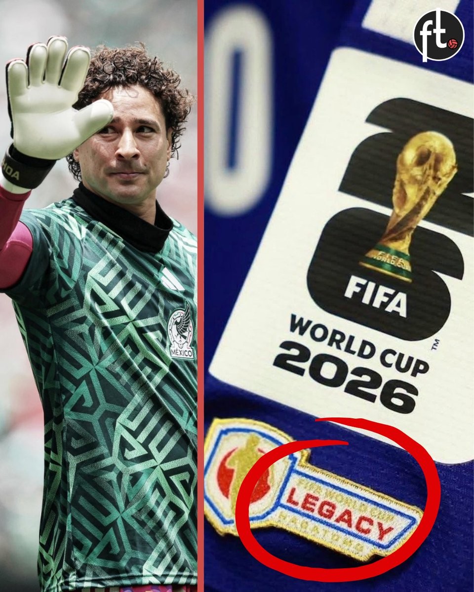
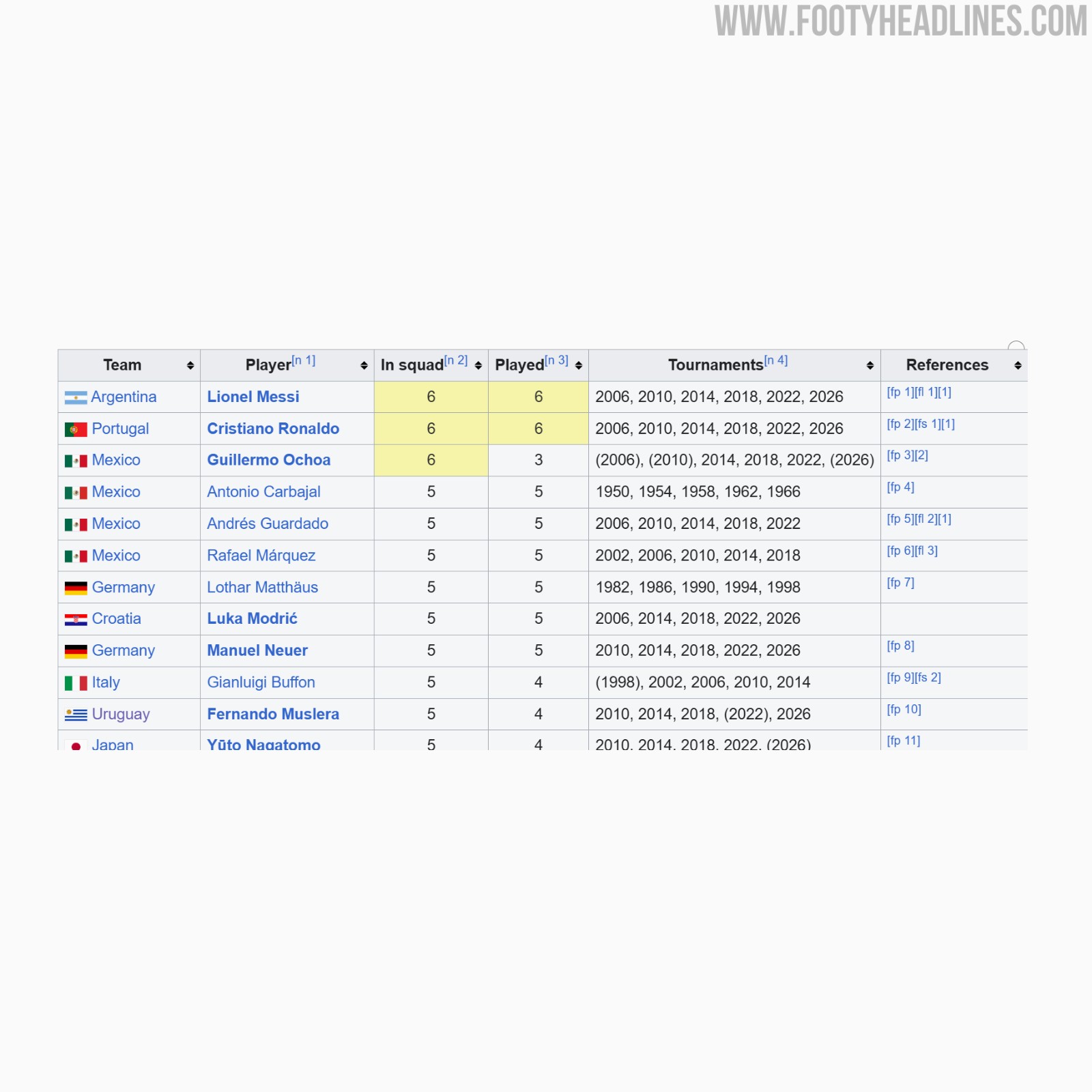
FIFA Denies Guillermo Ochoa 2026 World Cup Legacy Patch Over Appearance Rules
Guillermo Ochoa has been denied the chance to wear FIFA's new legacy patch at the 2026 World Cup. Despite being selected for six World Cup tournaments spanning from 2006 to 2026, the Mexican goalkeeper does not meet the strict criteria set by FIFA. The governing body requires players to have made on-pitch appearances in at least five different World Cups to qualify for the special badge.
Ochoa did not play any minutes during the 2006 and 2010 tournaments, meaning he has only registered on-pitch appearances in three World Cups prior to the 2026 edition. Because of this, FIFA officially refused to award him the patch. Other veterans playing in the tournament, such as Lionel Messi, Cristiano Ronaldo, Luka Modric, Manuel Neuer, and Yuto Nagatomo, have received the legacy patch for meeting the five-tournament appearance threshold.
The Mexican Football Federation is reportedly planning to push for a reconsideration of the ruling. If Ochoa features in a match during the 2026 tournament, the federation intends to appeal FIFA's decision in hopes of securing the legacy patch for the veteran goalkeeper.