"Looks Like a Nazi Symbol": All-New Spezia Calcio Logo Unveiled
 Jul 8, 2023, by Pat
Spezia Calcio, who got relegated from Serie A last season, yesterday unveiled their new visual identity, which according to the official announcement represents the club's values and connection with the city.
But the new logo has sparked controversy and a revolt among fans and citizens. Many people have expressed concerns that the logo bears resemblances to symbols associated with Nazism and extreme right-wing movements.
The official Spezia Calcio page and social media platforms have been flooded with comments criticizing the logo. Fans have even initiated a petition on change.org, urging the club's ownership not to adopt the new symbol, stating that it disrespects the historical significance of Spezia Calcio.
Spezia Calcio Logo 2023-24
This is the new Spezia Calcio logo, to be used from 2023-2024, compared to the previous design.
The minimalist design of the Spezia 23-24 logo consists of three key elements: the name 'Spezia' completing the structure, the historical symbol of an eagle positioned prominently, and the intersection of the letters S and C, forming an anchor at the bottom.
𝐀𝐍𝐂𝐎𝐑𝐀𝐓𝐈 𝐀𝐋 𝐏𝐀𝐒𝐒𝐀𝐓𝐎
— Spezia Calcio (@SpeziaCalcio) July 6, 2023
𝐍𝐀𝐕𝐈𝐆𝐀𝐍𝐃𝐎 𝐕𝐄𝐑𝐒𝐎 𝐈𝐋 𝐅𝐔𝐓𝐔𝐑𝐎
𝑨𝑵𝑪𝑯𝑶𝑹𝑬𝑫 𝑻𝑶 𝑻𝑯𝑬 𝑷𝑨𝑺𝑻
𝑺𝑨𝑰𝑳𝑰𝑵𝑮 𝑰𝑵𝑻𝑶 𝑻𝑯𝑬 𝑭𝑼𝑻𝑼𝑹𝑬#VoliamoInsieme 🦅 pic.twitter.com/tPa5ABjrKa
Considering the amount of criticism, it remains to be seen whether Spezia will keep the change or revert back to the old design.
Do you think the criticism of the Spezia Calcio emblem is justified? Comment below.

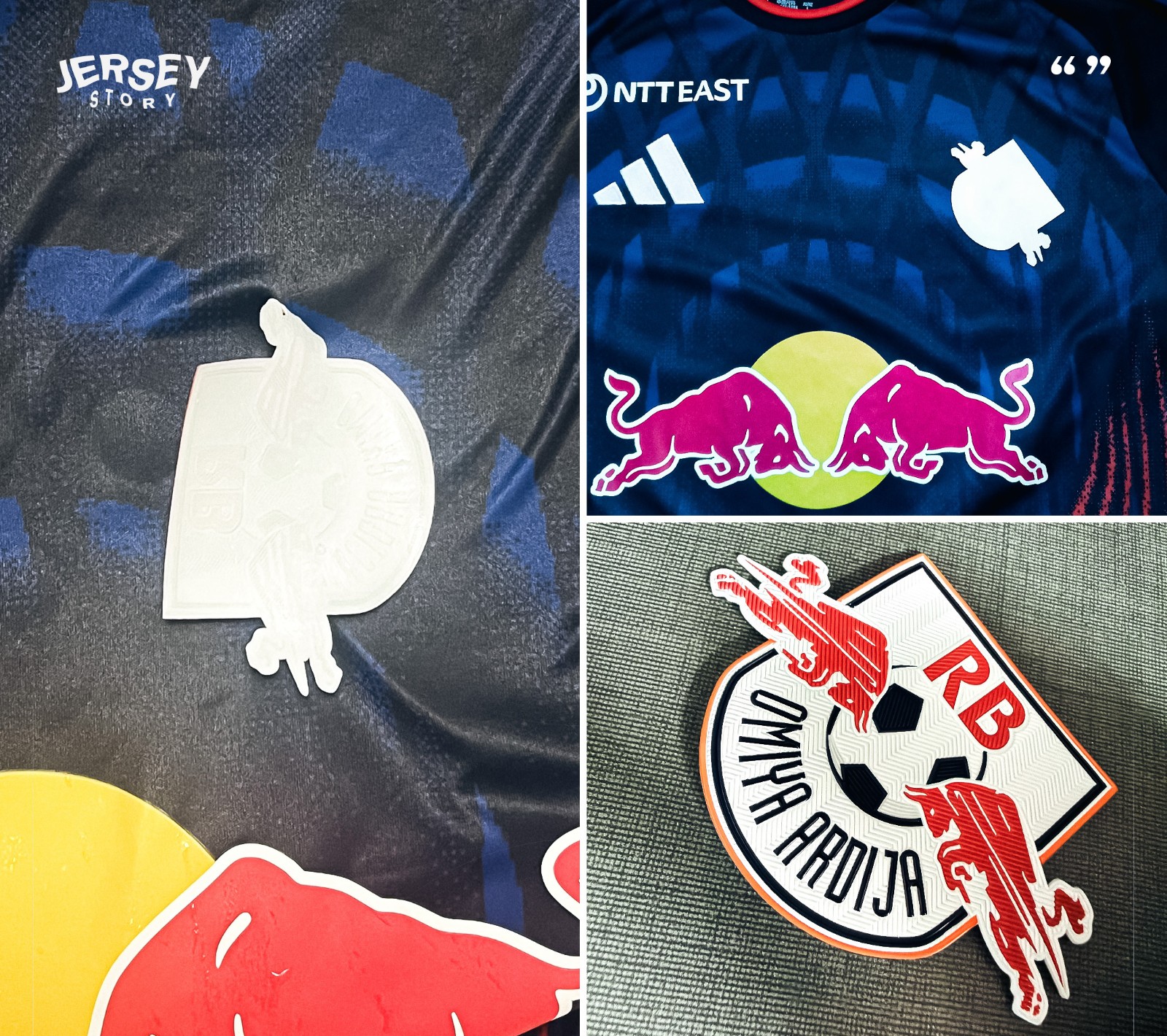
Adidas Manufacturing Issue in Japan?
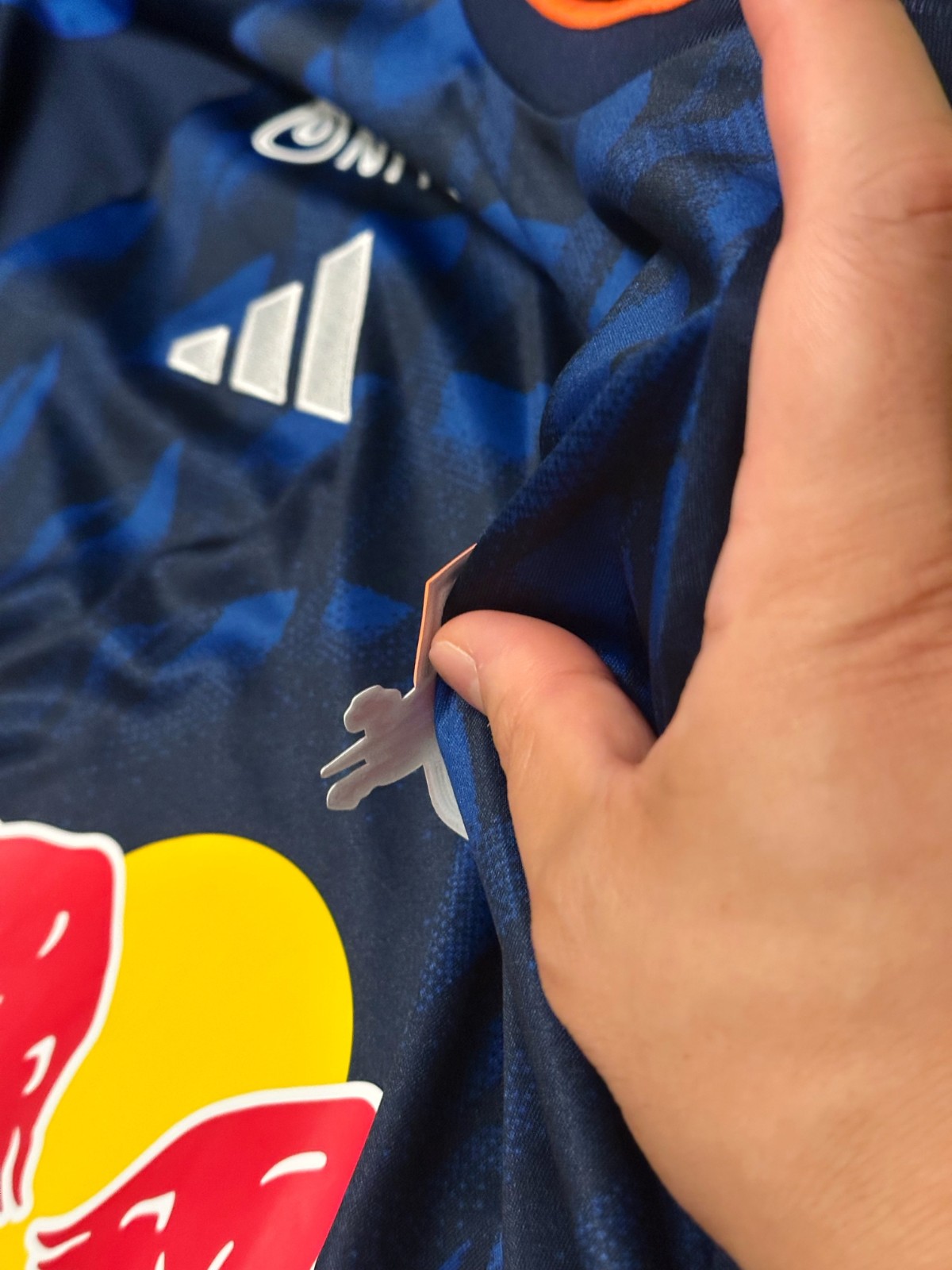
Multiple supporters of RB Omiya Ardija (J2 League) have reported severe issues with peeling logos after just a single wash, regardless of whether the shirts were hand-washed or machine-washed. This is also the club's very first season wearing Adidas kits.
Many fans compared the quality of the heat-applied crests on the new Adidas shirts to their previous Under Armour ones, noting that the Under Armour logos remained completely intact even after an entire season of use. Big thanks to @jerseystory_vn for the collage.
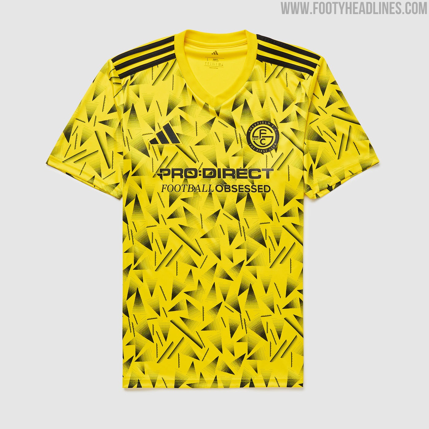
Sheffield FC Release Limited-Edition 26-27 Pre-Season Charity Kit
Sheffield FC, the world's oldest football club, has teamed up with Adidas and Pro:Direct Soccer to launch a special-edition pre-season kit for the 26-27 season.
The special Sheffield FC kit is a teamwear design. It features a vibrant yellow base covered in a striking black geometric graphic pattern, the jersey comes complete with black Adidas branding, three stripes, and club crest. The eye-catching release is strictly limited to just 169 pieces, created to support the Bright Young Dreams initiative and raise funds for The Children's Hospital Charity.

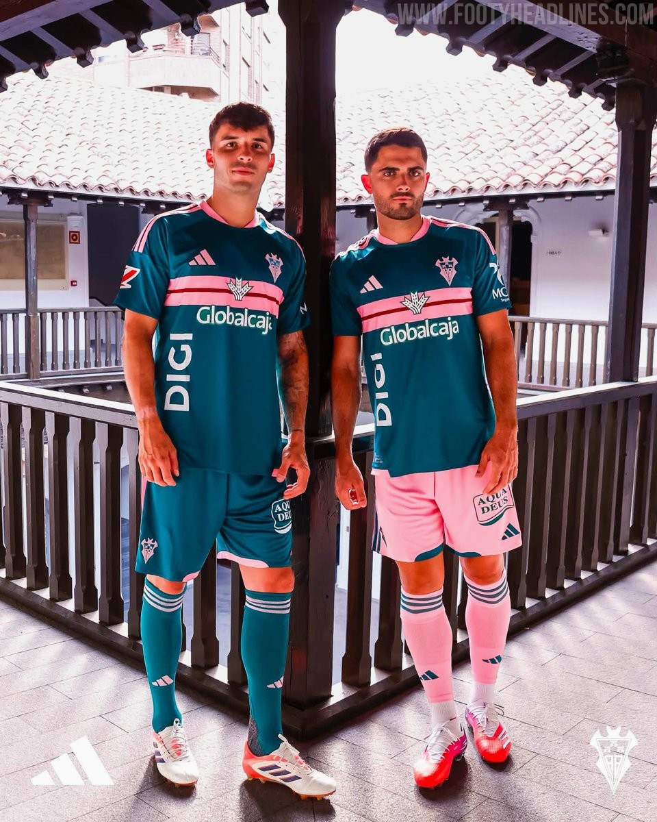
Albacete Balompié 26-27 Away Kit Released
Spanish Segunda División club Albacete Balompié has officially launched its new away kit for the 26-27 season, crafted by Adidas. The striking design features a dark green base complemented by light pink accents on the crew-neck collar, shoulder stripes, and sleeve trim. A prominent horizontal chest band in pink is bisected by a thin red central stripe, delivering a unique look for the campaign. The set is completed with customizable green or pink shorts alongside matching socks.
Waldhof Mannheim 26-27 Home Kit Released
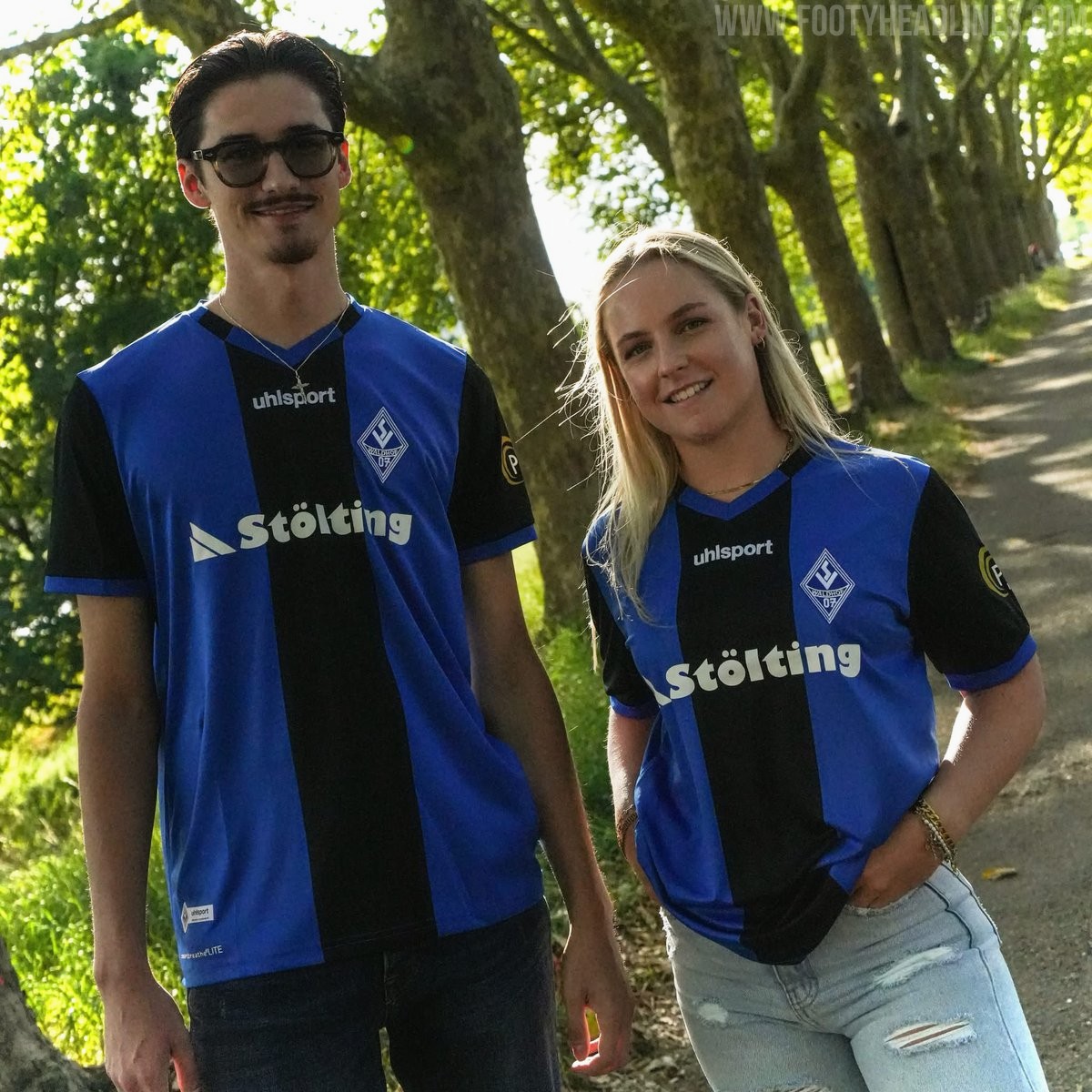
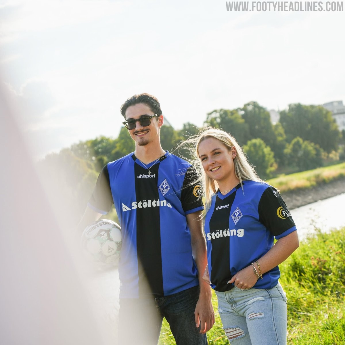
German 3. Liga club SV Waldhof Mannheim 07 and technical partner uhlsport have officially launched the club's new home jersey for the 26-27 season. Grounded in traditional colors, the uhlsport Waldhof Mannheim 26-27 home shirt features a broad black vertical stripe running down the center flanked by vibrant blue side sections, complemented by black sleeves with blue cuff trim and a matching V-neck collar. White branding, including a centered uhlsport logo and main sponsor Stölting, stands out cleanly against the central black stripe alongside the club crest.
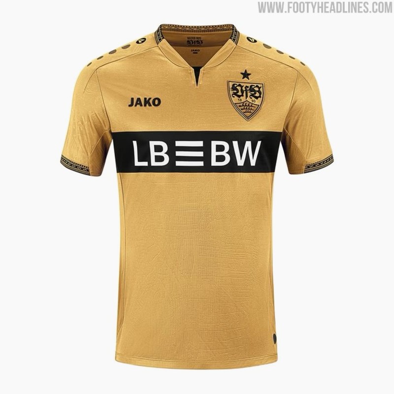
VfB Stuttgart 26-27 Third Kit Released
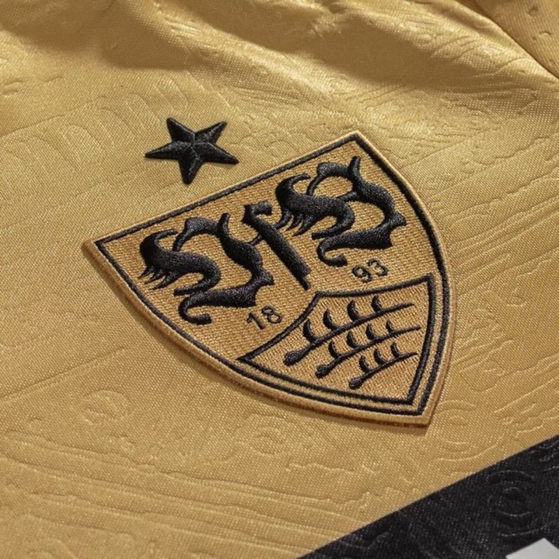
VfB Stuttgart and kit supplier Jako have officially unveiled the club's new third kit for the 26-27 season. Continuing the theme of honoring the local heritage of Bad Cannstatt, the new shirt takes inspiration from ancient Celtic gold artifacts discovered in the region and preserved at the Landesmuseum Württemberg.
The Stuttgart 26-27 third kit features a gold base color complemented by the club's signature black chest band, which houses the white LBBW sponsor logo. The collar and sleeve cuffs are detailed with black trim and intricate patterns derived from Celtic metalwork, while the fabric incorporates an all-over embossed texture inspired by ancient craftsmanship. An enlarged, embroidered VfB crest in black and gold completes the shirt design. Special details round off the presentation, including an inner collar print featuring the phrase Kelten aus Cannstatt alongside historical motifs. The new third uniform is completed with matching gold shorts and socks.
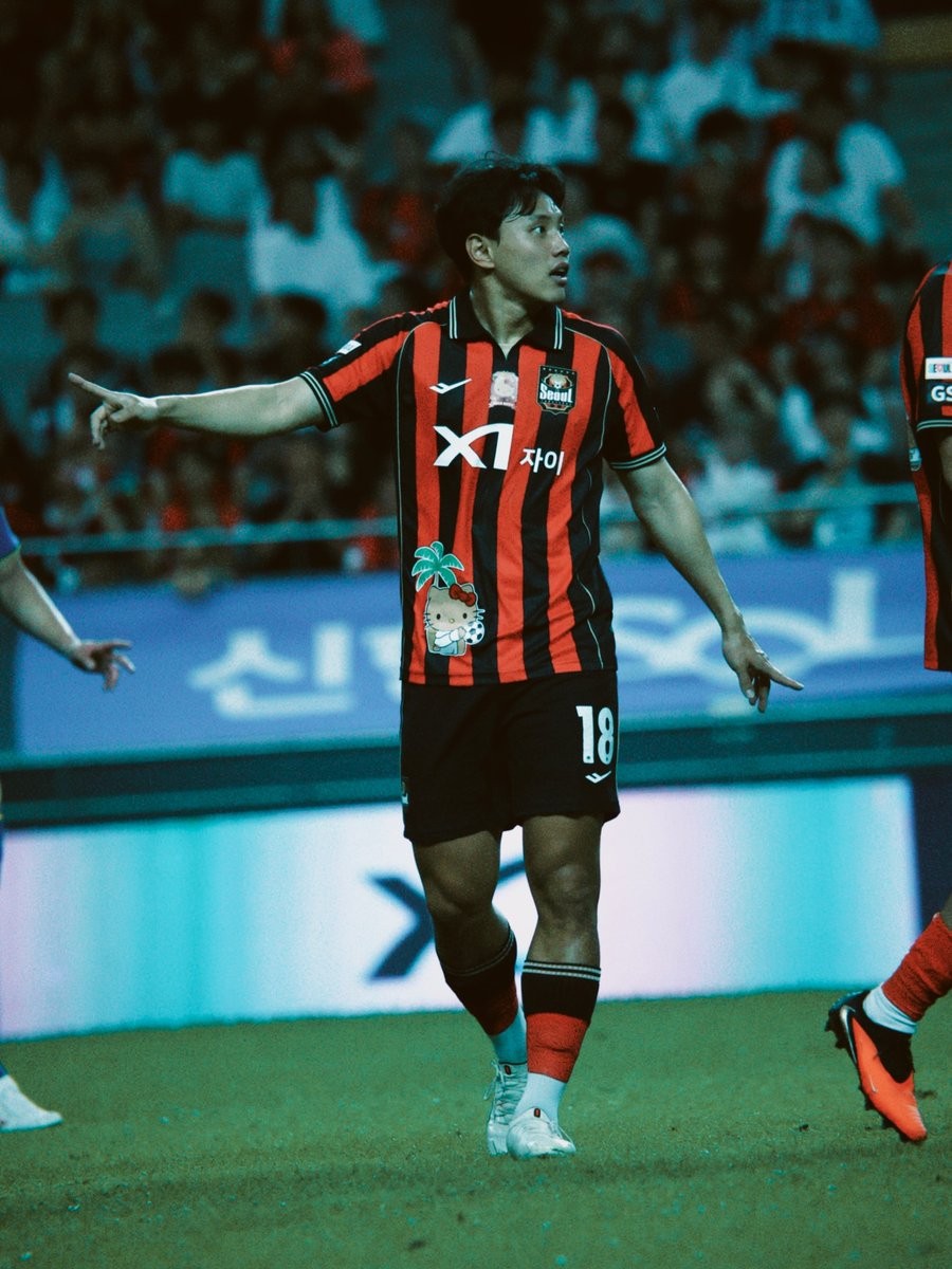
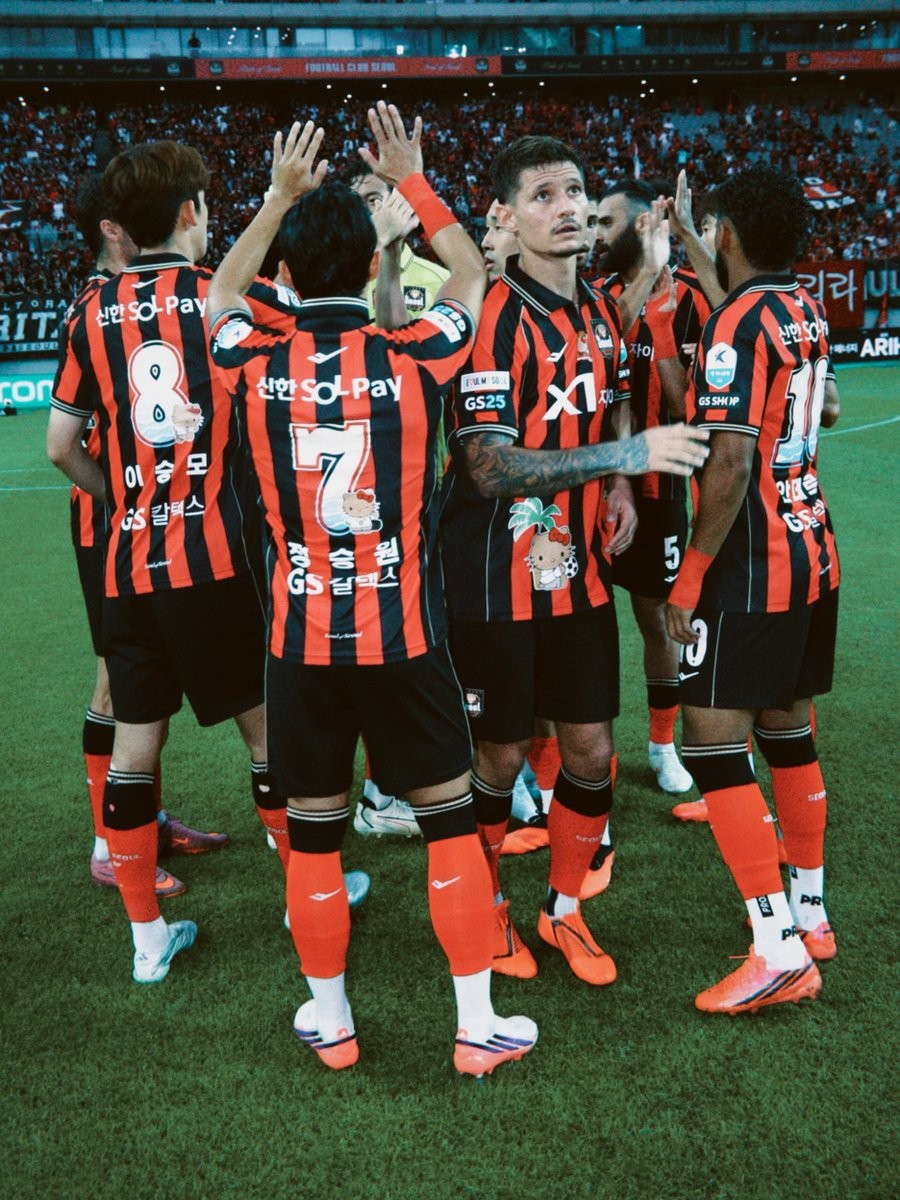
FC Seoul Launch Hello Kitty Special Kit Marking Set
FC Seoul has launched a special Hello Kitty collaboration uniform marking set as part of the official K League x Sanrio Characters partnership for the 26-27 season.
The South Korean club updated its classic red and black striped home kit with custom summer-themed graphics starring Sanrio's world-famous mascot. The special kit customization features a custom patch on the lower right front of the shirt showing Hello Kitty next to a palm tree and a football. On the back, each player's squad number is styled in a white and light blue font decorated with ocean wave details and Hello Kitty graphics, accompanied by custom player names.
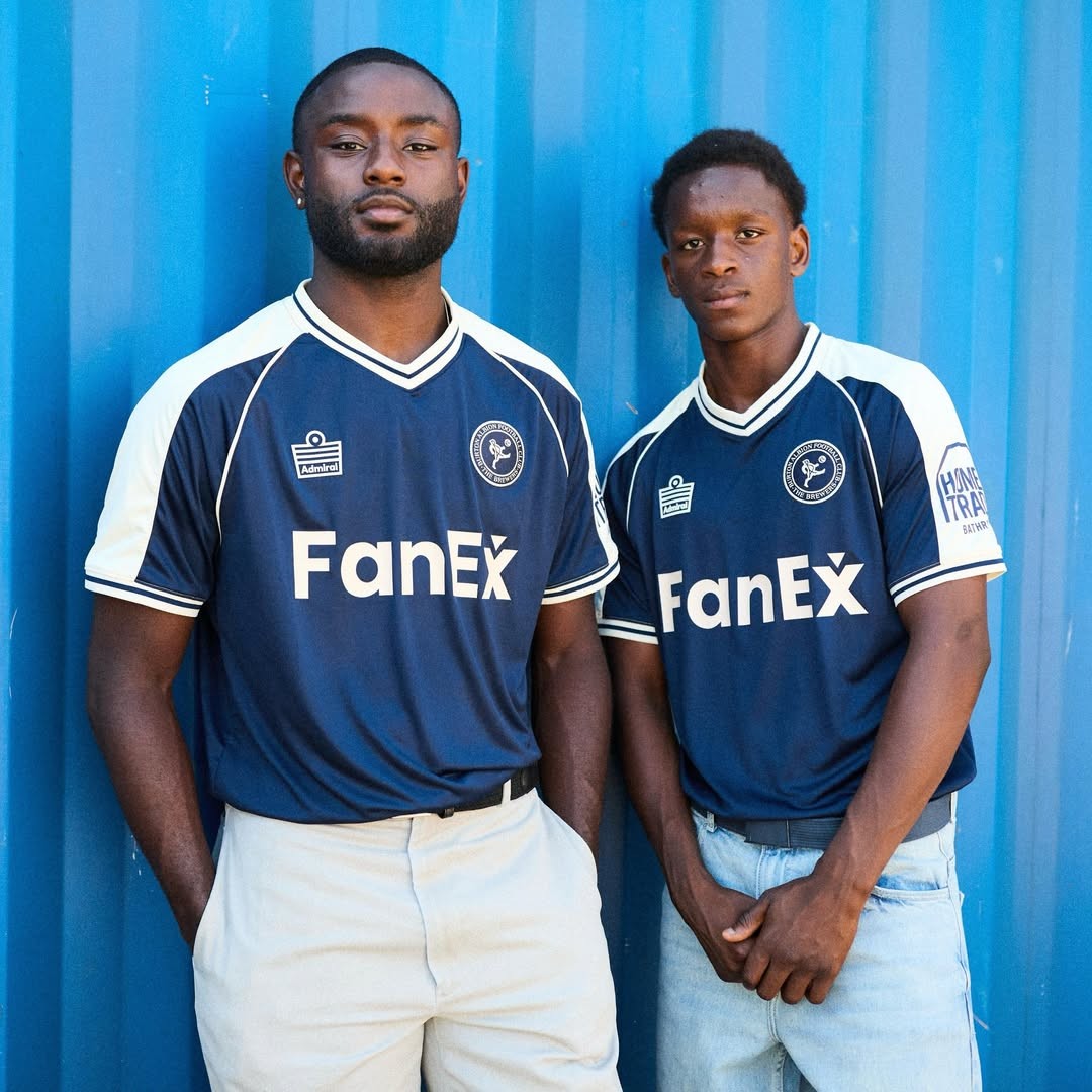
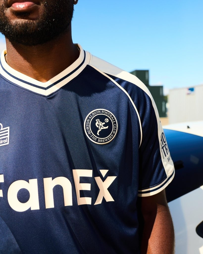
Burton Albion 26-27 Away Kit Released
English League One club Burton Albion have officially unveiled the 2026-27 away kit. Made by Admiral, the new shirt draws inspiration from the Brewers' long tradition of blue-and-white change kits.
The Admiral Burton Albion 2026-27 away shirt features a deep navy blue base with white detailing on the shoulders, collar and sleeve cuffs. Combining a timeless football shirt silhouette with modern finishing touches, the design celebrates Burton Albion's heritage while looking firmly to the future.
What do you think of the new Burton Albion 2026-27 away kit? Let us know your thoughts in the comments below.
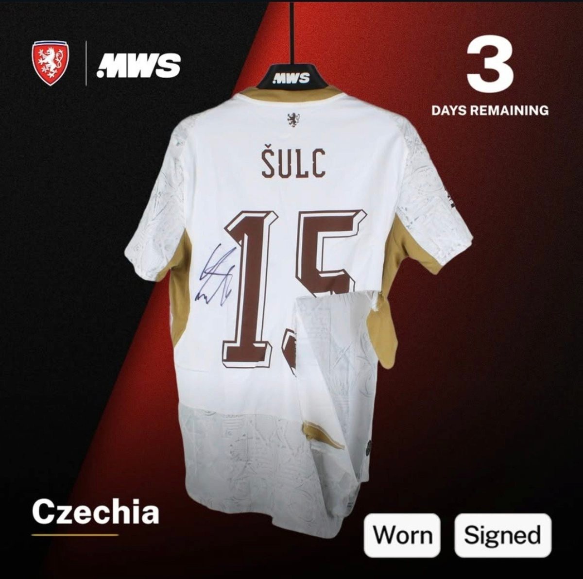
Puma Czechia Kit Ripped at World Cup Available to Buy
Puma's kit durability issues surfaced once again during the World Cup. Now, one of the ripped kits is even available to purchase.
Czechia midfielder Pavel Šulc suffered a severe tear to his jersey during a match against South Korea, tearing away a large section of fabric right next to his squad number 15 and forcing him to leave the pitch for a quick kit change.
The exact torn shirt from the game has now been put up for auction on MatchWornShirt, as spotted by @ShirtSquadApp.
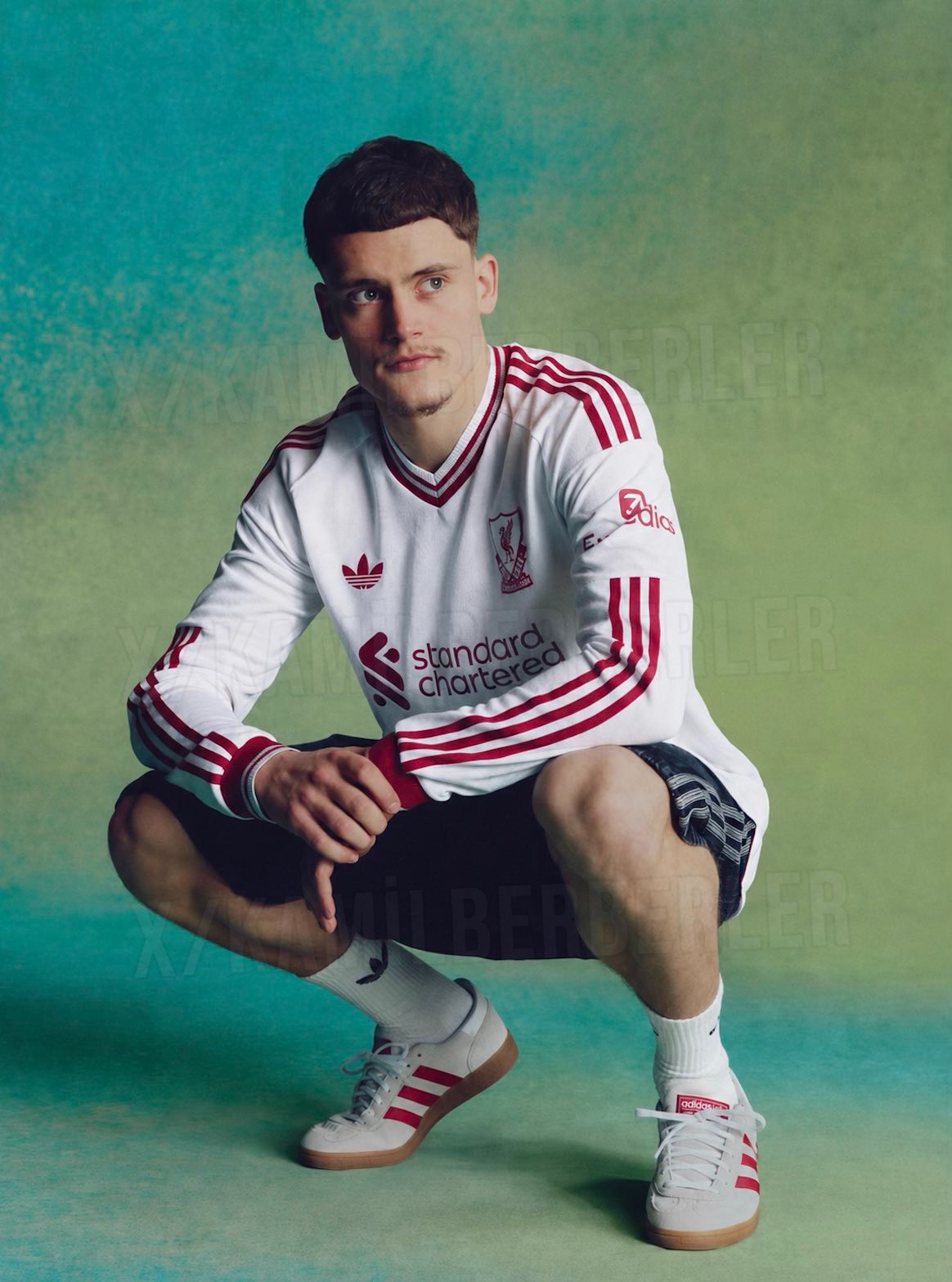
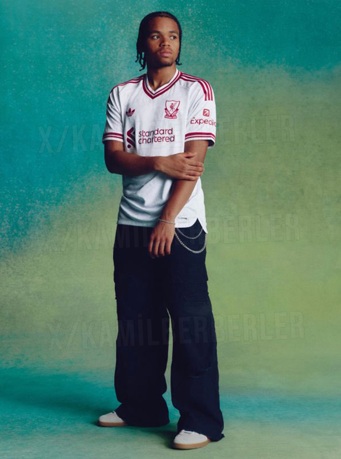
Liverpool 26-27 Away Kit Leaked - 2 New Pictures
Ahead of its official release, further promotional images of the Adidas Liverpool 26-27 away kit have been leaked by @KamilBerberler.
It will be released tomorrow, 29 July 2026.