Sporting to Release New Logo After 25 Years
 Jun 12, 2026, by Phan Tich Giay

- New Logo Release: Sporting CP plans to launch an all-new official club logo after 25 years with their current design, aiming for a major brand refresh.
- Business Rationale: The rebrand is motivated by the desire to streamline visual identity, open new revenue opportunities, and boost existing commercial ventures, according to André Bernardo.
- Design Principles: The new emblem will retain the club's core historical DNA, including the Lion, green background, shield, and SCP letters, with inspiration from older club symbols and a minimalist optimization for modern media.
Sporting CP are planning to undergo a major brand refresh, with intentions to launch an all-new official club logo after nearly a quarter of a century with their current design.

Sporting CP to Release New Logo After 25 Years
Sporting CP's current primary emblem has been in active service since 2002. While the core shield has remained standard on home kits, the club has frequently experimented with various monochromatic and simplified color variations on their away and third kits over the last two decades.

Now, after 25 years, the club aims to streamline its visual identity. André Bernardo, Sporting CP's Strategic and Operational Director and Vice President, explained the business logic behind the upcoming rebrand:

"A stronger, clearer, and more recognized brand naturally opens up new revenue opportunities and boosts the existing ones."
For fans worried about too drastic of a departure from tradition, Bernardo offered reassurance that the core historical DNA of the club will remain fully intact:
"The emblem will keep the Lion, the green background, the shield, and the letters SCP."
Despite the update, the new emblem will remain faithful to the club's traditional identity and comply with club statutes. It will retain the central elements of the Sporting crest, including the lion, the green background, the shield, and the letters SCP. The redesign is reportedly inspired by older club symbols, which are generally viewed with more sympathy by the fanbase compared to the modernized 2001 design.

The rebrand is expected to follow the modern football trend of minimalist optimization, making the crest more adaptable for digital media, merchandising, and global commercial appeal while preserving the club's sacred traditional elements.
What do you hope to see from the new Sporting CP logo? Do you prefer a modern minimalist update or a return to a more retro look? Let us know your thoughts in the comments below.


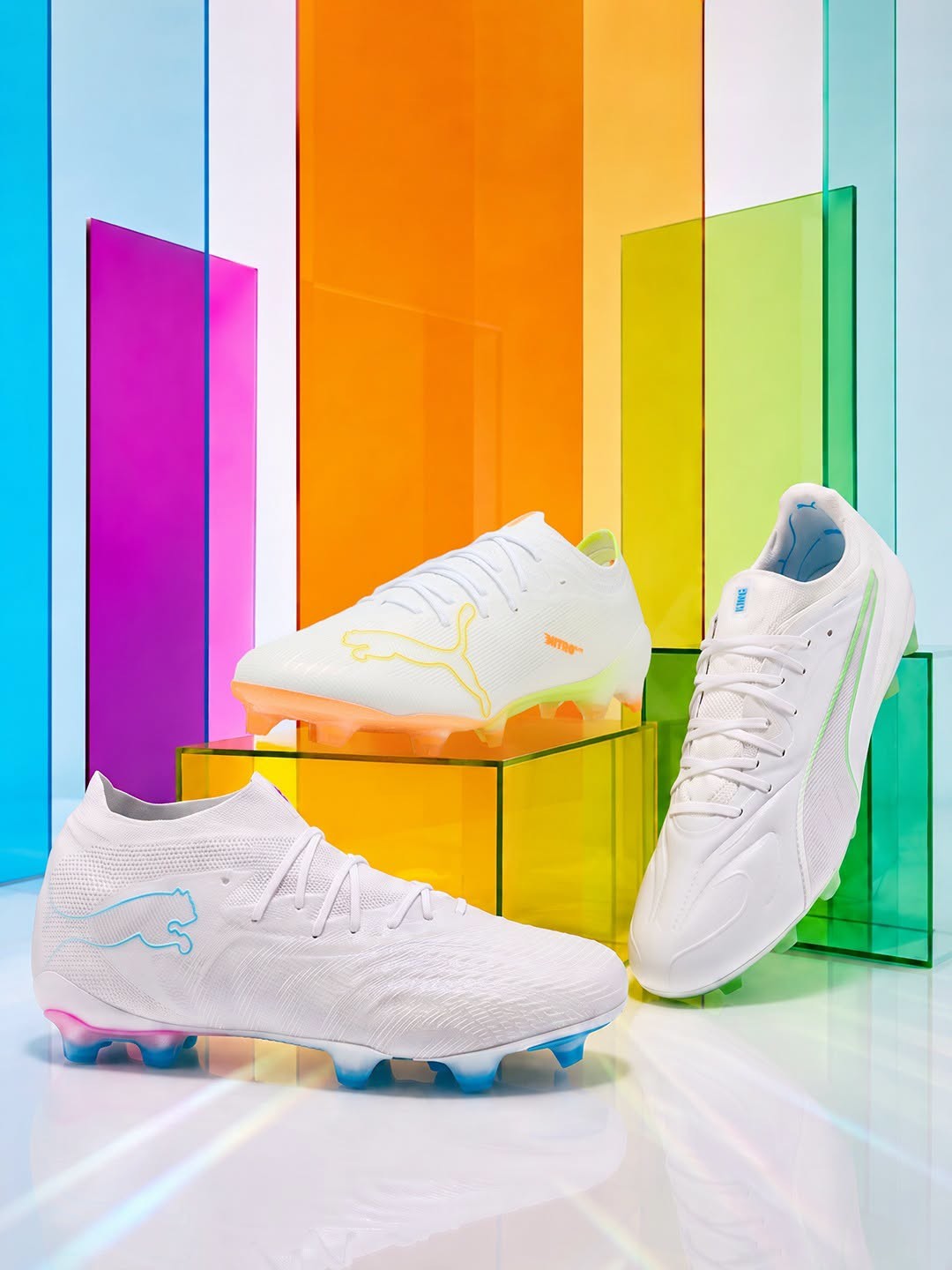
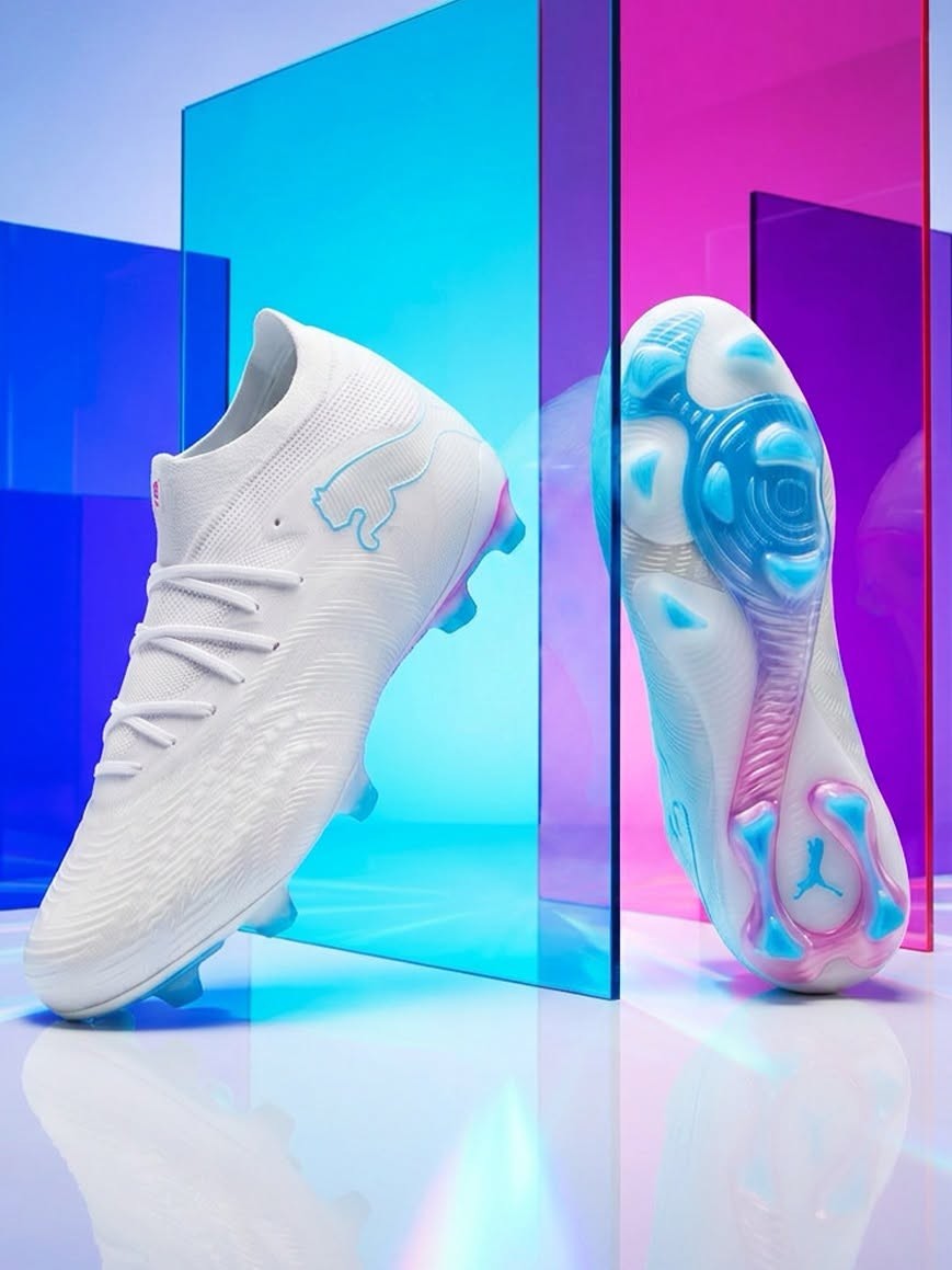
Puma 26-27 Whiteout Pack Released
Ahead of the new season, Puma has officially unveiled its new 2026-27 Whiteout Pack, continuing a long-standing tradition.
As expected, the collection features a clean white base across the range, with each of the three boot silos accented by its own distinctive color. The result is a unique identity for every silo while adding just the right touch of flair.
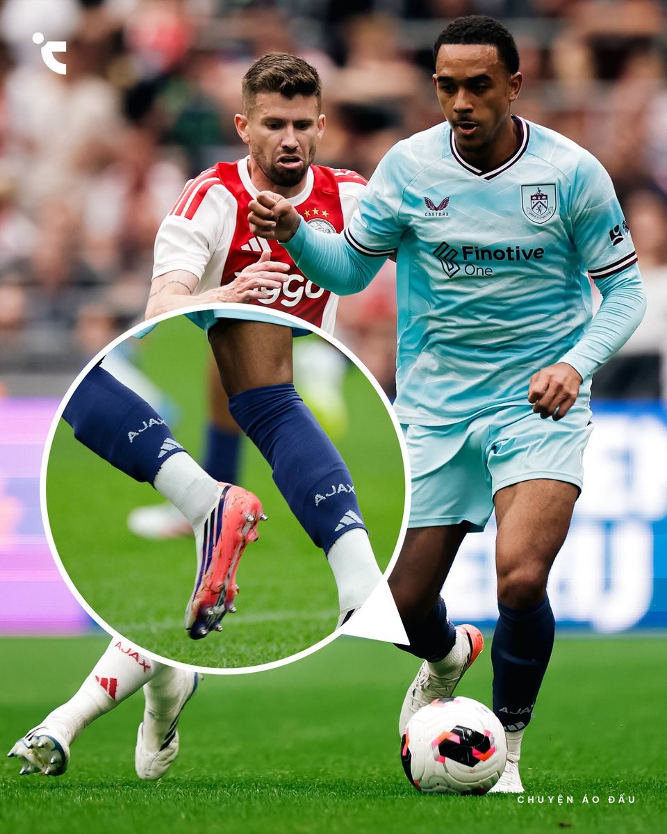
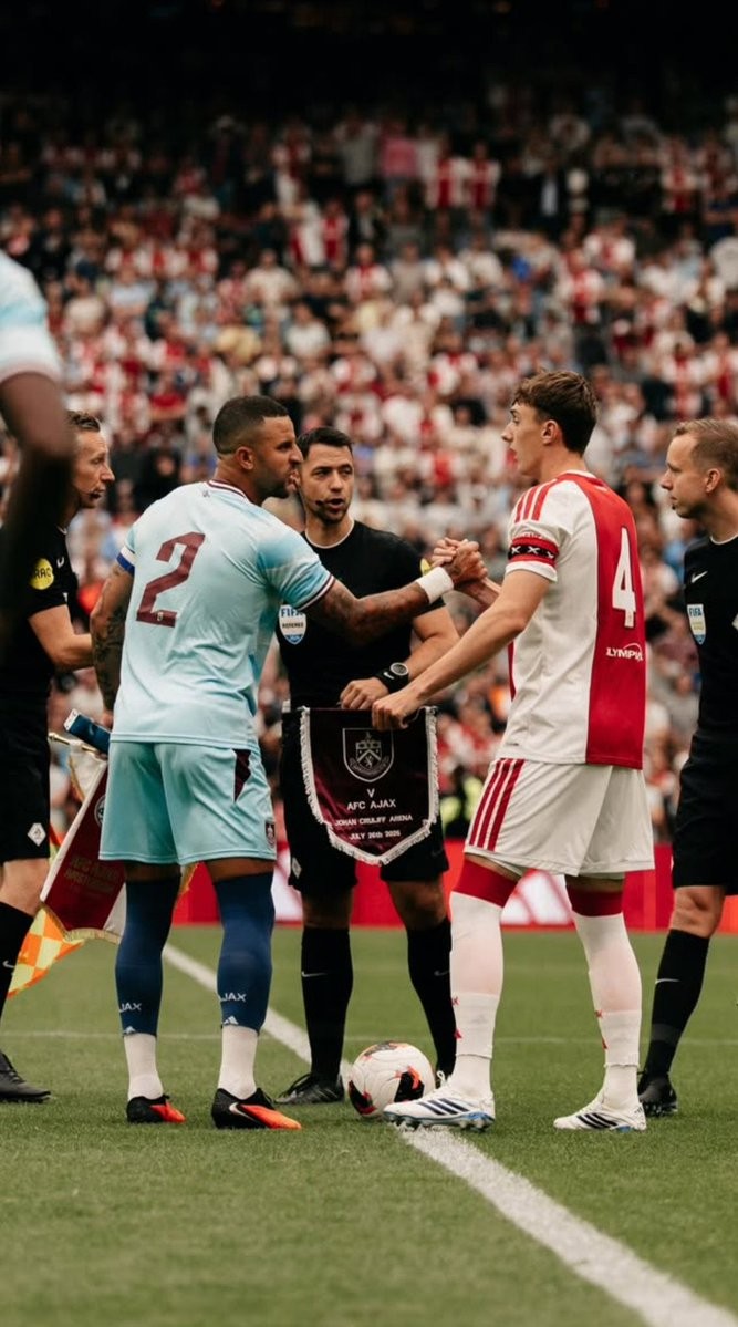
Burnley Forced to Wear Ajax Socks in 26-27 Pre-Season Friendly
An unusual kit mishap occurred during the pre-season friendly between Ajax and Burnley at the Johan Cruyff Arena on July 26, 2026. Burnley lined up in their light blue Castore change kit for the match, but a kit color clash forced the English side into an unexpected equipment modification right before kickoff.
With Ajax wearing their traditional red and white home kit paired with white socks, Burnley's kit management only had white socks available, creating an obvious sock clash. To allow the match to proceed smoothly, Ajax came to the rescue by lending Burnley a set of their dark blue Adidas socks.
Burnley players wore the dark blue Ajax socks throughout the match, with many players cutting off the lower foot section to wear them as sleeves over their white grip socks. Consequently, the Ajax branding and Adidas logo were clearly visible on the legs of Burnley's players during the game, which eventually ended in a 2-1 win for Ajax.
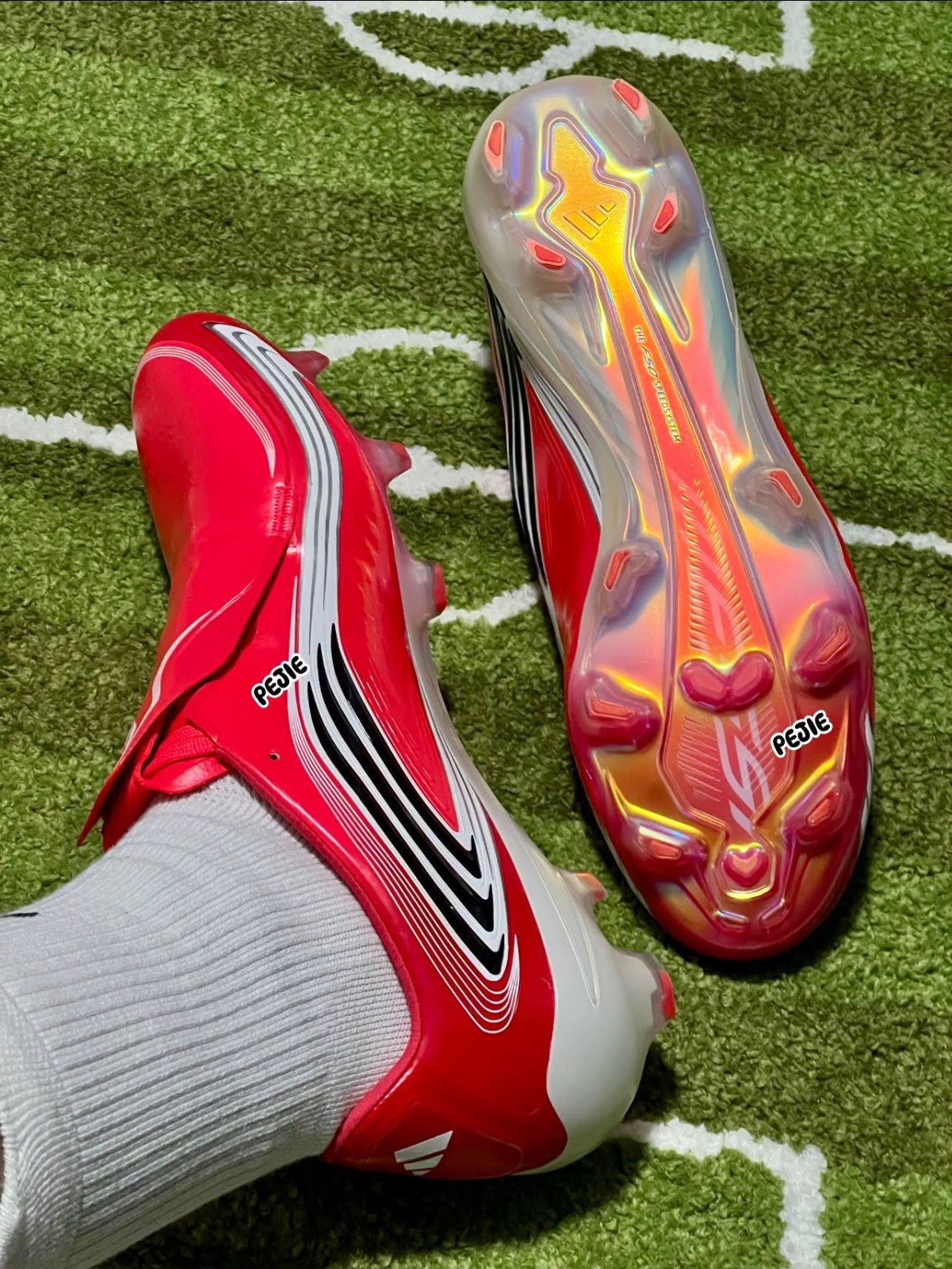
Red Adidas F50 Messi 26-27 Signature Boots Leaked - New Images
Footy Headlines can leak a new on-foot image of the red Adidas F50 Messi 26-27 signature boots. Thanks to PJ.

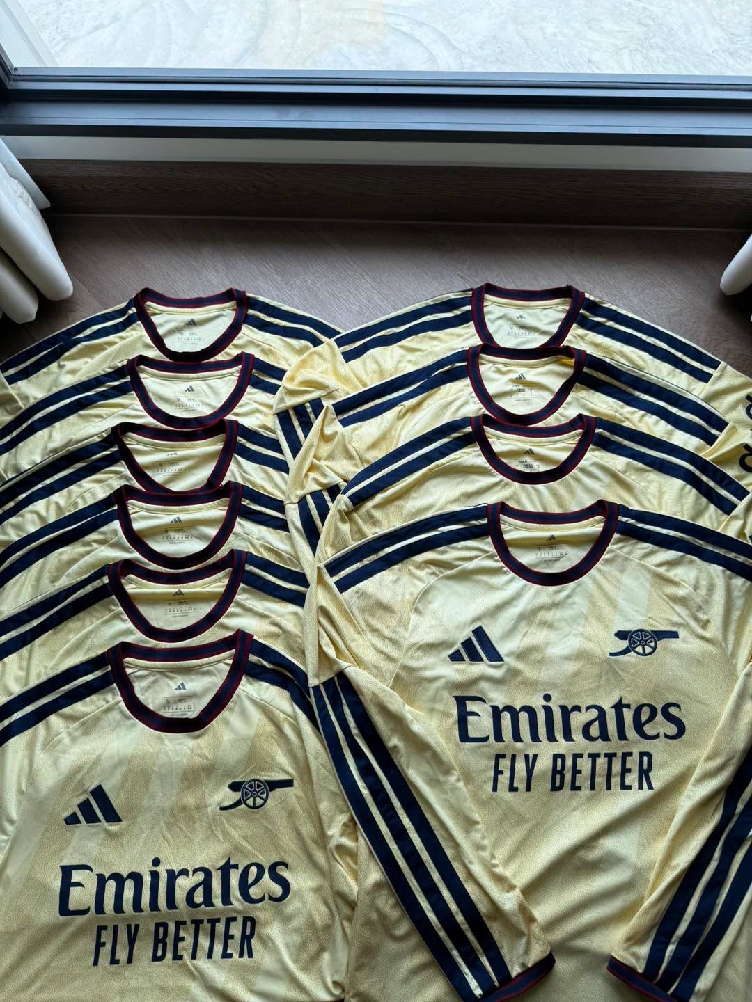
Arsenal 26-27 Third Kit - New Picture
Story Jersey continues to leak another new image of Arsenal's 2026-27 third kit, which is set to be released in August.


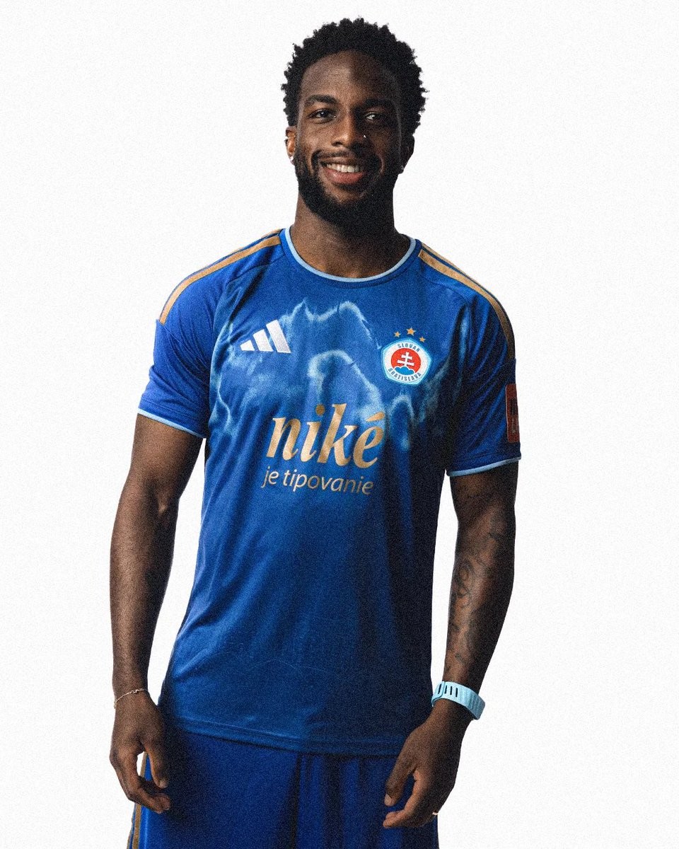
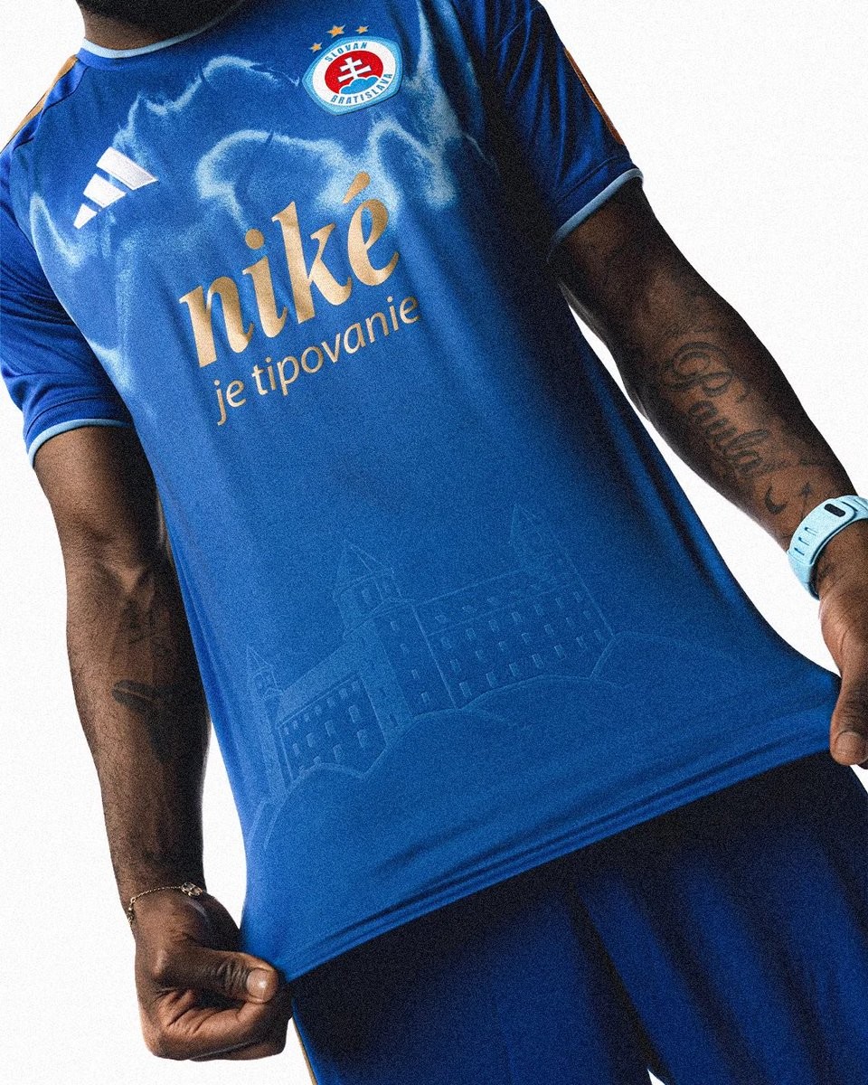
Slovan Bratislava 26-27 'Heart of Bratislava' Kit Released
Slovak champions ŠK Slovan Bratislava have officially unveiled their new 26-27 kit made by Adidas, dubbed the 'Heart of Bratislava' (Srdce Bratislavy). The design blends club identity with key historical symbols of the Slovakian capital.
The kit comes in a royal blue base highlighted by gold details, including the iconic Adidas three stripes on the shoulders, gold main sponsor branding, and gold player names and numbers on the back. The choice of gold pays homage to Bratislava's coronation history as the official crowning city for Hungarian monarchs over nearly three centuries.
Several bespoke elements are incorporated directly into the fabric. The lower front features an embossed graphic of the iconic Bratislava Castle, while a subtle atmospheric graphic pattern across the upper front represents the Danube River flowing through the heart of the city.
