Nike Explains Why Their 2026 World Cup Boots Are Pink
 Jun 17, 2026, by Chris
- Player Psychology and Confidence: Nike's decision to use pink for World Cup boots was driven by research indicating that athletes desire bold, bright colors during high-pressure moments to enhance confidence, with pink signaling a demand for elite performance.
- Maximum Visual Impact: Pink was strategically chosen for its optimal visual impact during global broadcasts, as Nike trials revealed it stood out most effectively against the green pitch, ensuring high visibility for fans.
- Unintended Consequence of Uniformity: While intended to make players stand out, the widespread adoption of pink by multiple brands inadvertently led to the opposite effect, as almost all players wearing the color resulted in none of them truly differentiating themselves.
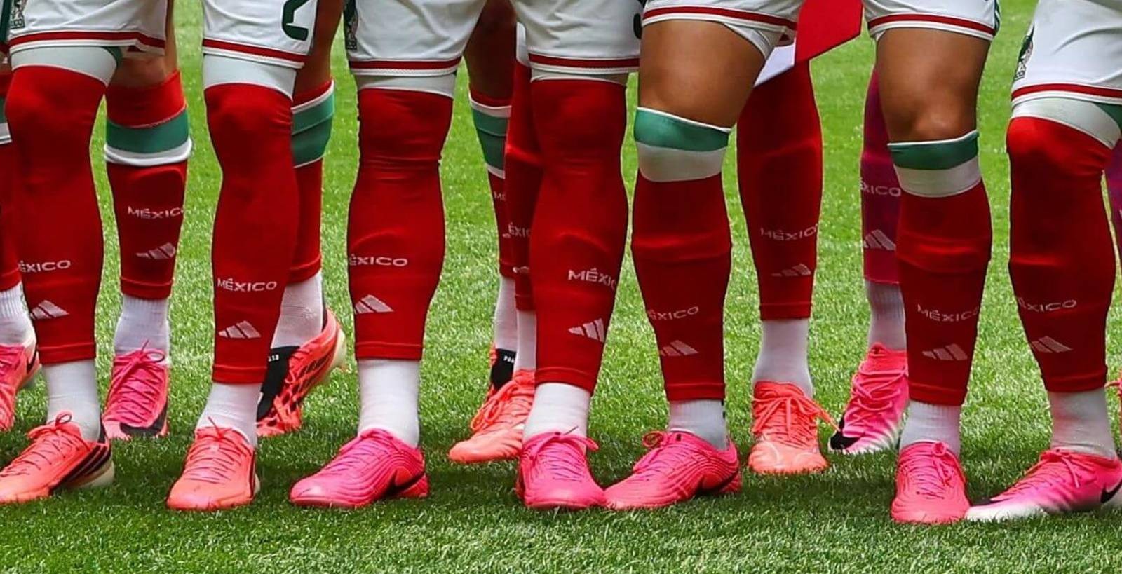
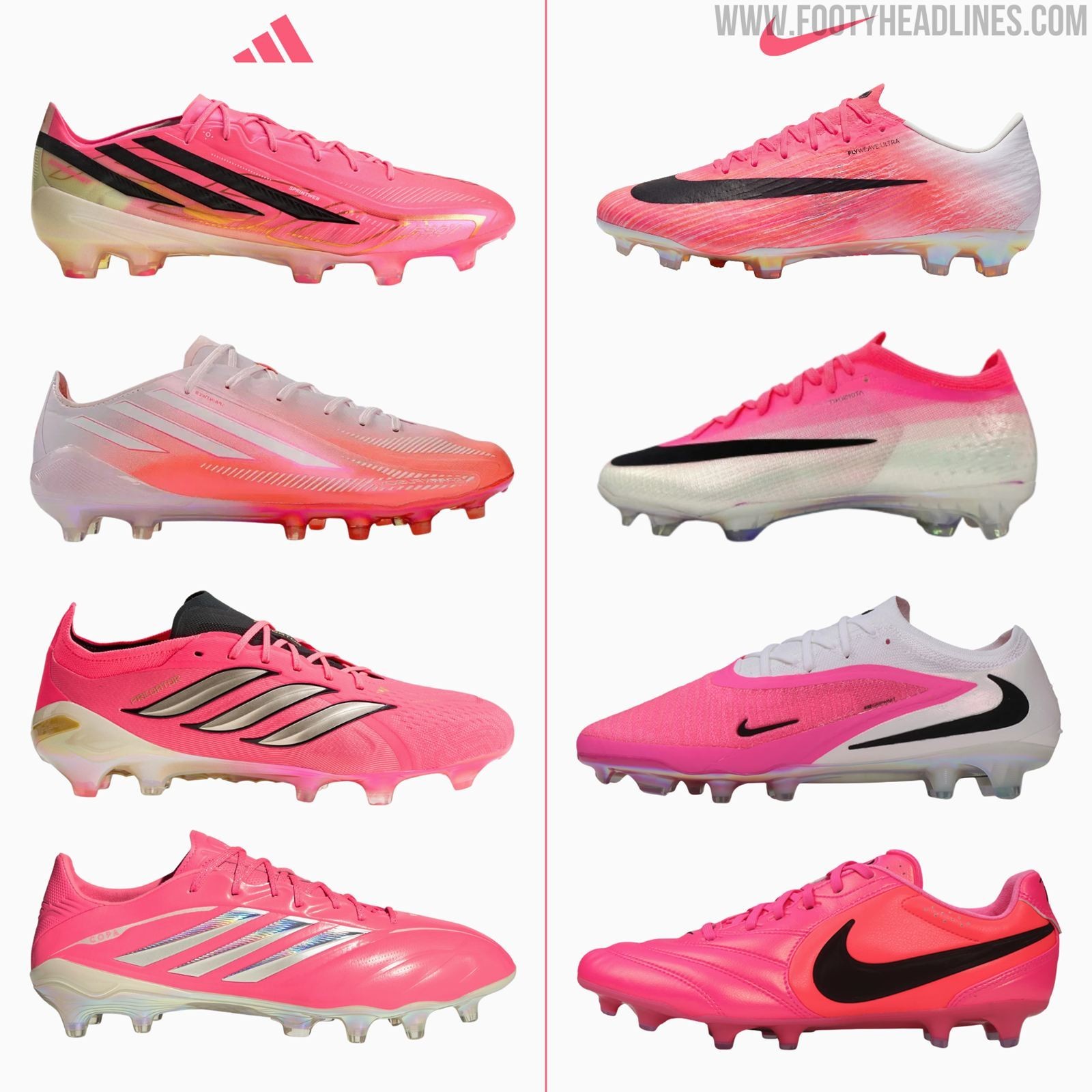
If you have tuned into the 2026 World Cup, you surely noticed the inescapable sea of pink footwear on the pitch. With major sportswear brands all seemingly coordinating on the vibrant colorway for their summer tournament packs, Nike has officially pulled back the curtain to explain exactly why pink was chosen as the defining color for football’s biggest stage.
Nike Explains the Reasoning Behind the 2026 World Cup's Pink Boot Phenomenon
According to Odinga Nimako via The Athletic, a senior figure on Nike’s global football footwear team, the decision started with the psychological edge it provides to the players.
Nike’s research revealed that athletes specifically crave the boldest, brightest colors during high-pressure moments to boost their confidence. "What we always hear from our consumers and athletes is when you wear a color like pink that is so loud and so bright it is like… you need to be really good to wear these," Nimako explained. While pink carries an inherent swagger that demands elite performance on the pitch, it has also reached a level of global cultural acceptance that makes it highly appealing to the everyday consumer market.
Beyond player mentality, the choice to go pink was also highly calculated for maximum visual impact during global broadcasts. During development trials, Nike discovered that nothing stood out more against the green grass than pink, ensuring perfect visibility for fans both in the stadium and watching on television. It seems well likely that Adidas and Puma made the same "discovery" and opted for pink as well.
However, with almost all players now wearing pink, brands have achieved the direct opposite - non of their players stands out, expect those NOT wearing pink.
Furthermore, because no nation at the 2026 World Cup wears a primarily pink kit, the boots are guaranteed to clash sharply with every uniform rather than blending in.
Should brands check with other brands to avoid having the same colors? Let us know in the comments below.
```
```
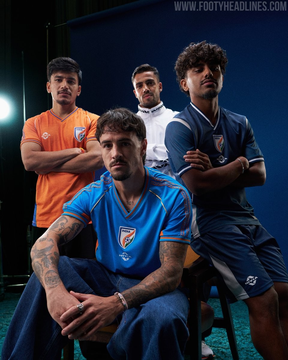
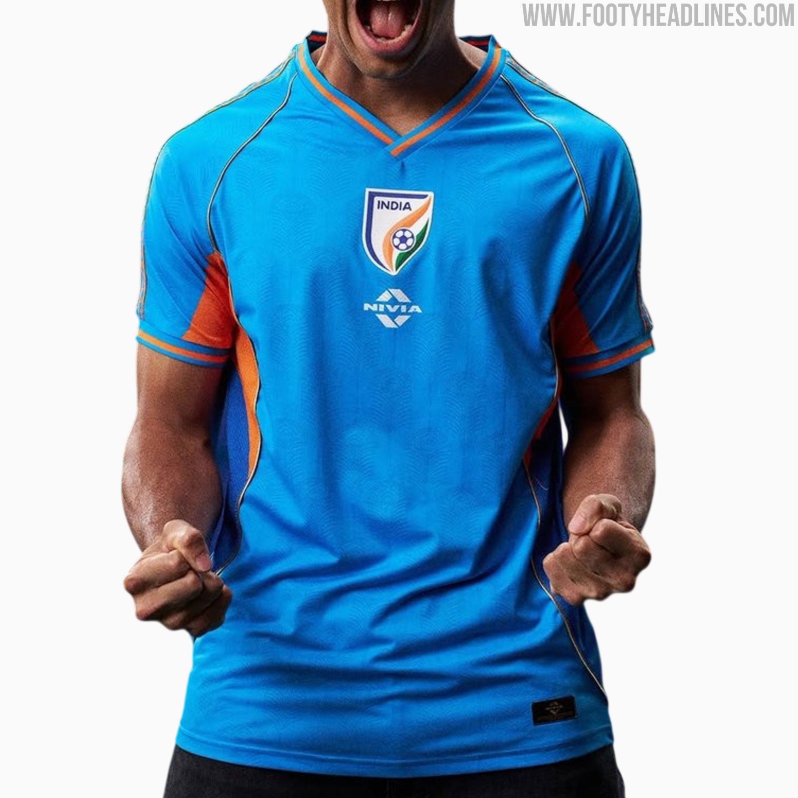
India 26-27 Home, Away & Third Kits Released
The All India Football Federation (AIFF) and technical sponsor Nivia Sports have officially launched the new India 26-27 home, away, and third kits. The new collection will be worn in the high-profile series of international friendlies against Panama, Brazil, and Uruguay.
The India 26-27 home shirt features a vibrant light blue base combined with bright orange accents on the side panels, V-neck collar, and sleeve cuffs. Subtly woven into the fabric is a peacock feather jacquard pattern, complemented by patterned ethnic-inspired taping running down the shoulders and golden piping framing the front. In line with the rest of the collection, the AIFF crest is centrally aligned on the chest, with the Nivia logo situated just below.
Completing the range, the away jersey arrives in dark blue with clean white contrast piping along the collar, cuffs, and shoulder inserts for a classic aesthetic. The third kit switches to an energetic saffron orange look accented by rich blue side panels and sleeve trim, mirroring the shoulder pattern details from the primary strip.

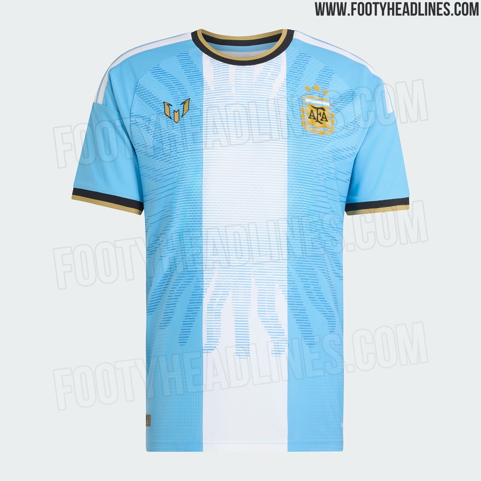
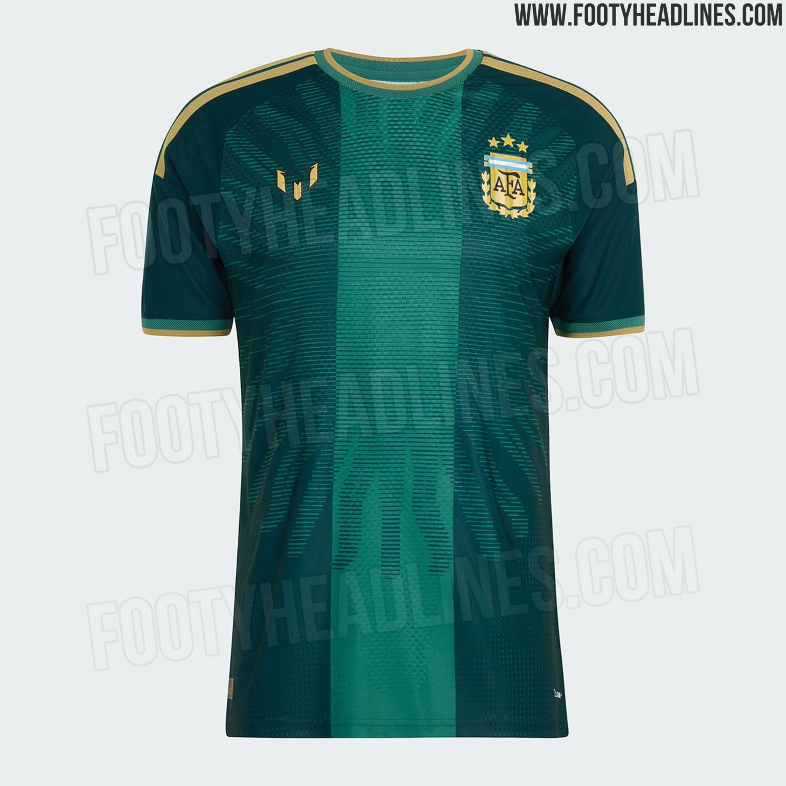
Adidas Argentina Messi Farewell Player & Keeper Kit Leaked - Official Pictures
We can leak official images of the Adidas Argentina commemorative collection celebrating Lionel Messi ahead of his final international appearance for the Albiceleste. The centerpiece of the capsule is the bespoke home shirt, rounded out by a dark green goalkeeper edition and a radiant light blue pre-match shirt, crafted as a fitting tribute ahead of Messi's emotional farewell against Benin on October 6, 2026.
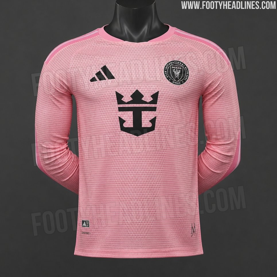
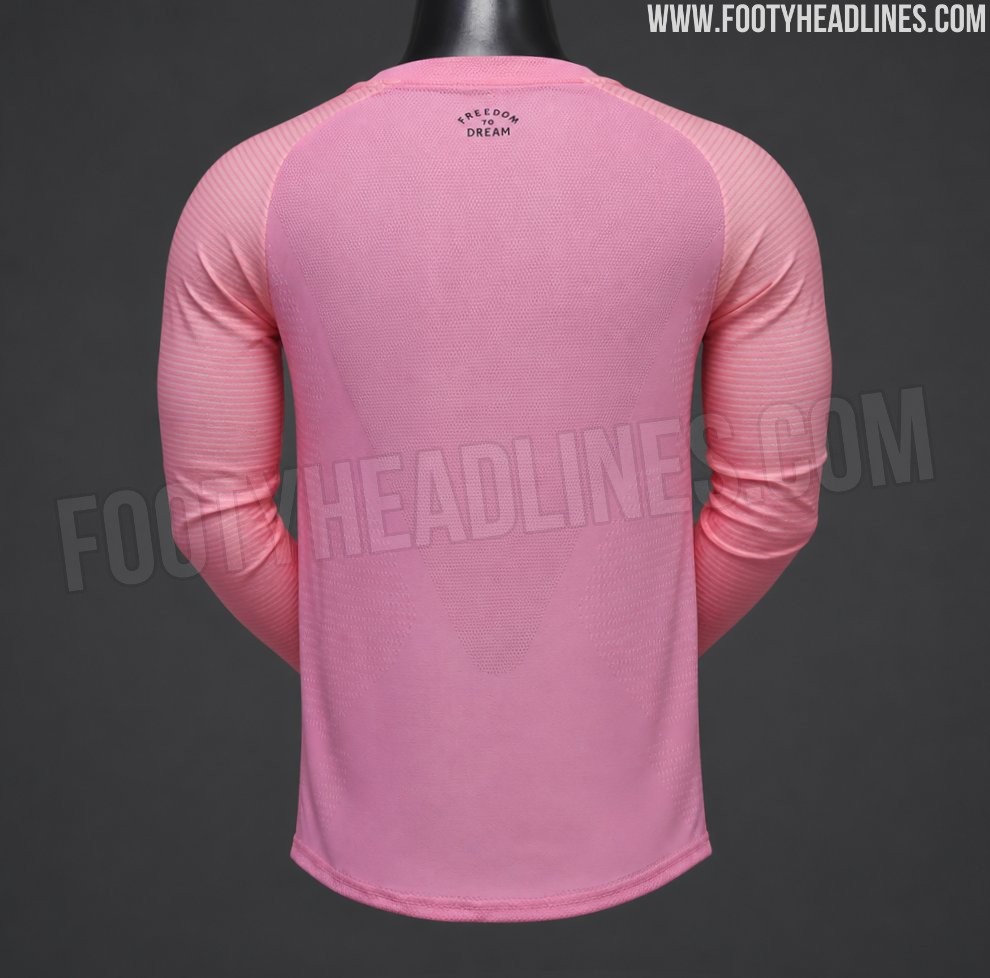
Inter Miami 2026-2027 Home Kit Leaked - Return of Long-Sleeve Kits in MLS
We can leak images of the Adidas Inter Miami 2026-2027 home kit in the authentic long-sleeve version. It is remarkable because Adidas has not made long-sleeve MLS kits available for almost a decade. While the images show a counterfeit, they match the information about a massive return of Adidas long-sleeve kits. More to follow very soon.
Jordan PSG 26-27 Fourth Kit Leaked - Launch Mockups
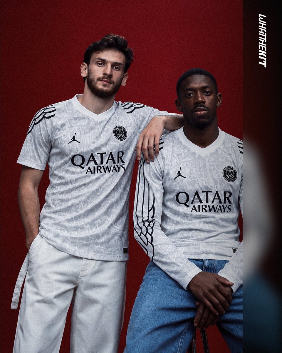
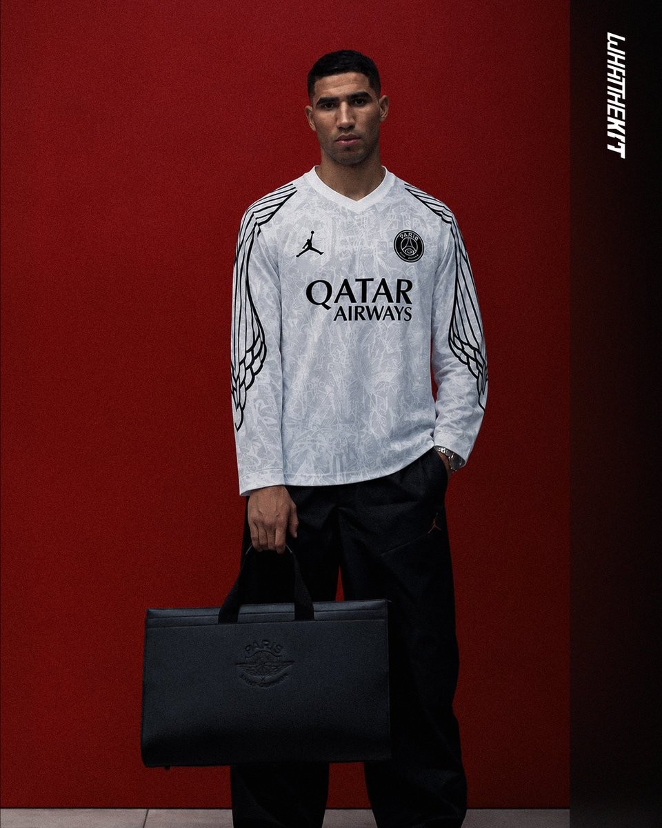
Following the leak of the Jordan Paris Saint-Germain 26-27 fourth shirt, our partner What The Kit has created a stylish series of launch mockups depicting how the kit will look on the club's star players. Set to debut in early 2027 as part of Jordan's upcoming "Wings 2.0" collection themed "Greatness from Greater Paris", the design revives the iconic wing motif first introduced during the 24-25 campaign. The new iteration switches to a predominantly white and light grey base adorned with subtle urban graffiti graphics, framed by contrasting black Jordan wings that cascade down the shoulders and sleeves, particularly standing out in the long-sleeve version.
Udinese 26-27 Third Kit Released - 130th Anniversary Design by Giuseppe Buccinnà
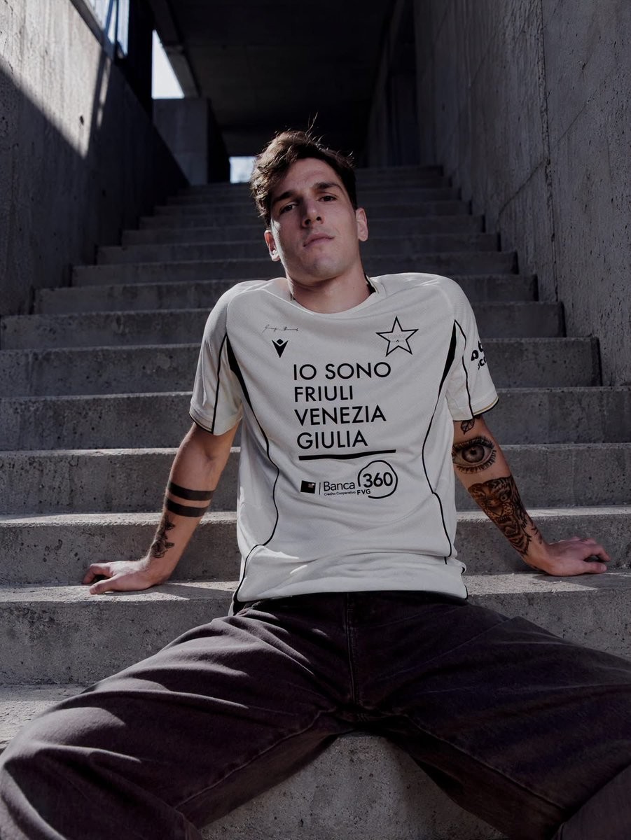
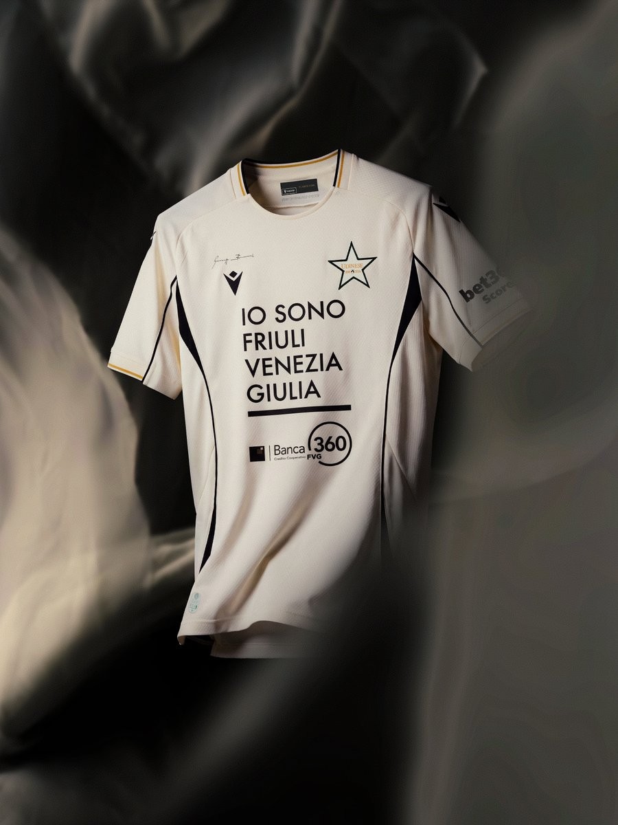
Udinese Calcio and technical partner Macron have officially launched the club's new third kit for the 26-27 season. Unveiled during Milan Fashion Week in partnership with the Camera Moda Fashion Trust, the bespoke shirt was created in collaboration with Italian fashion designer Giuseppe Buccinnà and serves as the centerpiece of a capsule collection celebrating the Friulian club's 130th anniversary.
The Macron Udinese 26-27 third shirt is built around an off-white cream base complemented by bold black curved side panels and piping that evoke mid-2000s kit silhouettes. Tone-on-tone geometric star textures are woven into the fabric structure, while subtle gold accents trim the sleeve edges. Most distinctively, Udinese's standard crest is replaced on the left chest with a commemorative star emblem dedicated to the club's founding in 1896.
Finishing details include Buccinnà's signature placed right above the embroidered Macron Hero on the chest, along with black back-neck detailing that displays "Designed in Bologna" and the iconic Friulian rallying cry "FUARCE UDIN" in gold lettering. The new third uniform is available immediately through official Udinese and Macron stores.
Jürgen Klopp Wears Unreleased Adidas Predator Touch Remake Boots in First Germany Training
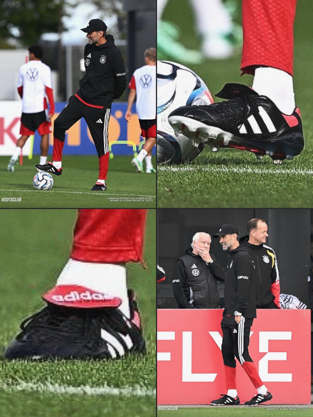
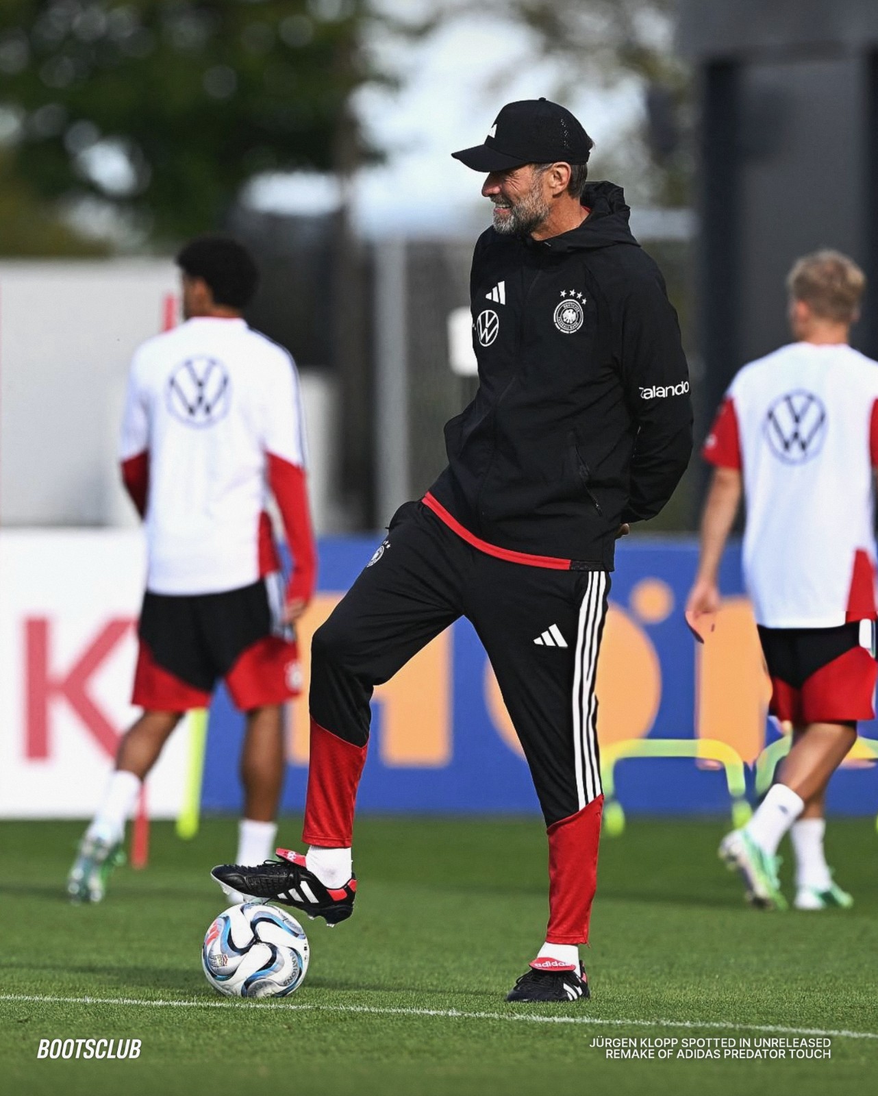
Germany head coach Jürgen Klopp was spotted during national team training lacing up the unreleased 2026 remake of the legendary 1996 Adidas Predator Touch football boots. Providing an early on-pitch showcase ahead of the boot's official drop in October/November 2026, Klopp wore the iconic classic black, white, and red design, highlighted by its distinct fold-over tongue with retro white Adidas branding, signature side stripes, and a modernised soleplate. Thanks to Boots Club for the images.