Graphics
A Look at Football Broadcast Scorebugs Across Major Competitions
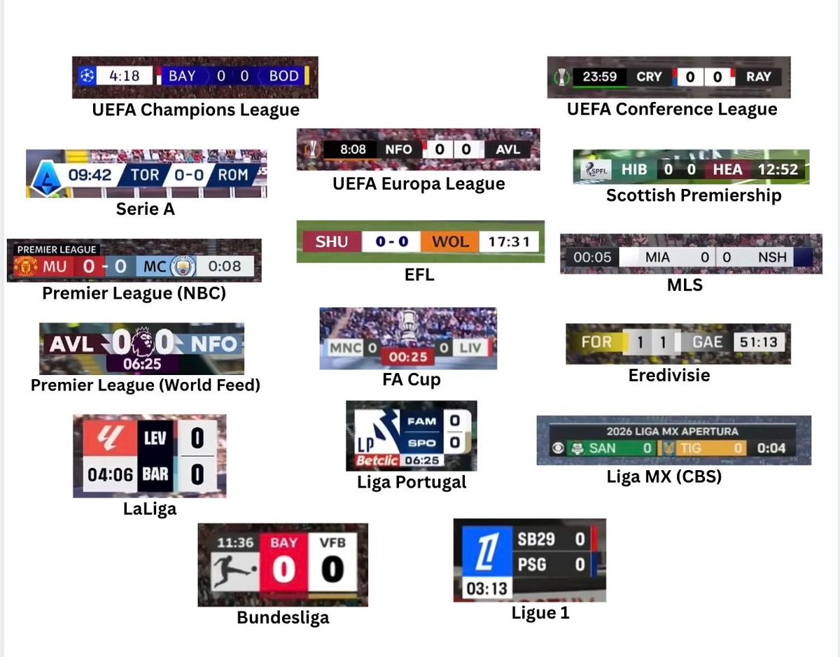
On-screen graphics have become an integral part of modern football broadcasting, directly shaping how supporters digest match details and information. A comparison shared by sports media creator @Braylon_Breeze brought together 16 distinct scorebugs featured across contemporary broadcasts, highlighting the diverse visual identities adopted by major leagues and networks. From the clean, vertical arrangements of Ligue 1 and La Liga to the horizontal bars used across UEFA club competitions, the overview captures the differing design philosophies currently on display.
While all scorebugs serve the fundamental purpose of presenting the scoreline, match clock, and team colors, their execution varies considerably. Tournaments like the UEFA Champions League, UEFA Europa League, and the Premier League opt for streamlined horizontal strips with strong contrast and subtle tournament branding. In contrast, competitions such as the Bundesliga and Ligue 1 utilize distinctive square or stacked formats, while Apple TV's presentation for MLS embraces extreme minimalism by stripping away ornate design elements in favor of a low-profile look.
The side-by-side comparison sparked lively discussion among fans regarding legibility versus graphic flair. Supporters often single out the high readability of the Bundesliga and Champions League graphics for praise, while bulkier or more generic designs frequently draw criticism. As broadcast networks and leagues continue to overhaul their visual packages season after season, scorebugs remain one of the most prominent and scrutinized design pieces in televised football.
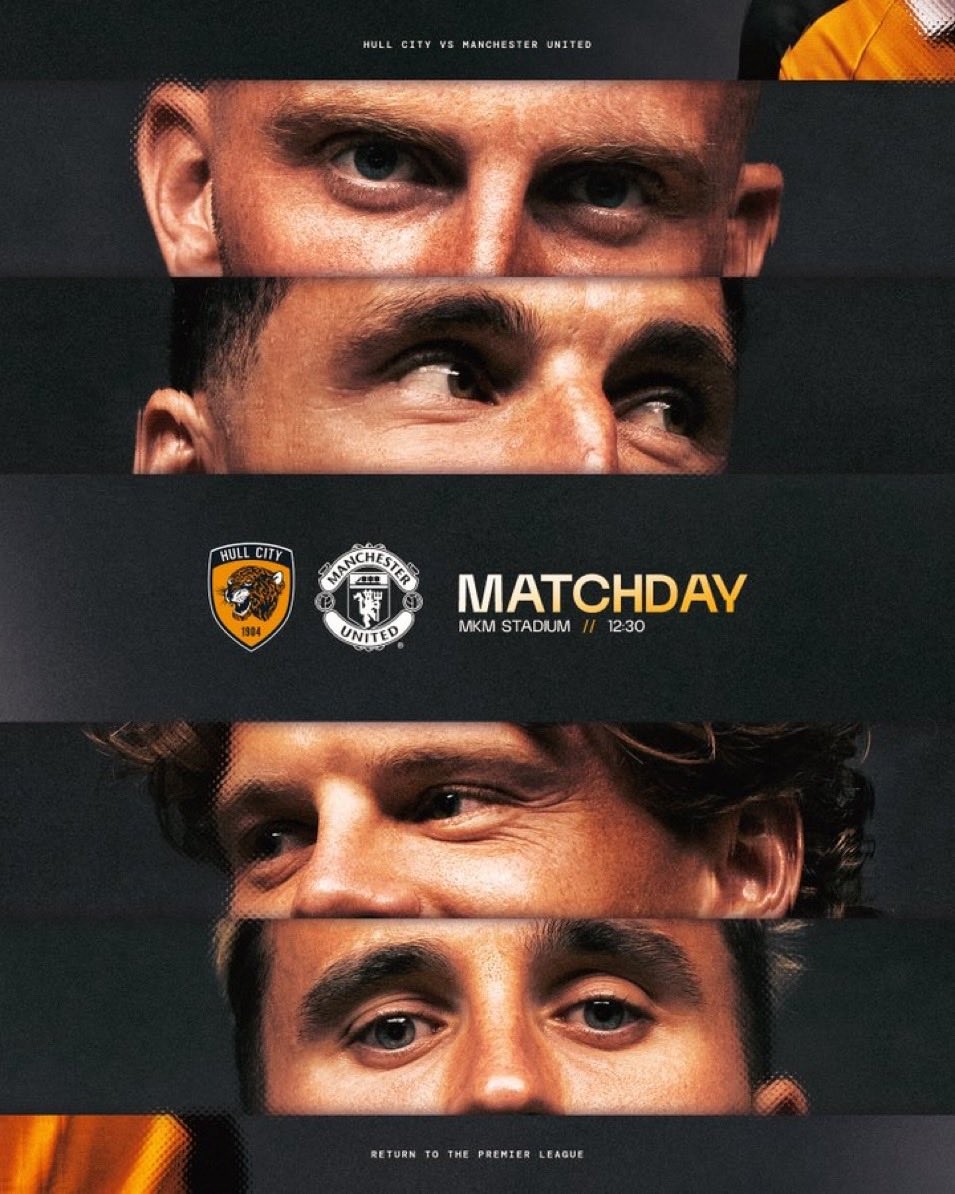
Hull City Receive High Praise for Impressive 26-27 Matchday Graphics
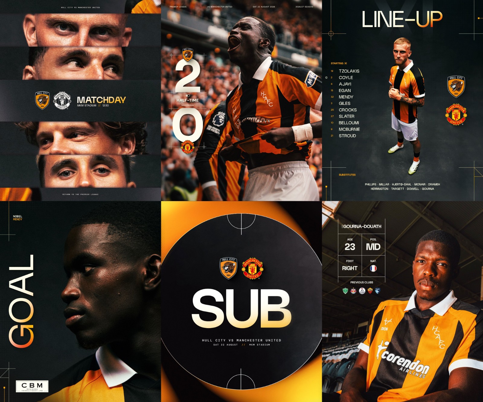
Hull City have captured the attention of the football design community with their standout matchday visual identity for the 26-27 Premier League season. Following their clash against Manchester United at the MKM Stadium, designers and supporters across social media quickly highlighted the club's elevated creative output, praising the media team's refined execution. Big thanks to @iamozdesign.
The refreshed graphics package combines atmospheric photography with sleek typography and the club's signature black and amber palette. From starting lineup cards and substitution graphics to real-time score updates, the visuals maintain a clean, editorial aesthetic accented by subtle pitch markings and modern layout grids. The cohesive visual language gives the club's digital presence an undeniably premium look.
As digital branding becomes an increasingly vital part of club identity, Hull City have set an impressive standard early in the campaign. The widespread positive response shows how thoughtful art direction and strong photography can elevate a club's matchday presentation.
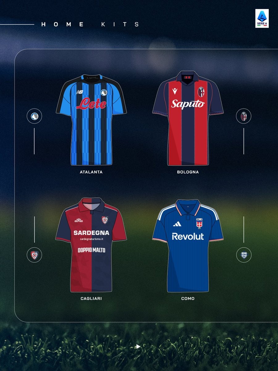

Serie A Releases 26-27 Home Kit Overview Graphics
Ahead of the upcoming Italian top-flight campaign, official Serie A channels have shared custom illustration graphics highlighting the 26-27 home kits for clubs across the league. The lineup graphic brings together all the primary shirts into a clean, unified overview.
The overview showcases the diverse range of kit manufacturers and iconic designs set to feature across Italian football this season. Major brands like Adidas, Nike, Puma, Macron, Joma, and Kappa are represented alongside local suppliers, displaying classic vertical stripes, traditional halved designs, and clean solid colorways for the 26-27 season.
With the new campaign fast approaching, these illustrated visuals offer supporters a convenient look at every club's primary colors before official action gets underway on the pitch.
New DFB-Pokal Youth Broadcast Graphics
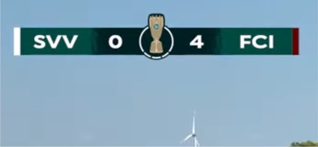
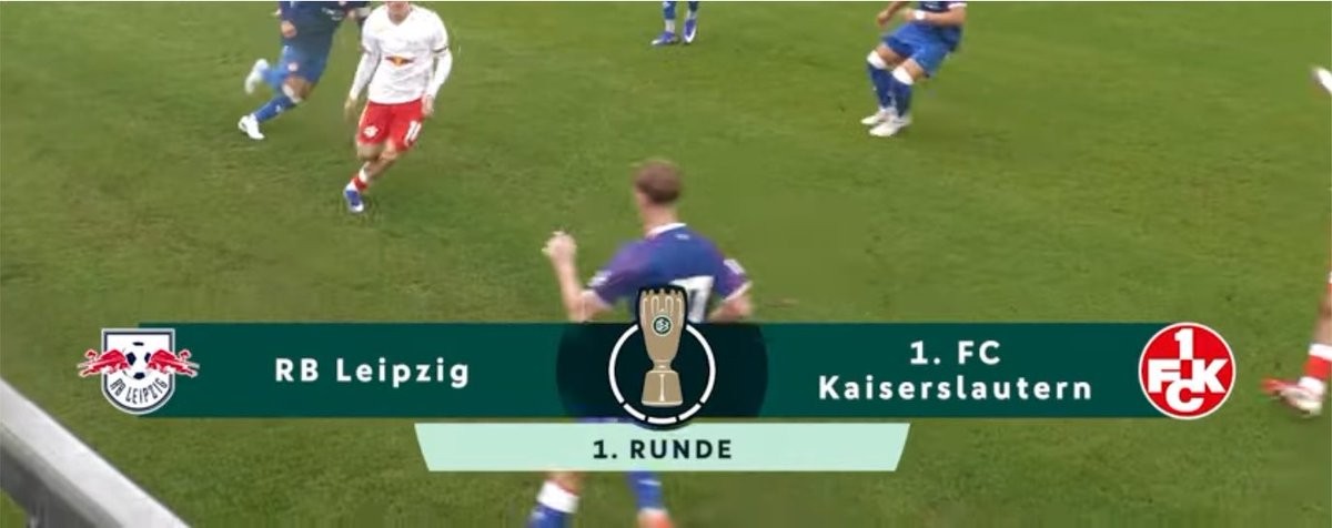
The German Football Association (DFB) has introduced an updated broadcast graphics package for the DFB-Pokal Nachwuchs youth competition for the 26-27 season. However, the new visual overlay—used during live broadcasts and official streams, has immediately drawn criticism from design-conscious fans following the tournament's first-round matches. Big thanks to @truksterrr.
Critics and graphic designers pointed out several noticeable design flaws in the new scoreboard and matchup banners. The graphic features a dark green bar with a central DFB-Pokal trophy icon separating team names, scores, and crests. Specific complaints highlight poor font selection, bad kerning, uneven spacing between elements, and misaligned club logos that give the overlay an unpolished and low-budget appearance.
As live streaming of youth football continues to expand, fans expect clean, professional presentation even at junior levels. It remains to be seen whether the DFB will refine the graphics package or fix the alignment issues for subsequent rounds of the 26-27 campaign.

Belgium Introduce American Football-Inspired Lineup Graphic at 2026 World Cup
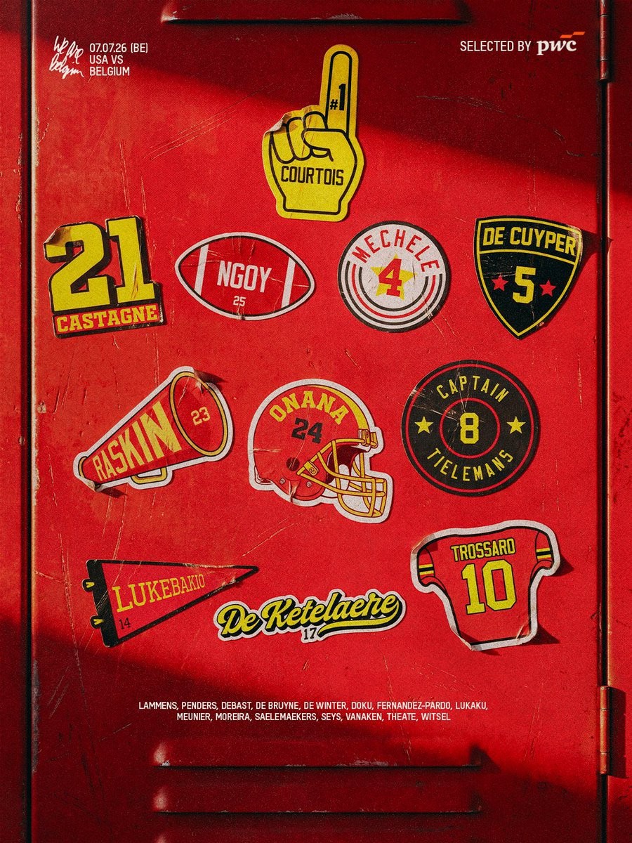
The Belgian national team has caught the attention of fans and kit enthusiasts during the 2026 World Cup with their unique lineup graphics. Their latest design, highlighted by football, features a striking American football theme, serving as a fitting nod to the tournament's North American host nations.
Rather than a standard list or traditional pitch layout, the new graphic presents the starting XI in a style reminiscent of an NFL playbook or broadcast graphic. This follows a series of highly praised, creative lineup announcements from the Belgian camp throughout the tournament, which have stood out for their distinctive typography and layout.
The decision to incorporate American football elements adds a localized touch to their media presence for the 2026 World Cup.


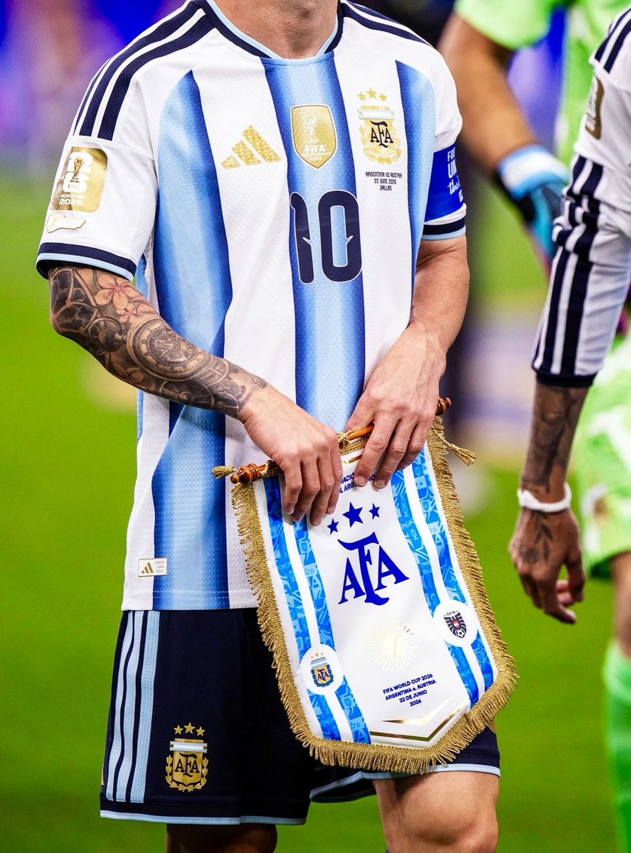
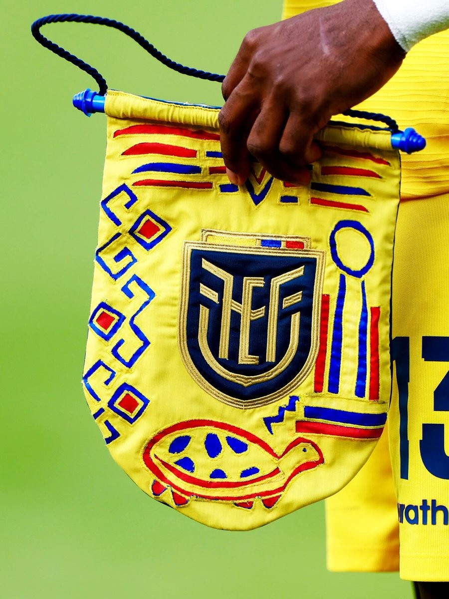
Unique 2026 World Cup Pennants
The football culture platform @vsrsus has shared a collection of pennants featuring unique and highly artistic designs from several national teams participating in the 2026 World Cup.
The designs feature intricate graphics, bespoke typography, and vibrant color palettes tailored to different nations competing in the tournament. Each pennant is reimagined not just as a ceremonial token, but as a standalone piece of football art that captures the distinct identity and heritage of the respective countries.
The peasants celebrate the intersection of graphic design and the global game during the 2026 World Cup.