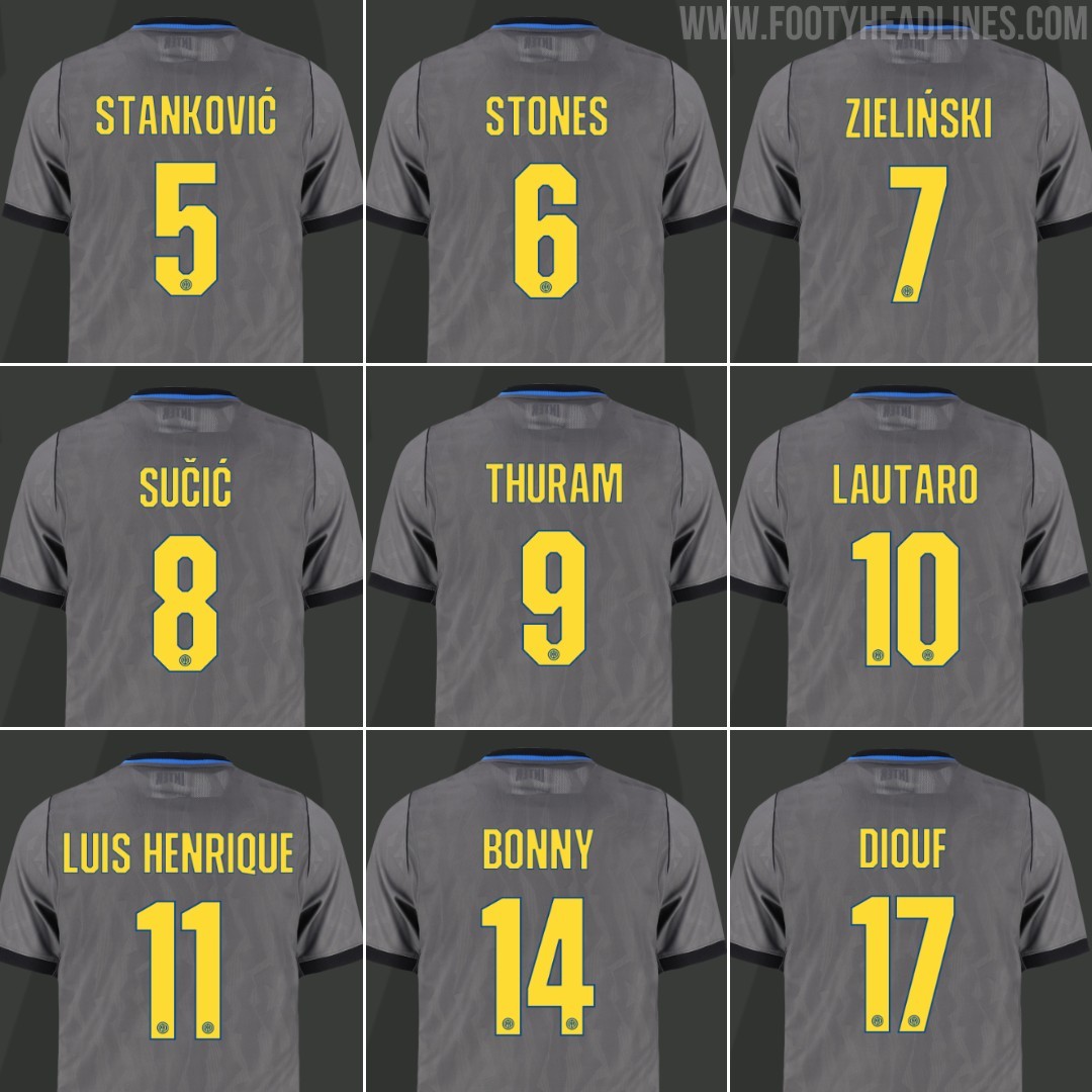
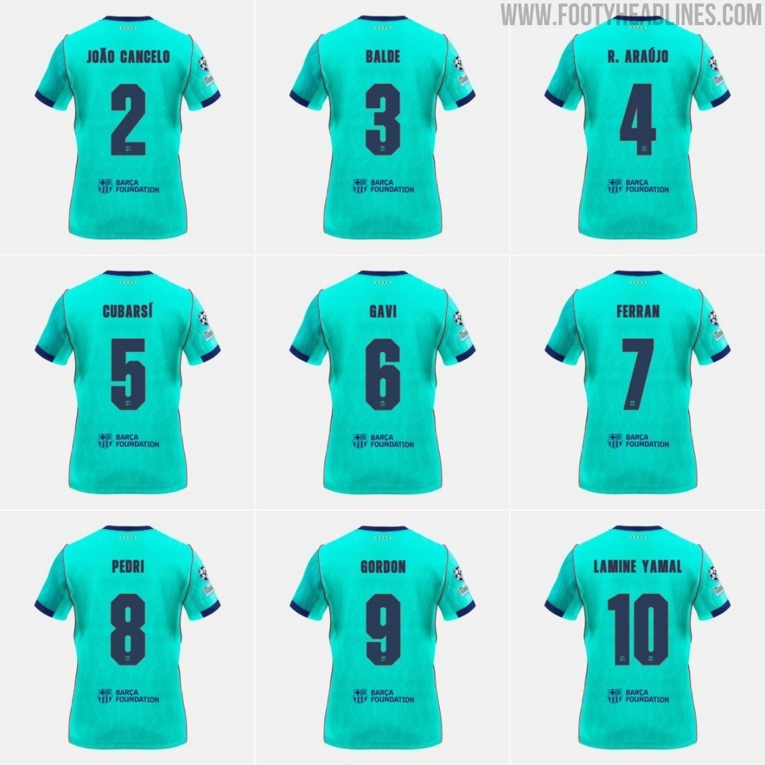
While the Nerazzurri introduced a dedicated cup font for their European campaign in the UEFA Champio...
While the Nerazzurri introduced a dedicated cup font for their European campaign in the UEFA Champions League, the typeface is actually not exclusive to the Italian club. It is completely identical to the custom font introduced by FC Barcelona on their own 26-27 third kit.
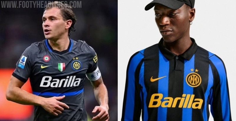
Barcelona officially presented the typography in August alongside their third kit, sporting an angular, blocky, and squared-off aesthetic that contrasts with the curved, art-inspired font used on their home and away shirts. For Inter's 1990s-inspired Iron Ore grey third jersey, Nike used the exact same font set. The only differences are the color scheme - Speed Yellow with a subtle blue outline for Inter compared to deep navy for Barcelona - and the club crest stamped at the bottom of the numbers.
Inter Milan have traditionally stuck with the standard Serie A league font even in European fixtures, so the appearance of a bespoke Champions League typeface on their third kit caught plenty of attention. However, it seems Nike chose to streamline the design across their elite roster rather than creating a truly unique typography for each club.