Not Unique: Inter Milan 26-27 Champions League Kit Font Is Identical to Barcelona's
 46 minutes ago, by Phan Tich Giay
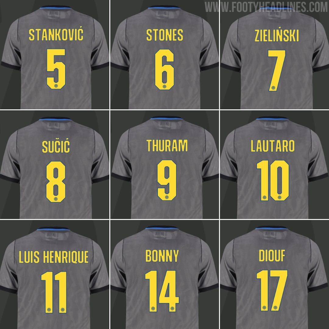
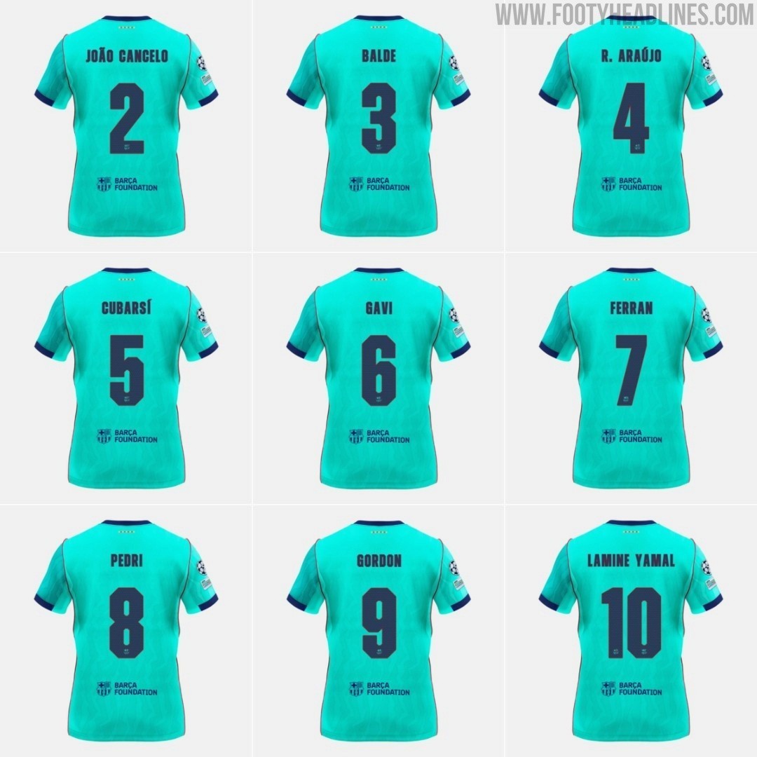
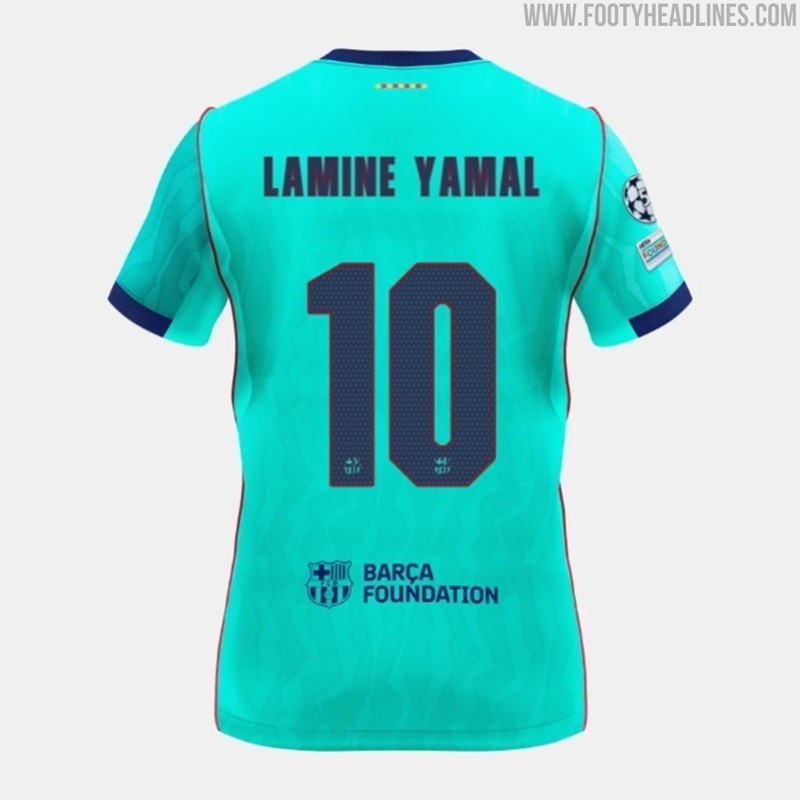
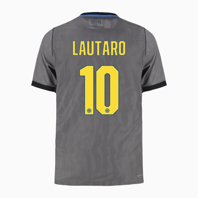
While the Nerazzurri introduced a dedicated cup font for their European campaign in the UEFA Champions League, the typeface is actually not exclusive to the Italian club. It is completely identical to the custom font introduced by FC Barcelona on their own 26-27 third kit.
Barcelona officially presented the typography in August alongside their third kit, sporting an angular, blocky, and squared-off aesthetic that contrasts with the curved, art-inspired font used on their home and away shirts. For Inter's 1990s-inspired Iron Ore grey third jersey, Nike used the exact same font set. The only differences are the color scheme - Speed Yellow with a subtle blue outline for Inter compared to deep navy for Barcelona - and the club crest stamped at the bottom of the numbers.
Inter Milan have traditionally stuck with the standard Serie A league font even in European fixtures, so the appearance of a bespoke Champions League typeface on their third kit caught plenty of attention. However, it seems Nike chose to streamline the design across their elite roster rather than creating a truly unique typography for each club.

Not Unique: Inter Milan 26-27 Champions League Kit Font Is Identical to Barcelona's
While the Nerazzurri introduced a dedicated cup font for their European campaign in the UEFA Champions League, the typeface is actually not exclusive to the Italian club. It is completely identical to the custom font introduced by FC Barcelona on their own 26-27 third kit.
Barcelona officially presented the typography in August alongside their third kit, sporting an angular, blocky, and squared-off aesthetic that contrasts with the curved, art-inspired font used on their home and away shirts. For Inter's 1990s-inspired Iron Ore grey third jersey, Nike used the exact same font set. The only differences are the color scheme - Speed Yellow with a subtle blue outline for Inter compared to deep navy for Barcelona - and the club crest stamped at the bottom of the numbers.
Inter Milan have traditionally stuck with the standard Serie A league font even in European fixtures, so the appearance of a bespoke Champions League typeface on their third kit caught plenty of attention. However, it seems Nike chose to streamline the design across their elite roster rather than creating a truly unique typography for each club.
FC Bourg-Péronnas 26-27 Away Kit Released
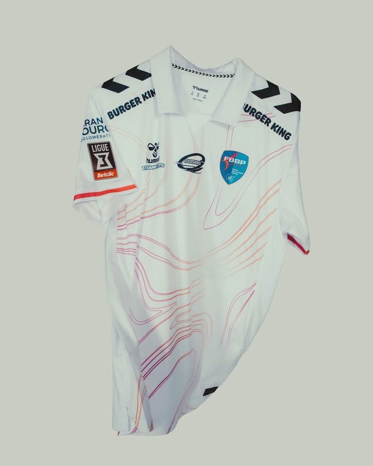
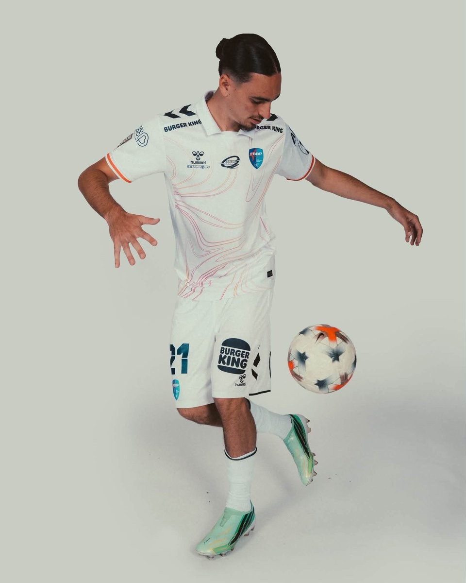
French Championnat National club Football Bourg-en-Bresse Péronnas 01 has officially launched its new away kit for the 26-27 campaign. Produced by Danish brand Hummel, the new design follows the earlier release of the team's home shirt.
The Hummel FBBP 01 26-27 away jersey is built on a clean white base and highlighted by an abstract, contour-like linework pattern flowing across the torso in subtle pink and orange hues. A traditional polo collar gives the shirt a refined aesthetic, accompanied by Hummel's signature black chevrons across the shoulders and vibrant contrast trim around the sleeve cuffs.
White shorts and matching white socks round out the full Bourg-en-Bresse Péronnas 26-27 away uniform.

Zulte Waregem Women 26-27 Away Kit Released
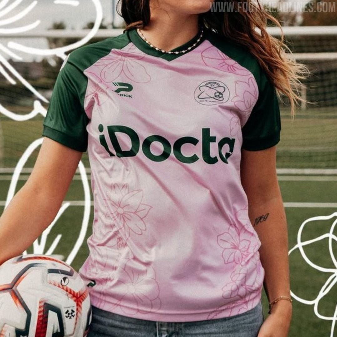
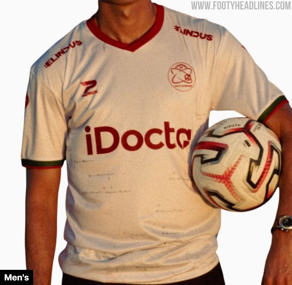
Belgian club SV Zulte Waregem and supplier Patrick have unveiled a bespoke 26-27 away kit created exclusively for the women's team. Marking the first time the women's side receives a completely independent design separate from the men's kit, the shirt features a light pink base paired with dark green raglan sleeves and trim. Subtle tonal floral illustrations run across the body, incorporating jasmine, alstroemeria, violet, and gladiolus inspired by player and youth academy drawings to represent friendship, trust, and strength, with dark green shorts and light pink socks rounding off the full strip.