All-New Louisville City FC Logo Revealed
Earlier today, Louisville City FC unveiled a new crest which is in line with the new NWSL franchise Racing Louisville FC. Both logos were designed by @wolffmatt who has a respectable football portfolio.

In terms of design, the new Louisville City logo introduces several changes in order to simplify the appearance of the most important club asset. This means that the skyline above the writing Louisville City disappears, as do the pale yellow accents implemented into many design elements. Essentially, the logo maintains its shape.
Wolff puts the stylistic focus on the fleur-de-lis of which 3 appear in the middle of the logo. This motif also appears within Racing Louisville's logo. To celebrate the club already winning two league titles in the USL Championship within 6 years of existence, there are also two stars above.
The goal for us was to create something simple, bold and timeless that works in harmony with Racing Louisville FC
“We love everything about the LouCity story going back to Day 1,” said club president Brad Estes. “This rebrand isn’t about changing our identity. It’s about the growth and evolution of our organization.”
“We will always pay homage to our original crest used for LouCity’s first six seasons,” said Mitch Ried, vice president of sales and marketing. “We also felt as our organization has grown from not only a USL club but also into a beautiful new stadium, youth academy and an NWSL franchise that we needed to accordingly update our brand.
What do you think of Louisville City FC's new logo? Do you like the unified approach of both Louisville franchises? Let us know your thoughts in the comments down below.
Perfectly Curacao Player Boot-Kit Combo at 2026 World Cup
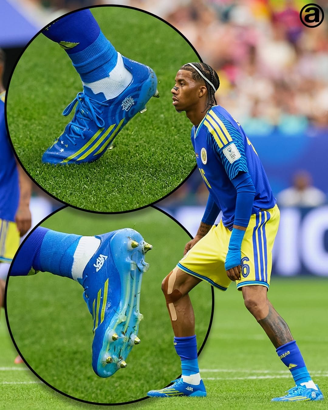
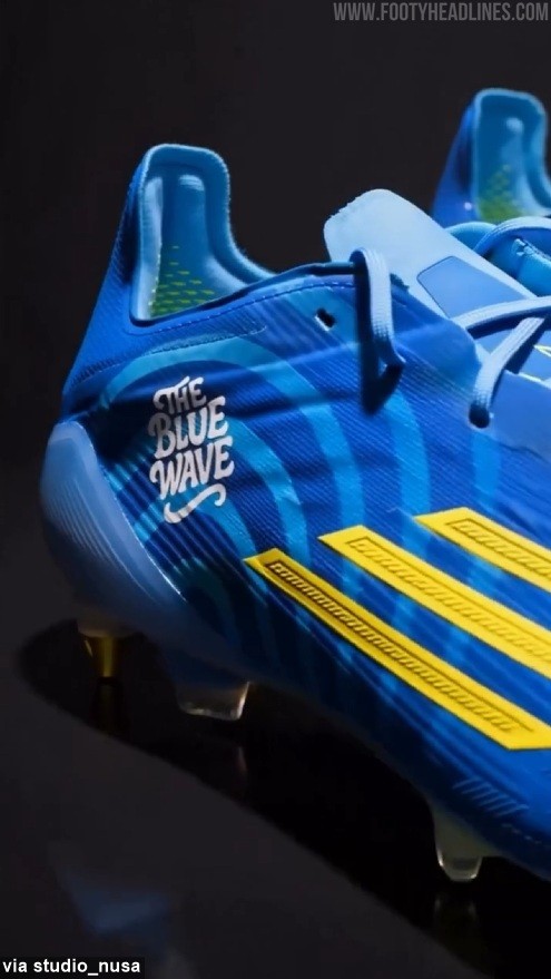
In the recent 2026 World Cup match, Curaçao national team player Jearl Margaritha wore the F50 "Ice Cold Precision" boots, but in a custom version with a slightly darker colorway to perfectly match the blue shade of Curaçao's 2026 home kit. Big thanks to @abcdefutbol.
The custom F50 was designed by @studio_nusa and draws inspiration from the waves surrounding the Caribbean island. The boots also feature the phrase "The Blue Wave" on the outer side.
https://www.footyheadlines.com/0747976324/messi-s-boots-match-his-kit-perfectly.html
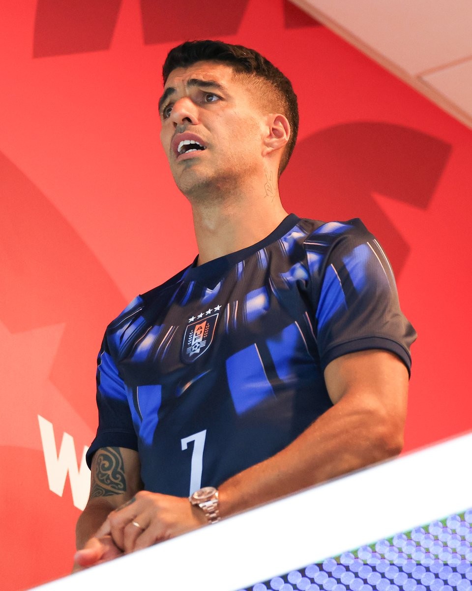
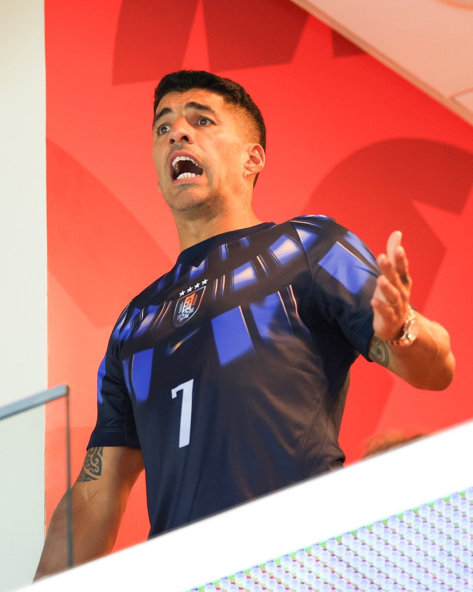
Luis Suarez Spotted in Uruguay 2026 Away Kit During Uruguay vs Cabo Verde Draw
Former Uruguay international Luis Suarez was spotted in the stands during Uruguay's 2026 World Cup match against Cabo Verde. Suarez, watching his nation from the sidelines, appeared visibly stressed as the game unfolded, ultimately ending in a surprising draw.
Suarez appeared wearing the Uruguay 2026 away jersey, seemingly to encourage his younger teammates from the stands. Surprisingly, he chose to wear the number 7 shirt instead of the iconic number 9 that he wore during his playing days with the national team. Images of him reacting to the tense moments of the match quickly circulated online, capturing his passionate support for the national team and drawing a wave of reactions across social media.


Persija Jakarta Announce Adidas Kit Deal
Indonesian club Persija Jakarta have officially announced a new kit partnership with Adidas. The announcement was made on June 22, 2026, coinciding with the 499th anniversary of the city of Jakarta. Adidas will replace Juara as the club's official apparel partner, taking over the production of all kits and training gear starting from the upcoming 2026-27 season.
Persija's move to a major global brand like Adidas is seen as a significant upgrade and a new chapter for the club. Further details regarding the official launch date of the 2026-27 kits are expected to be revealed in the coming weeks.
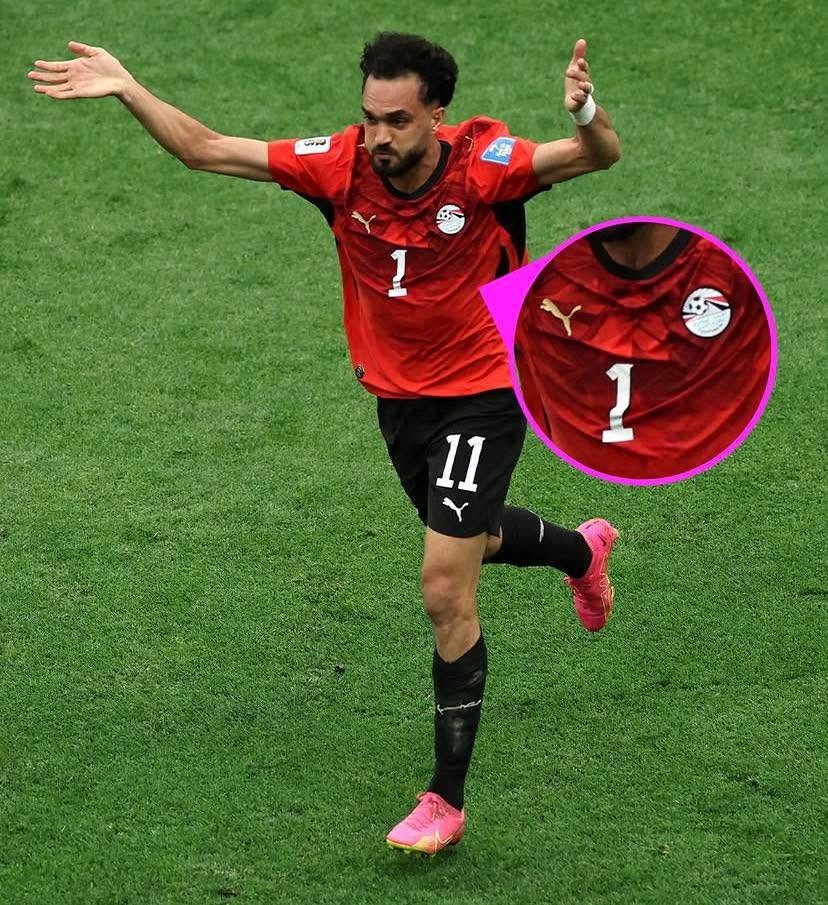
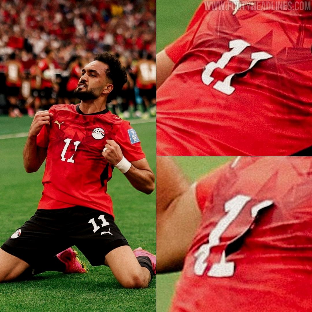
The Number on the Egypt Puma Kit Came Off
During Egypt's World Cup match against New Zealand, striker Mostafa Ziko was seen wearing a 'damaged' jersey after one of the digits on the front came off. Although he was wearing the number 11 shirt, one of the "1"s fell off, making it look like he was wearing number 1 instead.
The number appears to have been poorly heat-applied to the jersey and gradually peeled off due to sweat during the game. The incident occurred as Mostafa Ziko celebrated his goal, when one of the digits in his number 11 shirt detached, leaving only a single "1" visible on the front.


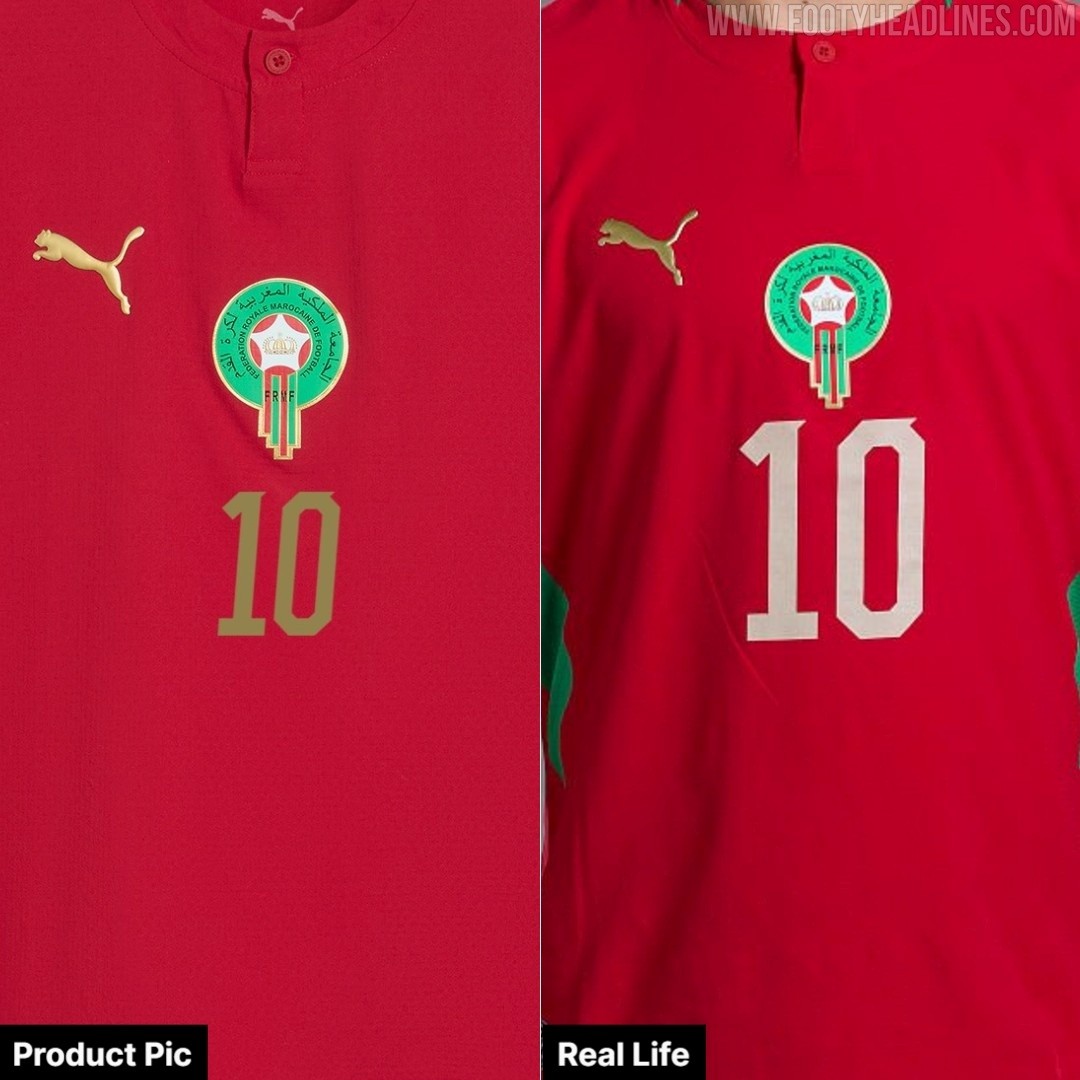
Morocco 2026 World Cup Kit Features Different Name Set to Commercial Version
Fans looking to purchase the exact Morocco 2026-27 home kit worn by the players at the World Cup will find a noticeable difference in the name and number sets. While official product pictures of the Puma kit display the chest numbers in gold, the actual shirts worn by the Moroccan national team feature a lighter, white-colored application. Big thanks to @rockonbaPES.
Alongside the retail discrepancies, there have been multiple reports of Puma kits easily ripping during tournament matches. These material failures have affected several of the brand's sponsored teams, including Morocco, Czechia, Egypt, and Paraguay.
https://www.footyheadlines.com/8529325653/puma-kits-keep-ripping-at-the-2026-world-cup.html


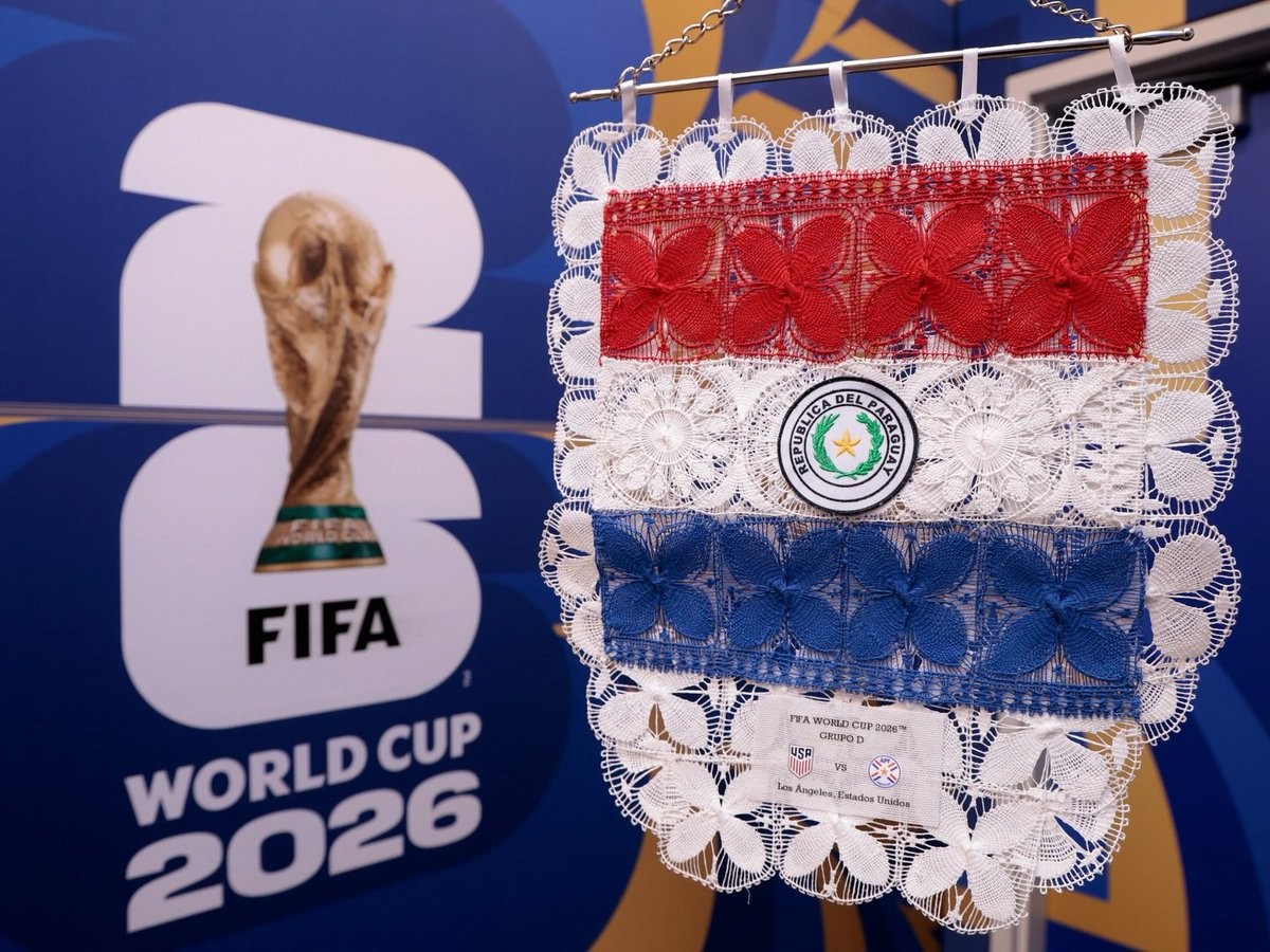
Special Paraguay 2026 World Cup Pennant
A look at the special exchange flag for the Paraguay national team at the 2026 World Cup has been shared online. These pennants are traditionally exchanged by team captains prior to kick-off during international matches.
The Paraguay 2026 World Cup exchange flag incorporates the traditional colors of the nation, tying into the visual identity established by Puma for the tournament. It prominently features the Paraguayan Football Association crest alongside the Puma logo.