
Ajax 22-23 Third Kit Heavily Modified Due to UEFA Kit Rules
 Sep 13, 2022, by Pat
UEFA's infamous kit rules struck again in the Champions League tonight as the Ajax 22-23 third kit, created by Adidas in collaboration with local fashion brand Daily Paper, had to modified ahead of their away game at Liverpool.


In order to comply with the UEFA rules, several changes had to be made. The most visible change is the font: rather than the unique font designed specifically for the kit, featuring an intricate pattern, the font used in the game was plain black with a red outline.

In addition to that, the Daily Paper writing below the crests on the shirt and shorts was not present in the UEFA Champions League game - this is to be expected as only one brand's logo can appear on one shirt.
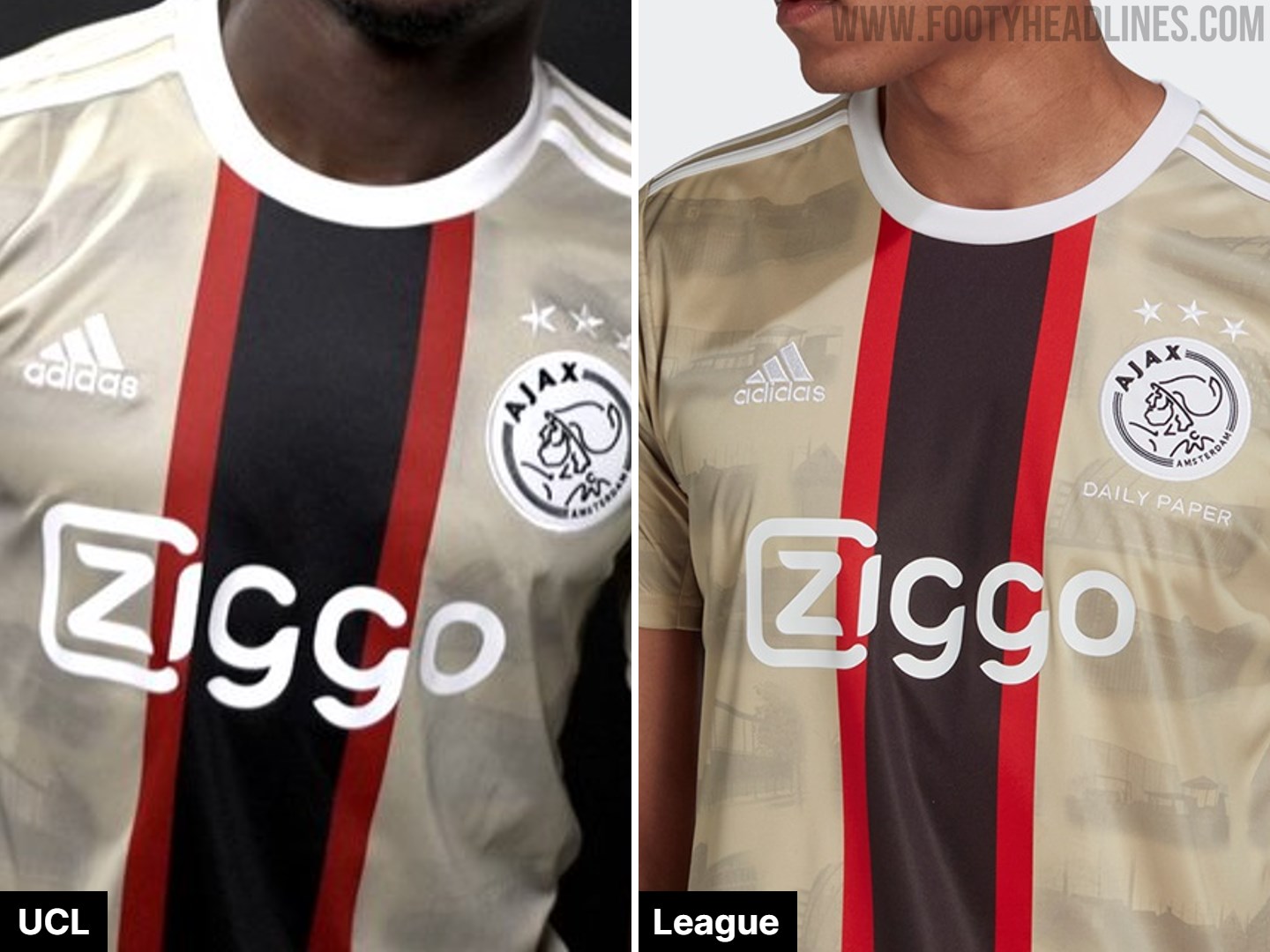
Finally, the back-neck graphic, which also includes the Daily Paper name, was also removed from the kits worn in Liverpool.

According to Ajaxlife.nl, Ajax already expected all of these details to be against UEFA's rules but tried to apply the original design anyway. A conscious decision was made to keep them on the shirt for the Eredivisie, where all three changed aspects are allowed, and also to sell that version to the supporters, including the font.
Let's hear your thoughts in the comments below.
Werder Bremen Weserstadion Centenary Kit Released
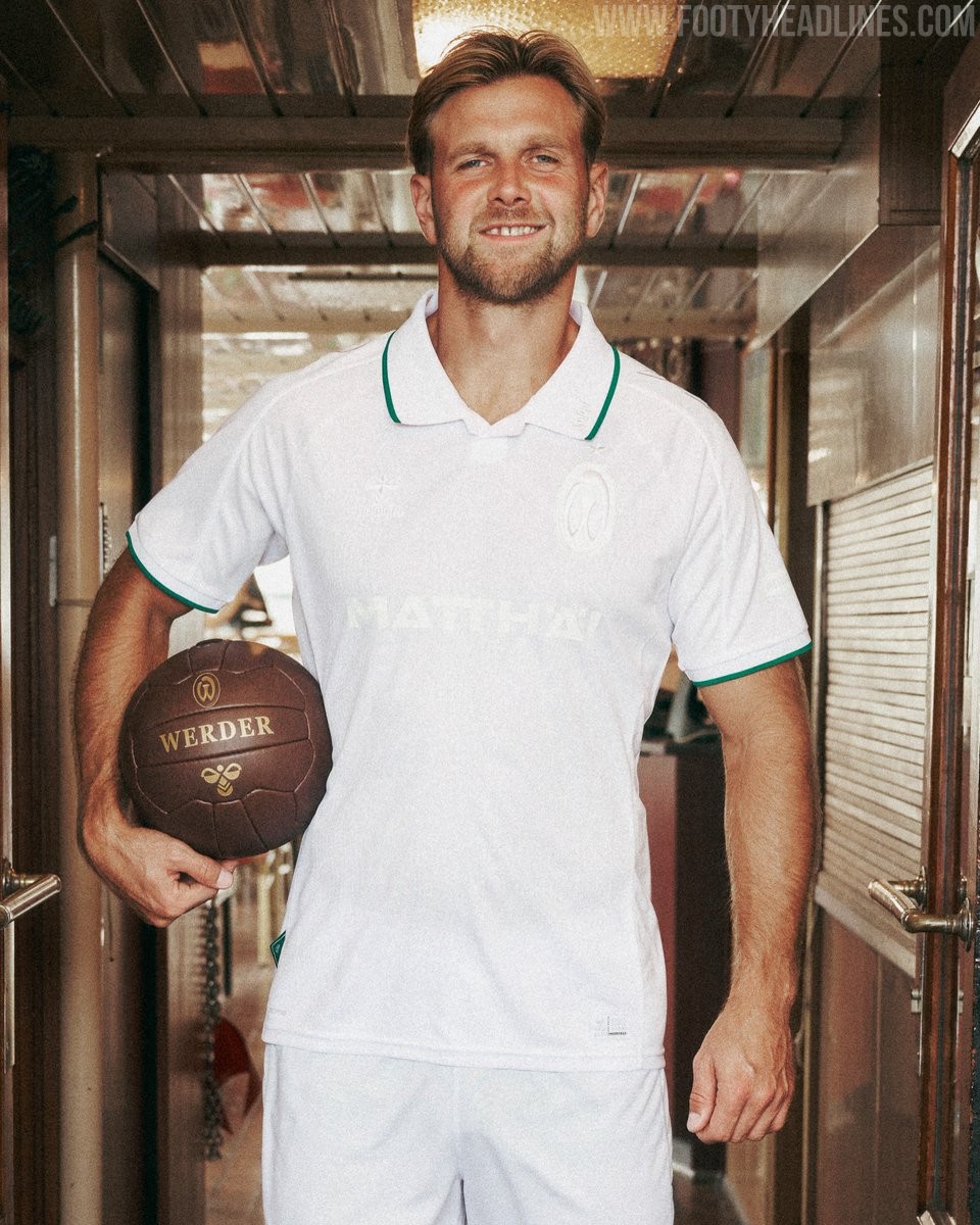
SV Werder Bremen and kit supplier Hummel have officially launched a special-edition jersey to mark the 100th anniversary of the Weserstadion. The club's iconic home on the river opened its gates on October 17, 1926, and the milestone is being honored throughout the 26-27 campaign with this commemorative release.
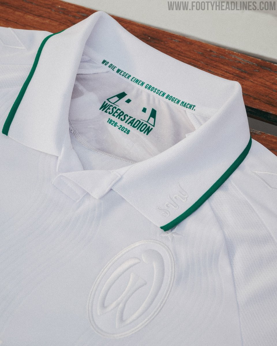
The outfield shirt opts for a clean, heritage-focused look with an all-white base accented by delicate green piping on the classic polo collar and sleeve cuffs. To maintain a minimalist finish, the club crest, Hummel logo, and main sponsor Matthäi are all executed in tonal white. A stadium graphic paired with the line "Wo die Weser einen großen Bogen macht" is printed on the inner collar, while the upper back is signed off with "100 Jahre Weserstadion." Alongside the player shirt, Hummel also revealed a contrasting goalkeeper jersey defined by a vibrant 1990s-inspired geometric pattern in purple, teal, and black.
Both centenary jerseys are scheduled to be worn on pitch on September 26, 2026, during a legends friendly between Werder Bremen and Real Madrid at the Weserstadion. The outfield shirt retails for €89.95 and is available now through Werder's online store.
Sassuolo 26-27 Third Kit Released
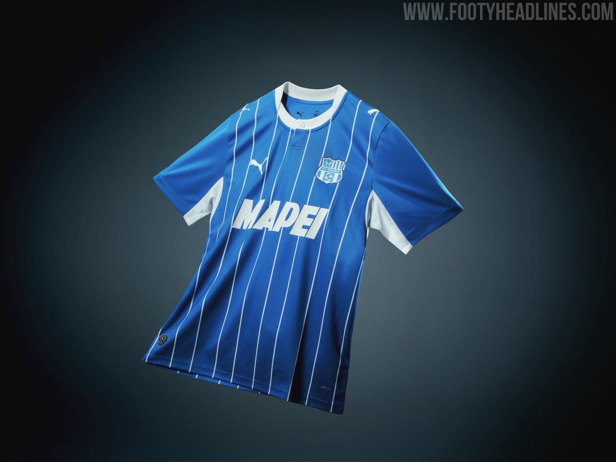
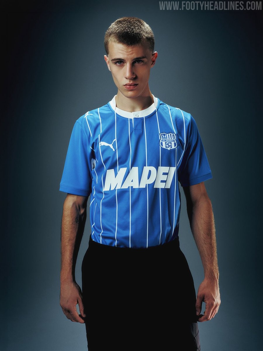
Puma and Italian club US Sassuolo have officially launched the club's new third kit for the 26-27 season. Stepping away from the club's traditional green and black identity, the alternate strip adopts a bold blue aesthetic crafted to honor long-time owner and main sponsor MAPEI, celebrating more than two decades of partnership as well as paying tribute to the Mapei Stadium.
The Puma Sassuolo 26-27 third shirt features an 'Electro Royal' blue base adorned with thin white vertical pinstripes down the front, drawing inspiration from the striping in the club's emblem. It is detailed with a white collar featuring a subtle button placket, white underarm inserts, and white Puma cat logos. The Sassuolo crest is rendered in a monochrome blue and white execution on the left chest to match the centered MAPEI sponsor logo.
Erling Haaland Shows Off Nike Phantom 6 Signature Boots
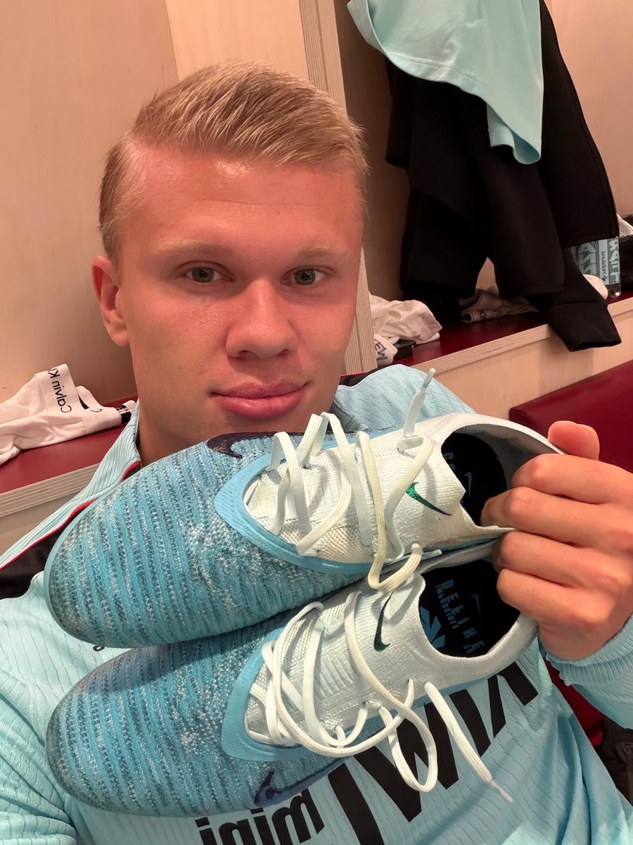
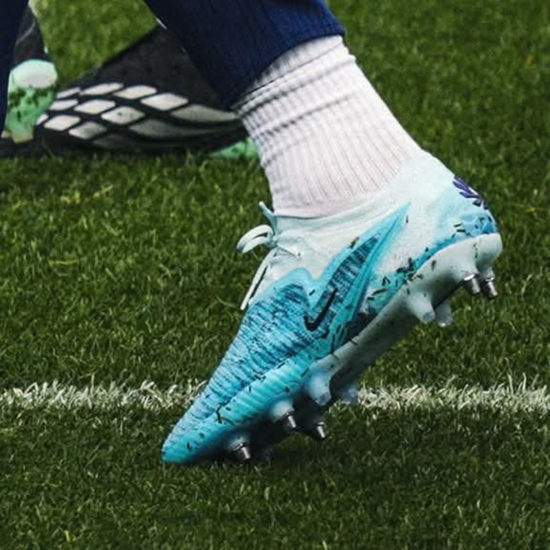
Manchester City star Erling Haaland has provided the clearest look yet at his upcoming Nike Phantom 6 signature boots for the 26-27 season. After previously being spotted wearing the pair during training sessions with the Norwegian national team, the striker shared an image holding the finished low-cut boots inside the dressing room.
The new signature boots feature a Sky Blue and White color scheme that aligns naturally with Manchester City's primary colors. A distinctive cloud-like graphic wraps around the heel and rear section of the boot, adding an exclusive graphic touch over the light blue upper.
The Nike Phantom 6 Haaland boots are scheduled for an official launch on 1 October 2026.

Spezia Calcio 26-27 Third Kit Released
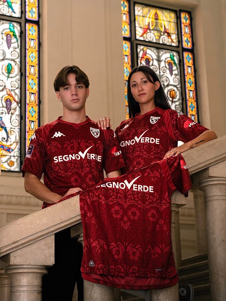
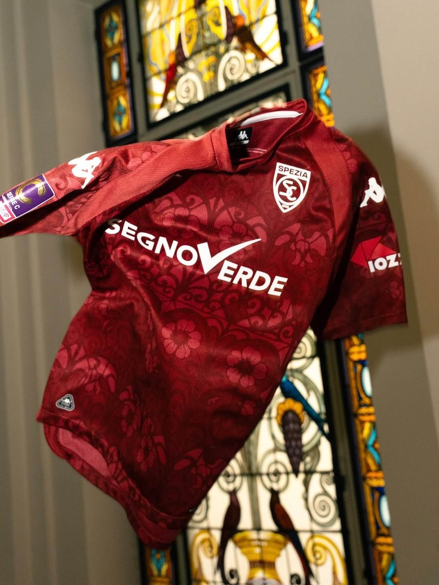
Kappa and Italian club Spezia Calcio have officially unveiled their new third kit for the 26-27 season. Titled "Liberty Soul," the new strip draws direct inspiration from the local decorative art and architecture of La Spezia.
The Spezia Calcio 26-27 third shirt comes in a rich garnet base, overlaid with an intricate tonal floral pattern inspired by the Liberty-style stained-glass windows adorning historic buildings throughout the city. Clean white accents provide contrast on the Kappa logos, the club crest on the left chest, and the main shirt sponsor. Honoring club heritage, Spezia's historic 1944 championship badge is placed on the upper back below the collar.
The new third kit completes the club's 26-27 collection alongside the white 120th-anniversary home shirt and the black-and-gold away jersey. It is available to purchase now via Spezia's official online store.
Special Adidas Argentina Messi 2026 'Farewell' Kit Collection Leaked
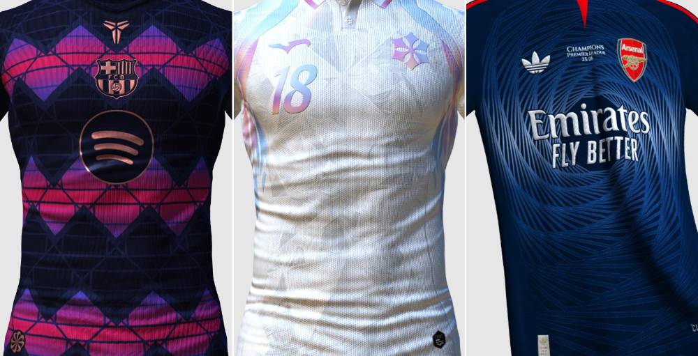
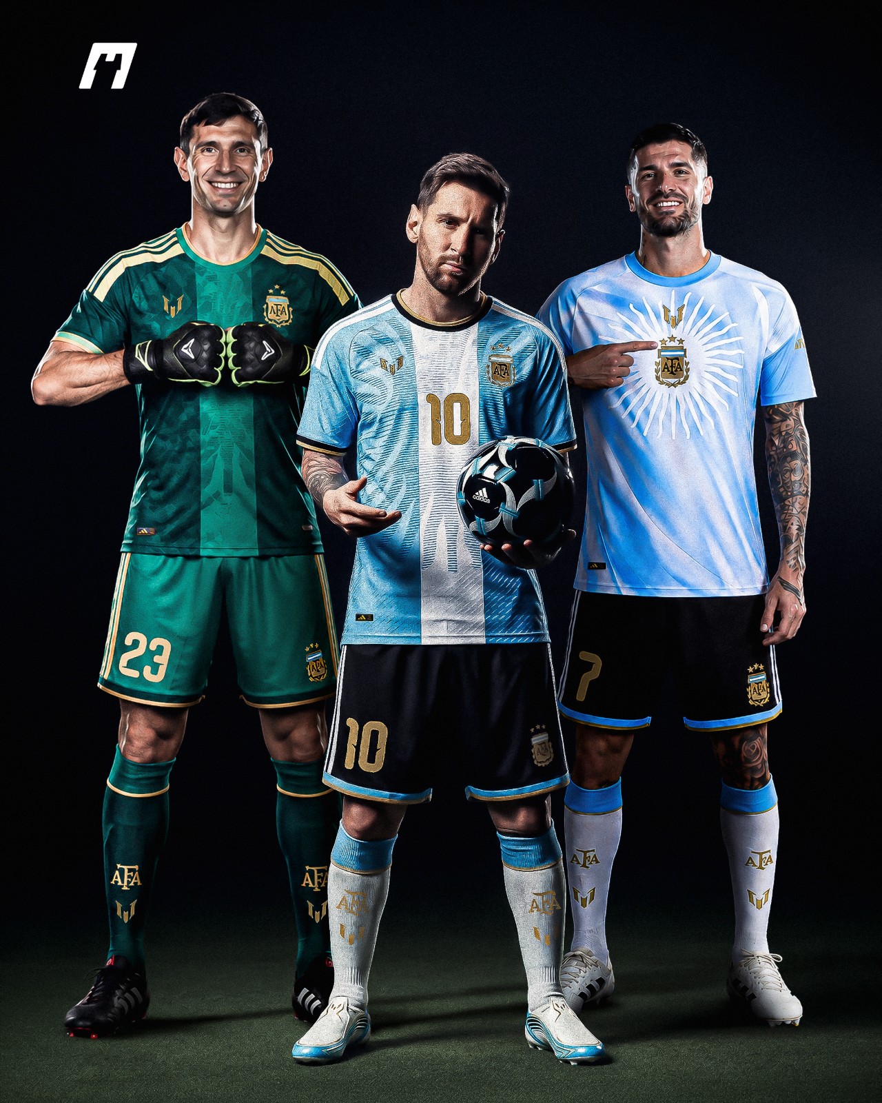
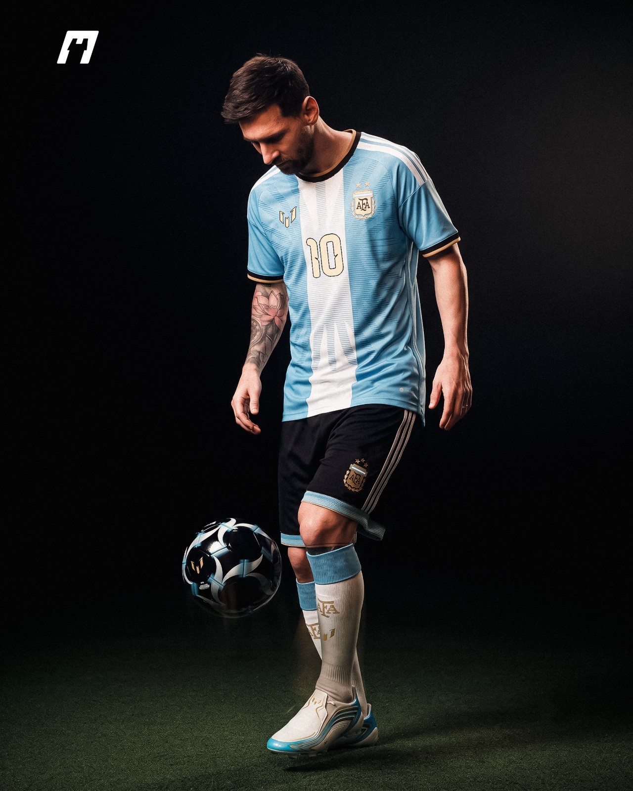
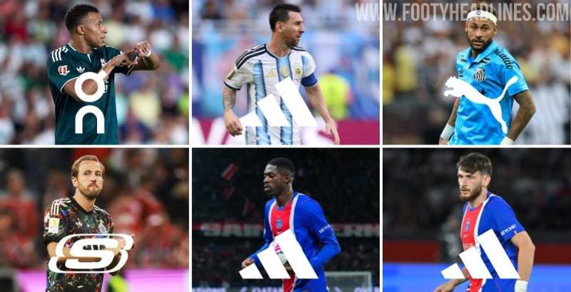
Based on leaked image, our partner @whatthekit_x created a mockup of Leo Messi, Emiliano Martínez and Rodrigo De Paul wearing the special Argentina kit, goalkeeper kit and pre-match shirt, respectively, featured Messi's personal brand logo to honor his legendary career with the national team.



Napoli Women 26-27 Away Kit Released
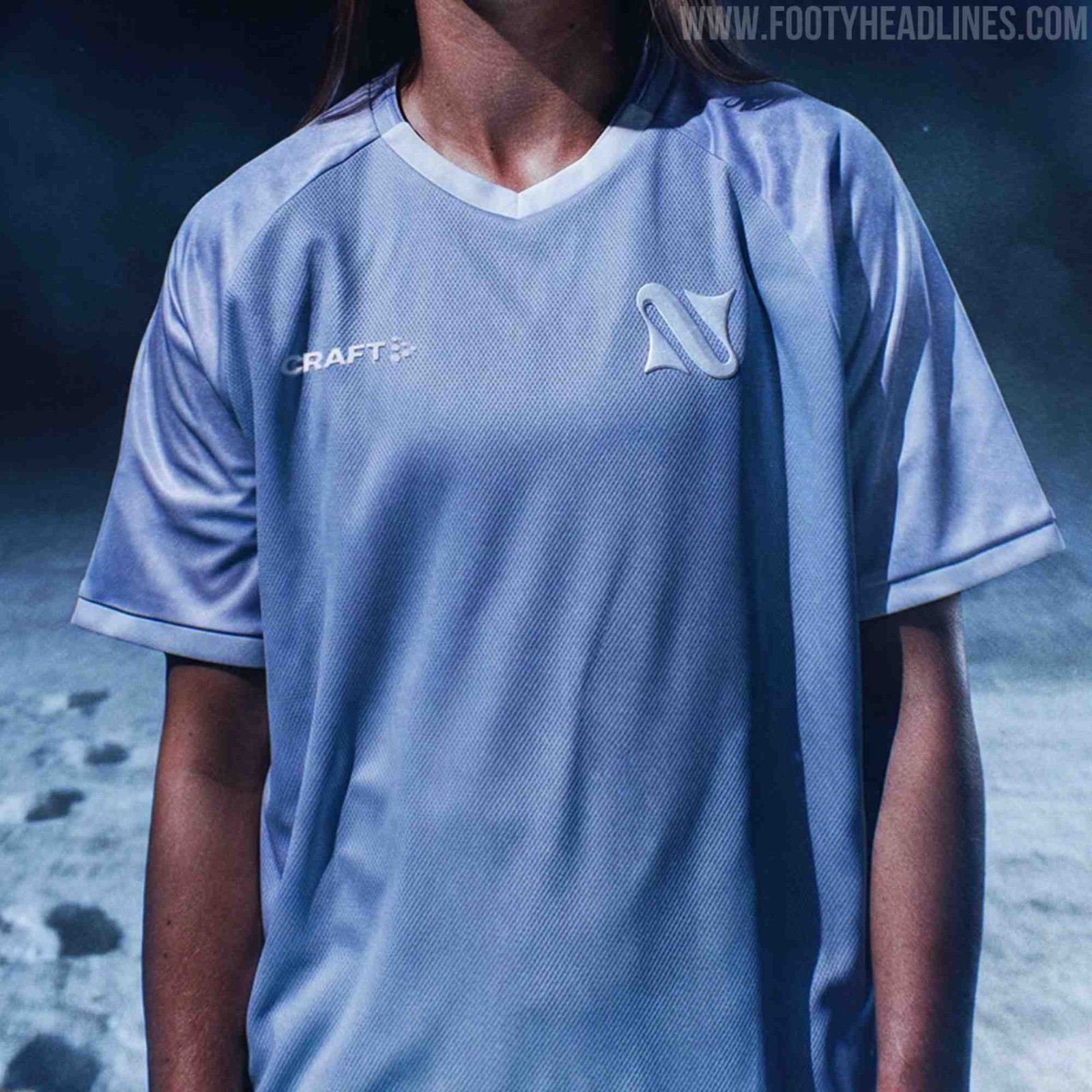
Following the launch of their ocean-themed home strip, Napoli Women have unveiled their new away kit for the 26-27 season. Produced in partnership with Swedish brand Craft and creative agency Modì, the jersey represents the second chapter of the club's "Dagli abissi al cielo" (From the abyss to the sky) narrative concept.
The design draws unique inspiration from Urania, the Neapolitan protagonist of Ernesto Capocci's 1857 proto-science fiction novella about the first woman to journey to the Moon. Capocci, a famed astronomer and former director of Naples' Capodimonte Observatory, penned the story nearly a decade before Jules Verne. To reflect this lunar theme, the shirt adopts muted gray and lilac tones paired with a crater-like lunar soil texture across the raglan sleeves, side panels, and shorts. A crisp white panel on the upper back features the inscription "To the Moon," while the chest carries Napoli Women's new emblem rendered in pearl-white 3D PVC.

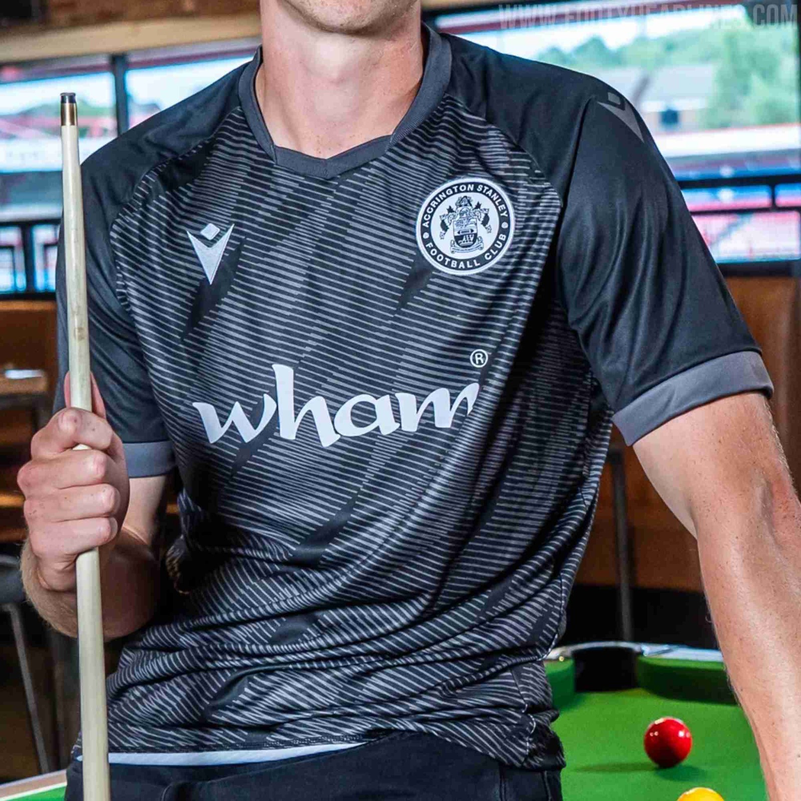
Accrington Stanley 26-28 'Stanley-Noir' Third Kit Released
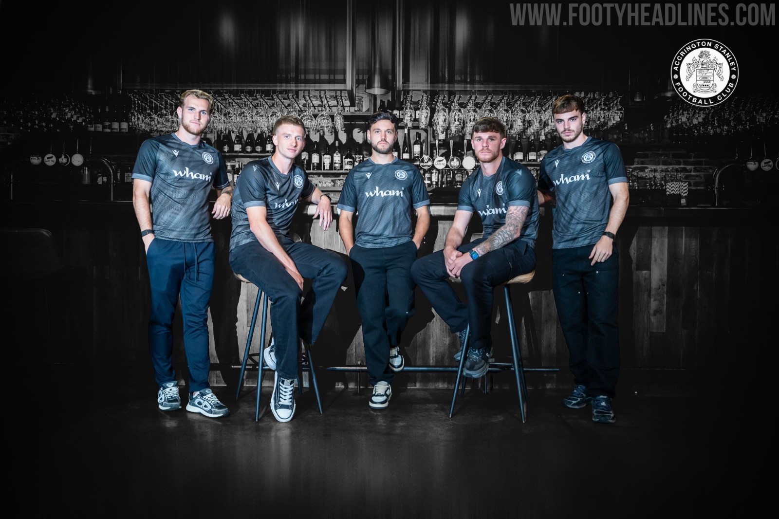
Accrington Stanley have officially unveiled their brand-new 'Stanley-Noir' third kit for the 26-28 seasons, designed in direct collaboration with technical sponsor Macron. The strip adopts a sleek, dark steel gray aesthetic characterized by a subtle diagonal wave pattern across the torso, paired with monochrome white applications for the embroidered club badge, Macron Hero, and front-of-shirt sponsor Wham, who return for their tenth consecutive campaign. Rounded off with dark shorts and socks featuring Fagan & Whalley branding, the new alternate strip is now available to purchase through the club's online store and physical retail shop.