Streamlined Nike 2024 Kit Font Revealed - To Be Used by France, Portugal & More, But Not All Teams
 Mar 19, 2024, by Chris

- Nike Main Font: Nike has released a main, classic 1990s-inspired typeface for its 2024 Federation kits, to be used by teams such as France and Portugal.
- Bespoke Fonts: Some federations, including Brazil, Norway, and South Korea, will use bespoke kit typefaces designed specifically for them.
- Design Features: The main font has a 3D design, while bespoke fonts have varying themes, such as Brazilian art for Brazil, metallic elements for Norway, and a modern, fluid design for South Korea.
This week, Nike released its new 2024 Federation kits. Now, bit by bit, we get a look at the typefaces for Nike's 2024 federation kits.


Thanks to font expert @Niuzekor, Subside Sports, Gia and emcemce for bringing together everything known about the Nike 2024 kit typefaces. Without them, this article would not have been possible.
Nike 2024 Federation Kit Fonts


Nike has one main font for its 2024 Federation Kits. Countries that have chosen to use the main Nike typeface are France, Portugal, Poland, and certainly a few others.


The main Nike 2024 Federation kit font has a very classic look inspired by the typefaces of the 1990s. It has a 3D design without any modern twists.
Adidas Germany Euro 2024 Kit Font


Like 2022: Bespoke Germany 2024 Kit Font Leaked
Indeed, the classic typeface follows the same approach as the home font Adidas designed for Germany.
Each federation's crest is placed on the bottom of the Nike 2024 kit numbers. The front numbers are either placed below the Swoosh (e.g. Portugal) or in the center (Poland, France).
Three federations - Brazil, Norway, and South Korea - use a bespoke kit typeface by Nike. There is no image of the Brazil and Norway 2024 kit typefaces yet, but already a description by Nike.
Brazil 2024 Kit Font
The Brazil 2024 kit font has letters that are inspired by Brazilian art and design.
Norway 2024 Kit Font
The bespoke Norway 2024 kit font brings the design elements together through a sharp, metallic treatment.
South Korea 2024 Kit Font

The South Korea 2024 kit font has a fluid and very modern design.


Do you like the classic streamlined Nike 2024 kit typeface? Let us know in the comments below.
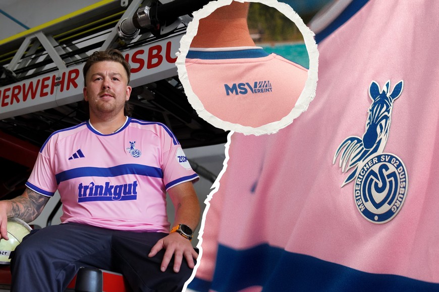
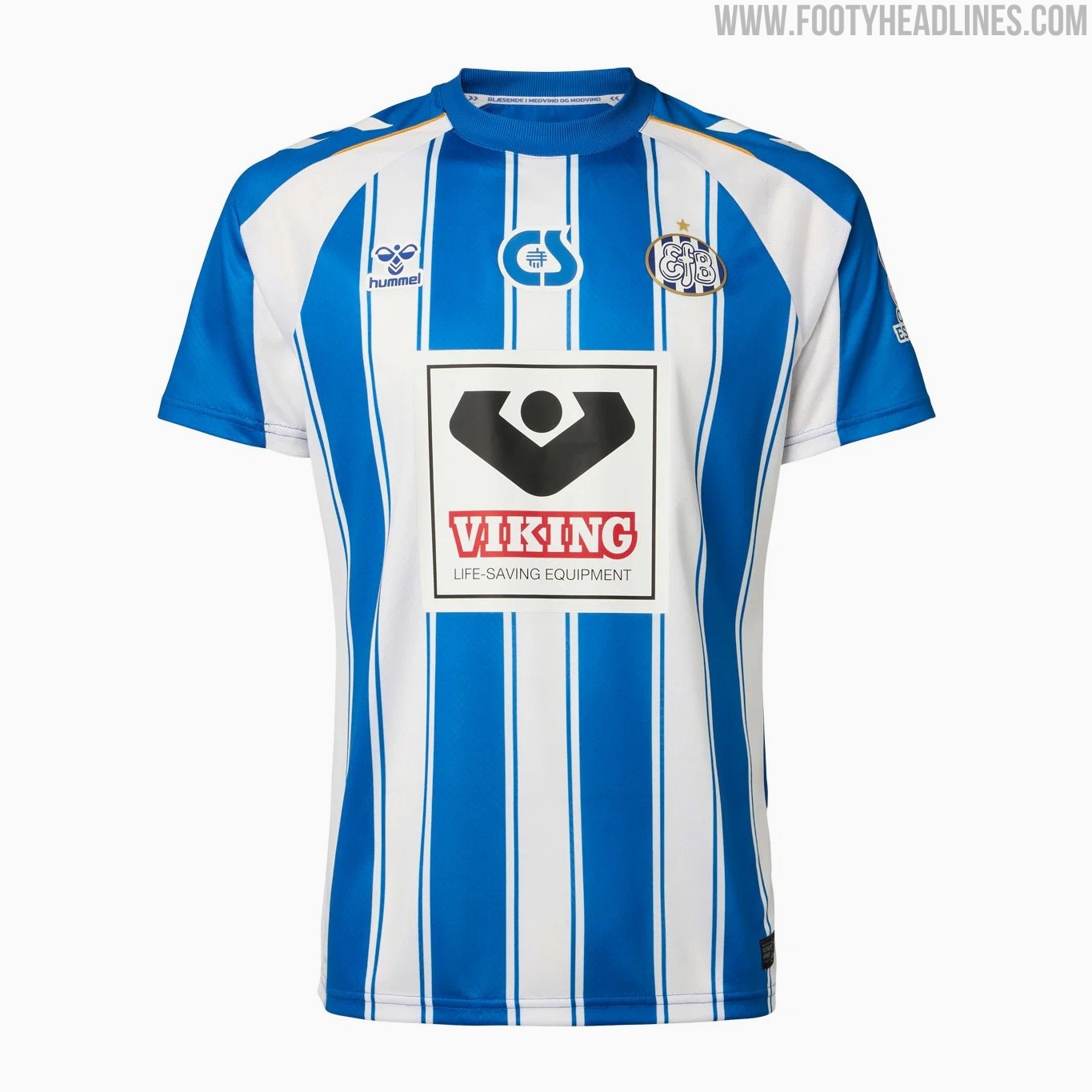
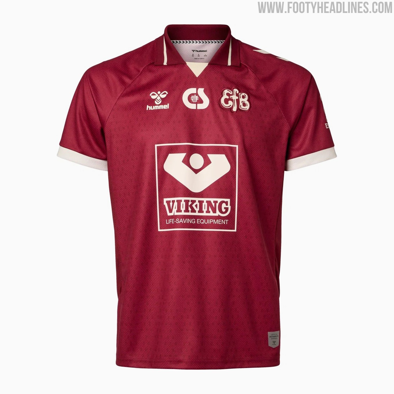
MSV Duisburg 26-27 Third Kit Released
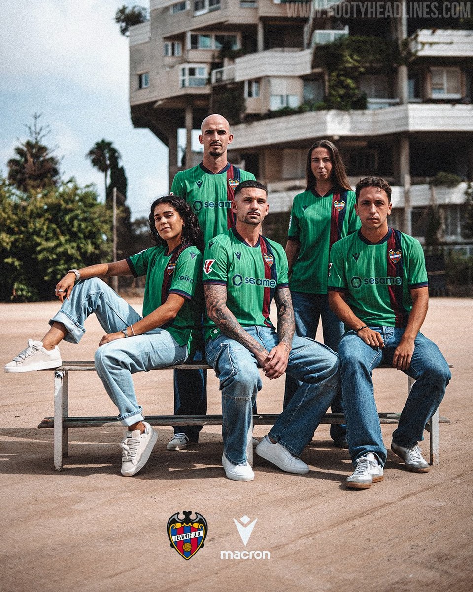
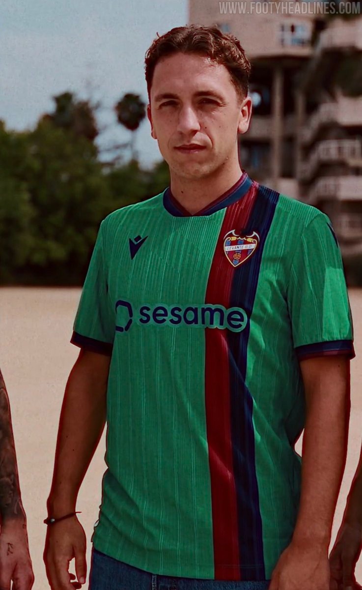
Levante 26-27 Third Kit Released
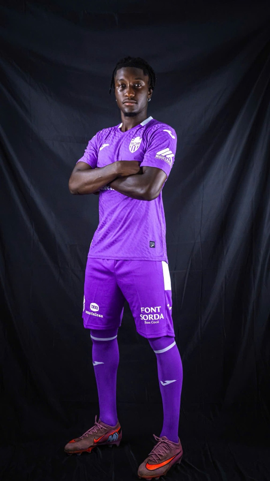
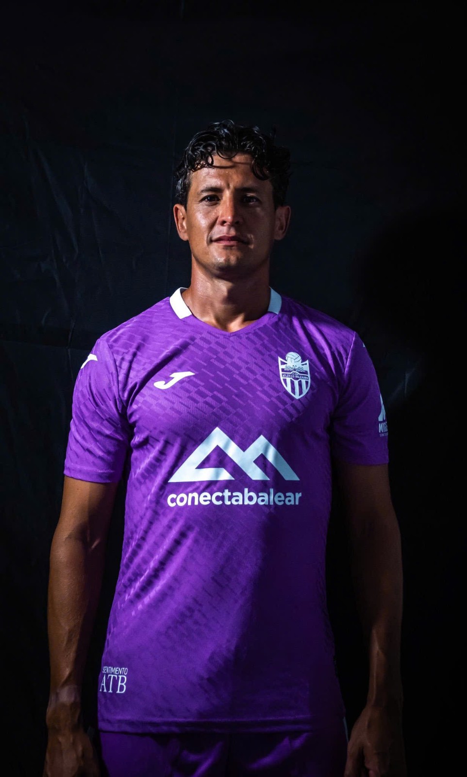
Atlético Baleares 26-27 Away Kit Released
Segunda Federación side Atlético Baleares have introduced their away kit for 2026-27 season, made by Spanish brand Joma.
The design features a striking purple base with subtle geometric patterns all over the shirt, combined with turquoise as the secondary color for collar details, club crest and sponsor logos. Matching purple shorts and socks complete the set.
What do you think of the Atlético Baleares 2026-27 away kit? Leave your thoughts in the comments below.
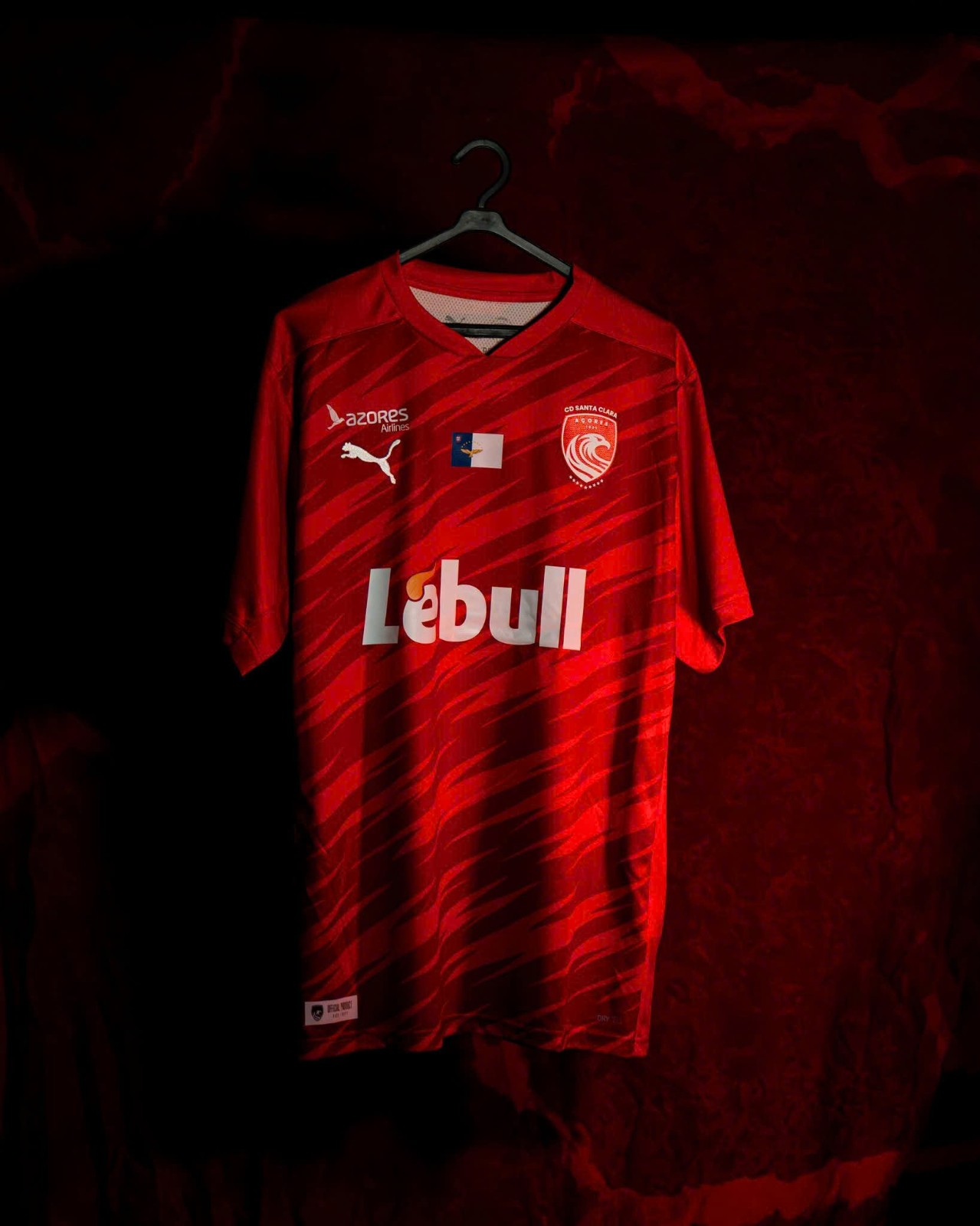
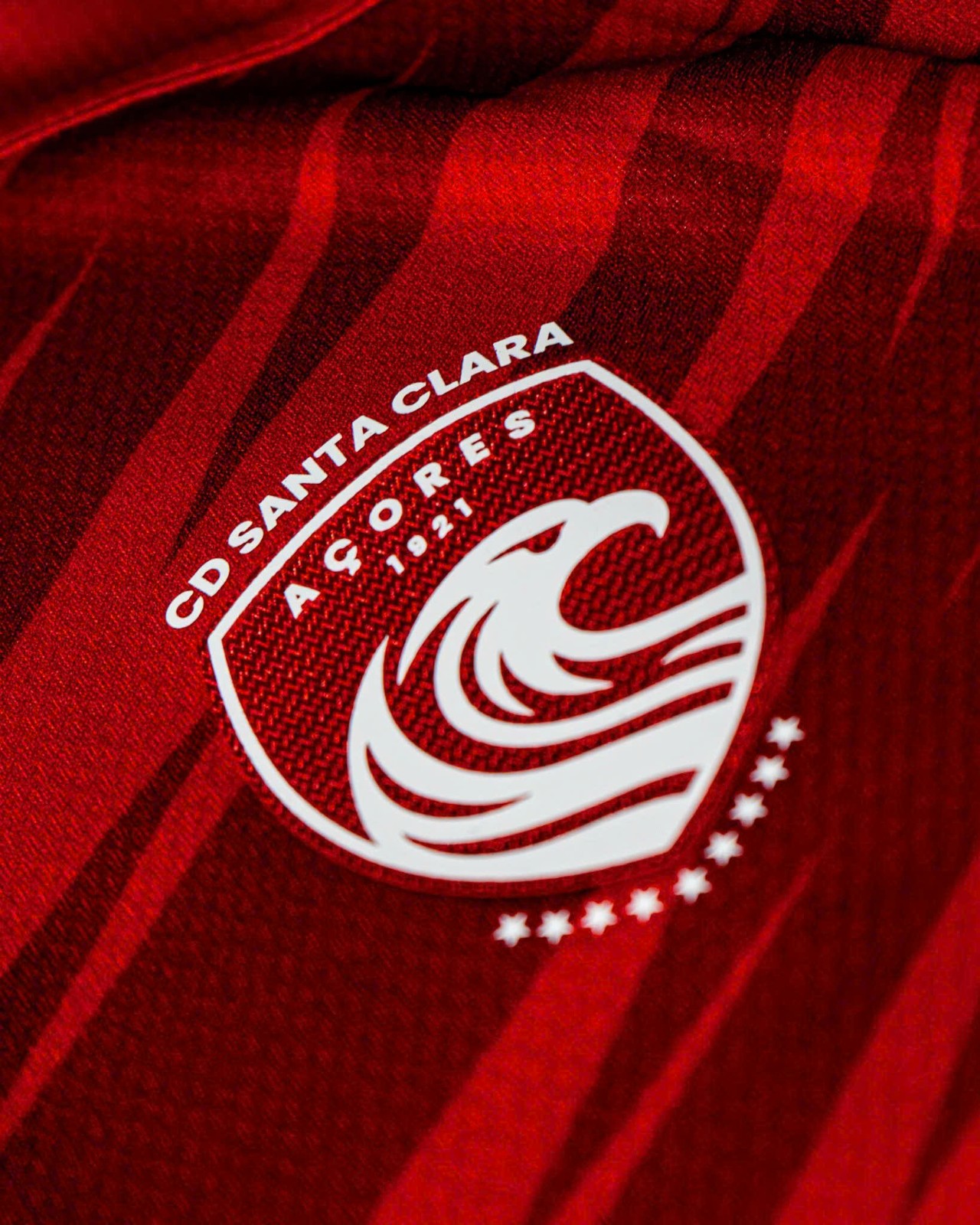
No More Umbro: Puma Santa Clara 26-27 Home Kit Released
Liga Portugal side Santa Clara have unveiled their first home kit with new partner Puma, replacing Umbro. The kit will be worn in the upcoming 2026-27 season.
The design uses simple template from the German brand, using traditional red as the main color. A striking dark red pattern is placed all over the front of the shirt, combined with red shorts and socks to round off a simple look for the first season of this partnership.
What do you think of the Santa Clara 2026-27 home kit? Leave your thoughts in the comments below.