bbb


AC Milan Debut Bespoke European Font on 26-27 Away Kit
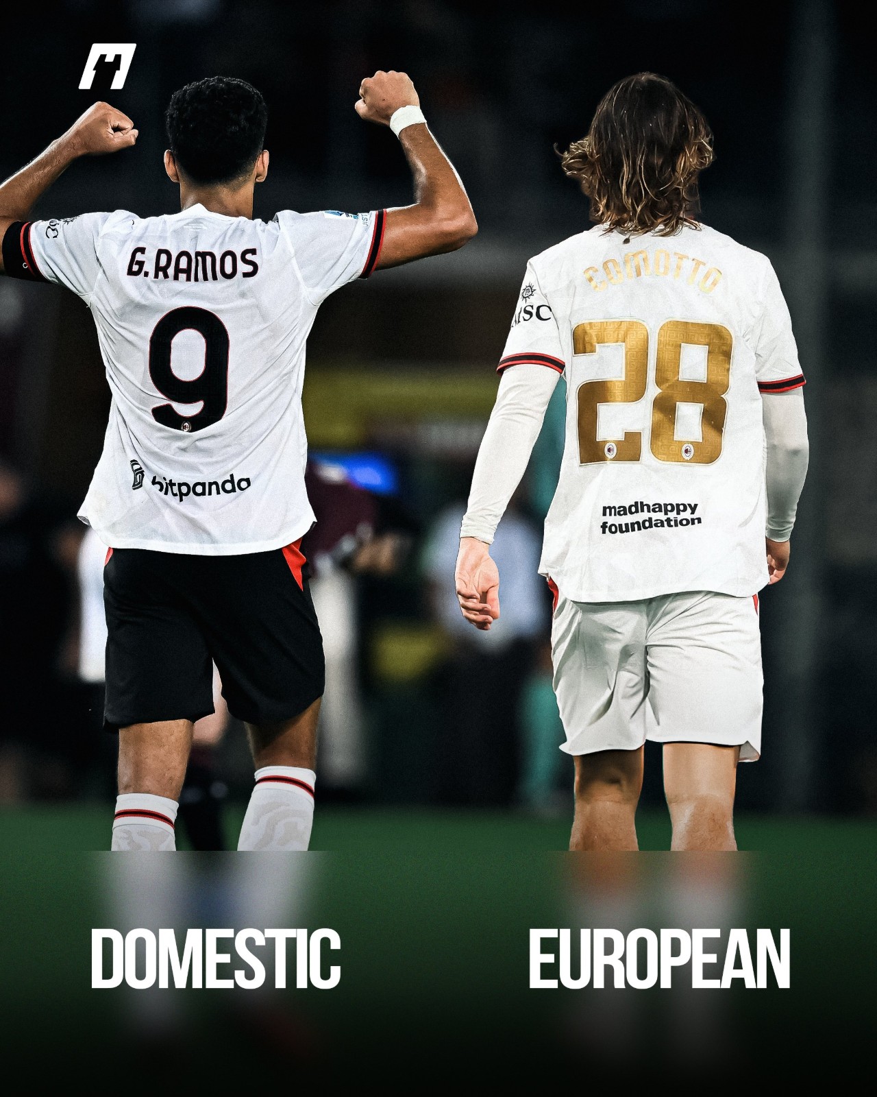
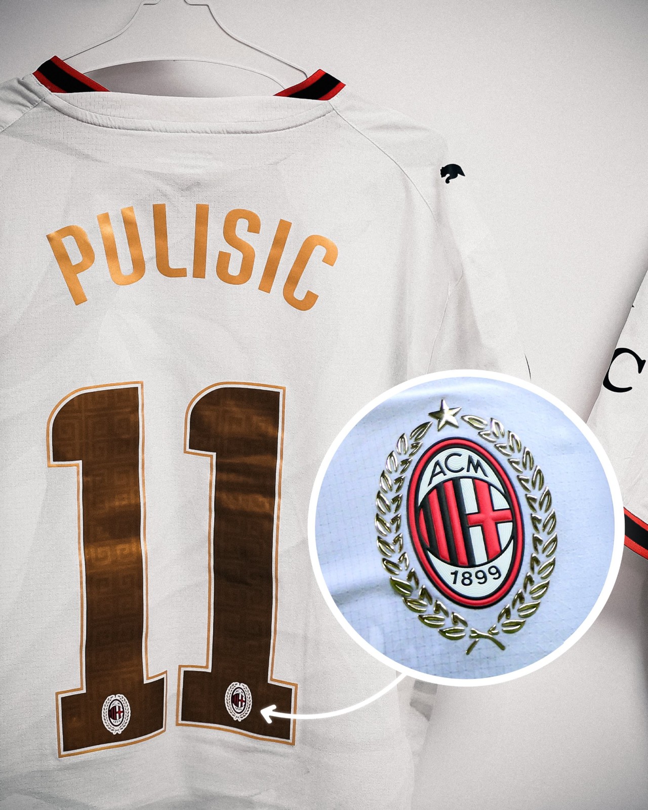
AC Milan officially debuted their bespoke font for away kit in the recent match against Bournemouth.
The move marks a departure from their primary home strip, where the Italian giants have continued using standard Serie A lettering for their Europa League fixtures rather than adopting a dedicated cup typeface.
This marks the first time since the 2023-24 season that Milan have featured a bespoke European font. During that campaign across the Champions League and Europa League, the club rolled out a bespoke font honoring their iconic 2003 Champions League triumph.
Intriguingly, the new look hasn't been applied across the board. Milan’s goalkeeper featured the Serie A font, creating a striking typographic contrast with the rest of the squad on the night.
Big thanks to @whatthekit_x for the comparison graphic and information.
Borussia Dortmund Share Complete Modern Home Kit History
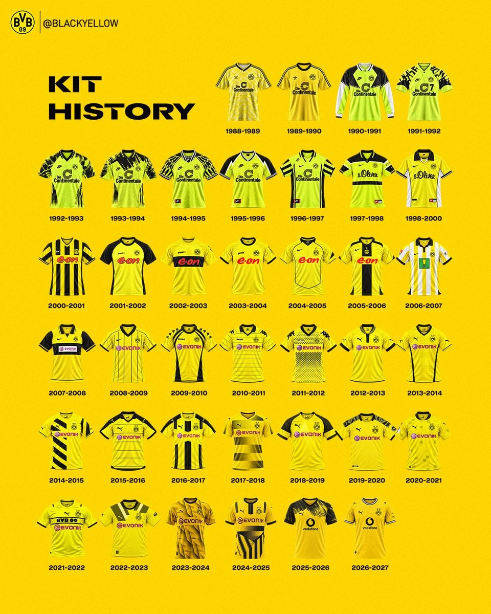
Borussia Dortmund's official English-language channel (@BlackYellow) has shared a comprehensive visual timeline chronicling nearly four decades of the club's primary shirts. Spanning from the 88-89 campaign up to the current 26-27 season, the graphic provides a neat year-by-year retrospective of how the iconic black and yellow identity has transformed in modern football.
The retrospective captures several distinct manufacturer eras. It opens with classic late-1980s Adidas designs before stepping into the bold, neon-infused Nike era of the 1990s—which produced memorable kits including the 1996-97 Champions League triumph. Also documented are the club's unique in-house Goool.de apparel in the early 2000s, a brief stint with Kappa from 09-10 to 11-12, and the enduring partnership with Puma that commenced in 12-13 and remains active today.
Alongside the varying templates, the timeline charts notable shirt sponsors over the eras, transitioning from Continentale and s.Oliver to E.ON, Evonik, and Vodafone. The visual concludes with the clean 26-27 home jersey, which blends a vibrant yellow base with subtle tonal patterns paying homage to Dortmund's industrial and architectural heritage.


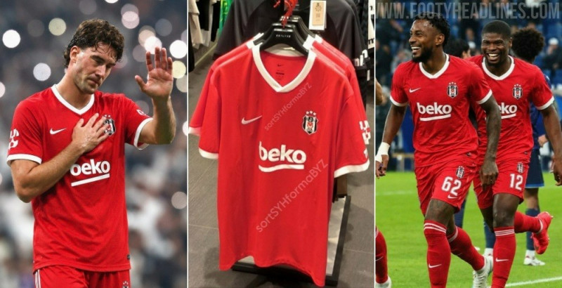
AC Milan Debut Bespoke European Font on 26-27 Away Kit
AC Milan officially debuted their bespoke font for away kit in the recent match against Bournemouth.
The move marks a departure from their primary home strip, where the Italian giants have continued using standard Serie A lettering for their Europa League fixtures rather than adopting a dedicated cup typeface.
This marks the first time since the 2023-24 season that Milan have featured a bespoke European font. During that campaign across the Champions League and Europa League, the club rolled out a bespoke font honoring their iconic 2003 Champions League triumph.
Intriguingly, the new look hasn't been applied across the board. Milan’s goalkeeper featured the Serie A font, creating a striking typographic contrast with the rest of the squad on the night.
Big thanks to @whatthekit_x for the comparison graphic and information.
Borussia Dortmund Share Complete Modern Home Kit History
Borussia Dortmund's official English-language channel (@BlackYellow) has shared a comprehensive visual timeline chronicling nearly four decades of the club's primary shirts. Spanning from the 88-89 campaign up to the current 26-27 season, the graphic provides a neat year-by-year retrospective of how the iconic black and yellow identity has transformed in modern football.
The retrospective captures several distinct manufacturer eras. It opens with classic late-1980s Adidas designs before stepping into the bold, neon-infused Nike era of the 1990s—which produced memorable kits including the 1996-97 Champions League triumph. Also documented are the club's unique in-house Goool.de apparel in the early 2000s, a brief stint with Kappa from 09-10 to 11-12, and the enduring partnership with Puma that commenced in 12-13 and remains active today.
Alongside the varying templates, the timeline charts notable shirt sponsors over the eras, transitioning from Continentale and s.Oliver to E.ON, Evonik, and Vodafone. The visual concludes with the clean 26-27 home jersey, which blends a vibrant yellow base with subtle tonal patterns paying homage to Dortmund's industrial and architectural heritage.
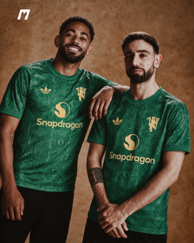
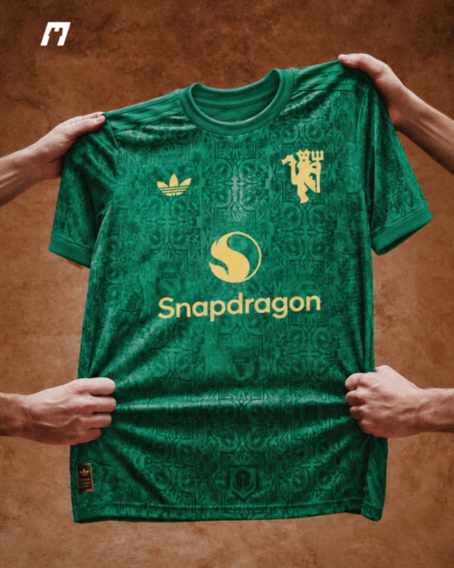
Manchester United 26-27 Fourth Kit Leaked - Green Version
Our partner @whatthekit_x have created a mockup of the green Adidas Manchester United 2026-27 fourth kit. The design features a tonal pattern inspired by the club’s heritage crests, metallic gold details and a tribute to United’s Newton Heath origins as part of the 125th-anniversary collection.
The special-edition shirt is also expected to be available in a red version.


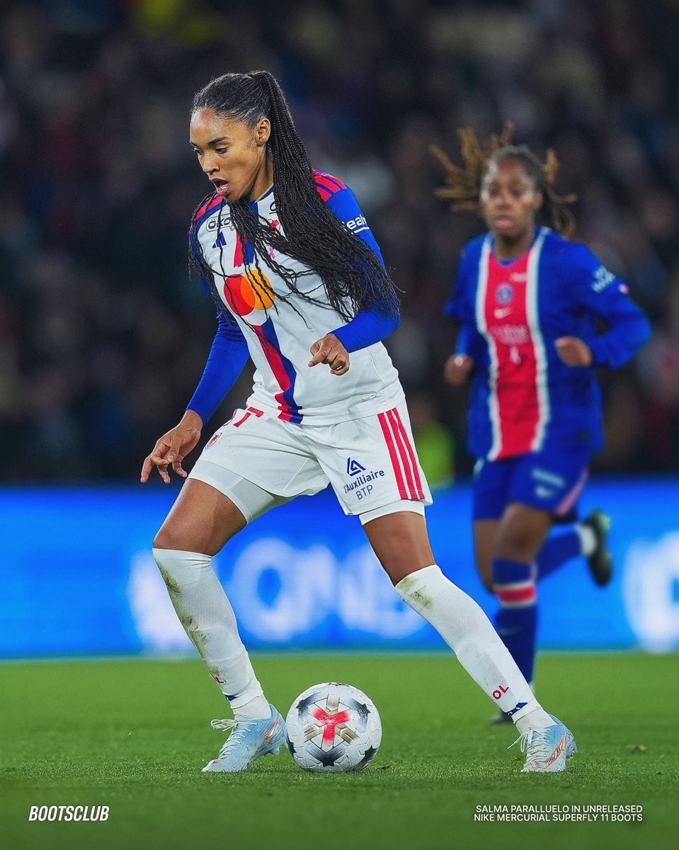
Salma Paralluelo Debuts Unreleased Nike Mercurial 'United 004' Boots
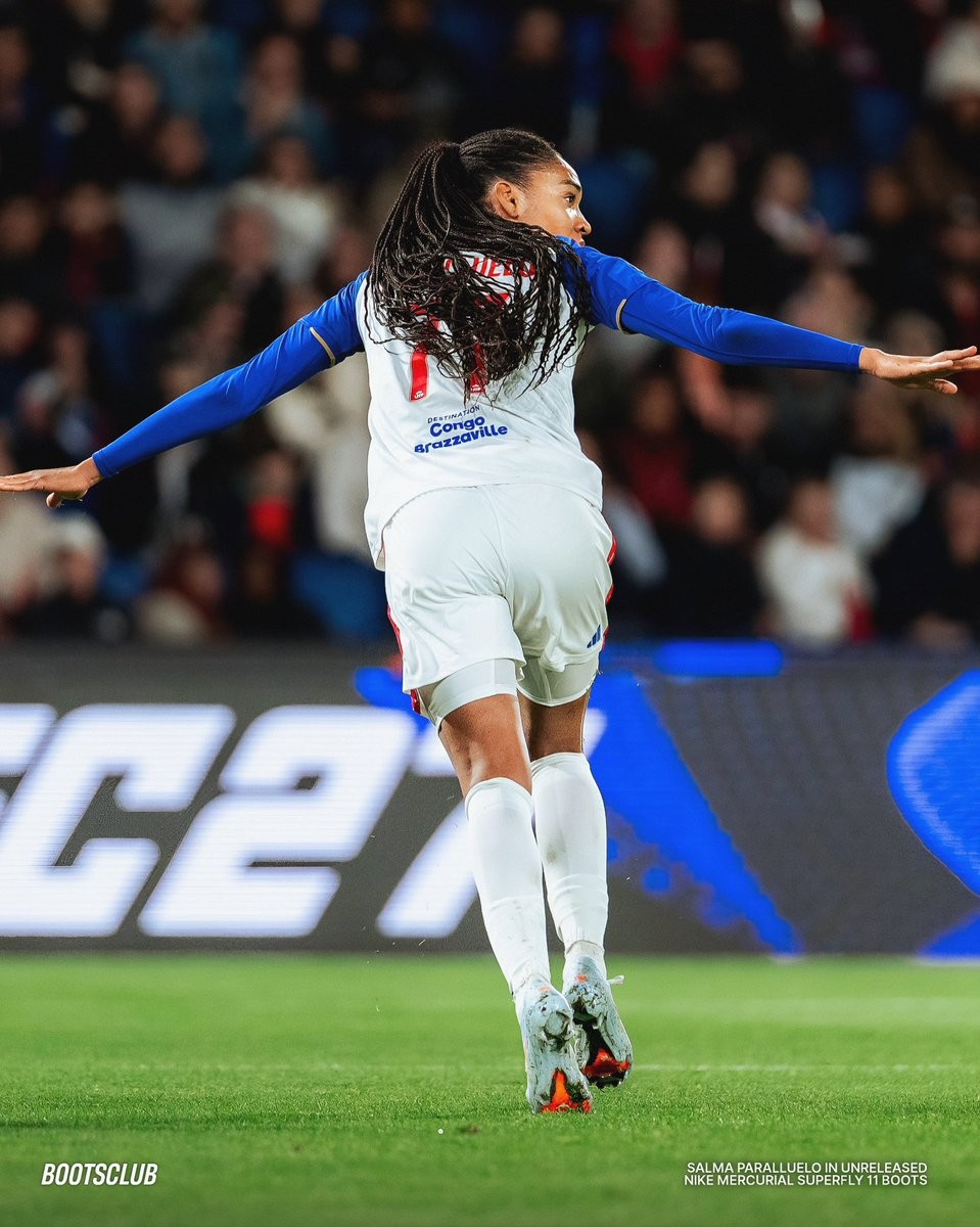
Salma Paralluelo gave the world a first on-pitch look at the upcoming Nike United 004 pack during OL Lyonnes' 4-0 league victory against Paris Saint-Germain. The Spanish forward, who delivered a goal and an assist on the night, took to the pitch in an unreleased colorway from Nike's signature women-focused series. Big thanks to bootsclub.
The boots feature a clean, icy light blue upper contrasted with bold detailing. A metallic silver Swoosh outlined in vibrant orange commands attention across the forefoot and instep, paired with matching fiery orange accents on the laces, heel branding, and stud tips. The design matches recent leaks of the upcoming United 004 edition, providing a fresh and energetic aesthetic on pitch.
Expected to launch during late 2026 for the 26-27 season, the United 004 pack is the latest chapter in Nike's athlete-led initiative shaped with insight from players such as Paralluelo, Lauren James, and Naomi Girma. Alongside the Mercurial silo, the upcoming collection will also feature the Phantom 6 and Tiempo Maestro.


Nike Mercurial 2027 'United' Pack Chapter 5 2027 Boots Leaked
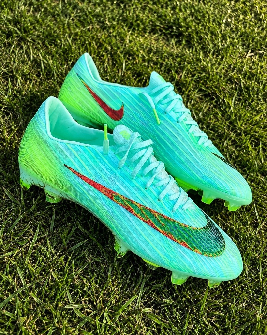
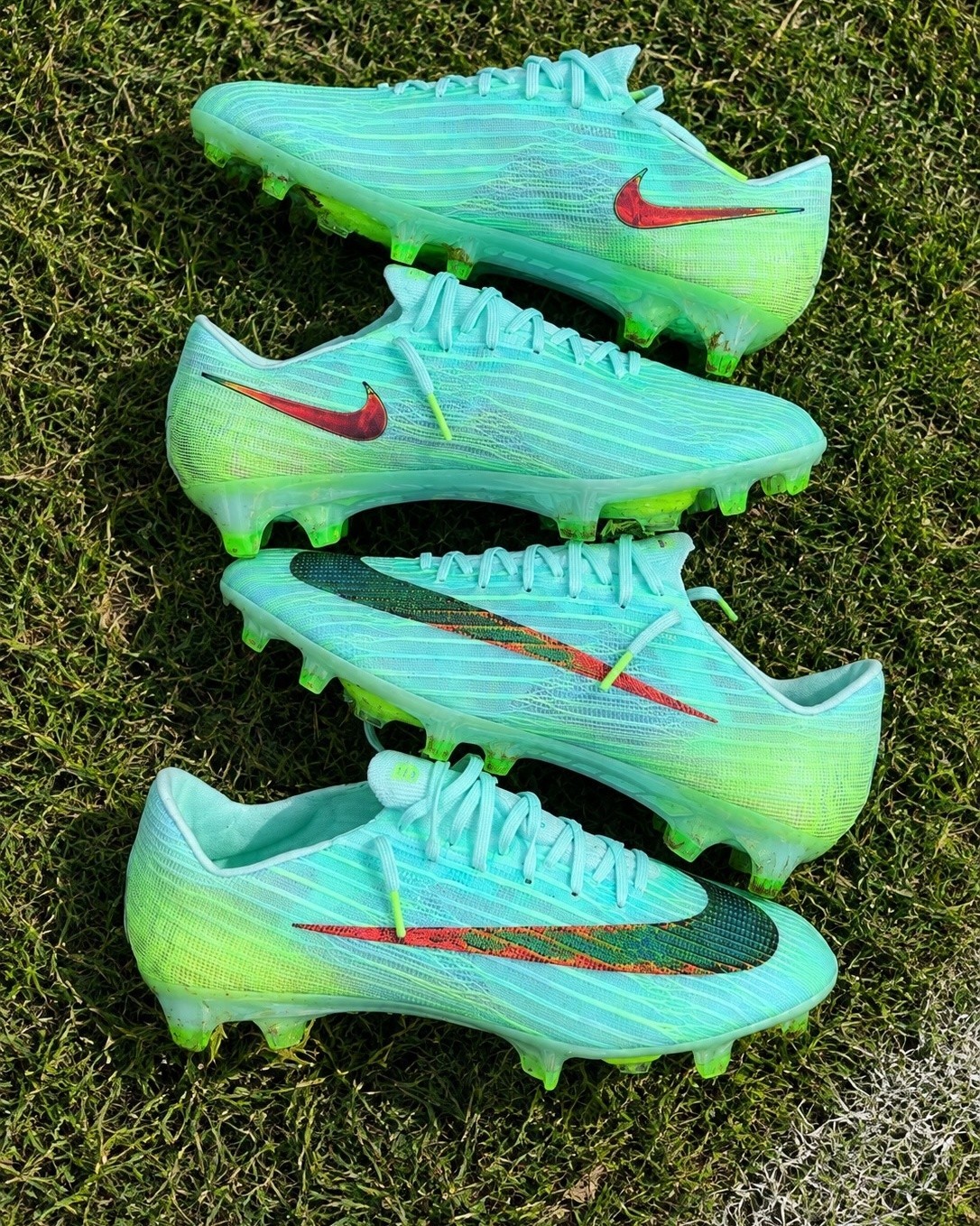
New photos of the Nike Mercurial Superfly 11 'United Pack 005' football boots have been shared by @patoeldelzapato. They are set to be launched in February 2027.
