Why We Don't Like Streamlined League Kit Fonts

Yesterday, we took a closer look at the streamlined fonts of the Premier League, La Liga, Ligue 1 and Serie A. However, while more and more leagues introduce league-wide kit typefaces(most recently Serie A and J League), we are no fans of them.

Streamlined Football Kit Typefaces - Disadvantages
Unfitting Design For Kit:


The biggest disadvantage of a having a streamlined kit font is that it often does not fit the design of the kit. In example, teams in Spain's La Liga have got a classy jersey that is destroyed by the big La Liga font.

Limited Choice Of Color:


Another big issue in several leagues with a streamlined font is that there are just a few colors to choose from. In example, the Premier League just has five different color options - the font does often not match the kit colors (in example the shade of yellow), which also causes teams to use unfitting number colors (e.g. black with Leeds' home kit).


Boring For Designers And Football Kit Fans:


What we most hate about streamlined football kit typefaces is that they reduce the number of bespoke typefaces being released and visible on-pitch. Watching Premier League matches might be interesting in terms of football but it is not in terms of kits.

Streamlined fonts have three big advantages
Of course, there are also advantages. Below are the three most logical.
Streamlined Football Kit Typefaces - Advantages
- A streamlined kit font prevent teams from having strange fonts that are hardly legibly.
- It is (might be) also good for the streamlined visual appearance of the competition.
- It makes it easier (and cheaper?) for retailers to sell custom kits with the correct font.
The only big league to have no streamlined kit font is the German Bundesliga. Custom typefaces are allowed in FIFA & UEFA competitions, including the Champions League, World Cup and Euro.


Are you a fan of league-wide streamlined kit typefaces? Comment below.


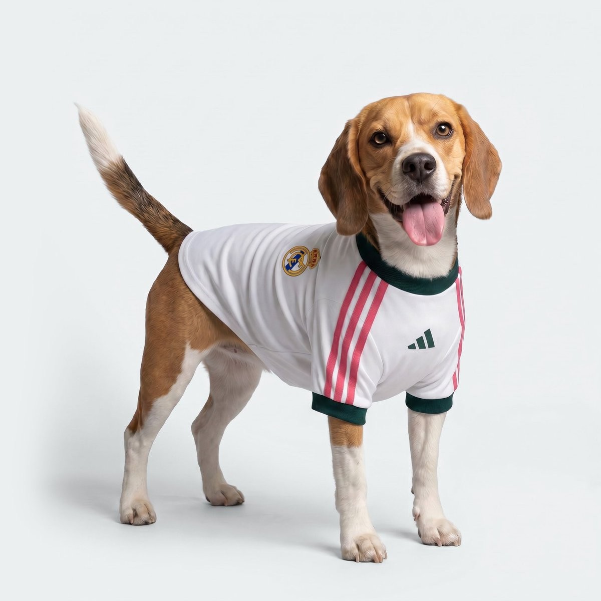
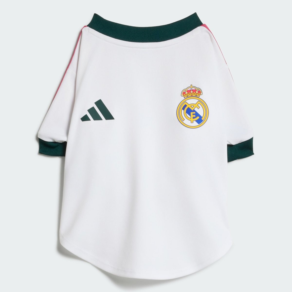
Adidas Launches Special 26-27 Dog Kit for Real Madrid
Adidas has released a dedicated kit for dogs linked to Real Madrid. The designs adapt the club's new 2026-2027 home kit.
The collection lets fans outfit their pets to match the team's look. It builds on Adidas's growing range of pet products, including similar jerseys created for select national teams ahead of the 2026 World Cup.
Arsenal Sends Kit Without Adidas Logo & Arsenal Crest
Arsenal shirt collector @NathanPanter_52 has posted images of the 26-27 home shirt bought for £136 that is missing both the Adidas logo and the club crest. The item is an official product - it is very uncommon that something like that happens.
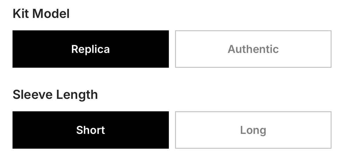
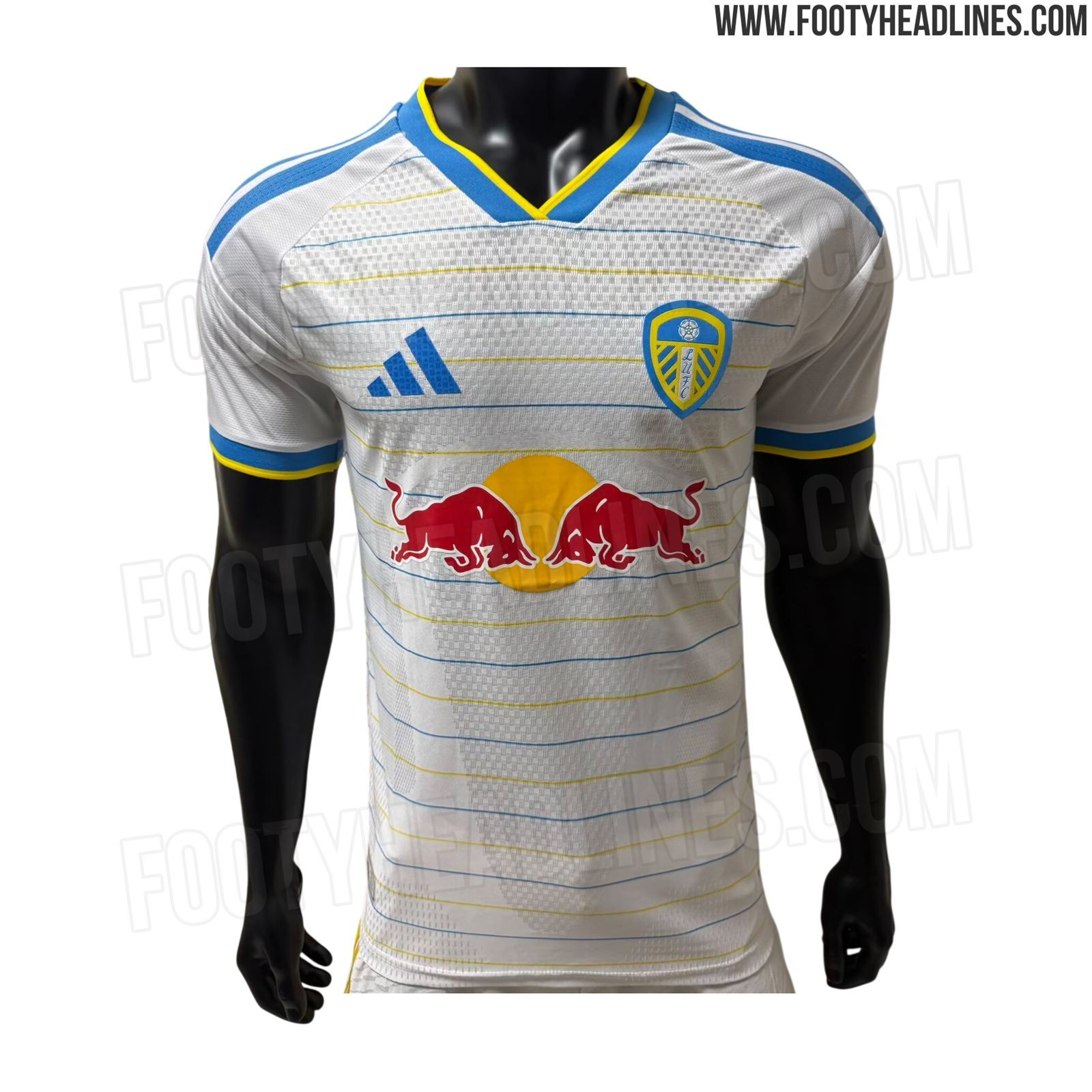
LEAKED: Adidas to Upgrade Leeds United to Local Elite Tier
As spotted by @theadelites, a new customisation option on the Leeds United club shop website allows fans to chosse between replica and authentic kits (added by error too early). This probably means that Adidas has upgraded the club from the B Premium tier to one of the Local A Elite tiers. The move gives fans the option to select authentic kits built around advanced Climacool+ performance technology.
Reports from February indicated similar upgrades for clubs including Ajax and Lyon ahead of the 2026-27 season, but Adidas apparently postponed/scrapped these. Adidas previously already upgraded British teams Celtic, Aston Villa, and Newcastle United.


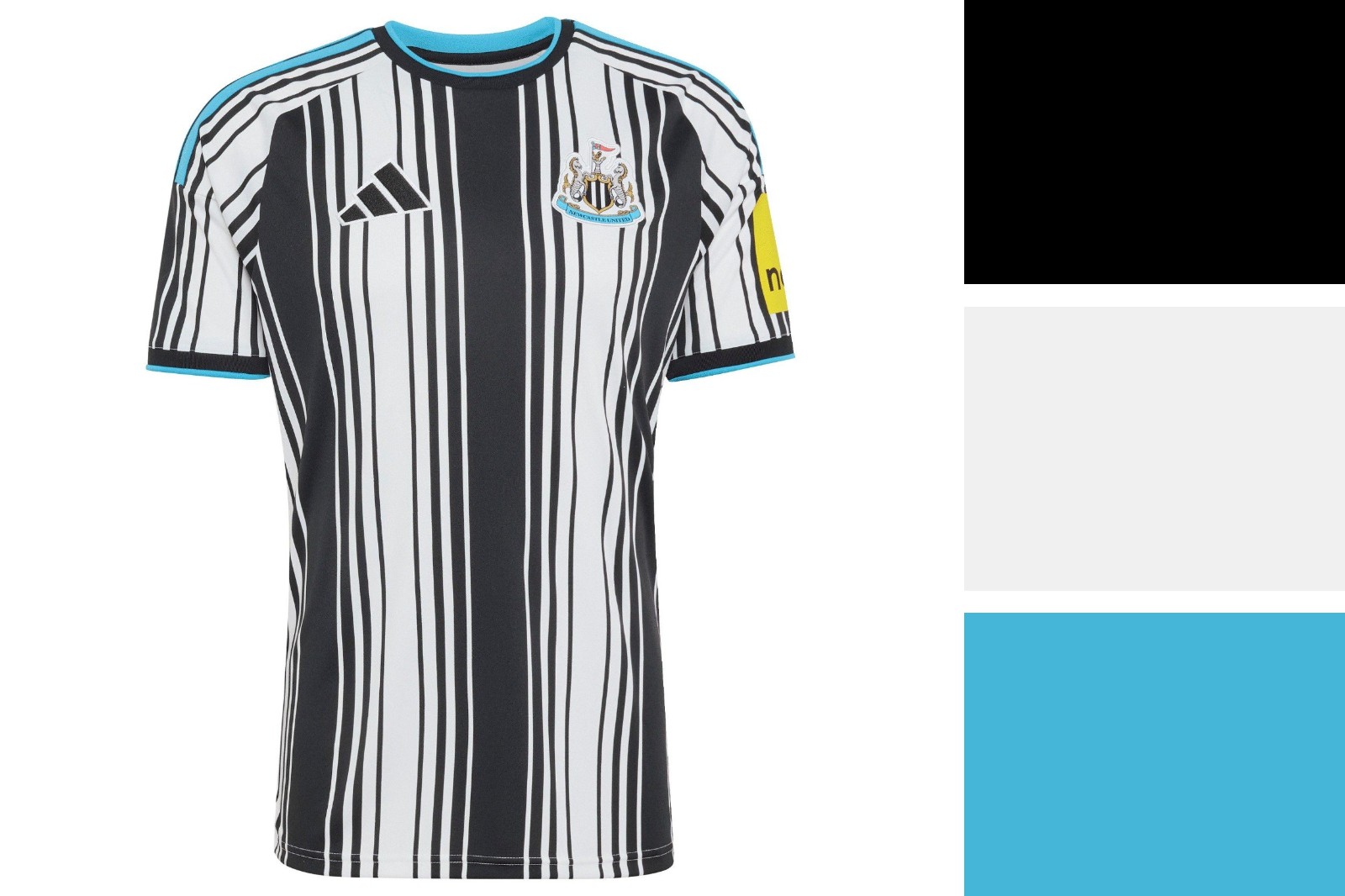
A quick color analysis of Newcastle's 26-27 home kit. It are not the colors that make this shirt bad, unlike the Madrid 26-27 kit.
