
Top Ten Away Kits of the 22-23 Season

A few days ago we gave you our list of the Top 10 Away Shirts of the 22-23 season, so today it’s time four our pick of the best away kits. Like any judgement of physical appearance, these choices are subjective and plenty of you will have different opinions, so make sure you let us hear them in the comment section.
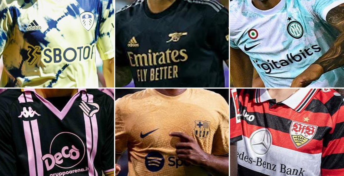

Top 10 22-23 Away Kits
Manufacturers have a little more freedom to experiment with away jerseys so often the designs can be a bit more adventurous than those of the home shirts. Plenty of clubs also have traditional away colours, although changes to these can generally be tolerated pretty well if the overall design is well executed.
Many of our top ten draw from their club’s history, while creating something that’s relevant to the more modern trends. Check them out below.
10 - Palermo

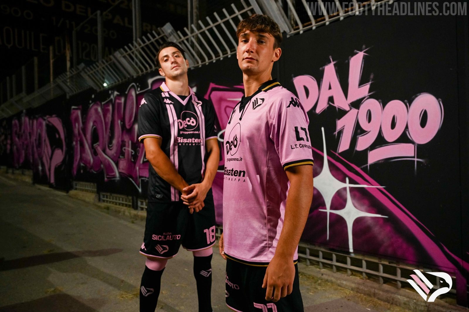
The latest acquisition of the City Football Group, Palermo launched a set of interesting shirts this summer, the black and pink away having lots of retro appeal with its symmetrical double stripes and wide collar with v insert. White trim on the collar and cuffs instead of gold may have worked better from an aesthetic standpoint, but gold has featured on the club badge throughout their history.

9 - Parma
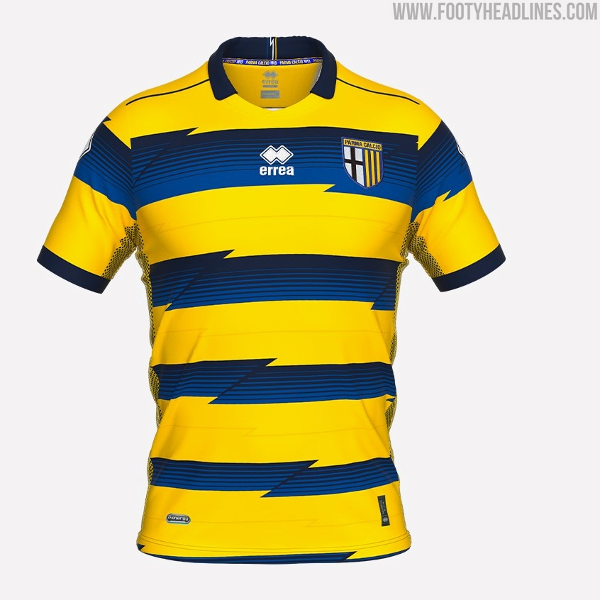


A new twist on the iconic blue and yellow striped shirts worn by Juan Sebastian Veron, Hernan Crespo, Lilan Thuram and Fabio Cannavaro during the club’s glorious late 90s to early 00s era. The jagged lines are a minor change and are executed better than some other attempts to introduce variety to striped shirts.

8 - Barcelona
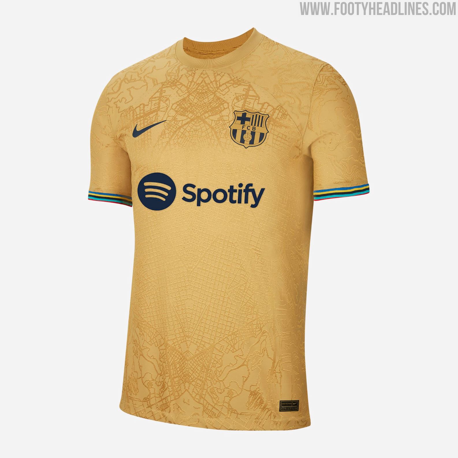


Map graphics are all the rage this season and this Nike effort for Barcelona is among the most impressive. The shirt is inspired by the 1992 Olympic Games that were held in the city, the gold base referencing the medals and the colours of the Olympic rings incorporated brilliantly in the cuffs. A map of Barcelona is woven into the fabric and applied in a mirrored fashion giving a symmetrical print on the torso.

7 - Leeds
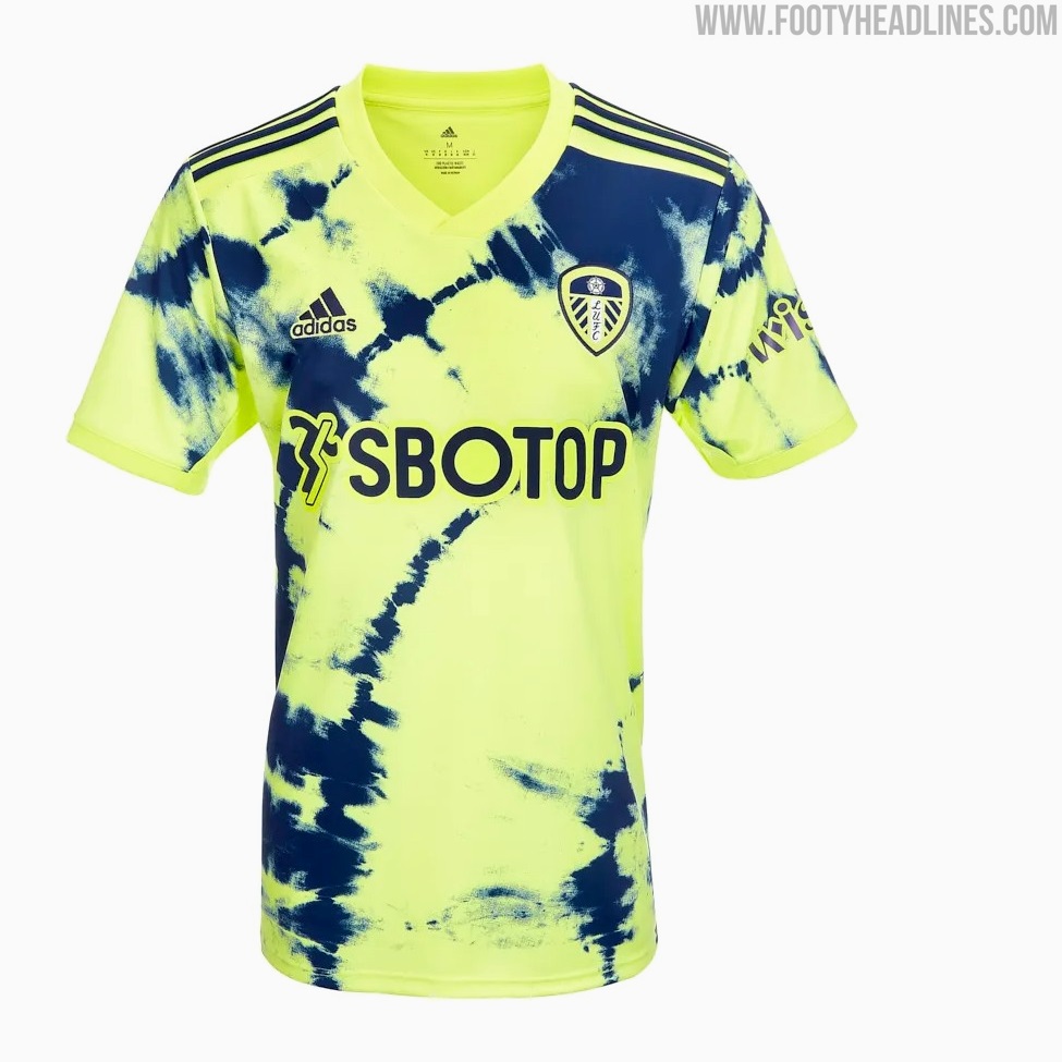

This kit would surely be flying off the shelves if the club could actually get their hands on the shipments. Tie-dye is nothing new, having been around since the 60s, going in and out of fashion before seeing a huge resurgence in recent years. Adidas have played around with it before but it's been done to great effect here by using the club’s traditional away colours while creating something unlike any of their previous yellow and blue kits.

6 - Brondby


Created in collaboration with a small group of fans and a local tattoo artist, sketches showing off the club’s origins and identity were sublimated onto the fabric, it’s safe to say this one went down well with the supporters. This shirt became the fastest selling in Brondby’s history. It's not the first time we’ve seen tattoos implemented into a design, but the all-over application, the blue on blue tones and its authenticity give it an edge. Solid colourway too.

5 - Lazio


Lazio featured on our list of best home kits and they’ve done it again with their away shirt. The black lines of the gradient chest band really accentuate the curvature around the Mizuno logo and create a sense of motion, which seems like the perfect accompaniment to the runbird. The blue and yellow are vibrant but are proportioned expertly to the black base. As if that wasn’t enough, it has the retro badge too. Really stellar work from Mizuno, let’s hope this partnership keeps churning out more beauties over the next few seasons.
4 - Valencia
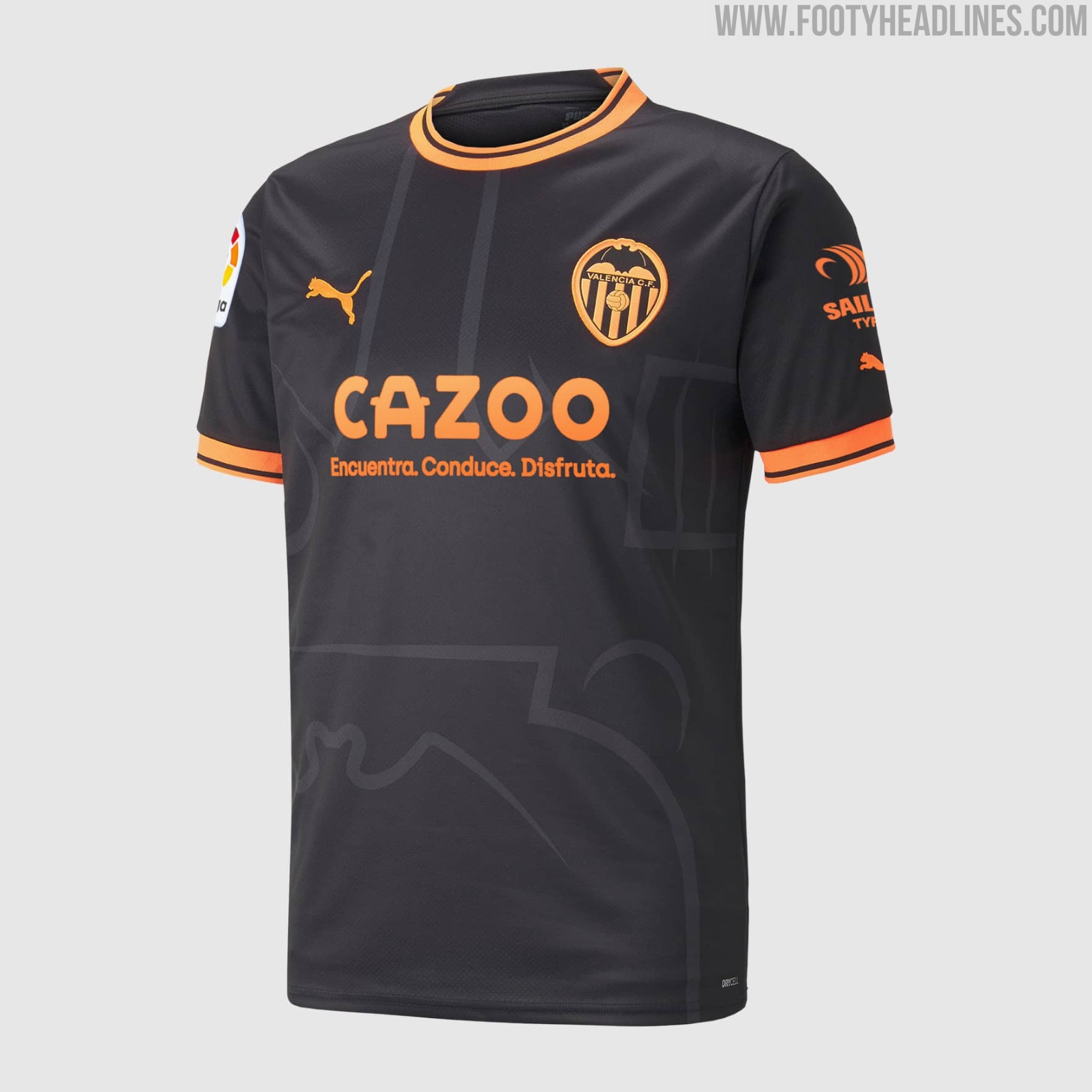
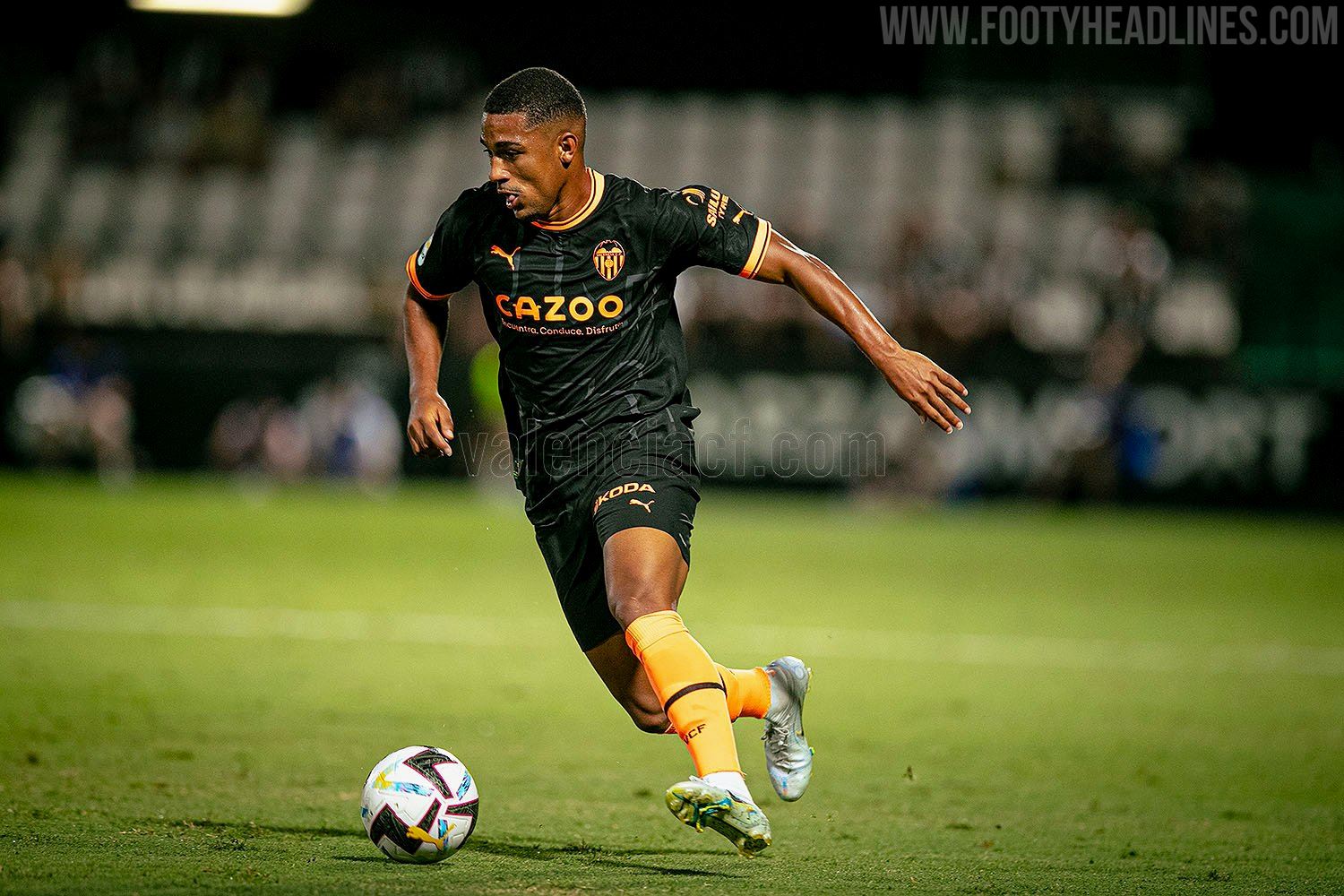
Another case of excellently proportioned main to accent colours. The same template as Man City’s home shirt, it's allowed to really shine here thanks to the two tone colour scheme and the stark contrast of orange on black. When sponsors are flexible enough to allow their logos’ colours to be changed, it can really do wonders for the shirt’s overall aesthetic. These two colours have been used frequently for Valencia away shirts, so its already got some identity to it, but the enlarged badge graphic elevates it further.
3 - Arsenal


Black and gold may have been done to death over the last couple of seasons, but this Arsenal shirt doesn't just rely on a tried and tested colourway (and technically it’s also black and bronze, according to Adidas). The simplified cannon badge instantly improves any Arsenal shirt and the AFC lettering print gives just enough of a retro tinge to what is a very modern shirt. Adidas haven’t put a foot wrong since they started making Arsenal’s kits and this shirt has set the bar even higher again.

2 - Stuttgart


Very likely the most faithful throwback kit produced by a brand different from the original manufacturer, Stuttgart’s 22-23 away kit is a tribute to the one they wore from 1997 to 1999. Jako even included Adidas’ the three stripes on the collar, but they obviously couldn’t go as far as putting them on the shoulders too. The jako logos and dots that replace them are probably the shirt’s weakest feature, but hats off for how the Mercedes logo is incorporated seamlessly into the striped design.

1 - Inter
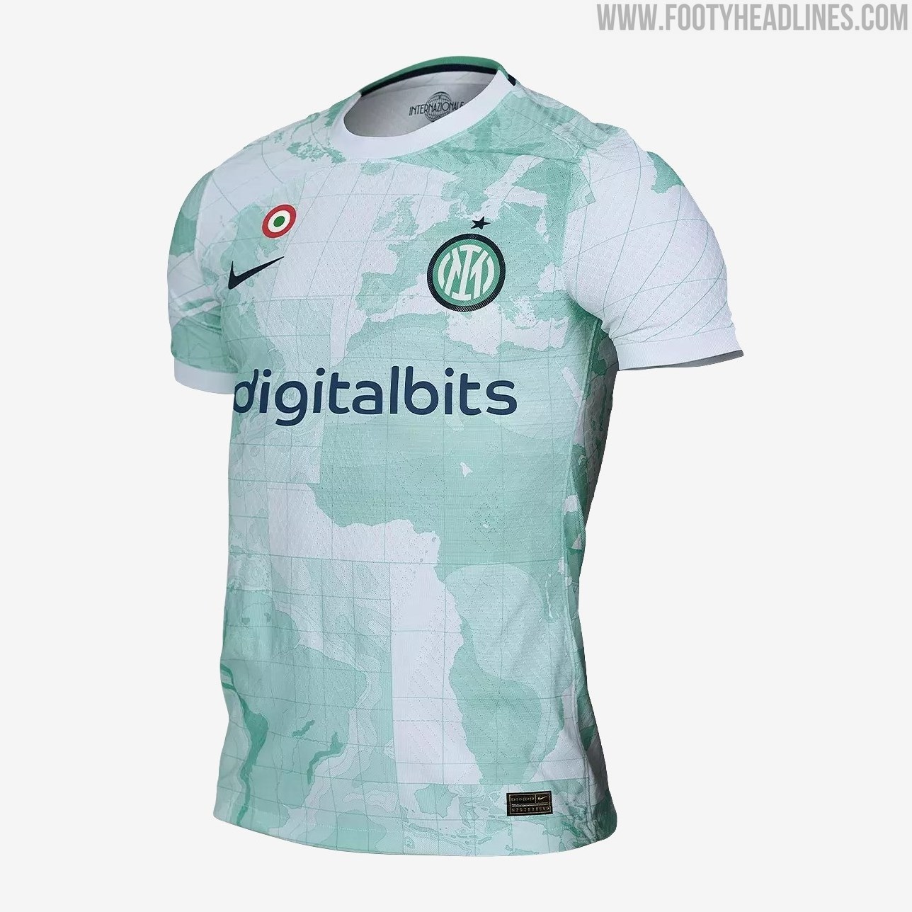

Contrary to the common popular theme of putting a map of the club’s home city on the shirt, Inter went bigger and better and splashed a mint green map of the whole world across their away jersey. This is in reference to the club’s origins as a splinter club open to players of any nationality (as opposed to AC Milan who limited the number non-Italians who could join), and the relatively neutral choice of colours prevent it from being over-imposing. This Nike template has its fair share of critics but this design manages to get the best out of it.

What do you think of our top ten away shirts? Some of them not worthy of their place? Any glaring omissions? Tell us what you’d change in the comments.
Brazilian Clubs Defend Betting Sponsors
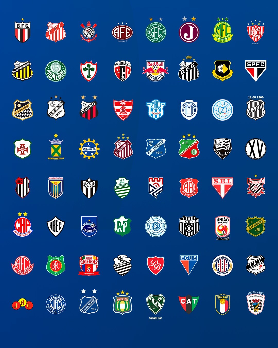
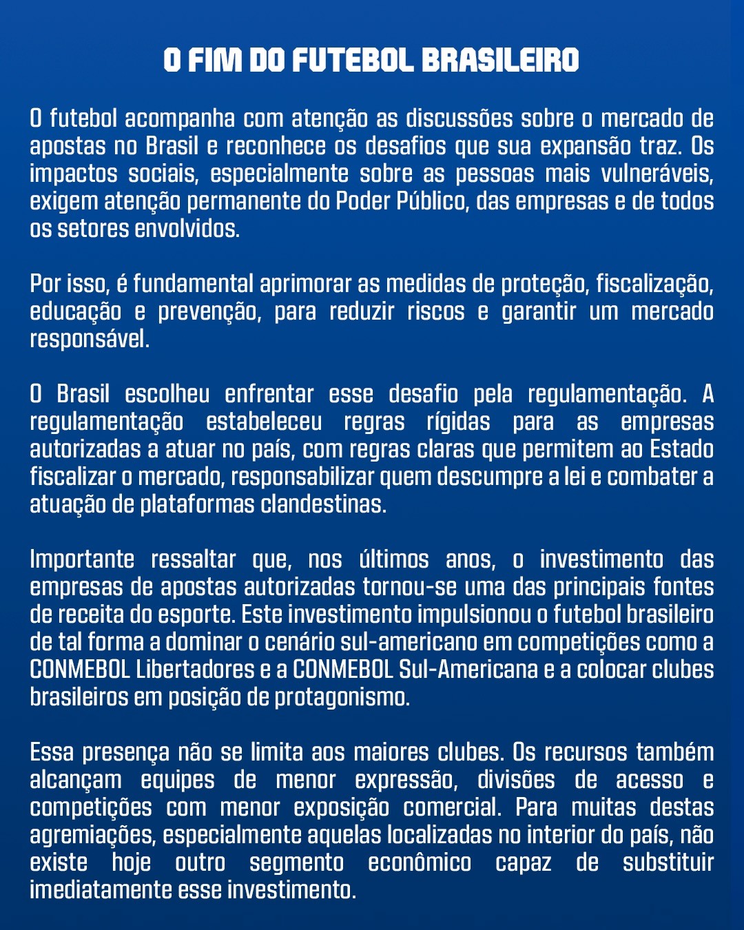
Corinthians, Palmeiras, São Paulo and Santos have joined forces with the São Paulo Football Federation (FPF) and other Brazilian football bodies to push back against possible restrictions on betting, warning that major changes could have a serious financial impact on the sport.
The reaction comes as the Brazilian government prepares a possible executive order to ban online casino operations, while further restrictions on sports betting are still being discussed. Clubs are concerned that tighter rules could put existing sponsorship deals and an important source of football revenue at risk.
And the numbers show why. 13 of the 20 Série A clubs currently have a betting company as their main shirt sponsor, with the combined value of these deals estimated at more than R$1 billion per season. Flamengo (Betano), Fluminense (Superbet), Botafogo (Vbet), Palmeiras (Sportingbet), Corinthians (Esportes da Sorte), São Paulo (Superbet)...
The debate comes as major European leagues have moved in the opposite direction. Italy introduced a broad ban on gambling advertising and sponsorship in 2018, while Spain introduced strict restrictions covering betting advertising and shirt sponsorships from the 2021-22 season. In England, Premier League clubs agreed to remove gambling sponsors from the front of matchday shirts from the 2026-27 season, although other forms of gambling partnerships remain possible.
What do you think of Brazilian clubs pushing back against possible betting restrictions? Let us know your thoughts in the comments below.

The Woltemade Effect: Juventus Squad Follows Striker With Major Long-Sleeve Switch
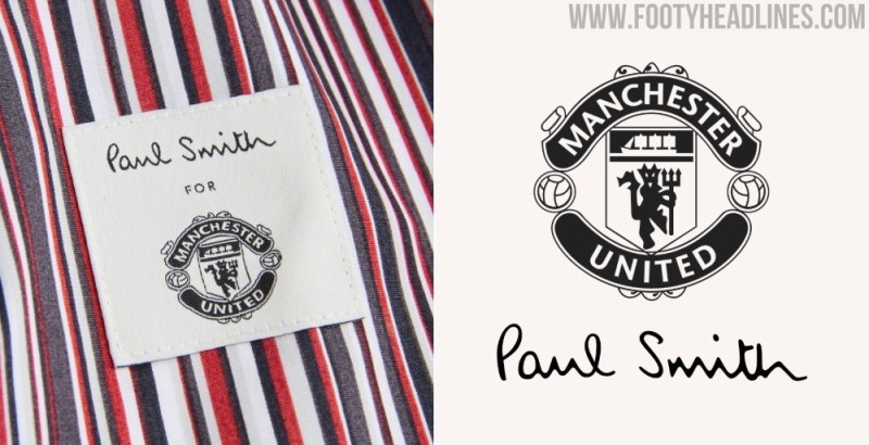
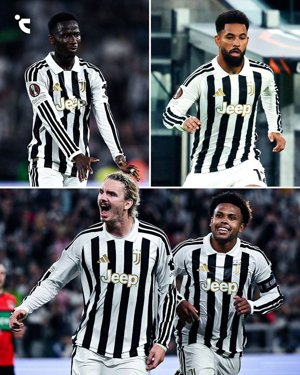
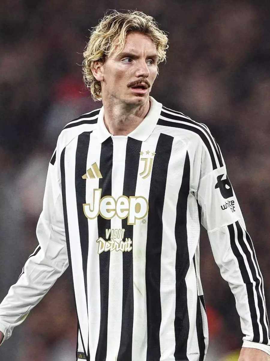
Nick Woltemade's arrival at Juventus has sparked an unexpected kit trend in Turin. After the German forward made headlines by debuting a long-sleeved home shirt against AC Milan—becoming the first Bianconeri outfield player in over 12 years to wear an official long-sleeve match kit—his teammates are now following in his footsteps.
The trend reached new heights in Juventus's recent European clash against NEC, where six players took the pitch in long sleeves. Alongside Woltemade, starters Weston McKennie, Douglas Luiz, and Pape Matar Sarr all lined up with full-length sleeves, while substitutes Randal Kolo Muani and Teun Koopmeiners also sported the look off the bench. Interestingly, Douglas Luiz demonstrated that switching to the classic silhouette takes some getting used to, as the Brazilian midfielder changed back into a short-sleeved jersey for the second half.
The sudden revival of long sleeves on the pitch is made possible by Adidas reintroducing authentic long-sleeved player shirts for the 26-27 season. For more than a decade, outfield players at Juventus and across Europe were generally restricted to short-sleeve kits paired with compression baselayers.
With Woltemade leading the charge and half of the Juventus outfield lineup already embracing the design, the retro aesthetic looks poised to spread even further across Serie A this season.
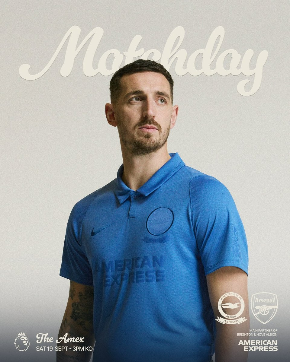
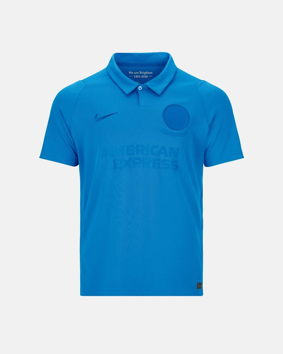
Brighton to Debut Special Nike 125th Anniversary Kit Against Arsenal
Brighton & Hove Albion are debuting a special limited-edition Nike 125th anniversary kit today in their Premier League encounter against Arsenal at the Amex Stadium. The match was selected to mark 125 years since the club's formation, being the closest home fixture to the anniversary of Albion's first-ever competitive match on September 21, 1901.
Crafted by Nike, the commemorative 26-27 shirt takes direct inspiration from the club's earliest kits from the 1901-02 season. Built around a clean mountain-blue base, the design leans heavily into an understated retro aesthetic. It features a classic polo collar, tonal blue branding for both the Nike Swoosh and the American Express front sponsor, and a matching tonal crest underlined with a '125 YEARS' ribbon. An internal collar graphic completes the look with the words 'We are Brighton 1901-2026'.
Initially launched in May 2026 alongside a limited run of 1,901 collector box sets, this unique kit is being worn as a strictly one-off tribute on the pitch.
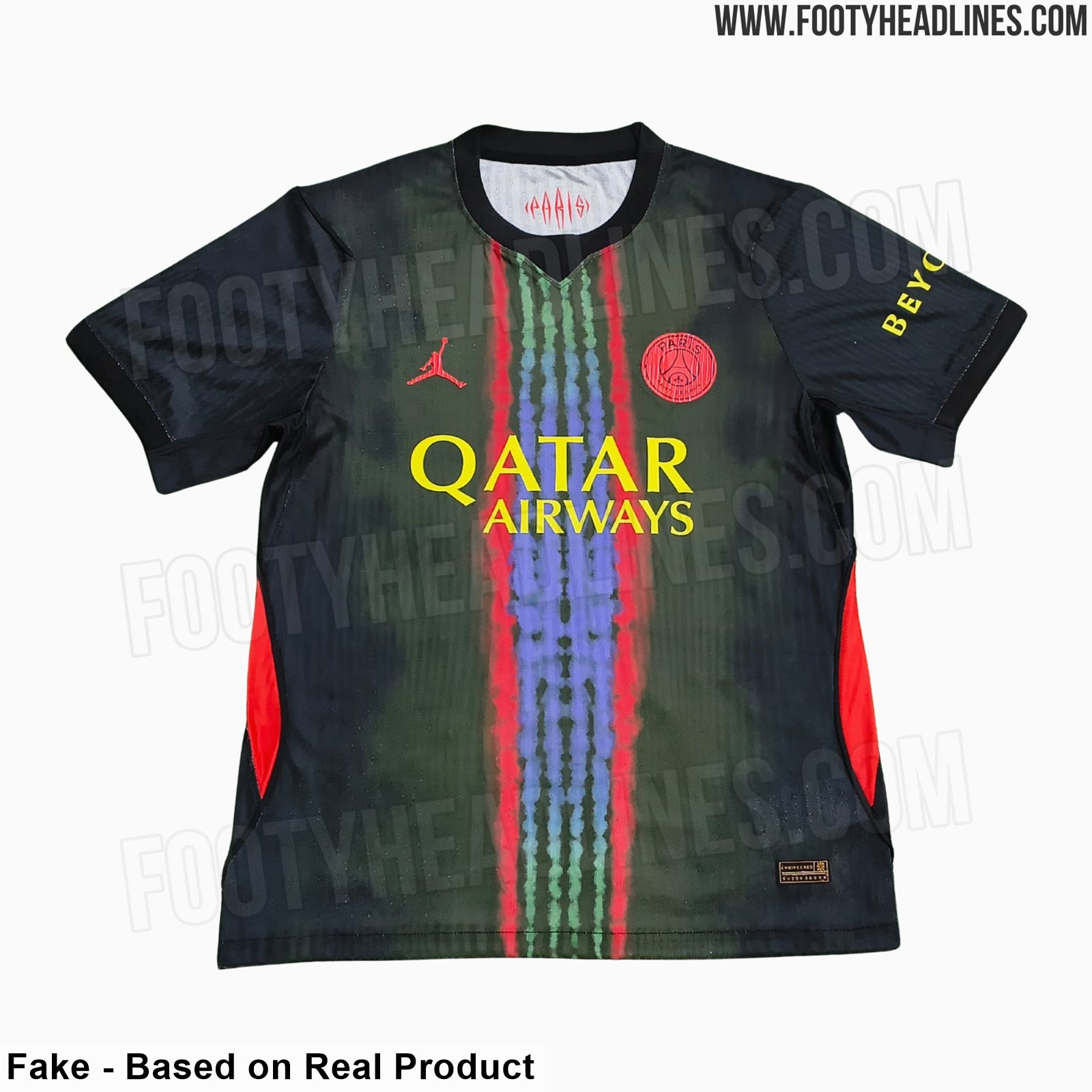
PSG 26-27 Third Kit Leaked - 9 New Images
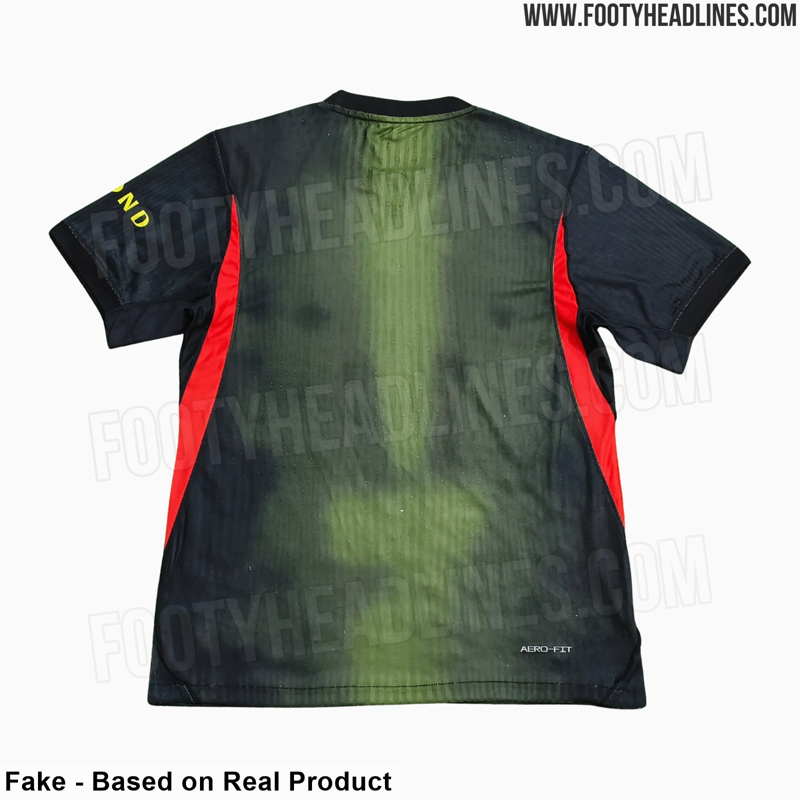
Footy Headlines can now leak 9 new pictures of the PSG 26-27 third kit. Although it is a fake, the design is identical to the real one.
The PSG 2026-2027 third kit has a striking look, predominantly black with red and multicolor elements, including red/yellow logos and red panels, and is made by Jordan.
The standout feature of the kit is a unique take on the team's classic Hechter design, which includes a multicolor center stripe merging blue, green, and red.
St Johnstone 26-27 Third Kit Released
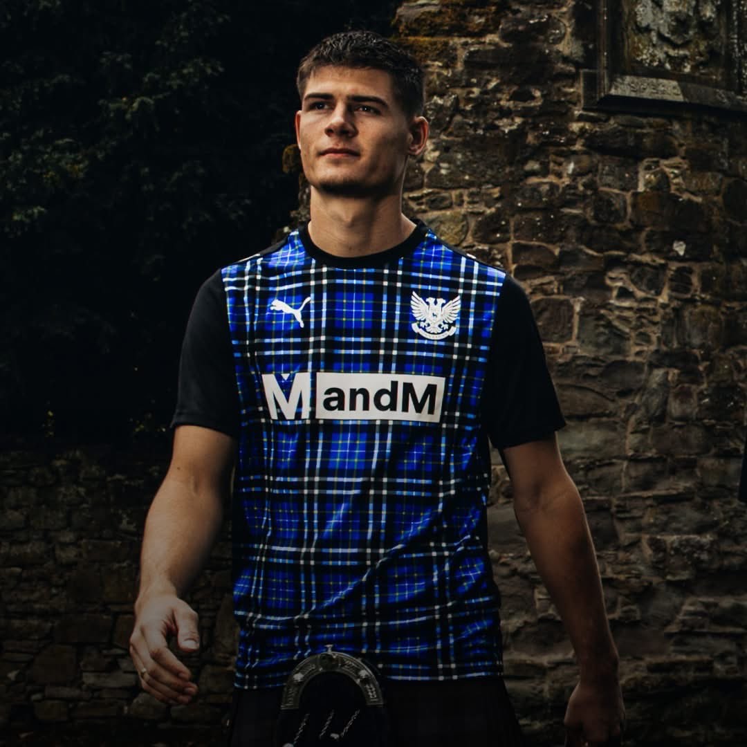
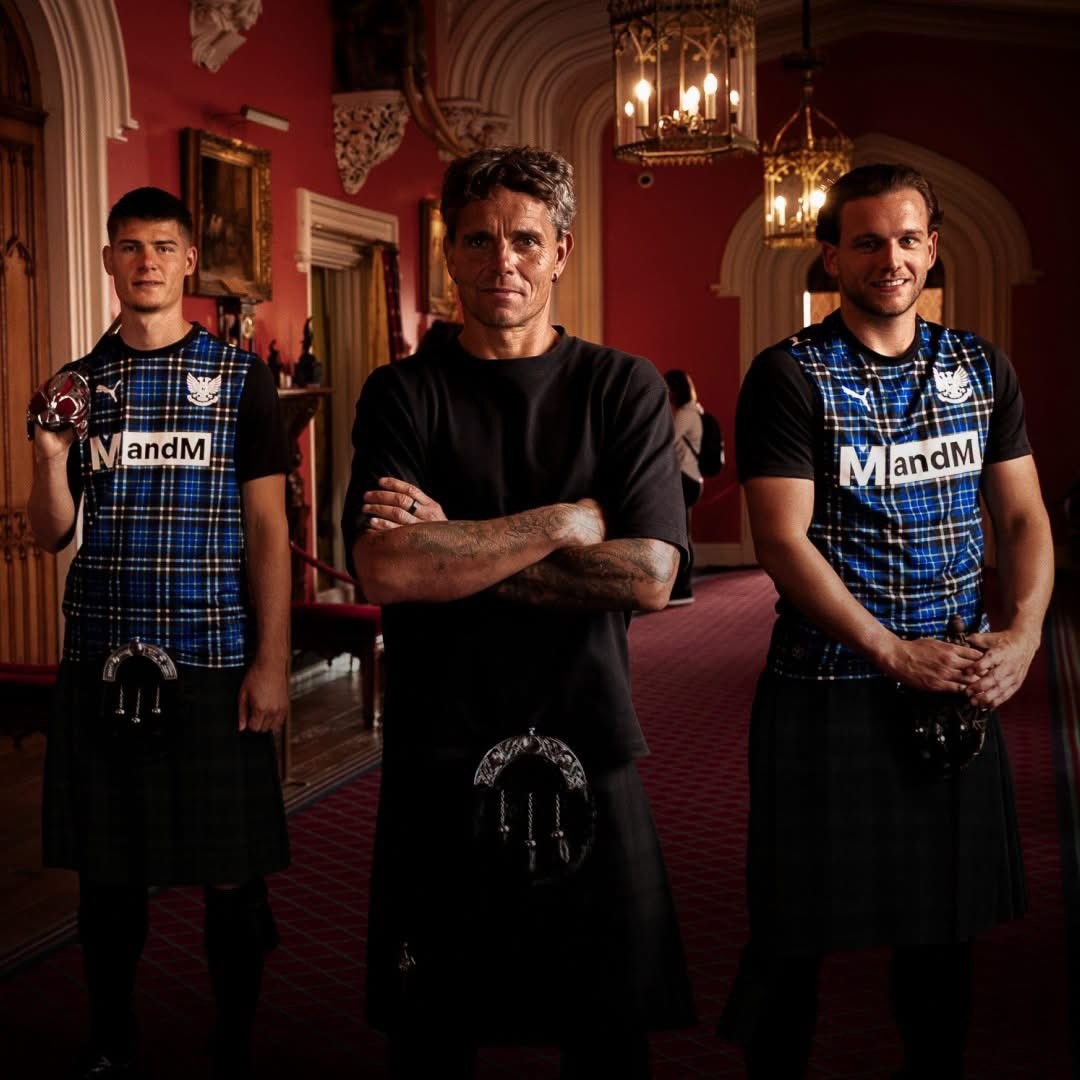
Scottish Premiership side St Johnstone has officially unveiled its new third kit for the 2026-27 season. Crafted by Puma as part of their partnership running through 2029, the striking strip celebrates regional pride with a launch photoshoot set against the backdrop of the historic Scone Palace.
The Puma St Johnstone 2026-27 third shirt combines a black base with the club's official St Johnstone tartan printed vibrantly across the front panel. Solid black covers the sleeves, back, and crew neck collar, allowing the intricate blue, black, and white pattern to take center stage. Clean white branding completes the look, featuring Puma cat motifs, a monochrome St Johnstone crest, and the MandM front sponsor.
Continuing the club's tradition of utilizing tartan accents on alternate strips, the new third kit made its competitive debut against Falkirk at McDiarmid Park. It completes the Saints' kit set for the 26-27 campaign alongside the previously unveiled royal blue home and yellow away shirts.
UD Ibiza 26-27 Third Kit Released
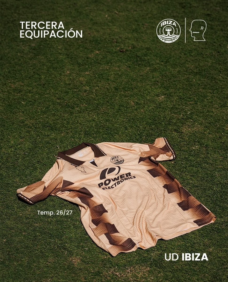
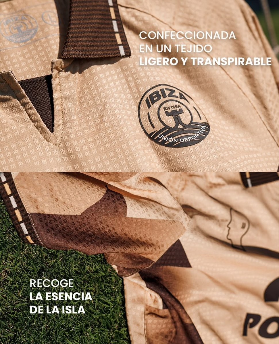
Spanish club UD Ibiza has unveiled its new third kit for the 26-27 season, continuing the unique aesthetic created in collaboration with cult streetwear collective Brain Dead. The creative label took over technical sponsorship duties from Puma ahead of the campaign, delivering bespoke designs that merge island identity with contemporary culture.
The UD Ibiza 26-27 third shirt is built around an earthy sand and gold base with an all-over micro-pattern fabric texture. Striking dark brown stepped chevron and gradient blocks run along the sides and down the sleeves. A retro polo collar in dark brown is highlighted by dashed edge trim, which is also repeated on the sleeve cuffs.
Brain Dead's signature head profile logo is placed on the right chest opposite a monochrome UD Ibiza crest on the left. Long-standing club sponsor Power Electronics is applied across the center chest in dark brown to round off the design.
Bespoke Rose Pattern: Ternana Femminile 26-27 Third Kit Released
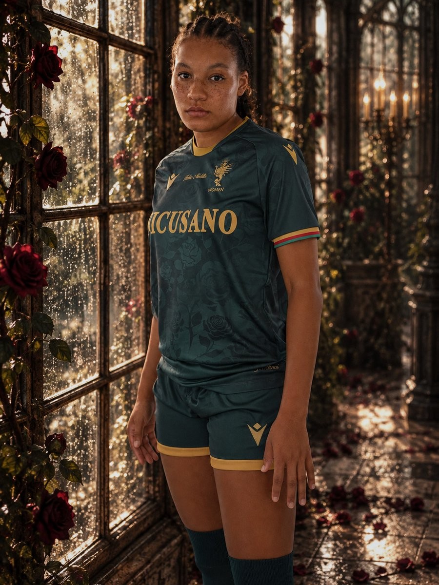
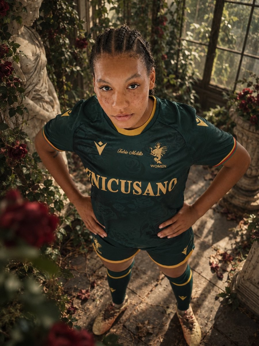
Italian Serie A Femminile side Ternana Women have officially unveiled their new 26-27 third kit, made by Macron. Continuing the bespoke thematic storytelling seen across their home and away uniforms this season, the alternative strip is centered on the concept of nymphs and the symbolic figure of the rose. The design explores the balance between elegance and resilience, using the motif of blooming roses and protecting thorns to reflect the team's identity.
The Macron Ternana Women 26-27 third jersey is built around a deep dark green base decorated with an intricate, tone-on-tone all-over jacquard graphic featuring roses, stems, and thorns. Metallic gold details appear throughout the kit, coloring the crew-neck collar trim, the Macron Hero logos, the Unicusano sponsor print, and the club crest featuring the mythical Thyrus dragon. A discreet tri-color cuff detail in red, green, and yellow adds a touch of classic club identity to the sleeves.
As with the rest of the club's collection, the shirt prominently features the name of former coach Fabio Melillo scripted in gold across the center chest in an ongoing tribute following his passing in 2024. The club's familiar motto "Attimi eTERNI" is stamped on the back of the neck. Dark green shorts with matching rose-patterned side panels and dark green socks complete the new strip.