Is Japanese Football Losing Its Identity?
 Dec 25, 2023, by Chris

- Logo Changes: Several Japanese football teams, including Nagoya Grampus, FC Tokyo, and Gamba Osaka, have recently updated their logos with more modern and simplified designs.
- Mixed Reactions: These logo changes have generated mixed reactions from fans, with some viewing them as a positive modernization and others as a loss of the sport's historical identity.
- Wider Trend: The trend of modernizing football logos isn't exclusive to Japan, as similar changes have been seen in South Korea, while it has plateaued in Europe.
Japanese football teams are undergoing a significant transformation with many choosing to abandon their traditional crests for more modern and simplified designs. Is this a change for the better or an identity crisis?
😥 Japanese football is losing its identity pic.twitter.com/eMICbItNkT
— Footy Headlines (@Footy_Headlines) December 23, 2023

Change for the Better or Identity Crisis? Japanese Teams Radically Update Logos
Two J-League teams, Nagoya Grampus and FC Tokyo, have both released new logos for 2024, which have received mixed reactions from fans. in 2022, Gamba Osaka also changed their logo, even more radically than the other two.
The trend is not limited to Japan alone, with Korean team Ulsan Hyundai and the South Korean Football Federation launching all-new crests as well.


European clubs surely had been at the forefront of the "innovation", but the trend seems to have stopped in Europe for now.
While some argue that the new logos are more fitting for the modern age, others feel that the changes are stripping Japanese football of its 1990s identity, when the pro league was founded.
Nagoya Grampus 2024 Logo

The new Nagoya Grampus logo ditches many of the previous elements while completely changing the appearance of the existing ones. In the center of the new Nagoya Grampus logo is a modernized graphic merging the traditional NGE letters and Risso's dolphin.
All-New Nagoya Grampus 2024 Logo Released
FC Tokyo 2024 Logo

The new FC Tokyo logo has a much more simple and modern look than the old crest. According to the club, "It is a fusion of the club's rich history and innovative spirit, representing the club's commitment to pushing boundaries and becoming a more inclusive and representative club".
All-New FC Tokyo Logo Released
New Gamba Osaka 2021 Logo

The new Gamba Osaka emblem features the acronym "G" for Gamba Osaka, which is made up of three elements: flame, heart, and goal.
All-New Gamba Osaka Logo Released - Juventus Style
All-New South Korea Logo Revealed
Do you think more Japanese clubs will follow? Is this transformation necessary for the development of Japanese football, or is it taking away from the sport's rich heritage? Let us know in the comments below.

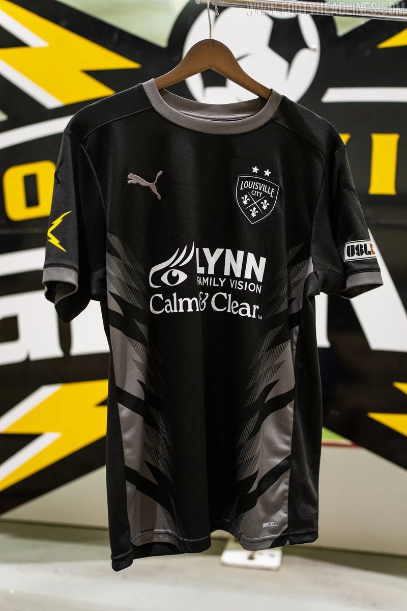
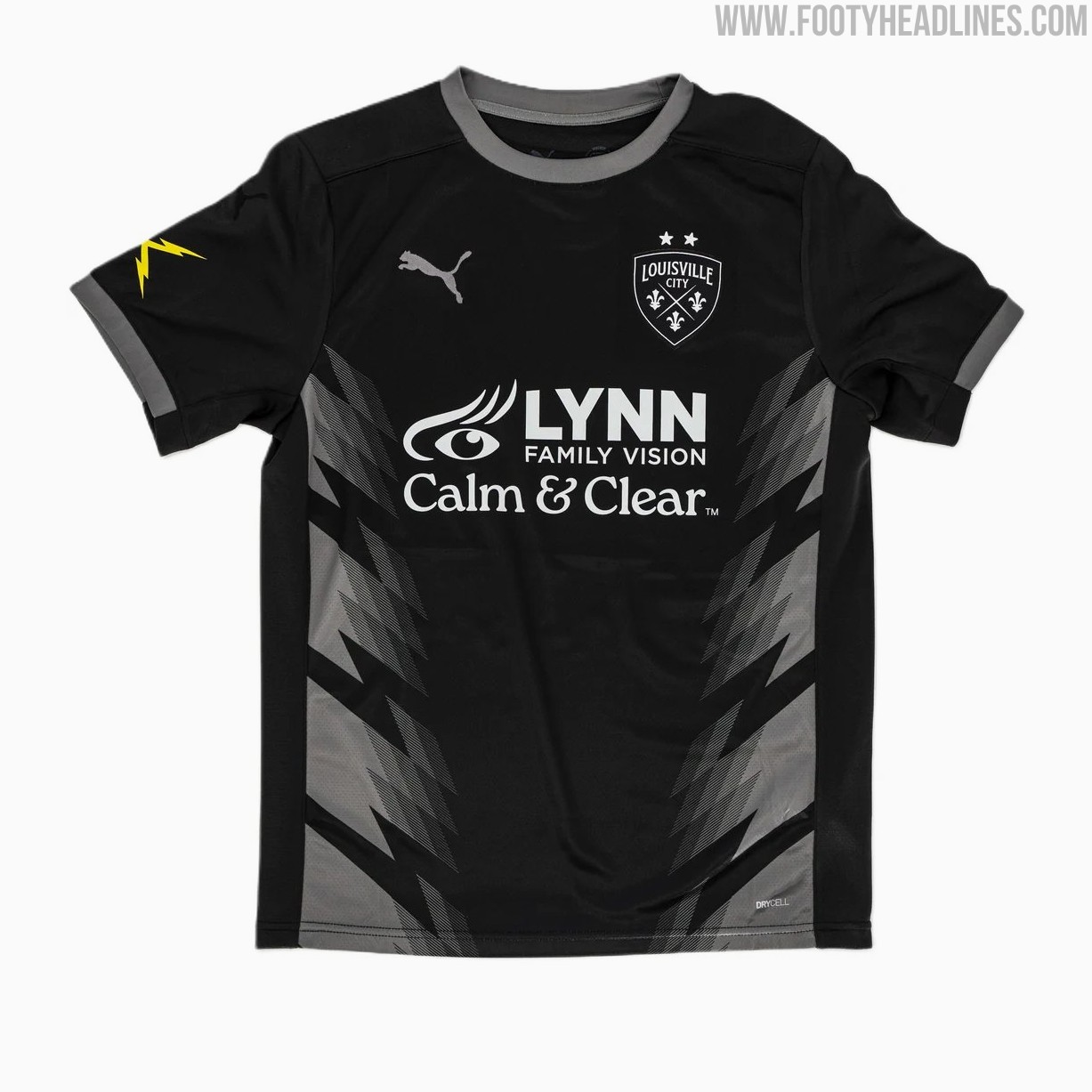
Louisville City 2026 Third Kit Released
USL Championship side Louisville City FC has officially unveiled its new Puma 2026 third kit, completing the team's jersey set for the 2026 season.
Dubbed the "Lightning Kit," the predominantly black uniform honors late club founder Wayne Estopinal and the former Louisville Lightning indoor soccer team that played from 2009 to 2012. The shirt features a subtle chevron stripe pattern across the front inspired by storm clouds, while striking yellow lightning bolts decorate the right sleeve. Rounding out the look with matching black shorts, the 2026 third jersey joins the previously released home and away options and is now available for purchase through the official club store.


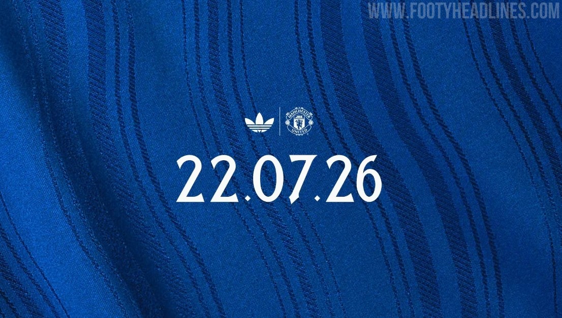
Manchester United 26-27 Away Kit Teased
Manchester United has officially teased its upcoming 26-27 away kit, confirming that the new Adidas shirt will be released on Wednesday, 22 July 2026. Following a series of leaks and an early appearance by British rapper Stormzy wearing the unreleased shirt, the official launch will finally officially unveil the blue design that pays homage to the River Irwell and the club's classic 1988 away kit.
Manchester United 26-27 Away Kit Leaked - 14 Official Images
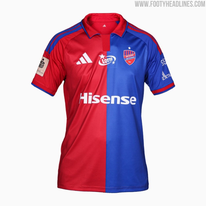
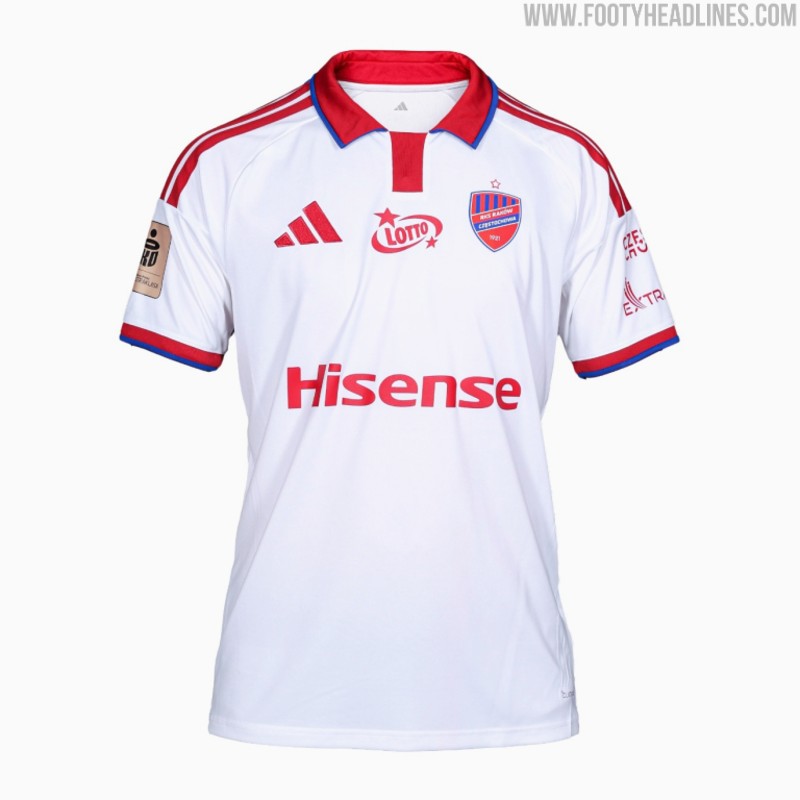
Raków Częstochowa 26-27 Home & Away Kits Released
Polish club Raków Częstochowa has officially released its new 26-27 home and away kits, made by Adidas. Launched under the slogan "Colors that oblige - this is our DNA, this is our identity," the new strips will be worn during the upcoming Ekstraklasa campaign.
The new Adidas Raków Częstochowa 26-27 home and away shirts both feature custom looks with Adidas' 2026 polo collar.