What Is the Most Iconic Shirt Sponsor in Football History?
 33 minutes ago, by Phan Tich Giay
- Cultural Significance of Shirt Sponsors: Shirt sponsors have transcended commercial deals to become indelible visual markers in football, intrinsically linked to glorious triumphs, legendary players, and pure nostalgia for fans and collectors.
- Diverse European Sponsorship Legacies: European powerhouses like Real Madrid, FC Barcelona, and Atlético Madrid have developed distinct sponsorship histories, including long-standing partnerships such as Inter with Pirelli and Liverpool with Carlsberg, and unique arrangements like Atlético's rotating Columbia Pictures deal.
- Iconic South American Club Sponsors: South American football culture also features legendary sponsor branding, with examples like Boca Juniors' Quilmes and River Plate's Budweiser being strongly associated with their historic rivalries and highly desired by retro kit collectors.
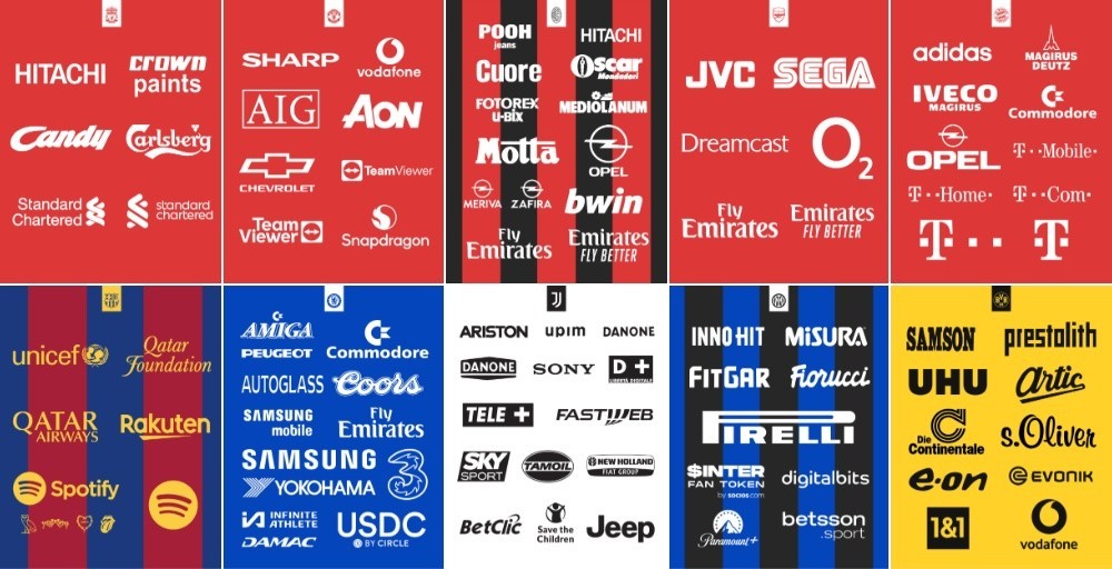
Shirt sponsors have defined the aesthetic of football kits for over four decades. For many fans and shirt collectors, the logo plastered across the chest is inextricably linked to glorious trophy triumphs, legendary players, and pure nostalgia. Renowned graphic designer Emilio Sansolini recently ignited debate across the football kit community by visualising the sponsorship histories of top European and South American powerhouses, asking fans to choose the single most iconic sponsor for each club.
What Is the Most Iconic Shirt Sponsor in Football History?
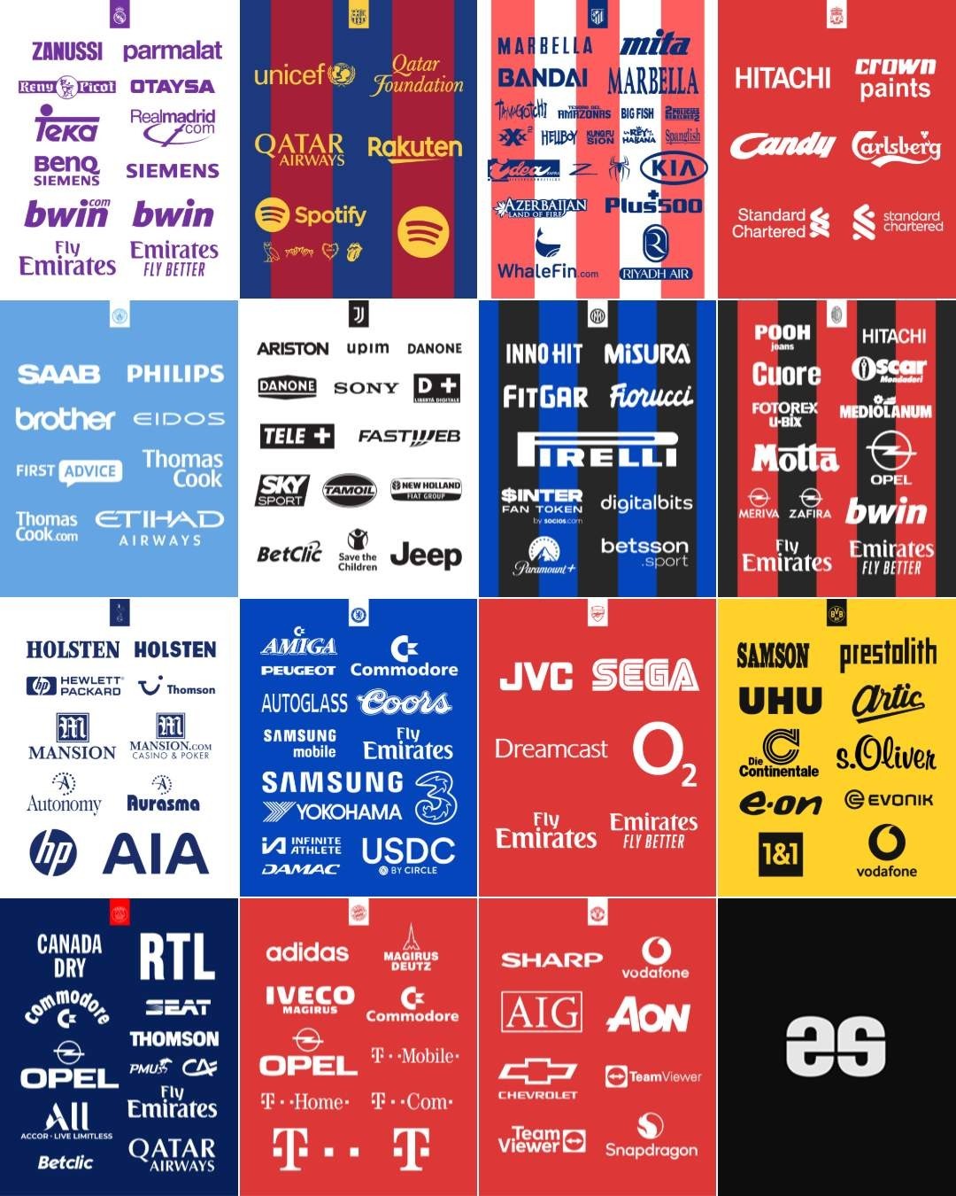
Over the decades, main sponsors have transcended mere commercial deals to become indelible visual markers of specific footballing eras, trophies, and legendary squads.
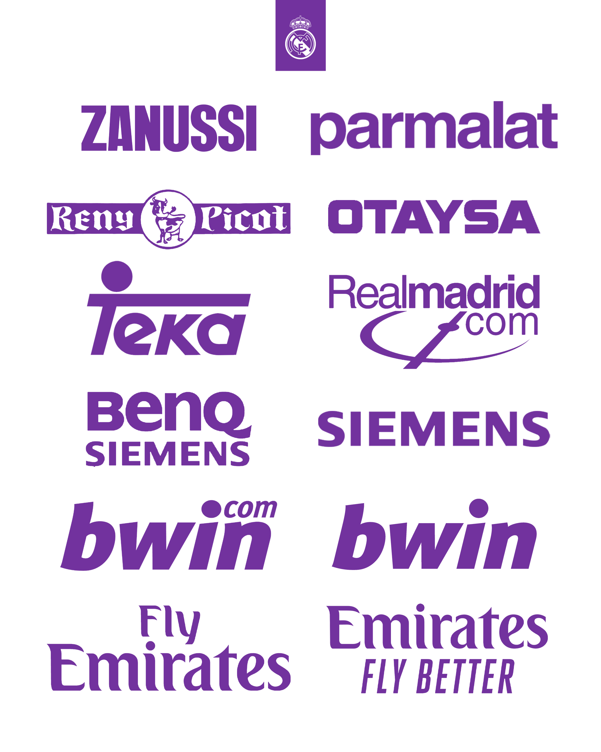
Real Madrid’s archive boasts historic partnerships such as Zanussi, Parmalat, and the indelible Teka era of the late 1990s, followed by the Galácticos era with Siemens and the early Champions League resurgence under bwin.
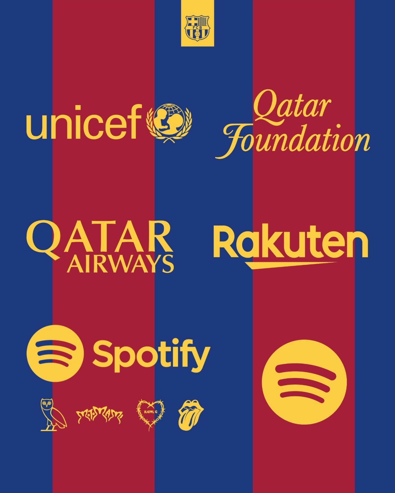
In contrast, FC Barcelona famously preserved an unblemished shirt for more than a century before debuting UNICEF on the chest in 2006, eventually evolving into standard commercial partnerships with Qatar Airways, Rakuten, and today's rotating pop-culture Spotify activations.
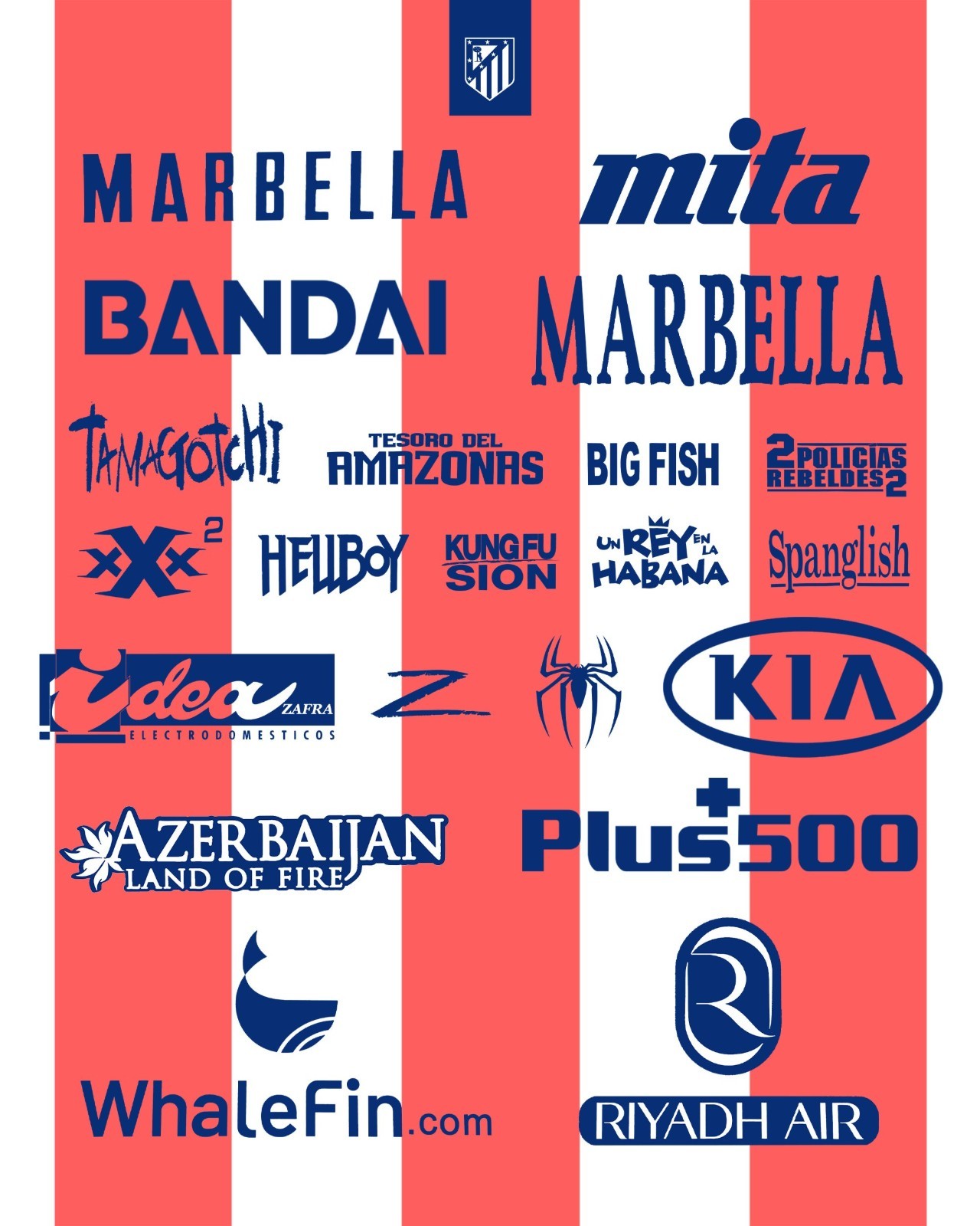
Atlético Madrid arguably boasts one of the most eccentric sponsorship archives in European football history. Alongside classic 1990s sponsor Marbella, Los Colchoneros became famous in the early 2000s for a pioneering tie-up with Columbia Pictures. The deal saw Diego Simeone's future squad rotate blockbusters such as Spider-Man 2, Hellboy, Kung Fu Hustle, and Bad Boys II across their red and white stripes on a match-by-match basis, creating instant collector grails.
The Definitive Era Markers
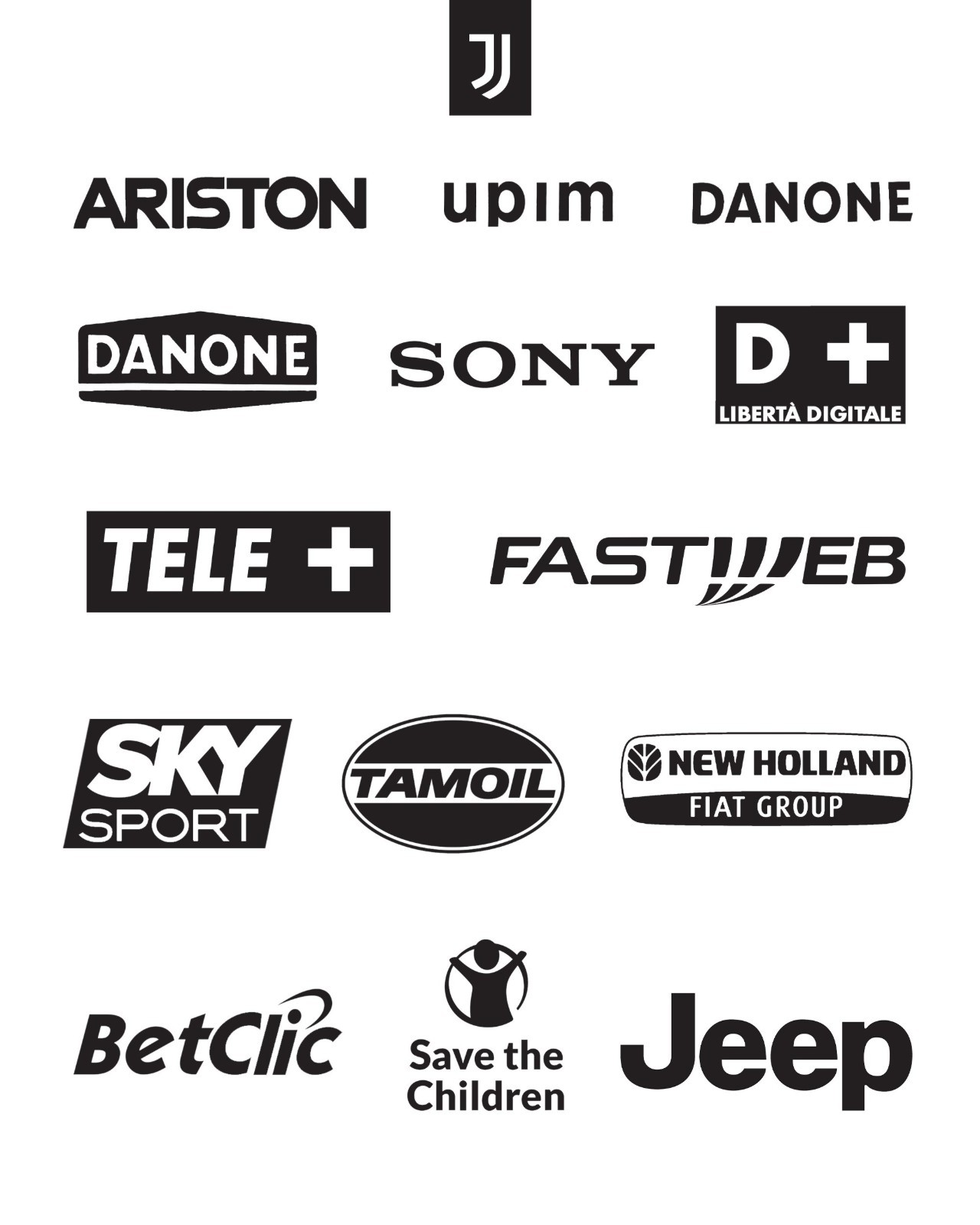
The graphics also capture Italian powerhouses where front-of-shirt branding reached peak cult status. Juventus jerseys evolved through Ariston, Danone, Sony during their 1996 UEFA Champions League triumph, Fastweb, and the dominant nine-title streak with Jeep.
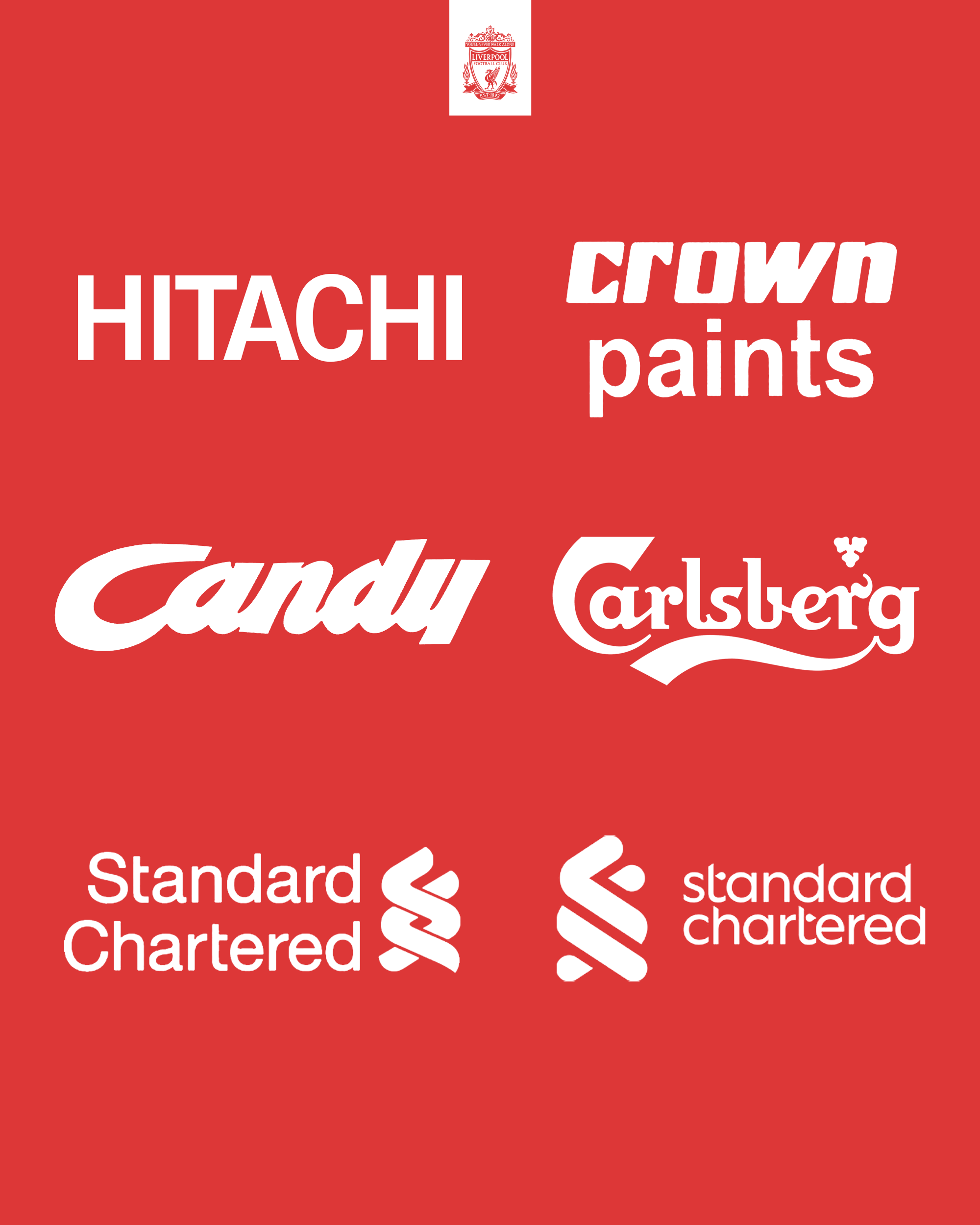
Across European football, certain partnerships forged an almost permanent identity: Inter with Pirelli across a 26-year run, AC Milan with Opel, Liverpool with Carlsberg, Arsenal with O2, and Manchester United with Sharp throughout the 1980s and 1990s.
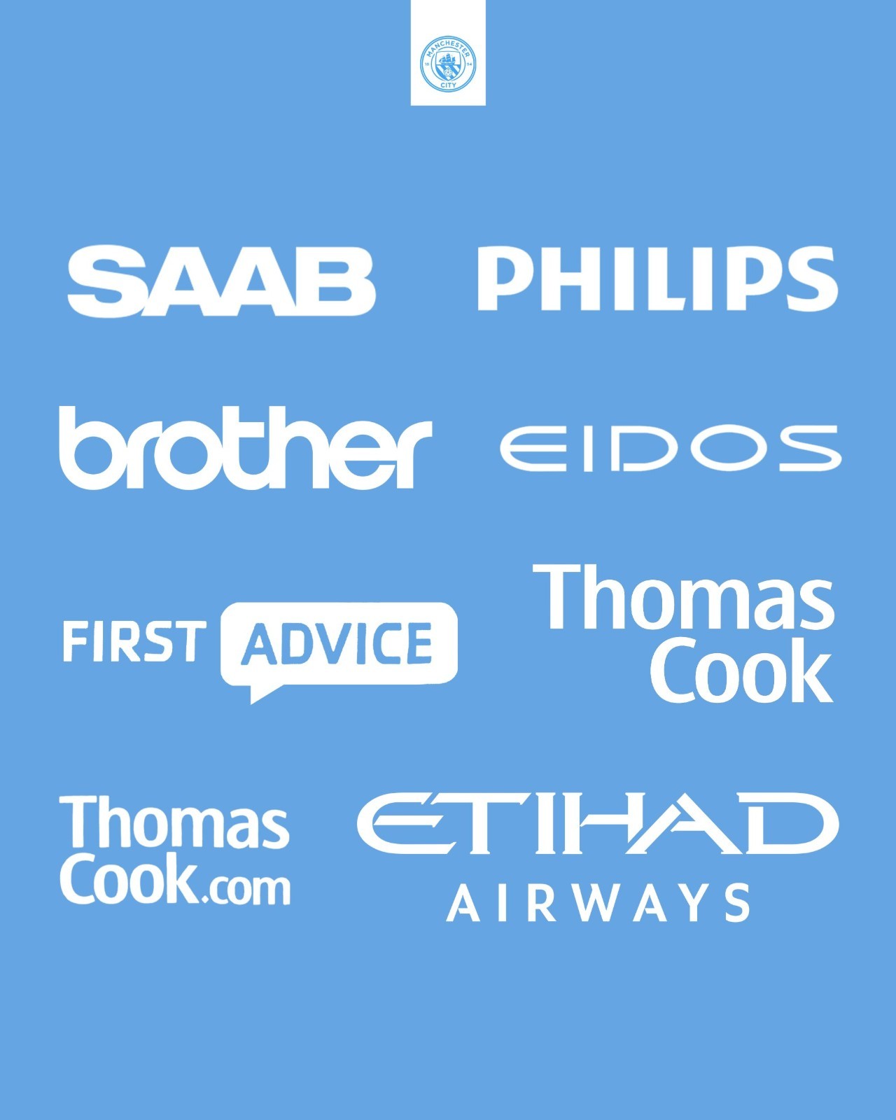
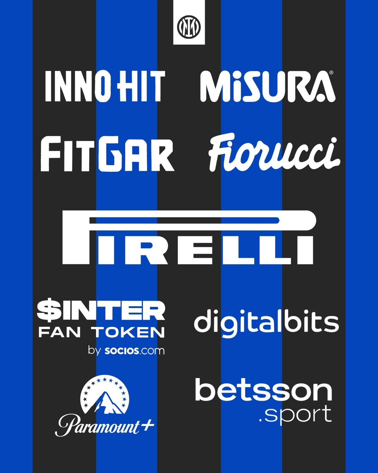
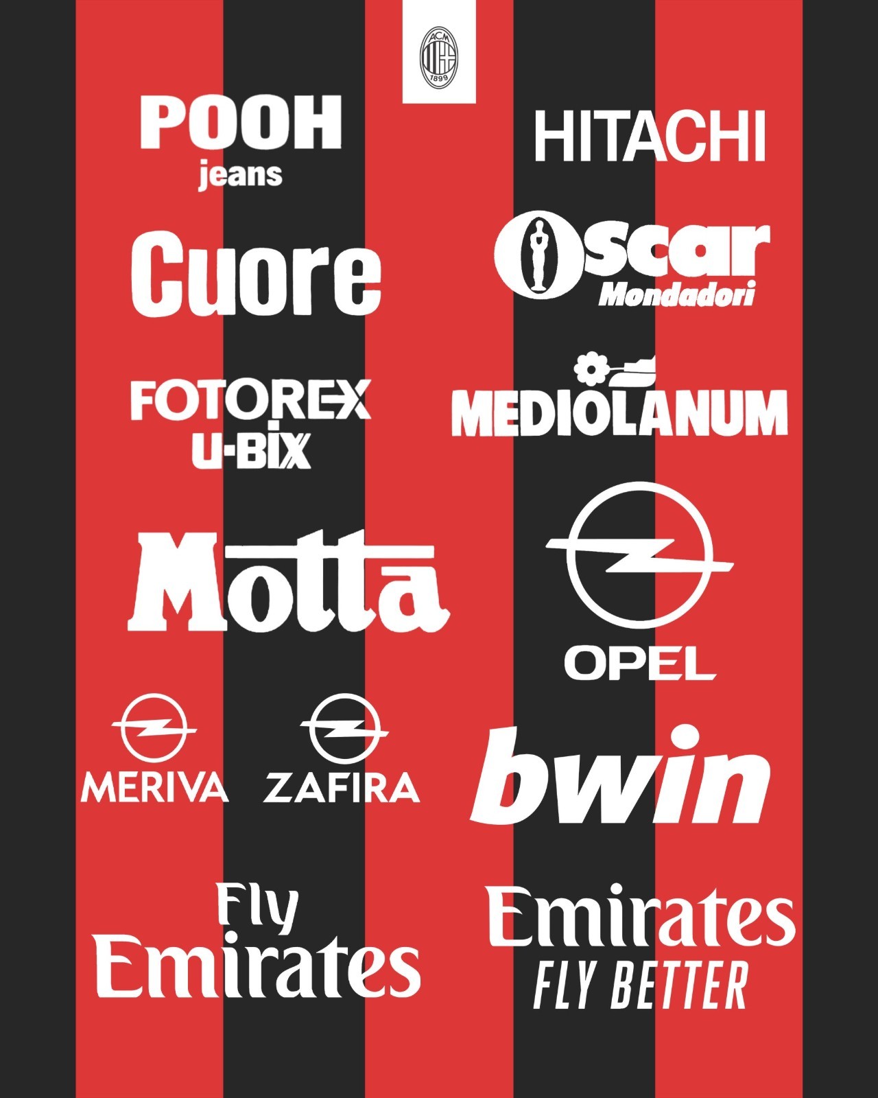
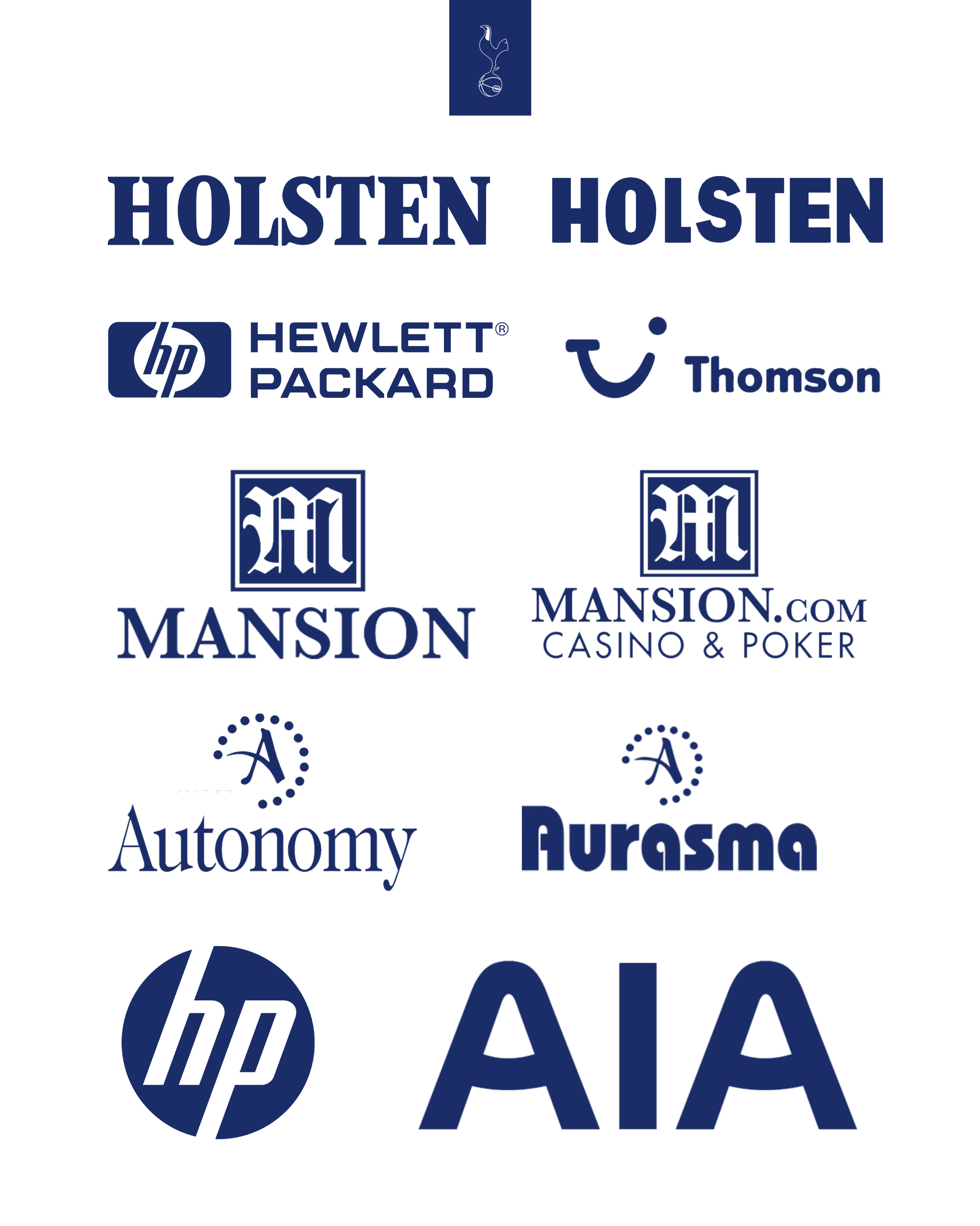
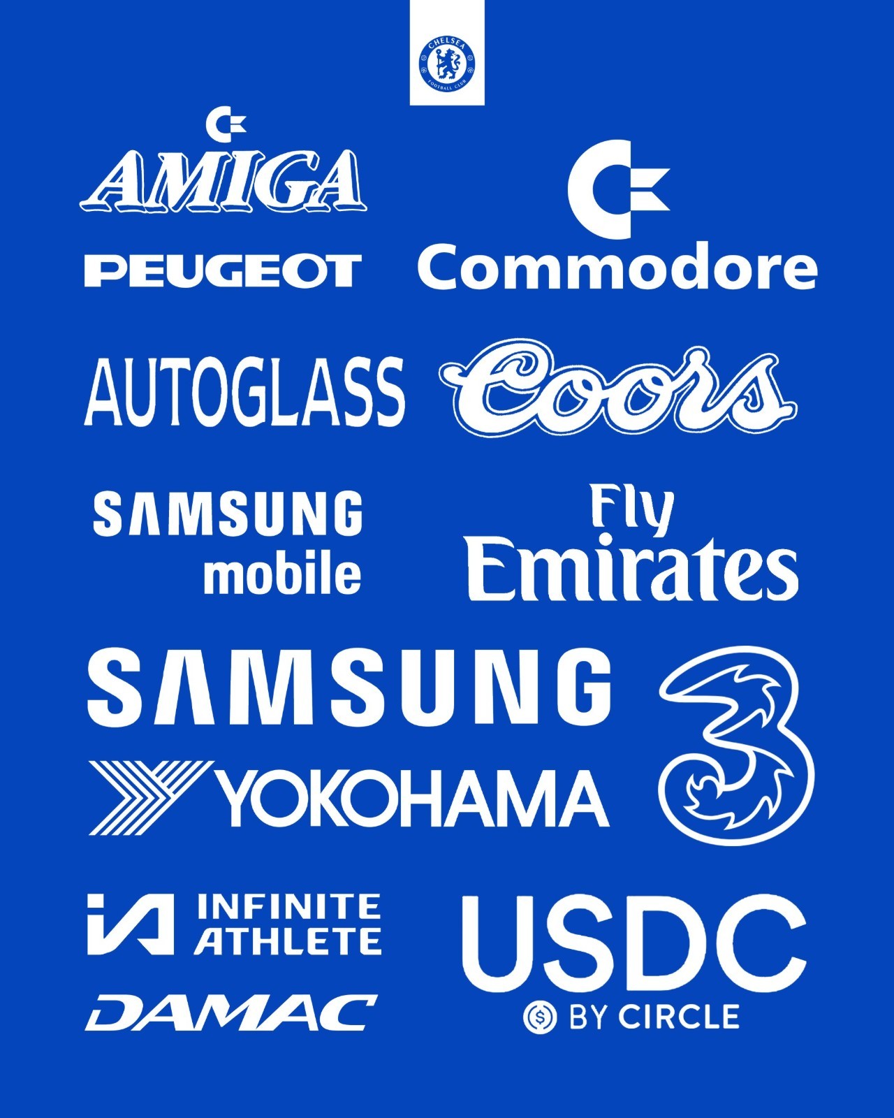
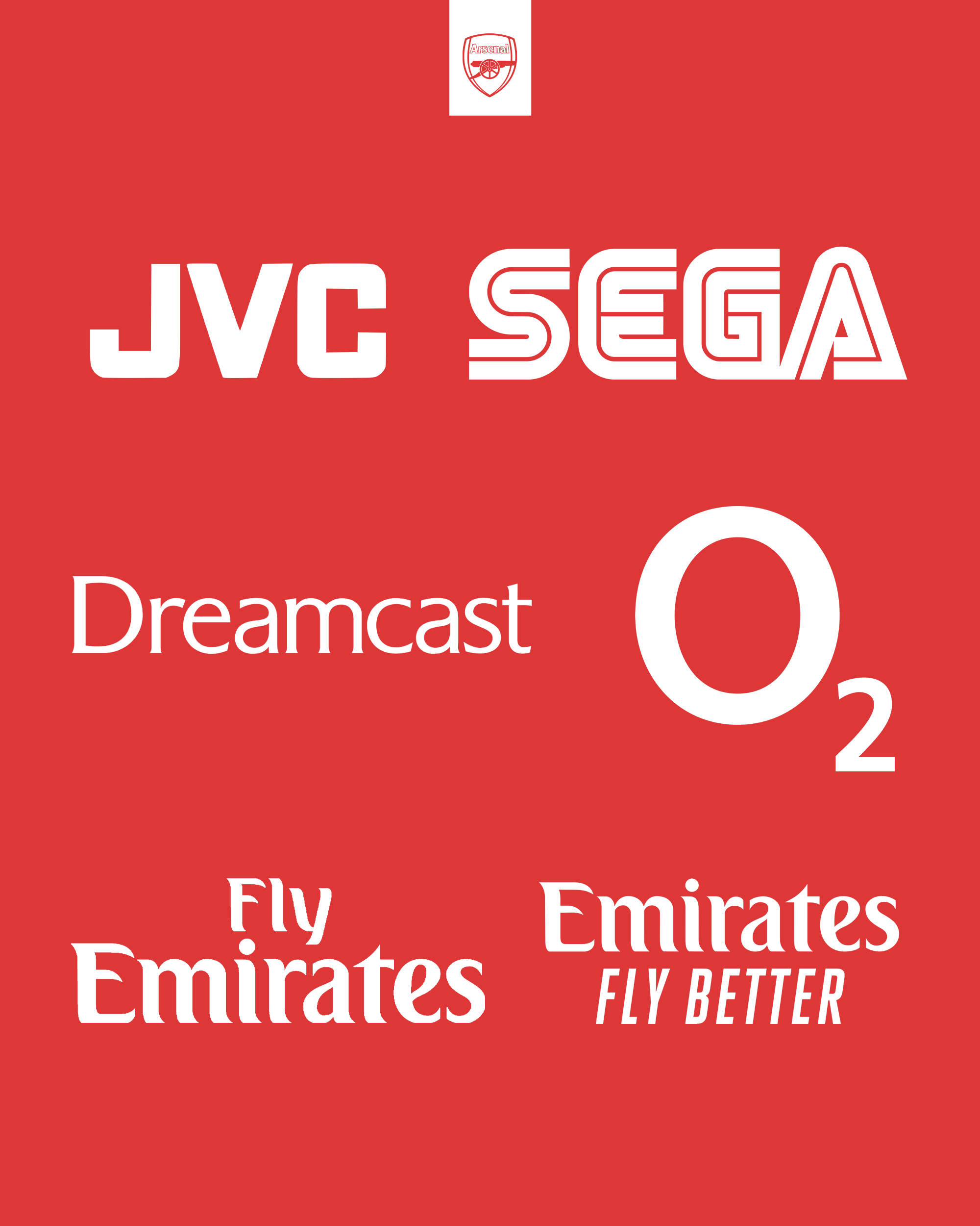
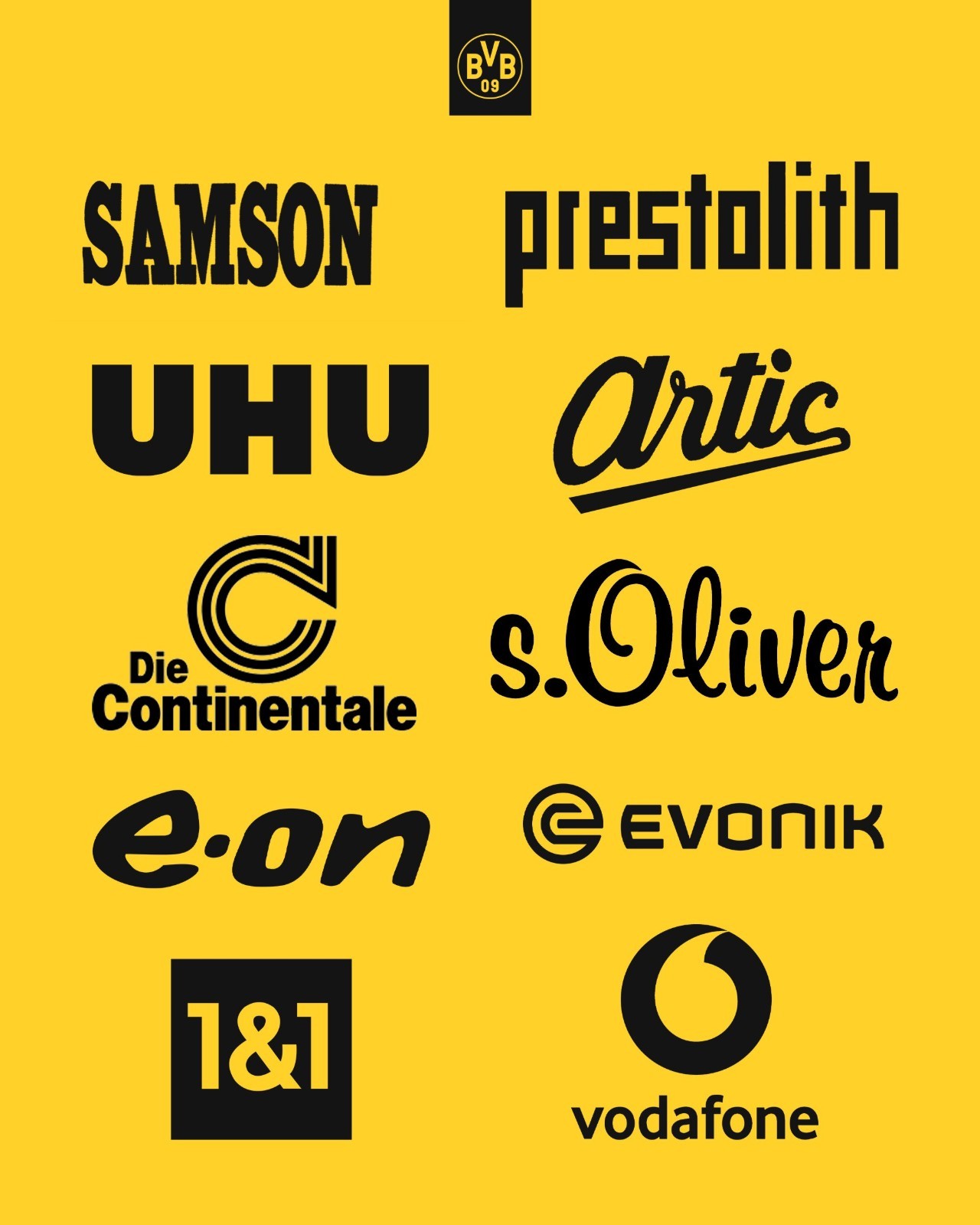
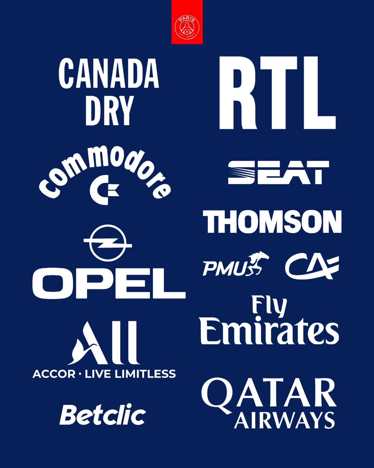
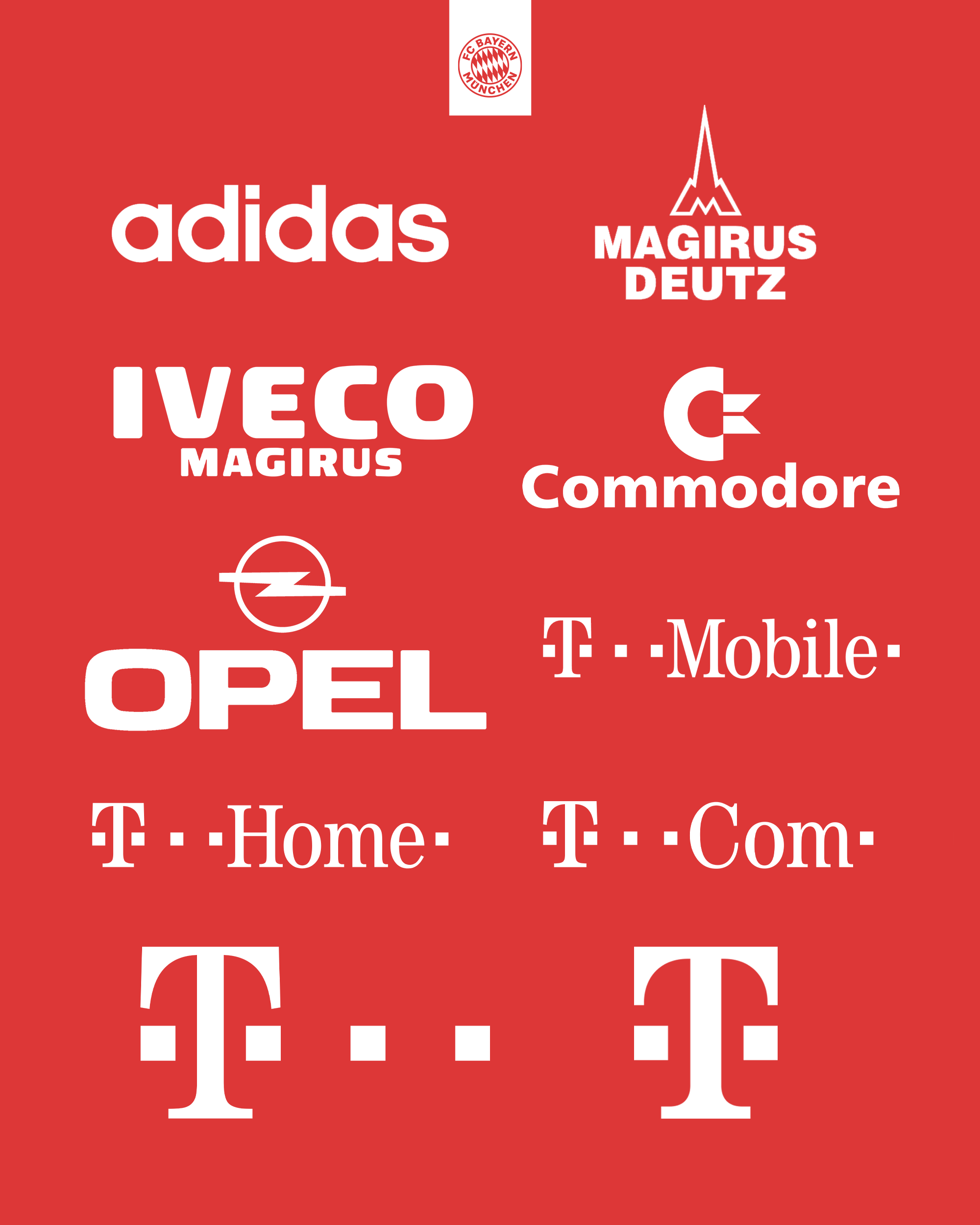
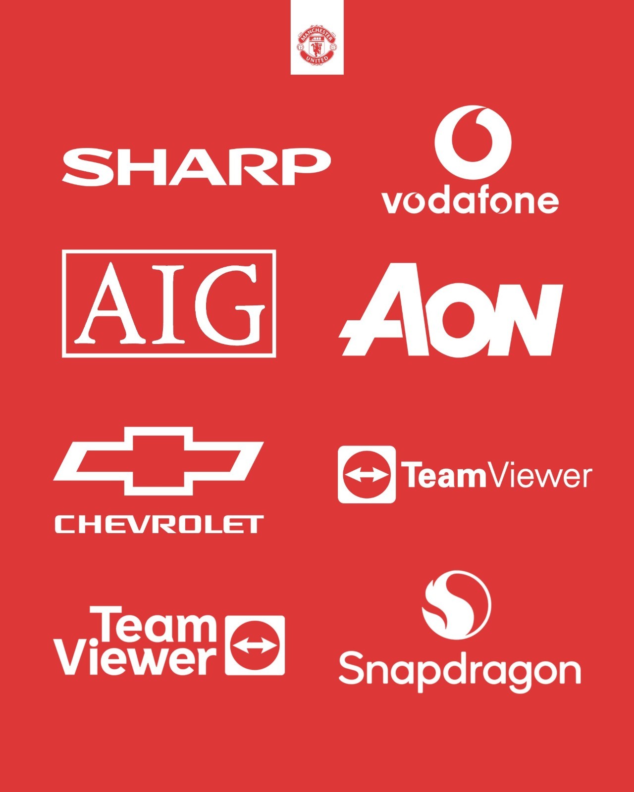
South American football culture is equally rich in legendary sponsor branding. Sansolini dedicated a special showcase to Argentina's traditional giants, spotlighting Boca Juniors, River Plate, Independiente, and Racing Club.
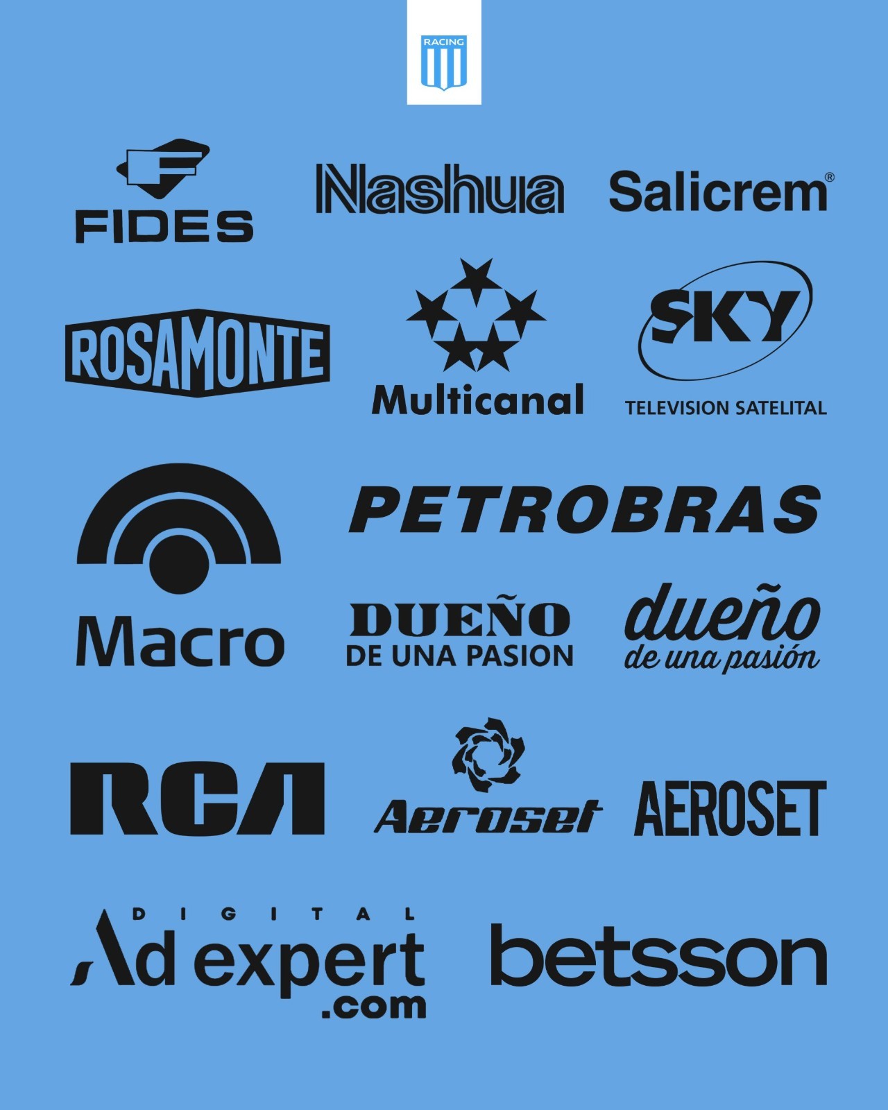
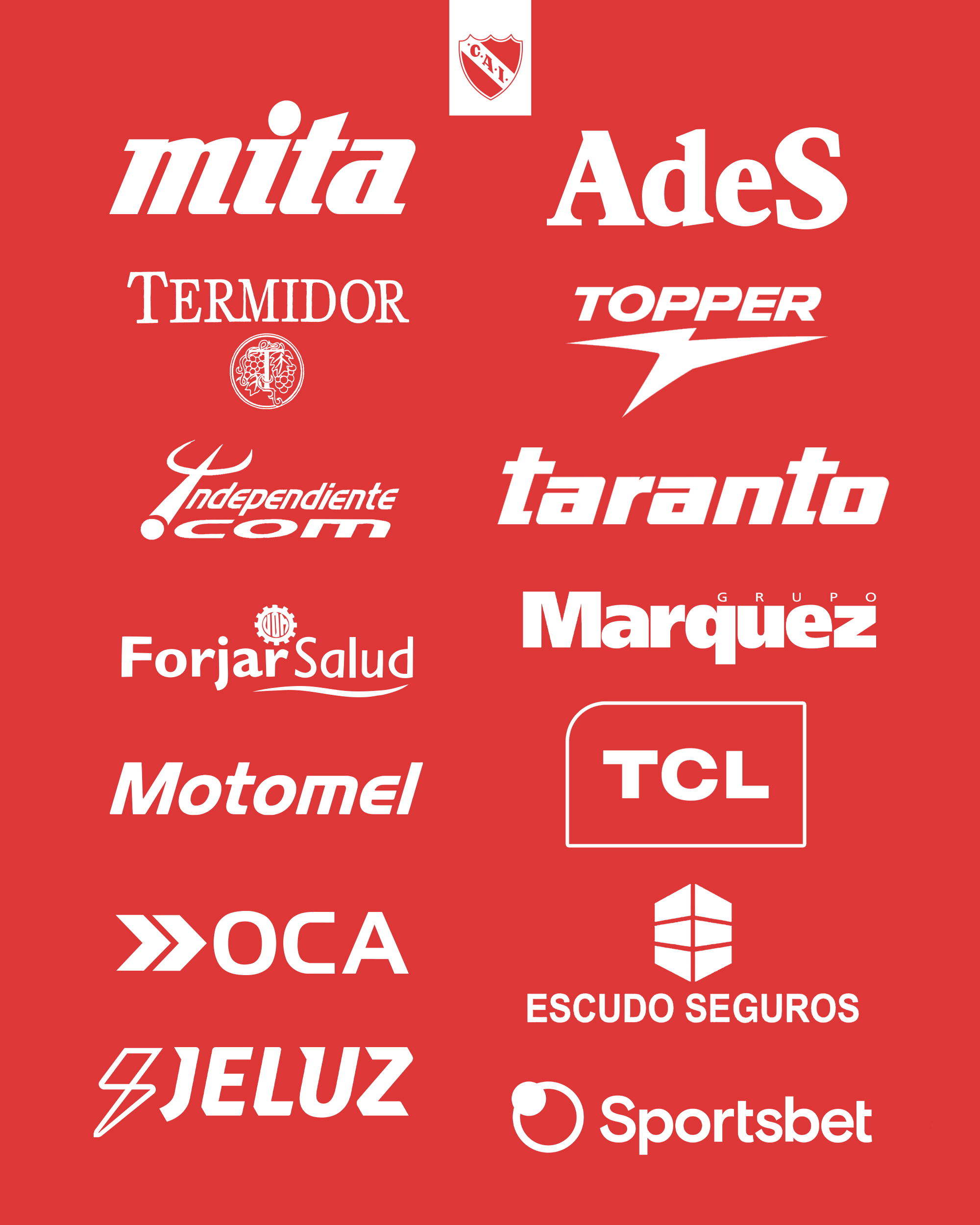
For Boca and River, the late 1990s and early 2000s Superclásico battles are forever intertwined with Quilmes and Budweiser across the chest, while Independiente's Ades and Racing's Rosamonte or Multicanal shirts remain heavily sought after by retro kit collectors.
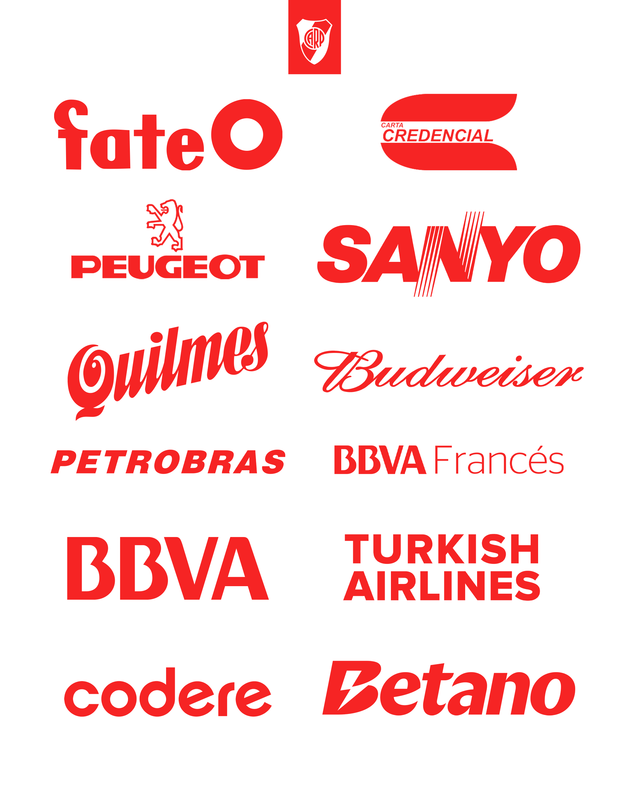
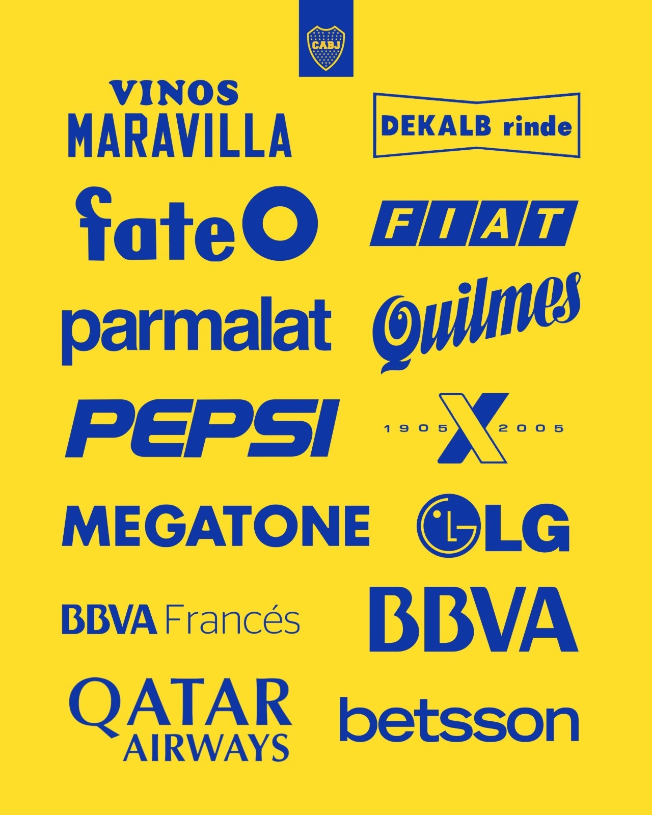
Ultimately, what elevates a front-of-shirt sponsor into an iconic piece of design is rarely the typography alone, but the silverware, heartbreaks, and iconic players attached to the fabric.
Which sponsor logo do you think is the undisputed greatest in football history? Let us know your favorites in the comments.


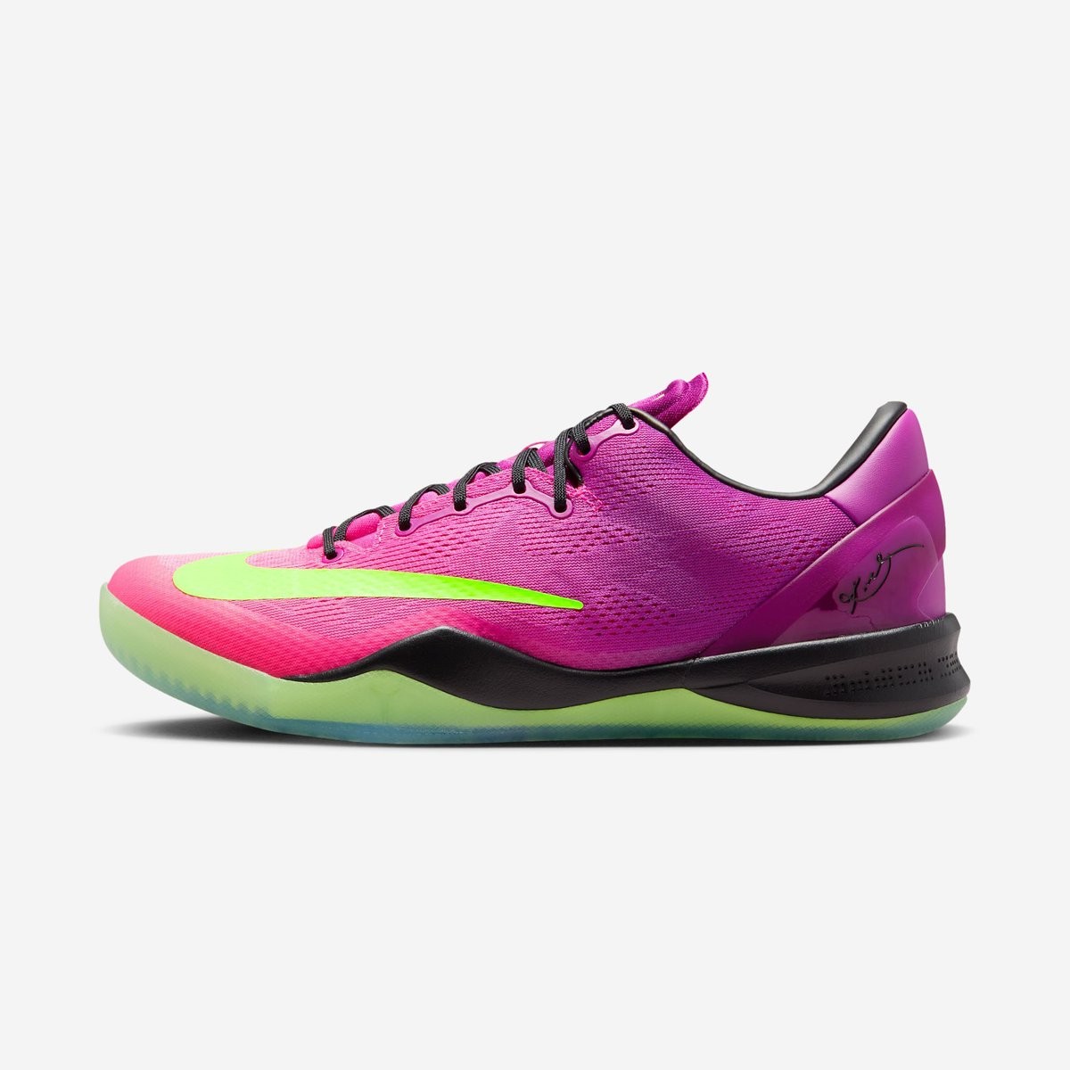
Nike Kobe 8 Protro 'Mambacurial' Releasing Next Week
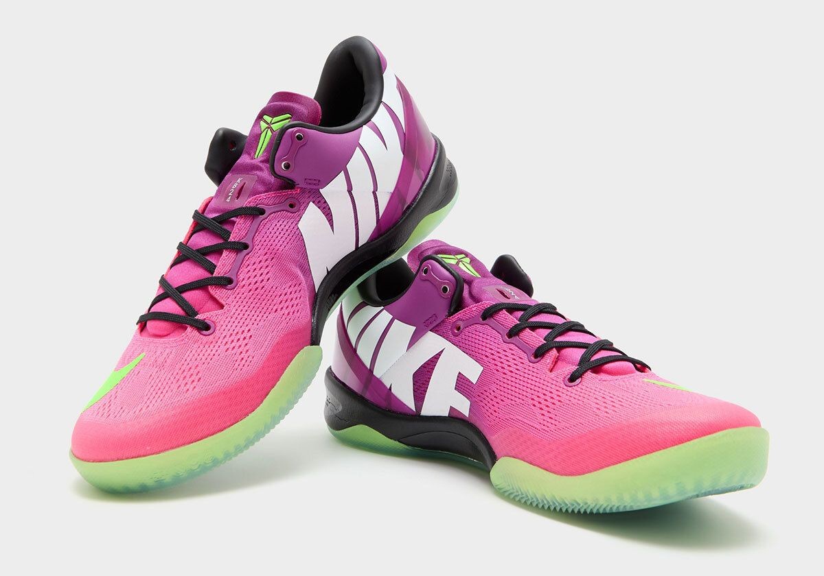
Nike is set to officially bring back one of its most famous crossover designs, the Kobe 8 Protro "Mambacurial", releasing on September 19, 2026. First introduced in 2013 as a tribute to Kobe Bryant's lifelong passion for football, the sneaker drew direct inspiration from the vibrant 2013 Nike Mercurial Vapor IX football boot. Thirteen years after its original debut, the model returns under the modernized Protro banner, uniting basketball performance with iconic football heritage. Big thanks to House of Heat.
The shoe faithfully recreates the beloved colorway, featuring a bold gradient across the engineered mesh upper in Red Plum, Pink Flash, and Electric Green. Signature football details define the look, including the oversized forefoot Swoosh that mimics Mercurial boot branding, massive block-letter "NIKE" lettering across the medial flank, and a translucent neon green outsole. Modern Protro upgrades have been implemented beneath the surface to provide improved cushioning and traction.


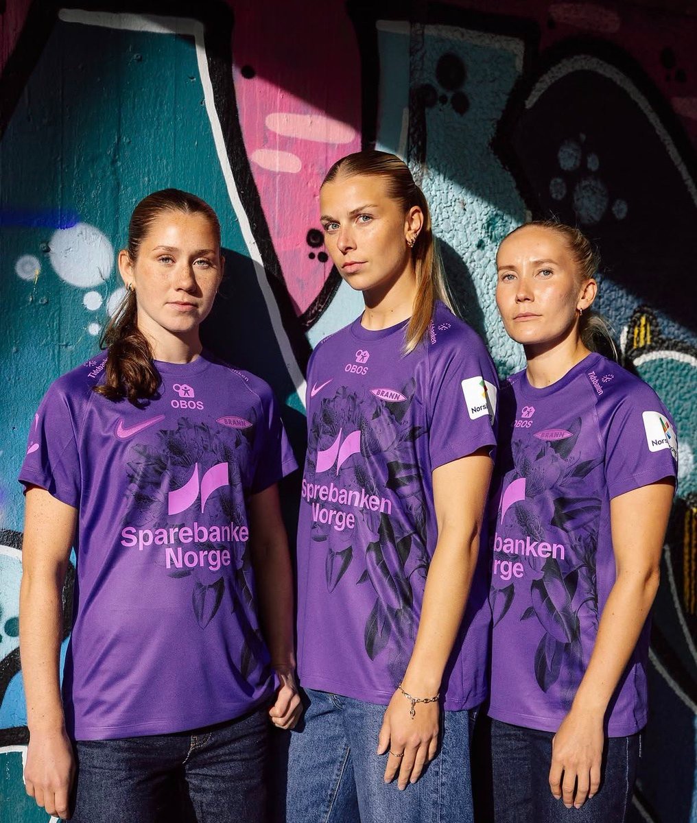
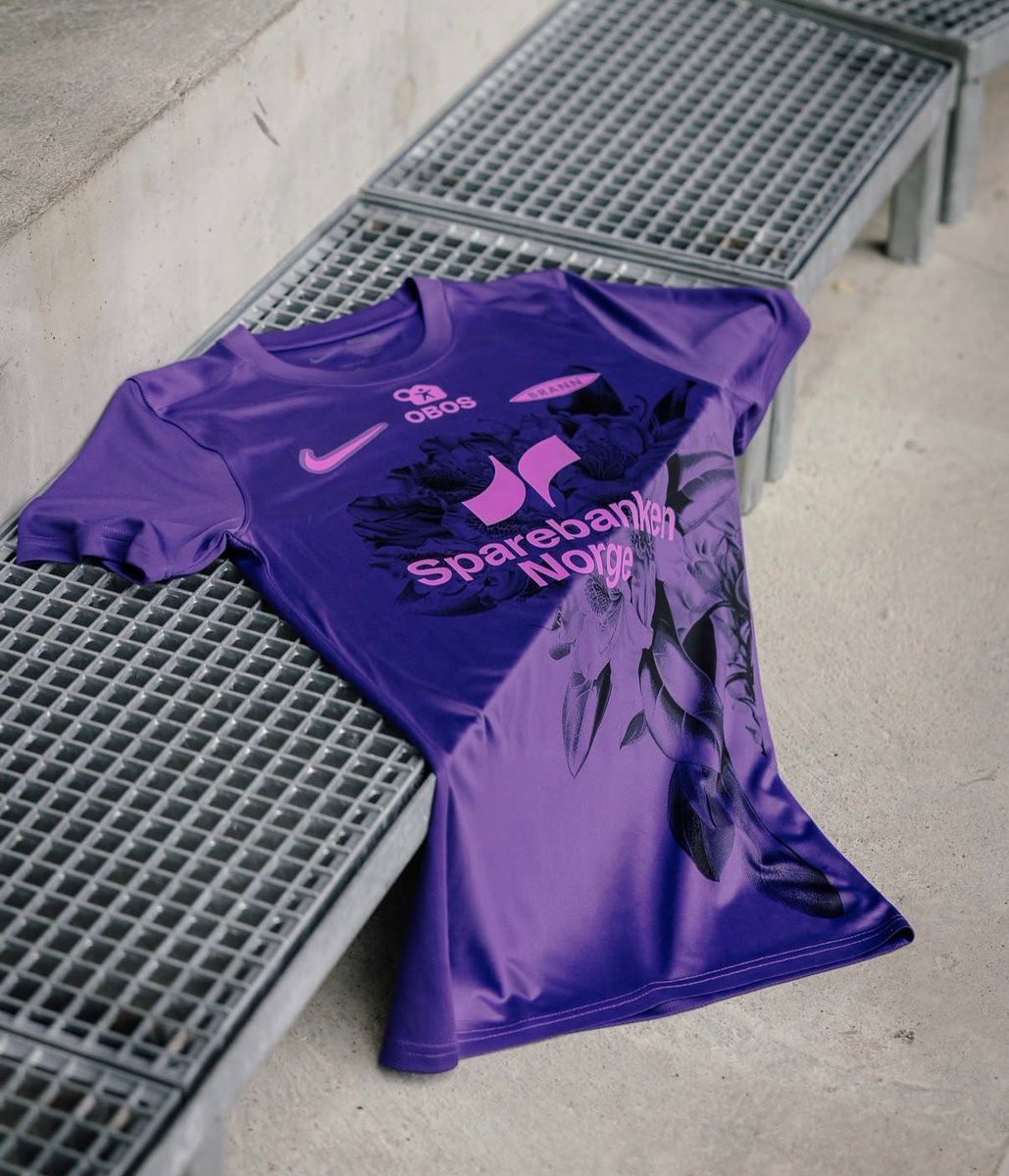
SK Brann Kvinner 26-27 Third Kit Released
Norwegian Toppserien side SK Brann Kvinner have officially unveiled their new 26-27 third kit, produced by Nike in collaboration with Unisport. The team debuted the vibrant new design during their away fixture against Lyn in Oslo.
The Nike SK Brann Kvinner 26-27 third shirt features a purple base paired with a large, dark rhododendron flower graphic printed across the front. The design honors Bergen's reputation as Norway's "Rhododendron City," known for the vibrant bushes that flourish in gardens and parks across the city. All branding, including the Nike Swoosh, monochrome Brann crest, and sponsor logos, is applied in a contrasting bright pink.
On the back, the jersey includes the inscription "For Bergen" in gothic lettering just below the collar, symbolizing the pride of representing the city on away trips. The new third uniform completes Brann Kvinner's 26-27 wardrobe alongside their traditional red home and dark away kits.
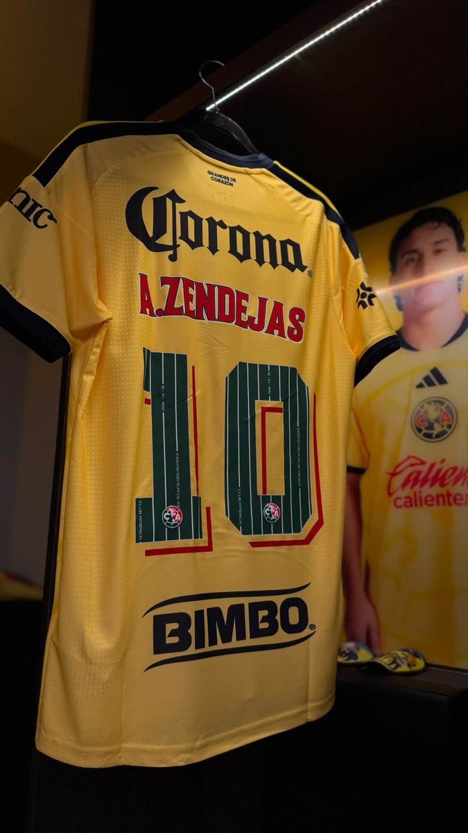
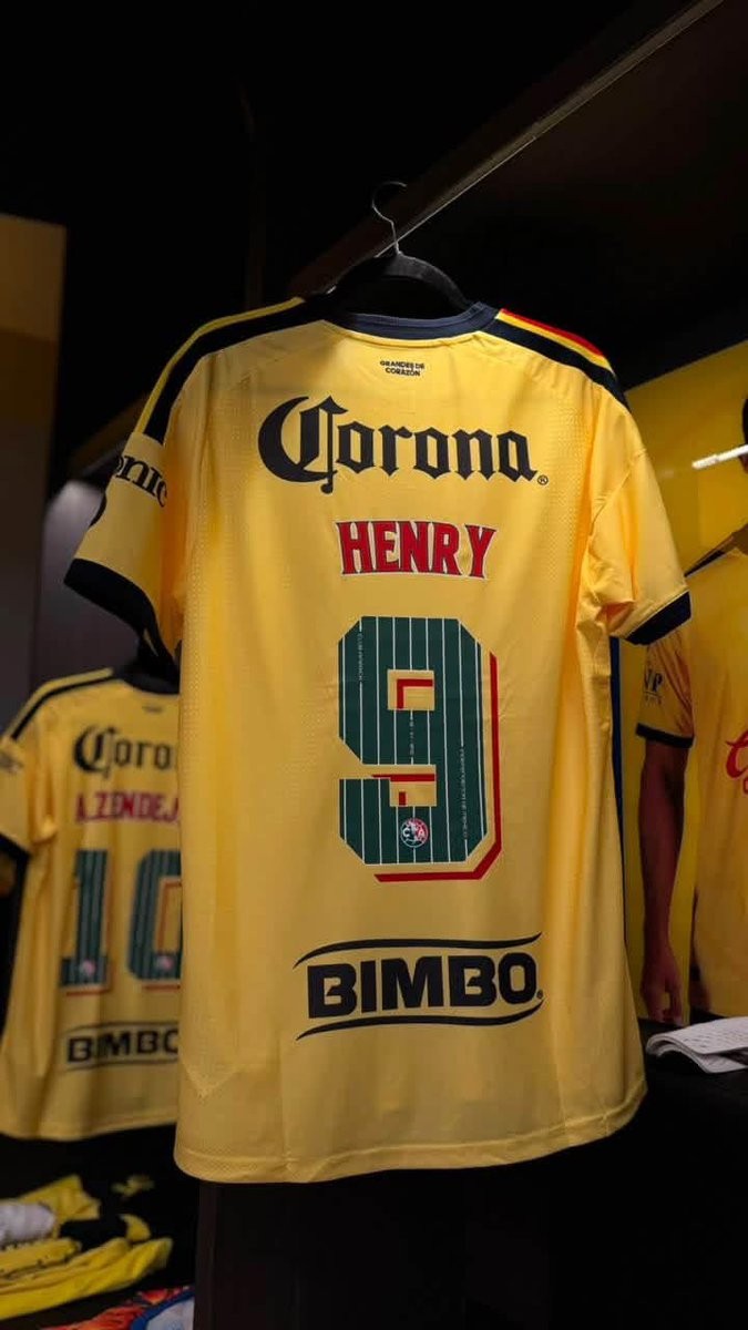
Special Club América 26-27 Kit Font Released
Club América has unveiled a special commemorative kit font for the 26-27 season, celebrating Mexican Independence Day and the club's marquee Clásico matches throughout September. The bespoke nameset replaces the regular squad typography on the back of Las Águilas' primary yellow home shirt, adopting the iconic green, white, and red of the Mexican flag.
The custom numbers feature a deep green base detailed with thin white vertical pinstripes. Embedded along the vertical lines are historic commemorative inscriptions, including the club name, the date "16 - 09 - 1810" marking the start of the Mexican War of Independence, and "INDEPENDENCIA DE MÉXICO". The player names above are rendered in vibrant red with a clean white outline.
To complete the patriotic design, each numeral incorporates a geometric red and cream 3D shadow effect, alongside Club América's crest placed at the base of every digit. The special typography delivers a unique cultural tribute, adding extra identity to the squad's jerseys during one of the most important periods of the Mexican football calendar.