Kit Watch
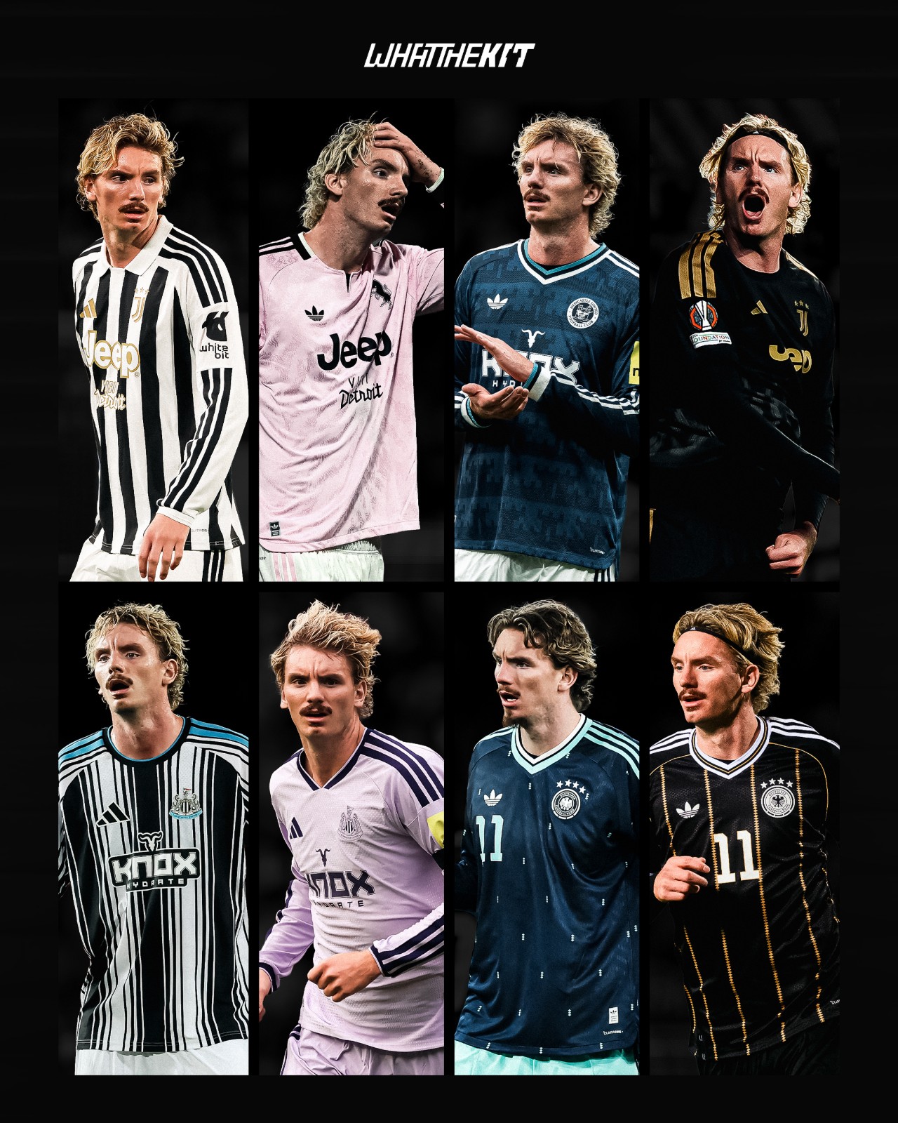
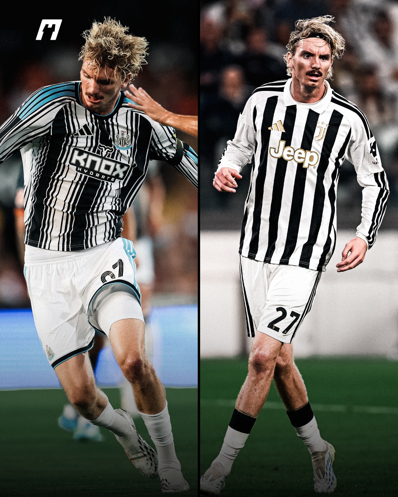
Nick Woltemade Wears Same Colors for Different Teams the 26-27 Season
From Newcastle United, Juventus to the Germany national team, 24-year-old striker Nick Woltemade has been spotted wearing identical Adidas kit colorways: black-and-white stripes, pink, navy and black-and-gold.
Big thanks to @whatthekit_x for the great spot and graphics.
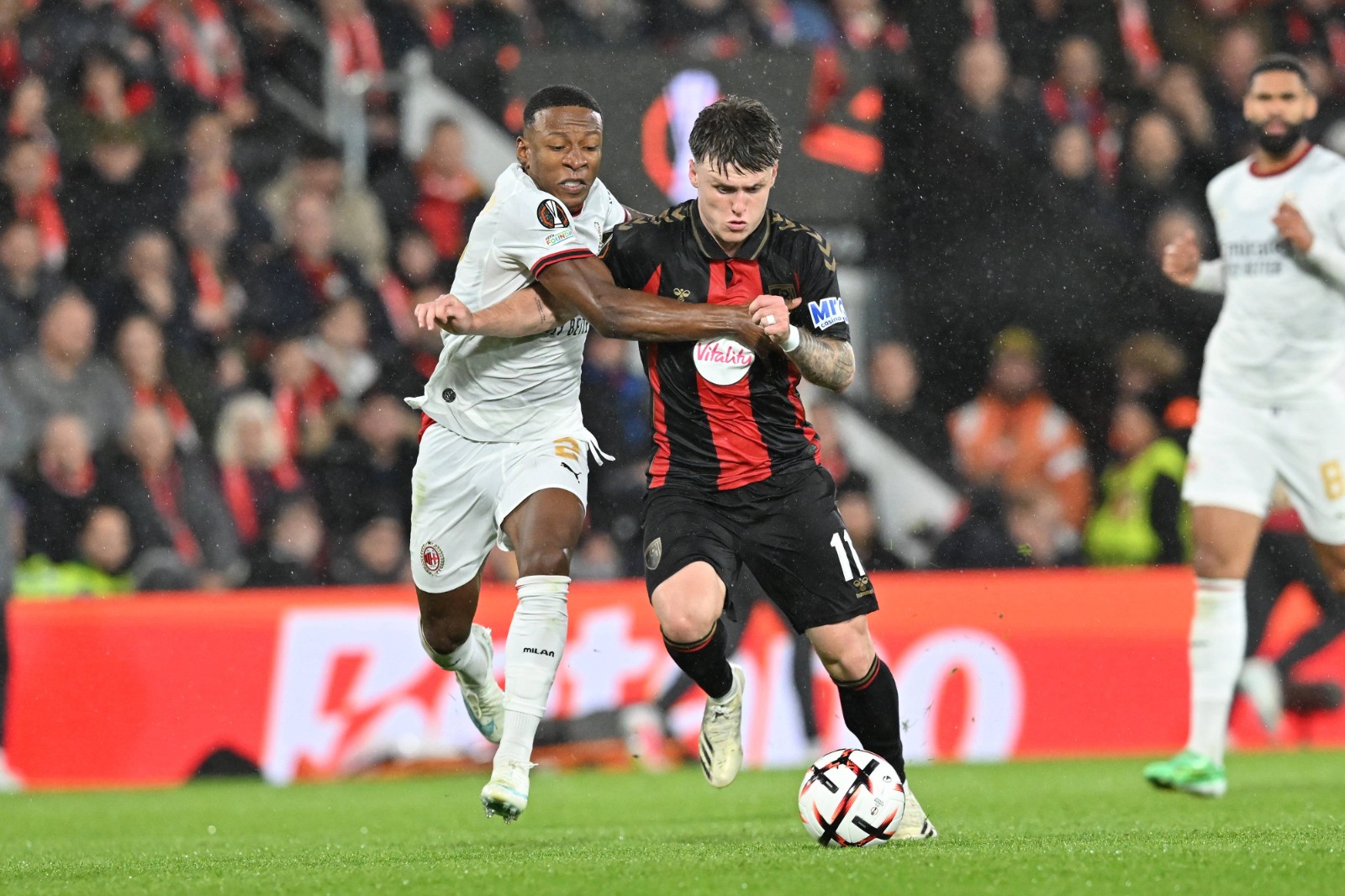
Bournemouth Face AC Milan in Their Own Inspired Kit
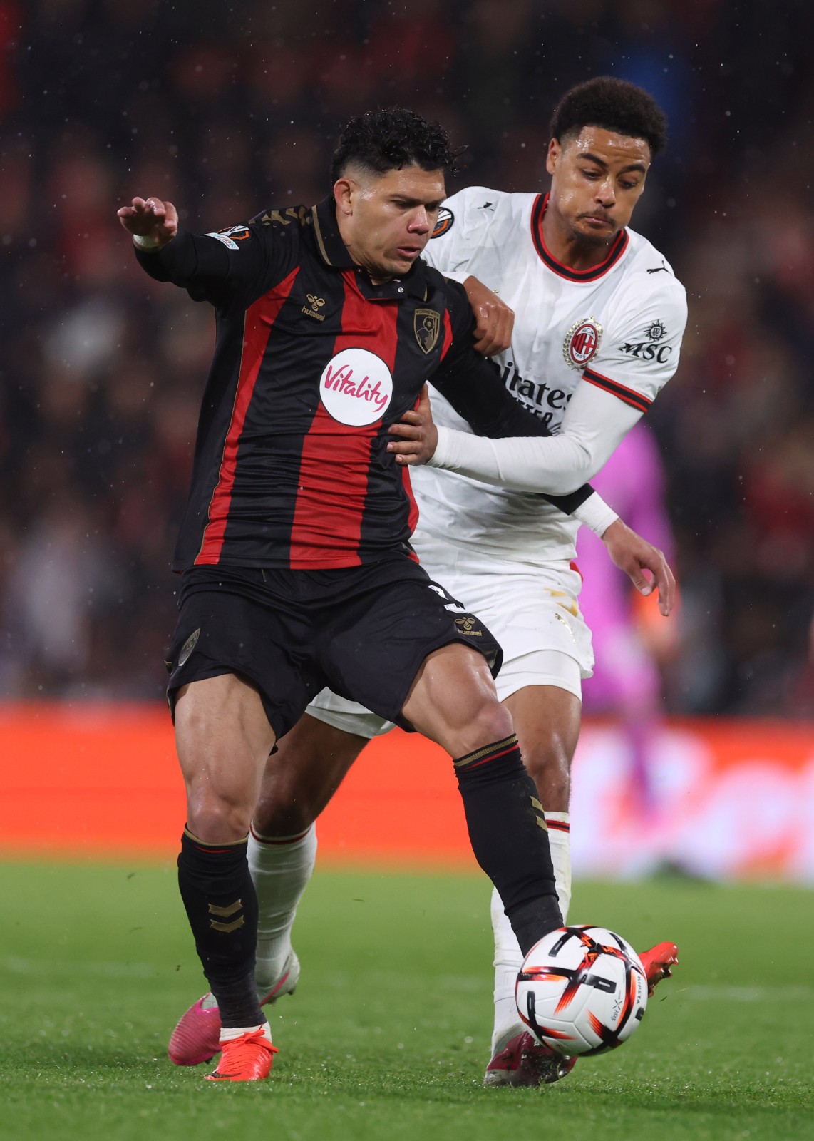
Bournemouth hosted AC Milan in the Europa League at the Vitality Stadium, bringing the two clubs together for a meeting with a special connection.
Bournemouth’s iconic red-and-black stripes were inspired by Milan, who won the European Cup in 1969. Before the 1970-71 season, manager John Bond and chairman Harold Walker introduced the design after a difficult period that saw the club drop into the Fourth Division.
More than 50 years later, Bournemouth faced their kit inspiration in European competition and came away with a 3-0 victory over the Rossoneri.
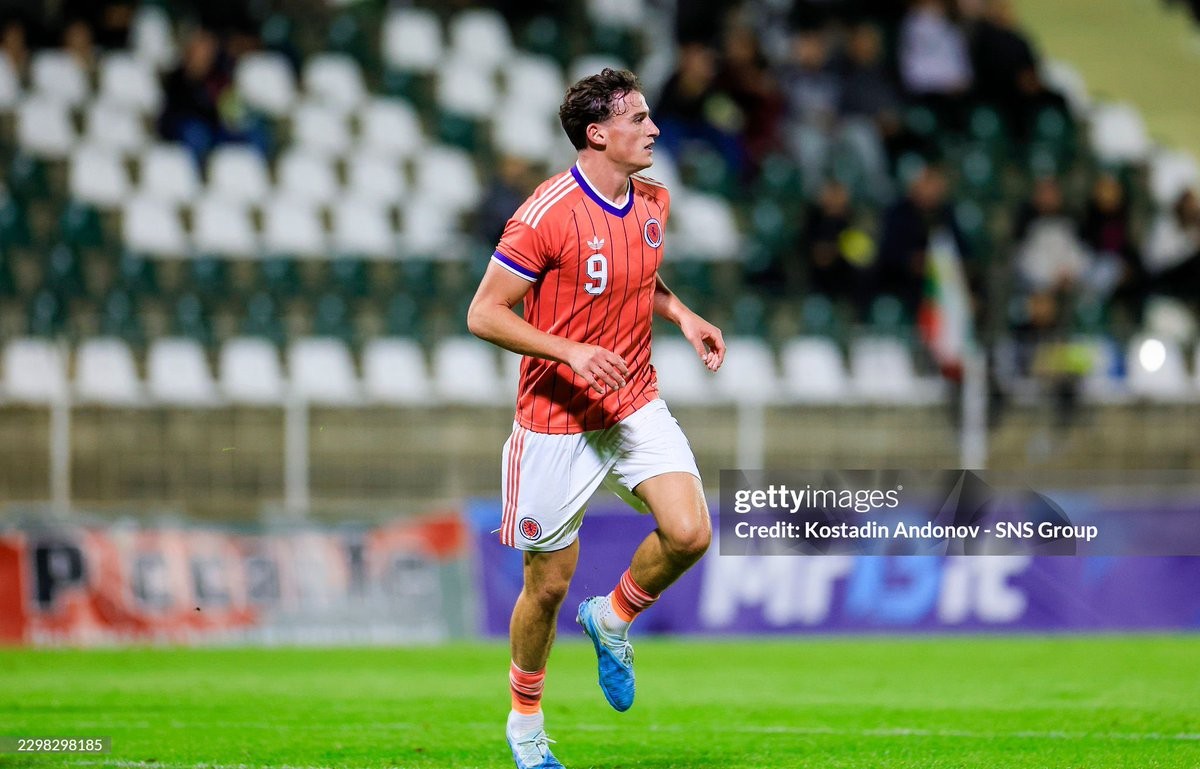
Scotland U-21 Debut Alternate White Shorts With Away Kit
In their UEFA Under-21 European Championship qualifier against Bulgaria on Tuesday, Scotland Under-21 took the pitch showcasing an alternate look for their 2026 away kit. Instead of the default dark shorts, the young Scots paired their salmon-toned away jersey with alternate white shorts. Big thanks to @g4ryw4lker.
The Scotland 2026 away kit, which features subtle vertical purple pinstripes and the retro Trefoil logo, blended cleanly with the white shorts that carry matching peach-red Three Stripes down the sides. With Bulgaria lining up in white shirts and green shorts, the mix allowed Scotland to avoid any clash while delivering a bright, retro-inspired aesthetic on the pitch.
This specific combination had previously been spotted in Scotland kit documentation as one of several designated options for the 2026 cycle. Ahead of the senior side's upcoming international campaigns, the Under-21 side provided the first on-pitch appearance for the white shorts setup, earning plenty of positive reactions from kit enthusiasts.
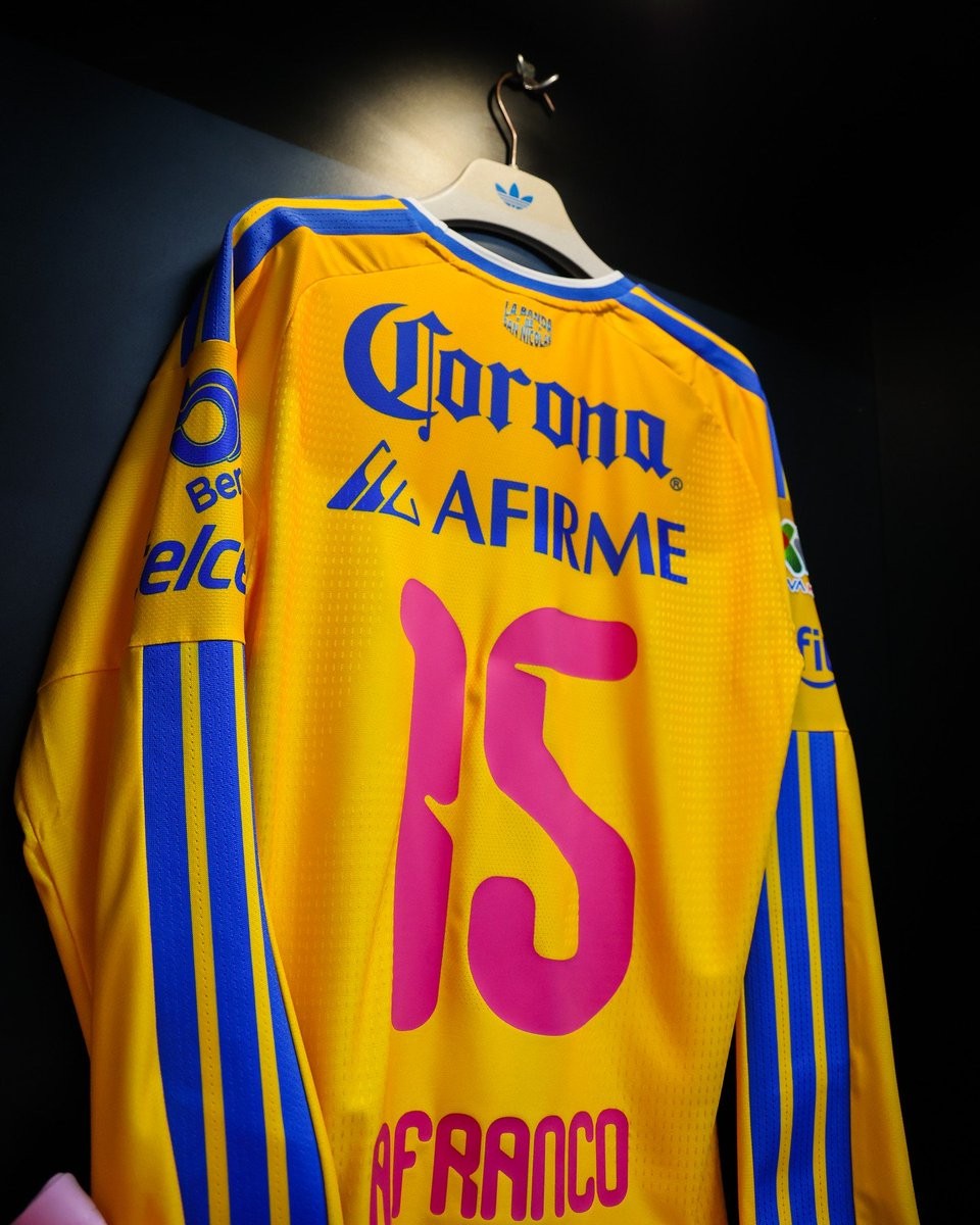
Tigres UANL Wear Pink Numbers for Breast Cancer Awareness
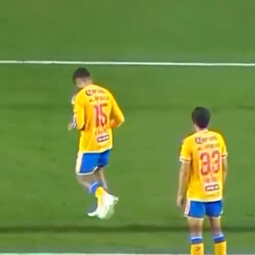
Mexican side Tigres UANL joined the global campaign for Breast Cancer Awareness Month (Octubre Rosa) during their Liga MX Apertura 2026 clash against Club León at Estadio Universitario. The club marked the occasion with dedicated pink details across both their pre-match routine and on the pitch to promote early detection and self-examination.
During the pre-game warm-up, Tigres players stepped out in custom light pink T-shirts. The front featured the wordmark "TIGRES" with the letter "I" replaced by a breast cancer awareness ribbon, topped by a tonal club crest. On the reverse, the shirts showcased the campaign's central message: "Ser Incomparable es notarlo a tiempo. Autoexplórate" ("Being Incomparable is catching it in time. Self-examine").
For the match itself, Tigres lined up in their regular 26-27 home kit, but with an eye-catching twist. The standard font coloring was replaced with vibrant pink player names and numbers on the back, offering a sharp contrast against their classic yellow and blue shirts while keeping the awareness initiative in full focus throughout the ninety minutes.
Liverpool 26-27 Third Kit On-Pitch Debut
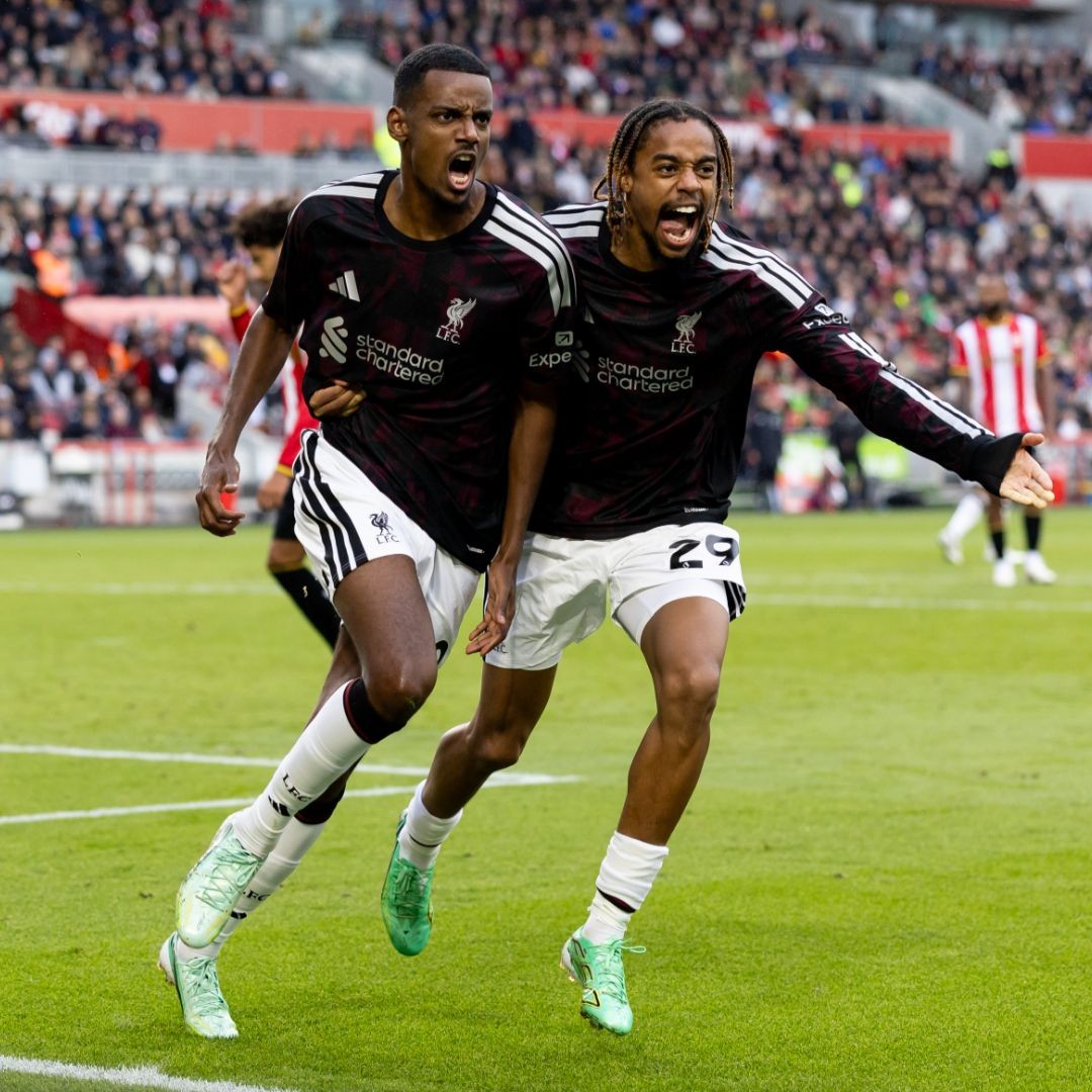
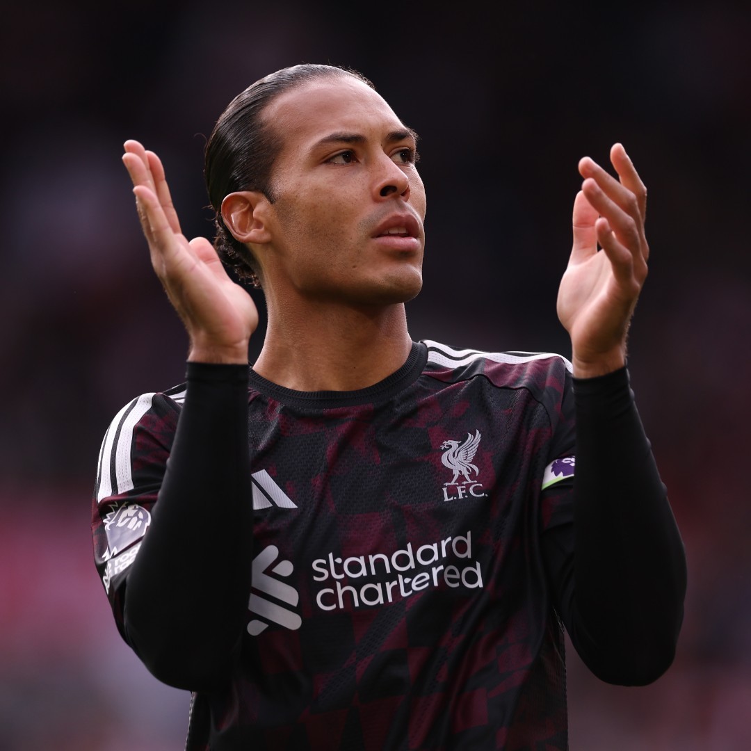
Liverpool debuted their new third kit, a tribute to Anfield’s iconic Kop stand, with a 2-1 victory over Brentford. The shirt features a pattern designed to resemble waving flags.
The match also marked the first on-pitch appearance of an alternative white shorts and socks combination, introduced to avoid a kit clash with Brentford, as the original ensemble features black shorts and socks.
AC Milan Debut Bespoke European Font on 26-27 Away Kit
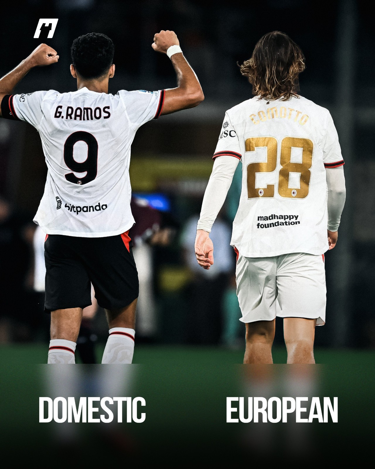
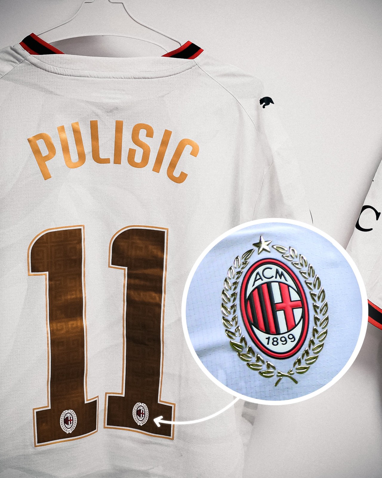
AC Milan officially debuted their bespoke font for away kit in the recent match against Bournemouth.
The move marks a departure from their primary home strip, where the Italian giants have continued using standard Serie A lettering for their Europa League fixtures rather than adopting a dedicated cup typeface.
This marks the first time since the 2023-24 season that Milan have featured a bespoke European font. During that campaign across the Champions League and Europa League, the club rolled out a bespoke font honoring their iconic 2003 Champions League triumph.
Intriguingly, the new look hasn't been applied across the board. Milan’s goalkeeper featured the Serie A font, creating a striking typographic contrast with the rest of the squad on the night.
Big thanks to @whatthekit_x for the comparison graphic and information.
Bootleg Makers Turn Crystal Palace Concept Into Real Shirt, But Swap Macron for Adidas
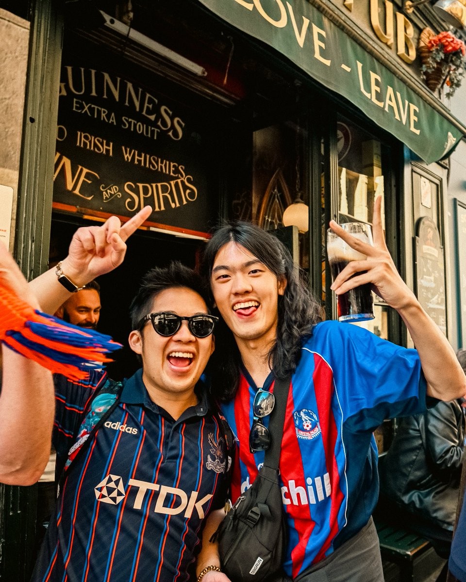
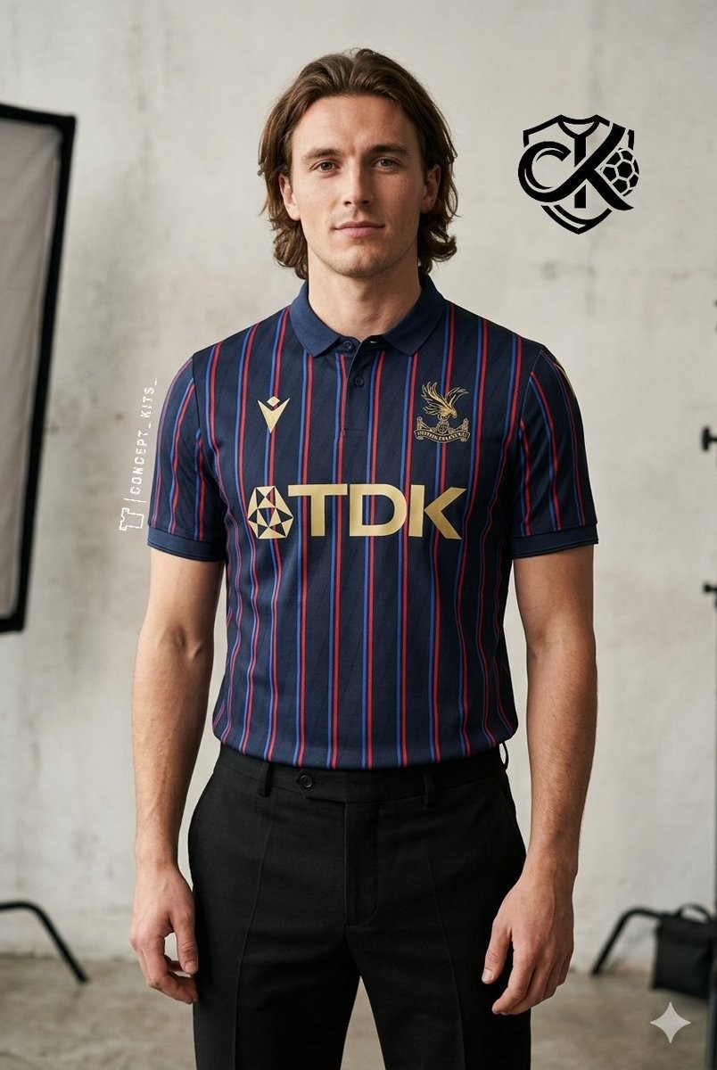
Counterfeit kit manufacturers are known for stealing fan concepts and turning them into physical shirts, but a recent Crystal Palace bootleg has taken an unusually strange turn. An original third kit concept created by digital designer @concept_kits_ was brought into production by fakers and recently spotted being worn by a fan in photos shared across Crystal Palace's official social media channels.
Originally published in April 2026, the concept kit features a deep navy base with thin red and blue pinstripes, classic gold TDK sponsor lettering, a gold monochrome club crest, and a gold Macron logo to reflect Palace's official technical partnership. However, when bootleggers adapted the design to produce it, they replaced the Macron branding with a gold Adidas logo and wordmark.
The designer reacted on X after discovering the bootleg being worn in public, noting with dry humor that at least someone was making money off his work.


Chelsea 26-27 Third Kit On-Pitch Debut
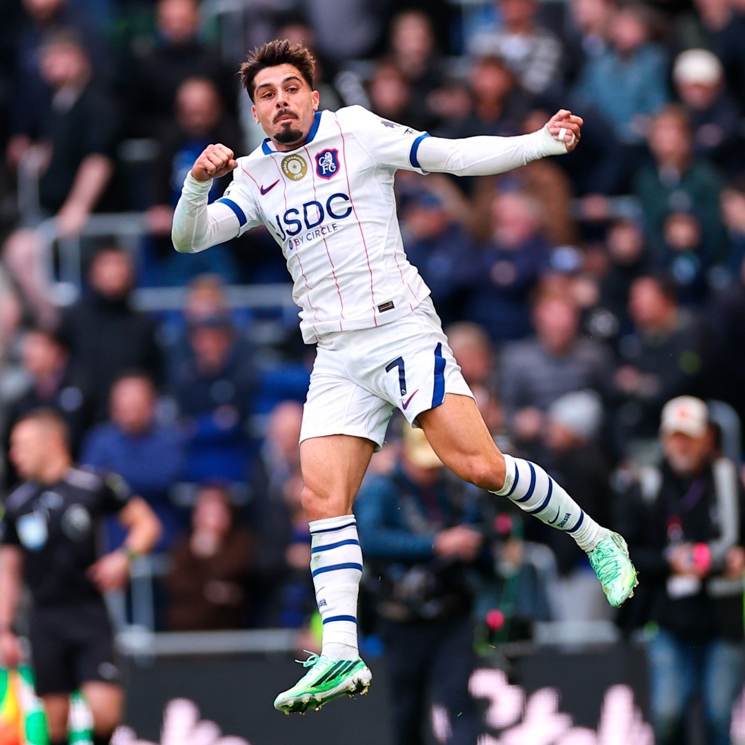
Chelsea made a striking debut with their new Nike third kit during a 2-0 victory over Everton. This kit inspiration from the club’s 1992–94 away shirt, paired with a classic crest from the early 1990s.
The design pays tribute to a fan-favourite kit from the club’s impressive era of transformation in the 1990s.
Notably, this marks the first time since the 2016-17 season that Chelsea have featured a white third kit.
Ronald Araújo Wore Old Premier League Font
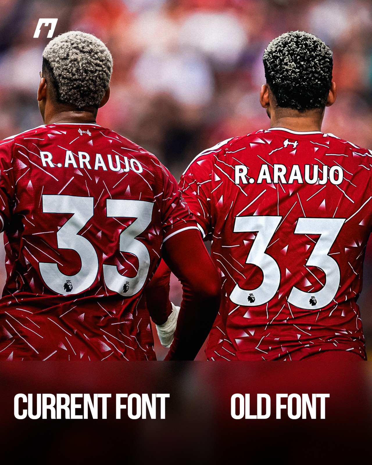
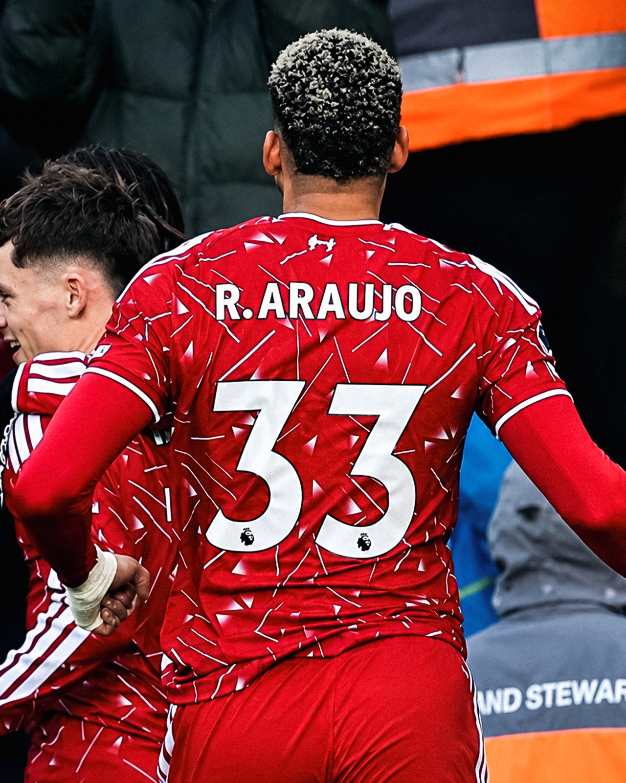
Despite being phased out over three years ago, the Premier League’s previous typography (used from 2017-18 to 2022-23) made an unexpected return during Liverpool’s recent win against Brighton, appearing on the back of Ronald Araújo's shirt.
For reasons yet to be officially confirmed, the Uruguayan defender’s number "33" was heat-pressed using the legacy Premier League font. Meanwhile, his surname and short numbering correctly featured the current league typeface introduced in 2023. In all prior fixtures this season, Araújo had worn the updated style without issue.
The mix-up is widely believed to be an emergency kit-room solution, likely caused by a temporary shortage of the standard large "3" printing stock on matchday.
Thanks to @whatthekit_x for the great spotting and create the comparison image.
Only Three Footballers Ever Have Featured Their Personal Logos on Official Kits
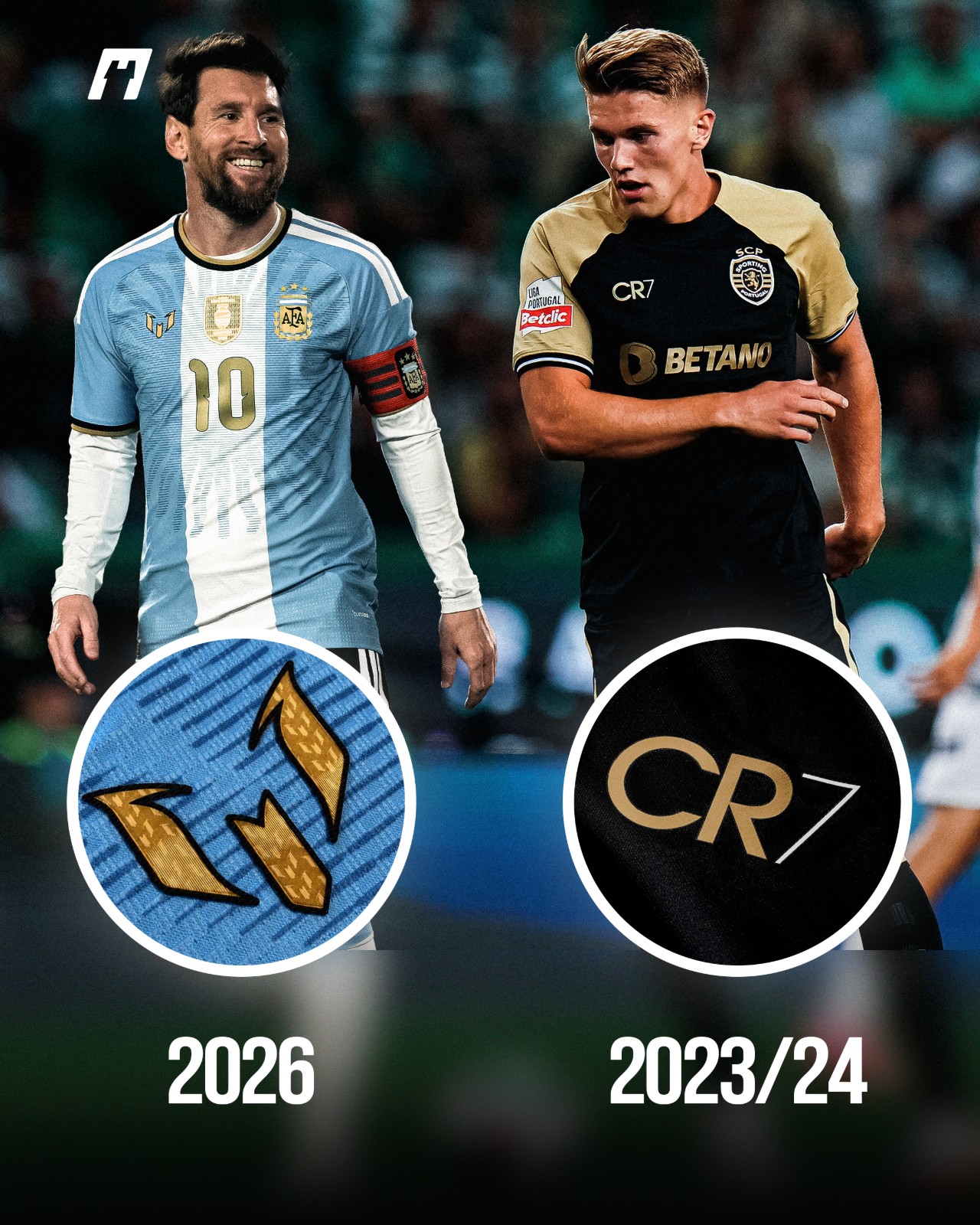
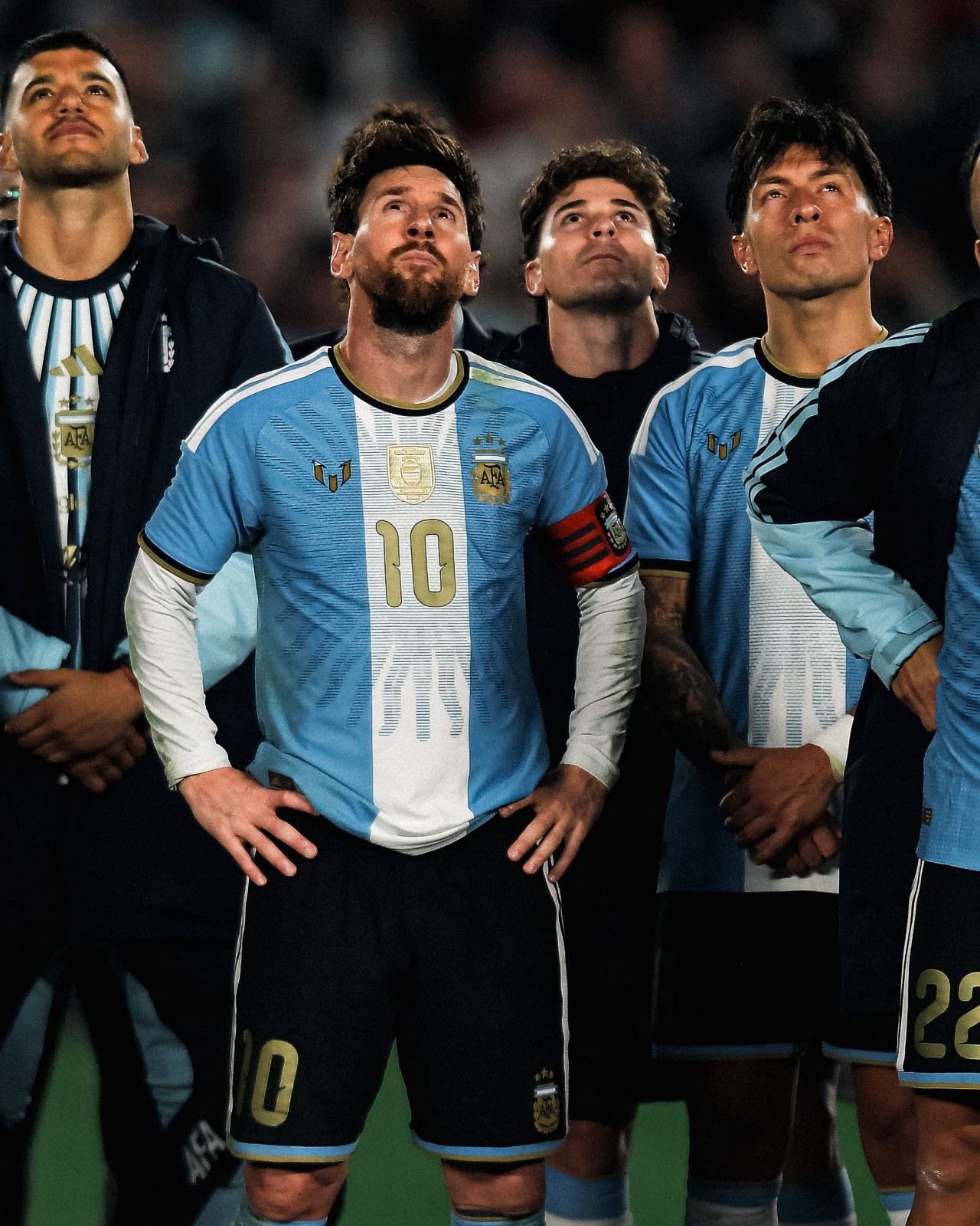
Lionel Messi, Cristiano Ronaldo, and Pelé are three football legends whose personal or brand logos have appeared on official match jerseys, replacing the kit manufacturer's logo.
For Messi, the "M" logo adorned a special farewell collection kit that tribute his final international appearance for Argentina.
For Ronaldo, the CR7 logo graced Sporting CP’s 23-24 third kit to mark the 20th anniversary of the José Alvalade Stadium's inauguration, the very venue where his performance in a celebratory friendly against Manchester United caught the eye of Sir Alex Ferguson.
For Pelé, Santos replaced the Umbro logo with the official Pelé Brand logo during their match against Atlético Mineiro in April 2026. The occasion marked the beginning of a global partnership between Santos, Umbro, Pelé Brand, and NR Sports, aimed at celebrating and preserving the Brazilian legend's legacy.
Big thanks to @whatthekit_x for spotting and create the collage.
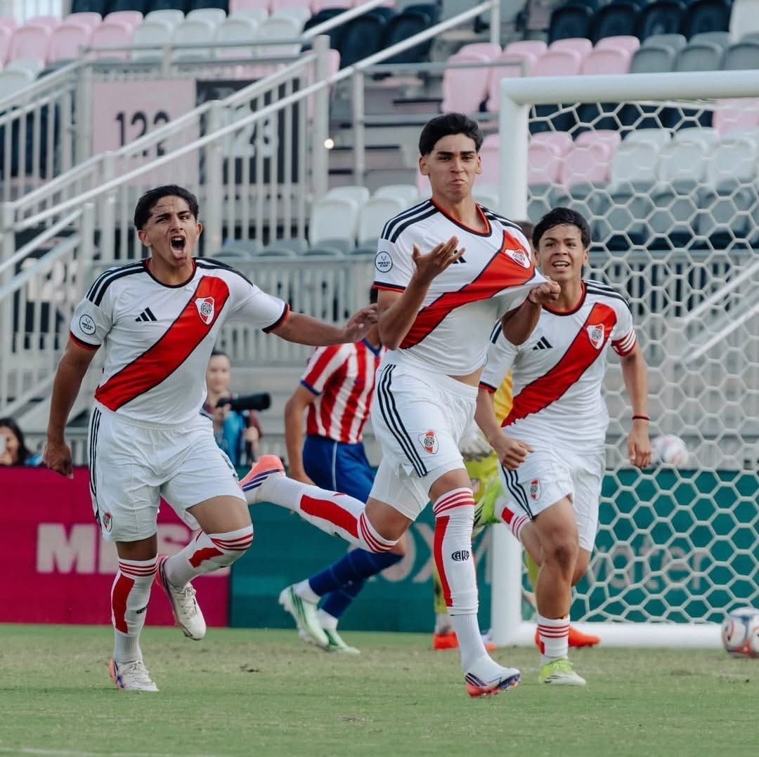
River Plate U16 Sport Curious Three-Season Kit Mash-Up at Messi Cup
River Plate's Under-16 side caught the eye of one of our followers during the Messi Cup in Miami by stepping onto the pitch in an intriguing patchwork uniform. Competing against international opposition such as Atlético Madrid, the Argentine youngsters wore a distinctive combination that blended elements across multiple kits and different seasons.
The core of the outfit consisted of River Plate's 26-27 home shirt paired unexpectedly with the 26-27 away shorts. The white away shorts feature the retro red Adidas Trefoil logo alongside black Three Stripes, creating a noticeable contrast against the modern three-bar performance logo featured on the 26-27 home jersey.
To make the ensemble even more peculiar, the kit was finished with home socks taken all the way from the 23-24 season. Featuring their characteristic red hoop detailing and CARP branding, the older socks completed an improvised, all-white look that stood out on the pitch.
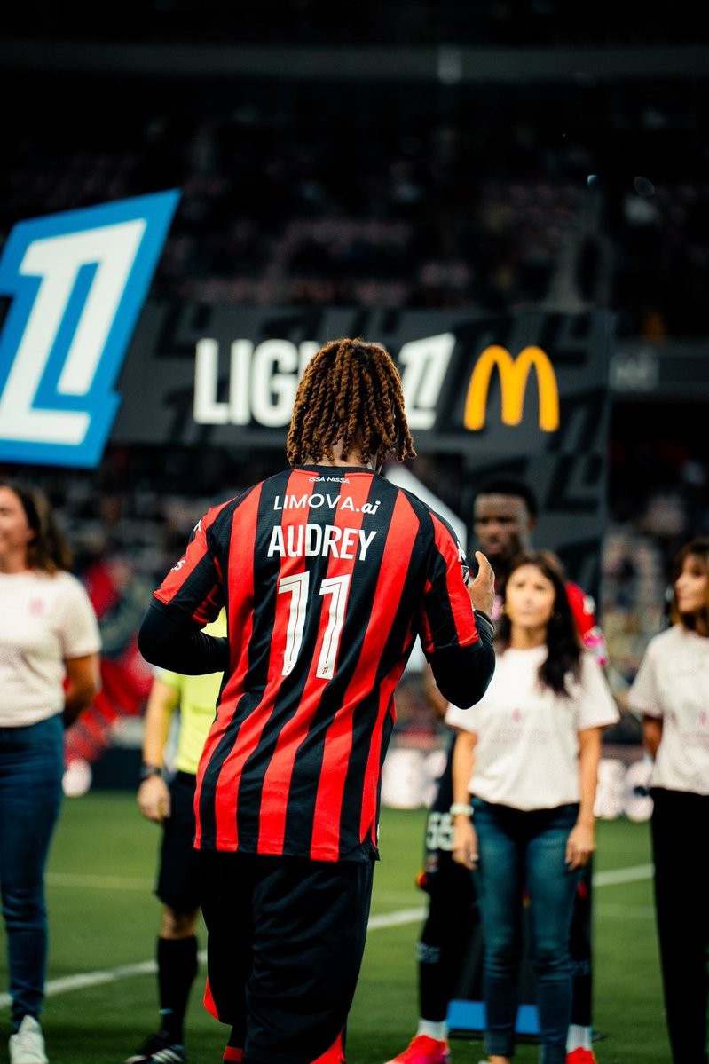
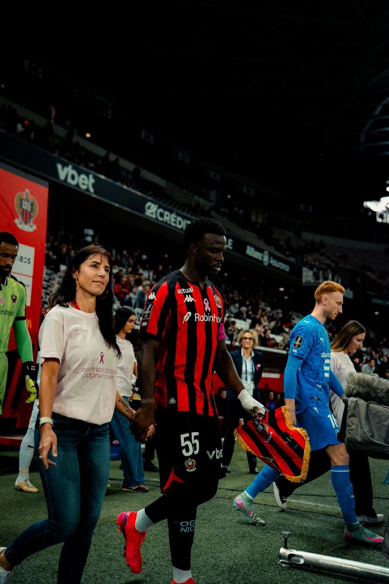
OGC Nice Wear Names of Breast Cancer Fighters on 26-27 Home Kits
OGC Nice closed out their month-long Breast Cancer Awareness campaign with a special initiative during their Ligue 1 fixture against Stade Rennais. Rather than featuring their own surnames on the back, Nice players wore the first names of women engaged in the fight against breast cancer on their 26-27 home shirts.
The tribute served as the grand finale of the club's "22 femmes, 22 portraits" campaign organized for Octobre Rose, which highlighted patients, survivors, caregivers, oncologists, researchers, and club staff members. In a touching pre-match moment at the Allianz Riviera, the women accompanied the players and match officials onto the pitch instead of the traditional child escorts.
Alongside the personalized name sets on the back, the shirts featured a pink ribbon motif on the chest. The team also conducted their pre-game warmup in bespoke pink t-shirts, while the team captain sported a pink armband. The unique match-worn kits are being auctioned via MatchWornShirt, with all proceeds supporting breast cancer research at the Centre Antoine Lacassagne.

Ronald Araújo Wore Old Premier League Font
Despite being phased out over three years ago, the Premier League’s previous typography (used from 2017-18 to 2022-23) made an unexpected return during Liverpool’s recent win against Brighton, appearing on the back of Ronald Araújo's shirt.
For reasons yet to be officially confirmed, the Uruguayan defender’s number "33" was heat-pressed using the legacy Premier League font. Meanwhile, his surname and short numbering correctly featured the current league typeface introduced in 2023. In all prior fixtures this season, Araújo had worn the updated style without issue.
The mix-up is widely believed to be an emergency kit-room solution, likely caused by a temporary shortage of the standard large "3" printing stock on matchday.
Thanks to @whatthekit_x for the great spotting and create the comparison image.

AC Milan Debut Bespoke European Font on 26-27 Away Kit
AC Milan officially debuted their bespoke font for away kit in the recent match against Bournemouth.
The move marks a departure from their primary home strip, where the Italian giants have continued using standard Serie A lettering for their Europa League fixtures rather than adopting a dedicated cup typeface.
This marks the first time since the 2023-24 season that Milan have featured a bespoke European font. During that campaign across the Champions League and Europa League, the club rolled out a bespoke font honoring their iconic 2003 Champions League triumph.
Intriguingly, the new look hasn't been applied across the board. Milan’s goalkeeper featured the Serie A font, creating a striking typographic contrast with the rest of the squad on the night.
Big thanks to @whatthekit_x for the comparison graphic and information.
Bournemouth Face AC Milan in Their Own Inspired Kit
Bournemouth hosted AC Milan in the Europa League at the Vitality Stadium, bringing the two clubs together for a meeting with a special connection.
Bournemouth’s iconic red-and-black stripes were inspired by Milan, who won the European Cup in 1969. Before the 1970-71 season, manager John Bond and chairman Harold Walker introduced the design after a difficult period that saw the club drop into the Fourth Division.
More than 50 years later, Bournemouth faced their kit inspiration in European competition and came away with a 3-0 victory over the Rossoneri.
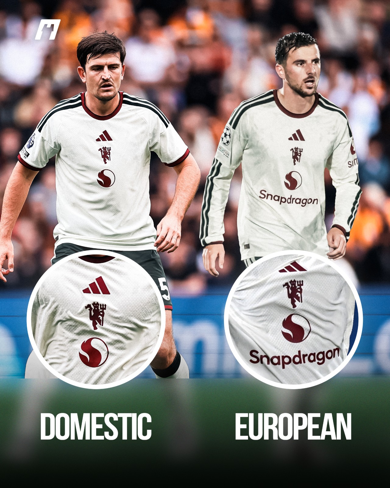
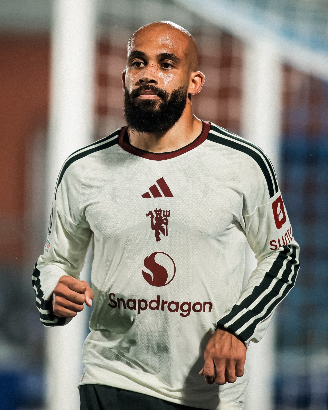
Manchester United Force to Modify Third Kit Sponsor for Champions League
Facing off against Como 1907, Manchester United took the pitch in their third kit, featuring a noticeable twist on the front-of-shirt sponsor logo.
The Red Devils were required to add the "Snapdragon" wordmark beneath the signature fireball emblem. This change comes down to strict UEFA Equipment Regulations, which mandate that main front-of-shirt sponsor branding must remain consistent across all registered match kits (home, away, and third).
Big thanks to @whatthekit_x for the comparison graphic.
Tigres UANL Wear Pink Numbers for Breast Cancer Awareness
Mexican side Tigres UANL joined the global campaign for Breast Cancer Awareness Month (Octubre Rosa) during their Liga MX Apertura 2026 clash against Club León at Estadio Universitario. The club marked the occasion with dedicated pink details across both their pre-match routine and on the pitch to promote early detection and self-examination.
During the pre-game warm-up, Tigres players stepped out in custom light pink T-shirts. The front featured the wordmark "TIGRES" with the letter "I" replaced by a breast cancer awareness ribbon, topped by a tonal club crest. On the reverse, the shirts showcased the campaign's central message: "Ser Incomparable es notarlo a tiempo. Autoexplórate" ("Being Incomparable is catching it in time. Self-examine").
For the match itself, Tigres lined up in their regular 26-27 home kit, but with an eye-catching twist. The standard font coloring was replaced with vibrant pink player names and numbers on the back, offering a sharp contrast against their classic yellow and blue shirts while keeping the awareness initiative in full focus throughout the ninety minutes.