Logos


EFL Trophy Set to Become 'Jersey Mike's Trophy'
The EFL Trophy is set for another commercial rebrand, with American fast-food chain Jersey Mike's Subs closing in on a record-breaking title sponsorship agreement. The English Football League is finalizing a five-year contract worth approximately £5 million to officially rename the competition the Jersey Mike's Trophy.
The landmark partnership represents the most lucrative commercial deal in the history of the tournament. Participating clubs from League One and League Two, alongside invited Category One academy sides, will benefit from boosted prize money, starting with an initial pool of around £900,000 this season. The agreement directly supports Jersey Mike's major expansion into the UK and Ireland, where the US brand plans to roll out up to 400 store locations.
This move adds yet another chapter to the competition's long lineage of commercial title sponsors. Most recently titled the Vertu Motors Trophy, the tournament has previously operated under numerous memorable names, including the Papa Johns Trophy, Checkatrade Trophy, Johnstone's Paint Trophy, and the nostalgic LDV Vans Trophy.


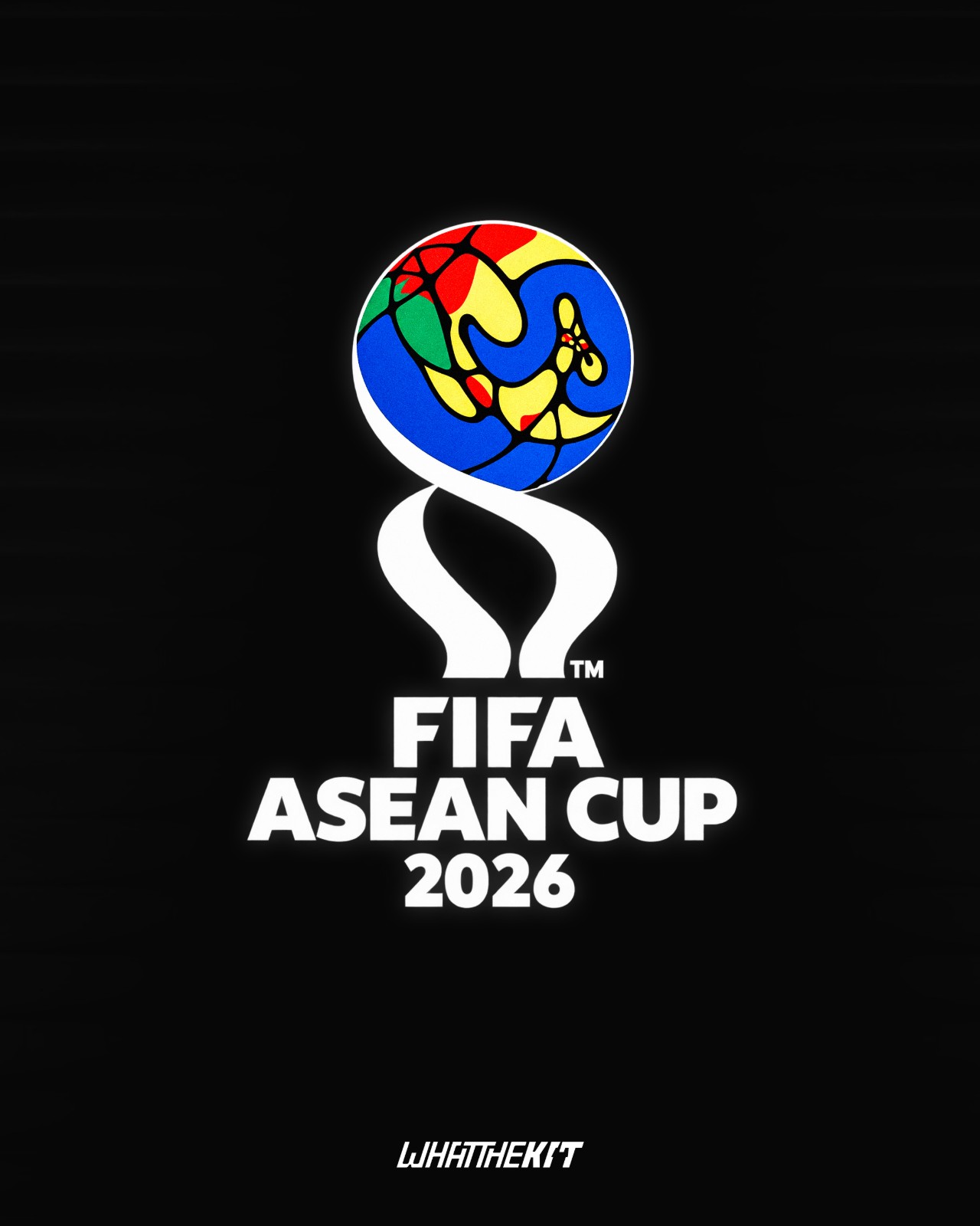
All-New FIFA ASEAN Cup Logo Revealed
The logo for the first FIFA-organized Southeast Asian tournament has been revealed. The design incorporates a colorful, stylized globe depicting the Southeast Asian region.
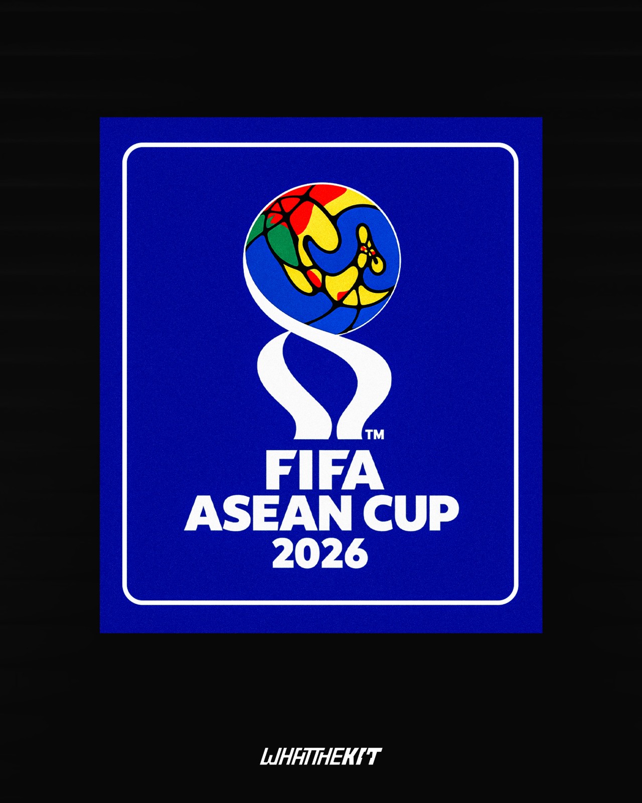
Our partner, What The Kit, has created a prediction concept mockup of the 2026 FIFA ASEAN Cup patch, featuring a prominent blue background.
EFL Trophy Set to Become 'Jersey Mike's Trophy'
The EFL Trophy is set for another commercial rebrand, with American fast-food chain Jersey Mike's Subs closing in on a record-breaking title sponsorship agreement. The English Football League is finalizing a five-year contract worth approximately £5 million to officially rename the competition the Jersey Mike's Trophy.
The landmark partnership represents the most lucrative commercial deal in the history of the tournament. Participating clubs from League One and League Two, alongside invited Category One academy sides, will benefit from boosted prize money, starting with an initial pool of around £900,000 this season. The agreement directly supports Jersey Mike's major expansion into the UK and Ireland, where the US brand plans to roll out up to 400 store locations.
This move adds yet another chapter to the competition's long lineage of commercial title sponsors. Most recently titled the Vertu Motors Trophy, the tournament has previously operated under numerous memorable names, including the Papa Johns Trophy, Checkatrade Trophy, Johnstone's Paint Trophy, and the nostalgic LDV Vans Trophy.
All-New FIFA ASEAN Cup Logo Revealed
The logo for the first FIFA-organized Southeast Asian tournament has been revealed. The design incorporates a colorful, stylized globe depicting the Southeast Asian region.
Our partner, What The Kit, has created a prediction concept mockup of the 2026 FIFA ASEAN Cup patch, featuring a prominent blue background.