Logos


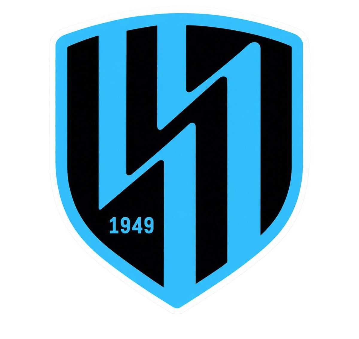
Saudi Side Al-Nahda Club Unveils Brand-New Minimalist Logo
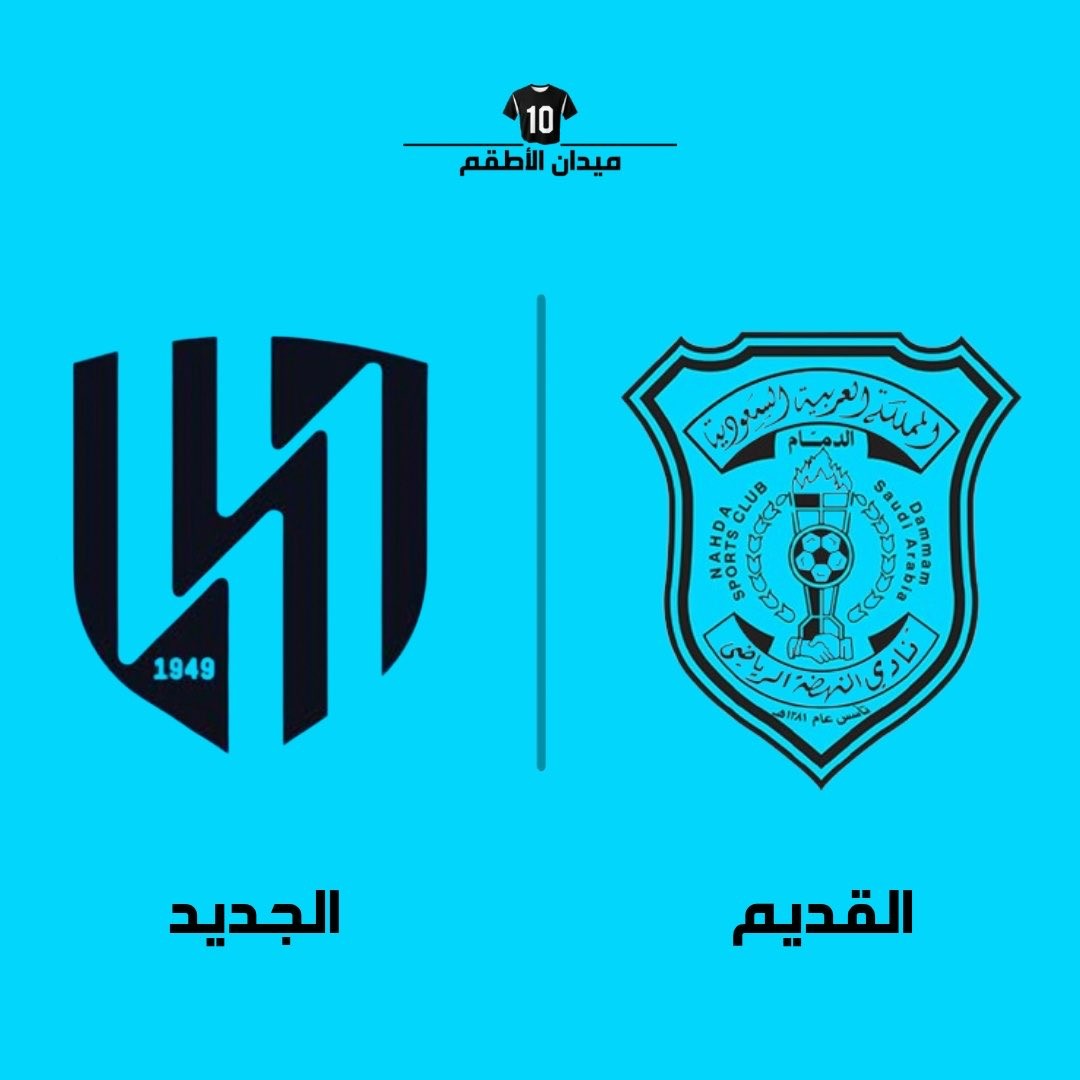
Saudi club Al-Nahda has officially revealed a brand-new visual identity and logo, moving away from its long-standing traditional emblem in favor of a sleek, ultra-modern aesthetic for the 26-27 season and beyond. Thanks to @MidanAlAtqam.
The new crest adopts a sharp shield silhouette executed in the club's signature black and sky blue colorway. At the core of the design is an abstract, interlocking geometric structure forming stylized vertical lines and an angular motif, accompanied by the club's founding year, 1949, at the bottom. This marks a radical departure from the previous ornate crest, which was packed with intricate elements including Arabic calligraphy, a classic football, a torch, and a handshake.
According to club chairman Ibrahim Al-Mowalad, the rebrand encapsulates Al-Nahda's journey through heritage, belonging, and future ambition. The drastic makeover has generated significant debate among fans, dividing those who appreciate the streamlined modern look and those who feel it strips away the detailed regional identity of the original crest.
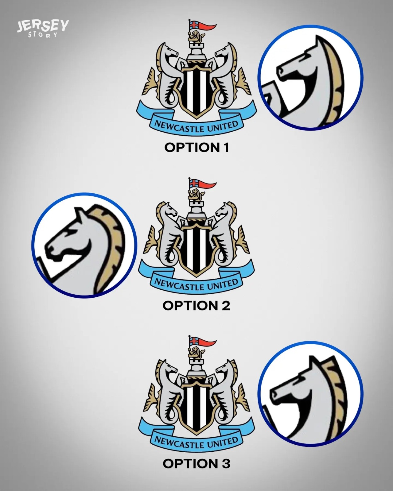
How the Three Newcastle Crest Options Compare
Jersey Story has created a very nice mock-up of how the three Newcastle United crest options compare.


New 26-27 V.League 1 Logo and Sleeve Patch Released
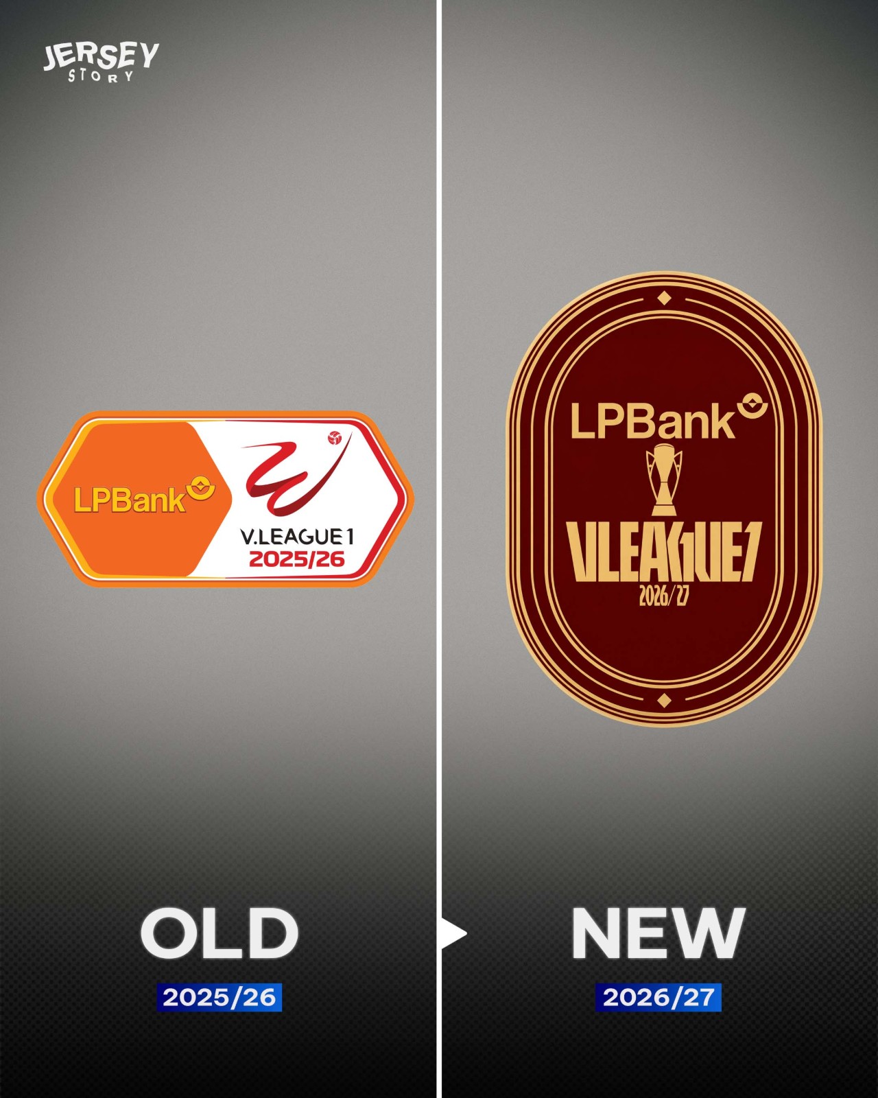
Vietnam's top domestic league, V.League 1, has officially launched its brand-new competition logo and sleeve patch ahead of 26-27 season.
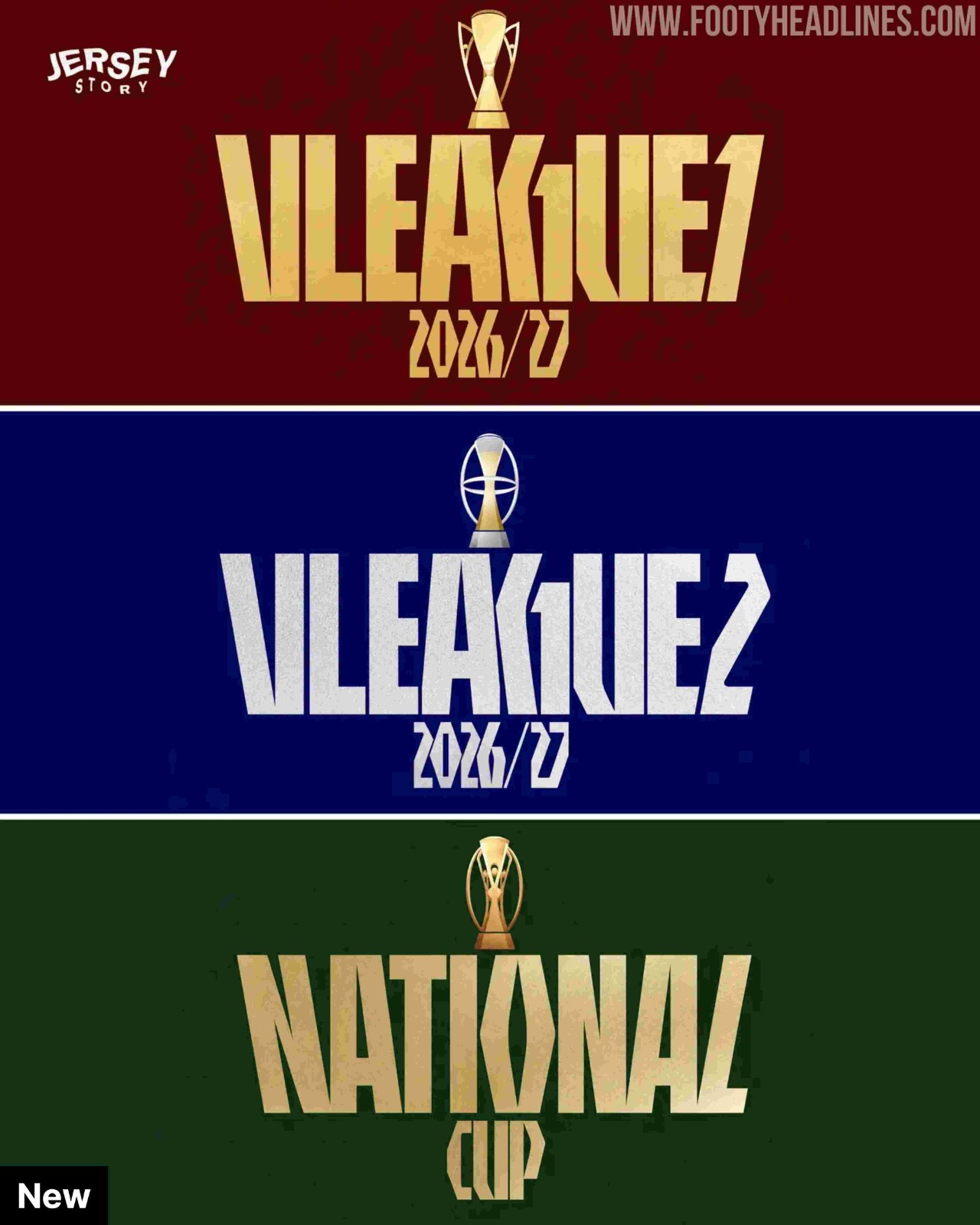
This follows Vietnam Professional Football (VPF) new brand identity across all three of the country's professional competitions: V.League 1, V.League 2, and the National Cup.
The newly introduced patch marks a major visual departure from previous designs, completely dropping the split dual-layout format (competition logo on one side, title sponsor logo on the other) used since 2018. The overall silhouette has also received a full overhaul, transitioning away from the hexagonal shape seen over the past six years to a sleek, rounded oval design.
Big thanks to @jerseystory_vn for the detailed information.

Saudi Side Al-Nahda Club Unveils Brand-New Minimalist Logo
Saudi club Al-Nahda has officially revealed a brand-new visual identity and logo, moving away from its long-standing traditional emblem in favor of a sleek, ultra-modern aesthetic for the 26-27 season and beyond. Thanks to @MidanAlAtqam.
The new crest adopts a sharp shield silhouette executed in the club's signature black and sky blue colorway. At the core of the design is an abstract, interlocking geometric structure forming stylized vertical lines and an angular motif, accompanied by the club's founding year, 1949, at the bottom. This marks a radical departure from the previous ornate crest, which was packed with intricate elements including Arabic calligraphy, a classic football, a torch, and a handshake.
According to club chairman Ibrahim Al-Mowalad, the rebrand encapsulates Al-Nahda's journey through heritage, belonging, and future ambition. The drastic makeover has generated significant debate among fans, dividing those who appreciate the streamlined modern look and those who feel it strips away the detailed regional identity of the original crest.
New 26-27 V.League 1 Logo and Sleeve Patch Released
Vietnam's top domestic league, V.League 1, has officially launched its brand-new competition logo and sleeve patch ahead of 26-27 season.
This follows Vietnam Professional Football (VPF) new brand identity across all three of the country's professional competitions: V.League 1, V.League 2, and the National Cup.
The newly introduced patch marks a major visual departure from previous designs, completely dropping the split dual-layout format (competition logo on one side, title sponsor logo on the other) used since 2018. The overall silhouette has also received a full overhaul, transitioning away from the hexagonal shape seen over the past six years to a sleek, rounded oval design.
Big thanks to @jerseystory_vn for the detailed information.