Logos

Tanjong Pagar United Reveal Controversial New AI Logo
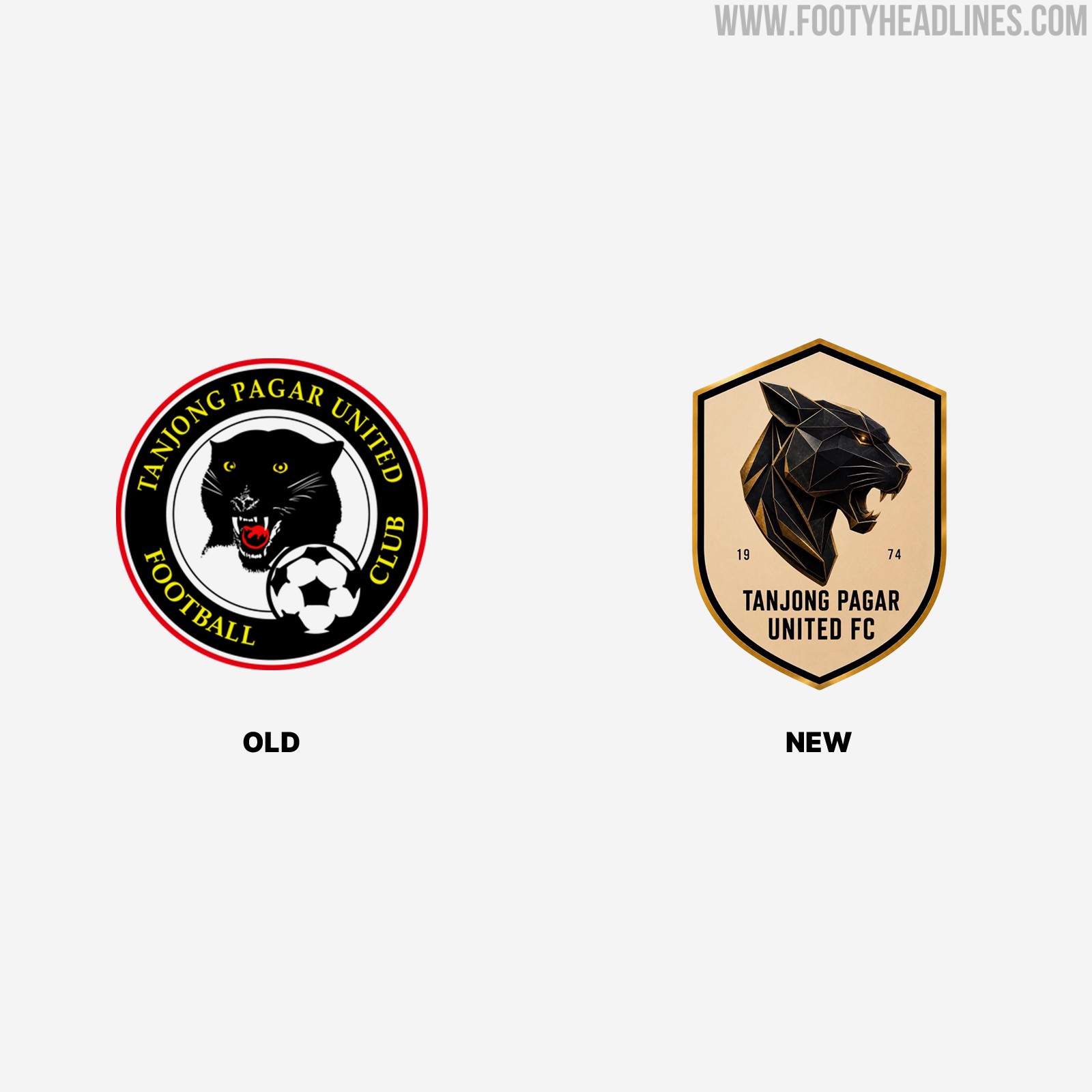
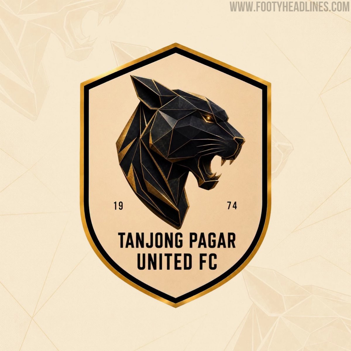
Following a recent change in club management, Singapore Premier League side Tanjong Pagar United have introduced a new club crest for the 2026-27 season. First spotted in an AFC licensing document earlier this month, the updated emblem replaces the club's traditional hand-drawn badge with a modernized design that has quickly drawn criticism from fans for looking overly generic and being AI-generated (it probably was).
The new management took charge on June 1, but there is currently no official confirmation on whether the team's kit colors will also be altered to complement the newly introduced visual identity.


New Al Khulood Logo Revealed
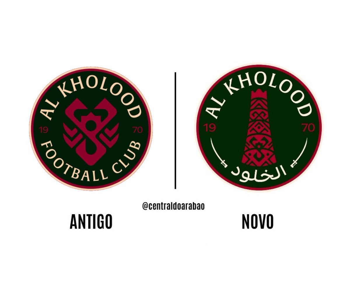
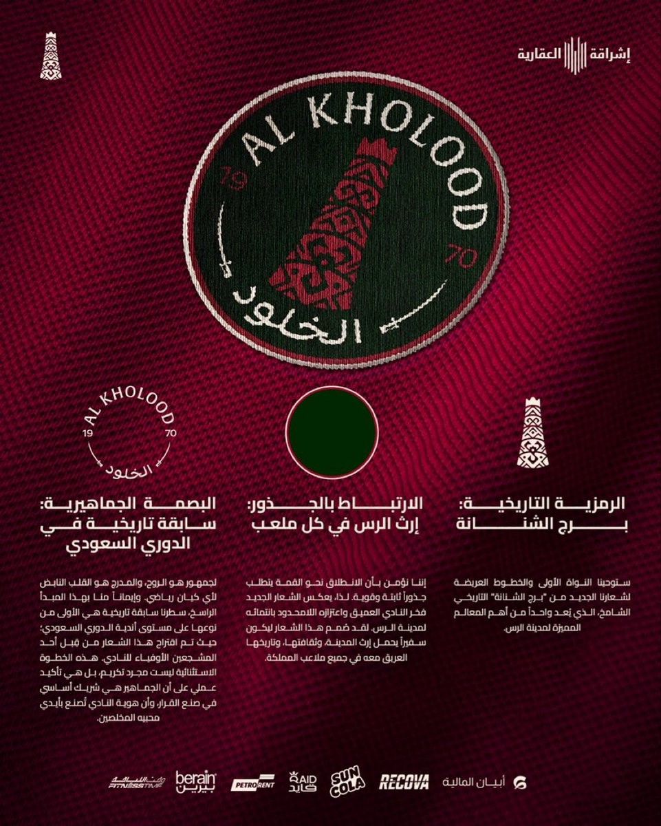
Saudi Pro League club Al Khulood have officially unveiled their new logo following a public fan vote. The updated crest, which forms part of a broader visual identity refresh for the team, incorporates elements inspired by the club's home city of Ar Rass into the previous shield design. This marks the second time the club's visual identity has been updated since Ben Harburg's acquisition of the team.

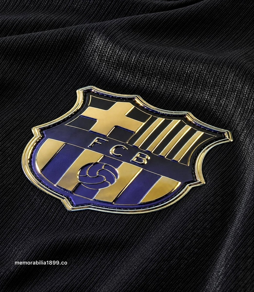
Nike Mamba FC Barcelona 2026-27 Away Kit Leaked - Close-Up Details
Barcelona shirt insider @memorabilia1899 has shared new close-up image showcasing a stunning iridescent club crest of the new Mamba Barcelona 26-27 away shirt
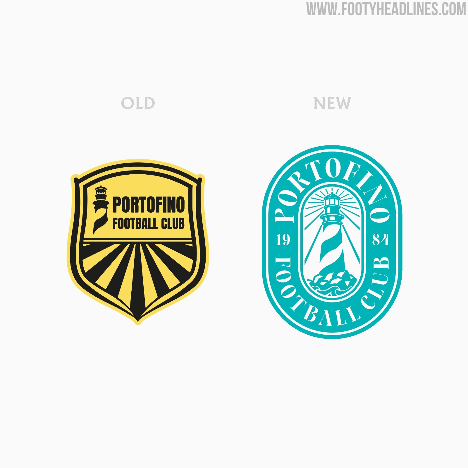
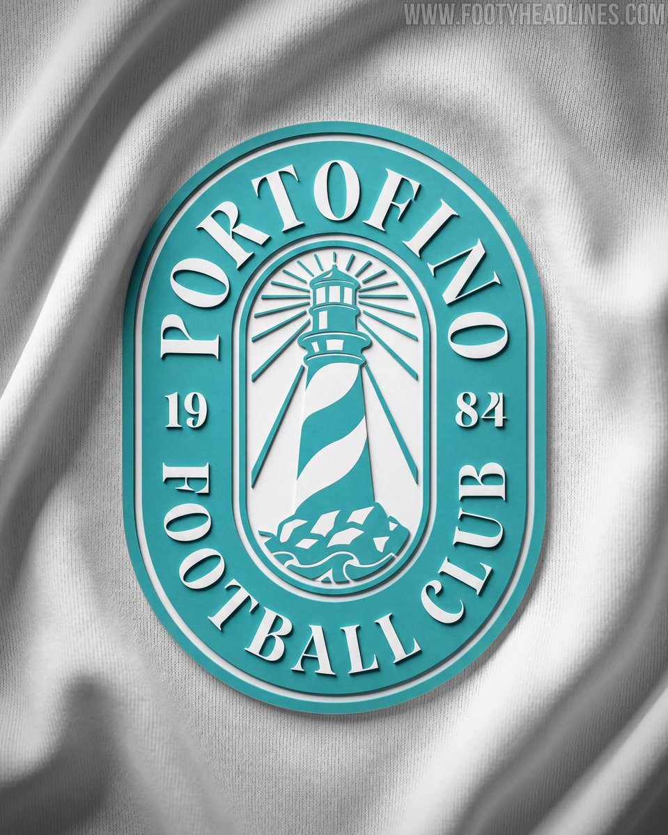
New Portofino FC Logo Revealed By Ezeta & Dan K. Norris
Italian creative brand Ezeta has unveiled the new logo for Portofino FC. Following the announcement of their partnership earlier this week, which is heavily inspired by the Italian Dolce Vita, the new crest introduces a fresh and elegant visual identity for the team.
Designed in collaboration with Dan K. Norris, the new Portofino FC logo centers around the prominent theme of a lighthouse, described as the Guardian of the Riviera. Shifting focus from a minor background element to the primary symbol, the updated design embodies the motto The Lighthouse Leads The Way, giving the club a strong and distinct maritime identity.
Nike Mamba FC Barcelona 2026-27 Away Kit Leaked - Close-Up Details
Barcelona shirt insider @memorabilia1899 has shared new close-up image showcasing a stunning iridescent club crest of the new Mamba Barcelona 26-27 away shirt

Tanjong Pagar United Reveal Controversial New AI Logo
Following a recent change in club management, Singapore Premier League side Tanjong Pagar United have introduced a new club crest for the 2026-27 season. First spotted in an AFC licensing document earlier this month, the updated emblem replaces the club's traditional hand-drawn badge with a modernized design that has quickly drawn criticism from fans for looking overly generic and being AI-generated (it probably was).
The new management took charge on June 1, but there is currently no official confirmation on whether the team's kit colors will also be altered to complement the newly introduced visual identity.
New Portofino FC Logo Revealed By Ezeta & Dan K. Norris
Italian creative brand Ezeta has unveiled the new logo for Portofino FC. Following the announcement of their partnership earlier this week, which is heavily inspired by the Italian Dolce Vita, the new crest introduces a fresh and elegant visual identity for the team.
Designed in collaboration with Dan K. Norris, the new Portofino FC logo centers around the prominent theme of a lighthouse, described as the Guardian of the Riviera. Shifting focus from a minor background element to the primary symbol, the updated design embodies the motto The Lighthouse Leads The Way, giving the club a strong and distinct maritime identity.


Nike Mamba FC Barcelona 2026-27 Away Kit Leaked - Close-Up Details
Barcelona shirt insider @memorabilia1899 has shared new close-up image showcasing a stunning iridescent club crest of the new Mamba Barcelona 26-27 away shirt

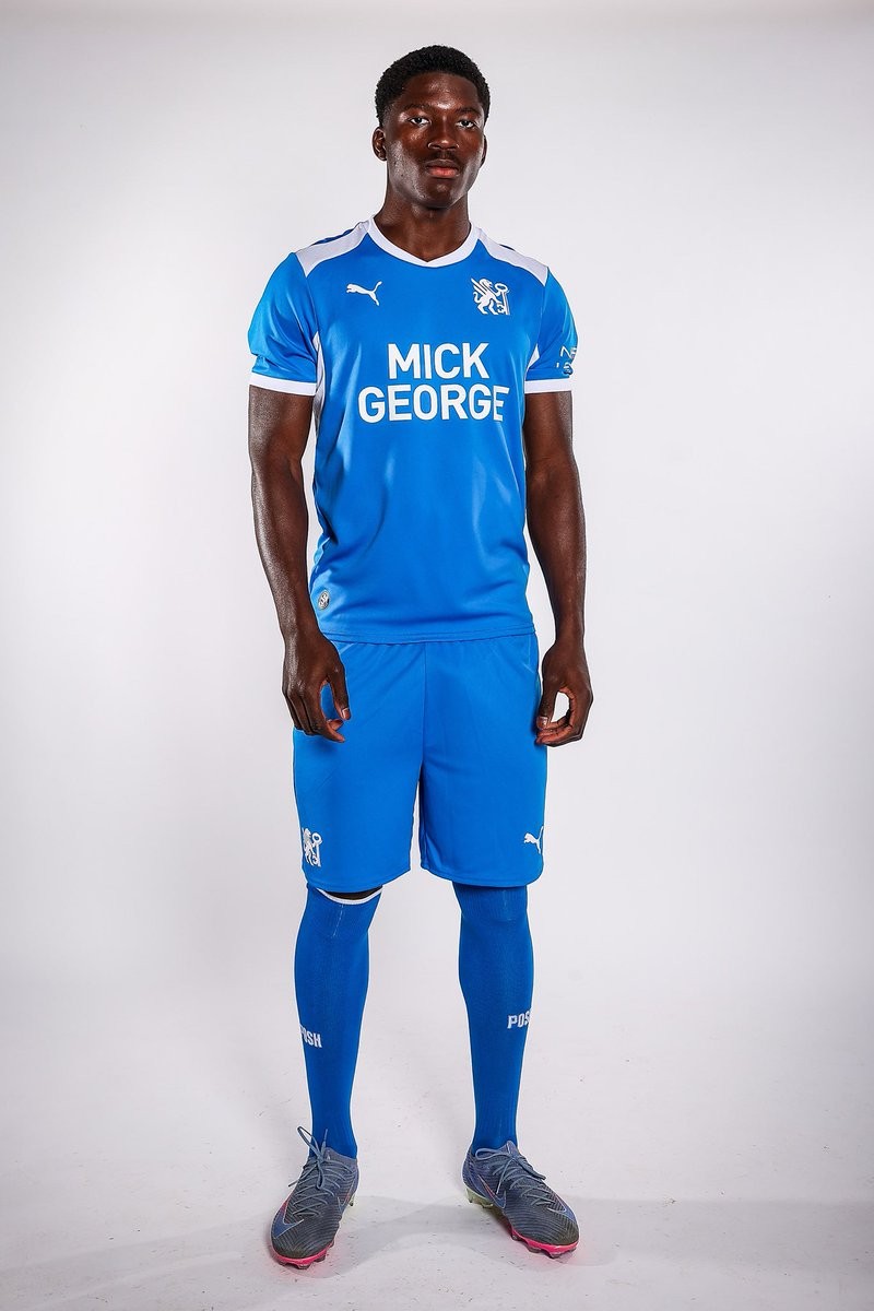
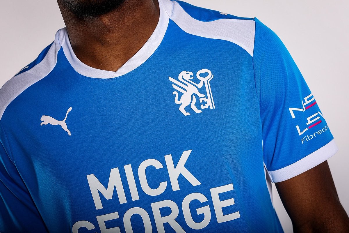
Peterborough United 26-27 Home Kit Released
Peterborough United have launched their 2026-27 home kit, made by Puma. This marks the first time the shirt features the club's updated crest as part of a broader rebrand for the new season in League One.
The design maintains the traditional royal blue colorway with a prominent crossover ribbed crew neck collar. Official club branding, sponsor logos, and Puma detailing complete the look.
The launch includes a campaign video narrated by director of football Barry Fry emphasizing the start of a new era for the club.
Adidas Authentic Kit Badge Features Hidden UV Print
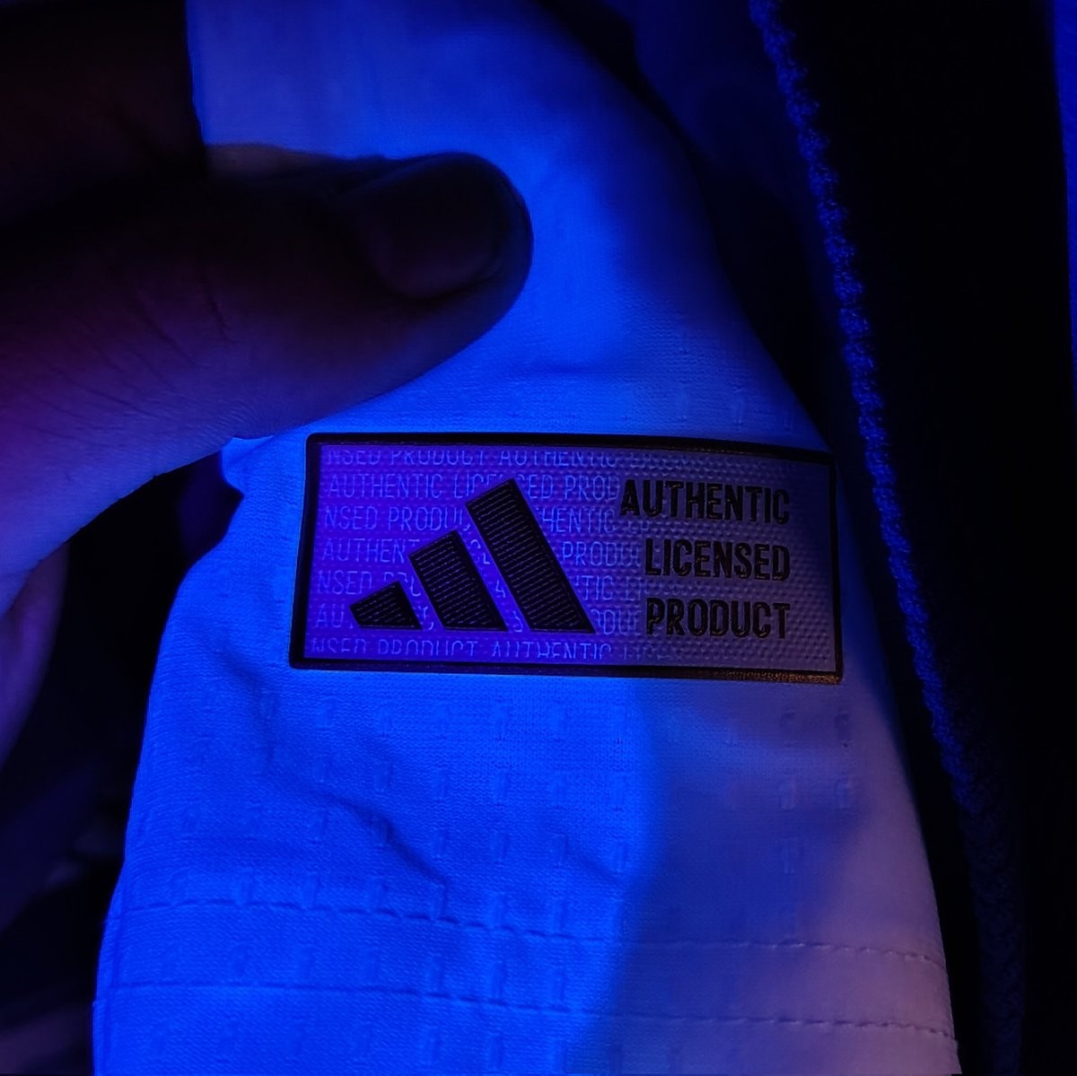
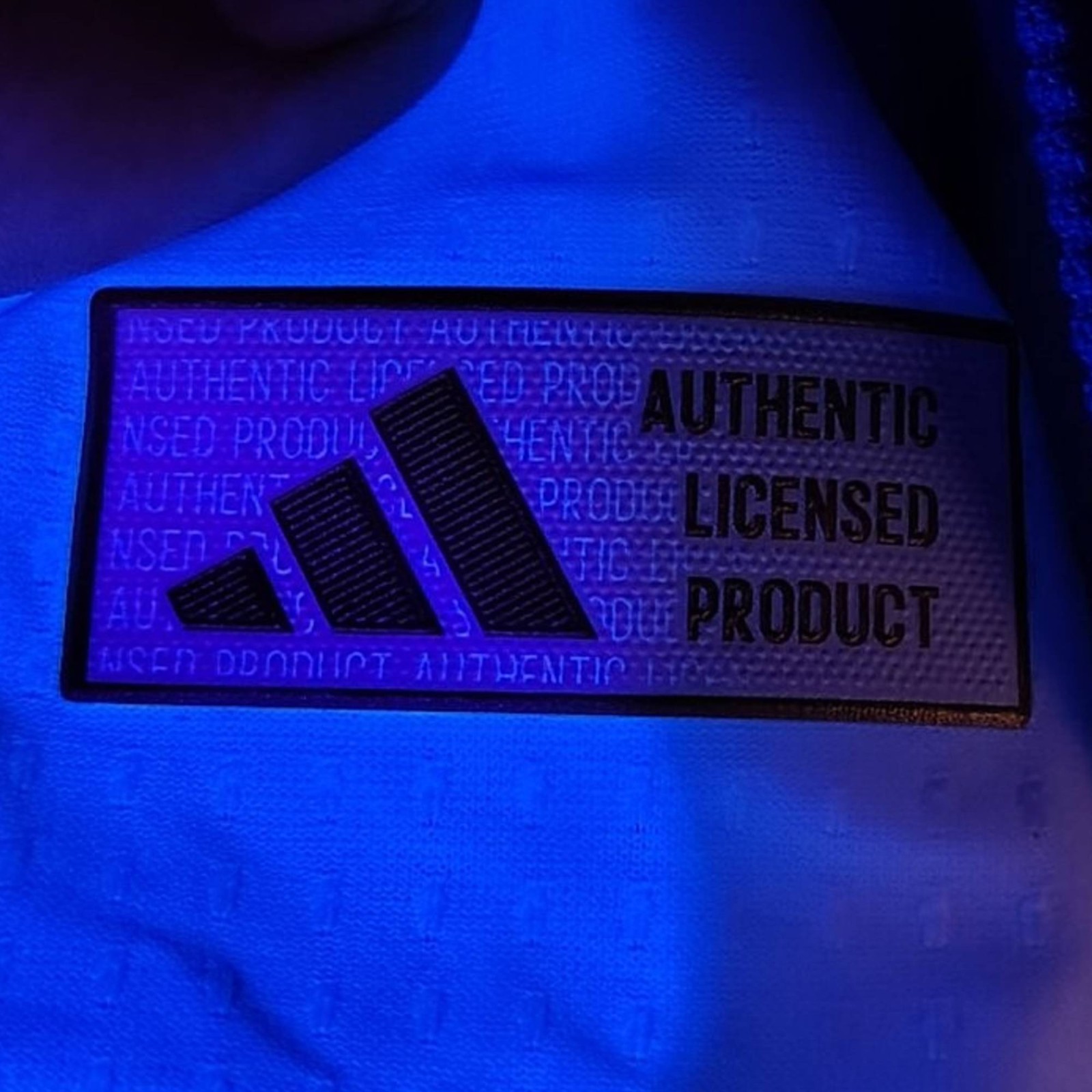
A detail on Adidas Authentic kit has drawn attention after being shared by @albxrnxz. The patch labeled "Authentic" reveals additional text when viewed under ultraviolet light. This applies to national team shirts, including those from the Argentina selección, and other recent Adidas kits. The feature serves as an extra verification step beyond standard tags and labels.
The observation highlights how Adidas incorporates advanced elements into its player versions and Authentic products. A heat-applied label combined with UV printing acts as a seal of authenticity, as noted on official product pages for items like the Argentina 2026 jerseys. This helps distinguish genuine merchandise from replicas.
The measure fits into Adidas' updates for the 2026 World Cup collection. Similar hidden UV prints appear in logos and badges across Authentic kits to address counterfeiting concerns. Fans can use a basic UV light to check their jerseys, adding a practical layer for collectors and buyers.
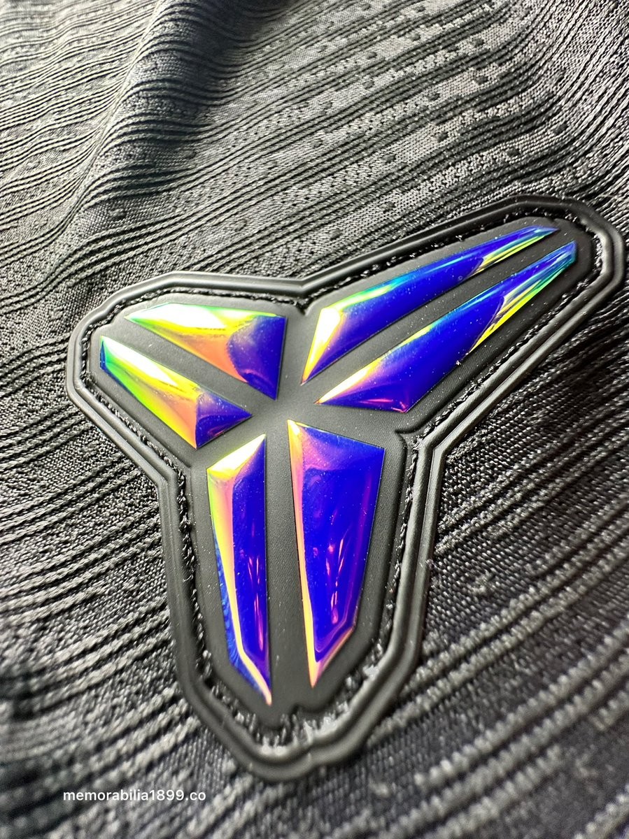
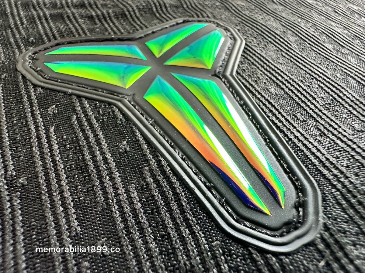
Mamba Barcelona 26-27 Away Kit - Iridescent Logo Effect
Barcelona kit collector account @memorabilia1899 has shared four images highlighting different aspects of the Mamba Barcelona 2026-27 away jersey under the theme of Mamba Mentality.
It highlights the stunning iridescent effect of the Mamba logo, with the colors shifting as the viewing angle changes.

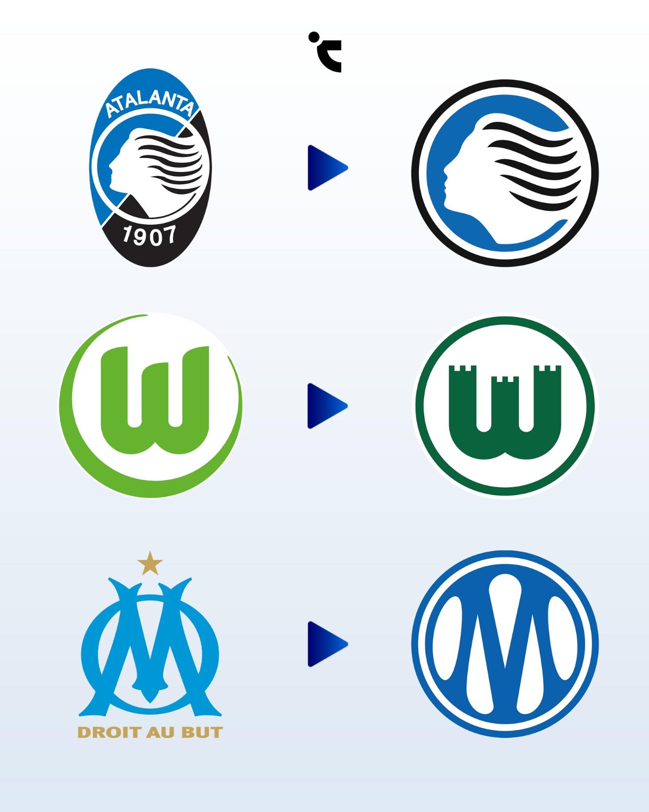
Atalanta, Marseille & Wolfsburg Change Logos for 26-27 Season
Vietnamese kit freaks Chuyện Áo Đấu have created a nice infographic of three European teams' logo changes for the 26-27 season. All of them have one thing in common - they are circular.
The underlying reasoning for this widespread circular design trend across modern football is primarily driven by digital functionality and commercial scalability. Circular, stripped-down logos provide a sense of visual balance and are significantly easier to apply across various media, ranging from tiny social media avatars to global lifestyle merchandise.
However, this rush toward extreme minimalism is increasingly alienating traditional football supporters and risking a severe homogenization of the sport's visual landscape.
For Wolfsburg, the change was praised by fans, as the Zinnen crest has been the fans' favorite design ever since. For Atalanta, it was also rooted in history, while OM was the biggest update.


